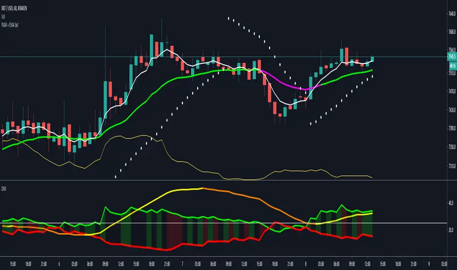
Directional Movement Index + Average Directional IndexPersonal DMI and ADX script
ADX color change from positive vs negative momentum
DMI Color fill based on DMI+/- positive momentum
No fill color during lack of momentum
DM Indicator
(JS)DMI BarsAlright - so this is my own version of John Carter's "10x Bars"... I have done multiple things that are different from his version so they are slightly different..
So first of all the main indicator is based off of the ADX and the DMI;
For those who aren't familiar with it, Directional Movement is what you'd pull up under "built-in's" from the indicators tab (if you want to check it out).
The standard interpretation of this however, is when the ADX is above 20 that suggests the trend is strong, whereas under 20 suggests it is weak.
Also, when the D+ is above the D- that suggests a bullish trend, and D- above D+ suggests a bearish trend.
These bars take away the need to have it at the bottom of your screen, and places the data on the bars on your chart instead.
=========================================================================================================================================
So here's what the colors stand for -
Yellow - The ADX is under 20, no strength in trend
Shades of green occur when the ADX is above 20 and there's a bullish trend (D+ higher than D-)
Bright Green (Lime) - Bullish trend, D+ above 30
Green - Bullish Trend
Yellow Green - Bullish trend, D+ below 15
Shades of red occur when the ADX is above 20 and there's a bearish trend (D- higher than D+)
Bright Red - Bearish trend, D- above 30
Red - Bearish Trend
Orange - Bearish trend, D- below 15
=========================================================================================================================================
I have also added multiple time frame labels (label script used is the one created by Ricardo Santos)
These labels are color coded the same as the bars/candles, and they appear off to the right of your screen using every built in time increment from TradingView.
The purpose is to show you in real time, and on any chart resolution, what the current trend is on every individual time frame.
So using just one single chart you'll see your current resolutions candles, but also on the labels you'll see:
1 Minute
3 Minute
5 Minute
15 Minute
30 Minute
45 Minute
1 Hour
2 Hour
3 Hour
4 Hour
Daily
Weekly
Monthly
There is an input I added that allows you to adjust where your labels appear on the side of your screen as well!
=========================================================================================================================================
Now onto the volume spike portion of the indicator. This will plot a blue dot under each bar that has a spike in volume which meets your specified criteria.
I have 500% as the default setting.
What that means is that this indicator looks back and gets the 50 bar volume average and then applies dots where volume is 500% above average.
=========================================================================================================================================
Now finally, the reversal arrows. This is another simple to understand concept that I first read in John Carter's book "Mastering the Trade" that he calls "HOLP/LOHP".
I have added the ability to change the look back period you'd like the indicator to watch for highs and lows on.
What that stands for is 'High of Low Period' and 'Low of High Period', and it is used like this-
Whenever a bar makes a new high the indicator watches the low on that highest bar. Then when a bar afterwards makes a lower low then the one on the high bar,
a reversal arrow is given. Apply this same concept in the other direction in for the highs on the lowest bars.
=========================================================================================================================================
Now, I didn't want to make a "set" or have a bunch of different indicators out there that are all intended for the same package, so I took the time to put them together,
and if there's a part of it you don't care for they can easily be turned off in the settings.
Enjoy!

Lachie 3.0: DDS (Divergence Detection System)
Introduction:
The purpose of this indicator is to assist users in detecting bullish divergence across any time frame. Divergence is the main component of my methodology, this on display at Blockchain Education (charts, calls, etc..). This is not a signal script, it is purely for educational purposes and should only be used as an indicator to invest further time in TA.
How to interpret:
When a unique event occurs in the market the logic of the code will trigger and display a green X underneath the candles on your chart. The green X means that the code is detecting bullish divergence. The chart may draw several Xs in one location.
What should I do when an X is drawn:
As this is an educational indicator, I can only recommend that once an X is drawn you should pay further attention to the currency/stock (do further Technical analysis). In some market conditions this indicator can be used and automated as an appropriate buy signal, however due to its primitive nature it can go wrong on the rare occasion.
What time frames is this indicator best on:
This indicator was designed on a 1 hour chart. However, it does perform quite well on the daily, 4 and 6 hour charts. Its performance is acceptable on 15 and 5 min for day trading.
FAQ:
Should I buy when I see a green X?
I will not recommend any purchases without first proper TA. Majority of the time the indicator will correctly fin the bottom however in extreme down trends the code will display fake Xs. Upon proper TA you will see how these are fake, but if you rely on a signal, you may get caught out.
I am getting too many Xs on my chart?
The logic of the code may not support some lower time frames, which will result in a lot of Xs.
Some divergence will complete over a large amount of candles, which can also cause a cluster of signals.
In a down trend occasionally the logic cannot correct interpret the weakness in the market.
Is this indicator applicable to any market?
Yes, although the indicator was developed based on Crypto Currency markets, the indicator is usable and in most instances more accurate on traditional markets.
Will there be future updates released?
As the code ages and further development is made, updates including increase accuracy for automation and signals may be released. This is really released for educational support. these updates may be released under a separate indicator listing.
This is an earlier derivative of current indicator with bullish and bearish divergence with higher accuracy (signal) script. This is for educational purposes only to aid people following my calls and methodology at Blockchain Education.
Images of indicator:
Created and owned by Lachlan Schahinger. (2018)


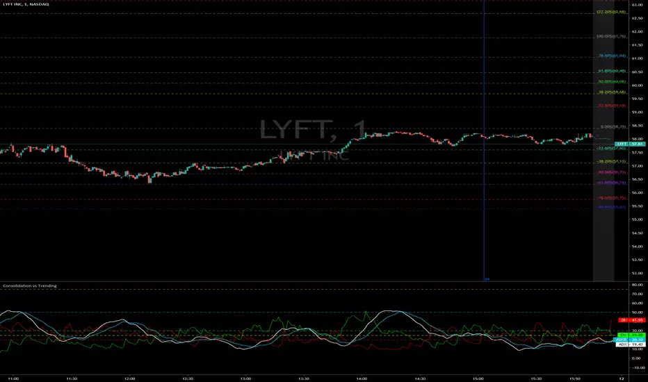
Consolidation vs Trending
ADX is used to quantify trend strength. ADX calculations are based on a moving average of price range expansion over a given period of time. The default setting is 14 bars, although other time periods can be used. ADX can be used on any trading vehicle such as stocks, mutual funds, exchange-traded funds and futures.
ADX is plotted as a single line with values ranging from a low of zero to a high of 100. ADX is non-directional; it registers trend strength whether price is trending up or down. The indicator is usually plotted in the same window as the two directional movement indicator (DMI) lines, from which ADX is derived.
When the +DMI is above the -DMI, prices are moving up, and ADX measures the strength of the uptrend. When the -DMI is above the +DMI, prices are moving down, and ADX measures the strength of the downtrend.
ADX values help traders identify the strongest and most profitable trends to trade. The values are also important for distinguishing between trending and non-trending conditions. Many traders will use ADX readings above 25 to suggest that the trend is strong enough for trend-trading strategies. Conversely, when ADX is below 25, many will avoid trend-trading strategies.
ADX Value Trend Strength
0-25 Absent or Weak Trend
25-50 Strong Trend
50-75 Very Strong Trend
75-100 Extremely Strong Trend
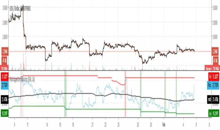
Risk Appetite IndicatorBitfinex coins risk appetite indicator. To be applied on EOS and LTC and perhaps on other coins, too.
Go long when the background is red, go short when the background is green.
Based on LONGS compared with the LONGS on BTC+ETH+XRP. Only works on coins that can be margin traded @ Bitfinex - because it reads the number of Bitfinex long positions.
Alerts are available.
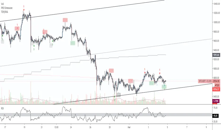
Time Indicator*This is a private script for Personal Use. To avoid any Trade Mark violations, the official math rules have been slightly optimized & name changed.
The Time Indicator gets its inspiration from the classic and trademarked work of Tom Demark (with one of the biggest differences being the elimination of the "Price Flip" being a necessary condition to start a "Setup"). The Indicator only displays values on the most recent 13 candles unless unless the count has something critically like 9. You should be very familiar with traditional trading techniques & the Tom DeMark's indicators in order to follow this one & also understand how it is different. Here is a very good presentation on it as part of Bloomberg's Market Essentials Trading Education Series .
The Chart below displays the features of the Indicator, but it is still a work in progress, additional features will be added soon in future updates.
