Market Cap / Revenue RatioA variation of the P/S ratio, this script takes the future estimated revenue of the current stock versus it's Market Cap. It then compares the aforementioned Market Cap:Revenue ratio against a market bellwether's corresponding ratio (MSFT by default) to determine the following:
- Light green when the ratio is extremely low (Stock is very undervalued)
- Green when the ratio is low (Stock's multiple is lower by 20-50%)
- Blue when the ratio is close to the benchmark (Stock is fairly valued to benchmark multiple)
- Red when the ratio is high (Stock's mulitple is higher by 50% or more)
- Dark red when the ratio is extremely high (Stock is very overvalued)
CONFIGURABLE
- Full Table: Show the entire calculation table
- Minimalist: Go minimal and show only the ratio and color code
- Show Benchmark Multiple: Show the multiple ratio calculated between the current stock and the benchmark stock (MSFT by default)
NOTES
- When calculating the Market Cap, TradingView sometimes under-reports the number of shares and thus skews the Market Cap too low. This seems to happen for stocks with multiple share classes like GOOGL so be mindful that the data can be wrong for these kinds of stocks. You can check on this by going into the Indicator's Settings and select Show Full Table which will show the number of shares outstanding reported by TradingView.
- For certain stocks such as foreign ADRs, there won't be a future revenue estimate so the script will automatically use the Total Revenue for the most recent Quarter in these cases
Revenuegrowth

Times-Revenue (Fundamental Metric)Times-revenue is calculated by dividing the selling price of a company by the prior 12 months revenue of the company. The result indicates how many times of annual income a buyer was willing to pay for a company.
In color Red: it shows the last annual metric calculated
In color Gray: it shows the last 4 quarters annualized results

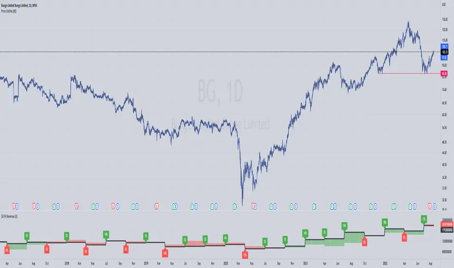
[GTH] RevenueVisually similar to the GTH Earnings indicator, this indicator plots
Reported Revenue (black line)
Difference to Estimated Revenue (colored bars)
Percentage change to the previous Reported Revenue (tags)
Note 1: Although in Tradingview the 'E' tags on the time line display Revenues alongside with Earnings , there is a difference in timing. Revenues are reported quarterly; Earnings reporting dates differ with each stock. Hence, the tags in this indicator are not necessarily aligned with the Earnings reporting dates.
Note 2: It should be obvious that this indicator can only report data provided by Tradingview. Even more obviousy, it can not display revenues of anything else but stocks.
If you find a malfunction, please provide examples. "Does not work" is not helpful.
ds Revenue, Margins, Earnings TrendsPURPOSE: Looks for trends in Revenue, Margins, Earnings (RME) and provides a quick indication of where to focus your attention. Developed for educational purposes for my Investing Program Students at Everett Community College, Everett, WA.
WHAT IT DOES:
Based on the principle that fundamental trends support technical price trends this indicator intends to help swing and position trading students evaluate the income statement by exposing recent trends in the revenue, margins, and earnings looking at eight quarters of data. It requires three quarters to determine a trend therefore there is a heavy focus on the last three quarters of data. Tools and indicators should be used to "tell something useful" in this case it is specifically is revenue, margins, and earnings expanding, contracting, or flat? Is this movement accelerating or decelerating? Lastly some logic is used to interpret at glance whether this stock warrants a closer look into the fundamentals and technicals of this particular company.
HOW TO:
This is a brief description on how to use this tool
1. TOP ROW: This shows the symbol and then provides a summation indicator (Green Checkmark, Yellow caution triangle, Red X) for each section (Revenue, Margins, Earnings). At a glance shows strength/weakness/concerns.
2. TABLE: You will see 8 quarters of data assuming it is available broken into sections for Revenue, Margins, and Earnings.
3. COLUMNS: The text color red does not denote a negative number and the text color green does not denote a positive number. Rather in the column of data where it is displayed, the green text helps visually show a bullish trend when each value is greater than the prior value and the red text helps visually show a bearish trend when each value is less than the prior value. Yellow background in columns highlights values which should not normally be negative numbers.
4. 3Q TREND ROW: This row analyzes the last three quarters of data in the column to determine if the trend is rising, falling, or flat.
5. 3Q ROCK ROW: This row analyzes the last three quarters of data to determine if the trend is accelerating up, accelerating down, or momentum (MOM) is sideways.
6. BOTTOM ROW INDICATORS: Based on whether the numbers are negative or positive and the trend, This row shows one of the following results:
6a. Green Checkmark is considered acceptable performance.
6b. Yellow Caution Triangle indicates a closer inspection of this columns data is warranted.
6c. Orange Diamond is more serious than the Caution but not as bad as a Red Flag. Extra caution is required here.
6d. Red Flag indicates a warning that undesirable performance characteristics are associated with the data in this column.
