Rate Of Change Earnings Move - ROCEMRate Of Change Earnings Move
What is it and how does it work?
The Rate of Change Earnings Move indicator or ROCEM is an indicator designed for giving the user an idea of how much a stock has moved up or down in past earnings reports. This is ideal for options traders who can use ROCEM to calculate whether or not their long straddles are actually probable of happening.
How it works
The indicator measures the absolute value rate of change and then calculates the average rate of change for the day of the earnings report for the past 8 earnings reports (2 years). It then takes the current stock price and finds the upper and lower price based on the average rate of change for past earnings.
I have also included a moving average (purple line), use this to see if the current rate of change is higher than usual.
Additionally, earnings reports are marked with a red x on the indicator.
How to trade ROCEM
This is primarily made for options trading so I will be explaining how it can be used for that. It is not suited for traditional stock trading as it does not determine a market direction.
Select a stock with an upcoming earnings
Enter your per leg commissions in the indicator if you want it to calculate new upper and lower prices (makes it easier to determine if the options trade will pass the breakeven when commissions are factored in)
Compare your long straddle breakevens with the upper and lower prices of the indicator. If the upper breakeven is smaller than the upper price in ROCEM and the lower breakeven is larger than the lower price in ROCEM, then a long straddle position could be considered a reasonable trade based on past earnings performance.
ROC

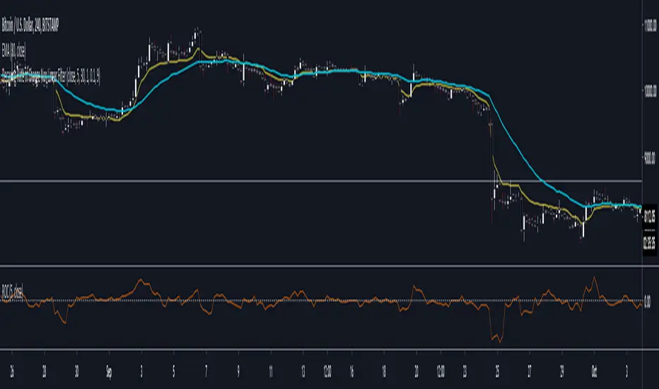
Decaying Rate of Change Non Linear FilterThis is a potential solution to dealing with the inherent lag in most filters especially with instruments such as BTC and the effects of long periods of low volatility followed by massive volatility spikes as well as whipsaws/barts etc.
We can try and solve these issues in a number of ways, adaptive lengths, dynamic weighting etc. This filter uses a non linear weighting combined with an exponential decay rate.
With the non linear weighting the filter can become very responsive to sudden volatility spikes. We can use a short length absolute rate of change as a method to improve weighting of relative high volatility.
c1 = abs(close - close ) / close
Which gives us a fairly simple filter :
filter = sum(c1 * close,periods) / sum(c1,periods)
At this point if we want to control the relative magnitude of the ROC coefficients we can do so by raising it to a power.
c2 = pow(c1, x)
Where x approaches zero the coefficient approaches 1 or a linear filter. At x = 1 we have an unmodified coefficient and higher values increase the relative magnitude of the response. As an extreme example with x = 10 we effectively isolate the highest ROC candle within the window (which has some novel support resistance horizontals as those closes are often important). This controls the degree of responsiveness, so we can magnify the responsiveness, but with the trade off of overshoot/persistence.
So now we have the problem whereby that a highly weighted data point from a high volatility event persists within the filter window. And to a possibly extreme degree, if a reversal occurs we get a potentially large "overshoot" and in a way actually induced a large amount of lag for future price action.
This filter compensates for this effect by exponentially decaying the abs(ROC) coefficient over time, so as a high volatility event passes through the filter window it receives exponentially less weighting allowing more recent prices to receive a higher relative weighting than they would have.
c3 = c2 * pow(1 - percent_decay, periods_back)
This is somewhat similar to an EMA, however with an EMA being recursive that event will persist forever (to some degree) in the calculation. Here we are using a fixed window, so once the event is behind the window it's completely removed from the calculation
I've added Ehler's Super Smoother as an optional smoothing function as some highly non linear settings benefit from smoothing. I can't remember where I got the original SS code snippet, so if you recognize it as yours msg me and I'll link you here.
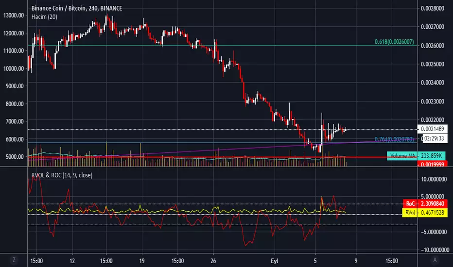
RVol & RoC - Relative Volume & Rate of Change by haciyatmazRelative Volume ( RVol ) is a critical measure of volume flows. It measures current volume in relation to the "usual" volume for this time of the day.
Rate of Change ( RoC ) is a momentum-based technical indicator that measures the percentage change in price between the current price and the price a certain number of periods ago.

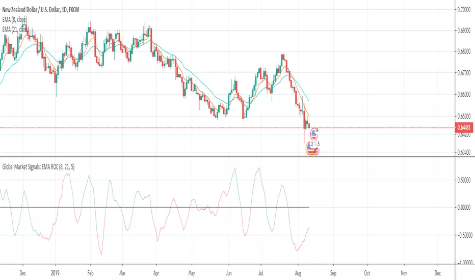
Global Market Signals: EMA ROCWelcome!
Thanks for checking out my indicator.
This is the difference in the rate of change between two exponential moving averages.
The colors are green and red:
- Green is when the fast EMA > slow EMA
- Red is when the fast EMA < slow EMA
When the indicator approaches it's upper or lower limits, it will indicate either sideways price movement or a reversal. When the color changes around it's upper or lower limits from green to red or vice-versa, an EMA crossover just occurred and a continuation of trend is possible before a pause or reversal in price.
I hope this helps!
Andre
Global Market Signals
(JS) RSI Divergence OscillatorPretty simple really - when the oscillator is positive it means that there's bull RSI divergence, negative means there is bear RSI divergence.
Simple formula to make it, Rate of Change on RSI vs. Rate of Change on price, smoothed out using an EMA.


Function To Candles - Another way to see indicatorsIntroduction
There are different and better way's to see price data, a candlestick chart is one of the best way to see the price since you have access to the open/high/low/close information, this is really efficient and can allow for naked non parametric trading strategies (candlesticks patterns) . But what about making candles out of indicators ? There are tons of studies about candlesticks patterns in price data but none (?) about candlestick patterns using indicator data, therefore i made this script in order to show candles from various indicators, i also made an heikin-ashi mode.
Rsi To Candles
All the indicators are use the open/high/low/close price as input in order to return candles. length control the indicator period.
Stochastic To Candles
The stochastic oscillator is restrained in a range of 0/100, therefore when equal to 0 or 100 the candles can be flat.
Rate Of Change To Candles
The rate of change don't distort price as heavily as other indicators since its based on differencing.
Center Of Gravity To Candles
The center of gravity (cog) is defined from tradingview as "an indicator based on statistics and the Fibonacci golden ratio", its not an indicator i'am familiar with and i don't know if its the same proposed by Elhers. The candles are smooth, high length can flatten the candles heavily making them hard to see.
Correlation Oscillator
In a range of -1/1 this indicator is quite smooth and can also flatten candles.
Patterns And Heikin-Ashi
There are tons of patterns that can be generated from candlesticks, they can be applied to this indicator as well.
The indicator can show an heikin-ashi mode, heikin-ashi candlestick use averaging to plot candles, this is why they appear smoother, some signals generated from heikin-ashi candles are :
Bullish body with no lower shadows = Strong Uptrend
Bearish body with no higher shadows = Strong Downtrend
High range and small body = Indecision/Risk of reversal
Conclusion
I made an indicator able to draw candles from other indicators, those candles contain various information that can generate decision from patterns. I hope you find a use to it, if its the case share your findings with me, maybe that you will even be able find a new candlestick pattern :)
Thanks for reading !

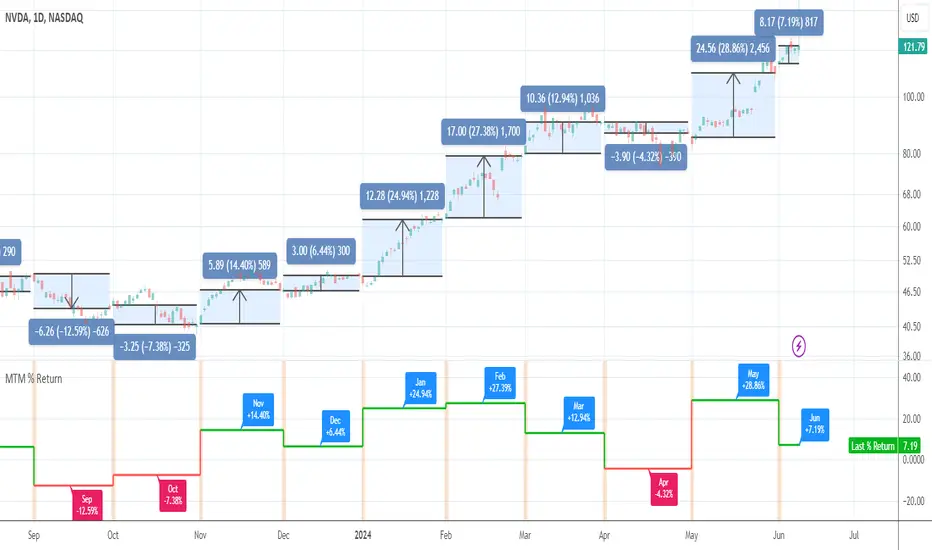
Month-to-Month % ReturnAn utility tool to see month-to-month performance of the asset and to eliminate the need in drawings. It works everywhere but better in use on the daily timeframe.
ROC Divergence — SharkCIAThis script helps to identify ROC pivot points and aims to show you when the trend has changed direction.

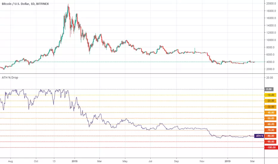
All-Time High % DropA utility tool to show price % drop since All-Time High.
Works on any ticker/instrument/asset.
Good luck!
Positive Volume IndexHello traders!
This indicator was originally developed by Paul L. Dysart in the 1930s and then described and popularized by Norman G. Fosback in his book "Stock Market Logic: A Sophisticated Approach to Profits on Wall Street"
Like and follow for more cool indicators!
Happy Trading!

[RESEARCH] Rate of ChangeHello traders and developers!
I was wondering how built-in "roc" function in Pine is defined and calculated so I made a little research.
I examined 4 samples:
1) "roc" function itself
2) "roc" according to its description
3) price change ratio
4) price percent change ratio
The results of the first and fourth samples are identical.
So, TV built-in roc(source, length) = 100 * change(source, length) / source .
And it's description is incorrect.
If you didnt know it - now you know it.
Good luck!

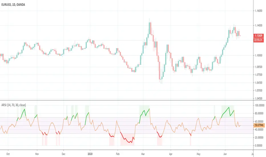
Asymmetrical RSIThis indicator was originally developed by Sylvain Vervoort (Stocks & Commodities, V.26:11 (October, 2008): "ARSI, The Asymmetrical RSI").
🥢 Crypto-Sticks: Rate of Change v1.0 by Cryptorthyhms🥢 Crypto-Sticks™ Rate of Change
A new series of indicators brought to you by Cryptorthyhms...giving you an alternate look at your trusted favorites!
🚀 Indicator Specific Info
⛔Please remember that you will have to adjust the ROC overbought and oversold levels to suit the volatility of the instrument you are working with. In the future I will implement a feature that does this automatically, but for now its manual.
The OB/OS zones are given in two levels, because often you can find a line of best fit that will hit "small movements" and one that will hit "big movements." In this case I chose 2 and -2 for the small zones. For the bigger zones i chose 5 and -5.
Heiken Ashi candles adds some more clear trend changing points which can be executed at the second candle going in either direction. Other coins/charts will require their own strategy - you could potentially have to tweak that parameter. In this example you would enter on 2nd green, exit on 2nd red.
Volume weighting the HA candles adds a different dimension to the indicator which I have to explore more fully.
Since WTI doesnt have volume, this feature is irrelevant for this chart.
💭Please leave me any ideas or feedback you have!
🚫If you use volume weighting you should be on heiken candles.
🚀 Crypto-Sticks General Info
🚧This series isnt polished 100%, and I have some more options I will add in the future. But for now, I want to just release them, as I am not sure when I will have the time to put more work into them (many other big projects I am working on).
📊Its basically reinterpretations of all your favorite indicators. I calculate the values a little bit differently than normal, but the end result is creating a candlestick chart (for the indicator!). Then I added the option to plot them as Heiken Ashi candles to smooth out noise and make signaling easier. Here's how it looks as Heiken Ashi:
🔊Lastly I implemented a Volume Weighting system for them all which simply integrates volume into the formulas for these indicators. For the most part this feature is experimental and doesn't provide huge utility (yet - I have other ways I want to try it as well - just no time). Though on some of the indicators it already shows great promise.
👍Enjoying this indicator or find it useful? Please give me a like and follow! There are many more indicators to be released in this series, not to mention I post crypto analysis and other free indicators regularly.
💬Questions? Comments? Want to get access to an entire suite of proven trading indicators? Come visit us on telegram and chat, or just soak up some knowledge. We make timely posts about the market, news, and strategy everyday. Our community isnt open only to subscribers - everyone is welcome to join.

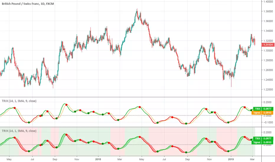
TRIXThis indicator was originally developed by Jack K. Hutson (Stocks & Commodities (July 1983): "Good TRIX").
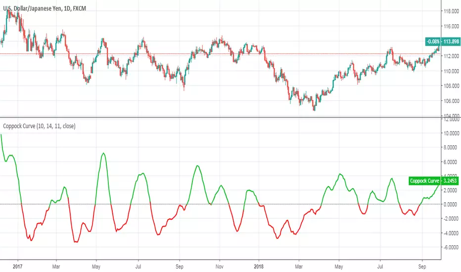
Coppock CurveThis indicator was originally developed by Edwin "Sedge" Coppock (Barron's Magazine, October 1962).
Specially for @AlexMayorov :
1) Buy when indicator crosses the zero line upside
2) Sell when indicator crosses the zero line downside
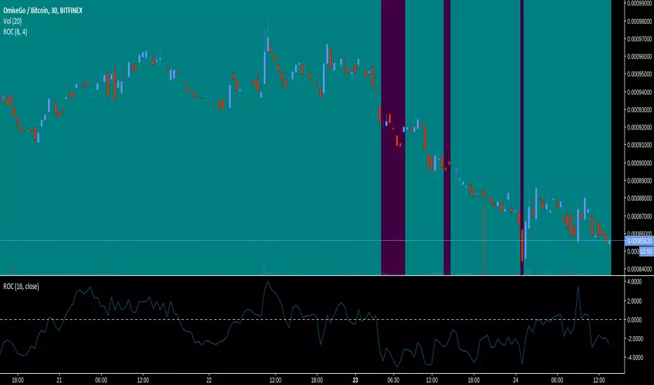
Rate Of Change Background (Sideways market)Colors the background of the chart aqua when the market is going sideways and purple when it's moving.
Smoothed Rate of ChangeSmoothed Rate of Change indicator script.
This indicator was originally developed by Fred G. Schutzman.
RSI based on ROC Backtest This is the new-age indicator which is version of RSI calculated upon
the Rate-of-change indicator.
The name "Relative Strength Index" is slightly misleading as the RSI
does not compare the relative strength of two securities, but rather
the internal strength of a single security. A more appropriate name
might be "Internal Strength Index." Relative strength charts that compare
two market indices, which are often referred to as Comparative Relative Strength.
And in its turn, the Rate-of-Change ("ROC") indicator displays the difference
between the current price and the price x-time periods ago. The difference can
be displayed in either points or as a percentage. The Momentum indicator displays
the same information, but expresses it as a ratio.
You can change long to short in the Input Settings
WARNING:
- For purpose educate only
- This script to change bars colors.
RSI based on ROC Strategy This is the new-age indicator which is version of RSI calculated upon
the Rate-of-change indicator.
The name "Relative Strength Index" is slightly misleading as the RSI
does not compare the relative strength of two securities, but rather
the internal strength of a single security. A more appropriate name
might be "Internal Strength Index." Relative strength charts that compare
two market indices, which are often referred to as Comparative Relative Strength.
And in its turn, the Rate-of-Change ("ROC") indicator displays the difference
between the current price and the price x-time periods ago. The difference can
be displayed in either points or as a percentage. The Momentum indicator displays
the same information, but expresses it as a ratio.
WARNING:
- This script to change bars colors.
Forex strength meterCalculates the strength of a particular currency taking into account it's rate of change (% price change in a period) in all correlated and anti-correlated pairs. For instance, when looking for USD strength we will add ROC for USDCAD, USDCHF and USDJPY while subtract AUDUSD, EURUSD, GBPUSD and NZDUSD.
After ROC step, one can smooth the result using EMA, or MACD.
As the script needs to fetch values from multiple currencies it isn't the fastest one, but it gets its job done.
Important: Only major currencies (AUD, CAD, CHF, EUR, GBP, JPY, NZD and USD) are considered.

Hersheys CoCoThis is my variation of the Correlation Coefficient and I call it "Hershey's CoCo". The indicator identifies very specific Stock, Sector and Market pressures on whatever symbol you are evaluating.
If interested, follow me and send me requests to evaluate your stock or sector as I refine this tool.
***********************************************
Price movement does not happen in isolation.
Stocks are held by various "containers" that can be traded independently and can affect the price of each stock. The most important of those containers are Sector and Market, while others include Industry, MarketCap and others.
For example, Market is simply the top level representation of all stocks, or the sea that carries, or sinks, all ships. You can monitor this level by looking at various indexes, ETFs and/or Funds. I use "VTI", the Vanguard Total Stock Market ETF.
Sectors can be monitored using any number of containers, like Vanguard Sector Index Funds or ProShares Ultra Sector Indexes. I use the S&P SPDR Sector Funds. A list of those are listed below.
Most of the techniques and indicators that deal with correlation and sector/market comparisons are not very detailed. Many simply overlay one price series over another, while you tediously follow the price lines from left to right trying to judge movement.
Another critical piece missing from other compare tools is normalizing each data series. Hershey's CoCo does this, so you can have confidence that the alerts you see are based on accurate comparisons at every level.
***********************************************
So let's get to the details! Hershey's CoCo currently compares 2 containers, so for this discussion we'll do Stock to Sector. You'll see arrows above and below some ticks of the price chart, plus a faint red or green background color.
Very Bull = Blue Arrow = Stock and Sector prices are up, Stock price up more
Bull = Green Arrow = Stock and Sector prices are up, Sector price up more
Bear = Red Arrow = Stock and Sector prices are down, Sector price down more
Very Bear = Black Arrow = Stock and Sector prices are down, Stock price down more
Neutral = No Arrow = Stock and Sector price movement equal
Arrow Length = Strength (the longer the arrow the bigger the difference)
Green Background = Bull = Above zero Simple Moving Average of all arrow values
Red Background = Bear = Below zero Simple Moving Average of all arrow values
To review, the Blacks and Blues are the HEAVIEST pressure... the LONGER the STRONGER!
