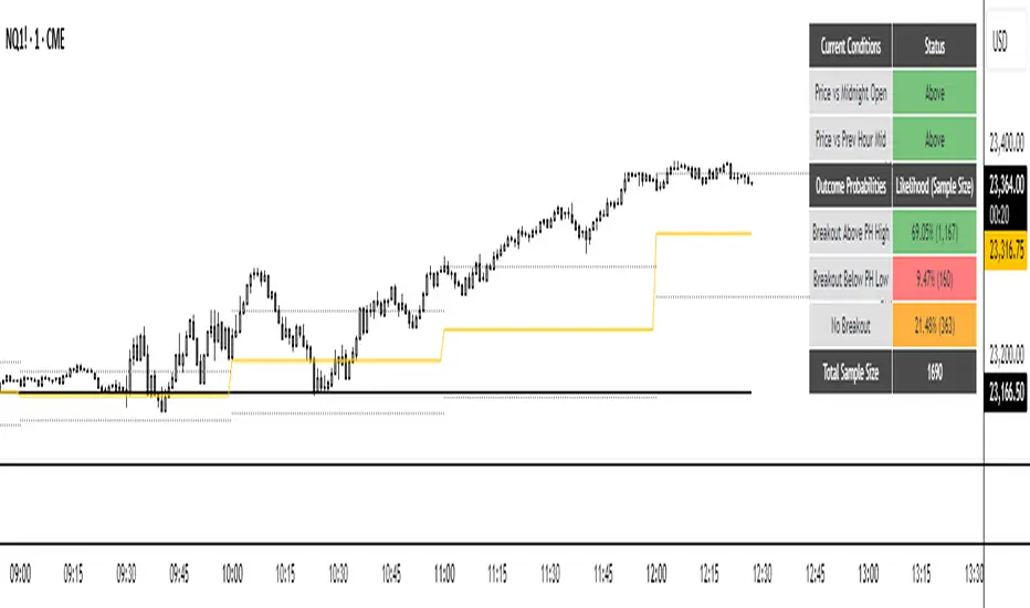
NQ Hourly Probability of PHH/PHL BreakNQ Hourly Probability of PHH/PHL Break
This indicator provides a statistical analysis of the Nasdaq 100 (NQ) on an hourly timeframe. It displays the historical probability of the current hour's candle breaking above the previous hour's high (PHH) or below the previous hour's low (PHL). The probabilities are contextual, changing based on the current hour of the day and the price's position relative to key levels.
It's made for traders who want to incorporate a data-driven approach into their intraday strategy.
________________________________________
SUMMARY
The core function of this tool is to display a real-time probability table on your chart. This table answers the question: "Based on historical data for this specific time of day and market context, what is the likelihood that price will break out of the previous hour's range?"
The indicator calculates these probabilities based on two key contextual conditions:
1. Is the current price above or below the Midnight Open price?
2. Is the current price above or below the midpoint of the previous hour's range?
By combining these conditions with the current hour, the indicator looks up the relevant historical statistics and presents them clearly.
________________________________________
FEATURES
• Probability Table: The main feature of the indicator. It displays the probability of breaking the Previous Hour High (PHH), the probability of breaking the Previous Hour Low (PHL), and the probability of the price staying within the range (No Breakout). It also shows the sample size for each statistic.
• Dynamic Color Coding: The table automatically highlights the most probable outcome in green, the second most probable in orange, and the least probable in red, allowing for a quick and easy assessment.
• Previous Hour Levels: Automatically plots the previous hour's high and low at the start of each new hour, providing key intraday levels for reference.
• Customizable Display: You have full control over the appearance, including line colors, styles, widths, and the text size of the probability table.
________________________________________
HOW TO USE
This indicator is designed for confluence, not as a standalone signal generator. It helps you frame your expectations for the current trading hour.
• Assessing Bias: If the table shows a high probability (e.g., >65%) of a breakout to the upside, you might have more confidence in looking for long opportunities or holding a long position through the PHH.
• Range-Bound Conditions: If the "No Breakout" probability is the highest, it suggests that a ranging or mean-reverting environment is more likely for that hour. You might be more cautious about chasing breakouts and instead look for trades within the previous hour's range.
• Context is Key: Always use this information in conjunction with your own analysis of market structure, order flow, and other factors.
________________________________________
IMPORTANT NOTES
• Asset Specific: The statistical data within this indicator is specifically calculated for NQ1! (Nasdaq 100 Futures). It will not be accurate for other assets like ES, BTC, or Forex pairs.
• Historical Data: These are historical probabilities and are not a guarantee of future results. Market dynamics can and do change. This tool is for educational and informational purposes to show what has happened in the past under similar conditions.
• Not Financial Advice: This script does not constitute financial advice. All trading decisions are your own responsibility.
________________________________________
USERINPUT
• Table Text Size: Adjust the size of the text in the probability table (Tiny, Small, Normal, Large).
• Show Midnight & PH Mid Lines: Toggle the visibility of the Midnight Open and Previous Hour Midpoint lines.
• Show Previous Hour High/Low Lines: Toggle the visibility of the PHH and PHL lines.
• Show Line Labels: Toggle the "phh" and "phl" text labels.
• Line Customization: Full control over the color, width, and style (Solid, Dotted, Dashed) for the high and low lines.
Search in scripts for "Table"
Top Crypto Above 28-Day AverageDescription
The “Top Crypto Above 28-Day Average” (CRYPTOTW) script scans a selectable universe of up to 120 top-capitalization cryptocurrencies (divided into customizable 40-symbol batches), then plots the count of those trading above their own 28-period simple moving average. It helps you gauge broad market strength and identify which tokens are showing momentum relative to their recent trend.
Key Features
• Batch Selection: Choose among “Top40,” “Mid40,” or “Low40” market-cap groups, or set a custom batch size (up to 40 symbols) to keep within the API limit.
• Dynamic Plot: Displays a live line chart of how many cryptos are above their 28-day MA on each bar.
• Reference Lines: Automatic horizontal lines at 25%, 50%, and 75% of your batch to provide quick visual thresholds.
• Background Coloration: The chart background shifts green/yellow/red based on whether more than 70%, 50–70%, or under 50% of the batch is above the MA.
• Optional Table: On the final bar, show a sortable table of up to 28 tickers currently above their 28-day MA, including current price, percent above MA, and “Above” status color-coding.
• Alerts:
• Strong Batch Performance: Fires when >70% of the batch is above the MA.
• Weak Batch Performance: Fires when <10 cryptos (i.e. <25%) are above the MA.
Inputs
• Show Results Table (show_table): Toggle the detailed table on/off.
• Table Position (table_position): Select one of the four corners for your table overlay.
• Max Cryptos to Display (max_display): Limit the number of rows in the results table.
• Current Batch (current_batch): Pick “Top40,” “Mid40,” or “Low40.”
• Batch Size (batch_size): Define the number of symbols (1–40) you want to include from the chosen batch.
How to Use
1. Add the CRYPTOTW indicator to any chart.
2. Select your batch and size to focus on the segment of the crypto market you follow.
3. Watch the plotted line to see the proportion of tokens with bullish momentum.
4. (Optional) Enable the results table to see exactly which tokens are outperforming their 28-day average.
5. Set alerts to be notified when the batch either overheats (strong performance) or cools off significantly.
Why It Matters
By tracking the share of assets riding their 28-day trend, you gain a macro-level view of market breadth—crucial for spotting emerging rallies or early signs of broad weakness. Whether you’re swing-trading individual altcoins or assessing overall market mood, this tool distills complex data into an intuitive, actionable signal.

Cross-Exchange Open Interest[nakano]## Cross-Exchange Open Interest
This Pine Script® indicator aggregates **Open Interest (OI)** across multiple exchanges and trading pairs, displaying it as a single, easy-to-understand candlestick chart. OI represents the total number of outstanding derivative contracts and is a crucial metric for gauging market sentiment and liquidity.
このPine Script®インジケーターは、複数の取引所と複数の取引ペアにわたる**オープンインタレスト (OI)** を集計し、単一の分かりやすいローソク足チャートとして表示します。OIは未決済のデリバティブ契約の総数を表し、市場のセンチメントと流動性を測る重要な指標となります。
### Key Features
* **Cross-Exchange Aggregation:** Integrates OI data from several major exchanges (e.g., Binance, OKX, BitMEX, Kraken). You can configure up to 10 exchange slots.
* **クロス取引所集計:** 複数の主要な取引所 (例: Binance, OKX, BitMEX, Kraken) からのOIデータを統合します。最大10個の取引所スロットを設定できます。
* **Multi-Pair Support:** For each exchange, you can specify multiple trading pairs (e.g., `USDT.P`, `USD.P`) separated by commas, and their OIs will be summed up.
* **複数ペアサポート:** 各取引所に対し、カンマ区切りで複数の取引ペア(例: `USDT.P`, `USD.P`)を指定し、それらのOIを合計して表示できます。
* **Flexible Asset Settings:**
* **Chart Symbol:** Automatically aggregates OI for the base asset of the current chart (e.g., BTC if on a BTCUSDT chart).
* **Custom Asset:** Allows you to manually specify a base asset (e.g., ETH, SOL) for OI aggregation.
* **柔軟な資産設定:**
* **チャートシンボルに連動:** 現在表示しているチャートの基本資産(例: BTCUSDTチャートならBTC)のOIを自動的に集計します。
* **カスタム資産:** 特定の基本資産(例: ETH, SOL)のOIを手動で指定して集計することも可能です。
* **OI Candlestick Display:** Plots the aggregated OI data as candlesticks.
* **Up/Down Candles:** OI increases are shown as "up" candles, and decreases as "down" candles, with customizable colors.
* **OIローソク足表示:** 集計されたOIデータをローソク足としてプロットします。
* **陽線/陰線:** OIが増加した場合は陽線、減少した場合は陰線として表示され、色をカスタマイズできます。
* **Bar Coloring based on OI Change:** Features the ability to change the color of the main chart's price bars based on significant OI changes.
* **Dynamic Threshold:** Calculates a dynamic threshold based on historical OI changes and a user-defined multiplier to automatically identify "significant changes" in OI.
* **Color-coded:** Highlights the main chart's bars with customizable colors when there is a large increase or decrease in OI.
* **OI変化に基づくバーカラーリング:** メインチャートの価格バーの色を、OIの大きな変化に基づいて変更する機能があります。
* **動的閾値:** 過去のOI変化を基に動的な閾値を計算し、設定した乗数に応じてOIの「大きな変化」を自動で識別します。
* **色分け:** OIの大幅な増加または減少があった場合に、メインチャートのバーをカスタマイズ可能な色でハイライトします。
* **Debug Table (Optional):** When enabled, a debug table appears on the chart, showing raw OI data, quantity-based OI, and USD-converted OI for each exchange and pair in real-time, which helps in verifying the data.
* **デバッグテーブル (オプション):** 有効にすると、各取引所・ペアごとの生OIデータ、数量ベースのOI、USD換算OIをリアルタイムで表示するデバッグテーブルがチャート上に表示され、データの確認に役立ちます。
### How to Use
This indicator helps you understand the overall trend of open positions for a specific asset across the market. An increase in OI generally indicates an influx of capital and growing market interest, while a decrease suggests the opposite. By combining price movements with OI changes, you can gain deeper insights into bullish/bearish signals and the potential for trend continuation or reversal.
このインジケーターは、特定の資産に対する市場全体の未決済ポジションの動向を把握するのに役立ちます。OIの増加は通常、市場への資金流入と関心の高まりを示し、OIの減少はその逆を示唆します。価格変動とOIの変化を組み合わせることで、市場の強気・弱気の兆候や、トレンドの継続・反転の可能性をより深く分析することが可能です。
### Settings
* **OI Candle Settings:** Configure the colors for the up and down OI candles.
* **OIローソク足設定:** OIローソク足の陽線と陰線の色を設定します。
* **Asset & Exchange Settings:**
* **Asset Source:** Choose "Chart Symbol" to link to the current chart's symbol, or "Custom" to specify the asset in "Base Asset (Custom)".
* **Slot 1-10:** Enable/disable each exchange slot and set the exchange name and comma-separated trading pairs you wish to aggregate.
* **資産と取引所の設定:**
* **資産ソース:** 「Chart Symbol」を選択すると現在のチャートのシンボルに連動し、「Custom」を選択すると「Base Asset (Custom)」で指定した資産のOIを集計します。
* **スロット 1-10:** 各スロットで取引所を有効/無効にし、取引所名と、集計したい取引ペア(カンマ区切り)を設定します。
* **Bar Coloring on OI Change:**
* **Enable Bar Coloring:** Toggles whether the main chart's bars change color based on significant OI changes.
* **Threshold Calculation Period / Multiplier:** Sets the period and multiplier for dynamic threshold calculation.
* **OI Increase Color / OI Decrease Color:** Sets the colors applied to the main chart's bars for large OI increases/decreases.
* **OI変化に基づくバーカラーリング:**
* **バーカラーリングを有効にする:** OIの大きな変化に基づいてメインチャートのバーの色を変更するかどうかを切り替えます。
* **閾値計算期間 / 乗数:** 動的な閾値計算に使用する期間と乗数を設定します。
* **OI増加時の色 / OI減少時の色:** OIの大きな増加/減少があった場合にメインチャートのバーに適用される色を設定します。
* **Debug Table Settings:**
* **Show Debug Table:** Toggles the display of the debug table and sets its position.
* **Font Size / BG Color:** Configures the font size and background color for the debug table.
* **デバッグテーブル設定:**
* **デバッグテーブルを表示:** デバッグテーブルの表示/非表示を切り替え、表示位置を設定します。
* **フォントサイズ / 背景色:** デバッグテーブルのフォントサイズと背景色を設定します。

SR Nube 1.1The SR Nube 1.1 indicator offers a comprehensive perspective on price action through the strategic combination of three key elements: a dynamic cloud based on two Volume Weighted Moving Averages (VWMA), a consistent reference Exponential Moving Average (EMA) across all timeframes, and an intuitive information table.
The Dynamic Cloud: This cloud is calculated using two VWMA with lengths that automatically adjust based on the chart's timeframe. This dynamic adaptation allows for the identification of relevant support and resistance zones across different timeframes, providing contextual insight into potential price movement. The cloud visualizes areas of volume confluence, helping traders pinpoint zones where buying or selling pressure may be significant.
The Consistent Reference EMA: An EMA with a specific length (calculated to be representative of a higher timeframe, such as 1 hour, and displayed consistently across all timeframes) is overlaid on the chart. This EMA serves as a macro trend guide and a constant visual reference point, making it easier to identify the overall market direction regardless of the active trading timeframe. Its consistency across timeframes helps maintain perspective and align trades with the dominant trend.
The Information Table: Located in the top-left corner of the chart, a concise table summarizes the current price status relative to the cloud (on the 20-minute timeframe, as a reference for the main strategy) and the price's position concerning the reference EMA (based on the 1-hour timeframe). This table provides a quick, color-coded overview of trend alignment across multiple key timeframes, which can assist traders in making more informed decisions.
Utility and Underlying Concepts:
This indicator is designed for traders seeking a tool that combines volume analysis (through the VWMA in the cloud) with a higher timeframe trend reference (the consistent EMA). The dynamic cloud helps identify potential entry and exit zones within the trading timeframe, while the reference EMA provides a directional filter. The information table simplifies the evaluation of trend confluence across multiple timeframes, potentially increasing the probability of successful trades.
The underlying strategy is based on the idea of trading in the direction of volume and in alignment with a higher timeframe trend, using the cloud to identify value areas and the EMA as a key directional filter. The information table acts as a quick visual aid for assessing this alignment.
How to Use:
Add the "SR Nube 1.1" indicator to your TradingView chart.
Observe the dynamic cloud to identify potential support and resistance zones on your trading timeframe.
Use the blue EMA as a guide for the overall market trend.
Consult the information table in the top-left corner to see the price alignment with the 20-minute cloud and the 1-hour EMA. The colors will provide a quick indication of the potential direction.
Look for confluence between the cloud signals on your trading timeframe, the price's position relative to the EMA, and the information provided in the table to identify potential entry and exit opportunities.

EMI, RSI, Pivot based technical IndicatorsMulti-Indicator Trading Toolkit for Comprehensive Market Analysis
This Pine Script-based trading tool integrates multiple technical indicators to provide traders with a holistic view of market trends, volatility, and key price levels. Designed for flexibility, the script allows users to customize settings to match their trading strategy.
Key Features & Functionalities
1. Exponential Moving Averages (EMA)
Plots four configurable EMAs (default: 9, 21, 50, and 200) to identify trend direction and potential support/resistance zones.
2. Relative Strength Index (RSI)
Calculates RSI (default length: 14) to highlight overbought (70) and oversold (30) market conditions.
Customizable thresholds allow traders to adapt the RSI to different market conditions.
3. Pivot Points with Support & Resistance Levels
Computes pivot levels based on the previous day’s high, low, and close.
Includes dynamic support (S1-S5) and resistance (R1-R5) levels to assist in trade decision-making.
4. Volume-Weighted Average Price (VWAP)
Tracks the average price weighted by volume over a session, helping traders determine fair value zones.
5. Opening Range Breakout (ORB)
Identifies potential breakout opportunities based on the highest and lowest price within a user-defined opening range (5m, 15m, or 30m, etc.).
Highlights these levels to assist in trade entries and exits.
6. Multi-Timeframe RSI Analysis
Retrieves and displays RSI values from multiple timeframes (e.g., 1m, 5m, 15m, 1H, 1D).
Helps traders analyze RSI trends across different timeframes in a single view.
7. Volatility Index (VIX) Tracking
Monitors VIX data to gauge market volatility.
Displays daily percentage change and short-term variations (15 min, 1 hour), aiding in risk assessment.
8. Dynamic Table Display
Organizes key data (RSI values, VIX levels, and volatility changes) in customizable tables for an easy-to-read format.
Users can modify table position, colors, and display settings for personalized analysis.
9. Advanced Plotting for Visual Clarity
Clearly plots EMA, RSI, pivot levels, ORB levels, VWAP, and VIX movements on the chart.
Uses distinct colors and styles to enhance readability.
10. Customizable Inputs for Personalized Analysis
Provides a user-friendly input panel to modify settings, including EMA periods, RSI thresholds, ORB duration, table position, and plotting preferences.
Enables traders to tailor the script to their preferred trading style.
🧠 How the Indicators Work Together (Strategy Logic)
This script is not just a visual dashboard of common indicators — it’s a cohesive trading assistant designed to help traders make data-driven decisions through multi-layered confluence logic:
1. Trend Confirmation using EMAs:
The combination of 9/21/50/200 EMAs filters trades based on overall trend strength.
For example, long trades are considered only when the 21 EMA is above the 50 EMA and price is above the 9 EMA, confirming bullish momentum.
2. Momentum Alignment via Multi-Timeframe RSI:
Traditional RSI can give early or false signals. This script fetches RSI values from multiple timeframes (1m, 5m, 15m, 1H, 1D) to identify consistent strength or weakness across market structures.
3. Only when RSI is oversold/overbought across multiple timeframes does the signal become valid — reducing noise.
Breakout Confirmation with ORB + VWAP:
The script detects opening range breakouts (ORB) and filters them using VWAP and EMA zones to confirm whether breakouts are supported by volume and trend.
For instance, a long breakout above the ORB high is validated only when price is also above VWAP and EMAs align.
4. Volatility Context with VIX:
Incorporates VIX changes (live, 15m, 1h) to assess whether market conditions favor breakouts or consolidation.
If VIX is rising sharply, the script highlights caution zones — useful for adjusting position size or avoiding false breakouts.
5. Dynamic Signal Filtering:
Instead of triggering alerts directly, this script displays aligned conditions visually in a dynamic table.
Traders can see at a glance whether all confluence layers are in agreement, helping reduce over trading and enhance timing.
🌟 What Makes This Script Unique
✅ Strategic Integration of trend, momentum, volatility, and range-breakout concepts — not just plotted indicators.
✅ Multi-timeframe RSI logic presented in a table — letting traders spot alignment across timeframes without switching charts.
✅ Built-in volatility filter (VIX) for risk context, a feature rarely combined with ORB and trend indicators in a single script.
✅ Adaptive to all timeframes and instruments, especially useful for high-beta indices like Bank Nifty or Nasdaq.
✅ User-friendly customization, allowing traders to tailor everything from ORB window size to table position and indicator settings.
This all-in-one trading toolkit is designed for traders seeking a structured, data-driven approach to technical analysis. Whether you’re a short-term trader or a long-term investor, this script offers the flexibility and insight needed to navigate the markets effectively.

BBMA Strategy - EXT CSD CSM MHV RE CodesBINANCE:BTCUSD
Below is a detailed guide for using and interpreting the "BBMA Strategy - Enhanced EXT CSD CSM with Subplot" indicator. This guide is designed to be added to the description of the indicator when publishing it on TradingView. It provides clear instructions for users on how to apply the indicator, interpret its signals, and understand its features, including the multi-timeframe analysis and subplot table.
BBMA Strategy - Enhanced EXT CSD CSM with Subplot: User Guide
Overview
The "BBMA Strategy - Enhanced EXT CSD CSM with Subplot" is a comprehensive trading indicator built on the Bollinger Bands Moving Average (BBMA) framework. It combines multiple technical analysis tools—Bollinger Bands, Moving Averages (MAHI and MALO), EMA, ATR, volume analysis, RSI, MACD, market structure, and candlestick patterns—to identify high-probability trading setups. The indicator supports five key BBMA setups: EXT (Extreme), CSD (Consolidation), CSM (Continuation Setup Movement), RE (Re-Entry), and MHV (Market High Volatility).
This enhanced version includes:
Multi-Timeframe (MTF) Analysis: Confirms signals across a Lower Timeframe (LTF) and Higher Timeframe (HTF) for stronger trade validation.
Subplot Table: Displays signal status ("Active" or "Upcoming") and MTF confirmations in a clear table format.
Market Structure and Volume Filters: Incorporates Break of Structure (BOS), RSI divergence, and volume conditions to filter out low-probability trades.
Customizable Settings: Adjust Bollinger Bands, MA periods, timeframes, and more to suit your trading style.
This indicator is suitable for traders of all levels and can be used across various markets (e.g., forex, crypto, stocks) and timeframes (1M to 1D).
How to Use the Indicator
1. Add the Indicator to Your Chart
Open TradingView and load the chart of your chosen asset (e.g., BTCUSD, EURUSD, XAUUSD).
Go to the Pine Editor, paste the indicator code, and click "Add to Chart."
The indicator will overlay on your chart, displaying Bollinger Bands, Moving Averages, EMA, and signal labels. A subplot table will appear at the bottom of the chart.
2. Configure the Settings
The indicator provides customizable inputs to tailor it to your trading preferences. Access the settings by clicking the gear icon next to the indicator name on your chart:
Bollinger Bands Settings:
BB Period: Default is 20. Adjust the lookback period for Bollinger Bands.
BB Deviations: Default is 2. Adjust the standard deviation for the bands.
MAHI Settings (Moving Averages on High):
MAHI 5 Period: Default is 5. Period for the shorter MA on highs.
MAHI 10 Period: Default is 10. Period for the longer MA on highs.
MALO Settings (Moving Averages on Low):
MALO 5 Period: Default is 5. Period for the shorter MA on lows.
MALO 10 Period: Default is 10. Period for the longer MA on lows.
EMA Settings:
EMA Period: Default is 50. Adjust the period for the Exponential Moving Average.
ATR Settings:
ATR Period: Default is 14. Period for the Average True Range.
ATR SMA Period: Default is 14. Period for the ATR smoothing.
Timeframe Settings:
Minor HTF: Default is 1h. Select the minor higher timeframe for trend confirmation.
Major HTF: Default is 4h. Select the major higher timeframe for trend confirmation.
Lower TF for Confirmation: Default is 5m. Select the lower timeframe for signal confirmation.
Market Structure Settings:
Market Structure Lookback: Default is 10. Adjust the lookback period for swing highs/lows in market structure analysis.
3. Select Your Chart Timeframe
The indicator works on any timeframe from 1 minute (1M) to 1 day (1D).
For best results, align your chart timeframe (Current Timeframe, CTF) with the LTF and HTF settings:
Example: If CTF is 15m, set LTF to 5m and HTF to 1h or 4h.
This ensures proper multi-timeframe alignment for signal confirmation.
Indicator Components
Main Chart Elements
Bollinger Bands (BB): Plotted as three lines (upper, middle, lower) to identify volatility and potential reversal zones.
Upper Band: Blue line.
Middle Band: Black line (basis).
Lower Band: Blue line.
MAHI (Moving Averages on High): Two weighted moving averages on highs to detect trend direction.
MAHI 5: Green line.
MAHI 10: Lime line.
MALO (Moving Averages on Low): Two weighted moving averages on lows to confirm trend direction.
MALO 5: Red line.
MALO 10: Orange line.
EMA (50-period): Purple line to identify the overall trend.
Signal Labels: Appear on the chart when a setup is confirmed:
EXT Buy: Green upward arrow (reversal buy at BB lower band).
EXT Sell: Red downward arrow (reversal sell at BB upper band).
CSM Buy: Teal upward arrow (continuation buy above BB middle).
CSM Sell: Maroon downward arrow (continuation sell below BB middle).
RE Buy: Aqua upward arrow (re-entry buy between BB lower and middle).
RE Sell: Fuchsia downward arrow (re-entry sell between BB upper and middle).
MHV: Orange label (high volatility breakout after consolidation).
CSD: Yellow diamond (consolidation signal).
Subplot Table
Located at the bottom of the chart, the table summarizes signal status across three timeframes:
CTF (Current Timeframe): Shows "Active" (signal confirmed) or "Upcoming" (signal forming) for each setup.
LTF (Lower Timeframe): Displays a checkmark (✔) if the signal is confirmed on the LTF.
HTF (Higher Timeframe): Displays a checkmark (✔) if the signal is confirmed on the HTF.
Columns represent the five BBMA setups: EXT Buy, EXT Sell, CSD, CSM Buy, CSM Sell, RE Buy, RE Sell, and MHV.
Interpreting the Signals
1. EXT (Extreme) Setup
EXT Buy (Green Arrow):
Condition: Price touches or breaks below the BB lower band, closes above it, with high ATR volatility, strong volume, and additional confirmations (e.g., hammer candle, RSI oversold, MACD bullish, MAHI/MALO crossover, or bullish divergence).
Interpretation: A potential reversal buy signal. Look for confirmation in the subplot table (LTF and HTF rows).
Action: Consider a long position if LTF and HTF confirm (✔ in both rows). Use the BB middle or upper band as a target.
EXT Sell (Red Arrow):
Condition: Price touches or breaks above the BB upper band, closes below it, with high ATR volatility, strong volume, and additional confirmations (e.g., shooting star candle, RSI overbought, MACD bearish, MAHI/MALO crossunder, or bearish divergence).
Interpretation: A potential reversal sell signal.
Action: Consider a short position if LTF and HTF confirm. Use the BB middle or lower band as a target.
2. CSD (Consolidation) Setup
CSD (Yellow Diamond):
Condition: BB width is narrow (below its SMA), low ATR volatility, small candles, and no MAHI/MALO crossovers.
Interpretation: The market is consolidating, often preceding a breakout (e.g., MHV).
Action: Avoid trading during CSD unless preparing for an MHV breakout. Monitor the subplot for "Upcoming" MHV signals.
3. CSM (Continuation Setup Movement)
CSM Buy (Teal Arrow):
Condition: Price is above the BB middle, MAHI crossover, MALO crossover or MACD bullish, price above EMA 50, with additional confirmations (e.g., bullish engulfing or MACD bullish).
Interpretation: A continuation buy signal in an uptrend.
Action: Enter a long position if LTF and HTF confirm. Target the BB upper band or recent swing highs.
CSM Sell (Maroon Arrow):
Condition: Price is below the BB middle, MAHI crossunder, MALO crossunder or MACD bearish, price below EMA 50, with additional confirmations (e.g., bearish engulfing or MACD bearish).
Interpretation: A continuation sell signal in a downtrend.
Action: Enter a short position if LTF and HTF confirm. Target the BB lower band or recent swing lows.
4. RE (Re-Entry) Setup
RE Buy (Aqua Arrow):
Condition: Price is between the BB lower and middle bands, MAHI crossover, MALO crossover or MACD bullish, price above EMA 50, with additional confirmations (e.g., bullish engulfing or MACD bullish).
Interpretation: A re-entry buy signal after a pullback in an uptrend.
Action: Enter a long position if LTF and HTF confirm. Target the BB middle or upper band.
RE Sell (Fuchsia Arrow):
Condition: Price is between the BB upper and middle bands, MAHI crossunder, MALO crossunder or MACD bearish, price below EMA 50, with additional confirmations (e.g., bearish engulfing or MACD bearish).
Interpretation: A re-entry sell signal after a pullback in a downtrend.
Action: Enter a short position if LTF and HTF confirm. Target the BB middle or lower band.
5. MHV (Market High Volatility) Setup
MHV (Orange Label):
Condition: Follows a CSD signal, with expanding BB width, high ATR volatility, strong volume, and MAHI/MALO crossover or crossunder.
Interpretation: A breakout signal after consolidation, indicating high volatility and potential for a strong move.
Action: Trade in the direction of the breakout (e.g., buy if MAHI crossover, sell if MAHI crossunder). Confirm with LTF and HTF. Target significant levels like recent swing highs/lows.
6. Multi-Timeframe Confirmation
LTF Confirmation: A checkmark (✔) in the LTF row indicates the signal is also present on the lower timeframe (e.g., 5m). This adds confidence to the trade.
HTF Confirmation: A checkmark (✔) in the HTF row indicates alignment with the higher timeframe trend (e.g., 4h). This confirms the signal's strength.
Strongest Signals: Look for signals with both LTF and HTF confirmations (✔ in both rows). These have the highest probability of success.
7. Upcoming Signals
The CTF row in the subplot table may show "Upcoming" for a setup (e.g., EXT Buy: Upcoming). This indicates the setup is forming but not yet confirmed.
Action: Monitor these setups closely. They may turn "Active" on the next candle if conditions are met.
Trading Tips
Trend Alignment: Use the EMA 50 and market structure (is_uptrend) to ensure trades align with the overall trend. For example, prioritize CSM Buy signals in an uptrend.
Risk Management:
Set stop-losses below recent swing lows (for buys) or above recent swing highs (for sells).
Use the BB middle or opposite band as a target for most setups.
Avoid Overtrading: Focus on signals with LTF and HTF confirmations to filter out noise.
Timeframe Selection:
Scalping: Use 1m or 5m CTF with 1m LTF and 15m HTF.
Day Trading: Use 15m or 1h CTF with 5m LTF and 4h HTF.
Swing Trading: Use 4h or 1D CTF with 1h LTF and 1D HTF.
Backtesting: Test the indicator on historical data for your chosen asset and timeframe to understand its performance.
Alerts
The indicator includes built-in alerts for each setup:
EXT Buy/Sell: Triggers when an EXT signal is confirmed.
CSD: Triggers during consolidation.
CSM Buy/Sell: Triggers for continuation signals.
RE Buy/Sell: Triggers for re-entry signals.
MHV: Triggers for high volatility breakouts. To set up alerts:
Right-click on the chart and select "Add Alert."
Choose the condition (e.g., "BBMA EXT Buy").
Set your preferred notification method (e.g., email, SMS).
Limitations
Lagging Indicators: The indicator uses moving averages and other lagging tools, which may delay signals in fast-moving markets.
False Signals: Like all indicators, it can produce false signals, especially in choppy markets. Use LTF/HTF confirmations to filter trades.
Timeframe Dependency: Ensure your CTF, LTF, and HTF are properly aligned to avoid conflicting signals.
Massive Market Order Detector by GSK-VIZAG-AP-INDIA
Massive Market Order Detector by GSK-VIZAG-AP-INDIA
Purpose of the Indicator:
This indicator is designed to detect massive market orders (high-volume trades) in real-time, helping traders identify potential accumulation or distribution zones. It highlights sudden spikes in volume that exceed a calculated threshold, signaling strong buying or selling pressure.
Core Logic & Unique Aspects:
Volume Spike Detection: Compares the current volume to the average volume over a user-defined lookback period. If the volume exceeds the threshold (calculated using a multiplier), it is classified as a Massive Order.
Buy vs. Sell Order Identification: Determines whether the detected massive order is a buy (green marker) or a sell (red marker) based on candlestick price action.
Time Zone Adjustment: Allows traders to adjust the timestamp according to their local timezone, ensuring accurate interpretation of order timings.
Table Display of Recent Orders: A table is created within the chart to list the last 15 detected massive orders, showing key details such as time, volume, type (buy/sell), price, and volume percentage change.
How It Works:
The indicator calculates the average volume over a lookback period (default: 20 bars).
If the current volume exceeds the threshold (average volume × multiplier), it is marked as a Massive Order.
The order is classified as:
Massive Buy Order (MB) → If the closing price is higher than the opening price.
Massive Sell Order (MS) → If the closing price is lower than the opening price.
The detected orders are visually represented as green (MB) and red (MS) labels on the chart.
The most recent 15 massive orders are logged in a table for easy reference.
Intended Use Cases:
🔹 Scalping & Intraday Trading – Spot unusual market activity to enter or exit trades quickly.
🔹 Swing Trading – Identify strong buying or selling pressure at key support/resistance levels.
🔹 Breakout Confirmation – Validate if price breakouts are backed by significant volume.
🔹 Market Manipulation Detection – Recognize potential institutional buying/selling activity.
Input settings:
Lookback Period: Adjust the number of bars to calculate average volume.
Volume Multiplier: Set the threshold as 1/2/3 for defining a massive order.
Time Zone Offset: Modify timestamps to match your local market time.
Max Signals in Table: Control how many signals are displayed in the table.
Why Use This Indicator?
✅ Identifies smart money activity
✅ Works across multiple timeframes (5m, 15m, 1H, Daily, etc.)
✅ No repainting – Reliable real-time signals
✅ Easy-to-read visual cues & table logs
Disclaimer:
"This indicator is for educational and informational purposes only and should not be considered financial advice. Always do your own research (DYOR) and consult with a qualified financial professional before making investment decisions. Trading involves significant risk, and past performance does not guarantee future results. I am not a licensed financial advisor and hold no liability for any losses incurred. This indicator may not work in all market conditions, and results are based on backtesting or hypothetical scenarios. Use at your own discretion and ensure compliance with local regulations."

The Flip by Tren10xWhat the Script Does:
"The Flip" is a simple trading script designed to enhance market analysis and trading decisions by detecting key price levels and timeframe shifts. It identifies when timeframes switch from bullish to bearish or vice versa and displays this information using the 50% levels and the Full Time Frame Continuity (FTFC) table.
How the Script Works:
Detection of Key Levels:
50% Level of the Previous Candle: The script calculates and displays the midpoint of the previous candle, helping traders quickly identify potential reversal points and key support or resistance levels.
Opening Print Levels: The script tracks the opening prices for various timeframes (Day, Week, Month, Quarter, and Year), indicating whether the current price is above or below these levels to understand market sentiment and trends.
High/Low Levels: It monitors and displays the Previous Day High/Low, Week High/Low, Month High/Low, Quarter High/Low, and Year High/Low, highlighting significant price levels and potential breakout or breakdown points.
Full Time Frame Continuity Table:
The script provides a visual table showing the alignment of different timeframes (bullish or bearish), allowing traders to make informed decisions based on the overall market structure.
How to Use the Script:
Add to Chart:
Load "The Flip" script onto your TradingView chart.
Customize Settings:
Adjust the appearance and display settings to fit your trading preferences.
Analyze the Chart:
Use the 50% level of the previous candle to identify potential reversal points.
Track the opening print levels for various timeframes to gauge market sentiment.
Monitor the high/low levels to spot significant price levels and potential breakout or breakdown points.
Refer to the FTFC table to see the alignment of different timeframes and make decisions based on the overall market structure.
What Makes This Script Original:
Integration with "The Strat"
Inspired by "The Strat" created by Rob Smith, "The Flip" focuses on the critical moment when timeframes switch from bullish to bearish or vice versa, providing a unique perspective on market movements.
Comprehensive Market View:
By displaying the 50% level of the previous candle, opening print levels, high/low levels, and a full time frame continuity table, the script offers a holistic view of the market, helping traders make more informed decisions.
User-Friendly Visualization:
The script's visual indicators and FTFC table make it easy to quickly assess market conditions and potential trading opportunities, enhancing both the efficiency and effectiveness of market analysis.
When Full Time-Frame Continuity is bullish, you will see a green check mark ✔️, indicating all major timeframes (Daily, Weekly, Month, Quarter, and Year) are aligned.
When Full Time-Frame Continuity is bearish, you will see a red drop 🩸, indicating all major timeframes (Daily, Weekly, Month, Quarter, and Year) are aligned.
Otherwise, you will see mixed timeframes.

Multi-Timeframe Trend IndicatorMulti-Timeframe Trend Indicator
The “Multi-Timeframe Trend Indicator” is a versatile tool designed to help traders identify trends across multiple timeframes using Exponential Moving Averages (EMAs). This indicator is suitable for both novice and experienced traders. It allows users to customize the lengths of the short and long EMAs, providing a clear visualization of the trend direction (UP, DOWN, SIDE) for various intervals including 1 minute, 5 minutes, 15 minutes, 30 minutes, 1 hour, and 4 hours. The indicator offers extensive customization options, enabling adjustments for table position, colors, and more to suit individual trading preferences.
How the Calculation Works
The Multi-Timeframe Trend Indicator uses EMAs to calculate trends. EMAs give more weight to recent prices, making them responsive to new information. The short EMA, calculated over a shorter period, reacts quickly to price changes, while the long EMA, calculated over a longer period, smooths out fluctuations to show the overall trend.
For each timeframe, the indicator calculates both the short EMA and the long EMA. If the short EMA is above the long EMA, the trend is considered “UP”. If the short EMA is below the long EMA, the trend is “DOWN”. If the absolute difference between the short and long EMAs is within a user-defined threshold, the trend is classified as “SIDE” (sideways).
This calculation is repeated for multiple timeframes: 1 minute, 5 minutes, 15 minutes, 30 minutes, 1 hour, and 4 hours. The results are displayed in a table, providing a comprehensive view of the trend direction across different timeframes.
How the Code Works
Input Parameters: Users can input the lengths of the short and long EMAs and the threshold for identifying sideways trends. These inputs allow for a high degree of customization to match individual trading strategies.
Trend Calculation Function: The trend function calculates the trend direction based on the EMAs. It uses the math.abs function to find the absolute difference between the EMAs and determines if the trend is “UP”, “DOWN”, or “SIDE” based on the threshold.
Requesting Data for Multiple Timeframes: The script uses the request.security function to fetch price data and calculate the EMAs for different timeframes independently of the current chart timeframe. This ensures consistency in trend analysis regardless of the displayed timeframe.
Creating and Updating the Table: A table is created to display the trend directions for each timeframe. The table’s position and appearance can be customized. The trend data for each timeframe is color-coded (green for UP, red for DOWN, gray for SIDE) and displayed in the table.
Customization Options: Users can customize the colors, table position, and EMA lengths through the indicator settings, providing flexibility to adapt the indicator to their trading style.
Disclaimer
This indicator is for informational purposes only and should not be considered financial advice. It does not predict future price movements and does not guarantee accurate trend calculations, as market conditions can vary. Trading involves substantial risk and is not suitable for everyone. Always conduct your own research before making any trading decisions.

Live Economic Calendar by toodegrees⚠️ PLEASE READ ⚠️
Although this indicator is accurate in showcasing live and upcoming News Events, checking the original sources is always suggested. This indicator aims to save Time, but due to limitations it may not be 100% correct 100% of the Time.
Description:
The Live Economic Calendar indicator seamlessly integrates with external news sources to provide real-Time, upcoming, and past financial news directly on your Tradingview chart.
By having a clear understanding of when news are planned to be released, as well as their respective impact, analysts can prepare their weeks and days in advance. These injections of volatility can be harnessed by analysts to support their thesis, or may want to be avoided to ensure higher probability market conditions. Fundamentals and news releases transcend the boundaries of technical analysis, as their effects are difficult to predict or estimate.
Designed for both novice and experienced traders, the Live Economic Calendar indicator enhances your analysis by keeping you informed of the latest and upcoming market-moving news.
This is achieved with three different visual components:
News Table: A dedicated News Table shows the Day of the Week, Date, Time of the Day, Currency, Expected Impact, and News Name for each event (in chronological order). Once a news event has occurred, or the day is over, it will be greyed out – helping to focus on the next upcoming news events.
News Lines: Vertical lines plotted in the future help analysts monitor upcoming news events; vertical lines in the past help analysts spot and backtest previous news events that already occurred.
News Labels: Color-coded news labels will plot once the news events have occurred. This not only gives analysts a minimalistic visual cue, but also retains the information of which news were released at that Time in their tooltips.
Forex Factory Calendar News Feed:
The Forex Factory Data Feed includes news events from January 2007 to the present. The data is updated daily. Please see the Technical Description below for more information.
Forex Factory provides news for all major currencies and markets:
Australia (AUD)
Canada (CAD)
Switzerland (CHF)
China (CNY)
European Union (EUR)
United Kingdom (GBP)
Japan (JPY)
New Zealand (NZD)
United States of America (USD)
Further, there are four types of news impact, defined by respective color-coding which is retained to avoid confusion:
⚪ Holiday
🟡 Low Impact
🟠 Medium Impact
🔴 High Impact
News' Time of the day data is in 24H format, and 'All Day' news are marked at Daily candle open.
⚠️ Original Release Notes ⚠️
The original release of this indicator supports the Forex Factory News Calendar in EST (New York Time). Future updates will include multiple news sources, as well as supporting different Timezones.
Given Data limitations, the Daily chart can omit some data due to the market being close on some days. This will be fixed in the future once an efficient solution is implemented.
Key Features:
Impact-Based News Filtering: Filter news items based on their expected impact (holiday, low, medium, high) to focus on the most market-critical information.
Symbol-Specific News: Automatically filter news to display only what's relevant to the currency pair or trading symbol you are analyzing.
Custom Currency News: Want to see more than the news relevant to the current symbol? Toggle which markets' news you are most interested in.
Chart History: Keep your charts clean by displaying only the drawings of Today's news, or This Week's news.
Custom Lookback: Look further back in Time by choosing a custom number of Lookback Days, allowing you to backtest and keep in mind salient news events from the past.
Line and Label Customization: Both the News Lines and Labels are highly customizable (except the colors), allowing you to make the indicator yours.
Table History: Choose whether to focus on Today's news only, or the news for This Week.
Table Customization: The table colors and position are highly customizable, allowing you to make it fit your visual preference and your layouts' aesthetic.
"Wondering how it's done? 👇"
Technical Description:
This script utilizes Pine Seeds , a service integrated with TradingView for importing custom data. This stunning feature enables users to upload and access custom End Of Day (EOD) data, which can be updated as frequently as five times daily.
This data can be imported in one of two formats:
Single Value: integer or float
Candle Data: open, high, low, close, volume
Upon encountering Pine Seeds, I recognized its potential for importing financial news events. Given that Forex Factory is a primary source of financial news in my personal analysis, integrating it into my layouts seemed like an exciting opportunity. This integration is expected to provide significant value to users looking to integrate additional news feeds all in one place.
Development Challenges:
Format Limitations: News events must be converted into numerical values for import, due to the required Pine Seeds format.
Amount of Data: With all currencies considered, the system may encounter over 40 news events in a single day.
Data Availability: The reliance on End Of Day (EOD) data means that information for the current day is displayed with a delay, and accessing future data is not possible.
Solutions:
Encoding: Each news event is encoded as an integer in the "DCHHMMITYP" format.
D = day of the week
C = currency
HHMM = Time of day
I = news impact
TYP = event ID (see Event Library A and Event Library B )
To ensure data assignment for each candle across the open, high, low, close, and volume series, the value "999" is used as a placeholder:
Importing: Utilizing the encoding system, up to five news events per day can be imported for a singular Pine Seeds custom symbol.
By creating multiple custom Pine Seeds Symbols, efficient imports of a larger number of events is then easily achievable. Nine unique symbols have been established, accommodating up to 45 news events per day.
These symbols are searchable, and accessible as " TOODEGREES_FOREX_FACTORY_SLOT_N " where N ranges from 1 to 9.
The Pine Seeds data feed appears as follows:
Uploading Schedule: To ensure analysts are informed about current and upcoming week's news, events are uploaded one week in advance.
This approach is vital for preparing for potential market impacts across various asset classes and currencies, allowing visibility of an entire week's news ahead of Time.
Data Scraping:
Unfortunately Forex Factory doesn't offer an API to fetch their news feed.
Hence an ad hoc python scraper was developed to read and save news events from January 2007 till the present leveraging Selenium. The scraper algorithm is part of a larger script responsible for scraping data, formatting data, and creating all necessary datasets.
The pseudo-code for the python script is as follows:
Read and save news event data on Forex Factory
Format day of the week, currency, Time of the day, and impact data for the Encoding
Encode and save News Event IDs – Event ID dataset is created
Format news data for Pine Seeds (roll-back date by one week, assign news to open, high, low, close, and volume values)
Create Pine Seeds Datasets
This script is ran everyday at Futures market close (16:00 EST) to update the last part of the each dataset, ensuring accuracy, and taking into account last-minute news additions or revisions.
Once the data (next week's news) is imported by the Live Economic Calendar indicator, it's immediately decoded by leveraging the Forex Factory Decoding Library , and saved into an array.
Upon a new week open, the decoded data is used to plot news events on the chart and in the news table.
See the inner workings of these processes in the Forex Factory Utility Library .
Although these libraries are specifically built for this indicator, feel free to use them to create your own scripts. Looking forward to see what the Pine Script community comes up with!
Thank you for making it this far. Enjoy!
Ciao,
toodegrees
This tool is available ONLY on the TradingView platform.
Terms and Conditions
Our charting tools are provided for informational and educational purposes only and do not constitute financial, investment, or trading advice. Our charting tools are not designed to predict market movements or provide specific recommendations. Users should be aware that past performance is not indicative of future results and should not be relied upon for making financial decisions. By using our charting tools, the user agrees that Toodegrees and the Toodegrees Team are not responsible for any decisions made based on the information provided by these charting tools. The user assumes full responsibility and liability for any actions taken and the consequences thereof, including any loss of money or investments that may occur as a result of using these products. Hence, by using these charting tools, the user accepts and acknowledges that Toodegrees and the Toodegrees Team are not liable nor responsible for any unwanted outcome that arises from the development, or the use of these charting tools. Finally, the user indemnifies Toodegrees and the Toodegrees Team from any and all liability.
By continuing to use these charting tools, the user acknowledges and agrees to the Terms and Conditions outlined in this legal disclaimer.

Demand & Supply Zone Scoring: Rally Base & Drop ConceptDemand & Supply Zone Scoring Indicator
The Demand & Supply Zone Scoring indicator is designed to calculate the Trade Strength Score based on the concepts of demand and supply zones, specifically RBR (Rally Base Rally), RBD (Rally Base Drop), DBD (Drop Base Drop), and DBR (Drop Base Rally).
The Demand & Supply Zone Scoring indicator is specifically designed to facilitate a top-down approach with multiple timeframe analysis. It considers the higher timeframe (HTF) for curve analysis, intermediate timeframes (ITF) for trend analysis, and lower timeframes (LTF) for zone-specific analysis.
The indicator provides a table displayed on the chart, offering valuable information for analysis. Let's go through each row of the table:
1. Location:
This row represents the analysis of the curve on the higher time frame (HTF) to identify key levels. It determines whether the price is in a retail area (high on the curve) or a wholesale area (low on the curve). Trading within the wholesale area is considered a strong sign.
2. Trend:
This row focuses on the intermediate time frame (ITF) trend. It indicates whether the trend is upward or downward. If the ITF trend is up and you intend to buy, it suggests a strong point.
3. Achievement:
This row analyzes the achievement of the zone on the lower time frame (LTF). It considers whether the leg-out candle or follow-through candles of the zone have broken any opposite side zone or pivot level. A breakout in the opposite direction is seen as an excellent point.
4. Strength:
This row assesses the strength of the zone on the lower time frame (LTF) where the trade is planned. It looks at the strength of the leg-out candle, such as whether it's a gap candle, an exciting candle, or a candle with follow-through. A strong leg-out candle indicates an excellent point.
5. Time:
This row evaluates the time spent by base candles inside the zone on the lower time frame (LTF). It considers the number of base candles and the duration spent in the zone. Typically, 1 to 3 base candles are seen as strong, while more than 6 base candles receive 0 points.
6. Reward-to-Risk Ratio (RR):
This row focuses on the Risk-to-Reward (RR) ratio of the zone on the lower time frame (LTF) where the trade is planned. It compares the potential reward to the risk. A higher RR ratio, such as 1:3 or greater, is considered excellent.
7. Freshness:
This row analyzes the freshness of the zone on the lower time frame (LTF). It indicates whether the zone is new or has been tested multiple times. A fresh zone or one that has been tested only once is preferable.
Furthermore, it's important to mention that you have the flexibility to customize the text for each parameter according to your specific requirements. The table is designed to be fully customizable, allowing you to adapt the wording to your preferences and trading strategy.
This customization feature ensures that the indicator aligns with your personal trading approach and makes it easier for you to interpret and analyze the information provided in the table.
Additionally, please note that only the total score is displayed in the table on the chart by default. This is to avoid any visibility issues caused by displaying all the parameters. However, if you wish to see all the parameters in the table on the chart, you can easily enable them through the settings.
By enabling the parameters, you will have a comprehensive view of each factor's contribution to the Trade Strength Score directly on the chart.
By utilizing this indicator, calculating the Trade Strength Score becomes easier, providing a comprehensive analysis of various factors that influence trading decisions.
This indicator is developed by Afnan Tajuddin to assist fellow traders in conducting a top-down approach in an effective and efficient manner.
For more educational articles and trade setup ideas, feel free to follow me on TradingView and join me on the journey towards financial freedom through trading.

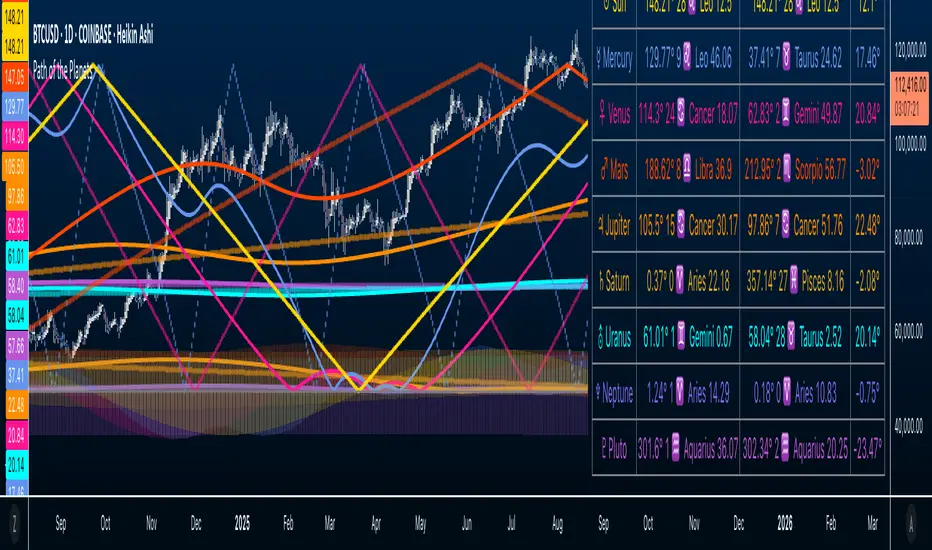
Path of the Planets🪐 Path of the Planets
Path of the Planets is an open-source Pine Script™ v6 indicator. It is inspired by W.D. Gann’s Path of Planets chart, specifically the Chart 5-9 artistic replica by Patrick Mikula "shown below". The script visualizes planetary positions so you can explore possible correlations with price. It overlays geocentric and heliocentric longitudes and declinations using the AstroLib library and includes an optional positions table that shows, at a glance, each body’s geocentric longitude, heliocentric longitude, and declination. This is an educational tool only and not trading advice.
Key Features
Start point: Choose a date and time to begin plotting so studies can align with market events.
Adjustments: Mirror longitudes and shift by 360° multiples to re-frame cycles.
Planets: Toggle geocentric and heliocentric longitudes and declinations for Sun, Mercury, Venus, Earth, Mars, Jupiter, Saturn, Uranus, Neptune, and Pluto. Moon declination is available.
Positions table: Optional color-coded table (bottom-right) with three columns labeled Geo, Helio, and Dec. Values show degrees with the zodiac sign for the longitudes and degrees for declinations.
Visualization: Solid lines for geocentric longitudes, circles for heliocentric longitudes, and columns for declinations. Includes a zero-declination reference line.
How It Works
Converts bar timestamps to Julian days via AstroLib.
Fetches positions with AstroLib types: geocentric (0), heliocentric (1), and declination (3).
Normalizes longitudes to the −180° to +180° range, applies optional mirroring and 360° shifts, and converts longitudes to zodiac sign labels for the table.
Plots and the table update only on and after the selected start time.
Usage Tips
Apply on daily or higher timeframes when studying broader cycles. For degrees, use the left scale.
Limitations at the moment: default latitude, longitude, and timezone are set to 0; aspects and retrogrades are not included; the focus is on raw paths.
License and Credits
Dependency: @BarefootJoey Astrolib
Contributions and observations are welcome.
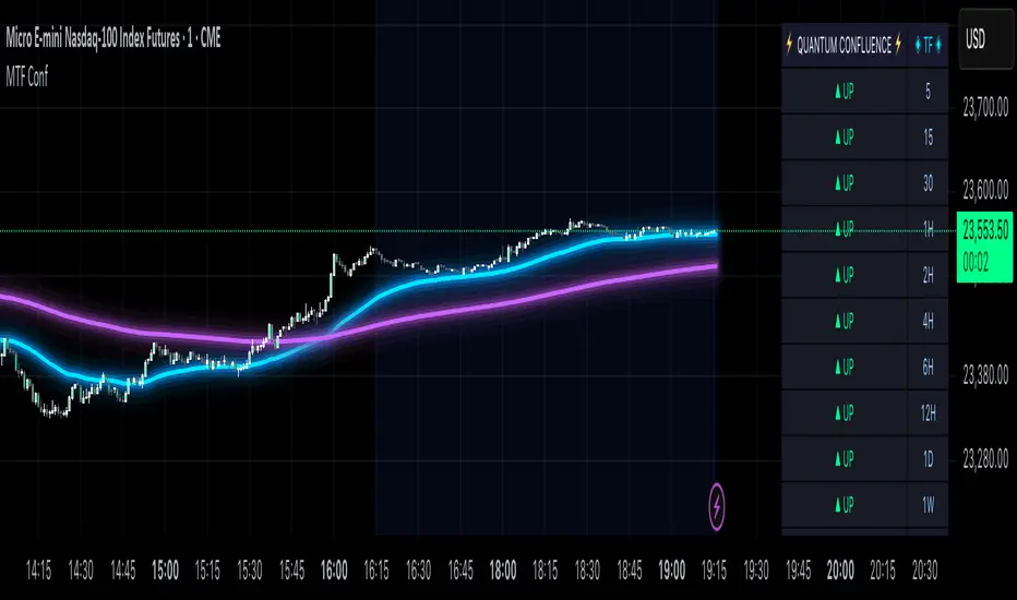
MTF Confluence Dashboard (Multi‑Timeframe Trend/Bias)MTF Confluence Dashboard — Multi‑Timeframe Trend/Bias Table + EMA
The MTF Confluence Dashboard is a fast, non‑repainting multi‑timeframe (MTF) confluence tool that shows higher‑timeframe trend and bias alignment in a compact, on‑chart table. It’s built for prop‑firm challenges and futures day traders who need instant top‑down confirmation without switching charts. Get a clean read of trend direction across your selected timeframes, plus on‑chart MAs for timing.
Why traders use it
* MTF Confluence at a glance: Trend/Bias table aggregates short vs long MA on 1m→1W (you pick which TFs show).
* Non‑repainting: Uses closed-bar higher‑TF data; reliable for alerts and evaluations.
* Futures + prop‑firm friendly: Minimal lag, lightweight, session‑agnostic; perfect for ES/NQ/CL/GC scalping or intraday swings.
Core features
* Trend/Bias Table: “Up / Down” per timeframe and an overall AVG sentiment.
* MA Engine: Choose MA type (SMA/EMA/WMA/HMA) and lengths (e.g., 50/200) to define bias.
* On‑Chart Confirmation: Plots short/long MAs for entry timing on your trading TF.
* Smart Alerts: Built‑in alerts for Strong Up/Up/Neutral/Down/Strong Down average bias.
* Custom Layout: Vertical or Horizontal table, resizable text (Tiny → Huge), corner positioning.
* Pro Visual Themes:
* Dark Intergalactic (neon/futuristic for dark charts)
* Light Minimal (clean light mode)
* Pro Modern (low‑saturation, desk‑ready)
How to trade it
* Scalps (1m–5m): Only take longs when 5m/15m/1H/D are “Up” and AVG is Up/Strong Up; use MA crosses/pulls for entries.
* Intraday swings (5m–15m–1H): Wait for a higher‑TF flip to align; trail under the long MA.
* Risk discipline: If AVG shifts to Neutral/Down, stop looking for longs until bias realigns.
Settings you’ll care about
* Timeframes to display (1m, 2m, 3m, 5m, 10m, 15m, 30m, 1H, 2H, 4H, 6H, 12H, 1D, 1W).
* MA Type: SMA / EMA / WMA / HMA.
* Short/Long lengths (defaults 50/200).
* Theme, orientation, and size.
Notes
* Works on all symbols and timeframes.
* No repainting; alerts trigger on closed conditions.
* Built by PineProfits.
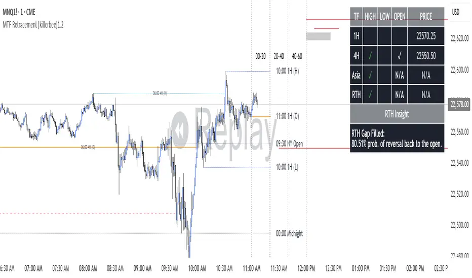
[killerbee] MTF RetracementKey Features
Multi-Timeframe (MTF) Analysis: Plot the high, low, and open from up to four user-defined higher timeframes. This allows you to see the bigger picture and identify key levels that institutional traders are watching.
Dynamic Support & Resistance: Lines are drawn at these key MTF levels and extend until price breaks through them, providing a clean and dynamic view of support and resistance.
Session Highlighting: Automatically draw boxes and high/low lines for the Asia, London, and RTH (Regular Trading Hours) sessions. This helps you understand the context of price action throughout the trading day.
Customizable Opening Price Lines: Pinpoint significant opening prices with dedicated lines for events like the "Midnight Open," "8:30 Open," and "9:30 Open."
"NQ STATS TABLE": A powerful statistical table that provides real-time insights:
Break/Hit Confirmation: Instantly see when a key MTF high/low has been broken or when an opening price has been retraced to.
9 AM Directional Bias: A bullish or bearish bias based on the close of the 9 AM (New York time) hourly candle.
Historical Probabilities: The table displays historical probabilities for price to either break a previous high/low or retrace to the open, based on the current hour of the trading session.
Extensive Customization: Nearly every visual aspect of the indicator can be customized to your preference, including colors, line styles, visibility of each component, and the position of the stats table.
How to Use
Identify Key Levels: The lines from the higher timeframes (HTF1, HTF2, etc.) represent significant support and resistance. Pay close attention to these levels as price approaches them.
Look for Breaks and Retracements:
When a high or low line is broken, the line will stop extending. This can signal a shift in market structure and a potential continuation in the direction of the break.
The "Open Line" for each timeframe represents the opening price. When the line stops extending, it means price has retraced back to that open, a common occurrence in the market.
Utilize the Sessions:
The Asia, London, and RTH boxes help you frame your trading day. The highs and lows of these sessions are often critical levels of support and resistance.
Breakouts from these session ranges can lead to strong directional moves.
Leverage the STATS TABLE:
Use the "Break" and "Hit" columns to quickly confirm when key levels have been breached or revisited.
The "Direction" row gives you a quick sentiment reading based on the 9 AM candle.
The "Trades Back %" and "High/Low Forms" provide a statistical edge by showing you the historical likelihood of certain price behaviors based on the time of day. This can help you decide whether to play for a breakout or a retracement.
Mavericks ORBMavericks ORB – Opening Range Breakout Zones
Overview:
Mavericks ORB is a fully customizable Opening Range Breakout (ORB) indicator designed for serious intraday traders. It dynamically plots the ORB range for your chosen session and timeframe (5 min, 15 min, or any custom range), projects powerful price zones above and below the range, and automatically includes key midpoints—giving you actionable levels for breakouts, reversals, and dynamic support/resistance.
How It Works:
Configurable Session & Duration:
Choose any session start time and range length (e.g., 5 or 15 minutes) to define your personal ORB window.
Automatic Range Detection:
The indicator marks the high, low, and midpoint of the ORB range as soon as your defined period completes.
Dynamic Zones & Midpoints:
Three replicated price zones are projected both above and below the initial ORB, each calculated using the original ORB’s range and evenly spaced. Each zone includes its own midpoint for nuanced trade management and target planning.
Pre-Market Levels:
Tracks pre-market high and low (with fully customizable colors), giving you crucial context as the regular session opens.
Session Range Visualization:
Highlights the defined trading session with an adjustable background color for easy visual tracking.
Real-Time Info Table:
Displays a summary of all key levels—ORB range, highs, lows, and pre-market levels—right on your chart.
Full Customization:
Adjust all colors, enable/disable session range shading, show/hide labels, and tweak all session settings to fit your trading style.
Key Features:
Select any ORB start time and duration (fully customizable)
Plots ORB High, Low, and Midpoint in real time
Automatically projects 3 zones above and 3 zones below, each with its own midpoint
Pre-market high/low detection and labeling
Configurable session shading for visual clarity
At-a-glance info table with all major levels
Multiple color customizations for all zones and lines
Ready-to-use alert conditions for session and pre-market events
How to Use:
Set your preferred ORB start time and duration (e.g., 9:30 AM, 5 min for US equities).
Watch as the ORB forms and updates in real time.
Once complete, the high, low, and midpoint are plotted.
Monitor the projected zones above and below.
Use these for breakouts, targets, or support/resistance.
Reference the info table for all levels and pre-market context.
Customize as you go: Adjust colors, shading, and session settings to your needs.
Who is this for?
Intraday traders who trade the opening range breakout strategy (stocks, futures, forex, crypto)
Price action traders who want clean, actionable levels
Anyone looking for a reliable, highly visual ORB framework on TradingView
Short Description (for TradingView):
Mavericks ORB is a customizable Opening Range Breakout indicator that plots your session’s high, low, midpoint, and projects three dynamic zones above and below the range including midpoints for powerful trade planning. Includes pre-market levels, session highlights, and a real-time info table. Perfect for intraday price action traders.
What Makes Mavericks ORB Unique?
Flexible: Works with any timeframe or session.
Visual: Clean, uncluttered, and fully customizable.
Strategic: Automatic zone and midpoint projection, not just lines.
Practical: At-a-glance info table and real pre-market context.
Alert-ready: Triggers for session and pre-market events.
If you want to include any tips or a personal note (some script publishers do), you could add:
Tip: Use the midpoints for partial profit-taking or to gauge momentum strength. Adjust your ORB window for different asset classes or volatility environments.

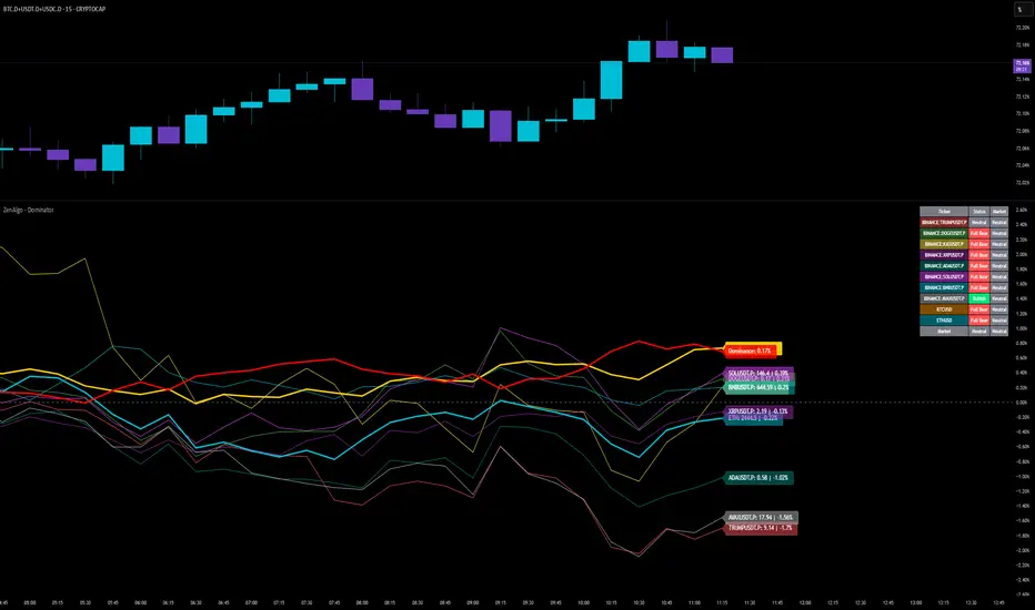
ZenAlgo - DominatorThis indicator provides a structured multi-ticker overview of market momentum and relative strength by analyzing short-term price behavior across selected assets in comparison with broader crypto dominance and Bitcoin/ETH performance.
Ticker and Market Data Handling
The script accepts up to 9 user-defined symbols (tickers) along with BTCUSD and ETHUSD. For each symbol:
It retrieves the current price.
It also requests the daily opening price from the "D" timeframe to compute intraday percentage change.
For BTC, ETH, and dominance (sum of BTC, USDT, and USDC dominance), daily change is calculated using this same method.
This comparison enables tracking relative performance from the daily open, which provides meaningful insight into intraday strength or weakness among different assets.
Dominance Logic
The indicator aggregates dominance data from BTC , USDT , and USDC using TradingView’s CRYPTOCAP indices. This combined dominance is used as a reference in directional and status calculations. ETH dominance is also analyzed independently.
Changes in dominance are used to infer whether market attention is shifting toward Bitcoin/stablecoins (typically indicating risk-off sentiment) or away from them (typically risk-on behavior, benefiting altcoins).
Price Direction Estimation
The script estimates directional bias using an EMA-based deviation technique:
A short EMA (user-defined lookback , default 4 bars) is calculated.
The current close is compared to the EMA to assess directional bias.
Recent candle changes are also inspected to confirm a consistent short-term trend (e.g., 3 consecutive higher closes for "up").
A small threshold is used to avoid classifying flat movements as trends.
This directionality logic is applied separately to:
The selected ticker's price
BTC price
Combined dominance
This allows the script to contextualize the movement of each asset within broader market conditions.
Market Status Evaluation
A custom function analyzes ETH and BTC dominance trends along with their relative strength to define the overall market regime:
Altseason is identified when BTC dominance is declining, ETH dominance rising, and ETH outperforms BTC.
BTC Season occurs when BTC dominance is rising, ETH dominance falling, and BTC outperforms ETH.
If neither condition is met, the state is Neutral .
This classification is shown alongside each ticker's row in the table and helps traders assess whether market conditions favor Bitcoin, Ethereum, or altcoins in general.
Ticker Status Classification
Each ticker is analyzed independently using the earlier directional logic. Its status is then determined as follows:
Full Bull : Ticker is trending up while dominance is declining or BTC is also rising.
Bullish : Ticker is trending up but not supported by broader bullish context.
Bearish : Ticker is trending down but without broader confirmation.
Full Bear : Ticker is trending down while dominance rises or BTC falls.
Neutral : No strong directional bias or conflicting context.
This classification reflects short-term momentum and macro alignment and is color-coded in the results table.
Table Display and Plotting
A configurable table is shown on the chart, which:
Displays the name and status of each selected ticker.
Optionally includes BTC, ETH, and market state.
Uses color-coding for intuitive interpretation.
Additionally, price changes from the daily open are plotted for each selected ticker, BTC, ETH, and combined dominance. These values are also labeled directly on the chart.
Labeling and UX Enhancements
Labels next to the current candle display price and percent change for each active ticker and for BTC, ETH, and combined dominance.
Labels update each bar, and old labels are deleted to avoid clutter.
Ticker names are dynamically shortened by stripping exchange prefixes.
How to Use This Indicator
This tool helps traders:
Spot early rotations between Bitcoin and altcoins.
Identify intraday momentum leaders or laggards.
Monitor which tickers align with or diverge from broader market trends.
Detect possible sentiment shifts based on dominance trends.
It is best used on lower to mid timeframes (15m–4h) to capture intraday to short-term shifts. Users should cross-reference with longer-term trend tools or structural indicators when making directional decisions.
Interpretation of Values
% Change : Measures intraday move from daily open. Strong positive/negative values may indicate breakouts or reversals.
Status : Describes directional strength relative to market conditions.
Market State : Gives a general bias toward BTC dominance, ETH strength, or altcoin momentum.
Limitations & Considerations
The indicator does not analyze liquidity or volume directly.
All logic is based on short-term movements and may produce false signals in ranging or low-volume environments.
Dominance calculations rely on external CRYPTOCAP indices, which may differ from exchange-specific flows.
Added Value Over Other Free Tools
Unlike basic % change tables or price overlays, this indicator:
Integrates dominance-based macro context into ticker evaluation.
Dynamically classifies market regimes (BTC season / Altseason).
Uses multi-factor logic to determine ticker bias, avoiding single-metric interpretation.
Displays consolidated information in a table and chart overlays for rapid assessment.
Multi-Timeframe Continuity Custom Candle ConfirmationMulti-Timeframe Continuity Custom Candle Confirmation
Overview
The Timeframe Continuity Indicator is a versatile tool designed to help traders identify alignment between their current chart’s candlestick direction and higher timeframes of their choice. By coloring bars on the current chart (e.g., 1-minute) based on the directional alignment with selected higher timeframes (e.g., 10-minute, daily), this indicator provides a visual cue for confirming trends across multiple timeframes—a concept known as Timeframe Continuity. This approach is particularly useful for day traders, swing traders, and scalpers looking to ensure their trades align with broader market trends, reducing the risk of trading against the prevailing momentum.
Originality and Usefulness
This indicator is an original creation, built from scratch to address a common challenge in trading: ensuring that price action on a lower timeframe aligns with the trend on higher timeframes. Unlike many trend-following indicators that rely on moving averages, oscillators, or other lagging metrics, this script directly compares the bullish or bearish direction of candlesticks across timeframes. It introduces the following unique features:
Customizable Timeframes: Users can select from a range of higher timeframes (5m, 10m, 15m, 30m, 1h, 2h, 4h, 1d, 1w, 1M) to check for alignment, making it adaptable to various trading styles.
Neutral Candle Handling: The script accounts for neutral candles (where close == open) on the current timeframe by allowing them to inherit the direction of the higher timeframe, ensuring continuity in trend visualization.
Table: A table displays the direction of each selected timeframe and the current timeframe, helping identify direction in the event you don't want to color bars.
Toggles for Flexibility: Options to disable bar coloring and the debug table allow users to customize the indicator’s visual output for cleaner charts or focused analysis.
This indicator is not a mashup of existing scripts but a purpose-built tool to visualize timeframe alignment directly through candlestick direction, offering traders a straightforward way to confirm trend consistency.
What It Does
The Timeframe Continuity Indicator colors bars on your chart when the direction of the current timeframe’s candlestick (bullish, bearish, or neutral) aligns with the direction of the selected higher timeframes:
Lime: The current bar (e.g., 1m) is bullish or neutral, and all selected higher timeframes (e.g., 10m) are bullish.
Pink: The current bar is bearish or neutral, and all selected higher timeframes are bearish.
Default Color: If the directions don’t align (e.g., 1m bar is bearish but 10m is bullish), the bar remains the default chart color.
The indicator also includes a debug table (toggleable) that shows the direction of each selected timeframe and the current timeframe, helping traders diagnose alignment issues.
How It Works
The script uses the following methodology:
1. Direction Calculation: For each timeframe (current and selected higher timeframes), the script determines the candlestick’s direction:
Bullish (1): close > open / Bearish (-1): close < open / Neutral (0): close == open
Higher timeframe directions are fetched using Pine Script’s request.security function, ensuring accurate data retrieval.
2. Alignment Check: The script checks if all selected higher timeframes are uniformly bullish (full_bullish) or bearish (full_bearish).
o A higher timeframe must have a clear direction (bullish or bearish) to trigger coloring. If any selected timeframe is neutral, alignment fails, and no coloring occurs.
3. Coloring Logic: The current bar is colored only if its direction aligns with the higher timeframes:
Lime if the higher timeframes are bullish and the current bar is bullish or neutral.
Maroon if the higher timeframes are bearish and the current bar is bearish or neutral.
If the current bar’s direction opposes the higher timeframe (e.g., 1m bearish, 10m bullish), the bar remains uncolored.
Users can disable bar coloring entirely via the settings, leaving bars in their default chart color.
4. Direction Table:
A table in the top-right corner (toggleable) displays the direction of each selected timeframe and the current timeframe, using color-coded labels (green for bullish, red for bearish, gray for neutral).
This feature helps traders understand why a bar is or isn’t colored, making the indicator accessible to users unfamiliar with Pine Script.
How to Use
1. Add the Indicator: Add the "Timeframe Continuity Indicator" to your chart in TradingView (e.g., a 1m chart of SPY).
2. Configure Settings:
Timeframe Selection: Check the boxes for the higher timeframes you want to compare against (default: 10m). Options include 5m, 10m, 15m, 30m, 1h, 2h, 4h, 1D, 1W, and 1M. Select multiple timeframes if you want to ensure alignment across all of them (e.g., 10m and 1d).
Enable Bar Coloring: Default: true (bars are colored lime or maroon when aligned). Set to false to disable coloring and keep the default chart colors.
Show Table: Default: true (table is displayed in the top-right corner). Set to false to hide the table for a cleaner chart.
3. Interpret the Output:
Colored Bars: Lime bars indicate the current bar (e.g., 1m) is bullish or neutral, and all selected higher timeframes are bullish. Maroon bars indicate the current bar is bearish or neutral, and all selected higher timeframes are bearish. Uncolored bars (default chart color) indicate a mismatch (e.g., 1m bar is bearish while 10m is bullish) or no coloring if disabled.
Direction Table: Check the table to see the direction of each selected timeframe and the current timeframe.
4. Example Use Case:
On a 1m chart of SPY, select the 10m timeframe.
If the 10m timeframe is bearish, 1m bars that are bearish or neutral will color maroon, confirming you’re trading with the higher timeframe’s trend.
If a 1m bar is bullish while the 10m is bearish, it remains uncolored, signaling a potential misalignment to avoid trading.
Underlying Concepts
The indicator is based on the concept of Timeframe Continuity, a strategy used by traders to ensure that price action on a lower timeframe aligns with the trend on higher timeframes. This reduces the risk of entering trades against the broader market direction. The script directly compares candlestick directions (bullish, bearish, or neutral) rather than relying on lagging indicators like moving averages or RSI, providing a real-time, price-action-based confirmation of trend alignment. The handling of neutral candles ensures that minor indecision on the lower timeframe doesn’t interrupt the visualization of the higher timeframe’s trend.
Why This Indicator?
Simplicity: Directly compares candlestick directions, avoiding complex calculations or lagging indicators.
Flexibility: Customizable timeframes and toggles cater to various trading strategies.
Transparency: The debug table makes the indicator’s logic accessible to all users, not just those who can read Pine Script.
Practicality: Helps traders confirm trend alignment, a key factor in successful trading across timeframes.

Bayesian TrendEnglish Description (primary)
1. Overview
This script implements a Naive Bayesian classifier to estimate the probability of an upcoming bullish, bearish, or neutral move. It combines multiple indicators—RSI, MACD histogram, EMA price difference in ATR units, ATR level vs. its average, and Volume vs. its average—to calculate likelihoods for each market direction. Each indicator is “binned” (categorized into discrete zones) and assigned conditional probabilities for bullish/bearish/neutral scenarios. The script then normalizes these probabilities and paints bars in green if bullish is most likely, red if bearish is most likely, or blue if neutral is most likely. A small table is also displayed in the top-right corner of the chart, showing real-time probabilities.
2. How it works
Indicator Calculations: The script calculates RSI, MACD (line and histogram), EMA, ATR, and Volume metrics.
Binning: Each metric is converted into a discrete category (e.g., low, medium, high). For example, RSI < 30 is binned as “low,” while RSI > 70 is binned as “high.”
Conditional Probabilities: User-defined tables specify the conditional probabilities of each bin under three hypotheses (Up, Down, Neutral).
Naive Bayesian Formula: The script multiplies the relevant conditional probabilities, normalizes them, and derives the final probabilities (Up, Down, or Neutral).
Visualization:
Bar Colors: Bars are green when the Up probability exceeds 50%, red for Down, and blue otherwise.
Table: Displays numeric probabilities of Up, Down, and Neutral in percentage terms.
3. How to use it
Add the script to your chart.
Observe the colored bars:
Green suggests a higher probability for bullish movement.
Red suggests a higher probability for bearish movement.
Blue indicates a higher probability of sideways or uncertain conditions.
Check the table in the top-right corner to see exact probabilities (Up/Down/Neutral).
Use the input settings to adjust thresholds (RSI, MACD, Volume, etc.), define alert conditions (e.g., when Up probability crosses 50%), and decide whether to trigger alerts on bar close or in real-time.
4. Originality and usefulness
Originality: This script uniquely applies a Naive Bayesian approach to a blend of classic and volume-based indicators. It demonstrates how different indicator “zones” can be combined to produce probabilistic insights.
Usefulness: Traders can interpret the probability breakdown to gauge the script’s bias. Unlike single indicators, this approach synthesizes several signals, potentially offering a more holistic perspective on market conditions.
5. Limitations
The conditional probabilities are manually assigned and may not reflect actual market behavior across all instruments or timeframes.
Results depend on the user’s choice of thresholds and indicator settings.
Like any indicator, past performance does not guarantee future results. Always confirm signals with additional analysis.
6. Disclaimer
This script is intended for educational and informational purposes only. It does not constitute financial advice. Trading involves significant risk, and you should make decisions based on your own analysis. Neither the script’s author nor TradingView is liable for any financial losses.
Русское описание (Russian translation, optional)
Этот индикатор реализует наивный Байесовский классификатор для оценки вероятности предстоящего роста (Up), падения (Down) или бокового движения (Neutral). Он комбинирует несколько индикаторов—RSI, гистограмму MACD, разницу цены и EMA в единицах ATR, уровень ATR относительно своего среднего значения и объём относительно своего среднего—чтобы вычислить вероятности для каждого направления рынка. Каждый индикатор делится на «зоны» (low, mid, high), которым приписаны условные вероятности для бычьего/медвежьего/нейтрального исхода. Скрипт нормирует эти вероятности и раскрашивает бары в зелёный, красный или синий цвет в зависимости от того, какая вероятность выше. Также в правом верхнем углу отображается таблица с текущими значениями вероятностей.

Time based Insights [Digit23]Description:
The NSE Trading Time Insights indicator is a powerful tool designed for traders on the National Stock Exchange (NSE) of India. It provides a comprehensive overview of different trading sessions throughout the day, offering valuable insights into market characteristics and potential trading strategies for each time period.
Key Features:
1. Dynamic Session Display: The indicator automatically detects the current trading session and highlights it in the table.
2. Customizable Table: Users can choose to display either a full table showing all sessions or focus on the current session only.
3. User-Editable Content: Time ranges, session characteristics, and trading insights are fully customizable by the user.
4. Visual Customization: Table position and color scheme can be adjusted to suit individual preferences.
5. Market Status Indicator: Clearly shows when the market is closed.
Sessions Covered:
1. Opening Bell
2. Mid-Morning
3. Lunch Hour
4. Early Afternoon
5. Power Hour
For each session, the indicator displays:
- Time Range
- Session Name
- Market Characteristics
- Trading Insights
Customization Options:
- Table Position: Choose from top-left, top-right, bottom-left, or bottom-right of the chart.
- Color Scheme: Customize colors for header, cells, highlighting, and market closed status.
- Session Details: Edit time ranges, characteristics, and trading insights for each session.
Usage:
This indicator is particularly useful for:
1. New traders learning about intraday market dynamics on the NSE.
2. Experienced traders looking for a quick reference of session characteristics.
3. Traders developing or refining time-based trading strategies.
4. Anyone seeking to understand the typical flow of the trading day on the NSE.
Note:
The indicator uses the chart's time to determine the current session. Ensure your chart is set to the correct time zone for accurate results.
Disclaimer:
This indicator is for informational purposes only. The provided insights and characteristics are general in nature and may not reflect current market conditions. Always conduct your own analysis and risk assessment before making trading decisions.

Position Size Calculator for ContractDescription:
Position Size Calculator is a versatile Pine Script tool designed to help traders manage their risk and position sizing effectively. This script calculates essential trading metrics and visualizes them directly on your chart, helping you make informed trading decisions.
Features:
- Account Size & Risk Management:
- Account Size: Input your total account balance to calculate position sizes.
- Maximum Risk: Define how much of your account you are willing to risk per trade in dollars.
- Pip Value: Set the value of a single pip for one contract, which is crucial for calculating risk
and position size.
Trade Setup Visualization:
- Entry Price: Specify the price at which you plan to enter the trade.
- Stop Loss: Define your stop loss level to manage your risk.
- Take Profit: Set your target profit level for the trade.
- Visualize the Entry, Stop Loss, and Take Profit levels on your chart with customizable line
colors and text sizes.
- View the distance in pips between the Entry, Stop Loss, and Take Profit levels.
Position Size Calculation:
- Calculates the number of contracts to open based on your risk tolerance and the pip value.
- Displays the maximum number of contracts you can open given your risk parameters.
Customizable Table Display:
- Table Position: Choose the position of the summary table on the chart (Top-Left, Top-Right,
Bottom-Left, Bottom-Right, etc.).
- Table Text Size: Adjust the text size for the summary table.
- Table Background Color: Set the background color for the summary table.
- Table Border Color: Customize the border color of the summary table.
How to Use:
1- Input your Account Size: Enter your current account balance.
2- Set Maximum Risk and Pip Value: Define how much you're willing to risk per trade and the
pip value for your contract.
3- Define Trade Levels: Input your desired Entry Price, Stop Loss, and Take Profit levels.
4- Customize Visuals: Adjust the line styles and table settings to fit your preferences.
5- View Calculations: The script will display the distance in pips and the calculated position
size directly on your chart.
Example Usage:
Example to calculate the value of 1 pips with 1 contract:
Inputs:
Account Size: Your total trading account balance.
Maximum Risk: Risk amount per trade in dollars.
Pip Value: Value of one pip for a single contract.
Entry Price: The price at which you plan to enter the trade.
Stop Loss: The level at which you will exit the trade to cut losses.
Take Profit: The target price to lock in profits.
Line Text Size: Size of the text for the Entry, Stop Loss, and Take Profit lines.
Line Extend: Option to extend the lines for visual clarity.
Table Position: Position of the summary table on the chart.
Table Text Size: Size of the text in the summary table.
Table Background Color: Background color of the summary table.
Table Border Color: Border color of the summary table.
Visuals:
Entry Price, Stop Loss, and Take Profit levels are clearly marked on the chart.
Summary Table with important trade metrics displayed.

Universal RPPI Indices & Futures [SS Premium]Hello everyone,
For the much-anticipated indicator release, the universal RPPI for Futures and Indices!
If you follow me, chances are you know this indicator by now, since its the basis of all of my analyses and target prices, but if not, let me introduce you!
What is it?
The RPPI for Indices & Futures is essentially a compendium indicator. It contains hundreds of, just over 100 different math models of various futures and indices.
These models are designed to forecast the current targets on multiple timeframes including:
1. The daily
2. The weekly
3. The monthly
4. The Three Month (for SPY and QQQ ONLY)
5. The 6 Month (for DJI, SPX and USOIL/CLI1! ONLY)
6. The annual (for DJI, SPX and USOIL/CLI1! ONLY)
7. The 3 hour
So I will go over the details of the models within the indicators compendium and how they are produced. If you are not interested, just skip to the next section!
What is a model and how is it produced?
Models are math equations and frameworks that attempt to predict future behavior. They are developed in many ways and through many methods. In this particular indicator, each index and future is unique and has been created in various ways, such as using principles of data smoothing, data interpolation, data substitution and data omission.
All this means is, I have manually adjusted model parameters to correct for rare, outlier events. The outcome is having a more accurate model that is better prepared to predict what you want it to predict.
Now let's get into the indicator use.
The first thing we need to talk about is selecting a model type. Different model types are available on a handful of stocks in the indicator, such as SPY, QQQ, DJI and DIA, and so it is important to explain the difference.
Corrected vs Uncorrected Models (i.e. Low Precision vs High Precision Models)
In the settings menu, you will see the second option that reads "Precision". This is where you have the ability to select the model type.
"High Precision" is a corrected model. It is a model that I have used data manipulation for (like the examples above) to enhance its accuracy.
"Low Precision" is a UNCORRECTED model. These models have undergone no data manipulation and are just raw projections.
Which do you use?
There are only a handful of tickers that have both models, like SPY, GLD1! and DJI (among others). Some tickers perform better with low precision models, others perform better with high precision models.
To know what model works best with which stock, the indicator will tell you. At the bottom of the settings table, simply select "Show Model Data":
Selecting this, you will get a table that looks like this:
It will tell you the available model types and which one works best. For IWM, the high-precision corrected model is best. This is true for QQQ and NQ1! as well. However, for SPY and ES1!, the uncorrected model is actually better:
Sometimes, different models perform better at various levels of precision, for example, high on the monthly but low on the daily.
This is why I have omitted this option for the majority of stocks. I don't want this to be confusing to use. For 90% of the included tickers, I have selected the model of best fit. However, for a few of the very popular and volatile tickers (ES, NQ specifically), I have included the ability to use both.
Rule of Thumb:
The rule of thumb with selecting high vs low, is essentially this:
a) If the market is hugely volatility with major swings intraday that exceed its normal behaviour, switch to the low precesion model. This will not be skewed by the massive swings.
b) If the market is stable, trendy or range bound, but not trending beyond its normal, general behaviour, keep it at high precision.
With that, you will be good to go!
Using the indicator:
The indicator is intended as a standalone indicator. Of course, you can combine other indicators that you like to help you out, but there is a strategy version of this that will be released within the coming days/weeks, as this is intended to be a full strategy in and of itself.
As with the universal forecaster, you are given threshold levels that are labelled "Bullish Condition" and "Bearish Condition", a break and hold of the "Bullish Condition" and it is a long to the high targets. Inverse for the bearish condition.
In addition to these conditionals, the indicator also provides you with a high probability retracement level. These are available on the weekly, monthly and higher timeframes. A special moving retracement level is available for SPY only, however it moves based on the PA to give you a sort of POC.
Testing Model Performance:
It is possible to see model performance. At the bottom of the settings menu, select the option to "Show Demographic Data". You need to be sure you are on the chart of the selected timeframe.
This is ES1! on the daily timeframe. It shows you the demographics, i.e. the extent targets are hit, the extent that the high prob retracement targets are missed, the extent that ES closes in and out of its daily range.
This is very valuable information. This table is essentially saying there is only a 10% chance that ES will close above its range and a 9% chance ES closes below its range. This means, that the most ideal setups are a move outside of its range!!
You can view it on all timeframes. If your chart isn't aligned with the lookback, you will get a warning sign:
Misc Functions:
Show price accumulation:
There is an option to toggle on price accumulation. It will show you the amount of accumulation in each of the ranges:
This will show where the accumulation of price rests in relation to the targets.
Autoregression Assessment:
You can have the indicator plot an autoregressive trendline of the expected stock trajectory. You can select the forecast length and it will plot the direction it suspects the stock will go:
Show Standard Deviation:
In the menu, you can toggle on the show standard deviation function. This will plot the standard deviation that each price rests at. The default timeframe for standard deviation is the daily. If you are looking at the weekly, please select the weekly timeframe.
This is helpful because you can see which targets are likely based on where the standard deviation rests. In the above example, a move to the low range would be a move to -2 standard deviations and beyond. This is not something that a ticker would normally do in general circumstances.
FAQ Table:
There is also an option to display an FAQ table. This will show you model revisions and pending revision dates. This will allow you to see when each model was last updated and when new updates will be pushed:
Which models does this contain?
The indicator contains models for the following stocks:
SPY
QQQ
DIA
DJI
ES1!
SPX
NQ1!
NDX
SOXX
IWM
RTY
GCL1! (Gold)
CL1! / USOIL (Oil)
XLE
XLF
YM1!
And some more are in the works (like JETS).
NOTE: Feel free to leave a comment of future ones you would like to see!
The indicator will automatically select the model for whichever ticker you are on.
Some models are cross-compatible, such as CL1! and USOIL, but the indicator is programmed to recognize those that are cross-compatible and auto-select those models.
From there, you just need to select the timeframe you wish to view!
And that is the indicator! I know very wordy explanation but wanted to cover all basis on the indicator so you can be well prepared!
As always, leave your questions, and comments below, and safe trades!
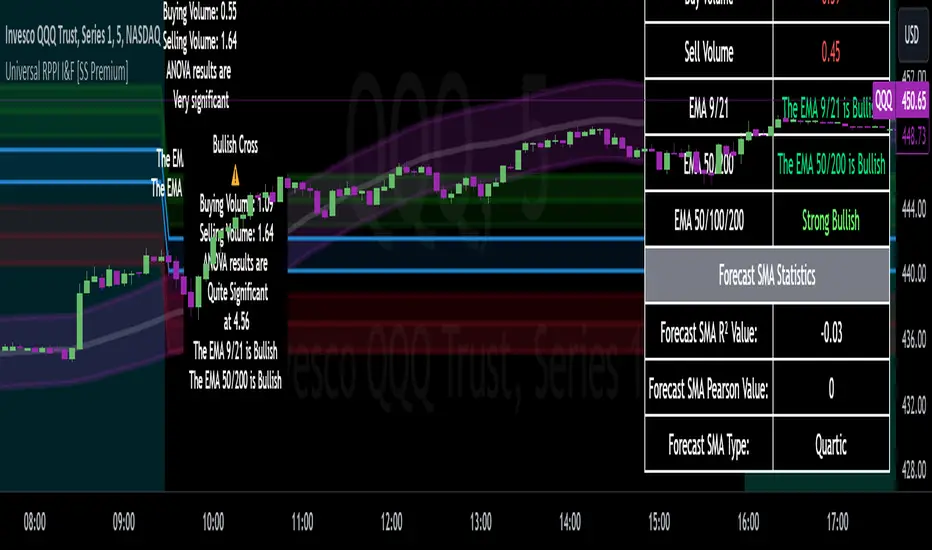
Autoregressive CloudHello,
I am releasing this indicator called the Autoregressive Cloud Indicator.
What it does:
The indicator performs an autoregression analysis on 3 price variables of a ticker, those being the High, the Low and the Close. It uses a 1-lag system and looks back at the previous close, high and low’s effect on the proceeding high, low and close. It then plots out the anticipated range for the ticker based on the autoregression analysis, as well as displays the lag-correlation (autocorrelation) in a table.
What is Autoregression analysis?
Autoregression is a modelling technique used to describe a time series based on its own past values. It assumes that the current value of a variable is a linear combination of its previous values and a random error term.
And what is autocorrelation?
Autocorrelation measures the correlation between a time series and its lagged values. It quantifies the degree to which the current value of a series is related to its past values at different lags, indicating any patterns or dependencies in the data over time. Autoregression and autocorrelation are closely related concepts used to analyze and model time series data.
So how does it work?
The indicator calculates autoregressive values for the close, high, and low prices of a security based on the specified lookback length (which is defaulted to 50). It then plots three sets of clouds representing the smoothed autoregressive values for each price component (done using the SMA function). The transparency of the clouds can be adjusted using the "Transparency" input. Additionally, the code includes a correlation table that displays the correlation coefficients between the lagged values of the close, high, and low prices. The table's position can be customized using the "Position" input.
The indicator defaults to the chart timeframe; however, you can manually adjust the indicator to display the range for whatever timeframe you would like. You can view the 30 minute, 15 or even hourly range on the 1 minute or 5 minute chart if you want.
The indicator will show the anticipated “true trading range” of the stock based on the autoregression and autocorrelation of all 3 variables:
Above is SPY on the 5 minute timeframe with 15 minute levels overlayed. Here, you can see the anticipated trading range for that 15 minute time period.
Using the Correlation Table:
The correlation table displays the Pearson Coefficient for all 3 autoregressions.
A positive correlation: A positive autocorrelation indicates a positive relationship between past and current values of a time series variable. It suggests that when the variable has a high value at a certain time, it is more likely to have a high value in the future, and when it has a low value, it is more likely to have a low value in the future. This positive autocorrelation can imply persistence or trend in the data, indicating that past values can provide useful information for predicting future values. The rule of thumb is anything over 0.5 is considered significant.
A positive correlation among all 3 variables also indicates an uptrend. If you see a strong positive (i.e. the values are all greater than 0.8), it indicates an incredibly decisive and strong uptrend.
A negative correlation: A negative autocorrelation indicates an inverse relationship between past and current values of a time series variable. It suggests that when the variable has a high value at a certain time, it is more likely to have a low value in the future, and vice versa. This negative autocorrelation can imply mean reversion or oscillatory behavior in the data, where extreme values tend to be followed by values closer to the average. It indicates that past values can provide useful information for predicting future values by anticipating a reversal in the direction of the variable. The rule of thumb is anything below or equal to -0.5 is considered significant.
A negative correlation among all 3 variables also indicates a downtrend. If you see a strong negative (i.e. the values are all less than or equal to -0.8), it indicates an incredibly decisive and strong downtrend.
Uses of the Indicator:
The indicator can be used for the following functions:
1. Day trading and scalping within an expected range;
2. Determining the strength or weakness of an uptrend or downtrend on various timeframes;
3. Determining the relationship between previous values and past performance and its effect on future performance;
4. Can alert to changes in trend direction in advance (you may see high, low or close turn negative before others, signifying that weakness is beginning to materialize in an uptrend, or inverse in a downtrend (value changes positive)).
Customizability:
SMA: The autoregression data is smoothed by a 3 period lookback. You can change this if you want, but in order for the indicator to present the true trading range, it is recommended to leave it at <= 3.
Lookback Length: This is the length of the lookback period for the autoregression and autocorrelation functions.
Transparency settings: You can adjust the transparency of the clouds manually.
Timeframe: You can adjust the timeframe, as explained above, to display the timeframe of interest. When you adjust the timeframe, the data will all reflect that timeframe and not necessarily the current TF you have open (i.e. you select 30 minutes while viewing it on the 5 minute, it will show the data for the 30 minute TF period).
Video Tutorial:
I have prepared a video outlining the indicator and also explaining the theory of autoregression/correlation. You can find it below:
Let me know any comments, questions or suggestions below.
Thank you for taking the time to read/watch and check out this indicator.
Safe trades everyone!
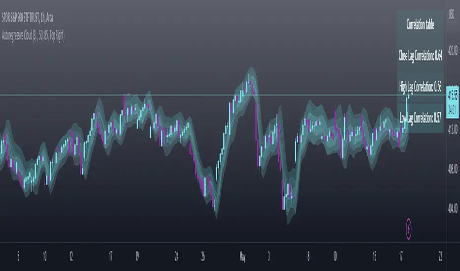
EMA bridge and dashboard with color coding.
Summary:
This is a custom moving average indicator script that calculates and plots different Exponential Moving Averages (EMAs) based on user-defined input values. The script also displays MACD and RSI, and provides a table that displays the current trend of the market in a color-coded format.
Explanation:
- The script starts by defining the name of the indicator and the different inputs that the user can customize.
- The inputs include bridge values for three different EMAs (high, close, and low), and four other EMAs (5, 50, 100, and 200).
- The script assigns values to these inputs using the `ta.ema()` function.
- Additionally, the script calculates EMAs for higher timeframes (3m, 5m, 15m, and 30m).
- The script then plots the EMAs on the chart using different colors and line widths.
- The script defines conditions for going long or short based on the crossover of two EMAs.
- It plots triangles above or below bars to indicate the crossover events.
- The script also calculates and displays the RSI and MACD of the asset.
- Finally, the script creates a table that displays the current trend of the market in a color-coded format. The table can be positioned on the top, middle, or bottom of the chart and on the left, center, or right side of the chart.
Parameters:
- i_ema_h: Bridge value for high EMA (default=34)
- i_ema_c: Bridge value for close EMA (default=34)
- i_ema_l: Bridge value for low EMA (default=34)
- i_ema_5: Value for 5-period EMA (default=5)
- i_ema_50: Value for 50-period EMA (default=50)
- i_ema_100: Value for 100-period EMA (default=100)
- i_ema_200: Value for 200-period EMA (default=200)
- i_f_ema: Value for fast EMA used in MACD calculation (default=9)
- i_s_ema: Value for slow EMA used in MACD calculation (default=21)
- fastInput: Value for fast length used in MACD calculation (default=7)
- slowInput: Value for slow length used in MACD calculation (default=14)
- tableYposInput: Vertical position of the table (options: top, middle, bottom; default=middle)
- tableXposInput: Horizontal position of the table (options: left, center, right; default=right)
- bullColorInput: Color of the table cell for a bullish trend (default=green)
- bearColorInput: Color of the table cell for a bearish trend (default=red)
- neutColorInput: Color of the table cell for a neutral trend (default=white)
- neutColorLabelInput: Color of the label for neutral trend in the table (default=fuchsia)
Usage:
To use this script, simply copy and paste it into the Pine Editor on TradingView. You can then customize the input values to your liking or leave them at their default values. Once you have added the script to your chart, you can view the EMAs, MACD, RSI, and trend table on the chart. The trend table provides a quick way to assess the current trend of the market at a glance.
