Harmonic PatternsHello Traders,
This is Harmonic Pattern script . I made this script long time ago and now pubished it for the community. it can find & show following patterns:
- Gartley
- Butterfly
- Bat
- Alternate Bat
- Crab
- Deep Crab
- Shark
- Cypher
- Double Top
- Double Bottom
- ABCD
only ABCD patterns is not enabled by default, you can enable if you want.
The script has many features in it, so you have many options. lets see them
ZigZag Period : is the period for zig zag that is used to find harmonic patterns.
Error Rate % : the patterns may not be perfect and we need to use a threshold. with this option you can set error rate
Deep Search: if you enable this option then the script check combination with old zigzag points. an example is under the explanation part
Pattern Prediction : if you set this option then while price is moving the script checks the possible next patterns that can be possible (shows first possible one). an example is under the explanation part
Show ZigZag: you have option to see zigzag
Show Pattern Names: you have option to see Pattern names
Remove Old Pattern Names : old found patterns can stay on the chart or you have option to delete from the chart by this option
Show Harmonics: you have option to show patterns
Show Targets: you have option to see the target and stop-loss level by each harmonic
Show Statistics: you can see the statictics about harmonic patterns on current chart
Show Full Statistics: you can see the statictics about harmonic patterns on current chart in details
"Stop-loss ATR Len" and "Stop-loss ATR Mult" is used to calculate stop-loss levels
and many options for visualization and alerts...
The scripts works dynamically in real time, it means it may find different patterns on each candles. if it finds a new one in same direction then old one becomes invalid, you should check the last one.
Lets see some examples:
it changes the colors if price reached the target or stop-loss. blue => reached target, black => stop-loss, and if color was not changed it means it found another harmonic pattern.
if it finds a harmonic pattern then it show entrty level, cancelation level of the pattern, target 1 and target 2
and if price reaches entrty level then it shows targets and stop-loss levels
as written above, t has ability to predict patterns if you enable this option:
Deep search is used to find patterns by some old zigzag levels as seen in following screenshot:
it can show full statistics if you enable it in the options:
The source code is hidden but it's free script. so like it/favorite this script, apply it to your chart and start using it ;)
Special thanks to my friend @gornidah who helped while developing the script!
Enjoy!
Search in scripts for "stop loss"

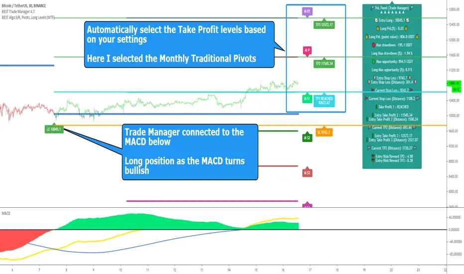
BEST Standalone Trade Manager with Automatic Take ProfitHello BEST traders
The BEST Trade Manager got upgraded with many more features
This version allows setting automatically the TP levels on either Daily/Weekly/Monthly Fibonacci/Traditional/Camarilla/Woodie pivots and Daily/Weekly/Monthly/Intraday Moving Averages
I. 💎 SCRIPTS ACCESS 💎
1. Available only with one-time payment on my website.
2. My website URL is in this script signature at the very bottom (you'll have to scroll down a bit and going past the long description) and in my profile status available here: Daveatt
3. Many video tutorials explaining clearly how all our indicators work are available on your website > guides section.
4. You may also contact me directly for more information
II. 🔎 What is the BEST Trade Manager?🔎
2.1 Concept
The BEST Trade Manager is compatible with any indicator.
Once connected, it adds another layer of good stuff with real-time user custom defined stop loss (8 available options), take profits (4 possible options) + alerts compatible for trading automation.
2.2 How hard is it to update your indicator?
We'll send to our customers, a comprehensive and easy tutorial, to make any indicator compatible.
I guarantee you, it should take no more than 2 minutes per indicator. We made it easy, fun, and awesome. #bolder #statement
III. The amazing benefits of our Plug&Play system
I hope you're ready to be impressed. Because, what I'm about to introduce, is my best-seller feature - and available across many of my indicators.
The BEST Trade manager can be connected to any external indicator
Let's assume you want to connect your RSI divergence to your Trade Manager.
I mentioned an RSI divergence but you may connect any oscillator ( MACD, On balance volume, stochastic RSI, True Strenght index, and many more..) or non-oscillatory (divergence, trendline break, higher highs/lower lows, candlesticks pattern, price action, harmonic patterns, ...) indicators.
THE SKY IS (or more likely your imagination) is the limit :)
Of course, this tool is compatible with my other indicators
We go in-depth on our website why the Plug&Play is an untapped opportunity for many traders out there - URL available on my profile status and signature
IV. 🧰 Features 🧰
Candles can be colored to highlight the trend direction better [/b [
4.1 Stop-Loss Management
For what's following, let's assume that 2 is the stop-loss value you inserted in the indicator, and the Algorithm Builder gives a BUY signal.
This is NOT a recommendation at all, only an example to explain how this feature works.
- %Trailing: The Stop-Loss starts 2% away from the entry price - and will move up (because we're on a BUY trade as per our example) every time your trade will gain 2% profit
- Pips Trailing: Same as above but using a distance in pips/USD value
- Percentage: The Stop-Loss stays static 2% away from the entry price. There is no trailing here
- TP Trailing: Trail your stop-loss every time a Take Profit level is hit
- Supertrend: embedded supertrend use as a trailing stop
- Fixed: Set the Stop-Loss at a fixed position (value should be in currency/units)
- ATR multiple: Set the Stop-loss at a multiple of ATR
- External connector: Let's say your indicator already contains embedded stop-loss levels, you can add them in the Trade Manager
4.2 Take Profits Management
You can manage up to 3 take profit levels defined as a percentage or price value or ATR multiple.
The expected input is in percentage value (for instance, setting the % target of TP1 to 2% will set the TP1 level 2% away from the entry price
This version allows setting automatically the TP levels on either Daily/Weekly/Monthly Fibonacci/Traditional/Camarilla/Woodie pivots and Daily/Weekly/Monthly/Intraday Moving Averages
4.3 Built-in Risk-to-Reward Panel with real-time analytics
The good stuff doesn't stop here.
You'll notice that this sometimes green (when in a LONG), sometimes red (when in a SHORT) panel at the right of your chart.
- Entry Price: the price when the Algorithm Builder will give a signal.
- The Trade PnL in percentage.
- Entry Stop Loss: Distance (in currency/units) between the selected stop-loss algorithm (percent, trailing, TP trailing, etc.) and the entry price.
- Entry TP1/TP2/TP3: Distance (in currency/units) between the entry price and the first take profit
- Risk/Reward TP1/TP2/TP3: Using the Stop-loss distance at entry, and Take Profit 1/2/3 at the entry to compute the risk-to-reward ratio.
- Max drawdown and Max opportunity (value and percentage): respectively the maximum loss and maximum win per trade
For more details, please check the guides section of my website. Links are in my signature and profile status.
V. 🔔 Alerts 🔔
We enabled the alerts on the:
1. Stop-Loss hit
2. Take Profit 1/2/3 hit
3. custom hard exits based on either MACD / RSI divergence/ MM cross
5.1 🤖 Compatible with trading bots? 🤖
It's compatible with all third-parties out there capturing alerts and forwarding them to the brokers.
We enabled TradingConnector and ProfitView alert templates so far.
If you have any doubts or questions, please hit me up directly or ask in the comments section of this script.
BEST regards,
Dave
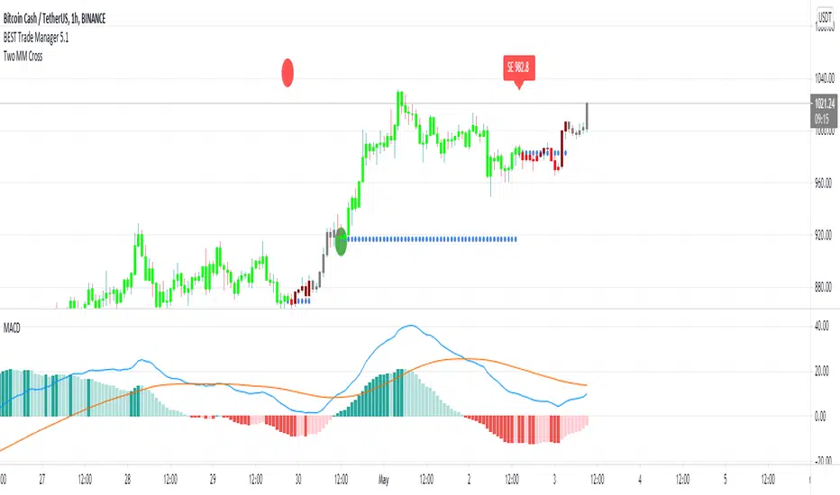
Buy/Sell/TP/SL/TSL Alerts ModuleThis tool is not a self-sufficient indicator, just an attachable module that allows you to enhance a specific indicator with risk management components without having a headache.
What you need to do, and actually this is the most important step, is to rewrite your indicator to a buy-sell signal form which will output only -1, 0, 1 values and then connect it to the module.
After that the module gives you a lot of possibilities to customize Take Profit, Stop Loss and Trailing Stop Loss levels through the settings window and to set all the alerts you need up.
Simple Buy/Sell setup for the RSI:
Now I am adding Stop Loss:
and Take Profit:
and finally Trailing Stop Loss:
Okay, I have shown how it works with RSI signals. Here is example for the MACD:
and example for the WaveTrend Oscillator:
If you have any questions don't hesitate to ask and contact me either via private messages on TradingView or via Telegram

[Daveatt] BEST Trade Manager Pivots 1.0Hello BEST traders
The BEST Trade Manager got upgraded with many more features
This version allows setting automatically the TP levels on either Fibonacci/Traditional/Camarilla/Woodie pivots
I. 💎 SCRIPTS ACCESS 💎
1. Available only with one-time payment on my website.
2. My website URL is in this script signature at the very bottom (you'll have to scroll down a bit and going past the long description) and in my profile status available here: Daveatt
3. Many video tutorials explaining clearly how all our indicators work are available on your website > guides section.
4. You may also contact me directly for more information
II. 🔎 What is the BEST Trade Manager?🔎
2.1 Concept
The BEST Trade Manager is compatible with any indicator.
Once connected, it adds another layer of good stuff with real-time user custom defined stop loss (8 available options), take profits (4 possible options) + alerts compatible for trading automation.
2.2 How hard is it to update your indicator?
We'll send to our customers, a comprehensive and easy tutorial, to make any indicator compatible.
I guarantee you, it should take no more than 2 minutes per indicator. We made it easy, fun, and awesome. #bolder #statement
III. The amazing benefits of our Plug&Play system
I hope you're ready to be impressed. Because, what I'm about to introduce, is my best-seller feature - and available across many of my indicators.
The BEST Trade manager can be connected to any external indicator
Let's assume you want to connect your RSI divergence to your Trade Manager.
I mentioned an RSI divergence but you may connect any oscillator ( MACD, On balance volume, stochastic RSI, True Strenght index, and many more..) or non-oscillator (divergence, trendline break, higher highs/lower lows, candlesticks pattern, price action, harmonic patterns, ...) indicators.
THE SKY IS (or more likely your imagination) is the limit :)
We go in-depth on our website why the Plug&Play is an untapped opportunity for many traders out there - URL available on my profile status and signature
IV. 🧰 Features 🧰
Candles can be colored to highlight the trend direction better [/b [
4.1 Stop-Loss Management
For what's following, let's assume that 2 is the stop-loss value you inserted in the indicator, and the Algorithm Builder gives a BUY signal.
This is NOT a recommendation at all, only an example to explain how this feature works.
- %Trailing: The Stop-Loss starts 2% away from the entry price - and will move up (because we're on a BUY trade as per our example) every time your trade will gain 2% profit
- Pips Trailing: Same as above but using a distance in pips/USD value
- Percentage: The Stop-Loss stays static 2% away from the entry price. There is no trailing here
- TP Trailing: Trail your stop-loss every time a Take Profit level is hit
- Supertrend: embedded supertrend use as a trailing stop
- Fixed: Set the Stop-Loss at a fixed position (value should be in currency/units)
- ATR multiple: Set the Stop-loss at a multiple of ATR
- External connector: Let's say your indicator already contains embedded stop-loss levels, you can add them in the Trade Manager
4.2 Take Profits Management
You can manage up to 3 take profit levels defined as a percentage or price value or ATR multiple.
The expected input is in percentage value (for instance, setting the % target of TP1 to 2% will set the TP1 level 2% away from the entry price
This version allows setting automatically the TP levels on either Fibonacci/Traditional/Camarilla/Woodie pivots
4.3 Built-in Risk-to-Reward Panel with real-time analytics
The good stuff doesn't stop here.
You'll notice that this sometimes green (when in a LONG), sometimes red (when in a SHORT) panel at the right of your chart.
- Entry Price: the price when the Algorithm Builder will give a signal.
- The Trade PnL in percentage.
- Entry Stop Loss: Distance (in currency/units) between the selected stop-loss algorithm (percent, trailing, TP trailing, etc.) and the entry price.
- Entry TP1/TP2/TP3: Distance (in currency/units) between the entry price and the first take profit
- Risk/Reward TP1/TP2/TP3: Using the Stop-loss distance at entry, and Take Profit 1/2/3 at the entry to compute the risk-to-reward ratio.
- Max drawdown and Max opportunity (value and percentage): respectively the maximum loss and maximum win per trade
For more details, please check the guides section of my website. Links are in my signature and profile status.
V. 🔔 Alerts 🔔
We enabled the alerts on the:
1. Stop-Loss hit
2. Take Profit 1/2/3 hit
3. custom hard exits based on either MACD / RSI divergence/ MM cross
5.1 🤖 Compatible with trading bots? 🤖
It's compatible with all third-parties out there capturing alerts and forwarding them to the brokers.
We enabled TradingConnector and ProfitView alert templates so far.
If you have any doubts or questions, please hit me up directly or ask in the comments section of this script.
BEST regards,
Dave

BEST Trade ManagerHello traders
The BEST Trade Manager got upgraded with many more features
I. 💎 SCRIPTS ACCESS 💎
1. Available only with one-time payment on my website.
2. My website URL is in this script signature at the very bottom (you'll have to scroll down a bit and going past the long description) and in my profile status available here: Daveatt
3. Many video tutorials explaining clearly how all our indicators work are available on your website > guides section.
4. You may also contact me directly for more information
II. 🔎 What is the BEST Trade Manager?🔎
2.1 Concept
The BEST Trade Manager is compatible with any indicator.
Once connected, it adds another layer of good stuff with real-time user custom defined stop loss (8 available options), take profits (4 possible options) + alerts compatible for trading automation.
2.2 How hard is it to update your indicator?
We'll send to our customers, a comprehensive and easy tutorial, to make any indicator compatible.
I guarantee you, it should take no more than 2 minutes per indicator. We made it easy, fun, and awesome. #bolder #statement
III. The amazing benefits of our Plug&Play system
I hope you're ready to be impressed. Because, what I'm about to introduce, is my best-seller feature - and available across many of my indicators.
The BEST Trade manager can be connected to any external indicator
Let's assume you want to connect your RSI divergence to your Trade Manager.
I mentioned an RSI divergence but you may connect any oscillator ( MACD, On balance volume, stochastic RSI, True Strenght index, and many more..) or non-oscillator (divergence, trendline break, higher highs/lower lows, candlesticks pattern, price action, harmonic patterns, ...) indicators.
THE SKY IS (or more likely your imagination) is the limit :)
We go in-depth on our website why the Plug&Play is an untapped opportunity for many traders out there - URL available on my profile status and signature
IV. 🧰 Features 🧰
Candles can be colored to highlight the trend direction better [/b[
4.1 Stop-Loss Management
For what's following, let's assume that 2 is the stop-loss value you inserted in the indicator, and the Algorithm Builder gives a BUY signal.
This is NOT a recommendation at all, only an example to explain how this feature works.
- %Trailing: The Stop-Loss starts 2% away from the entry price - and will move up (because we're on a BUY trade as per our example) every time your trade will gain 2% profit
- Pips Trailing: Same as above but using a distance in pips/USD value
- Percentage: The Stop-Loss stays static 2% away from the entry price. There is no trailing here
- TP Trailing
- Supertrend: embedded supertrend use as a trailing stop
- Fixed: Set the Stop-Loss at a fixed position (value should be in currency/units)
- ATR multiple: Set the Stop-loss at a multiple of ATR
- External connector: Let's say your indicator already contains embedded stop-loss levels, you can add them in the Trade Manager
4.2 Take Profits Management
You can manage up to 3 take profit levels defined as a percentage or price value or ATR multiple.
The expected input is in percentage value (for instance, setting the % target of TP1 to 2% will set the TP1 level 2% away from the entry price
4.3 Built-in Risk-to-Reward Panel with real-time analytics
The good stuff doesn't stop here.
You'll notice that this sometimes green (when in a LONG), sometimes red (when in a SHORT) panel at the right of your chart.
- Entry Price: the price when the Algorithm Builder will give a signal.
- The Trade PnL in percentage.
- Entry Stop Loss: Distance (in currency/units) between the selected stop-loss algorithm (percent, trailing, TP trailing, etc.) and the entry price.
- Entry TP1/TP2/TP3: Distance (in currency/units) between the entry price and the first take profit
- Risk/Reward TP1/TP2/TP3: Using the Stop-loss distance at entry, and Take Profit 1/2/3 at the entry to compute the risk-to-reward ratio.
- Max drawdown and Max opportunity (value and percentage): respectively the maximum loss and maximum win per trade
For more details, please check the guides section of my website. Links are in my signature and profile status.
V. 🔔 Alerts 🔔
We enabled the alerts on the:
1. Stop-Loss hit
2. Take Profit 1/2/3 hit
3. custom hard exits based on either MACD/RSI divergence/MM cross
5.2. 🤖 Compatible with trading bots? 🤖
Should be compatible with all third-parties out there capturing alerts and forwarding them to the brokers.
We enabled TradingConnector alert templates so far and we'll add the ProfitView ones shortly
If you have any doubts or questions, please hit me up directly or ask in the comments section of this script.
Kind regards,
Dave
Algorithm Builder - INDICESHello traders
I. 💎 SCRIPTS ACCESS AND TRIALS 💎
1. For the trial request access, they have to be done through my website .
2. My website URL is in this script signature at the very bottom (you'll have to scroll down a bit and going past the long description) and in my profile status available here : Daveatt
Due to the new scripts publishing house rules, I won't mention the URL here directly. As I value my partnership with TradingView very much, I prefer showing you the way for finding them :)
3. Many video tutorials explaining clearly how all our indicators work are available on your website > guides section.
4. You may also contact me directly for more information
II. 🔎 Algorithm Builder INDEX 🔎
2.1 INDEX trading
Let's start with a quick definition.
Index Trading is a type of trading of a group of stocks that make up the index. An Index is a measurement of the value of a section of the stock market. It is computed from the prices of selected stocks. It may also be referred to as a group of stock market publicly-listed uppermost businesses within a region. There are numerous Stock Market Indices within the world such as Dow Jones/SPX500 (USA), DAX (Germany), S&P/ASX 200 (Australia), FTSE100 (London), CAC 40 (France), AEX index (Amsterdam), IBEX 35 and more.
2.2 🔗 Which brokers are compatible? 🔗
⚠️⚠️Please note we mostly tested those signals with FXCM broker.
You may use a different broker but you have to make sure your broker has a similar price quote with at most 2/3 pips difference with FXCM.
We chose a broker where the spreads are among the lowest across the board.
Disclaimer : we're not affiliated in any way with them.
2.3 Concept
This indicator is born because we identified 2 types of traders :
1) Those who want to play with the indicators and discover a sound system by themselves.
That's why we made the Algorithm Builders (Singles/Multiples) + Backtest suites
2) Those who want to be guided way more and get signals that actually are very coherent AND without too much configuration on their end.
We're very aware that this point is a big claim and to prove how confident we are with our Algorithm Builder (INDEX), we're sharing on TradingView the signals given by the tool at the end of each day.
Our new PREMIUM customers automatically get a 3 weeks trial to try out all of our indicators and see themselves how they perform.
We could show you all the track records/backtests in the world (which could easily be faked with very optimistic setups or photoshop) - instead, we'd like YOU to try our products yourselves during your Trial - as this would be the best proof you could ever get that our indicators could help your trading.
III. 🔅 The INDEX Framework 🔅
ALL signals are displayed because they have to be taken (unless invalidated or risk too big) because we cannot know before what signal will lead to big profits versus get invalidated.
Those signals were made such as :
- in case of a risk of losing capital, we would lose a small amount thanks to the invalidations/hard exits.
- give only signals where the Risk-to-reward is decent enough and the risk is not disproportioned compared to the potential reward.
- NOT a guarantee at all but we made those signals such as they'll reward the traders with about 30/50 pips gains per trade.
Assuming the Algo INDEX gives 5 trades a day and you applied it on 3 indexes and 1 trade per index is a loss (= likely invalidated with a small loss - a Stop Loss could always happen but we designed it to prevent those from happening), then we're not aware of any other trading method/system beating that on index trading. Period.
And we're actively monitoring what the competition is doing on a daily basis always to stay ahead.
I'll explain below which market condition is riskier and how to act (which is better than usually reacting in trading or in life in general).
IV. 📜 The 10 Commandments 📜
1️⃣ You shall read our guide on our website and look at the video tutorial .
URL available on this script signature (you'll have to scroll down a bit and going past the long description) and in my profile status.
I give way more details there and won't give too much info here because it will make this script description way too long.
2️⃣ You shall follow the method religiously and trade like a “MACHINE” .
All graphical elements displayed on the chart by our indicator is useful (= to be used) and has been thought of, tested and traded with for years.
We know that adopting someone else's method is a huge leap of faith but it's required sometimes to ask our clients to trust us.
3️⃣ You must always consider the supports and resistances.
We know it could be surprising to see so many S/R displayed by the indicator but you'll have to trust us on the following claim: They're all important and must be considered before entering a trade or not
4️⃣ You must Not change the recommended chart timeframe.
Even if the chart timeframe is 1 minute, the sub-indicators used are very smoothed and based on indicators in 15/30/1h timeframes.
Entering in a 1 min chart allows to enter sooner and this combined with multi timeframes indicators allows to enter when a trend is confirmed.
5️⃣ You Must NOT trade anything else than indexes with this indicator.
As said before, we're working really hard on releasing a similar assisted trading framework for cryptocurrencies and other asset classes (FOREX, COMMODITIES, ...) and we aim to release the Algo Builder CRYPTO before the end of this year.
We started with the ALGO INDEX because it's our specialty, there is a ton of liquidity in that market and a lot of traders asked for it - we would say almost as close as the number of traders asking us for an ALGO CRYPTO framework.
6️⃣ You shall know the Leading Trend displayed on your chart
- Signal in the same direction of the leading trend: i.e. green signal on a green chart background and red signal on a red chart background.
- Signal given regardless of the leading trend direction.
In other words, green/red signal may be displayed on either background color (green/red)
In that scenario, we recommend waiting for a pullback near the EMA(20) and set your SL to breakeven quickly.
⚠️ To be clear; ALL signals should be taken but those against the trend could require a pullback as explained above.
7️⃣ You shall know your trading profile
Trend confirmation when entering against the leading trend: You'll also notice that the leading trend is real and strong.
Let's assume a trader enters in a LONG position/RED background and then the chart background turns GREEN at some point later on.
You'll often see that this "event" will confirm even more the trend direction and that's when the trend could very likely accelerate.
8️⃣ You will embrace the Hard Exits philosophy.
The framework won't work as well as expected without them.
It's even the most important "commandment" and it requires to be rigorous and throw away to the bin whatever we might think and feel.
Not exiting a signal when invalidated because you feel differently will not work.
9️⃣ You must know the Risk and Money Management basis.
Each market is unique and cannot possibly be traded the same way.
We're happy to provide a few guidelines for the INDEX market just below.
- Know your macro events with the daily economic calendar.
- Stay consistent with your position sizing
- Stay consistent with your trade management
🔟 You Shall Test and Make your Own Conclusions.
You have a FREE TRIAL period to test because we know that many traders aren't full-time traders and have a family/job/life outside trading.
So take your time to visually backtest the signals, trade with small positions, follow our rules and learn from your own experience.
While we keep saying "do this, do that", we're not dogmatic at all and we welcome any feedback you might have that could benefit the community and we'll likely integrate it if we see a good value in your idea.
You can submit an idea/feedback/comment by contacting me directly.
V. 🧰 Features 🧰
5.1 Supports and Resistances
The indicator displays the main algorithmic supports and resistances according to our trading method for INDEX.
5.2 Choose your favorite risk management algorithm
1/ Pre-defined and recommended mode for this INDEX framework - Algo S/R method using:
- the nearest algorithmic resistances for the take profit levels.
2/ Define your own Stop-loss and Take-profits level in real-time
Stop-Loss Management
For what's following, let's assume that 2 is the stop-loss value you inserted in the indicator, and the Algorithm Builder gives a BUY signal.
This is NOT a recommendation at all, only an example to explain how this feature works.
- %Trailing: The Stop-Loss starts 2% away from the entry price - and will move up (because we're on a BUY trade as per our example) every time your trade will gain 2% profit
- Percentage: The Stop-Loss stays static 2% away from the entry price. There is no trailing here
- TP Trailing: This is a very awesome feature. The stop-loss is set 2% away when the trades start.
When the TP1 is hit, the stop-loss will be moved to the Entry price (also called breakeven).
When the TP2 is hit, the SL is moved to the previous TP1 position
- Fixed: Set the Stop-Loss at a fixed position (value should be in currency/units)
Take Profits Management
You can manage up to 2 take profit levels defined as a percentage or price value.
The expected input is in percentage value (for instance, setting the % target of TP1 to 2% will set the TP1 level 2% away from the entry price
5.3 Built-in Trade Manager
This is very likely the most loved utility script that we shared on TradingView.
It's included in your Algorithm Builder - Single Trend+, and will certainly help you immensely to analyze your charts and your trades.
We made sure that all the graphical elements on the chart will be updated in real-time whenever our user change anything on the indicator configuration.
You'll also be able to change the Trade Manager labels positions as you wish :)
5.4 Built-in Risk-to-Reward Panel
The good stuff doesn't stop here.
You'll notice that this sometimes green (when in a LONG), sometimes red (when in a SHORT) panel at the right of your chart.
It displays for the selected trading algorithmic (see 2.3.2 above), a ton of useful real-time analytics.
- Entry Price: the price when the Algorithm Builder will give a signal.
- The Trade PnL in percentage.
- Entry Stop Loss: Distance (in currency/units) between the selected stop-loss algorithm (percent, trailing, TP trailing, etc.) and the entry price.
- Entry TP1: Distance (in currency/units) between the entry price and the first take profit
- Entry TP2: Distance (in currency/units) between the entry price and the second take profit
- Risk/Reward TP1: Using the Stop-loss distance at entry, and Take Profit 1 at entry to compute the risk-to-reward ratio.
- Risk/Reward TP2: Using the Stop-loss distance at entry, and Take Profit 2 at entry to compute the risk-to-reward ratio.
For more details, please check the guides section of my website. Links are in my signature and profile status.
5.5 Built-in PnL real-time calculations
YES!!!! you read it correctly
The panel displays the risk-to-reward ratios but also the PnL (Profit and Loss in percentage value) of the current and last trade
VI. 🔔 Alerts 🔔
We enabled the alerts on the:
1. Main BUY/SELL entries
3. Exit Signals such as stop-loss, take-profit, hard-exits
VII. 🧬 Compatible with trading bots?🧬
I'm very aware of all existing solutions out there allowing us to capture the TradingView alerts (Instabot, ProfitView, ...) and forwarding them to the brokers to automatize your trading.
You'll find a more detailed answer on our website.

Trade Manager/Pnl and Risk-Reward Panel (Plug&Play)Hello traders
The Trade Manager Standalone is finally back and with many more built-in features.
I. 💎 SCRIPTS ACCESS AND TRIALS 💎
1. No TRIAL is available for that script. Available only with one-time payment on my website .
2. My website URL is in this script signature at the very bottom (you'll have to scroll down a bit and going past the long description) and in my profile status available here : Daveatt
Due to the new scripts publishing house rules, I won't mention the URL here directly. As I value my partnership with TradingView very much, I prefer showing you the way for finding them :)
3. Many video tutorials explaining clearly how all our indicators work are available on your website > guides section.
4. You may also contact me directly for more information
II. 🔎 What is a Trade Manager?🔎
2.1 Concept
Standalone Trade Manager compatible with any indicator.
Once connected, whenever you'll update your Algorithm Builders or your indicator, the Trade Manager Stop-loss, take-profit levels, and analytics get updated automatically. #bold #statement #but #actually #true
2.2 How hard is it to update your indicator?
We'll send to our customers, a comprehensive and easy tutorial, to make any indicator compatible.
I guarantee you, it should take no more than 2 minutes per indicator. We made it easy, fun, and awesome. #bolder #statement
III. The amazing benefits of our🔌&🕹️ (Plug&Play) system
Hope you're ready to be impressed. Because, what I'm about to introduce, is my best-seller feature - and available across many of my indicators.
In TradingView, there is a feature called "Indicator on Indicator" meaning you can use an external indicator as a data source for another indicator.
I'm using that feature to connect any external indicator to our Trade Manager (Plug & Play) - hence the plug and play name. Please don't make it a plug and pray :) it's supposed to help you out, not to stress you even more
Let's assume you want to connect your RSI divergence to your Trade Manager.
I mentioned an RSI divergence but you may connect any oscillator (MACD, On balance volume, stochastic RSI, True Strenght index, and many more..) or non-oscillator (divergence, trendline break, higher highs/lower lows, candlesticks pattern, price action, harmonic patterns, ...) indicators.
THE SKY IS (or more likely your imagination) is the limit :)
Fear no more. The Plug&Play technology allows you to connect it and use it the backtest calculations.
This is not magic ✨, neither is sorcery, but certainly is way beyond the most awesome thing I've ever developed on TradingView (even across all brokers I know). #bold #statement #level #9000
TradingView is the best trading platform by far and I'm very grateful to offer my indicators on their website.
To connect your external indicator to ours, we're using a native TradingView feature, which is not available for all users.
It depends on your TradingView subscription plan ( More info here )
If you intend to use our Algorithm Plug&Play indicator, and/or our Backtest Plug&Play suites, then you must upgrade your TradingView account to enjoy those features.
We value our relationship with our customers seriously, and that's why we're warning you that a compatible TradingView account type is required - at least PRO+ or PREMIUM to add more than 1 Plug&Play indicator per account.
We go in-depth on our website why the Plug&Play is an untapped opportunity for many traders out there - URL available on my profile status and signature
IV. 🧰 Features 🧰
4.1 Stop-Loss Management
For what's following, let's assume that 2 is the stop-loss value you inserted in the indicator, and the Algorithm Builder gives a BUY signal.
This is NOT a recommendation at all, only an example to explain how this feature works.
- %Trailing: The Stop-Loss starts 2% away from the entry price - and will move up (because we're on a BUY trade as per our example) every time your trade will gain 2% profit
- Percentage: The Stop-Loss stays static 2% away from the entry price. There is no trailing here
- TP Trailing: This is a very awesome feature. The stop-loss is set 2% away when the trades start.
When the TP1 is hit, the stop-loss will be moved to the Entry price (also called breakeven).
When the TP2 is hit, the SL is moved to the previous TP1 position
- Fixed: Set the Stop-Loss at a fixed position (value should be in currency/units)
4.2 Take Profits Management
You can manage up to 2 take profit levels defined as a percentage or price value.
The expected input is in percentage value (for instance, setting the % target of TP1 to 2% will set the TP1 level 2% away from the entry price
4.3 Built-in Trade Manager
This is very likely the most loved utility script that we shared on TradingView.
It's included in your Algorithm Builder - Single Trend+, and will certainly help you immensely to analyze your charts and your trades.
We made sure that all the graphical elements on the chart will be updated in real-time whenever our user change anything on the indicator configuration.
You'll also be able to change the Trade Manager labels positions as you wish :)
4.4 Built-in Risk-to-Reward Panel
The good stuff doesn't stop here.
You'll notice that this sometimes green (when in a LONG), sometimes red (when in a SHORT) panel at the right of your chart.
It displays for the selected trading algorithmic (see 2.3.2 above), a ton of useful real-time analytics.
- Entry Price: the price when the Algorithm Builder will give a signal.
- The Trade PnL in percentage.
- Entry Stop Loss: Distance (in currency/units) between the selected stop-loss algorithm (percent, trailing, TP trailing, etc.) and the entry price.
- Entry TP1: Distance (in currency/units) between the entry price and the first take profit
- Entry TP2: Distance (in currency/units) between the entry price and the second take profit
- Risk/Reward TP1: Using the Stop-loss distance at entry, and Take Profit 1 at entry to compute the risk-to-reward ratio.
- Risk/Reward TP2: Using the Stop-loss distance at entry, and Take Profit 2 at entry to compute the risk-to-reward ratio.
For more details, please check the guides section of my website. Links are in my signature and profile status.
4.5 Built-in PnL real-time calculations
YES!!!! you read it correctly
The panel displays the risk-to-reward ratios but also the PnL (Profit and Loss in percentage value) of the current and last trade
V. 🔔 Alerts 🔔
We enabled the alerts on the:
1. Stop-Loss
2. Take Profit 1
3. Take Profit 2
VI. 🤖 Compatible with trading bots? 🤖
I'm very aware of all existing solutions out there allowing us to capture the TradingView alerts (Instabot, ProfitView, ...) and forwarding them to the brokers to automatize your trading.
You'll find a more detailed answer on our website.
If you have any doubt or question, please hit me up directly or ask in the comments section of this script.
I'll never claim I have the best trading methodology or the best indicators.
You only will judge and I'll appreciate all the questions and feedback you're sending my way.
They help me a ton to develop indicators based on all the requests I received.
Kind regards,
Dave

Assisted framework with the Algorithm Builder - INDEXHello traders
I. 💎 SCRIPTS ACCESS AND TRIALS 💎
1. For the trial request access, they have to be done through my website .
2. My website URL is in this script signature at the very bottom (you'll have to scroll down a bit and going past the long description) and in my profile status available here : Daveatt
Due to the new scripts publishing house rules, I won't mention the URL here directly. As I value my partnership with TradingView very much, I prefer showing you the way for finding them :)
3. Many video tutorials explaining clearly how all our indicators work are available on your website > guides section.
4. You may also contact me directly for more information
II. 🔎 Algorithm Builder INDEX 🔎
2.1 INDEX trading
Let's start with a quick definition.
Index Trading is a type of trading of a group of stocks that make up the index. An Index is a measurement of the value of a section of the stock market. It is computed from the prices of selected stocks. It may also be referred to as a group of stock market publicly-listed uppermost businesses within a region. There are numerous Stock Market Indices within the world such as Dow Jones/SPX500 (USA), DAX (Germany), S&P/ASX 200 (Australia), FTSE100 (London), CAC 40 (France), AEX index (Amsterdam), IBEX 35 and more.
2.2 🔗 Which brokers are compatible? 🔗
⚠️⚠️Please note we mostly tested those signals with FXCM broker.
You may use a different broker but you have to make sure your broker has a similar price quote with at most 2/3 pips difference with FXCM.
We chose a broker where the spreads are among the lowest across the board.
Disclaimer : we're not affiliated in any way with them.
2.3 Concept
This indicator is born because we identified 2 types of traders :
1) Those who want to play with the indicators and discover a sound system by themselves.
That's why we made the Algorithm Builders (Singles/Multiples) + Backtest suites
2) Those who want to be guided way more and get signals that actually are very coherent AND without too much configuration on their end.
We're very aware that this point is a big claim and to prove how confident we are with our Algorithm Builder (INDEX), we're sharing on TradingView the signals given by the tool at the end of each day.
Our new PREMIUM customers automatically get a 3 weeks trial to try out all of our indicators and see themselves how they perform.
We could show you all the track records/backtests in the world (which could easily be faked with very optimistic setups or photoshop) - instead, we'd like YOU to try our products yourselves during your Trial - as this would be the best proof you could ever get that our indicators could help your trading.
III. 🔅 The INDEX Framework 🔅
ALL signals are displayed because they have to be taken (unless invalidated or risk too big) because we cannot know before what signal will lead to big profits versus get invalidated.
Those signals were made such as :
- in case of a risk of losing capital, we would lose a small amount thanks to the invalidations/hard exits.
- give only signals where the Risk-to-reward is decent enough and the risk is not disproportioned compared to the potential reward.
- NOT a guarantee at all but we made those signals such as they'll reward the traders with about 30/50 pips gains per trade.
Assuming the Algo INDEX gives 5 trades a day and you applied it on 3 indexes and 1 trade per index is a loss (= likely invalidated with a small loss - a Stop Loss could always happen but we designed it to prevent those from happening), then we're not aware of any other trading method/system beating that on index trading. Period.
And we're actively monitoring what the competition is doing on a daily basis always to stay ahead.
I'll explain below which market condition is riskier and how to act (which is better than usually reacting in trading or in life in general).
IV. 📜 The 10 Commandments 📜
1️⃣ You shall read our guide on our website and look at the video tutorial .
URL available on this script signature (you'll have to scroll down a bit and going past the long description) and in my profile status.
I give way more details there and won't give too much info here because it will make this script description way too long.
2️⃣ You shall follow the method religiously and trade like a “MACHINE” .
All graphical elements displayed on the chart by our indicator is useful (= to be used) and has been thought of, tested and traded with for years.
We know that adopting someone else's method is a huge leap of faith but it's required sometimes to ask our clients to trust us.
3️⃣ You must always consider the supports and resistances.
We know it could be surprising to see so many S/R displayed by the indicator but you'll have to trust us on the following claim: They're all important and must be considered before entering a trade or not
4️⃣ You must Not change the recommended chart timeframe.
Even if the chart timeframe is 1 minute, the sub-indicators used are very smoothed and based on indicators in 15/30/1h timeframes.
Entering in a 1 min chart allows to enter sooner and this combined with multi timeframes indicators allows to enter when a trend is confirmed.
5️⃣ You Must NOT trade anything else than indexes with this indicator.
As said before, we're working really hard on releasing a similar assisted trading framework for cryptocurrencies and other asset classes (FOREX, COMMODITIES, ...) and we aim to release the Algo Builder CRYPTO before the end of this year.
We started with the ALGO INDEX because it's our specialty, there is a ton of liquidity in that market and a lot of traders asked for it - we would say almost as close as the number of traders asking us for an ALGO CRYPTO framework.
6️⃣ You shall know the Leading Trend displayed on your chart
- Signal in the same direction of the leading trend: i.e. green signal on a green chart background and red signal on a red chart background.
- Signal given regardless of the leading trend direction.
In other words, green/red signal may be displayed on either background color (green/red)
In that scenario, we recommend waiting for a pullback near the EMA(20) and set your SL to breakeven quickly.
⚠️ To be clear; ALL signals should be taken but those against the trend could require a pullback as explained above.
7️⃣ You shall know your trading profile
Trend confirmation when entering against the leading trend: You'll also notice that the leading trend is real and strong.
Let's assume a trader enters in a LONG position/RED background and then the chart background turns GREEN at some point later on.
You'll often see that this "event" will confirm even more the trend direction and that's when the trend could very likely accelerate.
8️⃣ You will embrace the Hard Exits philosophy.
The framework won't work as well as expected without them.
It's even the most important "commandment" and it requires to be rigorous and throw away to the bin whatever we might think and feel.
Not exiting a signal when invalidated because you feel differently will not work.
9️⃣ You must know the Risk and Money Management basis.
Each market is unique and cannot possibly be traded the same way.
We're happy to provide a few guidelines for the INDEX market just below.
- Know your macro events with the daily economic calendar.
- Stay consistent with your position sizing
- Stay consistent with your trade management
🔟 You Shall Test and Make your Own Conclusions.
You have a FREE TRIAL period to test because we know that many traders aren't full-time traders and have a family/job/life outside trading.
So take your time to visually backtest the signals, trade with small positions, follow our rules and learn from your own experience.
While we keep saying "do this, do that", we're not dogmatic at all and we welcome any feedback you might have that could benefit the community and we'll likely integrate it if we see a good value in your idea.
You can submit an idea/feedback/comment by contacting me directly.
V. 🧰 Features 🧰
5.1 Supports and Resistances
The indicator displays the main algorithmic supports and resistances according to our trading method for INDEX.
5.2 Choose your favorite risk management algorithm
1/ Pre-defined and recommended mode for this INDEX framework - Algo S/R method using:
- the nearest algorithmic resistances for the take profit levels.
2/ Define your own Stop-loss and Take-profits level in real-time
Stop-Loss Management
For what's following, let's assume that 2 is the stop-loss value you inserted in the indicator, and the Algorithm Builder gives a BUY signal.
This is NOT a recommendation at all, only an example to explain how this feature works.
- %Trailing: The Stop-Loss starts 2% away from the entry price - and will move up (because we're on a BUY trade as per our example) every time your trade will gain 2% profit
- Percentage: The Stop-Loss stays static 2% away from the entry price. There is no trailing here
- TP Trailing: This is a very awesome feature. The stop-loss is set 2% away when the trades start.
When the TP1 is hit, the stop-loss will be moved to the Entry price (also called breakeven).
When the TP2 is hit, the SL is moved to the previous TP1 position
- Fixed: Set the Stop-Loss at a fixed position (value should be in currency/units)
Take Profits Management
You can manage up to 2 take profit levels defined as a percentage or price value.
The expected input is in percentage value (for instance, setting the % target of TP1 to 2% will set the TP1 level 2% away from the entry price
5.3 Built-in Trade Manager
This is very likely the most loved utility script that we shared on TradingView.
It's included in your Algorithm Builder - Single Trend+, and will certainly help you immensely to analyze your charts and your trades.
We made sure that all the graphical elements on the chart will be updated in real-time whenever our user change anything on the indicator configuration.
You'll also be able to change the Trade Manager labels positions as you wish :)
5.4 Built-in Risk-to-Reward Panel
The good stuff doesn't stop here.
You'll notice that this sometimes green (when in a LONG), sometimes red (when in a SHORT) panel at the right of your chart.
It displays for the selected trading algorithmic (see 2.3.2 above), a ton of useful real-time analytics.
- Entry Price: the price when the Algorithm Builder will give a signal.
- The Trade PnL in percentage.
- Entry Stop Loss: Distance (in currency/units) between the selected stop-loss algorithm (percent, trailing, TP trailing, etc.) and the entry price.
- Entry TP1: Distance (in currency/units) between the entry price and the first take profit
- Entry TP2: Distance (in currency/units) between the entry price and the second take profit
- Risk/Reward TP1: Using the Stop-loss distance at entry, and Take Profit 1 at entry to compute the risk-to-reward ratio.
- Risk/Reward TP2: Using the Stop-loss distance at entry, and Take Profit 2 at entry to compute the risk-to-reward ratio.
For more details, please check the guides section of my website. Links are in my signature and profile status.
5.5 Built-in PnL real-time calculations
YES!!!! you read it correctly
The panel displays the risk-to-reward ratios but also the PnL (Profit and Loss in percentage value) of the current and last trade
VI. 🔔 Alerts 🔔
We enabled the alerts on the:
1. Main BUY/SELL entries
3. Exit Signals such as stop-loss, take-profit, hard-exits
VII. 🤖 Compatible with trading bots? 🤖
I'm very aware of all existing solutions out there allowing us to capture the TradingView alerts (Instabot, ProfitView, ...) and forwarding them to the brokers to automatize your trading.
You'll find a more detailed answer on our website.
If you have any doubt or question, please hit me up directly or ask in the comments section of this script.
I'll never claim I have the best trading methodology or the best indicators.
You only will judge and I'll appreciate all the questions and feedback you're sending my way.
They help me a ton to develop indicators based on all the requests I received.
Kind regards,
Dave

ton_platinum IndicatorIndicator «ton_platinum»
Class : hybrid indicator
Trading type : any
Time frame : any
Purpose : search for time intervals when buy trades are banned, search for optimal point to open buy/sell trades
Level of aggressiveness : high
Indicator «ton_platinum» is a hybrid indicator which includes features from both standard indicators and so called anti-indicators. The aim of anti-indicators is not generation of trading signals, but generation of anti-signals – detection of time intervals when trading is not allowed because of a number of technical contraindications.
Despite the importance, indicators of this type are very rare. Nevertheless they are quite vital. Here are some examples:
Example 1. Buys on the top of uptrend before its reverse and start of the correction. Technical indicators like averages and trend indicators in this situation will generate buy signals. But buys on the top usually end with sufficient losses. As the result, even trading in trend can generate losses.
Example 2. Buys in the oversold zones. They look like very good trading opportunities. But in case of strong downtrend this can result significant losses.
As can be seen, strong buy signals do not necessarily mean earnings and sometimes even can lead to critical losses.
The same is true for sales.
To avoid such situations anti-indicators can be used. For example indicator «ton_platinum» generates signals which forbid buy/sell trades.
In gold version signals are generated based on results of analysis from three analytical blocks as the result the quality of the signals is maximum. One more difference from the demo and silver versions is generation of buy/sell signals. Signals from indicator «ton_platinum» are formed on the basis of analysis of different technical indicators (trend indicators, moving averages, oscillators), price patterns and statistical properties of the data.
Also additional elements of visualization are added – channel lines (they help to set take-profit and stop-loss parameters of the trade). In platinum version maximum amount of visual element is used. They significantly ease the interpretation of price information and technical analysis. In particular unlike gold version platinum provides information about support/resistance levels. This information can be used to detect entry points for trades. Also aggressiveness level is increased. As the result much more signals are generated by the indicator. One more advantage of the platinum version is use of unique leading synthetic levels of support/resistance based on the Ishimoku approach.
Structure of the indicator
Indicator consists of the following elements:
- blue zone – signals about the absence of ban for buy trades. Is not a buy signal, so blue zone shouldn’t be associated with ideal conditions for buy trades;
- red zone – signals about the absence of ban for sell trades. Is not a sell signal, so red zone shouldn’t be associated with ideal conditions for sell trades;
- orange zone – shows moments when buy and sell trades are forbidden. The most typical situations for the cases of buy (sell) are strong overbought (oversold), presence of strong downtrend (uptrend) and other contraindications;
- channel lines – show price value which will not be exceeded during current time frame with probability up to 70% (this probability can be increase by adjusting «Number of deviations» parameter);
- leading synthetic levels (red/blue zones) – show the most likely point of price reverse in the future. Depending on level type it can be red (level of resistance) or blue (level of support);
- trend lines (red/blue line) – show the direction of current price dynamics using the data filtration.
Rules of trading
Rules of trading are quite easy. The absence of forbidden sign (current price is in the red/blue zone) buy/sell trades in this time frame are not forbidden. The presence of forbidden sign (current price is in the orange zone) trading is not allowed. To ease the work with indicator signals are automatically displayed on the chart. They are marked “buy” (for buy signals) or “sell” (for sell signals).
Profits are set near the opposite channel line (for buy trades – near bottom line; for sell trades – near upper line) or positions can be hold till the opposite signal appears on the chart.

ton_gold IndicatorIndicator «ton_gold»
Class : hybrid indicator
Trading type : any
Time frame : any
Purpose : search for time intervals when buy trades are banned, search for optimal point to open buy/sell trades
Level of aggressiveness : standard
Indicator «ton_gold» is a hybrid indicator which includes features from both standard indicators and so called anti-indicators. The aim of anti-indicators is not generation of trading signals, but generation of anti-signals – detection of time intervals when trading is not allowed because of a number of technical contraindications.
Despite the importance, indicators of this type are very rare. Nevertheless they are quite vital. Here are some examples:
Example 1. Buys on the top of uptrend before its reverse and start of the correction. Technical indicators like averages and trend indicators in this situation will generate buy signals. But buys on the top usually end with sufficient losses. As the result, even trading in trend can generate losses.
Example 2. Buys in the oversold zones. They look like very good trading opportunities. But in case of strong downtrend this can result significant losses.
As can be seen, strong buy signals do not necessarily mean earnings and sometimes even can lead to critical losses.
The same is true for sales.
To avoid such situations anti-indicators can be used. For example indicator «ton_gold» generates signals which forbid buy/sell trades.
In gold version signals are generated based on results of analysis from three analytical blocks as the result the quality of the signals is maximum. One more difference from the demo and silver versions is generation of buy/sell signals. Signals from indicator «ton_gold» are formed on the basis of analysis of different technical indicators (trend indicators, moving averages, oscillators), price patterns and statistical properties of the data. Also additional elements of visualization are added – channel lines (they help to set take-profit and stop-loss parameters of the trade).
Structure of the indicator
Indicator consists of the following elements:
- blue zone – signals about the absence of ban for buy trades. Is not a buy signal, so blue zone shouldn’t be associated with ideal conditions for buy trades;
- red zone – signals about the absence of ban for sell trades. Is not a sell signal, so red zone shouldn’t be associated with ideal conditions for sell trades;
- orange zone – shows moments when buy and sell trades are forbidden. The most typical situations for the cases of buy (sell) are strong overbought (oversold), presence of strong downtrend (uptrend) and other contraindications;
- channel lines – show price value which will not be exceeded during current time frame with probability up to 70% (this probability can be increase by adjusting «Number of deviations» parameter);
- trend lines (red/blue line) – show the direction of current price dynamics using the data filtration.
Rules of trading
Rules of trading are quite easy. The absence of forbidden sign (current price is in the red/blue zone) buy/sell trades in this time frame are not forbidden. The presence of forbidden sign (current price is in the orange zone) trading is not allowed. To ease the work with indicator signals are automatically displayed on the chart. They are marked “buy” (for buy signals) or “sell” (for sell signals).
Profits are set near the opposite channel line (for buy trades – near bottom line; for sell trades – near upper line) or positions can be hold till the opposite signal appears on the chart.

Best Holy Grail Indicator V3Thanks to everyone that has been contacting me about the holy grail project, your comments and feedback have made this project much more rewarding. I'm excited for your further feedback. Here is Version 3.
How to use:
At the heart of this projects is a new kind of moving average that I have been developing. As such it is reasonable to think of these lines as highly enhanced and finely tuned moving averages. Their slopes, crossovers, spreads, and behaviors are all meaningful, just as in other moving averages. What is special about these is that if you trade their price crossovers, it almost never generates a real loss, just consistent profits. In trending markets these lines can give you all you need to know about trend entry/exit and details inbetween, effectively letting you get in/out at the top/bottom. In a ranging market they will show you ideal lines of mean reversion, and how to play them.
Description (Upgrades from V2), there are 3 huge improvements from V2:
1) It follows the price better: In the inputs window there is now a box called “Responsiveness”, it can have values from 0 to 5. At 0 Version 3 looks a lot like V2. When you turn up the responsiveness the lines follow closer when they should, and repel themselves when they should be distant. Unfortunately the lines are no longer as smooth, but it isn’t much of a problem. When you turn this up the lines can generate losses if you blindly use the crossover, this is because the slopes of these lines now have more meaning as they focus on the trend, and not how price moves right around it. This can also give very powerful signals if all 5 lines crossover in the same place. Mess with it.
2) There are too many neutral entries: Now every trade can be closed profitably! I posted an idea a few weeks back about “smart execution traces”, it is an intelligently suggested stop loss. The way you set it is in the inputs window at “Smart Execution Baseline”. If you are using crossover signals from Line 4, then set this to 4, if you use line 3 then set it to 3, ect… Unfortunately the lines are also not so smooth, but this can be a very helpful tool. If you play with it you can easily get a feeling for it.
3) Flipping between timeframes is now easier: Here you can bring a line in from another time frame. In the input window there is a box “Line from other timeframe?”. Here you can select the line you are interested in. Next you have to choose which timeframe you are interested it, you can choose this in the “timeframe multiplier” box. This multiplies you current time frame to get the desired one. If you are on the hourly charts and are interest in line 4 on the 6 hour charts, you first choose line 4, then in the timeframe multiplier you enter 6 to see the 6 hour red line in the 1 hour time frame. Likewise if you are still in the 1 hour and want to see the 15 minute red line, simply multiply by 0.25 (which is 1/4). Due to the limitations of pinescript it is easier to see smaller timeframes, getting a higher timeframe line requires more data. If you don’t want to consult another timeframe leave both of these at 0 to cut down on computational time.
After enough inquiries, the source code is now for sale.
If you are making money with this system and want to share it, here are my addresses. If you donated and want to see some of the indicators I am currently working on just message me so I can privately tag you in.
ETH: 0xcf1ca127d9cefb5efbe9557fa09a05cf4daea6c1
ZEC: t1dSFhH9jkG1z9AdGA27e2UqCMLdA2Y1or1
LTC: LQ1cssjU3dhqSa9K85ErqZYuRAPLfGKivA
BCH: 15zwnh2t2nM2bufnuPv12hJvJhFrU8iSFk
Please feel free to write in further questions in the comments below. Hope this makes some of you rich, happy trading!

Box Theory StrategyHere is an explanation of the Box Theory trading strategy.
The Core Philosophy
This strategy is based on the idea that the market is a battle between buyers and sellers, and that these groups often defend the same price levels they used previously. Instead of trying to predict every move, this method focuses on trading only at the "extremes" where the probabilities are highest, while avoiding the middle of the chart where price action is random.
1. The Setup: Drawing the Box
To use this strategy, you must define the "playing field" for the day before you take any trades.
Top of the Box: Draw a line at the Previous Day’s High.
Bottom of the Box: Draw a line at the Previous Day’s Low.
Center Line: Draw a line roughly in the middle of these two points.
This box represents the established range where the market recently found value.
2. The Three Zones & Rules
Once the box is drawn, the chart is divided into three zones. Each zone dictates a specific action.
Zone 1: The Top (Resistance / Sell Zone)
What it represents: This is where sellers previously stepped in and pushed the price down. It is a known area of supply.
The Rule: NO BUYING.
If the price rallies to this level, you should look for Short/Sell opportunities.
Why? Buying here means purchasing at a price that was previously rejected. The probability of a reversal (price going down) is high.
Zone 2: The Bottom (Support / Buy Zone)
What it represents: This is where buyers previously stepped in and pushed the price up. It is a known area of demand.
The Rule: NO SELLING.
If the price drops to this level, you should look for Long/Buy opportunities.
Why? Selling here means shorting into support. The probability of a bounce (price going up) is high.
Zone 3: The Middle (Indecision Zone)
What it represents: This is the area of noise and confusion. Neither buyers nor sellers have clear control here.
The Rule: DO NOT TRADE.
Why? In the middle of the range, the odds of the price going up or down are roughly 50/50. Trading here is considered gambling because you do not have a statistical edge.
3. Execution: How to Trade
The Entry
Short Setup: Wait for the price to touch or slightly pierce the Top of the Box. Enter a short position when you see the price failing to break out (e.g., leaving a wick and closing back inside the box).
Long Setup: Wait for the price to touch or slightly pierce the Bottom of the Box. Enter a long position when you see the price failing to break down (e.g., bouncing off the level).
Stop Loss (Risk Management)
This strategy offers a very clear invalidation point.
For Shorts: Place your Stop Loss just above the box.
For Longs: Place your Stop Loss just below the box.
Logic: If the price clearly breaks out of the box, the range is broken, and you want to exit the trade immediately with a small loss.
Take Profit (Targets)
First Target: The Center Line. This is a safe place to take some profit or move your stop loss to breakeven.
Main Target: The opposite side of the box (e.g., if you sold at the top, target the bottom).
4. Handling Gaps (The "Cheater Box")
If the market opens significantly higher or lower than the previous day's range (a large gap), the original box may be too far away to be useful.
Adjustment: In this scenario, you can draw a new box using the highest and lowest price points of the current trading session so far.
Once this new range is established, apply the same rules: Sell the high, Buy the low, and avoid the middle.

EBP Auto Fibonacci Drawer 👑 Daily EBP Trading Strategy (Final Refined Summary)
This is a daily price action strategy that combines a specific reversal candle (EBP) with a Fibonacci retracement for a confirmed trend continuation entry.
1. 🕯️ The Signal Candle (EBP Confirmation)
Wait for a single daily candle to close that meets two strict criteria:
Liquidity Sweep: The candle's low must first wick below the low of the preceding day.
Strong Reversal: The candle must then reverse and close above the high of the preceding day (confirming a strong move).
2. 📐 Fibonacci Retracement Setup
The Fibonacci Retracement tool is applied to the newly confirmed EBP Candle to define the retracement and entry zone for the next day.
Drawing the Fib (for a Buy Setup): Draw the Fib from the EBP Candle's Close to the EBP Candle's Low.
3. 🎯 Entry and Risk Management
The trade is executed on the next candle (Day 2) after the price retraces and then reverses, confirmed by a candle close.
Action Retracement & Entry Condition Stop Loss (SL) Placement Target (TP) Placement
Buy (Long) Price retraces into the Fib levels, and then the candle CLOSES above any of the key breakout levels: 0%, 25%, 50%, 75%, or 100%. Placed at the Most Recent Swing Low (The lowest point before the EBP candle's move). The EBP Candle's High Wick.
Sell (Short) (Inverse) Price retraces into the Fib levels, and then the candle CLOSES below any of the key breakout levels: 0%, 25%, 50%, 75%, or 100%. Placed at the Most Recent Swing High (The highest point before the EBP candle's move). The EBP Candle's Low Wick.
Export to Sheets
Key Takeaways:
Timeframe: Daily candles are used for all signals and entries.
Entry Trigger: A confirmed candle close outside the Fib level is required, not just a wick or price crossing.
Risk Control: The Stop Loss is set at a structural point (the recent swing) for better protection.
Would you like to search for examples of this "Engineered Block Pricing" (EBP) candle pattern on a chart? That clarification makes sense, as placing the Stop Loss (SL) at the recent swing low (or high for a short) is a more conservative and structurally sound location than just the immediate EBP candle's wick.
Here is the final, fully refined summary of the Daily EBP Trading Strategy, incorporating all criteria: the specific signal candle, the Fibonacci retracement levels, the candle close entry trigger, and the recent swing low/high for the stop loss.
👑 Daily EBP Trading Strategy (Final Refined Summary)
This is a daily price action strategy that combines a specific reversal candle (EBP) with a Fibonacci retracement for a confirmed trend continuation entry.
1. 🕯️ The Signal Candle (EBP Confirmation)
Wait for a single daily candle to close that meets two strict criteria:
Liquidity Sweep: The candle's low must first wick below the low of the preceding day.
Strong Reversal: The candle must then reverse and close above the high of the preceding day (confirming a strong move).
2. 📐 Fibonacci Retracement Setup
The Fibonacci Retracement tool is applied to the newly confirmed EBP Candle to define the retracement and entry zone for the next day.
Drawing the Fib (for a Buy Setup): Draw the Fib from the EBP Candle's Close to the EBP Candle's Low.
3. 🎯 Entry and Risk Management
The trade is executed on the next candle (Day 2) after the price retraces and then reverses, confirmed by a candle close.
Action Retracement & Entry Condition Stop Loss (SL) Placement Target (TP) Placement
Buy (Long)
Price retraces into the Fib levels, and then the candle CLOSES above any of the key breakout levels: 0%, 25%, 50%, 75%, or 100%.
Placed at the Most Recent Swing Low (The lowest point before the EBP candle's sharp move). The EBP Candle's High Wick.
Sell (Short) (Inverse) Price retraces into the Fib levels, and then the candle CLOSES below any of the key breakout levels: 0%, 25%, 50%, 75%, or 100%.
Placed at the Most Recent Swing High (The highest point before the EBP candle's sharp move). The EBP Candle's Low Wick.

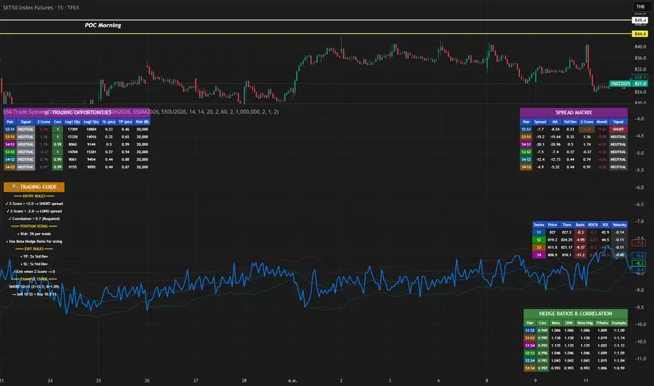
S50 Complete Hedge & Trade SystemTFEX:S501!
คู่มือการเทรด CALENDAR SPREAD
1. กลยุทธ์หลัก: MEAN REVERSION SPREAD TRADING
หลักการ:
- Spread ระหว่าง series จะมีค่าเฉลี่ย (Mean) และแกว่งไปมารอบๆ ค่าเฉลี่ยนี้
- เมื่อ Spread เบี่ยงเบนไปจาก Mean มากเกินไป จะกลับมาหาค่าเฉลี่ย (Mean Reversion)
2. INDICATORS ที่ใช้
A. Z-Score
Z-Score = (Spread ปัจจุบัน - Spread เฉลี่ย) / Standard Deviation
การตีความ:
- Z > +2.0 → Spread แพงเกินไป → SHORT spread
- Z < -2.0 → Spread ถูกเกินไป → LONG spread
- Z ≈ 0 → Spread อยู่ที่ค่าเฉลี่ย → EXIT
B. Correlation
Correlation > 0.9 = ดีมาก (เคลื่อนไหวพร้อมกัน 90%+)
Correlation > 0.7 = ดี (ใช้ได้)
Correlation < 0.7 = ไม่แนะนำ (Hedge ไม่มีประสิทธิภาพ)
C. Beta & Hedge Ratio
Beta = Cov(S1, S2) / Var(S2)→ บอกว่า S1 เคลื่อนไหวเท่าไหร่เมื่อ S2 เคลื่อนไหว 1 หน่วย
Hedge Ratio = Beta→ ใช้คำนวณจำนวน contract ที่ต้อง hedge
3. วิธีการเทรด SPREAD (ทีละขั้นตอน)
STEP 1: หาโอกาส
เงื่อนไข Entry:
1. |Z-Score| >= 2.0
2. Correlation > 0.7
3. Signal = "SHORT SPREAD" หรือ "LONG SPREAD"
STEP 2: คำนวณ Position Size
ตัวอย่าง:
- Account Size = 1,000,000 บาท
- Risk Per Trade = 2% = 20,000 บาท
- Spread Std Dev = 15 จุด
- Stop Loss = 1.0x Std Dev = 15 จุด
- S50 มูลค่า = 5 บาท/จุด
Position Size = Risk Amount / (SL Distance × Point Value)
= 20,000 / (15 × 5)
= 20,000 / 75
= 266 contracts (ปัดเป็น 26 สัญญา)
STEP 3: คำนวณ Hedge Ratio
สมมติ: Beta (S1:S2) = 1.05
ถ้าเทรด SHORT S2-S1 spread:
- Sell S2: 26 contracts
- Buy S1: 26 × 1.05 = 27.3 → ปัดเป็น 27 contracts
Portfolio Delta ≈ 0 (Market Neutral)
4. ตัวอย่างการเทรดจริง
SCENARIO A: SHORT SPREAD (Z-Score = +2.5)
สถานการณ์:
- S2-S1 Spread = 50 จุด
- Spread MA = 35 จุด
- Spread Std Dev = 6 จุด
- Z-Score = (50-35)/6 = +2.5 ⚠️ แพงเกินไป
- Correlation = 0.92 ✅
- Beta = 1.05
TRADE PLAN:
1. SELL S2: 10 contracts @ 1,200
2. BUY S1: 10 × 1.05 = 10.5 → 11 contracts @ 1,150
Initial Spread = 50 จุด
Take Profit (TP):
- Target Spread = MA = 35 จุด
- TP Distance = 50 - 35 = 15 จุด
- Profit = 15 × 5 = 75 บาท/spread
- Total Profit = 75 × 10 = 750 บาท
Stop Loss (SL):
- SL Spread = MA + (1.5 × Std Dev) = 35 + 9 = 44 จุด
- SL Distance = 50 - 44 = 6 จุด (ผิดพลาด - ควรเป็น 50 + 6 = 56)
- Loss = 6 × 5 × 10 = 300 บาท
Risk:Reward = 300:750 = 1:2.5
SCENARIO B: LONG SPREAD (Z-Score = -2.3)
สถานการณ์:
- S3-S2 Spread = 20 จุด
- Spread MA = 35 จุด
- Spread Std Dev = 6.5 จุด
- Z-Score = (20-35)/6.5 = -2.3 ⚠️ ถูกเกินไป
- Correlation = 0.88 ✅
- Beta = 1.03
TRADE PLAN:
1. BUY S3: 10 contracts @ 1,230
2. SELL S2: 10 × 1.03 = 10.3 → 10 contracts @ 1,210
Initial Spread = 20 จุด
Take Profit:
- Target Spread = 35 จุด
- Profit = (35-20) × 5 × 10 = 750 บาท
Stop Loss:
- SL Spread = MA - (1.5 × Std Dev) = 35 - 9.75 = 25.25 จุด
- SL = 20 - (20-25.25) = 14 จุด
- Loss = 6 × 5 × 10 = 300 บาท
5. RISK MANAGEMENT
A. Position Sizing Rules
1. อย่าเสี่ยงเกิน 2-3% ต่อการเทรด
2. ใช้ Beta Hedge Ratio เสมอ
3. ตรวจสอบ Margin requirement
B. Stop Loss Strategy
วิธีที่ 1: Fixed Std Dev
- SL = Entry ± (1.0-1.5x Std Dev)
วิธีที่ 2: ATR-based
- SL = Entry ± (1.5x ATR)
วิธีที่ 3: Time-based
- ปิดภายใน 3-5 วัน ถ้าไม่ได้กำไร
C. Take Profit Strategy
วิธีที่ 1: Target MA
- TP เมื่อ Spread กลับมาที่ MA
วิธีที่ 2: Partial Profit
- ปิด 50% เมื่อได้ 1x Std Dev
- ปิดอีก 50% เมื่อ Z-Score = 0
วิธีที่ 3: Trailing Stop
- Trailing SL = 0.5x Std Dev
6. สูตรคำนวณสำคัญ
1. Position Size
position_size = (account_size × risk_pct) / (sl_distance × point_value)
2. Hedge Contracts
hedge_contracts = position_size × beta
3. Profit/Loss Calculation
pnl = (exit_spread - entry_spread) × contracts × point_value
4. Risk:Reward Ratio
risk = sl_distance × contracts × point_value
reward = tp_distance × contracts × point_value
rr_ratio = reward / risk // ควร >= 2:1
5. Spread Value
spread_value = price_far - price_near
7. CHECKLIST ก่อนเทรด
☐ Z-Score >= ±2.0
☐ Correlation > 0.7
☐ Beta Hedge Ratio คำนวณแล้ว
☐ Position Size ไม่เกิน 2-3% risk
☐ TP/SL กำหนดชัดเจน
☐ Risk:Reward >= 2:1
☐ Margin เพียงพอ
☐ ตรวจสอบ Expiry Date ทั้ง 2 series
8. เทคนิคขั้นสูง
A. Calendar Roll Strategy
เมื่อ Near series ใกล้หมดอายุ:
1. ปิด Near leg
2. เปิด Next series leg ใหม่
3. รักษา Spread position ต่อไป
B. Butterfly Spread
ใช้ 3 series พร้อมกัน:
- Buy S1
- Sell 2×S2
- Buy S3
เหมาะกับตลาดไซด์เวย์
C. Dynamic Hedging
ปรับ Hedge Ratio ตาม:
- Beta ที่เปลี่ยนแปลง
- Volatility
- Time to Expiry
Critical Advanced Multi-Divergence Dashboard
Complete Dashboard Interpretation Guide
Dashboard Metrics Explained
1. Timeframe
What it shows: Current chart timeframe (15m, 1H, 4H, 1D, etc.)
How to interpret:
The script auto-detects your chart timeframe
Higher timeframes (4H, 1D) = more reliable signals but fewer trades
Lower timeframes (5m, 15m) = more signals but higher noise
Best practice: Use multiple timeframes - get signal on 1H, confirm on 15m for entry
2. Signal Bias: BULLISH / BEARISH / NEUTRAL
What it shows: Overall market direction based on divergence consensus
Color coding:
🟢 BULLISH (Green) = Net strength > +10 → Expect upward move
🔴 BEARISH (Red) = Net strength < -10 → Expect downward move
⚪ NEUTRAL (Gray) = Net strength between -10 to +10 → No clear direction
How to interpret:
BULLISH: Multiple bullish divergences detected → Look for LONG entries
BEARISH: Multiple bearish divergences detected → Look for SHORT entries
NEUTRAL: Conflicting signals or weak divergences → WAIT, don't trade
Trading Action:
BULLISH + Strength > 60 = Strong BUY signal
BEARISH + Strength > 60 = Strong SELL signal
NEUTRAL = Stay out, wait for clarity
3. Signal Strength: 0-100
What it shows: Quantified power of the divergence signal
Strength Scale:
🔴 0-30 (Red): Weak signal → Don't trade
🟠 31-60 (Orange): Moderate signal → Trade with caution, reduce position size
🟢 61-100 (Green): Strong signal → High confidence trade
Calculation factors:
Number of divergences detected
Volume confirmation (1.3x multiplier if high volume)
Trend filter (ADX reduces counter-trend signals by 40%)
Weighted scoring (volume-based indicators get 1.5x weight)
How to use:
Strength > 70 + ADX < 20 = Best reversal trades
Strength > 60 + Volume HIGH = Excellent entry
Strength < 40 = Skip the trade
Example Scenarios:
Strength = 85 → Take full position size
Strength = 55 → Take 50% position, tight stop loss
Strength = 25 → No trade, wait for better setup
4. Quality Score: 0-100
What it shows: Overall reliability and confidence rating
Components (max 100 points):
Divergence count (40 points): More indicators confirming = higher quality
Volume confirmation (20 points): High volume adds 20, normal adds 10
Trend alignment (20 points): Signal aligning with trend = 20, against trend but weak ADX = 15
Detection timing (20 points): Confirmed signals = 20, early detection = 15
Quality Tiers:
80-100: Excellent - High probability setup
60-79: Good - Tradeable with proper risk management
40-59: Fair - Only for experienced traders
Below 40: Poor - Avoid trading
How to use:
Quality > 75 + Strength > 60 = Grade A setup
Quality > 60 + Strength > 50 = Grade B setup (reduce size)
Quality < 50 = Don't trade regardless of strength
5. Bullish Divs: 3R/2H (Example)
What it shows: Count of bullish divergences detected
R = Regular divergences (price LL, indicator HL)
H = Hidden divergences (price HL, indicator LL)
Interpretation:
Regular divergences = Reversal signals (more important)
Hidden divergences = Continuation signals (trend confirmation)
Examples:
4R/1H → Strong bullish reversal expected
1R/3H → Bullish trend continuation likely
5R/0H → Very strong reversal setup
Trading Logic:
High R count = Look for trend reversal
High H count = Trend is strong, look for pullback entries
R+H both high = Very strong signal, major move expected
6. Bearish Divs: 2R/1H (Example)
Same logic as Bullish Divs but for downside:
2R/1H → Moderate bearish reversal setup
0R/4H → Strong downtrend continuation
4R/3H → Extremely strong bearish signal
7. ADX (Trend): 35
What it shows: Average Directional Index - measures trend strength
ADX Scale:
0-20: Weak or no trend → Range-bound market
20-25: Emerging trend → Early trend formation
25-50: Strong trend → Trend is established
50-75: Very strong trend → Major directional move
75+: Extremely strong trend → Parabolic move, be cautious
Color Coding:
🟠 Orange (ADX > threshold): Strong trending market
⚪ Gray (ADX < threshold): Weak trend/ranging
How to interpret:
ADX < 20 + BULLISH Signal = Best for reversal trades (range breakout)
ADX > 25 + BEARISH Signal = Counter-trend, risky (signal strength reduced 40%)
ADX > 40 + Signal against trend = Dangerous, skip
ADX < 20 + High Strength = Perfect reversal setup
Trading Examples:
ADX = 15, BULLISH strength 75 → Perfect buy at bottom
ADX = 45, BEARISH strength 60 → Caution: Market in strong uptrend, bearish signal gets discounted
ADX = 50, BULLISH strength 80 → Trend continuation: Pullback in uptrend, good long entry
8. Volume: HIGH / Normal
What it shows: Current volume vs 20-period moving average
Volume Status:
🟡 HIGH (Yellow): Volume > 1.5x average → Signal multiplied by 1.3x
⚪ Normal (Gray): Volume ≤ 1.5x average → Signal multiplied by 0.8x
Why it matters:
High volume = More participation = More reliable signal
Normal/low volume = Weak conviction = Less reliable
Trading Rules:
HIGH volume + Strong signal = Take trade immediately
Normal volume + Strong signal = Wait for volume confirmation
HIGH volume + Weak signal = Still tradable (volume validates)
Normal volume + Weak signal = Definitely skip
Example:
Strength 50 + HIGH volume → Effective strength = 65 (tradable)
Strength 50 + Normal volume → Effective strength = 40 (skip)
9. Volatility: 2.35%
What it shows: ATR (Average True Range) as percentage of price
Volatility Scale:
< 1%: Very low volatility → Tight ranges, breakout coming
1-2%: Normal volatility → Standard market conditions
2-3%: Elevated volatility → Bigger moves expected
> 3%: High volatility → Large swings, wider stops needed
How to use:
Low volatility (< 1%) = Tighten stops, smaller targets
Normal (1-2%) = Standard position sizing
High (> 3%) = Reduce position size, wider stops
Impact on trading:
High volatility → Script auto-adjusts pivot periods (better divergence detection)
Stop loss placement: Use ATR × 2 for stop distance
Position sizing: Reduce size in high volatility
10. Detection: EARLY / Confirmed
What it shows: Whether signal detected before or after pivot confirmation
Detection Modes:
🟡 EARLY (Yellow): Signal detected before pivot confirms → Earlier entry but slightly less reliable
🟢 Confirmed (Green): Signal after pivot confirmation → More reliable but later entry
Trade-off:
EARLY mode:
+ Enter 2-5 bars earlier
+ Better risk/reward ratio
- 10-15% more false signals
Confirmed mode:
+ Higher reliability
+ Better for conservative traders
- May miss 10-20% of move
How to use:
Aggressive traders: Use EARLY mode + higher quality threshold (>70)
Conservative traders: Use Confirmed mode + moderate quality (>60)
🎯 Complete Trading Decision Matrix
STRONG BUY Signal ✅
Signal Bias: BULLISH
Signal Strength: > 70
Quality Score: > 75
Bullish Divs: ≥ 3 (preferably high R count)
ADX: < 25 (weak trend/reversal) OR > 30 with DI+ > DI-
Volume: HIGH
Action: Enter LONG with full position
STRONG SELL Signal ✅
Signal Bias: BEARISH
Signal Strength: > 70
Quality Score: > 75
Bearish Divs: ≥ 3 (preferably high R count)
ADX: < 25 (weak trend/reversal) OR > 30 with DI- > DI+
Volume: HIGH
Action: Enter SHORT with full position
Moderate Trade ⚠️
Signal Strength: 50-70
Quality Score: 60-75
Volume: Normal
Action: Enter with 50% position size, tight stop loss
NO TRADE ❌
Signal Bias: NEUTRAL
Signal Strength: < 50
Quality Score: < 60
ADX: > 40 (signal against strong trend)
Volume: Normal + Strength < 50
Action: Stay out, wait for better setup
📊 Real Trading Examples
Example 1: Perfect Bullish Setup
Timeframe: 1H
Signal Bias: BULLISH 🟢
Signal Strength: 82/100 🟢
Quality Score: 88/100
Bullish Divs: 5R/2H (excellent)
Bearish Divs: 0R/0H
ADX: 18 (weak trend, perfect for reversal)
Volume: HIGH 🟡
Volatility: 1.8%
Detection: EARLY 🟡
INTERPRETATION: Grade A+ setup
- Strong bullish consensus (5 regular divergences)
- Low ADX = perfect reversal condition
- High volume confirms the signal
- Quality 88 = highly reliable
ACTION:
✅ Enter LONG immediately with full position
✅ Stop loss: 2 × ATR below entry (3.6%)
✅ Target: Previous swing high or 2:1 R/R
Example 2: Risky Counter-Trend Signal
Timeframe: 15m
Signal Bias: BEARISH 🔴
Signal Strength: 55/100 🟠
Quality Score: 62/100
Bearish Divs: 2R/1H
ADX: 45 (very strong uptrend)
Volume: Normal
Detection: EARLY
INTERPRETATION: Dangerous setup
- ADX 45 = strong uptrend in place
- Bearish signal is counter-trend
- Script already reduced strength by 40%
- Moderate quality, normal volume
ACTION:
❌ SKIP this trade
⏸️ Wait for ADX to drop below 25
⏸️ Or wait for bearish strength > 70 with HIGH volume
Example 3: Wait and Watch
Signal Bias: NEUTRAL ⚪
Signal Strength: 35/100 🔴
Quality Score: 48/100
Bullish Divs: 1R/1H
Bearish Divs: 1R/0H
ADX: 22
Volume: Normal
INTERPRETATION: Conflicting signals
- Both bullish and bearish divergences present
- Low strength and quality
- No clear direction
ACTION:
⏸️ Don't trade - wait for clarity
👀 Watch for one side to dominate
📊 Check higher timeframe for context
🎓 Pro Tips for Dashboard Reading
Check Multiple Timeframes:
Signal on 4H + confirmation on 1H = Best trades
Higher TF gives direction, lower TF gives entry
Volume is King:
Never ignore HIGH volume signals (even if strength is moderate)
Be extra cautious with normal volume + weak signals
ADX Context Matters:
ADX < 20 + Divergence = Reversal opportunity
ADX > 40 + Counter-trend divergence = Dangerous
Quality Over Strength:
Quality 80 + Strength 60 > Quality 50 + Strength 80
High quality ensures the signal is real, not noise
Regular vs Hidden Divergences:
High R count = Reversal expected (more important)
High H count = Continuation (use for re-entries)
Early Detection Trade-off:
Use EARLY for swing trading (better R/R)
Use Confirmed for day trading (higher accuracy)
⚡ Quick Decision Flowchart
Step 1: Check Signal Bias
├─ NEUTRAL? → ❌ Don't trade
└─ BULLISH/BEARISH? → Continue
Step 2: Check Signal Strength
├─ < 50? → ❌ Don't trade
├─ 50-60? → Reduce position 50%
└─ > 60? → Continue
Step 3: Check Quality Score
├─ < 60? → ❌ Don't trade
└─ ≥ 60? → Continue
Step 4: Check ADX
├─ > 40 AND counter-trend? → ❌ Don't trade
└─ < 40 OR with-trend? → Continue
Step 5: Check Volume
├─ HIGH → ✅ Take trade (boost confidence)
└─ Normal → Check if strength > 60, then ✅ trade
Step 6: Position Sizing
├─ Strength > 70 + Quality > 75 → 100% position
├─ Strength 60-70 + Quality 60-75 → 75% position
└─ Strength 50-60 + Quality 60-70 → 50% position
This dashboard gives you a complete edge in divergence trading by quantifying what was previously subjective! 🚀
Only for Educational purpose

XAUMO MegaBar VSA by Mohamed Mahmoud XAUMO MegaBar VSA — Smart Money Breakout & Reversal Engine for XAUUSD
(Educational Use Only)
1) WHAT THIS INDICATOR DOES
XAUMO MegaBar VSA is an institutional-style smart money engine for XAUUSD designed to show you what professional money is doing, not just where price is moving.
It combines:
- MegaBar detection on 1H and 15m
- VSA (Volume Spread Analysis) events
- VPOC / WVPOC and volume clusters
- Liquidity sweeps, CHoCH, order blocks, FVGs
- Full Fibonacci leg mapping (retracements + extensions)
- Pre-built execution ladders (Entry, SL, TP1–TP4, Reverse Fib trades)
All in one dashboard with:
- Color-coded candles
- Clean, ATR-offset labels
- Optional tables and debug panels
So traders can quickly decide:
“Is this move driven by smart money, or is it just noise?”
2) CORE MODULES & FEATURES
A) SESSION + ACCUMULATION / DISTRIBUTION CONTEXT
- Session filter: London, New York, Overlap, or custom.
- Accumulation / distribution zones shaded on chart with adjustable colors/opacity.
- Quick legend so you always know if the market is in “smart money accumulation” or “distribution”.
HOW TRADERS USE IT:
Focus only on your trading session and instantly see if volume is building (accumulation), unloading (distribution), or flat. This helps you avoid trading in dead liquidity.
--------------------------------------------------
B) MEGABAR ENGINE + FIB MAP
- Automatically detects “MegaBars” (institutional candles) on 15m and 1H.
- Uses body size, range, and volume to pick only meaningful bars.
- Builds a full Fibonacci map from each active MegaBar:
• Retracements: 0, 13, 23.6, 38.2, 50, 61.8, 78.6, 86.2, 100, and -33.
• Extensions: 125% up to 600%+ (configurable ladder).
- Per-level style controls:
• Color, width, line style (solid/dotted/dashed).
• Optional price labels with ATR-based offsets.
- Main Fib legend that explains shallow / normal / deep reload zones.
HOW TRADERS USE IT:
You stop guessing where to buy or sell. You trade around the institutional leg:
- Buy dips into defined reload zones after bullish MegaBars.
- Sell rallies into extension zones after bearish MegaBars.
- Use clean, pre-mapped structure for both scalps and swings.
--------------------------------------------------
C) VSA ENGINE + CANDLE LABELING
- Detects a full set of VSA events such as:
• No Demand / No Supply
• Stopping Volume
• Absorption
• Springs / Upthrusts
• Buying Climax / Selling Climax
• Bullish / Bearish EVR
• Tests and confirmed VSA signals at S/R
- Enhances with:
• Body vs total range analysis
• Wick dominance for exhaustion vs aggression
• Momentum and volume confirmation filters
HOW TRADERS USE IT:
Each label becomes a “comment” from smart money on the chart:
- “No Demand” near resistance + weak RVOL = skip long entries.
- “Stopping Volume” + spring at Fib reload zone + VPOC cluster = potential high-quality long.
- Combine VSA with the MegaBar Fib map and volume profile for structured decisions.
--------------------------------------------------
D) SUPERSONIC BREAKOUT ENGINE
- Calculates a breakout strength score using:
• RVOL and volume expansion
• Spread expansion vs recent bars
• Body quality (body vs range)
• Bar progress (how much of the candle’s time has elapsed)
- Differentiates:
• Potential vs confirmed breakouts
• Strong, volume-backed moves vs weak spikes
- Optional debug label explaining:
• Momentum score
• Volume ratio and RVOL
• Spread behaviour
• Body quality
• Bar elapsed %
HOW TRADERS USE IT:
You avoid chasing every big candle.
You only act when:
- Breakout strength is high,
- Volume confirms the move,
- Structure (Fib / VPOC / CHoCH) is aligned.
--------------------------------------------------
E) VPOC / WVPOC CLUSTERS & DYNAMIC ZONES
- Tracks real-time VPOC and WVPOC.
- Identifies VPOC/WVPOC clusters as powerful S/R zones.
- Confirms bullish or bearish breaks when price clears these levels with volume.
- Provides dynamic SL and TP logic:
• SL near/behind VPOC with ATR buffer.
• TP ladders aligned with volume structure.
HOW TRADERS USE IT:
You anchor your risk to where the most volume traded, not random price points:
- Use VPOC as a rational stop placement.
- Treat VPOC/WVPOC clusters as “coiled springs” – zones where large moves often start.
--------------------------------------------------
F) SMART MONEY ENTRY ENGINE (1H + 15M MEGABARS)
- Uses MTF `request.security` logic to bring 1H MegaBars into lower timeframes.
- Identifies:
• 1H + 15m confluence entries (A-grade setups).
• Single-TF entries (B-grade setups).
- Pre-calculates for each scenario:
• Entry level (Fib-based within the MegaBar range).
• Stop loss (beyond range or leg-based).
• TP1–TP4 along Fib extensions / structure.
- Labels show:
• “Entry = …”
• “SL = …”
• “TP1 = … / TP2 = … / TP3 = … / TP4 = …”
with adjustable font size and ATR-based offsets.
- Optional “show only latest” mode to keep your chart clean.
- Alert-ready so you can receive notifications when conditions are met.
HOW TRADERS USE IT:
You get a fully defined execution ladder:
- The engine tells you where a logical entry is,
- Where a logical SL should be,
- And how to scale out with multiple targets.
You can use:
- Confluence setups for main trades,
- Single-TF setups for more frequent but lower conviction trades.
--------------------------------------------------
G) REVERSE FIB TRADING MODULE
- Triggers after extended moves when key TPs are hit.
- Looks for:
• Rejection candles at or beyond major extensions.
• Exhaustion + VSA confirmation.
- Builds a reverse (counter-trend) Fib plan:
• Counter-trend entry from extension extremes.
• TP ladder based on 0.618, 0.786, 1.236, 1.382, 1.5, 1.618, 2.0, etc.
• SL and TSL based on ATR and Fib distance.
- ATR timeframe adapts to chart timeframe.
HOW TRADERS USE IT:
You can fade overextended moves once structure and P/A agree:
- Trend traders can use it to tighten or exit.
- Counter-trend traders can structure “fade” setups with defined risk.
--------------------------------------------------
H) LIQUIDITY SWEEPS, CHoCH, ORDER BLOCKS, FVGs
- Detects sweeps above highs and below lows (liquidity grabs).
- Marks CHoCH (Change of Character) when structure flips with volume.
- Basic smart money order block detection (bullish / bearish).
- FVGs (Fair Value Gaps) shaded on chart, removed when filled.
HOW TRADERS USE IT:
Combine sweeps + CHoCH + MegaBar + VSA + VPOC:
- Join clean, volume-backed continuations.
- Fade obvious stop hunts when they reject into strong zones.
--------------------------------------------------
I) VSA + BREAKOUT DASHBOARD TABLE (OPTIONAL)
- Compact table with:
• VSA context
• Breakout score
• RVOL / volume status
• Spread and candle quality
• ATR regime
• Close position within the bar
• VPOC and elapsed bar percentage
HOW TRADERS USE IT:
Before pressing the button, glance at the table:
- Is volatility supportive?
- Is volume confirming?
- Is this a clean breakout or a tired move?
This pushes you toward rule-based execution and away from impulse.
--------------------------------------------------
3) TYPICAL TRADING WORKFLOW WITH XAUMO MEGABAR VSA
A) Pick timeframe and session
- Use 15m or 1H on XAUUSD.
- Align the indicator’s session inputs with your actual trading hours.
B) Read context first
- Check accumulation / distribution zones.
- Look at VSA events and the breakout engine.
- Note where VPOC / WVPOC are relative to price.
C) Find the active MegaBar and its Fib structure
- Identify the most recent bull/bear MegaBar.
- See if price is:
• Pulling back into reload zones,
• Breaking out of them,
• Or extending into high-risk zones.
D) Wait for smart money confirmation
- Look for:
• Confluence setups (1H + 15m MegaBars),
• Strong breakout score,
• Valid VSA signals,
• Helpful structure: CHoCH, FVG, sweeps.
E) Execute using the printed ladders
- Use the on-chart Entry / SL / TP labels as your execution framework.
- Adjust lot size and risk % according to your own plan.
F) Manage and exit
- Use ATR / VPOC logic to trail or lock profits.
- Rotate to reverse Fib setups if extensions look exhausted.
4) WHO THIS INDICATOR IS FOR
- Gold traders (XAUUSD CFD or spot) on 15m and 1H.
- Traders who prefer institutional structure (volume, VPOC, SMC, Fib) over simple indicators.
- Traders who want pre-structured entries, SL, and TP ladders without losing flexibility.
- Advanced students of VSA and smart money concepts who want everything in one tool.
5) FULL EDUCATIONAL DISCLAIMER (READ CAREFULLY)
- This indicator and all descriptions are for EDUCATIONAL PURPOSES ONLY.
- NOTHING in this script, its labels, tables, alerts, outputs, or documentation is:
• Investment advice
• Trading advice
• A recommendation to buy or sell any asset
• A signal service or portfolio management tool
- Markets are risky. Trading leveraged instruments such as CFDs, futures, or margin products involves a HIGH RISK of loss, including the possible loss of ALL invested capital.
- Past performance, backtests, or hypothetical examples DO NOT guarantee future results.
- Any probabilities, scores, or “quality levels” shown by the indicator are purely algorithmic and DO NOT represent guarantees or promises of profit.
- You are solely responsible for:
• Your position sizing
• Your leverage
• Your entries, exits, and risk management
• Compliance with local regulations and tax rules
- Before trading live with real money, you should:
• Thoroughly backtest and forward-test the indicator.
• Use a demo account to understand how signals behave in real time.
• Consult a licensed financial professional if you need personalised investment or trading advice.
- By using this indicator:
• You accept that the author and any associated entities or brands (including XAUMO, XAUMO indicators, and any promotional text) bear NO LIABILITY for any financial losses, missed gains, or decisions you make based on this tool.
• You agree that you are acting entirely at your own risk and that all outputs are informational and educational, not prescriptive trading instructions.
In short:
Use XAUMO MegaBar VSA as a powerful educational and analytical companion,
NOT as a substitute for your own independent judgment, testing, and risk control.
=====================================================
XAUMO MegaBar VSA — محرّك البريك آوت و الريفرسال بتاع السمارت ماني للدهب
( استخدام تعليمي بس)
1) المؤشّر ده بيعمل إيه؟
XAUMO MegaBar VSA معمول مخصوص للـ XAUUSD عشان يورّيك "الفلوس الكبيرة" بتتحرك إزاي،
مش بس السِعر رايح فين.
بيجمع في حتّة واحدة:
- رصد MegaBar على الساعة والربع ساعة
- VSA (Volume Spread Analysis) – سلوك الفوليوم جوّه الشمعة
- VPOC / WVPOC و تجمّعات الفوليوم المهمّة
- سويپس لليكويديتي + CHoCH + Order Blocks + FVGs
- خريطة فيبوناتشي كاملة (Retrace + Extensions)
- سلالم تنفيذ جاهزة (Entry, SL, TP1–TP4 + صفقات Reverse Fib)
وكل ده:
- بألوان واضحة على الشموع
- لِيبلات متظبّطة بـ ATR Offset
- Tables و Panels اختيارية
عشان المتداول يسأل نفسه:
"الحركة دي بتاعة سمارت ماني؟ ولا مجرد دوشة ملوش لازمة؟"
2) أهم الموديولات اللي جوّه المؤشّر
A) الكونتكست بتاع السيشن + تجميع/توزيع
- فلتر جلسات: لندن – نيو يورك – overlap – أو وقت تحطّه انت.
- مناطق Accumulation / Distribution متظلّلة بألوان أنت بتختارها.
- لچند بسيط يوضّح لك السوق دلوقتي: تجميع؟ توزيع؟ ولا نايم.
المتداول يستخدمه إزاي؟
تركّز بس في الجلسة اللي انت شغّال فيها، وتشوف فورًا:
فيه بناء مراكز؟ فيه تصريف؟ ولا مفيش فوليوم أصلاً؟
ده يقلّل دخولك في أوقات السوق فيها “ميت”.
--------------------------------------------
B) محرّك الـ MegaBar + خريطة الفيبوناتشي
- المؤشّر يلقط لوحده الـ MegaBars (شموع مؤسّسات) على 15m و 1h.
- بيعتمد على: حجم الجسم، مدى الشمعة، الفوليوم.
- يرسم خريطة فيبوناتشي كاملة من الرجل الأساسية:
• Retrace: 0, 13, 23.6, 38.2, 50, 61.8, 78.6, 86.2, 100, -33
• Extensions: من 125% لحد 600%+ (سلم قابل للتعديل)
- لكل مستوى:
• لون / سماكة / ستايل (سوليد – دوتيد – داشد)
• ليبل سِعر مع Offset بـ ATR
- لچند يشرح لك Reload Zones: ضحلة / عادية / عميقة.
المتداول يستخدمه إزاي؟
بدل ما “تخمّن” فين تشتري وتبيع:
- تشتري الدِپ جوّه مناطق Reload بعد MegaBar صاعد.
- تبيع الريبوند جوّه Extensions بعد MegaBar هابط.
- عندك هيكل واضح للسوينج والسكالب من غير فوضى.
--------------------------------------------
C) VSA + لِيبلات على الشموع
- يكتشف أحداث VSA زي:
• No Demand / No Supply
• Stopping Volume
• Absorption
• Spring / Upthrust
• Buying / Selling Climax
• EVR (شموع مجنونة فوليومًا)
• Tests و Confirmed Signals عند الدعوم/المقاومات
- مع تحسينات:
• تحليل Body vs Range
• مين اللي غالب؟ جسم الشمعة ولا الذيول؟
• فلتر Momentum + Volume
المتداول يستخدمه إزاي؟
كل ليبل على الشمعة = كومنت من السمارت ماني:
- No Demand عند مقاومة + RVOL ضعيف → بلاش تشتري.
- Stopping Volume + Spring جوّه Reload Zone + VPOC → فرصة قوية للشراء.
- توصل بين VSA + Fib + VPOC فتفهم “مين بيكسب المعركة”.
--------------------------------------------
D) محرّك البريك آوت Supersonic
- بيحسب Score للقوة بتاعة البريك آوت من:
• RVOL + Volume Expansion
• توسّع السبريد مقارنة بالشموع السابقة
• جودة جسم الشمعة (جسم ولا ذيل)
• نسبة الوقت اللي عدّى من الشمعة الحالية
- يفرّق بين:
• بريك آوت محتمل vs مؤكد
• حركة قوية مدعومة بفوليوم vs “شمعة شو”
- يقدر يطلع ليبل Debug يشرح:
• Momentum Score
• Volume Ratio / RVOL
• Spread Behaviour
• Body Quality
• % الوقت اللي فات من عمر الشمعة
المتداول يستخدمه إزاي؟
ماتجريش ورا كل شمعة كبيرة:
- استنَى لما يكون الـ Score عالي،
- والفوليوم مصدّق الحركة،
- والهيكل (Fib / VPOC / CHoCH) موافق.
ساعتها بس البريك آوت يستاهل المخاطرة.
--------------------------------------------
E) VPOC / WVPOC + مناطق الفوليوم
- يرقب VPOC و WVPOC في الوقت الحقيقي.
- يحدّد Clusters مهمة تتحوّل لـ Support / Resistance محترم.
- يراقب كسر المناطق دي بفوليوم واضح (بداية موجة جديدة).
- SL و TP ديناميك:
• SL حوالين VPOC مع Buffer من ATR.
• TP متوزع على مستويات فيبوناتشي و زونات فوليوم.
المتداول يستخدمه إزاي؟
بتربط مخاطرتك بأين اشتغل الفوليوم التقيل:
- VPOC = منطق منطقي للستوب.
- Clusters = زون ضغط ينفع يبدأ منها ترند قوي.
--------------------------------------------
F) محرّك الدخول بتاع السمارت ماني (1h + 15m MegaBars)
- يجيب MegaBars بتاعة الساعة جوّه فريمات أقل بالـ `request.security`.
- يميّز:
• Confluence بين MegaBar الساعة + MegaBar الربع ساعة (صفقة A-Grade).
• MegaBar على فريم واحد بس (B-Grade).
- يجهّز تلقائيًا:
• Entry
• SL
• TP1–TP4 على Extensions و مستويات هيكلية.
- اللّيبلات تكتب:
• Entry = …
• SL = …
• TP1 = … / TP2 = … / TP3 = … / TP4 = …
مع تحكّم في حجم الخط و ATR Offset.
- فيه اختيار “أظهر آخر سيناريو بس” عشان الشارت يفضل نضيف.
- جاهز للـ Alerts لما الشروط تكمّل.
المتداول يستخدمه إزاي؟
يبقى عندك Execution Ladder كامل:
- فين تدخل،
- فين تحط الستوب،
- إزاي تقسم الخروج على أكتر من هدف.
--------------------------------------------
G) موديل الـ Reverse Fib (صفقات عكس الاتجاه)
- بيشتغل بعد ما السعر يبالغ في الحركة و يوصل Extensions معيّنة.
- يدور على:
• شموع رفض عند/بعد Extensions.
• Exhaustion + إشارة VSA.
- يرسم خطة عكسية:
• Entry عكسي من Extension Extreme.
• TP سلم مبني على 0.618, 0.786, 1.236, 1.382, 1.5, 1.618, 2.0, … إلخ
• SL و TSL مبنيين على ATR و مسافة الفيبوناتشي.
المتداول يستخدمه إزاي؟
لو انت ترند تريدر:
- تستخدمه عشان تقفل/تخفف عند تمدّد مبالغ فيه.
لو انت Counter-Trend:
- يديك سيناريو “فِيد” منطقي بمخاطرة محسوبة.
--------------------------------------------
H) سويپس لليكويديتي + CHoCH + Order Blocks + FVGs
- يوسم مناطق ضرب الستوبات فوق الهاي وتحت اللو (Liquidity Grabs).
- يحدد CHoCH لما الاتجاه يغيّر شخصيته مع فوليوم.
- يرصد Order Blocks أساسية (Bullish / Bearish).
- يظلّل الـ FVGs و يشيلها لما تتعبّى.
المتداول يستخدمه إزاي؟
تجمع بين:
MegaBar + VSA + Fib + VPOC + Liquidity:
- يا إمّا تلحق موجة نظيفة،
- يا إمّا تفِيد Stop Hunt غبي اتكشف على الشارت.
--------------------------------------------
I) داشبورد VSA + Breakout (Table اختياري)
- Table صغيرة فيها:
• حالة VSA
• قوة البريك آوت
• RVOL / Volume
• Spread & Candle Quality
• حالة ATR
• مكان الإغلاق جوّه الشمعة
• وضع VPOC
• نسبة الوقت اللي عدّى من الشمعة
المتداول يستخدمه إزاي؟
قبل ما تدوس Buy / Sell:
- تبص على التابل ثانيتين:
الدنيا شغّالة ولا لأ؟
فيه فوليوم؟ فيه ترند؟ ولا حركة ميتة؟
ده يقلل قرارات “من غير plan”.
3) سيناريو شغل متداول على XAUMO MegaBar VSA
1) اختار الفريم + الجلسة
- 15m أو 1h على XAUUSD.
- ظبّط سيشن لندن/نيويورك زي وقت شغلك الحقيقي.
2) اقرأ الكونتكست
- السوق بيبنِي مراكز؟ بيصفّي؟ ولا نايم؟
- إيه إشارات الـ VSA و Score البريك آوت؟
- فين VPOC / WVPOC من السعر؟
3) دور على MegaBar النشط و خريطة الفيبوناتشي بتاعته
- السعر:
• بيرجّع جوّه Reload Zone؟
• بيكسر البرنچ؟
• ولا داخل على Overextension؟
4) استنَى تأكيد السمارت ماني
- Confluence بين MegaBar الساعة والربع ساعة.
- Breakout Score محترم.
- VSA منطقي (No Demand, Stopping Volume, Spring, …).
- Structure: CHoCH / FVG / Liquidity Sweep في اتجاه الصفقة.
5) نفّذ باستخدام السلم المطبوع على الشارت
- استخدم Entry / SL / TP1–TP4 كـ هيكل أساسي.
- عدّل اللوت / الريسك حسب خطتك انت.
6) الإدارة والخروج
- استعمل ATR + VPOC في Trailing/Lock.
- لما Extensions تبان مبالغ فيها → ركّز على Reverse Fib.
4) المؤشّر ده مناسب لمين؟
- اللي بيتاجر دهب XAUUSD (CFD أو Spot) على 15m و 1h.
- اللي بيحب شغل مؤسّسات: Volume, VPOC, SMC, Fib مش مؤشرات بسيطة.
- اللي عايز Execution Plan جاهز (Entry/SL/TP) بس لسه عنده حريّة تعديل.
- اللي عايز يتعلّم VSA و Smart Money Concepts بشكل تطبيقي على شارت واحد.
5) إخلاء مسؤولية كامل (مهم تقراه)
- المؤشّر ده وكل الكلام اللي حواليه للتعليم بس.
- مش:
• نصيحة استثمارية،
• ولا توصية شراء/بيع،
• ولا خدمة إدارة محافظ،
• ولا سيجنال سيرڤس.
- التداول في الأسواق (خصوصًا المشتقات، الـ CFD، الفيوتشر) فيه مخاطرة عالية جدًا،
وممكن تخسر جزء كبير أو كل رأس مالك.
- أي أداء سابق، باك تست، أو مثال افتراضي → مش ضمان لنتيجة مستقبلية.
- أي نسبة احتمالات، Scores، أو “Quality” بيطلعها المؤشّر:
• دي حسابات كود، مش ضمان ربح،
• مش وعد ولا تعهّد بأي نتيجة.
- انت المسؤول 100% عن:
• حجم العقود اللي بتدخلها،
• الرافعة اللي بتستخدمها،
• أماكن الدخول والخروج،
• وإدارة المخاطرة بتاعتك،
• والتزامك بالقوانين والضرائب في بلدك.
- قبل ما تستخدم المؤشّر على حساب حقيقي:
• جرّب كويس على باك تست و فورورد تست،
• اشتغل فترة على Demo،
• لو محتاج نصيحة مالية شخصية → ارجع لمستشار مالي مرخَّص.
باختصار:
XAUMO MegaBar VSA ده أداة تعليمية وتحليلية قوية تساعدك تفهم حركة الذهب،
مش زرار “اطبع فلوس”.
انت صاحب القرار، وانت صاحب المسؤولية، وانت اللي بتتحمّل أي ربح أو خسارة.

Risk Management Console Pro by ShogunRisk Management Console Pro - Professional Trading Analytics
⚠️ CRITICAL LIQUIDATION DISCLAIMER ⚠️
The liquidation price calculated by this indicator is an approximation based on MEXC perpetual futures methodology and serves as a guide only. This level represents a catastrophic threshold and should never be approached in live trading. Actual liquidation prices vary by exchange, position size, market conditions, and fee structures. It is the trader's sole responsibility to diligently monitor risk exposure, maintain adequate margin buffers, and manage positions appropriately. This tool does not replace proper risk management protocols or real-time exchange data.
---
Overview
The Risk Management Console Pro is institutional-grade risk architecture I've built for futures traders who need precision capital deployment and surgical risk management. After a decade working across institutional finance and fintech, I developed this tool to bridge the gap between professional trading desks and retail execution.
Core Functionality
When you load the indicator, it prompts you to set three critical price anchors using a simple drag-and-drop interface: Entry Price, Stop Loss, and Take Profit. The system calculates an approximate liquidation threshold using MEXC perpetual futures methodology, so you can visualize your catastrophic risk boundary. All levels appear as horizontal reference lines with visual labels - a much cleaner approach than standard long/short tools.
The console automatically detects whether you're going long or short based on where your entry sits relative to your take profit. No manual configuration needed. The liquidation calculations adapt correctly for both directions.
Capital Allocation Framework
You configure two key parameters:
- Maintenance Margin (default $1,000 USD) - the collateral required to open and maintain your leveraged position
- Leverage (default 50x) - your position multiplier that determines capital efficiency and risk exposure
These inputs drive all the real-time calculations, letting you model position sizing with institutional precision before you commit capital.
Dashboard Analytics
The on-chart console displays comprehensive trade metrics in a clean, modern interface built for quick decision-making:
- Position Architecture: Margin, Leverage, Position Size, Quantity
- Risk/Reward Ratio: Real-time R:R calculation showing your trade asymmetry
- Price Levels: Entry, Stop Loss, Take Profit, Liquidation (color-coded as blue/red/green/orange)
- Live Performance: Unrealized P/L updating tick-by-tick with percentage of margin exposure (green for profit, red for loss)
- Projected Outcomes: Maximum loss and profit potential with margin-relative percentages
Display Customization
You have full control over visual elements through Display Settings:
- Toggle horizontal price lines
- Show/hide price level labels
- Toggle dashboard visibility
- Adjust table position (6 locations available)
- Modify color scheme (title, data, text, accent colors)
Professional Design
I went with an institutional dark theme using a slate/charcoal palette. The interface delivers Wall Street-caliber aesthetics with functional clarity. Every element is built for traders operating in high-stakes environments where milliseconds and basis points matter. The dashboard footer carries the Kaizen Systems signature, representing our commitment to continuous improvement in trading methodology.
Key Features Summary
- Automatic long/short detection
- MEXC-based liquidation calculation
- Real-time unrealized P/L tracking
- Draggable price level inputs
- Color-coded risk visualization
- Institutional-grade interface
- Fully customizable display options
- Position size optimization
- R:R ratio analysis
Risk Management Philosophy
This tool embodies a principle I've learned over the years: professional traders quantify risk before entering positions. By visualizing entry, exit, and catastrophic thresholds simultaneously, the Risk Management Console Pro enforces disciplined capital allocation and eliminates emotional decision-making during live market conditions.
Intended Use
I designed this for futures traders using leverage on perpetual contracts, particularly those trading on MEXC or similar platforms. It's ideal for intraday scalpers, swing traders, and position traders who need precise risk calculations across varying timeframes. The console transforms abstract concepts like "position sizing" and "risk/reward" into tangible, actionable data.
About Me
I'm Shogun, and I've spent the last decade deep in quantitative analysis, algorithmic strategy development, and institutional trading operations. As Founding Director of Kaizen Systems - a fintech platform I built to democratize institutional-grade tools for retail traders - I've created multiple proprietary indicators including the Katana strategy series. My focus is translating complex quantitative frameworks into accessible, actionable tools that empower traders at every level to execute with professional discipline.
The Risk Management Console Pro represents my commitment to elevating retail trading standards by providing the same caliber of risk analytics used by professional trading desks. Through continuous refinement and trader feedback, Kaizen Systems delivers tools that merge technical sophistication with practical usability.
Technical Notes
- Compatible with all timeframes and instruments
- Lightweight execution with minimal CPU overhead
- Updates in real-time on every tick
- No repainting or future data leakage
- Pure Pine Script v5 implementation
Support and Updates
For questions, feature requests, or trading strategy consultation, connect with me through TradingView messaging or visit Kaizen Systems for comprehensive trading resources and community support.
---
© 2025 Shogun for Kaizen Systems | All Rights Reserved
Trade responsibly. Past performance does not guarantee future results. Leverage amplifies both gains and losses.

TMT EMA Bundle - Hitesh NimjeTMT EMA Bundle - Multi Timeframe EMA Indicator
Created by: Hitesh Nimje | Contact: 8087192915
Overview
The TMT EMA Bundle is a comprehensive multi-EMA indicator designed for traders who rely on multiple exponential moving averages for trend analysis and trading decisions. This powerful tool displays 10 essential EMAs on your chart, providing complete visibility of short, medium, and long-term trends.
Key Features
🔹 10 Essential EMAs Included:
• EMA 9 (Blue) - Ultra Short-term trend
• EMA 11 (Red) - Short-term momentum
• EMA 15 (Yellow) - Quick trend changes
• EMA 21 (Black) - Swing trading reference
• EMA 50 (Gray) - Medium-term bias
• EMA 51 (Orange) - Alternative medium-term
• EMA 55 (Brown) - Extended medium-term
• EMA 100 (Purple) - Long-term trend
• EMA 200 (Maroon) - Major support/resistance
• EMA 400 (Green) - Primary trend direction
🔹 Customizable Settings
• Source selection for each EMA (Open, High, Low, Close, HL2, HLC3, OHLC4)
• Independent length adjustment for each moving average
• Color-coded lines for easy identification
🔹 Professional Features
• Clean, overlay display on price charts
• Optimized performance with max limits set
• Compatible with all timeframes
• Works on all instruments (Forex, Stocks, Crypto, Commodities)
How to Use
1. Trend Identification: All EMAs aligned = Strong trend
2. Support/Resistance: EMAs act as dynamic support/resistance levels
3. Entry Signals: Price reactions at key EMAs
4. Trend Confirmation: EMA crossovers indicate potential trend changes
5. Risk Management: Use EMAs for stop-loss placement
Best Practices
• Use higher timeframes (1H, 4H, Daily) for clearer signals
• Combine with price action and volume analysis
• Watch for EMA clusters and divergences
• Consider trend strength by EMA separation
Perfect For
✓ Swing Traders
✓ Day Traders
✓ Trend Followers
✓ Scalpers (shorter timeframes)
✓ Position Traders
Technical Specifications
• Version: Pine Script v6
• Overlay: Yes
• Multi-timeframe compatible
• No repainting
• Lightweight and efficient
This indicator is part of the Thought Magic Trading collection, designed to provide professional-grade technical analysis tools for serious traders.
Happy Trading! 📈
TRADING DISCLAIMER
RISK WARNING
Trading involves substantial risk of loss and is not suitable for all investors. Past performance is not indicative of future results. You should carefully consider whether trading is suitable for you in light of your circumstances, knowledge, and financial resources.
NO FINANCIAL ADVICE
This indicator is provided for educational and informational purposes only. It does not constitute:
* Financial advice or investment recommendations
* Buy/sell signals or trading signals
* Professional investment advice
* Legal, tax, or accounting guidance
LIMITATIONS AND DISCLAIMERS
Technical Analysis Limitations
* Pivot points are mathematical calculations based on historical price data
* No guarantee of accuracy of price levels or calculations
* Markets can and do behave irrationally for extended periods
* Past performance does not guarantee future results
* Technical analysis should be used in conjunction with fundamental analysis
Data and Calculation Disclaimers
* Calculations are based on available price data at the time of calculation
* Data quality and availability may affect accuracy
* Pivot levels may differ when calculated on different timeframes
* Gaps and irregular market conditions may cause level failures
* Extended hours trading may affect intraday pivot calculations
Market Risks
* Extreme market volatility can invalidate all technical levels
* News events, economic announcements, and market manipulation can cause gaps
* Liquidity issues may prevent execution at calculated levels
* Currency fluctuations, inflation, and interest rate changes affect all levels
* Black swan events and market crashes cannot be predicted by technical analysis
USER RESPONSIBILITIES
Due Diligence
* You are solely responsible for your trading decisions
* Conduct your own research before using this indicator
* Verify calculations with multiple sources before trading
* Consider multiple timeframes and confirm levels with other technical tools
* Never rely solely on one indicator for trading decisions
Risk Management
* Always use proper risk management and position sizing
* Set appropriate stop-losses for all positions
* Never risk more than you can afford to lose
* Consider the inherent risks of leverage and margin trading
* Diversify your portfolio and trading strategies
Professional Consultation
* Consult with qualified financial advisors before trading
* Consider your tax obligations and legal requirements
* Understand the regulations in your jurisdiction
* Seek professional advice for complex trading strategies
LIMITATION OF LIABILITY
Indemnification
The creator and distributor of this indicator shall not be liable for:
* Any trading losses, whether direct or indirect
* Inaccurate or delayed price data
* System failures or technical malfunctions
* Loss of data or profits
* Interruption of service or connectivity issues
No Warranty
This indicator is provided "as is" without warranties of any kind:
* No guarantee of accuracy or completeness
* No warranty of uninterrupted or error-free operation
* No warranty of merchantability or fitness for a particular purpose
* The software may contain bugs or errors
Maximum Liability
In no event shall the liability exceed the purchase price (if any) paid for this indicator. This limitation applies regardless of the theory of liability, whether contract, tort, negligence, or otherwise.
REGULATORY COMPLIANCE
Jurisdiction-Specific Risks
* Regulations vary by country and region
* Some jurisdictions prohibit or restrict certain trading strategies
* Tax implications differ based on your location and trading frequency
* Commodity futures and options trading may have additional requirements
* Currency trading may be regulated differently than stock trading
Professional Trading
* If you are a professional trader, ensure compliance with all applicable regulations
* Adhere to fiduciary duties and best execution requirements
* Maintain required records and reporting
* Follow market abuse regulations and insider trading laws
TECHNICAL SPECIFICATIONS
Data Sources
* Calculations based on TradingView data feeds
* Data accuracy depends on broker and exchange reporting
* Historical data may be subject to adjustments and corrections
* Real-time data may have delays depending on data providers
Software Limitations
* Internet connectivity required for proper operation
* Software updates may change calculations or functionality
* TradingView platform dependencies may affect performance
* Third-party integrations may introduce additional risks
MONEY MANAGEMENT RECOMMENDATIONS
Conservative Approach
* Risk only 1-2% of capital per trade
* Use position sizing based on volatility
* Maintain adequate cash reserves
* Avoid over-leveraging accounts
Portfolio Management
* Diversify across multiple strategies
* Don't put all capital into one approach
* Regularly review and adjust trading strategies
* Maintain detailed trading records
FINAL LEGAL NOTICES
Acceptance of Terms
* By using this indicator, you acknowledge that you have read and understood this disclaimer
* You agree to assume all risks associated with trading
* You confirm that you are legally permitted to trade in your jurisdiction
Updates and Changes
* This disclaimer may be updated without notice
* Continued use constitutes acceptance of any changes
* It is your responsibility to stay informed of updates
Governing Law
* This disclaimer shall be governed by the laws of the jurisdiction where the indicator was created
* Any disputes shall be resolved in the appropriate courts
* Severability clause: If any part of this disclaimer is invalid, the remainder remains enforceable
REMEMBER: THERE ARE NO GUARANTEES IN TRADING. THE MAJORITY OF RETAIL TRADERS LOSE MONEY. TRADE AT YOUR OWN RISK.
Contact Information:
* Creator: Hitesh_Nimje
* Phone: Contact@8087192915
* Source: Thought Magic Trading
© HiteshNimje - All Rights Reserved
This disclaimer should be prominently displayed whenever the indicator is shared, sold, or distributed to ensure users are fully aware of the risks and limitations involved in trading.

TMT Sessions - Hitesh NimjeTMT Sessions - Hitesh Nimje Indicator
Overview
The TMT Sessions indicator is a comprehensive trading tool designed to visualize and analyze the four major global trading sessions. It provides session-based technical analysis including ranges, trends, averages, and statistical metrics for each trading session.
Key Features
Four Global Trading Sessions
1. Session A - New York (13:00-22:00 UTC)
Color: Blue (#0000FF)
Default timeframe: US/Eastern market hours
2. Session B - London (07:00-16:00 UTC)
Color: Black (#000000)
Default timeframe: European market hours
3. Session C - Tokyo (00:00-09:00 UTC)
Color: Red (#FF0000)
Default timeframe: Asian market hours
4. Session D - Sydney (21:00-06:00 UTC)
Color: Orange (#FFA500)
Default timeframe: Australian market hours
Technical Analysis Tools
Range Analysis:
* Visual range boxes showing session high/low boundaries
* Transparent background areas with configurable transparency
* Range outline borders
* Session labels with customizable text display
Trend Analysis:
* Linear regression trendlines for each session
* Statistical metrics including:
R-squared values for trend strength
Standard deviation calculations
Correlation measurements
Statistical Indicators:
* Session Averages: Simple Moving Averages (SMA) calculated within each session
* VWAP: Volume Weighted Average Price for session-based intraday analysis
* Max/Min Lines: Highest and lowest prices recorded during each session
Visual Elements
Session Dividers:
* Visual markers showing session start/end points
* Session identification symbols (NYE, LDN, TYO, SYD)
* Configurable divider display options
Dashboard Features:
* Basic Dashboard: Session status (Active/Inactive) with color-coded indicators
* Advanced Dashboard: Additional metrics including:
Session trend strength (R-squared values)
Volume data
Standard deviation statistics
* Multiple dashboard positions (Top Right, Bottom Right, Bottom Left)
* Configurable text sizes (Tiny, Small, Normal)
Customization Options
Timezone Management:
* UTC offset adjustment (+/- hours)
* Exchange timezone option for automatic adjustment
* Session time customization
Display Settings:
* Individual session enable/disable
* Color customization for each session
* Range area transparency control
* Line description display toggle
* Session text label configuration
Use Cases
1. Session-Based Trading: Identify optimal trading times for each global session
2. Range Trading: Use session ranges as support/resistance levels
3. Trend Analysis: Track session-specific trends and momentum
4. Statistical Analysis: Monitor session volatility and trend strength
5. Market Structure: Understand how price moves across different trading sessions
Technical Specifications
* Pine Script Version: 6
* Overlays: True (displays on price chart)
* Performance: Optimized for up to 500 bars back
* Multi-element Support: Handles up to 500 lines, boxes, and labels
* Data Source: Compatible with all trading instruments and timeframes
Benefits for Traders
1. Global Market Awareness: Visual representation of all major trading sessions
2. Session Analysis: Automated calculation of key session statistics
3. Trading Strategy Development: Session-based entry and exit signals
4. Risk Management: Session ranges for stop-loss and take-profit levels
5. Market Timing: Optimal trading session identification
This indicator is particularly valuable for forex traders, day traders, and anyone who needs to understand price behavior across different global market sessions. It combines multiple technical analysis concepts into a unified, session-focused trading tool.
TRADING DISCLAIMER
RISK WARNING
Trading involves substantial risk of loss and is not suitable for all investors. Past performance is not indicative of future results. You should carefully consider whether trading is suitable for you in light of your circumstances, knowledge, and financial resources.
NO FINANCIAL ADVICE
This indicator is provided for educational and informational purposes only. It does not constitute:
* Financial advice or investment recommendations
* Buy/sell signals or trading signals
* Professional investment advice
* Legal, tax, or accounting guidance
LIMITATIONS AND DISCLAIMERS
Technical Analysis Limitations
* Pivot points are mathematical calculations based on historical price data
* No guarantee of accuracy of price levels or calculations
* Markets can and do behave irrationally for extended periods
* Past performance does not guarantee future results
* Technical analysis should be used in conjunction with fundamental analysis
Data and Calculation Disclaimers
* Calculations are based on available price data at the time of calculation
* Data quality and availability may affect accuracy
* Pivot levels may differ when calculated on different timeframes
* Gaps and irregular market conditions may cause level failures
* Extended hours trading may affect intraday pivot calculations
Market Risks
* Extreme market volatility can invalidate all technical levels
* News events, economic announcements, and market manipulation can cause gaps
* Liquidity issues may prevent execution at calculated levels
* Currency fluctuations, inflation, and interest rate changes affect all levels
* Black swan events and market crashes cannot be predicted by technical analysis
USER RESPONSIBILITIES
Due Diligence
* You are solely responsible for your trading decisions
* Conduct your own research before using this indicator
* Verify calculations with multiple sources before trading
* Consider multiple timeframes and confirm levels with other technical tools
* Never rely solely on one indicator for trading decisions
Risk Management
* Always use proper risk management and position sizing
* Set appropriate stop-losses for all positions
* Never risk more than you can afford to lose
* Consider the inherent risks of leverage and margin trading
* Diversify your portfolio and trading strategies
Professional Consultation
* Consult with qualified financial advisors before trading
* Consider your tax obligations and legal requirements
* Understand the regulations in your jurisdiction
* Seek professional advice for complex trading strategies
LIMITATION OF LIABILITY
Indemnification
The creator and distributor of this indicator shall not be liable for:
* Any trading losses, whether direct or indirect
* Inaccurate or delayed price data
* System failures or technical malfunctions
* Loss of data or profits
* Interruption of service or connectivity issues
No Warranty
This indicator is provided "as is" without warranties of any kind:
* No guarantee of accuracy or completeness
* No warranty of uninterrupted or error-free operation
* No warranty of merchantability or fitness for a particular purpose
* The software may contain bugs or errors
Maximum Liability
In no event shall the liability exceed the purchase price (if any) paid for this indicator. This limitation applies regardless of the theory of liability, whether contract, tort, negligence, or otherwise.
REGULATORY COMPLIANCE
Jurisdiction-Specific Risks
* Regulations vary by country and region
* Some jurisdictions prohibit or restrict certain trading strategies
* Tax implications differ based on your location and trading frequency
* Commodity futures and options trading may have additional requirements
* Currency trading may be regulated differently than stock trading
Professional Trading
* If you are a professional trader, ensure compliance with all applicable regulations
* Adhere to fiduciary duties and best execution requirements
* Maintain required records and reporting
* Follow market abuse regulations and insider trading laws
TECHNICAL SPECIFICATIONS
Data Sources
* Calculations based on TradingView data feeds
* Data accuracy depends on broker and exchange reporting
* Historical data may be subject to adjustments and corrections
* Real-time data may have delays depending on data providers
Software Limitations
* Internet connectivity required for proper operation
* Software updates may change calculations or functionality
* TradingView platform dependencies may affect performance
* Third-party integrations may introduce additional risks
MONEY MANAGEMENT RECOMMENDATIONS
Conservative Approach
* Risk only 1-2% of capital per trade
* Use position sizing based on volatility
* Maintain adequate cash reserves
* Avoid over-leveraging accounts
Portfolio Management
* Diversify across multiple strategies
* Don't put all capital into one approach
* Regularly review and adjust trading strategies
* Maintain detailed trading records
FINAL LEGAL NOTICES
Acceptance of Terms
* By using this indicator, you acknowledge that you have read and understood this disclaimer
* You agree to assume all risks associated with trading
* You confirm that you are legally permitted to trade in your jurisdiction
Updates and Changes
* This disclaimer may be updated without notice
* Continued use constitutes acceptance of any changes
* It is your responsibility to stay informed of updates
Governing Law
* This disclaimer shall be governed by the laws of the jurisdiction where the indicator was created
* Any disputes shall be resolved in the appropriate courts
* Severability clause: If any part of this disclaimer is invalid, the remainder remains enforceable
REMEMBER: THERE ARE NO GUARANTEES IN TRADING. THE MAJORITY OF RETAIL TRADERS LOSE MONEY. TRADE AT YOUR OWN RISK.
Contact Information:
* Creator: Hitesh_Nimje
* Phone: Contact@8087192915
* Source: Thought Magic Trading
© HiteshNimje - All Rights Reserved
This disclaimer should be prominently displayed whenever the indicator is shared, sold, or distributed to ensure users are fully aware of the risks and limitations involved in trading.

Position Sizing Calculator (Real-Time) - Futures Edition█ SUMMARY
The following indicator is a Position Sizing Calculator based on Average True Range (ATR), originally developed by market technician J. Welles Wilder Jr., intended for real-time trading.
This script utilizes the user's account size, acceptable risk percentage, and a stop-loss distance based on ATR to dynamically calculate the appropriate position size for each trade in real time.
█ BACKGROUND
Developed for use on the Micro E-mini Nasdaq-100 futures (MNQ), this script provides traders with continuously updated dynamic position sizes. It enables traders to instantly determine the exact number of contracts to use when entering a trade while staying within their acceptable risk tolerance.
This real-time position sizing tool helps traders make well-informed decisions when planning trade entries and calculating maximum stop-loss levels, ultimately enhancing risk management.
█ USER INPUTS
Trading Account Size: Total dollar value of the user's trading account.
Acceptable Risk (%): Maximum percentage of the trading account that the user is willing to risk per trade.
ATR Multiplier for Stop-Loss: Multiplier used to determine the distance of the stop-loss from the current price, based on the ATR value.
ATR Length: The length of the lookback period used to calculate the ATR value.
Show Target Risk Row: Toggle to hide/show the Target Risk Row
SL Levels Display: Option to see Both, Long Only, Short Only, or None of the Stop Loss Level Values.
Contract Point Value ($): Point value per contract. Tooltip highlights common values.
Tick Size: Minimum Price Movement (Default set to 0.25)
Minimum Contracts: Override the Minimum Contracts per trade to a user selected value.
(May Exceed User's Target Risk)

Universal Scalper Indicator [Crypto/Forex/Gold]Universal Scalper Pro is an all-in-one scalping system designed for the 15-Minute Timeframe. It automates the analysis of trend, volatility, and risk management into a single, high-contrast dashboard.
Unlike standard crossover indicators, this system filters out low-volatility "noise" using a built-in ADX engine and automatically calculates dynamic Stop Loss and Take Profit levels based on market volatility (ATR).
It is engineered to work universally on:
Crypto (BTC, ETH, SOL, Altcoins)
Commodities (Gold, Silver, Oil)
Forex (Major & Minor Pairs)
Stocks (High volume tech stocks like NVDA, TSLA)
📈 How It Works (The Strategy)
1. The Trend Engine (9/21 EMA) The core logic utilizes a Fast (9) and Slow (21) Exponential Moving Average crossover.
Bullish Signal: The 9 EMA crosses above the 21 EMA.
Bearish Signal: The 9 EMA crosses below the 21 EMA. This specific combination is chosen for its responsiveness to 15-minute intraday trends.
2. The Noise Filter (ADX > 15) To prevent "whipsaws" (fake signals during sideways markets), the script includes a Volatility Filter based on the Average Directional Index (ADX).
Signals are rejected if the ADX is below 15.
This ensures you only receive alerts when there is sufficient momentum to sustain a move.
3. Dynamic Risk Management (ATR) The script uses the Average True Range (ATR) to calculate Stop Loss and Take Profit levels that adapt to the specific asset's volatility.
Stop Loss: Placed at 1.5x ATR from the entry. (Tight enough to preserve capital, wide enough to survive standard market noise).
Take Profit: Placed at 2.0x ATR from the entry. (Provides a healthy 1:1.3 Risk/Reward ratio).
🚀 Key Features
Universal Dashboard: A bottom-right panel displays the live Trend Status, Entry Price, Stop Loss, and Take Profit. It automatically formats decimals for any asset (e.g., 2 decimals for Gold, 5 for Forex, 8 for Crypto).
"Sticky" Memory: The dashboard retains the prices of the last valid signal, allowing you to manage your trade even after the signal candle closes.
Trend Cloud: A visual Green/Red zone between the EMAs helps you instantly identify the market bias.
Unified Alerts: A single alert setup ("Any alert() function call") sends the Asset Name, Entry, SL, and TP directly to your phone.
🛠️ How to Use
Timeframe: Set your chart to 15 Minutes (15m).
Wait for the Signal: Look for the "BUY" (Green) or "SELL" (Red) label on the chart.
Check the Dashboard: Ensure the "STATUS" is BULLISH (for buys) or BEARISH (for sells). If the status says "WAIT", do not trade.
Execute: Enter the trade using the exact Stop Loss and Take Profit levels shown on the dashboard.
⚠️ Risk Disclaimer
Trading financial markets involves high risk and may not be suitable for all investors. This indicator is a technical analysis tool and does not constitute financial advice. Past performance is not indicative of future results. Always practice with a demo account before trading real capital.

MTF Checklist DashboardMTF Checklist Dashboard
Overview
The MTF Checklist Dashboard is an advanced multi-timeframe analysis tool that provides traders with a comprehensive visual dashboard to analyze market conditions across six customizable timeframes simultaneously. This indicator combines multiple technical analysis methods, including Opening Range Breakouts (ORB), VWAP, EMAs, and daily price levels, to generate high-probability confluence-based trading signals.
Unlike traditional single-timeframe indicators, this dashboard displays all critical information in one organized table, allowing traders to instantly identify when multiple timeframes align for optimal entry and exit opportunities.
Key Features
Multi-Timeframe Analysis
Analyzes up to 6 timeframes simultaneously (default: 1m, 5m, 15m, 30m, 1h, 4h)
Fully customizable timeframe selection via comma-separated input
Color-coded cells for instant visual recognition (green=bullish, red=bearish, yellow=neutral)
Technical Indicators Tracked
Current and previous candle direction
Opening Range Breakout (ORB) positioning with custom period
VWAP relationship (above/below)
200 EMA positioning
Daily and previous day high/low proximity
EMA crossovers (9 vs 21, both vs 200)
Advanced Signal Filtering System
Confluence scoring: Requires multiple timeframes to align (3-6 timeframes)
Higher timeframe confirmation: Ensures 30m/1h/4h agreement
Volume filter: Confirms signals with above-average volume (1.5x default)
ATR volatility filter: Validates sufficient market movement
Session timing: Restricts signals to optimal trading hours (EST)
Momentum confirmation: Requires recent directional strength
Range positioning: Blocks signals near daily extremes
Candle strength: Validates strong directional candles (60%+ body ratio)
Visual Signals
Optional entry arrows (above/below bars)
Background color highlighting
Organized dashboard with real-time price levels
ORB range, current day, and previous day summary rows
Alert Conditions
JSON-formatted alerts for automated trading integration
Separate alerts for long entry, short entry, long exit, and short exit
Compatible with webhook automation systems
How To Use
Dashboard Interpretation
The dashboard displays a color-coded table with the following columns:
TF: Timeframe being analyzed
C: Current candle (Green=bullish, Red=bearish)
P: Previous candle (Green=bullish, Red=bearish)
ORB: Opening Range Breakout position (A=Above, B=Below, W=Within)
VWAP: Price vs VWAP (A=Above, B=Below)
E200: Price vs 200 EMA (A=Above, B=Below)
D Hi/Lo: Proximity to current day high/low (Hi/Lo/Mid)
PD Hi/Lo: Proximity to previous day high/low (Hi/Lo/Mid)
9 vs 21: EMA 9 vs EMA 21 relationship (A=9 above 21, B=9 below 21)
9&21 v200: Both EMAs vs 200 EMA (>>=both above, <<=both below, <>=mixed)
Signal Generation
Long Entry Signal triggers when:
Minimum number of timeframes show bullish alignment (default: 5 of 6)
Higher timeframes (30m/1h/4h) confirm direction (default: 2 of 3)
Price breaks above ORB high with sufficient distance
Volume exceeds average by specified multiplier
ATR shows adequate volatility
Trade occurs during optimal session hours
Recent momentum is upward
Price not too close to daily high
Strong bullish candle forms
Short Entry Signal uses opposite conditions
Exit Signals trigger when opposing timeframe confluence reaches threshold (default: 3 timeframes)
Recommended Workflow
Select your asset and primary trading timeframe
Observe the dashboard - Look for rows showing mostly green (bullish) or red (bearish)
Wait for alignment - The indicator will show arrows when confluence requirements are met
Check the bottom rows - Review ORB levels and daily ranges for context
Set alerts - Enable TradingView alerts using the built-in alert conditions
Manage risk - Use appropriate position sizing and stop losses based on ORB range or daily ATR
Settings Guide
Basic Settings
Timeframes: Enter comma-separated values (e.g., "1,5,15,30,60,240")
Show Header: Toggle column headers on/off
ORB Minutes: Set opening range period (default: 15 minutes)
Near % for daily highs/lows: Define proximity threshold (default: 0.20%)
Use close for comparisons: Compare using close vs current price
Dashboard Position: Choose from 9 screen positions
Confluence Filters
Minimum Timeframes Aligned: Set required confluence (3-6, default: 5)
Require Higher Timeframe Confirmation: Toggle HTF requirement on/off
Min Higher Timeframes: Specify HTF agreement needed (1-3, default: 2)
Volume Filter
Volume Confirmation: Enable/disable volume filtering
Volume vs Average: Set multiplier threshold (default: 1.5x)
Volume Average Length: Period for volume average (default: 20 bars)
Volatility Filter (ATR)
Volatility Filter: Enable/disable ATR confirmation
ATR Length: Calculation period (default: 14)
Min ATR vs Average: Required ATR level (default: 0.5x = 50%)
ORB Filters
ORB Breakout Distance Required: Toggle distance requirement
Min Breakout % Beyond ORB: Additional breakout threshold (default: 0.10%)
Session Filter
Trade Only During Best Hours: Enable time-based filtering
Session 1: First trading window (default: 0930-1130 EST)
Session 2: Second trading window (default: 1400-1530 EST)
Momentum Filter
Recent Momentum Required: Enable directional momentum check
Lookback Bars: Period for momentum comparison (default: 3 bars)
Daily Range Filter
Block Signals Near Daily Extremes: Prevent entries at extremes
Distance from High/Low %: Minimum distance required (default: 2.0%)
Candle Filter
Strong Directional Candle: Require candle strength
Min Candle Body %: Body-to-range ratio threshold (default: 60%)
Visual Signals
Show Entry Signals: Master toggle for visual signals
Show Arrows: Display entry arrows on chart
Background Color: Enable background highlighting
Best Practices
Start with default settings and adjust based on your trading style and asset volatility
Higher confluence requirements (5-6 timeframes) produce fewer but higher-quality signals
Enable all filters for conservative trading; disable some for more frequent signals
Use the dashboard as confirmation alongside your existing trading strategy
Backtest on your specific instruments before live trading
Consider market conditions—trending vs ranging markets may require different settings
Alerts
This indicator includes four alert conditions with JSON formatting for webhook integration:
Long Entry Signal: Triggers when all long conditions are met
Short Entry Signal: Triggers when all short conditions are met
Long Exit Signal: Triggers when opposing confluence reaches exit threshold
Short Exit Signal: Triggers when opposing confluence reaches exit threshold
Alert messages include ticker symbol, action (buy/sell), price, and quantity for automated trading systems.
Important Notes
This indicator works best on liquid instruments with clear price action
Highly volatile markets may require adjusted ATR and ORB distance settings
Session times are in EST timezone—adjust if trading non-US markets
The ORB calculation requires sufficient price history for the day
Signals are generated in real-time but should be confirmed at candle close
Limitations
Maximum of 6 timeframes can be analyzed due to TradingView's security call limits
ORB calculations may not work correctly on instruments with gaps or irregular sessions
The indicator is most effective during regular market hours when volume and volatility are adequate
Lower timeframes (1m, 5m) may produce more false signals in choppy conditions
License
Mozilla Public License 2.0 (MPL-2.0)
This indicator is licensed under the Mozilla Public License 2.0. You are free to use, modify, and distribute this code under the terms of the MPL-2.0. The full license text is available at mozilla.org
Key license provisions:
You may use this code commercially
You may modify and distribute modified versions
Modified versions must be released under the same license
You must include the original license notice in any distributions
No trademark rights are granted
Disclaimer
This indicator is provided for educational and informational purposes only. It is not financial advice, and past performance does not guarantee future results. Trading involves substantial risk of loss. Always:
Practice proper risk management
Test thoroughly on paper/demo accounts before live trading
Use appropriate position sizing
Never risk more than you can afford to lose
Consult with a financial advisor for personalized advice
The creator assumes no liability for trading losses incurred using this indicator.
Version: 2.0
Pine Script Version: v6
Author: © EliasVictor

KOBK ORB - Dynamic Opening Range Breakout# KOBK ORB - Dynamic Opening Range Breakout
## What is KOBK ORB?
KOBK ORB is a professional-grade **Opening Range Breakout (ORB)** indicator designed for intraday traders. It automatically detects and tracks opening ranges during the first 5, 15, 30, and 60 minutes of the trading session, then signals when price breaks out of these ranges with advanced filtering.
---
## Key Features
✅ **Multi-Stage ORB Levels** - Tracks 5, 15, 30, and 60-minute opening ranges simultaneously
✅ **Automatic Breakout Detection** - Identifies when price breaks above/below ORB levels with visual labels
✅ **Retest Identification** - Shows when price returns to test ORB after breaking out (re-entry opportunities)
✅ **Smart Filters** - Volume, Trend, and Higher Timeframe bias filters to reduce false signals
✅ **Position Sizing** - Calculates shares to buy based on your risk management rules (fixed risk $ or % of account)
✅ **Automatic TP/SL Levels** - Displays entry, stop loss, and take profit targets (1R, 1.5R, 2R, 3R options)
✅ **Real-Time Dashboard** - Shows session stats, breakout counts, volatility meter, and trade performance
✅ **Risk/Reward Display** - Calculates R/R ratio for every trade setup
---
## How to Use
### 1. **Setup**
- Apply indicator to **5-minute chart** during regular trading hours
- Set your account size and risk per trade in settings
- Enable/disable ORB stages (5, 15, 30, 60 min) based on your strategy
### 2. **Read the ORB Levels**
- Yellow lines = ORB5 (first 5 minutes)
- Green lines = ORB15 (first 15 minutes)
- Blue lines = ORB30 (first 30 minutes)
- Purple lines = ORB60 (first 60 minutes)
- Watch for breakouts above the HIGH or below the LOW
### 3. **Take Breakout Signals**
- **Green UP label** = Price broke above ORB High (long signal)
- **Red DOWN label** = Price broke below ORB Low (short signal)
- Entry price, stop loss, and profit targets appear automatically
- Check dashboard for Volume, Trend, and HTF bias confirmation
### 4. **Trade Management**
- **Entry** = Breakout level (shown as cyan/orange line)
- **Stop Loss** = Red line (calculated by your stop method)
- **Take Profits** = Green lines (1R, 2R, 3R options)
- Lines freeze when last TP hits or SL is touched
### 5. **Monitor Dashboard**
- **Volume Status** = Shows if breakout has volume confirmation
- **Trend Filter** = Shows if price is in bullish/bearish trend
- **HTF Bias** = Shows if higher timeframe supports your trade
- **Daily Stats** = Tracks breakouts, retests, failed breaks today
- **Position Size** = Max shares to buy to stay within your risk
---
## Settings Guide
### Essential Settings
- **Enable ORB 5/15/30/60** - Choose which timeframes to track
- **Risk Mode** - Set risk per trade ($ amount or % of account)
- **Account Size** - Your total trading capital
- **Stop Method** - ATR, ORB %, Swing, or Smart Adaptive
### Filters (Optional but Recommended)
- **Volume Filter** - Requires minimum volume for breakout confirmation
- **Trend Filter** - Only takes breakouts aligned with trend
- **Higher Timeframe** - Checks daily trend before taking signals
### Display
- **Show Background** - Fills ORB range with color
- **Show Edge Labels** - Labels at ORB high/low
- **Show TP/SL Lines** - Displays profit targets on chart
- **Show Dashboard** - Real-time trade info panel
---
## Best Practices
🎯 **Best for:** Liquid stocks with >1M daily volume (SPY, QQQ, individual stocks)
⏰ **Best time:** 9:30-11:30 AM EST (first 2 hours when liquidity is highest)
📊 **Recommended:** Use on 5-minute charts for optimal signal quality
⚠️ **Risk Management:** Never risk more than 1-2% of account per trade
💡 **Tip:** Check HTF bias (daily trend) before taking signals - breakouts WITH trend have higher success rate
❌ **Avoid:** Choppy/ranging markets, low-volume stocks, earnings days
---
## Example Trade
**Scenario: LONG Breakout**
1. Market opens 9:30 AM
2. ORB5 is $100-$101 (range = $1)
3. Price breaks above $101 at 9:35 AM → **GREEN UP LABEL** appears
4. Dashboard shows: Entry $101.20, SL $100.50, TP1 $102.20 (+1R), TP2 $103.20 (+2R)
5. Position sizing shows: 150 shares max ($150 risk ÷ $1 stop distance)
6. Watch the green line extend as price rallies
7. Exit at TP1 ($102.20) for +$150 profit, or hold for TP2 (+$300 profit)
8. If SL hits, max loss = $150 (1R)
---
## Important Notes
⚠️ **Educational Use** - This indicator is for learning and strategy development
📈 **Paper Trade First** - Test on paper trading before risking real money
🔔 **Alerts Available** - Set up alerts for breakouts, retests, and failed breaks
💾 **Customize** - All colors, timeframes, and levels are adjustable
---
## Disclaimer
This indicator is for **educational and informational purposes only**. It does not constitute financial advice. Trading involves substantial risk of loss. Past performance does not guarantee future results. Always do your own research and consult with a financial advisor before trading.
