DECODE M2 Global Liquidity IndexThe most comprehensive M2 indicator on Trading View.
- Custom lead setting (days)
- Data sources for the 20 largest economies
- Only selected sources are loaded for efficiency
- Automatic multi-timeframe recalculation
Statistics

Median Price RSI DeviationThis indicator is a smoothed RSI-based trend filter that combines median price smoothing, customizable moving averages, and standard deviation bands to identify bullish or bearish conditions:
=> It first smooths price using a median filter.
=> Then it calculates RSI on that smoothed price.
=> The RSI is further smoothed using a selectable moving average (e.g., DEMA, EMA).
=> Standard deviation bands are applied around this smoothed RSI.
Signals:
=> A bullish signal is triggered when the upper band exceeds a long threshold (default 50).
=> A bearish signal occurs when the smoothed RSI drops below a short threshold (default 40).

Golden Setup V1Golden Setup V1 is an overlay indicator that automates Tony Rago’s “Golden Setup” price-level framework. It divides the chart into fixed “blockSize” intervals (default 100 points) and plots a series of key horizontal levels within each block—levels at 00, 12, 26, 33, 50, 62, 77 and 88 offsets. These levels act as dynamic support and resistance grids that roll up or down as price moves between blocks.
Key Features
Customizable Offsets
Define eight offset levels corresponding to Rago’s Golden Setup:
00 (Round Number)
12 (Target 12)
26 (First “Golden” level)
33 (Target 33)
50 (Mid-block pivot)
62 (Target 62)
77 (Second “Golden” level)
88 (Target 88)
Multi-Block Coverage
Choose how many blocks above and below the current 100-point block you wish to display, so you always have levels drawn for the surrounding price range.
Golden-Only Filter
A handy toggle lets you show only the two “Golden” offsets (26 & 77), which many traders prioritize for high-probability bounce or breakout areas.
Dynamic Nearest-Level Label
Highlights the closest Golden Setup level (to the right edge of the chart) with a movable label, so you always know which level price is approaching.
Full Styling Control
Customize line colors, widths, block size, label fonts and opacity to suit your charting style.
How It Works
Block Calculation
On each bar, the indicator computes the “current block” by flooring (close / blockSize) and multiplying back by blockSize.
Level Offsets
It adds each of the eight user-defined offsets to that block base (and, if price has moved below the lowest offset, shifts the block down one interval).
Drawing
Each level is drawn as a horizontal line extending across the chart for as many blocks above/below as you select.
Nearest-Level Detection
Within the present block, it calculates which of the plotted levels is closest to price and displays that value on the right edge.
Usage Tips
Use the Golden-Only filter to declutter and focus solely on the 26 & 77 levels, which often act as strong intra-block pivot points.
Combine with volume or momentum indicators to confirm bounces at these levels.
Adjust blockSize (e.g. 50 or 200) if you wish to work in smaller or larger price increments.
⚠️ Disclaimer: This script is for educational and illustrative purposes only. Trading involves risk—always back-test and validate any strategy on a demo account before going live.

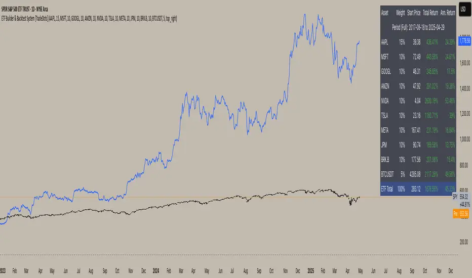
ETF Builder & Backtest System [TradeDots]Create, analyze, and monitor your own custom “ETF-like” portfolio directly on TradingView. This script merges up to 10 different assets with user-defined weightings into a single composite chart, allowing you to see how your personalized portfolio would have performed historically. It is an original tool designed to help traders and investors quickly gauge risk and return profiles without leaving the TradingView platform.
📝 HOW IT WORKS
1. Custom Portfolio Construction
Multiple Assets : Combine up to 10 different stocks, ETFs, cryptocurrencies, or other symbols.
User-Defined Weights : Allocate each asset a percentage weight (e.g., 15% in AAPL, 10% in MSFT, etc.).
Single Composite Value : The script calculates a weighted “ETF-style” price, effectively simulating a merged portfolio curve on your chart.
2. Performance Tracking & Return Analysis
Automatic History Capture : The indicator records each asset’s starting price when it first appears in your chosen date range.
Rolling Updates : As time progresses, all asset prices are continually evaluated and the portfolio value is updated in real time.
Buy & Hold Returns : See how each asset—and the overall portfolio—performed from the “start” date to the most recent bar.
Annualized Return : Automatically calculates CAGR (Compound Annual Growth Rate) to help visualize performance over varying timescales.
3. Table & Visual Output
Performance Table : A comprehensive table displays individual asset returns, annualized returns, and portfolio totals.
Normalized Chart Plot : The composite ETF value is scaled to 100 at the start date, making it easy to compare relative growth or decline.
Optional Time Filter : You can define a specific date range (Start/End Dates) to focus on a particular period or to limit historical data.
⚙️ KEY FEATURES
1. Flexible Asset Selection
Choose any symbols from multiple asset classes. The script will only run calculations when data is available—no need to worry about missing quotes.
2. Dynamic Table Reporting
Start Price for each asset
Percentage Weight in the portfolio
Total Return (%) and Annualized Return (%)
3. Simple Backtesting Logic
This script takes a straightforward Buy & Hold perspective. Once the start date is reached, the portfolio remains static until the end date, so you can quickly assess hypothetical growth.
4. Plot Customization
Toggle the main “ETF” plot on/off.
Alter the visual style for tables and text.
Adjust the time filter to limit or extend your performance measurement window.
🚀 HOW TO USE IT
1. Add the Script
Search for “ETF Builder & Backtest System ” in the Indicators & Strategies tab or manually add it to your chart after saving it in your Pine Editor.
2. Configure Inputs
Enable Time Filter : Choose whether to restrict the analysis to a particular date range.
Start & End Date : Define the period you want to measure performance over (e.g., from 2019-12-31 to 2025-01-01).
Assets & Weights : Enter each symbol and specify a percentage weight (up to 10 assets).
Display Options : Pick where you want the Table to appear and choose background/text colors.
3. Interpret the Table & Plots
Asset Rows : Each asset’s ticker, weighting, start price, and performance metrics.
ETF Total Row : Summarizes total weighting, composite starting value, and overall returns.
Normalized Plot : Tracks growth/decline of the combined portfolio, starting at 100 on the chart.
4. Refine Your Strategy
Compare how different weights or a new mix of assets would have performed over the same period.
Assess if certain assets contribute disproportionately to your returns or volatility.
Use the results to guide allocations in your real trading or paper trading accounts.
❗️LIMITATIONS
1. Buy & Hold Only
This script does not handle rebalancing or partial divestments. Once the portfolio starts, weights remain fixed throughout the chosen timeframe.
2. No Reinvestment Tracking
Dividends or other distributions are not factored into performance.
3. Data Availability
If historical data for a particular asset is unavailable on TradingView, related results may display as “N/A.”
4. Market Regimes & Volatility
Past performance does not guarantee similar future behavior. Markets can change rapidly, which may render historical backtests less predictive over time.
⚠️ RISK DISCLAIMER
Trading and investing carry significant risk and can result in financial loss. The “ETF Builder & Backtest System ” is provided for informational and educational purposes only. It does not constitute financial advice.
Always conduct your own research.
Use proper risk management and position sizing.
Past performance does not guarantee future results.
This script is an original creation by TradeDots, published under the Mozilla Public License 2.0.
Use this indicator as part of a broader trading or investment approach—consider fundamental and technical factors, overall market context, and personal risk tolerance. No trading tool can assure profits; exercise caution and responsibility in all financial decisions.
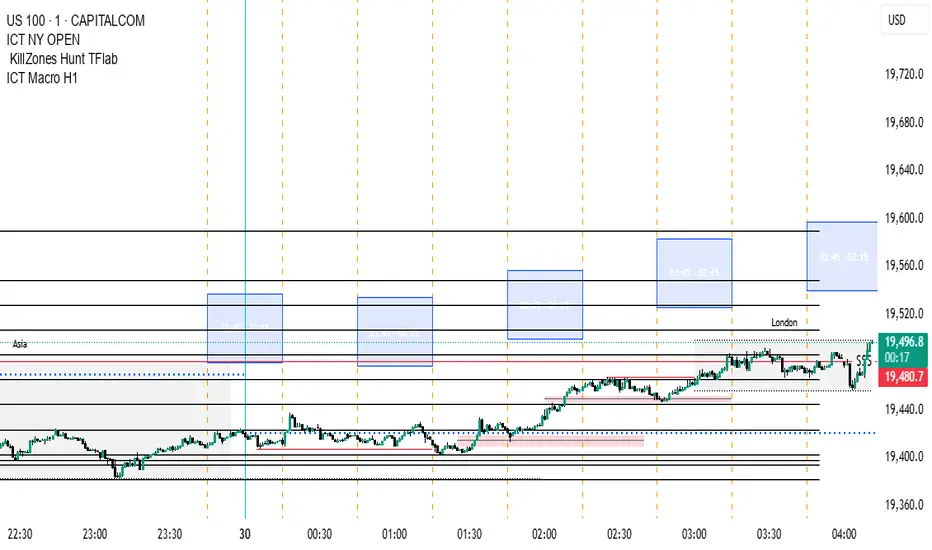
ICT Macro H1"H1 Candle Time Box" is a custom TradingView indicator that highlights a configurable time window surrounding the close of each 1-hour (H1) candle. The indicator draws a transparent box 15 minutes before and after each H1 candle close (by default), helping traders visualize time-based reaction zones.
🔍 Features:
Custom time window: Users can set how many minutes before and after the H1 close the box should appear.
Dynamic positioning: Boxes are drawn slightly above the candles to avoid overlap with price bars.
Live time labels: Each box displays its time range (e.g., "08:45 - 09:15") based on the start and end time of the zone.
Auto-cleaning: Only a limited number of recent boxes (default: 5) are shown, keeping the chart clean.
Requires 1-minute chart for precise timing.
This tool is especially helpful for intraday traders to identify areas of interest or market reactions before and after key hourly closes.

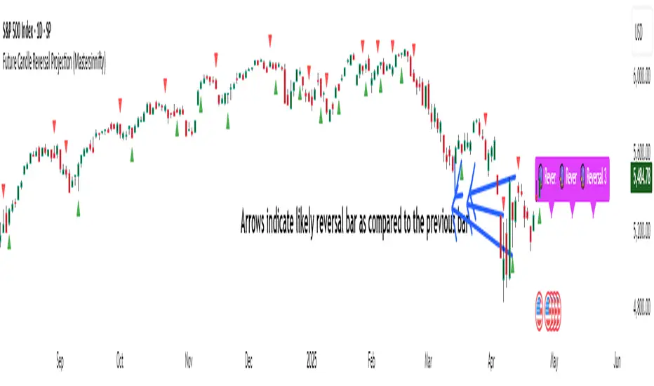
Future Candle Reversal Projection (Mastersinnifty)Overview
This tool identifies potential future market reversal zones by dynamically projecting pivot-based swing patterns forward in time. Unlike traditional ZigZag indicators that only reflect past movements, this indicator anticipates probable future turning points based on historical swing periodicity.
---
Key Features
- Forward Projections: Calculates and projects future swing zones based on detected pivot distances.
- Customizable Detection: Adjust the ZigZag depth for different trading styles (scalping, swing, position).
- Dynamic Updates: Real-time recalibration as new pivots form.
- Clean Visual Markers: Projects reversal estimates as intuitive labels and dotted lines.
---
How it Works
The indicator identifies significant swing highs and lows using a user-defined ZigZag depth setting. It measures the time (bars) and price characteristics of the latest swing movement. Using this pattern, it projects forward estimated reversal points at consistent intervals. Midpoint price levels between the last high and low are used for each future projection.
---
Who Can Benefit
- Intraday and swing traders seeking advanced planning zones.
- Technical analysts relying on pattern periodicity.
- Traders who wish to combine projected reversal markers with their own risk management strategies.
---
Disclaimer
This tool is an analytical and educational utility. It does not predict markets with certainty. Always combine it with your own analysis and risk management. Past behavior does not guarantee future results.
Hippo Battlefield - Bulls VS Bears 20 bars## Hippo Battlefield – Bulls VS Bears (20 Bars)
**What it is**
A multi-dimensional momentum-and-sentiment oscillator that combines classic Bull/Bear Power with ATR- or peak-normalization, then layers on RSI and MACD-derived metrics into:
1. **A colored bar series** showing net Bull+Bear Power strength over the last 20 bars,
2. **A dynamic table** of each of those 20 BBP values (grouped into four 5-bar “quartals”), with symbols, per-bar change, and rolling averages, and
3. **A composite “Weighted BBP” histogram** blending normalized RSI, MACD, and BBP into a single view.
---
### Key Inputs
- **Length (EMA)** – look-back for the underlying EMA (default 60)
- **Normalization Length** – look-back window for peak-normalization (default 60)
- **Use ATR for Norm.** – toggle ATR-based normalization vs. highest-abs(BBP)
- **Show Tables** – toggle the bottom-right 21×11 grid of raw and average BBP values
---
### What You See
#### 1. Colored Bars (Overlay = false)
- Bars are colored by normalized BBP intensity:
- Extreme Bull (≥+10): deep blue
- Strong Bull (+5 to +10): green/yellow
- Weak Bull (+0 to +5): dark green
- Weak Bear (–0 to –5): dark red
- Strong Bear (–5 to –10): pink/red
- Extreme Bear (<–10): magenta
#### 2. Bottom-Right Table (20 Bars of Data)
- Divided into four columns (0–4, 5–9, 10–14, 15–19 bars ago) and one “average” row.
- Each cell shows:
1. Bar index (1–20),
2. Normalized BBP value (to four decimals),
3. Direction symbol (↑/↓/=),
4. Bar-to-bar change (± value),
5. A separator “|”.
- At the very bottom, each column’s 5-bar average is displayed as “Avg: X.XXXX” with a dot marker.
#### 3. Top-Center Mini-Table
- When ≥20 bars have elapsed, shows the date at 20 bars ago and the average BBP across the full 20-bar window.
#### 4. Normalized RSI Line
- Rescales the classic 14-period RSI into a –20…+20 band to align with BBP.
#### 5. MACD Lines (Hidden) & Composite Histogram
- MACD and signal lines are calculated but not plotted by default.
- A “Weighted BBP” histogram combines:
- 20% normalized RSI,
- 20% average of (MACD + signal + normalized BBP),
- 60% normalized BBP
- Plotted as columns, color-coded by strength using the same palette as the main bars.
#### 6. Middle Reference Line
- A horizontal zero line to anchor over/under-zero readings.
---
### How to Use It
- **Trend confirmation**: Strong blue/green bars alongside a rising histogram suggest bull conviction; strong reds/magentas signal bear dominance.
- **Divergence spotting**: Watch for price making new highs/lows while BBP or the histogram fails to follow.
- **Quartal analysis**: The 5-bar group averages can reveal whether recent momentum is accelerating or waning.
- **Cross-indicator weighting**: Because RSI, MACD, and raw BBP all feed into the final histogram, you get a smoothed, blended view of momentum shifts.
---
**Tip:** Tweak the EMA and normalization length to suit your preferred timeframe (e.g. shorter for intraday scalps, longer for swing trades). Enable/disable the table if you prefer a cleaner pane.

ICT Macro H1 v2"H1 Candle Time Box" is a custom TradingView indicator that highlights a configurable time window surrounding the close of each 1-hour (H1) candle. The indicator draws a transparent box 15 minutes before and after each H1 candle close (by default), helping traders visualize time-based reaction zones.
🔍 Features:
Custom time window: Users can set how many minutes before and after the H1 close the box should appear.
Dynamic positioning: Boxes are drawn slightly above the candles to avoid overlap with price bars.
Live time labels: Each box displays its time range (e.g., "08:45 - 09:15") based on the start and end time of the zone.
Auto-cleaning: Only a limited number of recent boxes (default: 5) are shown, keeping the chart clean.
Requires 1-minute chart for precise timing.
This tool is especially helpful for intraday traders to identify areas of interest or market reactions before and after key hourly closes.

sabydee20b เส้นแนวนอน 4 เส้น บนล่าง ปรับได้This script allows you to draw customizable horizontal lines above and below a base price.
You can adjust the offset values, enable or disable each line, and independently configure the color, width, and line style (solid, dashed, dotted) for the base, upper, and lower levels.
Ideal for marking support/resistance zones or profit/loss targets.
Mother Fish

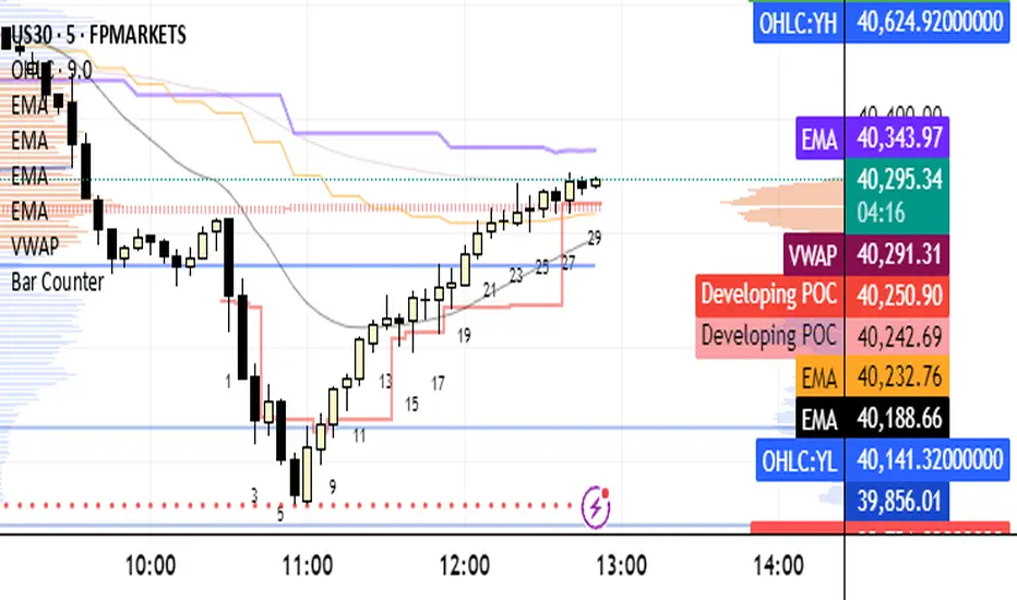
Bar CounterBar Counter Indicator: Track Bar Sequences with Precision
The Bar Counter Indicator is a highly customizable tool designed for traders who want to monitor and label candlestick bars on their TradingView charts based on their sequence within a specified timeframe. By numbering bars as they form, this indicator helps traders identify patterns, track market rhythm, and time entries or exits with greater precision. It is particularly useful for strategies that rely on counting bars, such as time-based setups, scalping, or pattern recognition.
### Key Features:
1. **Bar Numbering**:
- Assigns a sequential number to each candlestick bar within a user-defined timeframe, displayed directly on the chart.
- Option to show only **even-numbered bars**, **odd-numbered bars**, or both, allowing traders to focus on specific bar sequences (e.g., every second bar for a pattern).
2. **Time Range Filtering**:
- Optionally filter bar counting to a specific time window (e.g., a trading session like 9:30 AM to 4:00 PM).
- When the time filter is enabled, the counter resets to 1 at the start of the specified time range and only counts bars within that period, making it ideal for analyzing high-activity sessions like market opens or closes.
3. **Customizable Display**:
- **Text Position**: Choose whether bar numbers appear above or below the candlestick for optimal chart clarity.
- **Text Color and Size**: Customize the color and size (tiny, small, normal, large) of the numbered labels to match your chart preferences.
- **Vertical Offset**: Fine-tune the vertical placement of labels to avoid overlapping with price action or other indicators.
### How to Use:
- **Pattern Recognition**: Use the bar counter to identify recurring patterns that occur after a specific number of bars (e.g., reversals after 5 bars or breakouts after 10 bars).
- **Session-Based Trading**: Enable the time filter to count bars only during key trading sessions, such as the New York or London market hours, to focus on high-volume periods.
- **Scalping and Intraday Strategies**: Track bar sequences to time entries or exits, especially when combined with even/odd filtering for alternating setups.
- **Automation Support**: The numbered bars can assist in backtesting or developing automated strategies by providing a clear reference for bar counts.
### Ideal For:
- **Scalpers**: Monitor rapid bar sequences to time precise entries and exits in fast-moving markets.
- **Day Traders**: Focus on specific trading sessions by using the time filter to count bars during high-liquidity periods.
- **Pattern Traders**: Identify and act on candlestick patterns that depend on bar counts, such as those used in price action or harmonic trading.
- **All Markets**: Effective for forex, stocks, cryptocurrencies, commodities, and indices across any intraday timeframe.
### Why Choose This Indicator?
The Bar Counter Indicator offers unparalleled flexibility for traders who rely on bar sequencing to inform their strategies. Its ability to filter by time, display only even or odd bars, and customize label appearance ensures it adapts to a wide range of trading styles. Whether you're timing trades in a specific session or tracking patterns across a chart, this indicator provides a clear, visual way to stay on top of market rhythm. Simple yet powerful, it’s a must-have tool for traders seeking to enhance their precision and decision-making.
Add the Bar Counter Indicator to your TradingView chart today and take control of your bar-based trading strategies!

OHLCOHLC Indicator: Comprehensive Price Level Visualization
The OHLC Indicator is a versatile and powerful tool designed for traders to visualize key price levels across multiple timeframes directly on their TradingView charts. This indicator plots the Open, High, Low, and Close (OHLC) prices for daily, weekly, monthly, and yearly periods, as well as the previous day's OHLC levels, providing a clear and customizable view of significant price points. It is particularly useful for identifying support and resistance zones, trend direction, and potential breakout or reversal levels.
### Key Features:
1. **Multi-Timeframe OHLC Display**:
- **Daily OHLC**: Optionally display the current day's Open, High, Low, and Close prices, ideal for intraday traders seeking to monitor daily price action.
- **Yesterday's OHLC**: Plots the previous day's Open, High, Low, and Close by default, offering context for price movements relative to the prior session.
- **Weekly OHLC**: Visualize the current week's Open, High, Low, and Close, with customizable styles (e.g., circles for highs/lows, lines for opens).
- **Monthly OHLC**: Show the current month's OHLC levels, perfect for swing traders analyzing longer-term price structures.
- **Yearly OHLC**: Display the current year's OHLC, helping traders identify major annual price levels for strategic planning.
2. **Customizable Visibility**:
- Traders can toggle the display of OHLC levels for each timeframe (Daily, Yesterday, Weekly, Monthly, Yearly) via input settings, ensuring a clutter-free chart tailored to their needs.
- Each timeframe's OHLC is plotted with distinct colors and styles (e.g., blue lines for daily, green circles for weekly highs, purple crosses for monthly lows) for easy differentiation.
3. **Bias Highlighting**:
- **Background Bias Coloring**: When enabled, the chart background is lightly shaded green if the current price is above the weekly open or red if below, providing a quick visual cue of bullish or bearish bias relative to the weekly open.
- **Above/Below Week Open Indicator**: Optionally display small triangles at the top of the chart to indicate whether the current price is above (green triangle up) or below (red triangle down) the weekly open, enhancing trend awareness.
### How to Use:
- **Support and Resistance**: Use the High and Low levels from various timeframes to identify key support and resistance zones. For example, a daily high or yesterday's close often acts as a barrier for price movement.
- **Trend Analysis**: The weekly open and bias coloring help traders assess whether the market is trending bullish or bearish relative to the week's starting point.
- **Breakout and Reversal Trading**: Monitor price interactions with OHLC levels (e.g., a break above a monthly high or rejection at a yearly low) to spot potential breakout or reversal opportunities.
- **Customization**: Adjust the input settings to show only the OHLC levels relevant to your trading strategy, reducing chart noise and focusing on critical price points.
### Ideal For:
- **Day Traders**: Leverage daily and yesterday's OHLC to pinpoint intraday entry and exit levels.
- **Swing Traders**: Use weekly and monthly OHLC to identify significant price zones for multi-day or multi-week trades.
- **Position Traders**: Analyze yearly OHLC for long-term market structure and major trend direction.
- **All Markets**: Applicable to stocks, forex, cryptocurrencies, commodities, and indices on intraday or higher timeframes.
### Why Choose This Indicator?
The OHLC Indicator stands out for its flexibility, clarity, and ability to consolidate critical price levels across multiple timeframes into a single, easy-to-read overlay. Whether you're a scalper, swing trader, or long-term investor, this indicator empowers you to make informed decisions by highlighting the price levels that matter most. Its intuitive design and customizable options ensure it adapts to any trading style, making it an essential tool for traders seeking a competitive edge.
Add the OHLC Indicator to your TradingView chart today and gain a deeper understanding of market structure and price dynamics!
ICT Macro H1"H1 Candle Time Box" is a custom TradingView indicator that highlights a configurable time window surrounding the close of each 1-hour (H1) candle. The indicator draws a transparent box 15 minutes before and after each H1 candle close (by default), helping traders visualize time-based reaction zones.
🔍 Features:
Custom time window: Users can set how many minutes before and after the H1 close the box should appear.
Dynamic positioning: Boxes are drawn slightly above the candles to avoid overlap with price bars.
Live time labels: Each box displays its time range (e.g., "08:45 - 09:15") based on the start and end time of the zone.
Auto-cleaning: Only a limited number of recent boxes (default: 5) are shown, keeping the chart clean.
Requires 1-minute chart for precise timing.
This tool is especially helpful for intraday traders to identify areas of interest or market reactions before and after key hourly closes.
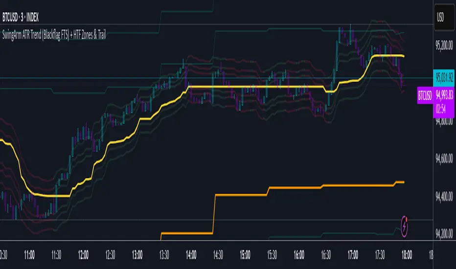
SwingArm ATR Trend (Blackflag FTS) + HTF Zones & Trail📐 SwingArm ATR Trend + HTF Zones | Blackflag FTS Concept
A precision-engineered volatility mapping and trend-trailing system inspired by the Blackflag FTS / SwingArm ATR methodology — now enhanced with multi-timeframe confluence, adaptive ATR zones, and Fibonacci-level support/resistance architecture.
Designed for trend traders, scalpers, and swing specialists, this tool visually defines where price is likely to pivot, trend, or exhaust — based entirely on structure and volatility, not lagging signals.
🧩 Core Logic
🔹 Adaptive Swing Zones (Current TF)
Built using Fibonacci-scaled ATR offsets from a dynamic midline (the average of the session high/low), these zones evolve with price structure:
Zone +1 / -1: Primary volatility boundaries — breakout or pullback zones.
Zone +2 / -2: Extended moves — high-momentum areas.
Zone +3 / -3: Exhaustion zones — potential reversal or take-profit areas.
Color shifts dynamically based on directional bias (bullish/bearish).
🟨 Trailing Stop (Current TF)
An adaptive trailing stopline that follows trend shifts using midline ± ATR logic.
Acts as a bias filter and exit manager.
Color-coded for clarity.
Flips based on price’s relationship to the trail.
🔶 Higher Timeframe Zones (HTF Overlay)
Optional overlay that mirrors the full structure — zones + trailing stop — from a higher timeframe of your choice.
Perfect for:
Validating local moves against macro context.
Spotting higher-timeframe traps or confluence breakouts.
🛠️ Settings & Customization
ATR Period — default is 14, but adaptable to asset volatility.
Source — usually close, but adjustable for experimentation.
Show/Hide Toggles — independently control visibility for:
Current TF zones & trail
HTF overlay
Zone Colors — full control for bullish/bearish bias on both timeframes.
Line Widths — customize to fit any chart style or background.
🎯 Real-World Trade Examples
📈 Long Trend + Pullback
Price breaks through Zone +1 with momentum.
Trail flips bullish; price holds above it.
HTF trail and zones are also bullish.
Entry: On retracement to the trail or Zone +1.
Exit: At Zone +2 or a trail break.
📉 Short Reversal
Price rejects Zone +2 with bearish candle.
Trail flips to bearish shortly after.
HTF trail confirms downtrend.
Entry: On retest of Zone +1 or failed bounce at trail.
Exit: At Zone -1/-2 or upon trail break.
🔁 Range or Fade Play
In low-trend conditions, Zones +2/-2 act as mean-reversion pivot points.
Scalp entries can be taken with tight stops near those extremes.
Avoid during clear HTF directional bias.
🧠 Trading Tips
Trend + Structure + Volatility = edge.
Let zones act as your pre-defined decision map.
Use the HTF layer to validate or fade local setups.
Great in combination with:
Price action or liquidity maps
Volume profile / OBV
Oscillators for entry timing
✅ Summary
This indicator helps you:
Stay in trends longer with smart trailing logic.
Know exactly where volatility could expand or exhaust.
Align entries with multi-timeframe structure.
Visually separate trending from ranging conditions.
It's an educational idea, and it doesn’t predict the future — it frames it with objective volatility zones so you can trade with clarity and confidence.
Regards!
30‑Sec OR & PaylinesTo solidify your trading with actual horizontal never-changing target lines to be used for stop orders and entries, this OR indicator will give you the edge you need to establish a position.
This Opening Range Indicator works on a 30 Second Chart and lasts the entire trading period for that day. The CME Futures established the OR way back before computers even existed. Use this to establish never-changing entry and stop orders, to solidify your trading results with no more guessing about where you get in or out. This will help you to control your results.

Realized Volatility (Daily-locked)
This script calculates and visualizes the 21-day realized volatility (RVOL) of the S&P 500 index (SPX), locked to daily timeframes. It measures the standard deviation of daily log returns over a 21-day window, annualizes it (assuming 252 trading days per year), and expresses it as a percentage.
Additionally, it pulls the daily closing value of the VIX (CBOE Volatility Index) and calculates the spread between the VIX and the realized volatility (VIX - RVOL).
The script plots both the annualized realized volatility and the VIX-RVOL spread, helping traders and analysts monitor discrepancies between implied volatility (VIX) and actual market volatility (RVOL).
This can provide insights into market sentiment, potential overpricing or underpricing of options, and volatility risk.

DataMap Free TrialOverview of the Script
The "DataMap" indicator is an overlay tool that visualizes key price levels to assist traders in identifying support, resistance, and liquidity zones. It operates on the following principles:
Statistical based Projection Levels:
For daily, (Pro Version weekly, and monthly) timeframes, the script calculates key levels (e.g., open, manipulation, pivot zone, distribution, extension, exhaustion, extremity) based on the opening price adjusted by the standard deviation of price movements.
These levels are plotted as horizontal lines with customizable styles, colors, and labels.
Alerts are triggered when the price crosses these levels (once per crossing, reset daily/(Pro
Version weekly/monthly)).
PRO VERSION :
Previous High/Low Levels (HTF Liquidity):
Plots previous daily highs/lows (PDH/PDL), weekly highs/lows (PWH/PWL), and monthly highs/lows (PMH/PML).
Levels change color when mitigated (price crosses above highs or below lows).
Alerts are triggered on crossings, with resets based on the timeframe (daily, weekly, monthly).
PRO VERSION:
Intraday Liquidity Levels:
Tracks highs and lows during predefined trading sessions (Asia, London, NY AM, NY Lunch, NY PM) in the America/New_York timezone.
Levels are plotted as lines and can be extended until mitigated or past mitigation, with options to hide mitigated levels.
PRO VERSION:
Alerts are triggered when session highs or lows are broken.
Customization:
Extensive input settings allow users to toggle visibility, adjust colors, line styles, label sizes, and historical data limits.
Supports different tick sizes and precision for accurate price display.

ICT UltimateThe ICT Ultimate is a sleek, fully automated trading powerhouse that fuses the best tactics from top ICT traders into one razor-sharp model. It’s built to nail market moves with pinpoint accuracy, slick risk control, and no emotional baggage. This is your go-to for crushing it in the markets, hands-free. The ultimate ICT edge—done and dusted.

Ivo PulseThe Ivolution Pulse Indicator provides an integrated suite of tools designed to assist traders in analyzing market volatility, trend dynamics, and momentum confluence for potentially clearer market insights. It is intended for various trading styles, including day trading and swing trading, across multiple asset classes available on TradingView.
Core Concepts & Methodology:
Ivolution Pulse combines several analytical concepts into a unified visual framework, emphasizing the principle of confluence where multiple conditions should align to highlight potential opportunities.
Dual Trend Clouds:
Function: Visualize short-term momentum (Green/Red areas) and the longer-term trend (Blue/Orange areas) for quicker trend assessment. These clouds also serve as dynamic support/resistance zones and aid in trend filtering.
Calculation Concept: Based on the relationship and crossovers of exponential moving averages (EMAs).
Key EMA (Yellow Line):
Function: Tracks a dynamic EMA level, providing a crucial reference point often acting as support or resistance.
Integrated Volatility Squeeze Detector:
Function: Identifies periods of range contraction (low volatility), helping traders anticipate potential volatility expansions. Visual cues indicate the presence and intensity of the compression.
Calculation Concept: Compares the relationship between Bollinger Bands and Keltner Channels. Includes a momentum component (based on linear regression) to gauge potential directionality during the squeeze.
Entry Signals (Standard & Confirmed):
Function: Provides potential entry signals derived from the script's internal confluence logic. Standard signals (Aqua/Purple triangles) may indicate earlier possibilities, while Confirmed signals (Green/Red triangles) flag setups requiring more stringent confirmation (often incorporating volatility expansion), aiming to highlight potentially higher-probability scenarios.
Calculation Concept: Signals require a confluence of multiple conditions derived from the script's components. Factors considered include: alignment of trend clouds, price position relative to the Key EMA, momentum direction, volatility status, Heikin Ashi patterns, and the slope of the Key EMA. The specific combination differs between Standard and Confirmed signals, reflecting a layered confirmation approach.
Automatic Potential Target Levels:
Function: Plots potential price target levels, offering objective, volatility-based reference points for trade management planning.
Calculation Concept: Calculated by projecting user-configurable multiples of the Average True Range (ATR) from the entry bar.
Market Internals (Optional):
Function: For traders analyzing indices like SPX/ES, optionally displays NYSE TICK, ADD, and Up/Down Volume Ratio to add context regarding overall market breadth.
Calculation Concept: Fetches data for USI:TICK, USI:ADD, USI:UVOL, USI:DVOL. Extreme readings relative to user-defined thresholds can provide additional market sentiment context.
Built-in Alert Conditions:
Function: Allows users to create standard TradingView alerts for key script events, facilitating timely awareness of signal occurrences or target levels being reached.
How to Use:
Interpret signals within the broader market context. Look for entries where signals align with the dominant trend (indicated by clouds/dashboard). Leverage the dashboard for efficient confirmation of multiple factors. Use the Key EMA to gauge potential support/resistance interactions. Utilize the squeeze detector to prepare for potential shifts in volatility. Target levels provide objective reference points for developing trade management strategies.
Unique Value:
While utilizing established analytical concepts (EMAs, ATR, Squeeze, etc.), Ivolution Pulse integrates them into a cohesive system designed to synthesize information and generate easy-to-follow signals. Its primary value lies in the specific confluence logic applied—aiming to filter potential entry signals—and the consolidation of multiple analytical viewpoints into the visual clouds and status dashboard. This integration seeks to streamline the analysis process and highlight conditions where multiple technical factors are in alignment.
Disclaimer:
Trading involves substantial risk of loss and is not suitable for all investors. Past performance is not indicative of future results. Ivolution Pulse is a tool for analysis and does not constitute financial advice or guarantee profits. Always use proper risk management and trade responsibly.

Strategy ChecklistHave your rules right where you can see them and see in a split second if the trade meets your required rules.
Small (adjustable) table on the bottom right of your screen with all your rules (up to 10). Good to know:
Delete the text input text for a rule to delete the rule from the table
You can check rule(s) by going into the indicator settings and checking the checkbox for the desired rule(s)

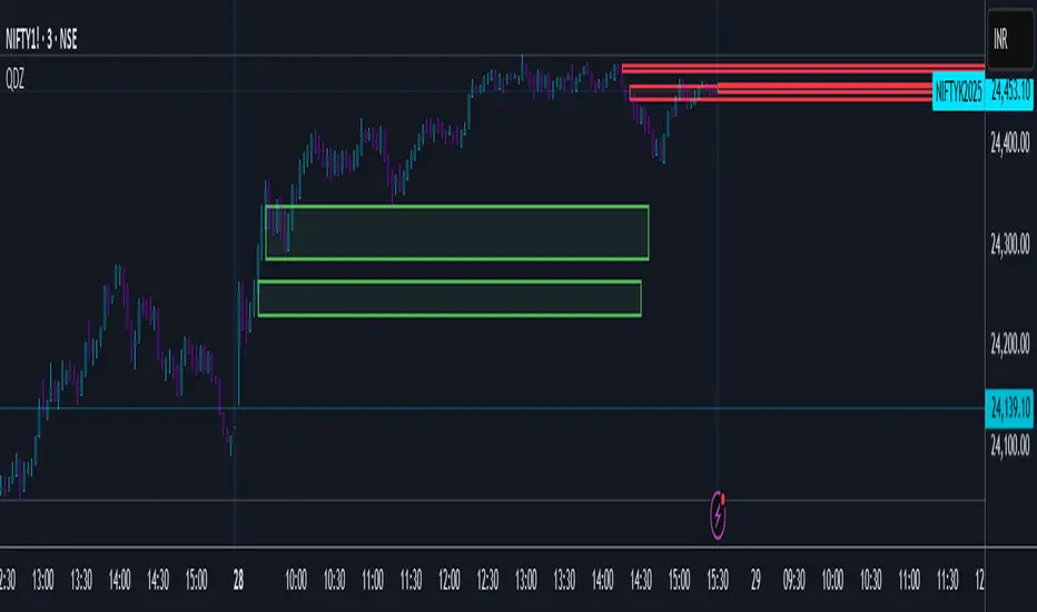
Quantum Delta Zones with EnhancementsQuantum Delta Zones (QDZ)
Short Title: QDZ
Overview
The Quantum Delta Zones (QDZ) is a unique technical indicator designed to highlight high-probability order block zones in the market based on a combination of Delta Sensitivity, order block tightness, and volume-based filters.
This indicator helps traders to identify key support and resistance levels (bullish and bearish order blocks) that are backed by strong volume and optimal market structure. It employs advanced zone detection and automatic zone management (box creation and deletion) to enhance trade analysis.
The primary objective of QDZ is to provide clear, visually appealing support/resistance zones while factoring in market order flow dynamics, ensuring that you are trading at optimal levels with confirmed volume behind it.
Key Features
Delta Sensitivity: The indicator uses a body-to-range ratio to assess the "delta" between the body and wick of each candlestick, helping to identify strong order block formations based on market sentiment.
Order Block Tightness: A filter is used to detect small, tight order blocks where price action shows accumulation (small body candles) near high-probability levels.
Projection Distance: The ability to project the detected order block zones into the future, providing an idea of where price might react based on historical price action.
Fade Strength: Allows you to adjust the transparency of the projected zones, giving you visual flexibility depending on how prominent you want these order blocks to appear.
Volume Filter: A high-volume filter ensures that only zones with substantial volume (based on a moving average) are considered for box creation, preventing false signals and low-probability trades.
Auto Box Deletion: When the market invalidates a zone (price moves beyond the zone’s projected area), the boxes are automatically deleted to keep the chart clean.
Alerts: Built-in alerts for when a bullish or bearish order block is detected, providing real-time notifications of significant potential trading opportunities.
How it Works
Step-by-Step Explanation:
Delta Sensitivity:
A candlestick is considered "Bullish" if the closing price is above the opening price and the body-to-range ratio is above the user-defined delta Sensitivity.
A candlestick is considered "Bearish" if the closing price is below the opening price with the same body-to-range ratio criteria.
Order Block Tightness:
The indicator looks for tight order blocks, where the body-to-range ratio is below the orderBlock Tightness setting, indicating small candles that may represent accumulation or distribution zones.
Volume Filter:
The indicator applies a filter to check if the volume is above the 50-period simple moving average (SMA) and multiplied by the user-defined volume Multiplier. Only zones with sufficient volume are considered.
Box Creation:
Once a valid order block is detected, the corresponding bullish or bearish box is drawn on the chart. These boxes extend forward by the number of bars specified by projection Bars.
Box Deletion:
If the price moves against the order block (for example, if a bullish box is invalidated when the price closes below its bottom), the box is automatically deleted to keep your chart uncluttered.
Alert System:
Alerts can be set for both bullish and bearish order block detection, notifying traders of the formation of a potential market opportunity.
Inputs / Settings
Delta Sensitivity: The ratio between the candlestick body and its range. Higher values mean stronger bullish/bearish pressure is required to trigger the order block detection.
Order Block Tightness: Defines how tight or small an order block should be to qualify for detection. Smaller values are more sensitive to smaller candlesticks.
Projection Distance: The number of bars into the future that the identified order block should be projected. Useful for seeing potential future support/resistance zones.
Fade Strength: Defines the transparency level of the order block boxes. Higher values result in more transparent boxes, lower values make the boxes more opaque.
Auto Delete: Automatically deletes order blocks if they are invalidated by price action.
Volume Filter: When enabled, only order blocks formed with higher-than-average volume will be considered. This helps eliminate low-probability signals.
Volume Multiplier: Multiplies the average volume by this factor to determine whether the current volume qualifies as "high" for an order block detection.
Visuals
Bullish Order Block: A green box is drawn when a bullish order block is detected. The box is projected forward based on the projection Bars setting.
Bearish Order Block: A red box is drawn when a bearish order block is detected. Similar to the bullish box, it is projected forward.
Fading: Both bullish and bearish boxes fade based on the fade Strength, making the most recent zones more visible while fading out older, less relevant zones.
How to Use in Trading
Bullish Order Block:
A bullish order block is a potential buy area. Once price retraces to the bottom of a detected bullish box, traders may consider it a buy zone, especially if it aligns with other technical factors (e.g., support, trend).
Bearish Order Block:
A bearish order block is a potential sell area. Once price retraces to the top of a detected bearish box, traders may consider it a sell zone, particularly in downtrends or near resistance.
Risk Management:
The projection Bars setting helps to set a clear projection distance. Traders should use their own risk management strategies, such as stop-loss placements below/above the order block zones, and take-profit levels based on market conditions.
Volume Confirmation:
The Volume Filter can be very useful for confirming order blocks. Trading only when an order block is accompanied by high volume ensures the zone has institutional or market-maker backing.
Box Deletion:
The Auto Delete feature automatically removes invalidated zones, keeping the chart clean and preventing you from trading out-of-date or broken levels.
Trading Strategy Example
Bullish Setup:
Look for a bullish order block (green box) formed after price has been trending down and volume is high.
Wait for price to retrace back into the order block zone.
Enter long at the bottom of the order block when price shows signs of support (e.g., bullish candlestick pattern).
Set stop-loss below the bottom of the order block and a take-profit target at a significant resistance level.
Bearish Setup:
Look for a bearish order block (red box) formed after price has been trending up and volume is high.
Wait for price to retrace back into the order block zone.
Enter short at the top of the order block when price shows signs of resistance (e.g., bearish candlestick pattern).
Set stop-loss above the top of the order block and a take-profit target at a significant support level.
Limitations
The QDZ indicator is based on historical price action, and while it is designed to identify areas of strong market participation, it does not guarantee future price behavior.
Traders should always combine this indicator with other technical analysis tools, such as trend analysis, oscillators, or fundamental factors, to improve their decision-making process.
Conclusion
The Quantum Delta Zones (QDZ) indicator is a powerful tool for traders looking to pinpoint high-probability order blocks that are backed by volume and strong market dynamics.
It integrates well with existing trading strategies by providing clear, actionable zones of support and resistance, while also offering advanced features like fade strength, auto-deletion, and volume filters.
Whether you're trading intraday or longer-term, this tool can be an essential part of your trading toolbox.
This is an educational idea, trade at your own desecration.
Regards.
EPS & Sales/Revenue Growth MarkerThis script plots the Revenue Growth and EPS Growth % on Earnings Date.
Idea Credit: Special thanks to @dharmeshrbhatt for inspiring the concept behind this tool.
Developed and Published by learningvitals.
Plots Revenue Growth % and EPS Growth % on earnings date.
Choose label position: Above Bar, Below Bar, Top, or Bottom.
Customizable growth colors based on combined EPS and Revenue performance.
Customizable line style and colors.
Controls max number of labels to keep the chart clean.

Altseason Index | AlchimistOfCrypto
🌈 Altseason Index | AlchimistOfCrypto – Revealing Bitcoin-Altcoin Dominance Cycles 🌈
"The Altseason Index, engineered through advanced mathematical methodology, visualizes the probabilistic distribution of capital flows between Bitcoin and altcoins within a multi-cycle paradigm. This indicator employs statistical normalization principles where ratio coefficients create mathematical boundaries that define dominance transitions between cryptographic asset classes. Our implementation features algorithmically enhanced rainbow visualization derived from extensive market cycle analysis, creating a dynamic representation of value flow with adaptive color gradients that highlight critical phase transitions in the cyclical evolution of the crypto market."
📊 Professional Trading Application
The Altseason Index transcends traditional sentiment models with a sophisticated multi-band illumination system that reveals the underlying structure of crypto sector rotation. Scientifically calibrated across different ratios (TOTAL2/BTC, OTHERS/BTC) and featuring seamless daily visualization, it enables investors to perceive capital transitions between Bitcoin and altcoins with unprecedented clarity.
- Visual Theming 🎨
Scientifically designed rainbow gradient optimized for market cycle recognition:
- Green-Blue: Altcoin accumulation zones with highest capital flow potential
- Neutral White: Market equilibrium zone representing balanced capital distribution
- Yellow-Red: Bitcoin dominance regions indicating defensive capital positioning
- Gradient Transitions: Mathematical inflection points for strategic reallocation
- Market Phase Detection 🔍
- Precise zone boundaries demarcating critical sentiment shifts in the crypto ecosystem
- Daily timeframe calculation ensuring consistent signal reliability
- Multiple ratio analysis revealing the probabilistic nature of market capital flows
🚀 How to Use
1. Identify Market Phase ⏰: Locate the current index relative to colored zones
2. Understand Capital Flow 🎚️: Monitor transitions between Bitcoin and altcoin dominance
3. Assess Mathematical Value 🌈: Determine optimal allocation based on zone location
4. Adjust Investment Strategy 🔎: Modulate position sizing based on dominance assessment
5. Prepare for Rotation ✅: Anticipate capital shifts when approaching extreme zones
6. Invest with Precision 🛡️: Accumulate altcoins in lower zones, reduce in upper zones
7. Manage Risk Dynamically 🔐: Scale portfolio allocations based on index positioning

전통 EMA vs 트레이딩뷰 SMMA 방식 RSI 비교This script compares RSI values calculated using two different smoothing methods: traditional EMA (Exponential Moving Average) and SMMA (Smoothed Moving Average, also known as RMA).
You can adjust the RSI length and observe how the EMA-based RSI responds faster to price changes, while the SMMA-based RSI provides smoother and more stable signals

TP/SL calcJust draw lines on top and bottom of entry price line.
-1% and +1%
-2% and +2%
-10% and +10%
