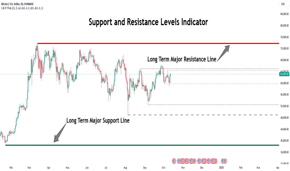
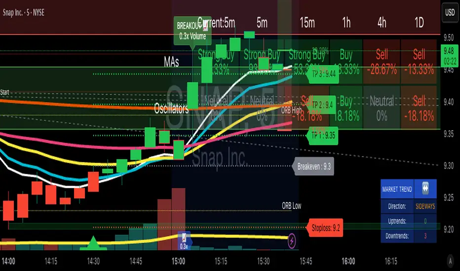
Supply and Demand Anchored [LuxAlgo]The Supply and Demand Anchored indicator is an anchored version of the popular Supply and Demand Visible Range indicator. Once adding the indicator to the chart, users need to manually select the starting and ending points for the indicator's calculation. The estimated supply/demand zones are then extended.
🔶 USAGE
The proposed indicator makes use of the same method highlighted in previous posts (see related scripts section below) to estimate supply and demand zones.
When adding the indicator to the chart, users will be prompted to select a starting and ending point for the calculation of the supply and demand zones, click on your chart to select those points.
Once calculated, each zone/level will be extended to the right of the chart. These can be used as support/resistance zones. Clicking on one of the graphical elements of the indicator or the indicator title will highlight the starting and ending calculation points, these can be dragged to be set at different locations.
🔶 SETTINGS
Threshold %: Percentage of the total visible range volume used as a threshold to set supply/demand areas. Higher values return wider areas.
Resolution: Determines the number of bins used to find each area. Higher values will return more precise results.
Intra-bar TF: Timeframe used to obtain intra-bar data.
🔶 RELATED SCRIPTS
Supply and Demand
Incomplete Session Candle - Incomplete Timeframe Candle Marker The "Incomplete Session Candle - Incomplete Timeframe Candle Marker" is an advanced tool tailored for technical analysts who understand the importance of accurate timeframes in their charting. While the indicator is not limited to the Indian market, its genesis is rooted in the nuances of trading sessions like those in India, which span 375 minutes from 9:15 AM to 3:30 PM.
Key Features:
Detects if the current timeframe is intraday (minutes or hours).
Calculates the expected duration of the candle for the chosen timeframe.
Highlights candles that don't achieve their expected session duration by placing a cross shape above the bar.
Compatible across various intraday timeframes, aiding traders in spotting discrepancies promptly.
Why We Made This: Not Just for India:
While we looked at the Indian market, this indicator works everywhere. Regular timeframes like 30 minutes, 1 hour, and 2 hours often end with incomplete candles, especially at the end of the trading day. For example:
A 30-minute timeframe makes 13 candles, but the last one is only 15 minutes long.
A 1-hour timeframe shows 7 candles, but the last one is just the last 15 minutes.
By switching to different timeframes like 25 minutes, 75 minutes, and 125 minutes, you get more complete information for better trading decisions. Learn more about this in our article: "Power of 25, 75, and 125-Minute Timeframes in the Indian Market", recognized by Trading View's Editors' Pick.
Benefits:
The indicator extends its benefits even to users without access to certain timeframes. It accommodates traders using a 1-hour timeframe (pertaining to Indian traders). By employing this indicator, traders consistently remain mindful of incomplete candles within their chosen timeframe
For those who utilize concepts like RBR, RBD, DBR, and DBD, this indicator is paramount. An incomplete candle can skew analysis, leading to potential misinterpretations of base or leg candles.
Final thoughts:
In markets like the Indian stock market, adopting such a tool is not just beneficial, but necessary. Whether you have access to unconventional timeframes or are using traditional ones, recognizing and accounting for the limitations of incomplete candles is critical & it's important to know if your candles fit the timeframe properly. This indicator gives you a better view of the market, which helps you make smarter trades.
Lastly, Thank you for your support! Your likes & comments. If you want to give any feedback then you can give in comment section.
Let's conquer the markets together!
mrD-Flip Zone(None repaint) [1.0]This indicator provides Flips Zones, to easily observe price action and the user can evaluate reversal zones.
This indicator also includes warnings when flip zones appear.
🔶 SETTINGS
- Current-Timeframe: Hide/Show Flips Zones in the current time frame.
- High-Timeframe: Hide/Show Flips Zones in the High time frame.
- Current Timeframe (color): Color Display Flips Zones in the current time frame.
- High Timeframe (color): Color Display Flips Zones in the current time frame.
🔶 The logic is described below:
The main characteristic that this indicator has is that it is possible to identify zones where prices can react.
The second feature that shows the best use of this indicator is that it shows the flips area of the larger timeframe in the current timeframe.
This indicator also acts as support and resistance levels.
This script is based on the function of Pivot High Low.
- New Pivot Low is identify
- New Pivot High is to identify
- New Pivot Low lower previous Pivot Low
- Upper Line of the Flips Zone is the high-price previous Pivot Low
- Lower Line of the Flips Zone is the low-price new Pivot Low
=>Flips box will be marked on the chart in the current time frame and the Flips box in the high time frame
*Special feature: the Flips box order shows different time frames.
🔶 USAGE
The Flips Zones are displayed by the script to provide can price reversal zones.
At Flips Zones, prices can reverse or continue the trend.
The Flips Zones are displayed by the script to provide price can reversal zones.
Once the Flips Zone is formed, the price action could retest. Can expect a price reversal or continue the trend.
The Flip Zones of the higher timeframe are displayed in the current timeframe according to the user's settings.
If the Flip Zones on the current timeframe and the Flip Zones on the higher timeframe overlap, Price can retest and reverse the trend quickly.
The trend can be determined by looking at the price position relative to the flips zone box. Price breaking out of flip zones is a sign of a downtrend, while price breaking above supply is a sign of an uptrend.
Note: This indicator is Non-repaint.
This indicator is great to use in confluence with other indicators or with various candlestick patterns.
Remember, don't make decisions based only on the one-time frame. Check the overall trend of the stock and look at Flip Zone in the high time frame.
🔶General disclaimer:
Trading stocks, futures, forex, options, ETFs, cryptocurrency, or any other financial instrument has huge potential rewards and risks.
You must be aware of the risks and willing to accept them to invest in stocks, futures, forex, options, ETFs, or cryptocurrencies.
Don't trade with money you can't afford to lose.
This is not an offer or an offer to Buy/Sell stocks, futures, Forex, options, ETFs, cryptocurrencies, or any other financial instrument.
Do not represent that any account will or is likely to achieve profit or loss of any kind.
The past performance of any trading system or method is not necessarily indicative of future results.
My Scripts/Indicators/Ideas/Algos/Systems are only for educational purposes!
Supply And DemandThis supply and demand indicator uses sessions, volume spikes, higher timeframe price action and other volume calculations to spot areas on the chart where price will likely react. From the 1 minute and below charts to the daily and up charts, you can get excellent levels for any timeframe.
Why Use Supply And Demand?
One of the safest ways to trade is to wait for price to enter an area of interest where price should react. When we play reversals off of these areas, you increase the likelihood that your trade will be profitable because there was previous price action that told you that the current level is one where price will react. So we look for reversals at or very near these levels to enter into scalp or swing trade positions and look to exit that position when price is at or near the next major supply and demand level.
How To Use
The strategy with this indicator is to wait for price action to reach the levels shown by this supply and demand indicator and then enter trades at these levels, looking for a reversal. The thicker lines and the lines that are from the highest timeframes will be the most important levels on the chart. There is a table on the chart that will help you identify what timeframe the levels are using, with the color of that line next to it for easy identification.
The default settings are designed for scalping the 1-5 minute charts, so there are more levels turned on than necessary if you are using higher timeframes than 5 minutes. If you are using higher timeframes, make sure to turn off some of the lower timeframe levels so that it doesn’t clog up your charts. On the daily timeframe and above, many of the levels are coded to not turn on so that you don’t have to turn them off manually, but be aware that you will need to adjust your charts to suit your preferences, especially if you are on anything above the 5 minute chart.
For scalping, wait for price to react from the supply and demand levels by showing wicks, struggling to break through or getting reversal candles at those levels. Ride those moves to the next major supply and demand area before taking profit. You may want to turn on sessions and some of the lower timeframe levels as well if there are big gaps on the chart that are not suitable for scalping.
For swing trading, you will want to turn some of the lower timeframe and session levels off. Leave it to only higher timeframe OHLC lines and volume spike levels. Then you can swing moves that reverse off of the supply and demand lines.
Customization
This indicator is fully customizable. You can turn on or off any of the levels as well as increase the number specific levels so your charts suit your preferences.
All of the levels used are color coded individually so you can easily tell which type of level it is and these colors can be changed within the settings to suit your preferences. These colors are also reflected in the line identification table that show you exactly which color each type of level is.
There are toggles for the line identification table and session identification table as well if you don’t want them on your chart.
Types Of Levels Used
This indicator uses 4 different types of levels that I have found to be extremely influential on the price action. They are: volume spikes, higher timeframe price action, country based trading sessions and the VWAP. All of these levels have proven to be very important levels in my testing and are very helpful in spotting reversal areas.
Volume Spikes
This indicator is looking for the largest volume spikes and plotting the levels where that volume came in. It checks for the highest volume spikes across multiple different lengths of candles so that you get recent levels as well as the most important levels in the past. There are volume spike calculations for your current chart timeframe, 1 hour charts, 4 hour charts, daily charts, weekly charts, and monthly charts. Each of these looks for volume spikes across various lengths of candles for each timeframe and is color coded so you can identify which levels are which easily. The weekly and monthly volume spike levels are fatter than the normal volume spike levels with a line width of 2 to signify their importance.
OHLC Higher Timeframe Candles
This script plots levels of higher timeframe candles since price usually reacts very strongly to these levels. The levels it will produce are the high, low, open and close of the most recent closed candle of each higher timeframe. You can adjust these to show as many or as few previous HTF candles as you would like. The higher timeframe candles available to use are as follows: 1 hour, 4 hour, daily, 3 day, weekly, monthly, quarterly and yearly. The monthly, quarterly and yearly levels are fatter than the normal levels with a line width of 2 to signify their importance.
Trading Sessions
Trading sessions are very important levels because the market makers of different parts of the world are typically positioning themselves at these specific times. The number of each trading session line can be adjusted to show more or less levels depending on your preference. When you adjust the number, it will affect all lines that are enabled for that specific session. The levels available for each Tokyo, London & New York session are as follows: session premarket open, regular session open, session close, and session high & low. The session close boxes are fatter than the others with a line width of 2 to signify its importance.
VWAP & Previous Close
We all know that the VWAP aka Volume Weighted Average Price is a very important level on any chart, so we included this level as a default. However, we decided to take this a step further and include the previous daily session’s VWAP closing price and plot those levels. These are extremely important levels that you should pay very close attention to, along with the other levels mentioned above. The market makers are hedging their positions based on these levels and you will typically see very strong reactions to these levels, especially in the first hour when the markets open up. The VWAP and previous session VWAP close levels can be turned on or off and the default for the number of previous VWAP session close prices is set to 5. These levels are fatter lines because they are extremely important, so make sure to pay attention to them!
Line & Session Identification Tables
There are two tables to help you identify what is on the chart. The first is a large table in the top right that shows you the color and type of each line that is turned on so you can easily identify which lines are which. The second table is a small one at the bottom center of the chart that tells you which trading session we are currently in and what color that session is on the chart. These tables can be turned on or off and you can also change where they are on the chart by adjusting them at the bottom of the settings page.
Markets
This Supply And Demand indicator can be used on any market with price data such as stocks, crypto, forex and futures.
Timeframes
This Supply And Demand indicator can be used on any timeframe, from the second charts all the way up to the yearly charts.
BladeSCALPER by MetaSignalsProBladeSCALPER
The sharpest tool to scalp M and W patterns
--------------------------------------------------------------------------
✔️ Get a clear signal of the next probable reversal move
✔️ Get instantly the zone where the price will probably get attracted to
✔️ Adjust TP1/TP2/TP3 accordingly to the PowerZONES
✔️ Check the winning rate of the M & W patterns on a time period
✔️ Optimize the probability of success of the M & W patterns
---------------------------------------------------------------------------
📌 For who?
---------------
Initialy, scalping is based on small moves, supposedly more predictable than big ones and repeating this operation many times.
For that, scalping means usally daytrading and not everybody can/want to be a daytrader: managing one's emotions is just critical;
But you can also use this indicator on a bigger time frame and trade when you want the M & Ws!
So basicaly BladeSCALPER is for anybody who wants to trade succesfully M&W patterns whatever Timeframe, whatever asset!
📌 For which asset?
-------------------------
BladeSCALPER is universal and works fine on all assets and all time-frames;
📌Why we made these innovations?
--------------------------------------------
"Double Tops" and "Double Bottoms", commonely called "M" and "W" as the letter explicitely shows these patterns, are some of the most predictive patterns you can find.
To exploit them, we needed to have an all in one tool:
◾ a very sharp scalping and innovative tool with embed statistics
◾ identify Risk/Reward ratio for TakeProfits
◾ and advanced Supports and Resistances information i.e the PowerZONES
📌 How to trade with BladeSCALPER ?
-----------------------------------------------
🔹 ScalpUP / ScalpDOWN Signals
The signals are given when the patterns of M and W are identified, in real time and do not repaint.
☝️ Quite often the Market will test the bottoms and the tops before validating such a figure;
👉 Only enter the trade when the candle closes clearly inside the coloured zone and not immediately on the signal.
🔹 PowerZONES
We innovated on the basic Supports and Resistances concept by adding new features with:
◾ zones that correspond better to real life trading than lines
◾ zones that change color depending of their position vs price : they turn red is the price is below them and blue if they are above.
◾ strength / attractivity of these zones = how many times the Support/Resistance have been touched in the past that will magnetize the price
◾ and distance between these zones to give a clear picture
Importance of the PowerZONES
In the current version, the TPs do not adjust to the PowerZONES, precisely to be able to keep a global statistical view;
☝️ But when you plan to trade on a signal, the real relevance is to adjust them according to the PowerZONES, of course;
👉 When buying, place your TPs just below the consecutive PowerZONES that the price could test
👉 When selling, place them just above the consecutive PowerZONES
🔹 TP1/TP2/TP3
TakeProfits are set theoretically and based on 3 risk/reward ratios: 1 / 1.5 / 2 ;
But of course this is just a setting to get an overall view of the effectiveness of the pattern on the current asset;
if you change these settings, you'll see that the Stats change accordingly.
☝️ Again, when you plan to trade on a signal, the real relevance is to adjust them according to the PowerZONES, of course;
🔹 StatsPANEL
With this innovative feature you can now see immediately
◾ the probability of win, based on the past patterns
◾ the exacts number of trades that have reached the TP1/TP2/TP3
◾ and more importantly the gains made by these trades in pips
We introduce also 2 important possibilities to improve the precision and relience of BladeSCALPER
◾ the PatternFACTOR can be changed; it defines a key percentage of the M & W patterns
◾ the MoveringAverageFILTER can be activated to
◽ suppress M patterns when the price is below the selected MovingAverage
◽ suppress W patterns when the price is over the selected MovingAverage
👉 Modifying these variables will change immediately the statistics just like the position of the TP1/TP2/TP3 and HistoryMax variables.
📌 Importance of setting up a Multi TimeFrame and doing a trend analysis
------------------------------------------------------------------------------------------
Even if you are on a scalping mode, it is crucial you set up a Multi Time Frame workspace and that you conduct a trend analysis before entering the market.
If you don't, you won't maximize your chances;
No indicator is 100% reliable, because the market cannot be modelized; anyone who tells you otherwise is lying to your face;
However, a statistical approach to the market is possible, because agents are not incoherent.
This is the meaning of stats we apply on double tops and double bottoms;
But to reinforce this point, you need to know what's happening on the next higher time unit to get a global view.
To do this, it's important to do a trend analysis or have a trend analysis tool.
---------------------------------------------------------------------------------------------------
🎛️ Configuration
----------------------
◾ Buy/Sell Signals: choose if you want to see only W or only M pattern signals
◾ PowerZones: uncheck if you don't want to see them (not recommanded)
◾ RewardBoxText: uncheck if you don't want to see the words "Entry, TP1, TP2, TP3"
◾ TakeProfit1/TakeProfit2/TakeProfit3: by default correspond to the multiple of the risk zone in grey under/above "Entry" i.e it is the classic concept of Risk/Reward ratio
◾ PowerZoneTouch: sets the number of time the zone has been touched
◾ PowerZoneDensity: increase this number if you want the number of zones to increase and reversely
◾ RewardBoxLength: adjust the standard number to the length of the anticipated move in duration
◾ StopLossExtraPoints: for a W pattern (ScalpUP) will bring lower the lower border of the RewardBOX; in a M pattern (ScalpDOWN) will bring higher the higher border of the RewardBOX; it will automatically move the distance of the TP1/TP2/TP3
◾ HistoryMax: the number of units taken into account to set the PowerZONES and the past M & W patterns
◾ PatternFactor: defines a key percentage of the M & W patterns
◾ MovingAverageFilter:
◽ untick (by default) : the filter is OFF
◽ ticked : the filter is ON
◾ MovingAveragePeriod: choose the speed of the average
◾ MovingAverageType: choose among all the types of averages available
◾ Applied to: define on which available moment of the Price the average is applied (close, open, highest...)
🛠️ Calculation & Precisions
------------------------------------
🔹 TP1/TP2/TP3
the 3 risk/reward ratios: 1 / 1.5 / 2 are multiples of the height of the grey zone = distance between your StopLoss and the entry line;
🔹 %WIN
Note that the % of success (%WIN) must be entered correctly;
Your risk/reward ratio is key and more important than the % success of the signal; you can have a % success of 30% (%WIN) which creates more points earned than a % success of 60% depending on your risk/reward ratio = the position of your TPs;
🔹 Calculation of points/pips
These are full points and we don't calculate partial outputs.
So if you have a tp1 at 20 and a tp2 at 100, if you get to tp2 you get 100 and not 20+100.
Stoplosses are of course calculated in negative.
🔹 PowerZONES
The originality of our concept is to test how many times a zone has been touched
The more the market has touched this zone the more probable it becomes a strategic zone where the liquidity will accumulate and thus will be chased!
Developing Market Profile / TPO [Honestcowboy]The Developing Market Profile Indicator aims to broaden the horizon of Market Profile / TPO research and trading. While standard Market Profiles aim is to show where PRICE is in relation to TIME on a previous session (usually a day). Developing Market Profile will change bar by bar and display PRICE in relation to TIME for a user specified number of past bars.
What is a market profile?
"Market Profile is an intra-day charting technique (price vertical, time/activity horizontal) devised by J. Peter Steidlmayer. Steidlmayer was seeking a way to determine and to evaluate market value as it developed in the day time frame. The concept was to display price on a vertical axis against time on the horizontal, and the ensuing graphic generally is a bell shape--fatter at the middle prices, with activity trailing off and volume diminished at the extreme higher and lower prices."
For education on market profiles I recommend you search the net and study some profitable traders who use it.
Key Differences
Does not have a value area but distinguishes each column in relation to the biggest column in percentage terms.
Updates bar by bar
Does not take sessions into account
Shows historical values for each bar
While there is an entire education system build around Market Profiles they usually focus on a daily profile and in some cases how the value area develops during the day (there are indicators showing the developing value area).
The idea of trading based on a developing value area is what inspired me to build the Developing Market Profile.
🟦 CALCULATION
Think of this Developing Market Profile the same way as you would think of a moving average. On each bar it will lookback 200 bars (or as user specified) and calculate a Market Profile from those bars (range).
🔹Market Profile gets calculated using these steps:
Get the highest high and lowest low of the price range.
Separate that range into user specified amount of price zones (all spaced evenly)
Loop through the ranges bars and on each bar check in which price zones price was, then add +1 to the zones price was in (we do this using the OccurenceArray)
After it looped through all bars in the range it will draw columns for each price zone (using boxes) and make them as wide as the OccurenceArray dictates in number of bars
🔹Coloring each column:
The script will find the biggest column in the Profile and use that as a reference for all other columns. It will then decide for each column individually how big it is in % compared to the biggest column. It will use that percentage to decide which color to give it, top 20% will be red, top 40% purple, top 60% blue, top 80% green and all the rest yellow. The user is able to adjust these numbers for further customisation.
The historical display of the profiles uses plotchar() and will not only use the color of the column at that time but the % rating will also decide transparancy for further detail when analysing how the profiles developed over time. Each of those historical profiles is calculated using its own 200 past bars. This makes the script very heavy and that is why it includes optimisation settings, more info below.
🟦 USAGE
My general idea of the markets is that they are ever changing and that in studying that changing behaviour a good trader is able to distinguish new behaviour from old behaviour and adapt his approach before losing traders "weak hands" do.
A Market Profile can visually show a trader what kind of market environment we currently are in. In training this visual feedback helps traders remember past market environments and how the market behaved during these times.
Use the history shown using plotchars in colors to get an idea of how the Market Profile looked at each bar of the chart.
This history will help in studying how price moves at different stages of the Market Profile development.
I'm in no way an expert in trading Market Profiles so take this information with a grain of salt. Below an idea of how I would trade using this indicator:
🟦 SETTINGS
🔹MARKET PROFILING
Lookback: The amount of bars the Market Profile will look in the past to calculate where price has been the most in that range
Resolution: This is the amount of columns the Market Profile will have. These columns are calculated using the highest and lowest point price has been for the lookback period
Resolution is limited to a maximum of 32 because of pinescript plotting limits (64). Each plotchar() because of using variable colors takes up 2 of these slots
🔹VISUAL SETTINGS
Profile Distance From Chart: The amount of bars the market profile will be offset from the current bar
Border width (MP): The line thickness of the Market Profile column borders
Character: This is the character the history will use to show past profiles, default is a square.
Color theme: You can pick 5 colors from biggest column of the Profile to smallest column of the profile.
Numbers: these are for % to decide column color. So on default top 20% will be red, top 40% purple... Always use these in descending order
Show Market Profile: This setting will enable/disable the current Market Profile (columns on right side of current bar)
Show Profile History: This setting will enable/disable the Profile History which are the colored characters you see on each bar
🔹OPTIMISATION AND DEBUGGING
Calculate from here: The Market Profile will only start to calculate bar by bar from this point. Setting is needed to optimise loading time and quite frankly without it the script would probably exceed tradingview loading time limits.
Min Size: This setting is there to avoid visual bugs in the script. Scaling the chart there can be issues where the Market Profile extends all the way to 0. To avoid this use a minimum size bigger than the bugged bottom box
Probability Box Rule of Thirds [PPI]█ Probability Box Rule of Thirds
The Probability Box Rule of Thirds , is a visual indicator that helps traders identify possible overbought and oversold conditions. It does this by dividing the price range – highest high minus the lowest low of a given lookback period or date range – into thirds. Each third has distinct probability characteristics and when combined represent a probability box.
We have spent years refining the probability box concept, and have previously published a How To on Trading View – "How to Trade Probability Ranges – The Critical Rule of 1/3" which can be found here:
To quickly summarize the How To – when using the Rule of Thirds , you are using a combination of statistics, probabilities of success, and prior price action to determine when to enter a trade. The visual range division helps remove subjectivity and clearly shows when the trading odds are stacked in your favor. By identifying and taking higher probability trades, you have a higher chance of success as trading is all about probability and risk management.
Implementing the Rule of Thirds starts with finding an instrument that is consolidating and identifying the nearest important support and resistance levels based on your targeted trading timeframe or lookback period.
The range between the support and resistance levels is divided into thirds to form three zones within the consolidation range.
When going LONG , you want to BUY in the bottom third of the range. Once you buy, your objective is to hold during the middle third and sell when the price enters the top third.
When you buy in the lower third, there's a 66.6% probability of success. If you buy in the middle third, you only have a 50% / 50% chance of success. Going long in the top third of the range gives you a 33.3% chance of success as you are already close to the identified resistance level.
When going SHORT , the sequence and odds are reversed. You want to SELL in the top third of the range, hold the middle third and exit in the bottom third of the range. This gives you a 66.6% chance of success when entering in the top third, a 50% / 50% chance when entering in the middle third, and a 33.3% chance in the bottom third given you are already close to the identified support level.
When the price lies in the middle third, the even 50% / 50% odds provide no probability edge and a trader is better off waiting until the price reaches the upper or lower thirds of the price range.
The Rule of Thirds allows us to quickly visually evaluate trades based on probabilities, selectively enter trades that have the highest odds of success, and avoid likely losing trades. The Rule of Thirds gives you confidence to hold trades based on prior trading ranges and provides clear levels where the prices are likely to either reverse or start trending.
The Probability Box Rule of Thirds automatically implements the first two steps of the Rule of Thirds by using the highest high and lowest low of a given lookback period to identify the support and resistance levels, and automatically divides the range into thirds. The rest of the Rule of Thirds rules remain the same.
Just having the price within the bottom thirds or top thirds, however, does not mean the price will immediately reverse. The GE chart below is an example of a stock that remained 'stuck' in the upper thirds of the price range for an extended amount of time:
And the CVS chart below is an example where the price is 'stuck' in the lower thirds of the price range:
While the price is in the upper or lower thirds, it is very important that the trader should use other indicators to identify when a significant trend reversal occurs. Once a trend reversal event happens, the trader either enters a trade AND/OR exits a trade if already in one.
When the price exceeds the bounds of the probability box, there are three possible outcomes – a strong continuation trend, the price consolidates around the probability box edge, or a trend reversal. Your favorite indicators will help determine which event is happening.
The CVS chart above is a good example of the probability box being exceeded with the last bar. The price exceeding the price range is temporary event as the price range will expand to encompass the revised price range on the next trading day.
█ Indicator Features
Each supported timeframe – Monthly, Weekly, and Daily – allows the selection of an appropriate lookback period for your trading style. The defaults are a good starting point for swing trading and long-term investing. You many need to experiment to find the optimal lookback period for your trading style.
Even if you only day trade, the Probability Box Rule of Thirds with the appropriate lookback periods can help you visualize the bigger picture of where the instrument is heading.
When viewing the charts, you can find the currently selected lookback period above the upper edge of the price range.
The indicator will display a dotted yellow line at 50% of the price range and show the line's value when requested.
The visibility of the actual thirds and border price values are controlled by the " Show Probability Box Values " checkbox. You may need to expand the chart's right margin to see the values.
The " Show Internal Labels " checkbox controls the display of the internal ⅓ Division labels and the percentage odds, along with the 50% label. This option by default is set to off.
The " Show Error Messages " checkbox controls the display of error messages and by default is turned on. Turn off to prevent error messages from being shown on intraday timeframes. Save as indicator default to prevent having to turn off this setting each time added to chart.
The color and transparency controls allow the user to modify the colors used for each third. The default settings are optimized for use with a DARK background.
█ Implementation Notes
IMPORTANT - the Probability Box Rule of Thirds is set up to only handle Monthly, Weekly and Daily charts. This is intentional as the indicator is designed to be used for safer multiple day and longer swing trades. When viewed on intraday charts, the indicator will be hidden.
The Probability Box Rule of Thirds uses a rolling window of the equivalent number of bars for the lookback period rather than relying on the bar starting and ending dates. This allows the use of a standard number of days in the selected lookback window across various instruments and ensures fast, efficient calculations.
The lookback periods are adjusted when non-standard timeframe multipliers are used – e.g., a 12M chart timeframe and a 3-year lookback period will result in a 3 bar lookback. Fractional bars in this calculation are rounded up and any incompatible lookback period and chart timeframe combination will generate a runtime error.
In summary, the Probability Box Rule of Thirds automates and visually identifies overbought and oversold areas, which combined with the Rule of Thirds probability risk profiles, increases your odds of success through better trade selections and higher confidence in your trades.
█ Disclaimer
There is substantial risk in trading. Losses incurred in trading can be significant. Only trade with money you can afford to lose. We make no claims whatsoever regarding the impact of past or future performance on your trading results.
Supply and Demand Daily [LuxAlgo]The Supply and Demand Daily indicator displays daily supply and demand areas on the user's chart. These areas are constructed using the market data within a previous daily interval.
This script makes use of the same logic as our previous Supply and Demand Visible Range indicator .
🔶 USAGE
The supply/demand areas & levels displayed by the indicator aim to provide potential support/resistance levels for users. Supply areas highlight where buyers are willing to exit the market and sell the asset, thus providing resistance and potentially causing prices to reverse or bounce back downwards, while demand areas highlights where buyers were willing to purchase the asset, thus providing support and potentially causing prices to reverse or bounce back upwards.
Historical areas allow the user to study the evolution of supply/demand from one day to another. Wider areas highlight prices avoiding reverting to this area, while thinner areas highlight prices returning more frequently to them.
Trends can be determined by looking at the price position relative to the previous day's supply/demand areas. Price breaking down from the demand zone is indicative of a downtrend, while price breaking above the supply zone is indicative of an uptrend.
Pullback/throwback scenarios can also be common using this indicator.
🔶 SETTINGS
Threshold %: Percentage of the total visible range volume used as a threshold to set supply/demand areas. Higher values return wider areas.
Resolution: Determines the number of bins used to find each area. Higher values will return more precise results.
Intra-bar TF: Timeframe used to obtain intra-bar data.
🔶 RELATED SCRIPTS
Supply and Demand Based Pattern [RH]This indicator focuses on detecting RBR and DBD patterns, which signify periods of increased momentum and potential continuation or reversal of the prevailing trend.
The RBR pattern consists of a rally (upward movement), followed by a base (consolidation or retracement), and then another rally. It suggests that the upward momentum may persist and provide trading opportunities.
On the other hand, the DBD pattern comprises a drop (downward movement), followed by a base, and then another drop. It indicates that the downward momentum might continue, offering potential shorting opportunities.
Bullish(RBR) example:
Bearish(DBD) example:
1. The bullish (RBR) and bearish (DBD) patterns share the same underlying logic, only differing in their directionality.
2. For both RBR and DBD patterns, the first rise/drop can consist of one or multiple candles. However, in the case of multiple candles, all candles must exhibit a bullish nature for RBR and a bearish nature for DBD.
Example:
3. It is a prerequisite for the first rise/drop to include at least one candle with a defined percentage of health, as determined by the user.
4. The base, following the first rise/drop, may comprise one or multiple candles.
Example:
5. To maintain consistency, the base is not allowed to retrace beyond 80%, although this value can be adjusted by the user.
6. Similar to the first rise/drop, the second rise/drop in both RBR and DBD patterns can consist of one or multiple candles. However, all candles within this phase must demonstrate a bullish nature for RBR and a bearish nature for DBD.
7. Confirmation of the bullish (RBR) pattern occurs when a candle closes above the high of the first rise. Conversely, the bearish (DBD) pattern is confirmed when a candle closes below the low of the first drop.
Example:
Alerts can be set for all bullish and bearish pattern or for the first pattern in the range of similar pattern.
Supply and Demand Deluxe (Stock Justice)Introducing " Supply and Demand Deluxe (Stock Justice) " - the ultimate TradingView indicator that revolutionizes how traders identify crucial supply and demand levels. With its unrivaled capabilities across multiple timeframes, this indicator offers a comprehensive toolkit for traders seeking an edge in the market.
To fully harness the power of "Supply and Demand Deluxe," traders can fine-tune the indicator's input parameters to suit their preferences and trading strategies. Let's delve into the key components and functionalities that make this indicator truly exceptional:
Daily and Weekly Pivots :
The indicator empowers you to plot vital reference points, including the previous week's high and low, yesterday's high and low, and the midpoint of yesterday's range. These plots provide invaluable insights into market sentiment and potential turning points.
Weekly Supply and Demand Levels :
Regardless of what timeframe you are looking at, this indicator allows you to unlock the ability to plot weekly supply and demand levels directly on your chart. Enjoy the freedom to customize the number of levels to plot, choose line colors and styles, and decide whether to extend the lines. For a more comprehensive analysis, enable the "Show Price" option to view the associated prices.
Daily Supply and Demand Levels :
Similar to the weekly levels, this feature allows you to plot daily supply and demand levels with ease. Tailor the number of levels, line colors, and styles to your preferences. The "Extend Left" and "Extend Right" options provide flexibility in determining whether the lines extend to the left, right, or both. Enable the "Show Price" option to display the corresponding prices, enhancing your decision-making process.
Hourly Supply and Demand Levels :
Effortlessly plot hourly supply and demand levels on your chart. The indicator automatically identifies these levels based on the highest and lowest values of previous ranges. Customize the number of levels, line colors, and styles to match your visual preferences. As with the previous features, you can display prices associated with these levels, amplifying your trading insights.
ATR Expected Moves :
Gain a deeper understanding of potential price moves with the ATR Expected Moves feature. Based on the Average True Range (ATR), this functionality allows you to plot expected price ranges. Adjust the lookback length and multipliers to fine-tune the calculation according to your trading style. With the flexibility to extend lines, choose colors and line styles, and display prices, you can adapt the indicator to your specific needs.
Futures Levels :
For futures traders, "Supply and Demand Deluxe" provides specific levels for the Midnight Open, London Open, Asian Open, and the 8:30am EST level. These pre-defined levels act as valuable reference points, enabling you to navigate futures markets with confidence.
By incorporating these cutting-edge features, the Supply and Demand Deluxe indicator by Stock Justice empowers traders to identify key supply and demand levels across various timeframes. Its customizable visual elements and adaptable parameters allow traders to align the indicator with their unique trading strategies, amplifying their potential for success.
////////////////////////
UNIQUENESS
////////////////////////
This one-of-a-kind indicator stands out from existing tools in the market due to its unparalleled combination of features and customization options. While other indicators may focus on specific aspects of supply and demand analysis, "Supply and Demand Deluxe (Stock Justice)" brings together a comprehensive suite of tools that cater to traders across various timeframes. From daily and weekly pivots to hourly supply and demand levels, this indicator covers a wide range of trading scenarios, allowing users to gain a holistic view of market dynamics.
What truly sets "Supply and Demand Deluxe" apart is the fact that it is its emphasis on customization. Traders have the freedom to fine-tune every aspect of the indicator, from the number of plotted levels to the colors, line styles, and extension options. By providing such extensive customization capabilities, this indicator enables traders to align it precisely with their unique trading strategies and preferences. Whether you're an aggressive short-term trader or a patient long-term investor, "Supply and Demand Deluxe" adapts to your individual style, empowering you to make well-informed trading decisions.
Furthermore, the incorporation of the ATR Expected Moves feature adds an extra layer of sophistication to this indicator. By leveraging the Average True Range, traders can gain insights into expected price ranges, enhancing their risk management and trade planning. The ability to adjust the lookback length and multipliers ensures that traders can adapt the ATR calculations to suit their desired level of precision. This feature, combined with the indicator's visual plots and customizable elements, sets "Supply and Demand Deluxe (Stock Justice)" in a league of its own, providing traders with an edge in understanding and navigating the market.
In summary, the uniqueness of "Supply and Demand Deluxe (Stock Justice)" lies in its comprehensive approach to supply and demand analysis, its extensive customization options, and the incorporation of the ATR Expected Moves feature. With its ability to cater to traders across various timeframes and adapt to individual trading styles, this indicator empowers users to unlock the full potential of supply and demand analysis and make informed trading decisions with confidence.
////////////////////////
Embrace the future of trading with "Supply and Demand Deluxe (Stock Justice)" and unleash the full potential of supply and demand analysis in your trading endeavors. Elevate your trading journey with this game-changing indicator.
Demand & Supply Zone Scoring: Rally Base & Drop ConceptDemand & Supply Zone Scoring Indicator
The Demand & Supply Zone Scoring indicator is designed to calculate the Trade Strength Score based on the concepts of demand and supply zones, specifically RBR (Rally Base Rally), RBD (Rally Base Drop), DBD (Drop Base Drop), and DBR (Drop Base Rally).
The Demand & Supply Zone Scoring indicator is specifically designed to facilitate a top-down approach with multiple timeframe analysis. It considers the higher timeframe (HTF) for curve analysis, intermediate timeframes (ITF) for trend analysis, and lower timeframes (LTF) for zone-specific analysis.
The indicator provides a table displayed on the chart, offering valuable information for analysis. Let's go through each row of the table:
1. Location:
This row represents the analysis of the curve on the higher time frame (HTF) to identify key levels. It determines whether the price is in a retail area (high on the curve) or a wholesale area (low on the curve). Trading within the wholesale area is considered a strong sign.
2. Trend:
This row focuses on the intermediate time frame (ITF) trend. It indicates whether the trend is upward or downward. If the ITF trend is up and you intend to buy, it suggests a strong point.
3. Achievement:
This row analyzes the achievement of the zone on the lower time frame (LTF). It considers whether the leg-out candle or follow-through candles of the zone have broken any opposite side zone or pivot level. A breakout in the opposite direction is seen as an excellent point.
4. Strength:
This row assesses the strength of the zone on the lower time frame (LTF) where the trade is planned. It looks at the strength of the leg-out candle, such as whether it's a gap candle, an exciting candle, or a candle with follow-through. A strong leg-out candle indicates an excellent point.
5. Time:
This row evaluates the time spent by base candles inside the zone on the lower time frame (LTF). It considers the number of base candles and the duration spent in the zone. Typically, 1 to 3 base candles are seen as strong, while more than 6 base candles receive 0 points.
6. Reward-to-Risk Ratio (RR):
This row focuses on the Risk-to-Reward (RR) ratio of the zone on the lower time frame (LTF) where the trade is planned. It compares the potential reward to the risk. A higher RR ratio, such as 1:3 or greater, is considered excellent.
7. Freshness:
This row analyzes the freshness of the zone on the lower time frame (LTF). It indicates whether the zone is new or has been tested multiple times. A fresh zone or one that has been tested only once is preferable.
Furthermore, it's important to mention that you have the flexibility to customize the text for each parameter according to your specific requirements. The table is designed to be fully customizable, allowing you to adapt the wording to your preferences and trading strategy.
This customization feature ensures that the indicator aligns with your personal trading approach and makes it easier for you to interpret and analyze the information provided in the table.
Additionally, please note that only the total score is displayed in the table on the chart by default. This is to avoid any visibility issues caused by displaying all the parameters. However, if you wish to see all the parameters in the table on the chart, you can easily enable them through the settings.
By enabling the parameters, you will have a comprehensive view of each factor's contribution to the Trade Strength Score directly on the chart.
By utilizing this indicator, calculating the Trade Strength Score becomes easier, providing a comprehensive analysis of various factors that influence trading decisions.
This indicator is developed by Afnan Tajuddin to assist fellow traders in conducting a top-down approach in an effective and efficient manner.
For more educational articles and trade setup ideas, feel free to follow me on TradingView and join me on the journey towards financial freedom through trading.
Intraday Intensity ModesIntraday Intensity Index was created by David Bostian and its use was later featured by John Bollinger in his book "Bollinger on Bollinger Bands" . It is categorically a volume indicator and considered to be a useful tool for analyzing supply and demand dynamics in the market. By measuring the level of buying and selling pressure within a given trading session it attempts to provide insights into the strength of market participants' interest and their aggressiveness in executing trades throughout the day. It can be used in conjunction with Bollinger Bands® or other envelope type indicators as a complimentary indicator to aid in trying to identify potential turning points or trends.
Intraday intensity is calculated based upon the relationship between the price change and the volume of shares traded during each daily interval. It aims to capture the level of buying or selling activity relative to the overall volume. A high intraday intensity value suggests a higher level of buying or selling pressure, indicating a more active and potentially volatile market. Conversely, a low intraday intensity value indicates less pronounced trading activity and a potentially quieter market. Overall, intraday intensity provides a concise description of the intensity of trading activity during a particular trading session, giving traders an additional perspective on market dynamics. Note that because the calculation uses volume this indicator will only work on symbols where volume is available.
While there are pre-existing versions within community scripts, none were found to have applied the calculations necessary for the various modes that are presented within this version, which are believed to be operating in the manner originally intended when first described by Bostian and again later by Bollinger. When operating in default modes on daily or lower chart timeframes the logic used within this script tracks the intraday high, low, close and volume for the day with each progressing intraday bar.
The BB indicator was included on the top main chart to help illustrate example usage as described below. The Intraday Intensity Modes indicator is pictured operating in three different modes beneath the main chart:
• The top pane beneath the main chart shows the indicator operating as a normalized 21 day II% oscillator. A potential use while in this mode would be to look for positive values as potential confirmation of strength when price tags the upper or lower Bollinger bands, and to look for negative values as potential confirmation of weakness when price tags the upper or lower Bollinger bands.
• The middle pane shows the indicator operating as an "open ended" cumulative sum of II. A potential use while in this mode would be to look for convergence or divergence of trend when price is making new highs or lows, or while price is walking the upper or lower Bollinger bands.
• The bottom pane shows the indicator operating in standard III mode, which provides independent values per session.
Indicator Settings: Inputs tab:
Osc Length : Set to 1 disables oscillation, values greater than 1 enables oscillation for II% (Intraday Intensity percent) mode.
Tootip : Hover mouse over (i) to show recommended example Settings for various modes.
Cumulative : When enabled values are cumulatively summed for the entire chart and indicator operates in II mode.
Normalized : When enabled a rolling window of Osc Length values are summed and normalized to the rolling window's volume.
Intrabar : When enabled price range and volume are evaluated for intensity per bar instead of per day which is a departure from the original
concept. Whenever this setting is enabled the indicator should be regarded as operating in an experimental mode.
Colors For Up Down : Sets the plot colors used, may be overridden in Settings:Style tab.
Styles / Width : Sets the plot style and width used, may be overridden in Settings:Style tab.
This indicator is designed to work with any chart timeframe, with the understanding that when used on timeframes higher than daily the indicator becomes "IntraPeriod" intensity, for example on weekly bars it would be "IntraWeek" intensity. On Daily or lower timeframes the indicator operates as "IntraDay" intensity and is being updated on each bar as each day progresses. If the experimental setting Intrabar is enabled then the indicator operates as "IntraBar" intensity and is no longer constrained to daily or higher evaluations, for example with Intrabar enabled on a 4H timeframe the indicator would operate as "Intra4H" intensity.
NOTICE: This is an example script and not meant to be used as an actual strategy. By using this script or any portion thereof, you acknowledge that you have read and understood that this is for research purposes only and I am not responsible for any financial losses you may incur by using this script!
Supply and DemandThis is a "Supply and Demand" script designed to help traders spot potential levels of supply (resistance) and demand (support) in the market by identifying pivot points from past price action.
Differences from Other Scripts:
Unlike many pivot point scripts, this one offers a greater degree of customization and flexibility, allowing users to determine how many ranges of pivot points they wish to plot (up to 10), as well as the number of the most recent ranges to display.
Furthermore, it allows users to restrict the plotting of pivot points to specific timeframes (15 minutes, 30 minutes, 1 hour, 4 hours, and daily) using a toggle input. This is useful for traders who wish to focus on these popular trading timeframes.
This script also uses the color.new function for a more transparent plotting, which is not commonly used in many scripts.
How to Use:
The script provides two user inputs:
"Number of Ranges to Plot (1-10)": This determines how many 10-bar ranges of pivot points the script will calculate and potentially plot.
"Number of Last Ranges to Show (1-?)": This determines how many of the most recent ranges will be displayed on the chart.
"Limit to specific timeframes?": This is a toggle switch. When turned on, the script only plots pivot points if the current timeframe is one of the following: 15 minutes, 30 minutes, 1 hour, 4 hours, or daily.
The pivot points are plotted as circles on the chart, with pivot highs in red and pivot lows in green. The transparency level of these plots can be adjusted in the script.
Market and Conditions:
This script is versatile and can be used in any market, including Forex, commodities, indices, or cryptocurrencies. It's best used in trending markets where supply and demand levels are more likely to be respected. However, like all technical analysis tools, it's not foolproof and should be used in conjunction with other indicators and analysis techniques to confirm signals and manage risk.
A technical analyst, or technician, uses chart patterns and indicators to predict future price movements. The "Supply and Demand" script in question can be an invaluable tool for a technical analyst for the following reasons:
Identifying Support and Resistance Levels : The pivot points plotted by this script can act as potential levels of support and resistance. When the price of an asset approaches these pivot points, it might bounce back (in case of support) or retreat (in case of resistance). These levels can be used to set stop-loss and take-profit points.
Timeframe Analysis : The ability to limit the plotting of pivot points to specific timeframes is useful for multiple timeframe analysis. For instance, a trader might use a longer timeframe to determine the overall trend and a shorter one to decide the optimal entry and exit points.
Customization : The user inputs provided by the script allow a technician to customize the ranges of pivot points according to their unique trading strategy. They can choose the number of ranges to plot and the number of the most recent ranges to display on the chart.
Confirmation of Other Indicators : If a pivot point coincides with a signal from another indicator (for instance, a moving average crossover or a relative strength index (RSI) divergence), it could provide further confirmation of that signal, increasing the chances of a successful trade.
Transparency in Plots : The use of the color.new function allows for more transparent plotting. This feature can prevent the chart from becoming too cluttered when multiple ranges of pivot points are plotted, making it easier for the analyst to interpret the data.
In summary, this script can be used by a technical analyst to pinpoint potential trading opportunities, validate signals from other indicators, and customize the display of pivot points to suit their individual trading style and strategy. Always remember, however, that no single indicator should be used in isolation, and effective risk management strategies should always be employed.
Auto Fib ZonesAuto Fib Zones is a extension of the ABC finder script that I released. It uses the pivot point system I developed in the ABC finder to identify major or significant trending moves in the market.
It will then draw the fibzones for the trend line. The fib zone will auto update for as long as the trend line continues (size will keep increasing).
The zones will continue to extend to the right along with price until it is tested. The start of the green teal zone is the 0.618 and fills to the 0.786 and the Blue zone is the 0.786 and fills to the trend start or 1 value of the fib.
You can adjust the Bars Back variable to require more or less candles to create/ validate a new trend. In the screen shot about it is set to 50 bars however I've seen good results on higher timeframes like 4h + with 15 bars as the setting.
This is basically ITC's Optimal Trade Entry concept at least that is what the original inspiration for modifying my base script was.
As always hope it helps. God bless
Supply and Demand Visible Range [LuxAlgo]The Supply and Demand Visible Range indicator displays areas & levels on the user's chart for the visible range using a novel volume-based method. The script also makes use of intra-bar data to create precise Supply & Demand zones.
🔶 SETTINGS
Threshold %: Percentage of the total visible range volume used as a threshold to set supply/demand areas. Higher values return wider areas.
Resolution: Determines the number of bins used to find each area. Higher values will return more precise results.
Intra-bar TF: Timeframe used to obtain intra-bar data.
🔶 USAGE
The supply/demand areas and levels displayed by the script are aimed at providing potential supports/resistances for users. The script's behavior makes it recalculate each time the visible chart interval/range changes, as such this script is more suited as a descriptive tool.
Price reaching a supply (upper) area that might have been tested a few times might be indicative of a potential reversal down, while price reaching a demand (lower) area that might have been tested a few times could be indicative of a potential reversal up.
The width of each area can also indicate which areas are more liquid, with thinner areas indicating more significant liquidity.
The user can control the width of each area using the Threshold % setting, with a higher setting returning wider areas. The precision setting can also return wider supply/demand areas if very low values are used and has the benefit of improving the script execution time at the cost of precision.
The Supply and Demand Zones indicator returns various levels. The solid-colored levels display the average of each area, while dashed colored lines display the weighted averages of each area. These weighted averages can highlight more liquid price levels within the supply/demand areas.
Central solid/dashed lines display the average between the areas' averages and weighted averages.
🔶 DETAILS
Each supply/demand area is constructed from volume data. The calculation is done as follows:
The accumulated volume within the chart visible range is calculated.
The chart visible range is divided into N bins of equal width (where N is the resolution setting)
Calculation start from the highest visible range price value for the supply area, and lowest value for the demand area.
The volume within each bin after the starting calculation level is accumulated, once this accumulated volume is equal or exceed the threshold value ( p % of the total visible range volume) the area is set.
Each bin volume accumulation within an area is displayed on the left, this can help indicate how fast volume accumulates within an area.
🔶 LIMITATIONS
The script execution time is dependent on all of the script's settings, using more demanding settings might return errors so make sure to be aware of the potential scenarios that might make the script exceed the allowed execution time:
Having a chart's visible range including a high number of bars.
Using a high number of bins (high resolution value) will increase computation time, this can be worsened by using a high threshold %.
Using very low intra-bar timeframe can drastically increase computation time but can also simply throw an error if the chart timeframe is high.
Users facing issues can lower the resolution value or use the chart timeframe for intra-bar data.
RD Key Levels (Weekly, Daily, Previous vWAP)The RexDog Key Levels indicator plots the weekly open, daily open, and the previous day vWAP close.
These are all critical price levels (zones) to know when trading any market or instrument. These areas are also high probability reaction areas that you can trade using simple confirmation trading patterns.
First, I'll cover an overview of the indicator then I'll share general usage tips.
Weekly Open - default is white/orange. White is when price is above the weekly open. Orange is when price is below the weekly open.
Weekly High/Low - there are options to turn on the weekly high and lows. Default plot is circles. Green is the high. Red is the low.
Daily Open - default is green/red. Green is when price is above the daily open. Red is when price is below the daily open.
Previous vWAPs - aqua single lines. These are the closing price of the daily vWAPs.
Top Indicators - The triangles at the top of the chart signify is price is currently above or below the weekly open. This is helpful on lower timeframe charts (5m, 15m) to get a quick indication when price is far extended beyond the weekly open. Green triangle = above weekly open. Red triangle = below weekly open.
General Usage
Each one of these levels are important levels markets look use for continuation or failure of momentum and bias. I also find it extremely helpful to think of these levels as magnets, dual magnets. They both attract and repel price at the same time. Now you might say, how is that helpful to have opposing views at the same time? Be indifferent to direction, create your own rules on when these price zones repel or attract price, I have my own.
Here's the easiest way to use these price levels.
As price approaches one of these levels to expect a reaction. A reaction is price is going in one direction and price hits a price level zone and reacts in the opposite direction.
These are price zones, sometimes you will see a reaction right at the price but visualize these areas as zones of reaction.
A high percentage of the time when price approaches these level zones there will be a reaction. So trade the reaction .
How do you do that?
Simple. Trade patterns that repeat. I have 3 solid patterns I trade around these key levels:
The first pattern is early entry with precise scale in rules and a very effective protective stop loss placement.
The second pattern is wait for confirmation that the level holds. This requires more patience and for you to fully trust the chart. The benefit of this pattern is with confirmation you have even more precise stop placement.
There is a bonus third pattern I trade around these levels. I call this the confirmation and bluff entry. It's a combination of both of the patterns above. You wait for confirmation but on any pull back you call the bluff on the market and enter on key test. Trade management here is critical. In addition to the pattern you trade you should have a series of failure patterns that tell you to get out of the trade, I use 2 primary failure patterns.
I trade all markets, same system, same rules, so I'll show a few examples.
Usually I start with Bitcoin but let's start with equities:
BA - Boeing - 8 Trades
Here we see weekly low patterns, previous week low test, vwAP hold patterns, day magnets and day holding. Then 2 week failures and a double hold pattern.
These are all straightforward trades to execute following really simple patterns.
BTCUSD Previous vWAP and Day Open Trades
We see here on the circle areas both daily open and previous day vWAP zone tests. Within this chart are all 3 highly effective patterns I trade.
SPY - 7 High Probability Trades
Here we see a pDay vWAP mixed with a daily failure. Next a daily retest, then a pDay vWAP failure, then a vWAP capture and test. Then a double weekly failure test (great trade there) and finally a daily test.
I could provide more examples but most are just derivatives of the above examples.
Strong Demands & Supplies + Liquidity | Zonas de Compra e VendaThis indicator is inspired on the Smart Money Concepts indicator (Credits to @LuxAlgo) and it was optimized to show only the most relevant demand and supply zones (premium) on every time frame - but on higher time frames (1H and above) the zones are more relevant and stronger, meaning these zones can handle the price for longer time.
I've added a new feature that includes the Liquidity lines in order to add more confluence and importance to a demand or supply zone: when a demand or supply zone has strong liquidity (like weekly or monthly) next to it means that zone can be a strongest price target.
- Blue Line: Daily liquidity
- Yellow Line: Weekly Liquidity
- Purple Line: Monthly Liquidity
Main Features:
- Displays the most relevant demand and supply zones (green and red boxes) and which ones are strong and weak
- Displays the relevant change of character and break of structure
- Displays the previous day highest price and previous day lowest price
- Display imbalances between sell and buy orders (purple boxes)
- Displays the liquidity areas with lines on each point.
- It works for Forex and Cryptocurrency as well.
Portuguese:
Este indicador é inspirado no Smart Money Concepts (Créditos para @LuxAlgo) e foi otimizado para mostrar apenas as zonas de procura e oferta mais relevantes em cada time frame - mas em time frames maiores as zonas são mais relevantes e mais fortes.
Adicionei uma nova funcionalidade que inclui as linhas de Liquidez de forma a adicionar mais confluência e importância a uma zona de procura ou oferta: quando uma zona de procura ou oferta tem forte liquidez (como semanal/linha amarela ou mensal/linha roxa) junto a ela significa que aquela zona pode ser um alvo de preço mais forte.
- Linha Azul: Liquidez diária
- Linha Amarela: Liquidez Semanal
- Linha Roxa: Liquidez Mensal
Principais características:
- Exibe as zonas de procura e oferta mais relevantes (zonas a verde e zonas a vermelho) e quais delas são fortes e fracas
- Exibe a mudança relevante de caráter e quebra de estrutura
- Exibe o preço mais alto do dia anterior e o preço mais baixo do dia anterior
- Exibe as imbalances entre as ordens de venda e compra (zonas a roxo)
- Exibe as zonas de maior liquidez através de linhas no gráfico
- Funciona tanto para Forex como para Criptomoedas
Break Levels – Peaks and Valleys – Market StructureDescription
An experimental script, designed as a visual aid, to highlight two consecutive green candles after a red candle, and two consecutive red candles after a green candle. We can assume these formations to be potential candidates as an origin of a peak and valley. The highest point of the 1st red candle and lowest point of the 1st green candle is to be considered as break levels.
How to use
Expect attacks/tests or a break of these levels in the future. A solid break through these levels may produce a potential retest in the opposite direction. The greater the number of times a zone is tested, the more likely it is to break.
By using them as reference points, traders are expected to follow their own set of rules and mark higher probability supply and demand zones in the area.
Alerts are added for either a candle close or wick through the levels. For the alerts the script only trails the latest high and low break levels.
This can be used as an alternative to those who use fractals for market structure.
Indicator in use
Global (World) Monetary Supply M2 (measured in USD)This is the Global Monetary Supply M2 of the richest and most populous countries that have info from at least 2008
It is measured in USD (converting the M2 of each of the countries respective currencies and virtually converting them into USD)
This is less than the global liquidity as it does not include the countries' assets in other currencies (on their balance sheets), it only focuses on the monetary supply of each of the countries own currencies.
The Zone Seeker Supply and Demand - by Karoshi TradingThe Zone Seeker Supply and Demand - by Karoshi Trading
The Zone Seeker is based on the Supply & Demand Methodology.
Activating this indicator will mark all the zones of your chart.
Depending on your setting preferences, some zones will be showed or not.
The indicator code works as follow:
We will use the number of consecutive candles, body size compared to the wick and body length to calculate the zones.
Here is an example of the indicator.
1# Consecutive Candles
The indicator will search for minimum 2 consecutive candles of the same color. That means, that both candles has to close above the opening price of each candle (Bullish) or close below there opening prices (Bearish).
2# Body Size
After the first condition is met, the Code will now look into each candles of step #1.
Each of the candles should be equal or above 50% body, to meet the second requirement.
It will calculate the body size, compared to the full candle size to determine the percentage of the body itself.
3# Body Length
If the first two steps are positive, the code will jump into the 3rd phase of the indicator, the „Body Length“. With 2 options (ATR & MA) the code will calculate within a 14 candles period the average range of the candles. With that information, the code will now compare the average range to our candles from step #1.
The candles from step #1 has to be equal or bigger than 1.5 times the range/size of the average candle to met our last requirement.
4# Demand & Supply Zones
After all 3 requirements are met, the code will search for the last candle of the opposite color, to mark a zone. As example, if we have a demand zone with all conditions met, the indicator will search for the latest candle where the price closed below the opening price.
After finding such a candle, the indicator will mark the whole range of this candle (body + wick) and create a colored rectangle with a description in it. As example „Demand CTF“
CTF = Current Time Frame
5# Testing the Zones
As a test, we only count if the price went inside or touched the zone and left it and closed outside the zone. (You can choose by yourself if touched is on or off in the settings).
The code will not count each candle as a test, but each phase where the price went into the zone and closed outside the zone. As an example, if price went into a demand zone and closes 2 candles within the zone and the 3rd candle closes above the demand zone, that will count as one test.
Each test, will change the color of the zone, to keep in track of the freshness of the zones. After the 3rd test of a zone, the zone will be automatically deleted.
6# Flipping Zones
As a flipping zone is meant, that if the demand zone get broken to the downside by 2 or less candles it will automatically turn into a fresh supply zone. Important to know is, it will only occur if the candles closes below the demand zone. Same occurs for supply zones.
7# Multiple TimeFrames
It is possible, to choose one more time frame on top of the current time frame your are actually trading.
The code will separate both time frames, so you can choose how many zones you want to see in each time frame.
The supplementary time frame zones will be in 3 different grey colors, to destinguish the zones.
Also, overlapping zones will have a little info box, to avoid overlapping text.
On top of that, you can also show "all" time frames at once.
Current Time Frame = Colorized Zones
Supplementary Time Frames = Grey Zones
MATHR3E LINES█ OVERVIEW
MATHR3E LINES automatically draws Demand lines and Supply lines with their associated targets
█ CONCEPTS
Disclaimer:
MATHR3E LINES indicator is intended for advanced traders and may fit your profile, whether you are a day trader or a long-term investor.
It was originally developed by a renowned market analyst and documented in numerous books. Among them is the author Jason Perl.
It is recommended to have read the trading techniques mentioned in the books covering this indicator beforehand.
How to use:
The indicator draws Demand lines and Supply lines with their associated targets.
These lines connect pivot points which are:
- Lows surrounded on either side by higher lows
- Highs surrounded on either side by lower highs.
The key to drawing trend lines objectively is to select the right pivot points. Their significance is determined by the number of surrounding highs and lows.
By default, these are set to 1 since they are more sensitive to price action than higher level pivot points, and therefore provide an earlier breakout signal.
Another approach suggests that the most significant points to connect are those whose levels coincide with trend reversals.
Once you have chosen a demand line, there are 3 conditions that must be met for the trend line to be used.
As far as one or more of the conditions is met, a break of the intrabar trendline is expected, and a closing violation above the breakout level is likely.
Qualifiers
• Qualifier #1: Reverse Break
• Qualifier #2: Gap Break
• Qualifier #3: Pressure Break
In turn, a confirmed breakout entry may be invalidated the following bar, if any of the disqualifying conditions occur:
Disqualifiers
• Open Failure
• Close Failure
• H/L Failure
█ FEATURES & BENEFITS
Versatile:
This indicator can be applied to any market or time frame.
The methodology is equally relevant whether you are day trading or position trading.
Breakout confirmation:
• If a breakout is confirmed, its associated lines will turn solid.
• Otherwise, for invalidated breakouts or broken trendlines , they will remain dashed
Alerts
Get notified on:
•Demand/Supply Line Confirmed Breaks
•Demand/Supply Invalidated Breaks
•Demand/Supply Target Reached
Support and Resistancewhat is "Support and Resistance"?
it is a support and resistance indicator.
what it does?
it draw support and resistance zones on the chart.
how it does it?
It determines the zones where the price leaves with a big candle after going horizontal for a while as support or resistance zones according to the price movement direction. while doing this, it compares the size of the candles and the elapsed time.
how to use it?
Red zones represent resistance and green zones represent support. You can buy in the support zone or sell in the resistance zone. my advice is to make your own interpretation by taking into account the price movement with different indicators. they are considered useful if there is a closure beyond the zones. otherwise, they continue to be shifted to the right.
notice: As new zones are created, old ones may disappear. so it might be wise to draw boxes using drawing tools where the old zones are.
Support and resistance are very important concepts for technical analysis. so I am thinking of updating and improving this indicator many times in the long run. but I couldn't wait long to post it.
examples:
Professional Zones - Institutional Demand and Supply Imbalances
Intro to Supply and Demand Zone Technical Analysis
Supply and demand is an increasingly common strategy among day and swing traders in equity, forex, and the futures markets. The goal of analyzing supply and demand zones is to pre-determine where price action may pivot before that pivot happens, thus giving us an edge over the market. There are many unique charting/trading strategies that fit under the supply and demand umbrella, however we are going to focus primarily on Institutional Zones of Demand and Supply Imbalances, as this is what our TradingView indicator actively displays.
What are Institutional Zones of Demand and Supply Imbalances?
First, let’s break down the phrase above. The first word is ‘institutional’, which is a key aspect in our trading. As a retail trader, you must understand that retail traders (individual traders like you and I) have very little control and very little effect on price action in the major markets. The price action that we see everyday is caused by large institutions and hedge funds buying and selling equities in massive quantities.
This chart displays the price action for ES, which is the S&P500 E-mini futures .
At the time this guide was created, that chart for ES displays the low of this year (2022). You can see major highs and major lows, as well as steep drops and momentous runs.
Price action like this appears random to the naked eye, however it is all controlled by major institutions. These institutions place large buy and sell orders for markets such as the S&P 500 Index which causes these moves.
Our Institutional Demand and Supply Analysis attempts to discover the price zones where institutions have placed their buy/sell orders. Their buy orders create “demand zones”. And their sell orders create “supply zones”. Knowing where these zones exist allows us to anticipate price trend reversals so we can profitably participate in them alongside the major institutions when these key moves take place.
We are looking for areas in the chart where institutions have created major imbalances (more buy orders than sell orders or vice versa) which creates demand and supply zones that impact price action and trend reversals in predictable ways.
What Causes These Supply and Demand Zones?
Understanding that institutions control the price of the markets is crucial for understanding how these zones of supply and demand imbalances are formed, and it can be derived from historical price action.
There are two types of price action, balanced and imbalanced. Balanced price action is flat, consolidatory price action where the overall direction is sideways. Imbalanced price action is an exaggerated move in price either up or down. Now here is the key: institutional supply and demand imbalances are formed when price action goes from balanced to imbalanced. Below is an example of balanced price action .
There are clearly areas of institutional buy and sell orders that are causing price action to oscillate between the areas of demand and supply. The longer price action consolidates and moves sideways, the larger the volume profile will be in this range. In other words, more institutional orders will build up as price remains relatively the same for a longer period of time.
Here is how a demand zone is formed :
Due to bullish CPI news, price action went from balanced to imbalanced by exploding to the upside. This bullish price action filled all of the sell orders and broke past the previous area of supply. Because price moved up so fast, the buy orders did not get a chance to fill, essentially leaving an area with a high concentration of buy orders remaining. Hence, a new demand zone is formed which is shown here .
Our state-of-the-art indicator automatically scans for these historical shifts in price action (balanced to imbalanced) via our supply and demand zone detection formula, and displays them on your chart instantly. Remember the first image sent of blank price action? Here it is below:
The image below shows the exact same chart of ES, however, our advanced Professional Zones - Institutional Demand and Supply Imbalances indicator has been applied to the chart.
Just like that, price action has been transformed from unexplainable chaos to an orderly sequence of demand bounces and supply rejections.
Yes, all of these zones may be charted manually if one were to acquire the knowledge required to chart them by hand, and spend numerous hours going back in time to find all these zones. Additionally, these charts would then have to be constantly monitored and updated, which would require hours of work each day. This powerful indicator automates all of that work to give you more precious time to analyze and trade these zone-driven pivots in the markets.
How To Measure the Strength of Supply and Demand Zones?
The longer the consolidation takes place, the larger the demand/ supply zone will be. This strength is measured by the time frame of the origin of the zone.
Each zone may be formed on a different time frame, the biggest being the 1 Month time frame, and the smallest being the 30 Minute. Each supply and demand zone is automatically labeled based on the time frame from which the zone originated.
The weakest zones are derived from the 30 minute time frame. This means the zone only took two 30 minute candles to form, which is not a lot of time for institutions to place large orders. This means that the bounces and rejections off of these zones will usually be smaller, and usually won’t last more than a few days.
Larger zones such as 1 Day, 1 Week, and 1 Month often cause large swings in the market lasting weeks, months and even years. So pay attention not just to where the demand and supply zones currently appear, but also to the strength of that zone. You can see below that the demand zone that the market bottomed in and reversed out of in 2022 was in fact, a very strong weekly zone.
What is the Significance of Supply and Demand Zone Breaks?
These zones are order-based. This means that a supply zone level doesn’t turn into demand when price action breaks above it, and demand doesn’t turn into supply when price action breaks below it. It is unlike standard trend-based support and resistance levels. If price action breaks below demand by even $0. 01 , all of the buy orders have been filled and the demand must be deleted from the chart (and vice versa for a supply zone ).
While it is possible to play these zone breaks as continuation plays off of current momentous price action, it is unpredictable how far price will go up or down after breaking supply or demand during that leg.
However, in my years of supply and demand experience, I have noticed that if demand breaks, the market will eventually come down to the next viable demand zone . This is because without a pivot caused by an institutional-created demand or supply imbalance, there is often not enough participation to cause a sustainable trend reversal for a long period of time. Below is an example of this:
Above is the 4 Hour chart of TSLA bouncing up off of a demand zone . We call this a bounce in “no man's land”, as there is no major demand bounce to support this reversal to the upside. So in theory, price action should return lower to the next major historical zone of demand before it has a chance of pulling off a solid reversal. Here is what happened:
As you can see above, TSLA did indeed end up heading back down into the next major demand zone before getting a sustainable reversal to the upside. So you may play these supply and demand zone breaks as continuation trades, either long or short, with a price target at the next major zone. Just make sure to use proper risk management and position sizing, as timing the trigger of a price target can be difficult.
How Might I Place a Trade Using the Indicator?
Now that the basics of institutional supply and demand zones have been discussed, there will come a time that this strategy must be actively applied to personal trading with a goal of becoming profitable. Here is a step-by-step process to place a trade using supply and demand paired with an example of a day trade from the 1 minute time frame.
Step 1: Find a highly institutionally traded stock that is currently in supply or demand as shown by our indicator. For example, AAPL:
Step 2: Look for an above-average (exaggerated) volume spike. Because we are in one of the green zones at the bottom of the chart, we know that we are in demand where large institutional buy orders reside. We need to wait for some of these orders to actually fill before we take our trade. This is known as volume confirmation. The color of the volume usually does not matter in this situation.
Step 3: Now that we have a volume spike which is confirmation of large orders being filled, we need more confirmation that the institutional orders are not only a buy, but large enough to actually reverse the current trend.
This is ultimately a judgment call. A few green candles may be good enough to dictate a reversal, or a trend break. It comes down to personal preference and how aggressive you would like to be. Keep in mind, the longer you wait, the more confirmation your trade has, but also, the longer you wait, the greater the risk of missing the new trend. In this example, we will use a trend line to confirm our trend reversal.
Step 4: Enter the trade. Now that you have proper demand confirmation, you may place your trade. Be sure to determine your stop loss, price target, position size, and all other risk management factors along the way.
In this example, AAPL ran all the way up to supply before rejecting; making for a perfect demand to supply call trade. Also, more short trade entries could have been taken based off of the multiple supply rejections AAPL had.
The Bottom Line
There are many ways one may go about trading the stock market. However in my years of trading and teaching, there has never been a strategy that has not only changed my career, but improved the trading careers of my students, more dramatically than Institutional Zones of Demand and Supply Imbalances.
Though charting new zones and deleting broken ones everyday was time consuming and repetitive, the results of trading these zones made it well-worth the hours of charting. However, after months of development and fine-tuning, the painful charting process has been automated by this powerful indicator, completely replacing the tedious charting work for myself and my students.
While numerous other indicators include the name “Supply and Demand Zones”, we believe that no supply and demand indicator remotely this advanced and accurate available on TradingView. I am very blessed to finally bring this revolutionary tool to the market.
Introduction to the Aurora Demand and Supply Indicator for TradingView and its Functionality
This page is dedicated to providing a thorough walk-through of our Professional Zones - Institutional Demand and Supply Imbalances indicator. The settings functionality, customizability, and purpose will be discussed to give you an in-depth understanding of the indicator. Understanding the purpose of the different functions and settings is crucial to utilizing this powerful tool at its full potential.
First Look Upon Indicator Addition
After purchasing the indicator, your chart may initially appear cluttered, zoomed out, and hard to read. But do not worry, it just means the indicator settings must be fine-tuned to optimize your experience. Tt may appear overwhelming. However this page will discuss each major customizable setting and the functionality behind it to streamline your TradingView set up.
Filter Options Settings Category
This is the first customizable feature that appears when accessing the settings of the indicator. What Filter Zone Ranges does is allow you to filter the range at which zones appear both above and below the current asset price. With this setting unchecked, every single demand and supply zone within the 5k candle limit (or 20k limit if you have a premium TradingView account) will appear on your chart. This causes chart clutter which limits the visibility of price action.
If you have this setting activated, you can choose exactly the range of zones visible to you. This range is percent based and is measured both above and below the current market price. For example, if you activate Filter Zone Ranges and set the Filter Percentage at 7%, only zones within the range of 7% above, and 7% below the current asset price will be shown.
Demand/ Supply Zone Options Settings Category
The next two categories contain the majority of the customizability for supply and demand zones. The first option in both the Demand/ Supply Zone Options is Create Demand/Supply Zones. This toggle is very straight forward, you may choose whether or not to display all demand zones, or all supply zones.
The next two options are Demand/ Supply Zone Border and Demand/ Supply Zone Fill. Again, these are straight forward. The border setting allows you to edit both the color and opacity of the zones’ border lines. The fill setting allows you to edit the color and opacity of the interior of the supply/demand boxes.
Following the first pair of visual settings, you will see Demand/ Supply Zone Box Offset. This allows you to toggle how much the indicator offsets each zone from its origin point. In other words, move it to the left or right from the point in time at which the zone was created. The 0 offset is the base setting which is actually a slight offset to the right of the origin point to ensure that the candlesticks remain unobstructed visually.
After the offset options, you will find Demand/ Supply Zone ERC Multiple. This is a key setting which inputs the value our formula utilizes to scan the areas of institutional supply and demand imbalances. Unless you are extremely experienced with supply and demand analysis or you are running backtesting, it is highly recommended this value is left at ‘2’ for both the demand and supply options.
The next two options you will see in your indicator settings are Extend Demand/ Supply Zone and Demand/ Supply Zone Size. This feature allows you to customize exactly how far your zones will extend from the point of origin into the future.
The three options on the drop down menu are Extend, Fixed, and Dynamic. Each of these options extend your zones in a different fashion. It is important to note that the value inputted in the size option is the amount of units the zones will extend to the right for both Fixed and Dynamic options. The larger this input is, the further out the zones will extend into the future, and vice versa.
The final setting in the Demand/ Supply Zone Options category is Broken Zones to Keep and Broken Demand/ Supply Zone Fill. The Broken Zones to Keep input allows you to see recent supply or demand zones that have been broken and deleted from your chart. This may be useful for a trader in a few different ways. The Broken Demand/ Supply Zone Fill setting allows you to customize the number of broken zones displayed as well as their color and opacity. The most prominent example of this option’s utility is for traders that do not observe price action during the entirety of the market open.
If an individual left their charts for a few hours and missed a demand break, it may give the illusion that there was never a demand there and price action has been in “no-man's land” all day. However if that individual inputted ‘1’ in the Broken Zones to Keep setting, they would be able to see that a demand has broken. This may be useful as the trader may have an altered sentiment after knowing that a zone did in fact break.
Note: the value inputted is the amount of previously broken zones that will appear on your chart. For example, if the value ‘3’ is inputted, the three most recently broken zones will appear on your chart.
Time Frame Options Settings Category
Time Frame Options Settings allows you to toggle which supply and demand zones appear on your chart by time frame. For example, if you are analyzing a chart on a larger time frame such as the daily or weekly, the small 30 minute and 45 minute zones will often clutter your chart. By deselecting the weaker and smaller time frame zones, it will clean your chart up, allowing you to only see the zones that assist your analysis.
However the first two options in the category are unique.The first is Show Forming Zones. This option is extremely useful if you are watching price action play out live, when seeing the possibility of a supply or demand zone forming may be of benefit during your day trading. By toggling this setting ON, you will see all possible supply and demand zones forming in real time. However, this could cause clutter if multiple zones are forming at once in which case, toggling it off may be more beneficial.
The second option in the Timeframe Options category is the Show Zones Inside toggle, which controls the table at the top right of your screen (you may get rid of this table by deselecting tables in display settings).
This setting simply is a “yes” or “no” as to whether or not the table located at the top right of your screen will display the number of zones price action is currently sitting in. This setting is useful as zones may sometimes pile up on top of one another, making it hard to know exactly how many zones price action is currently sitting in.
Gap Options Settings Category
Just below the Timeframe Options category, is the Gap Options category. Gaps appear when two daily candles highs and lows do not overlap. These are often created when a catalyst is released into the market overnight causing a large move, resulting in a “gap” up or down the next morning.
A Gap often forms due to a strong move to the upside, and the indicator highlights this gap with a gray box. Gaps are important to many traders as there is often a large lack of liquidity inside the gap area, which often acts as a magnet that attracts future price action to fill it. If toggled on, the indicator displays the gap among the supply and demand zones seamlessly. The rest of the settings for this category are options to customize the color, opacity, size, and offset. These have the same effect as the options in the Demand/ Supply Zone Options category.
Text Options Settings Category
The final category in the indicator input settings is Text Options. This category allows you to toggle zone labeling on or off, and to specify how you would like the zone labels to appear. It’s strongly recommended that zone labeling is left ON because knowing the time frame a supply or demand zone originated from is a massive indicator of its strength. Top right alignment causes labeling such as “3H” to appear at the top right of each zone.
Indicator Data Limitations
There are a few limitations of TradingView which impact the Professional Zones - Institutional Supply and Demand Imbalances indicator. The first is the data TradingView provides to its users. With a basic TradingView account, a user only has access to 5,000 candles of data. So if a user is on the 1 minute time frame, that user can only see 5,000 candles before that current point. This is important because our advanced indicator scans historical price action that has formed supply and demand zones and displays it on your chart. This means that if a user is on a 1 minute time frame chart, they will only be able to see zones formed within the last 5,000 candles. Older supply and demand zones can not be displayed. However if a user has the Premium TradingView subscription, they can access up to 20,000 candles, which greatly increases the potential zones the user may see on the smaller time frames.
To counter this, we strongly recommend checking the larger time frames before starting your trading day, as there could be an old zone lurking behind the scenes. Once you spot it on the 30 minute time frame, for example, you may easily take note of the demand zone and its location.
The Bottom Line
This indicator has been intricately and powerfully designed to not only display institutional supply and demand imbalances more accurately and efficiently than any other TradingView indicator, but it has also been designed to give the user full control. Full control means the user has the ability to customize the appearance and inputs, as well as toggle specific objects visible to the trader.
We have meticulously designed the Professional Zones - Institutional Supply and Demand Imbalances indicator to be extremely valuable as a stand-alone strategy, as well as versatile enough to incorporate multiple other trading strategies on top of supply and demand .
However, in order for this indicator to be utilized by you at its full potential, it is important that you understand all of its features, capabilities and configuration options before you dive into trading.