Hello everyone - it has been a while since I have posted an Idea. I tried to come up with a template for recurring posts earlier in the year that just became too time-consuming so I decided to wait until I worked out something different.
Lately, I have been moving away from purely focusing on technical analysis and more towards building a framework that helps me assess the overall market structure to set my bias before then looking to technicals and other indicators to find trade entries. My current approach utilizes three dashboards for market structure, which I call Macro, FX, & Risk. From there, I have a specific layout on Futures that helps me track order flow and momentum. When I feel like I have a good read on the market and am ready to make a trade, I then look at the 0DTE options chain and SPY intraday chart to determine support/resistance and good entry points.
I’m still working on improving using this style of trading, but will try to journal my bias on a weekly basis from here forward if possible, which can help me determine areas where I am succeeding and others that could use improvement. For today, I will try to briefly run through each of my layouts with brief notes about how I am perceiving the market’s activity in context. I’ll look at this on a shorter scale in the future, but for now I am going to look at roughly the last 12 months, going back to October 2024.

Layout 1: Macro
On this layout, the goal is to gauge the overall market backdrop. Here, we can see that DXY declined until July where it began to flatten. It’s still moving down slightly on average but the slope is not as steep, however I would not yet call this a bottom as the current candlestick setup makes me think more downside is still a possibility.
The next two panes show a comparison of
• US03MY (risk-free short term yield); black
•US10Y (risk-free short term yield); white
•DFII10 (10Y real yield: US10Y minus inflation expectations from TIPS); blue
indexed to 100 and the “Inflation Gauge” which is the difference between the average nominal US bond yield ((US10Y+US03MY)/2) minus the 10Y Real Yield, which provides a rough estimate of inflation expectations. Here we can see that nominal and real yields have been on the decline since June. In the first part of this phase, the inflation gauge was rising, suggesting true risk-on behavior. Fed policy remained unchanged while there was a modest rise in inflation expectations, yet investors did not pile into gold, so equities were the preferred risk asset during this period, especially since the dollar remained flat as previously mentioned.
On the righthand side, inflationary commodities (namely Oil CL1! and Corn
  ZC1!) have mostly been suppressed during this calendar year, however Oil has remained in a flat range since June and Corn has been on the rise since the middle of August. Copper COPPER1! , which is more of a signal of industrial demand, has been on a steady rise since markets bottomed in April 2025 and may even be accelerating.
Since inflation expectations have been falling, the rise in Copper and Corn may be more of a demand signal, however if something causes Oil or the other two commodities to surge too quickly, these could turn into inflation drivers.
For now, the picture I’m seeing here is that the market’s risk-on appetite may be waning, in favor of safer bets like US Treasuries and Gold, even when inflation expectations are taken into account. Commodities and the Inflation Gauge will be important to keep watching, as correlation to the upside could quickly change the economic backdrop.

Layout 2: FX
Here, I am seeing that US nominal yields remain higher than most other major countries (Germany and Italy are both Blue to match EXY and are the solid and dotted lines, respectively) while the Dollar has seen a steep decline compared to other currency baskets over the same period. The message this sends to me is that investors are demanding a higher return on US debt while betting that monetary policy will ease, growth will slow, or both.

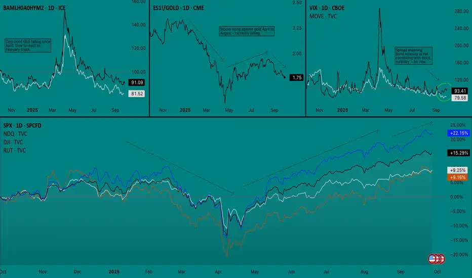
Layout 3: Risk
On this layout I am keeping track of the following
Top Left: Option adjusted spread (OAS) of corporate High Yield bonds/Investment Grade bonds
Top Middle: S&P 500 Futures/Gold spread
Top Right:VIX and  MOVE overlay
Bottom: Stock index comparison (SPX, NDQ, DJI, RUT)
I should have mentioned earlier that I’m trying to keep the start/end of the arrows on all of the charts aligned. The takeaway here is that the last time we saw ES1! sharply fall against
  GOLD , it provided an early signal for an equity sell off. The sell off Feb-April was a true risk-off event since both High Yield and Investment Grade bond yields surged and there was a simultaneous spike on VIX and MOVE. So far in September, we have seen stock volatility while bond volatility has remained flat. While VIX and MOVE were not leading indicators before, at the very least this indicates that equities are not yet ready to sell off.
Still, I cannot stress the point enough that Gold is very important to watch right now, especially as it relates to stocks since it can suggest that investors view it as the better risk asset, which cold lead them to dump the other (stocks) if an event makes it seem warranted.
——————————
Put simply, I think the market is saying the following:
1. More rate cuts are expected
2. Slower growth may be the bigger fear than inflation (at the moment)
3. Inflation worries are still present, yet diminished
4. Hedging with safe assets (bonds, gold) may be more attractive than stocks
5. Recent stock declines do not have risk-off confirmation
Next, I will take a look at my Bias chart, which right now mostly covers September thus far.
Layout 4: Bias
There’s a few things going on here that not everyone may be familiar with, so I’ll break it down pane-by-pane, as I have found this layout for FuturesES1! to be very effective
Top Left: 50R chart with indicators only. CVD Daily (blue), CVD Weekly (black), Fisher Transform (y-axis log scale), Anchored OBV (daily)
Bottom Left: ES1! Line Break (3 lines, 1h)
Center: ES1! Renko (ATR, 15m)
Right: VIX (1h)
I’m using a 50R chart on the top left pane to filter time-based noise and to provide more data to be calculated into each bar on the CVD indicator, which gives more conviction to each move. CVD is the most important indicator here and I have found that comparing Daily and Weekly CVD becomes more effective as the week progresses and often shows hidden order-flow divergences.
Line Break creates a new line when the price closes in the same direction of the trend. Reversals only occur when the price crosses above or below three lines in the opposite direction. Successions of small boxes (like we see here) are easy to reverse than several long boxes in a row.
Renko is similar to line break but it is filtered by ATR and new boxes only have to clear the filter before a reversal prints.
On this layout, we can see that there was a battle last week on the order flow but buyers ended up finishing on top. Volatility was climbing for six sessions straight but ended up getting dumped on Friday (9/26). Futures are currently climbing back towards ATH on Sunday night, however the print on the Line Break chart has me cautious about if this will be quickly reversed. I’d like to see at least one long bar print heading into Monday if I’m going to go long, as Line Break must be aligned with whichever direction I trade in.
——————————

Conclusion: I’m approaching this week with a good deal of caution. While I do not think that we will see a true risk-off event until the market approaches a point where policy tightening is getting priced in (i.e. Fed is too dovish and accelerates inflation, leading to a quick policy reversal). Still, the market’s defensive positioning and relative waning of interest in stocks cannot be ignored. With Q4 being traditionally strong, the market may sell into the weakness in order to reposition for a bullish end of the year, even if the broader outlook is starting to signal trouble ahead.
I’m not confident about trading either side on Monday, so it could be a volatility rebalancing day. What I will watch for, however, is VIX finding support and whether or not Futures reach new ATHs before pulling back. ATH before a pullback would be the best bullish scenario, while a failure to make new highs could lead to a flat distribution or re-accumulation range. In which case, order flow and daily options positioning will be important to watch.
If this becomes a weekly thing I will definitely not be explaining all of my charts and indicators each time, and will opt to keep it brief but wanted to at least explain it all once in case anyone ends up following along. Let me know if you have any questions or suggestions on how I can sharpen my analysis. Thank you for reading - AP.
Lately, I have been moving away from purely focusing on technical analysis and more towards building a framework that helps me assess the overall market structure to set my bias before then looking to technicals and other indicators to find trade entries. My current approach utilizes three dashboards for market structure, which I call Macro, FX, & Risk. From there, I have a specific layout on Futures that helps me track order flow and momentum. When I feel like I have a good read on the market and am ready to make a trade, I then look at the 0DTE options chain and
I’m still working on improving using this style of trading, but will try to journal my bias on a weekly basis from here forward if possible, which can help me determine areas where I am succeeding and others that could use improvement. For today, I will try to briefly run through each of my layouts with brief notes about how I am perceiving the market’s activity in context. I’ll look at this on a shorter scale in the future, but for now I am going to look at roughly the last 12 months, going back to October 2024.
Layout 1: Macro
On this layout, the goal is to gauge the overall market backdrop. Here, we can see that
The next two panes show a comparison of
•
•
•
indexed to 100 and the “Inflation Gauge” which is the difference between the average nominal US bond yield ((US10Y+US03MY)/2) minus the 10Y Real Yield, which provides a rough estimate of inflation expectations. Here we can see that nominal and real yields have been on the decline since June. In the first part of this phase, the inflation gauge was rising, suggesting true risk-on behavior. Fed policy remained unchanged while there was a modest rise in inflation expectations, yet investors did not pile into gold, so equities were the preferred risk asset during this period, especially since the dollar remained flat as previously mentioned.
On the righthand side, inflationary commodities (namely Oil
Since inflation expectations have been falling, the rise in Copper and Corn may be more of a demand signal, however if something causes Oil or the other two commodities to surge too quickly, these could turn into inflation drivers.
For now, the picture I’m seeing here is that the market’s risk-on appetite may be waning, in favor of safer bets like US Treasuries and Gold, even when inflation expectations are taken into account. Commodities and the Inflation Gauge will be important to keep watching, as correlation to the upside could quickly change the economic backdrop.
Layout 2: FX
Here, I am seeing that US nominal yields remain higher than most other major countries (Germany and Italy are both Blue to match EXY and are the solid and dotted lines, respectively) while the Dollar has seen a steep decline compared to other currency baskets over the same period. The message this sends to me is that investors are demanding a higher return on US debt while betting that monetary policy will ease, growth will slow, or both.
Layout 3: Risk
On this layout I am keeping track of the following
Top Left: Option adjusted spread (OAS) of corporate High Yield bonds/Investment Grade bonds
Top Middle: S&P 500 Futures/Gold spread
Top Right:
Bottom: Stock index comparison (SPX, NDQ, DJI, RUT)
I should have mentioned earlier that I’m trying to keep the start/end of the arrows on all of the charts aligned. The takeaway here is that the last time we saw
Still, I cannot stress the point enough that Gold is very important to watch right now, especially as it relates to stocks since it can suggest that investors view it as the better risk asset, which cold lead them to dump the other (stocks) if an event makes it seem warranted.
——————————
Put simply, I think the market is saying the following:
1. More rate cuts are expected
2. Slower growth may be the bigger fear than inflation (at the moment)
3. Inflation worries are still present, yet diminished
4. Hedging with safe assets (bonds, gold) may be more attractive than stocks
5. Recent stock declines do not have risk-off confirmation
Next, I will take a look at my Bias chart, which right now mostly covers September thus far.
Layout 4: Bias
There’s a few things going on here that not everyone may be familiar with, so I’ll break it down pane-by-pane, as I have found this layout for Futures
Top Left: 50R chart with indicators only. CVD Daily (blue), CVD Weekly (black), Fisher Transform (y-axis log scale), Anchored OBV (daily)
Bottom Left: ES1! Line Break (3 lines, 1h)
Center: ES1! Renko (ATR, 15m)
Right: VIX (1h)
I’m using a 50R chart on the top left pane to filter time-based noise and to provide more data to be calculated into each bar on the CVD indicator, which gives more conviction to each move. CVD is the most important indicator here and I have found that comparing Daily and Weekly CVD becomes more effective as the week progresses and often shows hidden order-flow divergences.
Line Break creates a new line when the price closes in the same direction of the trend. Reversals only occur when the price crosses above or below three lines in the opposite direction. Successions of small boxes (like we see here) are easy to reverse than several long boxes in a row.
Renko is similar to line break but it is filtered by ATR and new boxes only have to clear the filter before a reversal prints.
On this layout, we can see that there was a battle last week on the order flow but buyers ended up finishing on top. Volatility was climbing for six sessions straight but ended up getting dumped on Friday (9/26). Futures are currently climbing back towards ATH on Sunday night, however the print on the Line Break chart has me cautious about if this will be quickly reversed. I’d like to see at least one long bar print heading into Monday if I’m going to go long, as Line Break must be aligned with whichever direction I trade in.
——————————
Conclusion: I’m approaching this week with a good deal of caution. While I do not think that we will see a true risk-off event until the market approaches a point where policy tightening is getting priced in (i.e. Fed is too dovish and accelerates inflation, leading to a quick policy reversal). Still, the market’s defensive positioning and relative waning of interest in stocks cannot be ignored. With Q4 being traditionally strong, the market may sell into the weakness in order to reposition for a bullish end of the year, even if the broader outlook is starting to signal trouble ahead.
I’m not confident about trading either side on Monday, so it could be a volatility rebalancing day. What I will watch for, however, is VIX finding support and whether or not Futures reach new ATHs before pulling back. ATH before a pullback would be the best bullish scenario, while a failure to make new highs could lead to a flat distribution or re-accumulation range. In which case, order flow and daily options positioning will be important to watch.
If this becomes a weekly thing I will definitely not be explaining all of my charts and indicators each time, and will opt to keep it brief but wanted to at least explain it all once in case anyone ends up following along. Let me know if you have any questions or suggestions on how I can sharpen my analysis. Thank you for reading - AP.
Disclaimer
The information and publications are not meant to be, and do not constitute, financial, investment, trading, or other types of advice or recommendations supplied or endorsed by TradingView. Read more in the Terms of Use.
Disclaimer
The information and publications are not meant to be, and do not constitute, financial, investment, trading, or other types of advice or recommendations supplied or endorsed by TradingView. Read more in the Terms of Use.