Heikin Ashi Trend Continuation & Weakness Framework📈 Heikin Ashi Trend Continuation & Weakness Framework
This chart demonstrates how Heikin Ashi candles simplify trend analysis by filtering out market noise and emphasizing directional strength, momentum, and trend exhaustion.
Unlike standard candlesticks, Heikin Ashi focuses on average price behavior, making it ideal for:
Trend identification
Staying in strong moves
Avoiding premature reversals
This framework is designed to ride trends, not predict tops or bottoms.
⸻⸻⸻⸻⸻⸻⸻⸻⸻⸻
📊 Key Observations
1️⃣ Heikin Ashi Downtrend Rules (Bearish Control)
A strong downtrend is defined by:
Red candles only
Large candle bodies
No upper wicks → strong selling pressure
This structure indicates aggressive sellers with minimal pullback.
As long as these conditions persist, short bias remains dominant.
2️⃣ Trend Weakness Signals (Transition Phase)
Trend weakness appears when:
Candle bodies shrink
Upper and lower wicks start appearing
Heikin Ashi Doji candles form
⚠️ Important:
Heikin Ashi dojis do not signal an instant reversal.
They indicate loss of momentum and balance between buyers and sellers.
This phase often leads to:
Consolidation
Range formation
Or a slow trend transition
3️⃣ Structure Shift & Early Bullish Signs
After bearish momentum fades:
Red candles stop expanding
First green Heikin Ashi candles appear
Bodies are small → confirmation still pending
At this stage:
A potential uptrend is forming, but confirmation is required.
This prevents early long entries during false reversals.
4️⃣ Heikin Ashi Uptrend Rules (Bullish Control)
A confirmed bullish trend requires:
Green candles only
Large candle bodies
No lower wicks → strong buying pressure
This structure signals:
Aggressive buyers
Shallow pullbacks
High probability continuation
As long as these conditions hold, trend-following longs are favored.
5️⃣ Trend Continuation Logic
The strongest Heikin Ashi trends follow this sequence:
One-directional candles
Increasing body size
Minimal or no opposite wicks
This allows traders to:
Stay in winning trades longer
Avoid overtrading
Let trends mature fully
6️⃣ What Breaks the Trend?
A Heikin Ashi trend weakens when:
Opposite-colored candles appear
Wicks form against the trend
Candle bodies consistently shrink
Only multiple confirmations should be used to assume a trend change — not a single candle.
⸻⸻⸻⸻⸻⸻⸻⸻⸻⸻
📊 Chart Explanation
Symbol → NASDAQ:NVDA
Timeframe → 1D
This chart highlights:
Clean bearish phase using red HA candles
Momentum loss via doji candles
Transition into bullish structure
Confirmed uptrend with green candles & no lower wicks
Expected Sequence:
trend → momentum loss → transition → confirmation → continuation
Heikin Ashi excels at trend clarity, not precision entries.
⸻⸻⸻⸻⸻⸻⸻⸻⸻⸻
📘 How to Use Heikin Ashi Effectively
🔹 Trend-Following Use
Trade only in the direction of candle color
Stay in trades until opposite structure appears
Ignore small pullbacks during strong trends
🔹 Risk Management Tip
Use normal candles for exact entries if needed
Use Heikin Ashi for trend bias and holding trades
🔹 Common Mistake
❌ Treating doji candles as reversal signals
✅ Treating them as trend weakness alerts
⸻⸻⸻⸻⸻⸻⸻⸻⸻⸻
⚠️ Disclaimer
📘 For educational purposes only
🙅 Not SEBI registered
❌ Not financial or investment advice
Candlestick Analysis

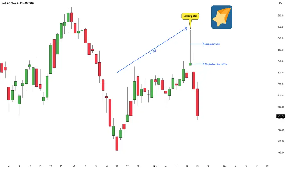
Identifying a Shooting Star Pattern on the ChartI was tracking a Swedish stock recently, and a very clean candlestick pattern popped up — a textbook shooting star.
The stock is Saab AB, a major Swedish company involved in military defense, commercial aviation, and civil security. Their operations span aircraft development, missile systems, naval platforms, surveillance systems, and a wide range of high-tech engineering services. In short, it’s one of Sweden’s core defense and aerospace names.
While going through the chart, this particular candle stood out because it matched the classic structure described in Japanese candlestick literature:
a tiny real body near the bottom,
a long upper wick,
and it formed after a short-term rally.
These are the key ingredients that define a shooting star.
From an educational perspective, the psychology behind this pattern is simple but powerful: the market pushed sharply higher during the session, could not sustain those higher levels, and slipped back toward the open. The candle itself captures that shift in momentum.
In classical candlestick theory, when a shooting star forms after an upswing , it often suggests that bullish strength may be fading and that the trend could be losing momentum. It doesn’t guarantee a reversal, but it does act as a visual warning sign — a moment where the advance pauses, hesitates, or becomes more vulnerable.
This post is simply to highlight how a shooting star looks on a real chart and what it typically represents in terms of market behaviour. No forecasts or trade ideas — just a clean educational example of the pattern in context.
Hammer Candlestick Reversals - Bullish & Bearish Setups🔹 Intro / Overview
In this idea, we focus on the Hammer candlestick pattern — both Bullish and Bearish variations.
The Hammer is a powerful reversal signal formed with a small body, a long shadow, and defined highs/lows.
When combined with EMA High–Low Band Confirmation and swing structure, it creates rule-based trading opportunities with clear validation and devalidation rules.
---
📖 Bullish & Bearish Hammer Intro
🟢 Bullish Hammer → Appears after a downtrend / at swing low . Buyers step in strongly, rejecting lower prices.
- EMA Band should be above the candle.
- Candle High = Validation line.
- Candle Low = Devalidation line.
- Entry → Close above the High.
- Stop-Loss → Candle Low.
- Target → 1x risk, with remaining lots trailed (ATR, Fibonacci, Box Trailing).
🔴 Bearish Hammer → Appears after a uptrend / at swing high . Sellers take control after rejecting higher prices.
- EMA Band should be below the candle.
- Candle Low = Validation line.
- Candle High = Devalidation line.
- Entry → Close below the Low.
- Stop-Loss → Candle High.
- Target → 1x risk, with remaining lots trailed.
---
📌 How to Use
🟢 Bullish Hammer Spotted
- Validation → Close above the Hammer’s high.
- Devalidation → Close below the Hammer’s low. (before validation)
- SL → Hammer Low.
- Target → 1x risk, remaining lots trail with ATR/Fibonacci.
🔴 Bearish Hammer Spotted
- Validation → Close below the Hammer’s low.
- Devalidation → Close above the Hammer’s high. (before validation)
- SL → Hammer High.
- Target → 1x risk, remaining lots trail with ATR/Fibonacci.
---
🎯 Trading Plan
- Entry → On validation close (Bullish above High, Bearish below Low).
- Stop Loss → Defined by Hammer candle (Low for Bullish, High for Bearish).
- Target → First TP = 1R, Remaining lots trailed for extended moves.
---
📊 Chart Explanation
1️⃣ 🟢 Bullish Hammer Spotted
- Candle validated as price closed above the high.
- 🎯 Target 1 achieved, remaining lots managed with trailing methods. Trailing Exit could be at swing top with best trailing
2️⃣ 🛑 Bearish Hammer →
- Candle validated as price closed below the low.
- 🎯 Target 1 achieved, remaining lots managed with trailing methods. Trailing Exit could be at swing bottom with best trailing
3️⃣ 🛑 Bearish Hammer →
- ❌ Devalidated
- Candle devalidated as price closed above the high.
4️⃣ 🛑 Bearish Hammer →
-Candle validated as price closed below the low.
⛔ Stop-Loss hit
- stop loss ensures risk management and discipline in trading.
5️⃣ 🛑Bearish Hammer →
-Candle validated as price closed above the low.
- 🎯 Target 1 achieved, remaining lots managed with trailing methods. Trailing Exit could be at swing bottom with best trailing
---
👀 Observation
- Bullish Hammer → Works best after prolonged downtrend at support zones.
- Bearish Hammer → Stronger after extended uptrends or near resistance zones.
- EMA Band → Confirms market bias and filters false signals.
- Risk Management → Defined SL + structured TP protect capital and maximize reward.
---
❗ Why It Matters?
- Clear rules: Validation, Devalidation, Entry, SL, and TP.
- Combines price action (Hammer) with EMA Band confirmation.
- Ensures disciplined trading instead of emotional decisions.
- Allows both conservative and aggressive management via trailing.
---
🎯 Conclusion
The Bullish & Bearish Hammer patterns, when combined with EMA High–Low Band confirmation, provide a structured reversal trading strategy.
By following strict entry, SL, and TP rules, traders can filter false setups and capture strong reversals at swing highs and lows.
🔥 Patterns don’t predict. Rules protect. 🚀
---
⚠️ Disclaimer
For educational purposes only · Not SEBI registered · Not a buy/sell recommendation · Not financial advice — purely a learning resource.

Bearish Hammer with EMA High-Low Band - Rule Based Entry 🔹 Intro / Overview
The Bearish Hammer candlestick is a signal of potential downside reversal.
It forms when buyers push price higher, but sellers regain control and close the candle near its low.
When combined with EMA High–Low Band confirmation, it creates a disciplined setup to identify short trade opportunities with clear rules.
---
📖 How to Use
✅ Validation → A valid signal occurs when the close price is below the low of the Bearish Hammer.
❌ Invalidation → If the close price crosses above the high of the Bearish Hammer, the signal is invalid. (Before validation )
EMA Band Confirmation:
- The Bearish Hammer must be above the EMA High–Low Band.
- The EMA High-Low band should not touch the Bearish Hammer.
- This ensures the setup aligns with bearish conditions.
✅ Bearish Hammar High must be swing high
---
🎯 Trading Plan
Entry → Enter short when the close price is below the Hammer’s low (validation line).
Stop-Loss (SL) → The high of the Bearish Hammer candle(Swing High)
Target (TP):
- First Target → 1R (equal to the risk defined by Entry–SL distance).
- Remaining Lots → Trail using ATR, Fibonacci levels, Box Trailing, or structure-based stops.
---
📊 Chart Explanation
- The Bearish Hammer shows rejection of higher prices, with a small body near the low and a long upper shadow.
- The EMA High–Low Band sits below the candle, and the Hammer forms above the band (no touch), confirming the setup.
- Validation occurs when the next close is below the Hammer’s low.
- Invalidation occurs if price closes above the Hammer’s high(before Validation)
---
👀 Observation
Bearish Hammer Behavior → Most effective after an uptrend or at resistance zones.
EMA Role → Ensures trade alignment with broader market bias.
Risk Management → SL above Hammer high, TP at least 1:1, with trailing options for extended downside moves.
---
❗ Why It Matters?
- Shows buyers losing strength.
- Sellers step back in and dominate.
- EMA Band ensures cleaner filtering of weak signals.
- Provides a strict framework for entry, SL, and targets.
---
🎯 Conclusion
The Bearish Hammer, combined with EMA High–Low Band confirmation, creates a structured short setup.
Using strict validation, devalidation, and risk management, traders can filter false signals and ride potential bearish moves with confidence.
🔥 Patterns don’t predict. Rules protect.
---
⚠️ Disclaimer
For educational purposes only · Not SEBI registered · Not a buy/sell recommendation · Not financial advice — purely a learning resource.

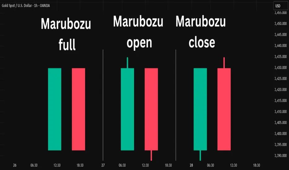
Marubozu Candlestick Pattern.....The Marubozu is a unique and powerful single candlestick pattern that signals strong momentum in the market.
📌 What is a Marubozu?
A Marubozu candlestick has "no wicks or small wicks" — just a full body from open to close. This shows that the buyers or sellers were in complete control during that period.
🔵 Bullish Marubozu
A Bullish Marubozu opens at the low and closes at the high, showing strong buying pressure. It often appears at the beginning of a bullish move or during a breakout.
🔴 Bearish Marubozu
A Bearish Marubozu opens at the high and closes at the low, indicating strong selling pressure. It can mark the start of a downtrend or a continuation of bearish strength.
🧠 Interpretation
Marubozu patterns are seen as signs of conviction. When spotted at support or resistance zones, they can strengthen breakout signals or confirm reversals.
⚠️ Tip :
Always combine Marubozu with volume analysis or other indicators to avoid false signals and improve accuracy.
🔍 Use this pattern to identify strong momentum shifts and trade in the direction of the breakout!
Disclaimer :
This post is not financial advice, it's for educational purposes only highlighting the power of coding( pine script) in TradingView, I am not a SEBI-registered advisor. Trading and investing involve risk, and you should consult with a qualified financial advisor before making any trading decisions. I do not guarantee profits or take responsibility for any losses you may incur.
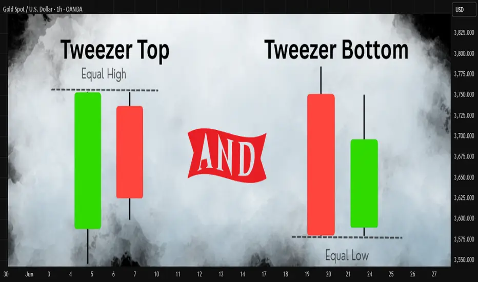
Tweezer Top and Tweezer Bottom Candlestick PatternsTweezer Top and Tweezer Bottom are powerful reversal candlestick patterns often spotted at the end of trends.
🔻 Tweezer Top
Appears at the top of an uptrend. It consists of two consecutive candles with similar highs. The first candle is usually bullish, followed by a bearish candle of almost the same high, signaling a potential bearish reversal.
🔺 Tweezer Bottom
Appears at the bottom of a downtrend. It consists of two candles with matching lows. The first candle is bearish, followed by a bullish candle of nearly equal low, indicating a possible bullish reversal.
📌 Key Characteristics:
• Both candles have equal highs (top) or lows (bottom)
• Second candle shows hesitation or rejection of the previous trend
• Often found near resistance or support zones
• Works best with volume confirmation or other confluence signals
Disclaimer :
This idea post is not financial advice, it's for educational purposes only highlighting the power of coding( pine script) in TradingView, I am not a SEBI-registered advisor. Trading and investing involve risk, and you should consult with a qualified financial advisor before making any trading decisions. I do not guarantee profits or take responsibility for any losses you may incur.
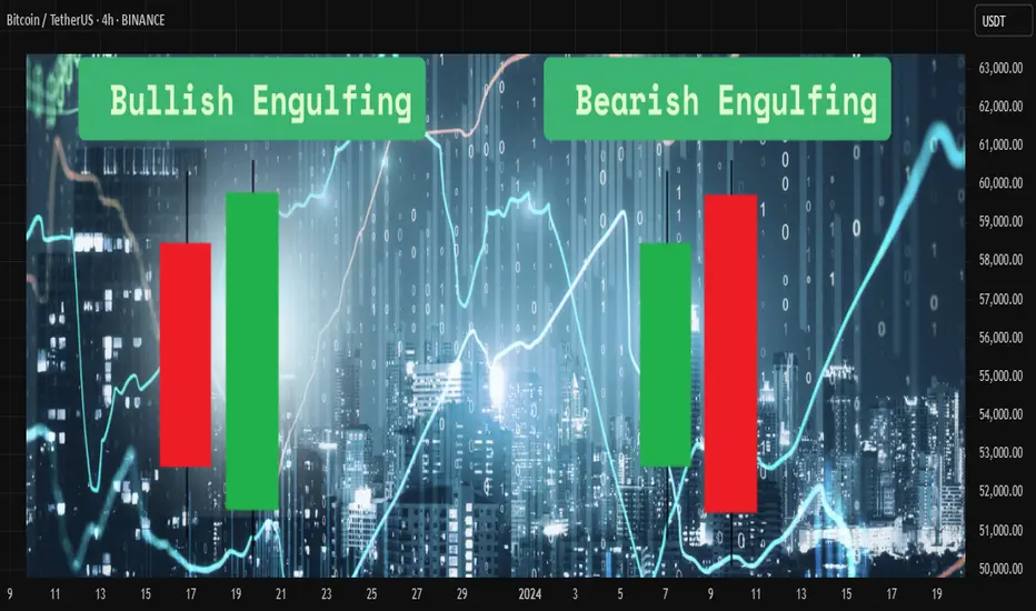
Engulfing Candlestick Pattern Explainedthe engulfing candlestick pattern is a powerful price action signal used by traders to identify potential reversals in the market. it consists of two candles:
🟢 bullish engulfing
* occurs during a downtrend
* the first candle is bearish (red)
* the second candle is bullish (green) and completely engulfs the body of the first candle
* it signals a potential reversal to the upside
🔴 bearish engulfing
* occurs during an uptrend
* the first candle is bullish (green)
* the second candle is bearish (red) and completely engulfs the body of the first candle
* it signals a potential reversal to the downside
📍 key points to remember
* the second candle must fully engulf the body (not just the wicks) of the first candle
* higher volume during the engulfing candle increases its reliability
* it works best when combined with support and resistance levels or trendlines
💡 confirmation
always wait for confirmation before entering a trade. for bullish engulfing, a break above the high of the engulfing candle is ideal. for bearish engulfing, a break below the low adds strength to the signal.
📈 How to use it ?
many traders use this pattern as part of their entry or exit strategy. combining engulfing patterns with indicators like rsi, moving averages, or trend filters can improve accuracy.
⚠️ risk management
like any pattern, engulfing candles are not 100% accurate. always use proper risk management and stop-loss placement to protect your capital.
Disclaimer :
This Video is not financial advice, it's for educational purposes only highlighting the power of coding( pine script) in TradingView, I am not a SEBI-registered advisor. Trading and investing involve risk, and you should consult with a qualified financial advisor before making any trading decisions. I do not guarantee profits or take responsibility for any losses you may incur.
Bullish and Bearish harami candlestick patternthe harami pattern is a two-candle reversal formation seen on candlestick charts. it reflects indecision and a possible shift in momentum, making it useful for spotting early signs of a trend change.
🔵 bullish harami
this pattern forms during a downtrend. the first candle is a large bearish one, followed by a smaller bullish candle that fits completely within the body of the first candle. this shows that selling pressure is weakening and a potential upward reversal may occur.
🔴 bearish harami
this pattern appears during an uptrend. the first candle is a strong bullish one, followed by a smaller bearish candle that is completely inside the previous candle’s body. this suggests that buying strength is fading, and a downward move might follow.
📌 key characteristics
* second candle is smaller and opposite in direction
* body of the second candle is fully within the body of the first candle
* confirmation from volume or the next candle increases reliability
✅ usage tips
* combine with support and resistance levels or trendlines
* look for confirmation from indicators like rsi or macd
* avoid using it alone in sideways or noisy markets
Disclaimer :
This post is not financial advice, it's for educational purposes only highlighting the power of coding( pine script) in TradingView, I am not a SEBI-registered advisor. Trading and investing involve risk, and you should consult with a qualified financial advisor before making any trading decisions. I do not guarantee profits or take responsibility for any losses you may incur.

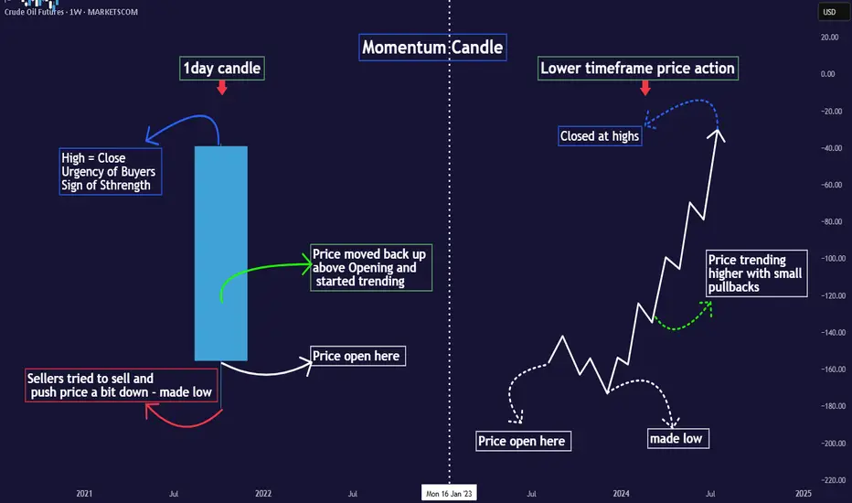
Simplified Approach to read Candlesticks -Easy Candles ~ Part 1MARKETSCOM:OIL
Introduction
⦿ Candles form the basis of chart creation and analysis.
⦿ A weak foundation can destabilise your entire structure. This thread will clarify and simplify your understanding of price candles.
I use two types of candles on charts:
1. Momentum/trending candles
2. Ranging/trading candles
Understanding these eliminates the need to memorize complex candle names (e.g., Marubozu, Harami bullish) cause every candlestick pattern is formed with combination of these 2 candels only.
Definitions:
⦿ Momentum candle: Body >50% of total size
⦿ Range candle: Body <50% of total size
Decode Momentum Candle
⦿ Only Buyers here - Clear Trend
Decode Range Candle
⦿ Both Buyers & Sellers here - No Trend
⦿ Indecision mode among participants.
⦿ Understand what major players did in the last candle to predict their next move.
⦿ Don't just memorise candle names; grasp the psychology behind them.
⦿ I'll share the levels of candle strength to elevate your candle reading.
♦️Stay tuned and follow for more educational
content.
OEducation
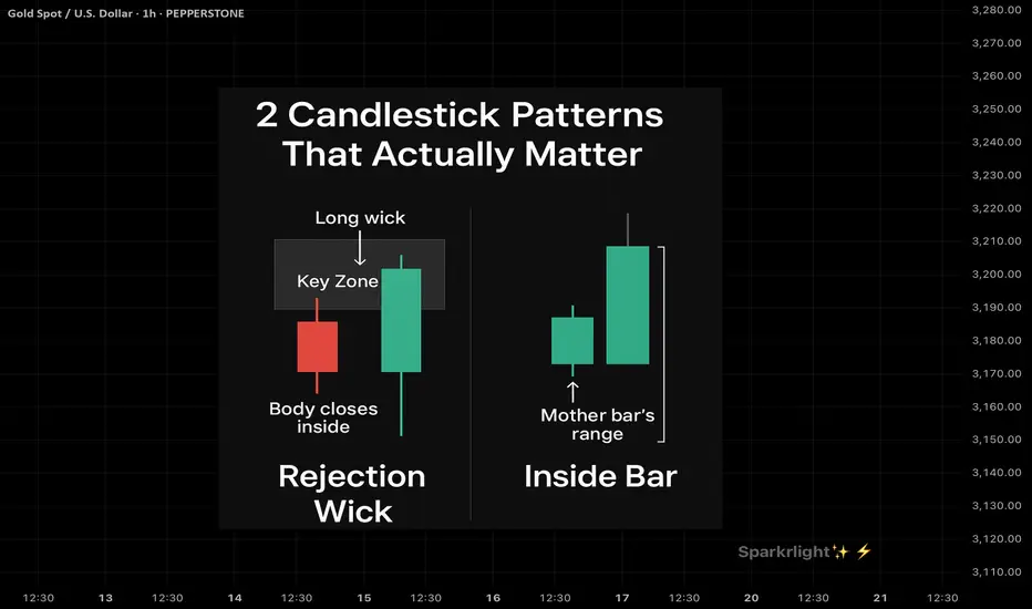
2 Candlestick Patterns That Actually Work — when used right !Intro:
Most traders learn candlestick patterns from cheat sheets —
Engulfing, doji, hammer, shooting star…
But not all patterns are created equal.
The key isn’t memorizing names — it’s understanding which ones hold real weight when used with structure.
Here are 2 powerful candlestick patterns that can shift the game — if you know when to trust them.
⸻
1. The Rejection Wick with Body Close Inside Structure (a.k.a. Rejection Candle)
What It Looks Like:
• A long wick that pierces above/below a key zone
• Candle body closes back inside the range
• Usually forms at OB, FVG, or liquidity sweep zones
Why It Works:
• It shows trapped traders and smart money rejection
• Confirms a false breakout and reclaim of intent
• Often leads to strong reversals or clean follow-throughs
When To Use It:
• After liquidity sweep
• Near HTF zone (OB / supply-demand)
• When followed by structure shift or BOS
Pro Tip: Combine with session awareness (NY / London open) for killer confluence.
⸻
2. The Inside Bar (Breakout Continuation Bar)
What It Looks Like:
• A small candle completely inside the range of the previous candle
• Price consolidates within one bar’s high-low range
• Often signals coiled pressure
Why It Works:
• It shows price resting before continuation
• When it forms near structure (OB or demand), the breakout that follows is often explosive
• Stop-loss is easy to place (above/below the mother bar)
When To Use It:
• After a BOS or clean impulse
• As a continuation signal on HTF
• Inside compression → expansion zones
Pro Tip: Trade the breakout of the inside bar with bias confirmation — not in both directions.
⸻
Final Word:
Candlestick patterns don’t work on their own.
They work when:
• Context is clear
• Liquidity has been handled
• Market structure aligns
If you trade candles without logic, you’re reacting to emotion.
But when you pair them with narrative and zones?
They become weapons.
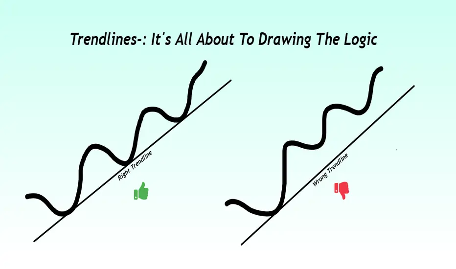
Not all lines are Trends: Post about proper Trendlines
Introduction-:
Trendlines are often the first tool traders learn and ironically, one of the most misused. Drawing a line between two swing points may look convincing, but that doesn’t make it meaningful. A right trendline is not just about connecting dots it’s about capturing the heartbeat of the market.
In this post we will learn how to draw high quality trendlines that align with price structure, reflect momentum, and provide reliable trade signals. Whether we are scalper, swing trader, or positional analyst, mastering this skill will bring more clarity and confidence to your chart reading.
1-:What Is a Trendline Really ?
A trendline isn't just a visual reference it’s a dynamic tool that reflects the direction and strength of a trend. Think of it as the price path of least resistance.
a) Identify areas of value for entry
b) Highlight potential reversal or breakout zones
c) Keep your analysis structured and disciplined
2-: Anatomy of a Right Trendline
a) Three Touches Minimum
A trendline with just two points is a projection. Once it gets a third touch or more, it becomes validated a level that other traders are likely watching too.
b) Wicks or Bodies Choose One, Use wicks when volatility is high or you're analyzing intraday charts and use bodies for cleaner structure in swing setups
Mixing both can distort your view so choose one and stick to it per chart.
c) Don’t Cut Through Candles, a forced line that slices through multiple candles is a biased line. Let the trendline hug swing points naturally without imposing your view on the market.
d) Respect the Slope, steep trendlines often mark emotional moves that don’t last. Shallow trendlines suggest controlled trends better for swing trades. Avoid extremes a flat or vertical line is usually unreliable.
3-: Timeframe Relevance
Always start with higher timeframes Daily or 4H to draw the main trendline. These longer-term lines attract more volume and institutional attention. Then shift to lower timeframes to refine your entries, keeping the higher-level structure in view.
4. Use Trendlines with Context for Better Accuracy, Trendlines become far more powerful when aligned with other tools, Some examples below.
Horizontal support and resistance can confirm trendline levels
Volume spikes can validate breakout or pullback setups
Divergence in RSI or MACD can signal weakening trend strength
Chart patterns like flags, triangles, or head-and-shoulders often form around key trendlines
The more layers of confirmation, the better your odds.
5-: Using Trendlines for Trading Decisions
a) Pullback Entry
Wait for price to touch the trendline and show a strong reaction (engulfing, pin bar, etc.). These setups offer high R:R with clear invalidation.
b) Break and Retest
A clean break below or above the trendline, followed by a retest, often marks trend continuation or reversal. Wait for confirmation before entering.
c) Logical Stop Placement
Place your stop-loss just outside the trendline’s opposite side. This approach is more rational than random pip buffers or fixed risk.
6-: Trendlines That Trap Traders
Not all breakouts are real. Sometimes price will breach a trendline just enough to trigger stops and then snap back so how to avoid the trap.
Don’t trust every breakout
Confirm with volume or candle structure
Watch for failure-to-follow-through patterns
Patience often reveals whether a move is genuine or manipulation.
Conclusion
The right trendline is not just a drawing it’s a tool that reflects the psychology of the market.
It helps you trade what the market is showing, not what you hope to see. Don’t draw lines to fit your bias. Let price action speak, and draw lines that the market itself respects.
Thanks for reading. If this added value, a like would be encouraging.
Regards- Amit.
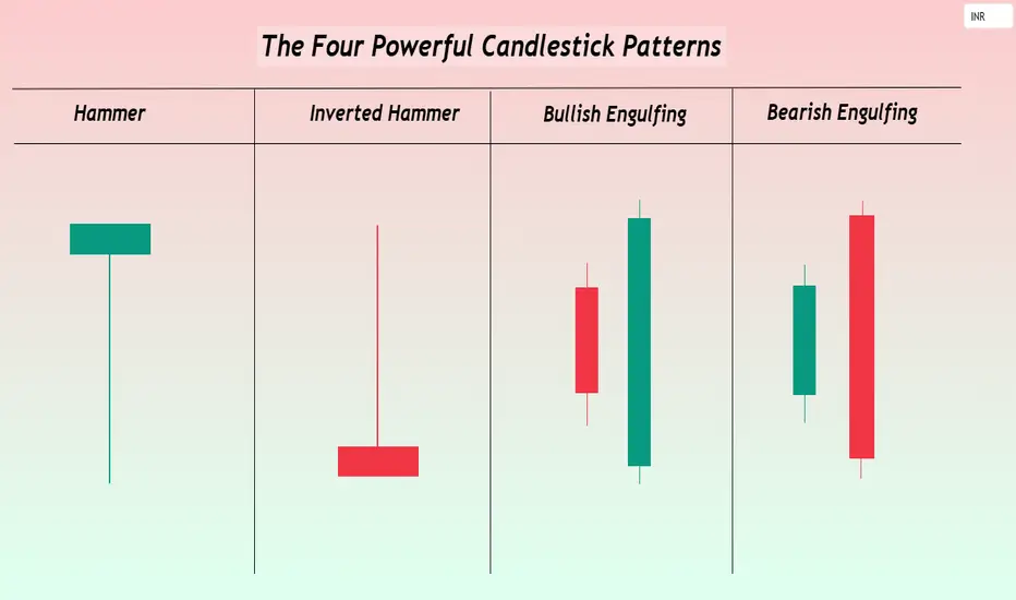
The Four Powerful Candlestick PatternsHello TradingView Community and Friends here I am sharing the four of the most powerful candlestick patterns every trader should know especially to the new entrants to technical analysis and that are-: Hammer, Inverted Hammer, Bullish Engulfing, and Bearish Engulfing.
These patterns are not just visual shapes they reveal critical shifts in market sentiment and offer high probability trading opportunities when interpreted correctly.
I hope this article adds real value to your trading journey. Feel free to share your thoughts and experiences in the comments, sharing below the Four Powerful Candlestick Patterns.
1-Hammer: The Bullish Reversal Indicator Structure and Appearance-:
A small real body located near the top of the price range.
A long lower wick that is at least twice the size of the body.
Little or no upper shadow.
Psychology-:
During the session, bears push the price significantly lower, but bulls step in aggressively, driving the price back near the open.
The result is a strong potential bottoming signal showing that buyers are regaining strength.
Trading Strategy-:
Most effective after a steep downtrend or during oversold conditions.
Confirmation is essential: the next candle should close above the Hammer’s high to validate the reversal. A prudent stop-loss can be placed just below the low of the Hammer.
2-Inverted Hammer: a Subtle Bullish Rreversal signal, Structure and appearance-:
A small real body located near the bottom of the trading range.
A long upper wick that is at least twice the size of the body.
Very little or no lower shadow.
Psychology-:
Buyers attempt to push prices higher during the session but face selling pressure.
However the very presence of buying pressure after a downtrend hints at underlying bullish interest starting to emerge.
Trading Strategy-:
Most useful after a strong downtrend when signs of exhaustion appear.
The confirmation is again crucial a strong bullish candle following the Inverted Hammer gives a higher probability setup.
Risk can be controlled by placing a stop-loss below the Inverted Hammer’s low.
3-Bullish Engulfing: Buyers Taking Over Structure and Appearance-:
A large bullish (green) candle that completely engulfs the previous small bearish (red) candle’s body.
Ideally, the bullish candle opens lower and closes higher than the previous candle’s range.
Psychology-:
Initial selling pressure is absorbed and reversed with strong buying momentum.
A complete shift in sentiment from bears to bulls is reflected in the engulfing candle.
Trading Strategy-:
Most powerful when appearing after a sustained downtrend or at key technical support levels.
Traders often enter on a break above the Bullish Engulfing candle’s high.
Volume confirmation higher than average during the pattern significantly strengthens the signal.
4-Bearish Engulfing: Sellers Seizing Control, Structure and Appearance-:
A large bearish (red) candle that fully engulfs the previous small bullish (green) candle’s body.
Ideally, the bearish candle opens higher and closes lower than the previous candle’s range.
Psychology-:
An initial bullish attempt is overwhelmed by aggressive selling pressure.
Bears decisively regain control, warning of a potential downside move.
Trading Strategy-:
Highly effective when occurring after an extended uptrend or near strong resistance zones.
Traders can initiate short positions on the break below the Bearish Engulfing candle’s low, with stops placed just above the pattern’s high.
Increased volume during the engulfing candle boosts the credibility of the reversal.
Key Techniques for Trading These Patterns Successfully-:
Always wait for confirmation a single candle is never enough subsequent price action is critical.
Volume matters- Candlestick signals accompanied by a surge in volume are generally more reliable.
Focus on key price zones- Patterns occurring near major support, resistance, or Fibonacci levels have a much higher success rate.
Risk management remains supreme- No pattern guarantees success. Appropriate stop-loss placement and calculated position sizing protect against false signals.
Conclusion-:
The Hammer, Inverted Hammer, Bullish Engulfing, and Bearish Engulfing patterns remain among the most trusted tools in a trader’s arsenal.
They capture critical moments when the balance of power between buyers and sellers shifts often leading to strong follow through moves.
However even the most powerful candlestick setups require patience, discipline, and proper confirmation.
By mastering these patterns and integrating them into a well rounded trading plan, traders can anticipate key market moves, time their entries better, and ride trends with greater confidence.
Focus on learning the language of price, and the markets will start speaking to you more clearly.
Hope you like this publication.
Best regards-Amit
The Market Speaks in the First Hour Learn to ListenDear TradingView Community and Fellow Traders, Wishing you all a focused and fulfilling trading journey. Each day in the market brings its own rhythm, and recognizing that early can make all the difference. In this piece, I’m sharing a concept that continues to shape my intraday approach, the First Hour Range. It’s a simple yet powerful framework that can offer clarity right from the start of the session.
Let’s explore how the first 60 minutes can set the tone for the entire trading day.
Body-:
The first hour of the trading session is one of the most dynamic and information-rich periods of the day. It lays the groundwork for what often becomes the day’s dominant trend, volatility structure, and psychological narrative. Whether you're a scalper, momentum trader, or swing trader analyzing intraday flow, the first hour can act as your primary map.
Understanding the First Hour Range-:
The First Hour Range is defined by the highest and lowest prices achieved during the first 60 minutes after market open. These two levels create a clear boundary that reflects the initial battle between buyers and sellers, often influenced by overnight global cues, news events, gap openings, and institutional order flow.
This range can be seen as a "price cage" a zone that either contains the price action for the rest of the session or is decisively broken to signal continuation or reversal.
Why Is This Range So Important?
High Volume and Volatility-: The opening hour is typically where the highest intraday volume occurs. This influx of participation leads to price discovery, as market participants react to overnight developments, pre-market news, and opening gaps.
Reference for Support and Resistance-: The high of the first hour acts as early resistance. The low acts as intraday support. If price breaks above or below this range later in the session, it’s often accompanied by strong follow-through, especially when confirmed with volume.
Bias Detection-: Traders can assess whether the session is likely to be trending or range-bound by observing how price behaves around the first hour range. A clean breakout and sustained move away indicates trend conviction. Repeated rejection from the edges hints at indecision or mean-reversion behavior.
Breakout Triggers-: Many intraday breakout strategies use the first hour range as a trigger zone. Long entries may be placed just above the high of the range, while short entries might be taken below the low. Traders often use volume spikes or candle confirmation (e.g., engulfing or Marubozu) for added conviction.
Fakeouts and Traps: On some days, price may breach the range high or low and then reverse back within it. This is known as a failed breakout or fakeout, often trapping aggressive breakout traders. For experienced traders, these traps can be lucrative countertrend setups with tight stop-loss placements.
Types of Market Days Based on First Hour Behavior
Trend Day-:
Price breaks out of the range early and continues in the direction of the breakout with minimal pullbacks. Look for rising volume and shallow retracements.
Range-Bound Day-:
Price stays within the range for most of the session, often forming a sideways consolidation. These are ideal for mean-reversion traders using oscillators or reversal patterns near the extremes.
Reversal Day-:
The initial breakout fails, and price reverses strongly in the opposite direction. Look for volume divergence or key reversal candlesticks like pin bars or bearish/bullish engulfing patterns.
Tips for Using the First Hour Range Effectively
Always mark the first hour high and low on your intraday chart, regardless of your trading style. It serves as a reference throughout the day.
Align higher timeframe bias (e.g., daily or 4-hour chart) with the breakout direction to improve probability.
Watch how price reacts at the range extremes. Wick rejections, reversal candles, or hesitation often precede strong counter moves.
In choppy markets, wait for a retest of the breakout level before entry this improves confirmation and reduces false signals.
Psychological Importance
The first hour is not just about price it’s about trader psychology. Emotional decisions, early fear or greed, profit-taking from overnight positions, and smart money manipulation all unfold during this time. Reading this layer helps you better anticipate the day’s rhythm.
Conclusion-:
The First Hour Range is a deceptively simple yet incredibly effective framework to assess market structure, trade opportunities, and risk zones. It’s a tool that adapts well to all kinds of markets equity indices, forex, commodities, or crypto.
Make it part of your daily routine. Observe how price respects or disrespects it. Use it to align your trades with market momentum or fade the crowd when the context favors reversals.
More often than not, the market whispers its intention in the first 60 minutes. The traders who are listening closely tend to ride ahead of the curve.
Best Regards- Amit

My Favorite Reversal Candle Pattern (Works Like Magic!)Hello Traders!
What if I told you that one single candlestick pattern could give you an 80% win rate — when traded with the right context and strategy? That’s right! Today, we’re talking about the powerful Engulfing Candlestick Pattern — backed by data, tested across timeframes, and loved by price action traders.
Let’s break it down properly so you can spot it, trade it, and win with it.
The Candle Setup: Bullish & Bearish Engulfing Patterns
Bullish Engulfing Pattern:
This forms at the end of a downtrend or pullback . A strong green candle completely engulfs the previous red candle’s body, signaling a shift from sellers to buyers.
This setup is most effective at key support zones, trendline bounces, or bullish reversals with volume confirmation .
Bearish Engulfing Pattern:
Seen after an uptrend or rally . A solid red candle engulfs the previous green candle’s body, showing a shift from buyers to sellers.
Best used near resistance levels, psychological zones, or after a parabolic price move .
Check the chart above to understand better!
Note: I’ve used real chart examples from the past to demonstrate Bullish & Bearish Engulfing patterns exactly as they appear in price action textbooks — so you can recognize them with clarity and confidence.
How to Trade the Engulfing Candle Effectively
Entry:
Enter above the bullish engulfing candle’s high (long) or below the bearish engulfing candle’s low (short) after the candle closes.
Stop Loss:
Place SL just below the bullish engulfing candle's low or above the bearish candle’s high.
Target:
Use a 1:2 or 1:3 risk-reward ratio, or set targets based on nearby support/resistance or Fibonacci levels.
When to Use:
Only trade engulfing patterns when they form at a confluence zone — such as support/resistance, trendlines, moving averages, or breakout retests .
Backtesting Insights
When tested across Nifty 50, Bank Nifty, and large-cap stocks on the 15 min, 1H, and Daily charts , the Engulfing pattern — when combined with structure — showed up to 80% success rate with proper risk management and discipline.
Rahul’s Tip
Don’t blindly trade the pattern—trade the location! Context is everything. Always confirm with structure and volume. Engulfing candles are powerful, but only when they appear where it actually matters.
Conclusion
The Engulfing Candle is one of the most reliable patterns if traded with patience and planning. Combine it with key zones and risk control , and it can become a high-probability weapon in your trading arsenal.
Have you used this pattern before? Share your success (or lessons) in the comments — let’s grow together!

Understanding Bullish & Bearish Candles FormationHello Traders!
In today’s post, we’ll be discussing the Candlestick Formation setup, which is essential for reading price action and identifying potential trend reversals. Candlestick patterns are a crucial tool for traders to understand market sentiment and predict future price movements. Let’s break down the two most common formations: Bullish Candlestick and Bearish Candlestick .
Bullish Candlestick Formation Setup
What is a Bullish Candlestick?
A bullish candlestick appears when the price closes higher than it opened. This formation suggests that buyers are in control and the price is likely to rise further.
Key Components of the Bullish Candlestick:
Body : The green section between the open price and the closing price . This is the main body of the candle, indicating the price movement during that time period.
Wicks : The thin lines above and below the body of the candle. The upper wick shows the highest price reached during the period, while the lower wick shows the lowest price.
Closing Price : The point at which the price closed for the trading period. A higher closing price indicates strong bullish momentum.
Open Price : The price at which the asset opened at the start of the trading period.
Low & High : The low is the bottom of the lower wick, and the high is the top of the upper wick.
When to Look for Bullish Candlesticks?
A bullish candlestick typically forms at the bottom of a downtrend, indicating a potential reversal or continuation to the upside. It’s a signal that the market is gaining upward momentum.
Bearish Candlestick Formation Setup
What is a Bearish Candlestick?
A bearish candlestick forms when the price closes lower than it opened. This indicates that sellers have control, and the price might continue to fall.
Key Components of the Bearish Candlestick:
Body : The red section between the open price and the closing price , representing downward price movement during the period.
Wicks : Similar to the bullish candlestick, the upper wick shows the highest price during the period, and the lower wick shows the lowest.
Closing Price : The point at which the price closed during the period, showing the downward momentum of the asset.
Open Price : The price at which the asset opened, showing the start of the downward movement.
Low & High : The high is at the top of the upper wick, and the low is at the bottom of the lower wick.
When to Look for Bearish Candlesticks?
A bearish candlestick typically forms at the top of an uptrend, signaling a possible trend reversal or a continuation to the downside. It suggests that selling pressure is building up.
Key Differences: Bullish vs Bearish Candlesticks
Bullish Candlestick:
The close is above the open .
Indicates upward price movement or buying strength.
Appears during a downtrend reversal .
Bearish Candlestick:
The close is below the open .
Signals downward price movement or selling pressure.
Appears during an uptrend reversal .
Trading with Candlestick Formations
Confirm the Trend : Look for candlestick formations at key levels, such as support and resistance, or after a strong uptrend or downtrend.
Use Multiple Candles : Don’t rely on just one candlestick. Look for multiple bullish or bearish candles to confirm the direction.
Combine with Other Indicators : Use candlestick patterns in conjunction with technical indicators like RSI, MACD, or moving averages for stronger confirmation.
Pay Attention to Volume : High volume with a bullish or bearish candlestick gives more weight to the signal.
Conclusion
Candlestick formations are one of the most powerful tools in a trader’s arsenal. By understanding the bullish and bearish setups, you can predict market movements and make informed decisions. Remember, always confirm the pattern with other indicators and never trade based on just one candlestick.
What candlestick patterns do you use in your trading strategy? Let me know in the comments!

Mastering the Three White Soldiers Pattern: A Bullish ReversalHello Traders!
I hope you're doing great in your trading journey! Today, we will be diving into the Three White Soldiers chart pattern, a powerful bullish reversal pattern that can help you spot a potential trend shift. This pattern typically occurs after a downtrend, signaling a strong reversal. If you can spot it early, it offers a high-reward trading opportunity. Let’s break down the pattern and how to use it effectively.
What is the Three White Soldiers Pattern?
The Three White Soldiers pattern consists of three consecutive long bullish candles that close progressively higher. This pattern typically appears after a downtrend and signifies a potential reversal. The pattern shows a strong shift in market sentiment, where buyers are stepping in to push the prices higher.
Key Characteristics of the Three White Soldiers Pattern
Trend Reversal: The pattern forms after a strong downtrend, signaling a potential trend reversal.
Three Consecutive Bullish Candles: The pattern consists of three long bullish candles, each closing higher than the previous one.
Strong Closing Prices: Each candle should close near its high, indicating strong buying pressure.
Volume Confirmation: The pattern is more reliable when accompanied by increasing volume, showing strong interest in the reversal.
How to Trade the Three White Soldiers Pattern
Entry Point: Consider entering a long position once the third candle closes, confirming the reversal.
Stop Loss: Place your stop loss below the low of the first candle in the pattern to limit potential losses.
Profit Target: For setting targets, measure the height of the pattern (distance between the low of the first candle and the high of the third candle) and project this distance upwards from the entry point to set your profit target.
Real-World Application: TCS Case Study
In the chart of Tata Consultancy Services (TCS) , we see a clear Three White Soldiers pattern forming after a downtrend. The price closed progressively higher over three consecutive days, breaking key resistance levels and signaling a potential bullish trend. Traders entering after the confirmation of the pattern would have witnessed a substantial upward move, with a clear Stop Loss and Profit Target in place.
Risk Management Considerations
Position Sizing: Adjust your position size according to your risk tolerance and overall portfolio.
Stop Loss Placement: Place your stop loss below the low of the first candle to manage risk in case the pattern fails.
Volume Confirmation: Confirm the pattern with increasing volume to ensure the strength of the reversal.
What This Means for Traders
The Three White Soldiers pattern is an excellent tool for identifying trend reversals and can be a powerful signal when used in conjunction with other technical indicators. Remember to always look for confirmation with volume and manage your risk effectively.
Look for the pattern after a significant downtrend to identify potential bullish reversals.
Use volume to confirm the strength of the pattern and increase the reliability of your trade.
Implement stop loss placement to minimize risk while targeting a favorable risk-to-reward ratio.
Conclusion
The Three White Soldiers pattern is a reliable bullish reversal signal that can offer excellent trading opportunities when combined with other technical indicators. By understanding its key characteristics, waiting for confirmation, and managing risk appropriately, you can increase your chances of making profitable trades.
Have you traded using the Three White Soldiers pattern?
Share your thoughts and experiences in the comments below! Let’s keep learning and improving our trading strategies!

Three Black Crows: How to Spot and Profit from Bearish ReversalsHello Traders!
I hope you’re all doing great! Today, we’ll discuss the Three Black Crows candlestick pattern, one of the most reliable bearish reversal patterns you can find in technical analysis. If you're serious about identifying potential trend reversals, understanding this pattern is essential.
The Three Black Crows is a powerful bearish signal that typically marks the end of an uptrend. It consists of three consecutive long red (or black) candles that close progressively lower, showing strong selling pressure and a shift in momentum. This pattern is particularly effective when it forms at a key resistance level, and it can lead to significant price declines.
What is the Three Black Crows Pattern?
The Three Black Crows candlestick pattern signals the reversal of an uptrend. The pattern forms when:
The first candle is a large red candle, closing near the low of the day.
The second candle opens below the first one and closes lower.
The third candle opens lower than the second one and closes near its low.
Each candle in the sequence is characterized by strong bearish price action, and their alignment suggests that bears are gaining control.
Key Characteristics of the Three Black Crows Pattern
Bearish Trend Reversal: Three long red candles following an uptrend suggest a shift in momentum from buyers to sellers.
Strong Resistance Zone: The pattern is more reliable when it forms near a strong resistance level, where the price has struggled to move past in the past.
Closing at the Low: Each of the three candles closes near their respective lows, showing increasing selling pressure.
Volume Confirmation: Volume should ideally increase with each successive candle, confirming that bears are taking control.
How to Trade the Three Black Crows Pattern
Entry Point: After the formation of the third candle, consider entering a short position once the price breaks the low of the third candle. This confirms the bearish trend.
Stop Loss: Place your stop loss just above the high of the third candle to minimize risk in case of a false breakout.
Profit Target: Measure the distance from the high of the pattern to the low of the third candle. Project this distance downward from the breakout point to estimate your profit target.
Real-World Application: Tata Consultancy Services Case Study
In the chart of Tata Consultancy Services (above), we can see a classic example of the Three Black Crows pattern. The price formed a resistance zone and then saw the three consecutive bearish candles break the support, confirming the bearish trend reversal. The huge fall after the pattern’s confirmation indicates the power of this candlestick formation.
Risk Management Considerations
Position Sizing: Adjust your position size based on your risk tolerance and make sure it fits within your overall portfolio strategy.
Stop Loss Placement: Place your stop loss above the third candle to avoid potential losses from a false breakout.
Confirmation with Volume: Always wait for volume confirmation before entering the trade. Volume should increase as the pattern forms.
What This Means for Traders
The Three Black Crows is an excellent pattern to spot potential trend reversals, especially after an uptrend. This pattern works best when combined with other technical indicators like trendlines, support and resistance, and moving averages to confirm the trend reversal.
Look for the pattern at resistance levels to identify high-probability bearish reversals.
Confirm with volume to increase the reliability of the pattern.
Use proper stop loss placement to manage your risk and ensure a favorable risk-to-reward ratio.
Conclusion
The Three Black Crows candlestick pattern is a reliable bearish reversal signal that can help traders capitalize on price declines. By identifying the pattern correctly, waiting for confirmation, and applying solid risk management strategies, you can improve your trading success.
Have you traded using the Three Black Crows pattern?
Share your experiences in the comments below! Let’s keep learning and growing together!

How to Trade Candlestick POIsThis is not precisely a forecast, rather, it is a tutorial on how to trade candlestick POIs using my custom Templar Trading Methodology. It is a very basic approach, not exactly as robust as I would teach in a class or seminar per se.
In this video, you will learn how to capture the best Day Trading ideas on a daily basis, especially on Gold (XAUUSD), and other high-volatility commodities. I hope you learn a thing or two from this though. Cheers!
- Adetola Freeman.

Three White Soldiers | Educational | Colpal The Three White Soldiers candlestick pattern is commonly used in technical analysis.
The pattern identifies potential bullish reversals in a downtrend or a period of consolidation. Traders often use the pattern and other technical analysis tools, such as support and resistance levels, trend lines, and volume indicators, to confirm the trend’s strength and potential entry and exit points.
The Three White Soldiers pattern can be used on various time frames, from short-term intraday charts to longer-term weekly or monthly charts, depending on the trading strategy and goals.
Disclaimer: This is for educational purpose. Definition and details can be found on any other search engine / books/ articles etc.

Gold - Bookish example for Morning/Evening StarA typical example of Morning Star and Evening Star in the same chart. Its a good time to consolidate Gold
Evening Star
Evening star patterns are associated with the top of a price uptrend, signifying that the uptrend is nearing its end
The first day consists of a large white candle signifying a continued rise in prices.
The second day consists of a smaller candle that shows a more modest increase in price.
The third day shows a large red candle that opens at a price below the previous day and then closes near the middle of the first day
Morning Star
The Morning Star pattern is a classic bullish reversal pattern in technical analysis. The pattern consists of three candlesticks: two large ones with different directions and a smaller candlestick between them.

Evening Star - A Typical ExampleEvening Star
Evening star patterns are associated with the top of a price uptrend, signifying that the uptrend is nearing its end
The evening star pattern is considered to be a very strong indicator of future price declines. Its pattern forms over three days:
The first day consists of a large white candle signifying a continued rise in prices.
The second day consists of a smaller candle that shows a more modest increase in price.
The third day shows a large red candle that opens at a price below the previous day and then closes near the middle of the first day

Morning Star + Flag pattern - Trend ReversalMorning Star - The Morning Star pattern is a classic bullish reversal pattern in technical analysis. The pattern consists of three candlesticks: two large ones with different directions and a smaller candlestick between them.
Flag Pattern - A sudden move in either direction followed by the price consolidates in a range following the sharp move, and the price then continues to move in the same direction after it breaks out of the range. Its visual resemblance to a flag and a pole

What is Price Action ? Beginners Guide in Easy Steps Part -2In our previous discussion, we delved into the fundamental techniques of reading a price chart with key price action strategies. This time, we're set to expand our understanding even further. By the end of this article, you'll have a fresh perspective on analyzing charts and interpreting price movements, empowering you with deeper insights and more confident trading decisions.
1. Identify the direction of trend with the help of price action candlesticks
a.)Strong Uptrend:
Green candlesticks moving upwards continuously.
Indicates strong buying pressure with no selling pressure.
b.)Uptrend with Deep Retracement:
Green candlesticks with some pullbacks.
Sellers present, causing temporary price dips.
c.)Indecisive Market:
Alternating red and green candlesticks.
No clear market direction, prices moving up and down without strong conviction.
d.)Tight Range Before Breakout:
Small red and green candlesticks within a tight range.
Usually occurs before a significant breakout.
e.)Weak Uptrend with Choppy Price Action:
Alternating red and green candlesticks, choppy pattern.
Indicates weak buying pressure and strong selling presence.
f.)Healthy Uptrend:
Green candlesticks with few red ones.
Strong buying pressure with minimal selling, indicating a solid upward trend.
2. Importance of Wicks and the closing of candle
Wick and a Doji Candle: Indicates early signs of buyers attempting to stop the price decline,
If you observe closely there is a wick in previous candle also, on the break of high of the candle price hit trendline resistance and fallen again.
Second Wick at the Same Zone: Sellers tried to push the price down again, but buyers stopped it, forming a bullish pin bar. First wick formed a demand zone but the second wick confirmed
of buyers activity.
After Some Fight, Buyers Win: Buyers managed to push the price up From the range, kicking out the sellers.
More Lower Wicks: Indicates both buyers and sellers are active, but buyers are gradually winning, which is bullish.
Lower Wick Shows Demand: After a downturn, the lower wick signals demand coming in.
Inside Bar with Bigger Upper Wick: Shows bearish bias. The break of the low led to the continuation of the fall.
NOTE: Wicks are an early indication of demand or supply presence, but the location of formation will be more important.It would help if you determined whether it's in an uptrend, downtrend, or range.
3. Multiple Candle Rejection
A)Exhaustion Gap:
At one point, the chart shows a gap up, where the opening price equaled the high of the day. This indicates an exhaustion gap, suggesting potential for a larger correction. Despite this, only a single bar correction occurred initially, showing resilience.
B)Brutal Correction:
A sharp, one-bar correction is seen, followed by buyers trying to push the prices back up within the same candle. This indicates a strong fight between buyers and sellers.
C)Inside Bars and Tight Range:
The presence of multiple inside bars with tight ranges and prominent lower wicks signals consolidation and market indecision. This is a period where neither buyers nor sellers dominate, often preceding a significant move.
D)Break and Continuation:
Eventually, the price breaks and closes above the range of the inside bars. This breakout triggers a continuation of the uptrend, evidenced by the subsequent series of green candles and higher prices.
#Understanding Candlestick Wicks:
Wicks/Tails: These are crucial as they indicate early signs of demand or supply. In this chart, the lower wicks suggest that buyers are stepping in at lower prices, even during pullbacks, showing underlying strength.
4.Importance of Close Of Candle
If you wait for close of the Candle beyond support or resistance zone then it can help you take high-probability entries only and avoid fake breakouts.
Fake breakout means when the price breaks the support or resistance area but it failed to sustain beyond that area and quickly comes inside the range.
That's all for today's idea I hope you have gained good insights into how to read market direction with the help of candlesticks structure If you read market direction in consideration with the factors explained in Part 1 then the outcomes will be Great.
If this idea helped you learn something new hit the boost button and share with your friends,
Stay tuned new ideas in this series coming soon.
Keep Learning,
Happy Trading.
NSE:NIFTY
