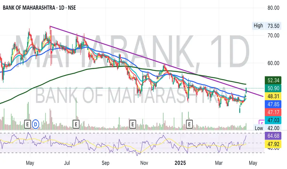
Bank of Maharashtra Trendline Breakout Key Ratios
Capital Adequacy Ratio - 17.38% in FY24 vs 16.48% in FY22
Yield on Advances: 8.94% in FY24 vs 7.29% in FY22
Cost of Fund: 3.95% in FY24 vs 3.35% in FY22
NIM - 3.97% in FY24 vs 3.17% in FY22
Cost to Income: 37.55% in FY24 vs 44.26% in FY22
ROE: 23.8% in FY24 vs 11.5% in FY22
Candlestick Analysis
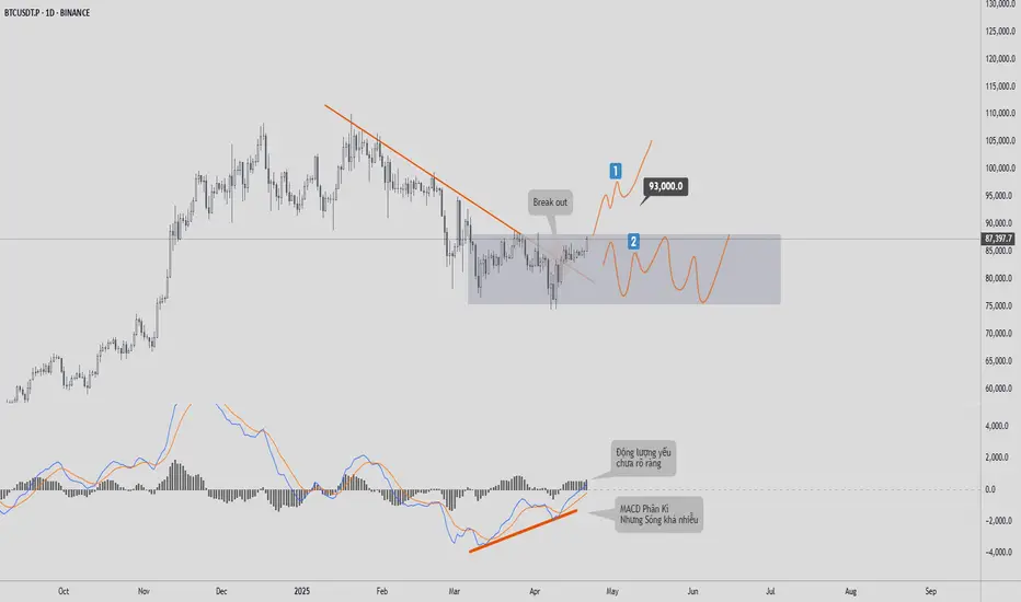
BITCOIN PRICE UPDATE – April 21, 2025🔴 BITCOIN PRICE UPDATE – April 21, 2025
💰The D1 chart of
BTC
is currently showing a pretty solid buying signal. From the 78k support zone, we can see that buyers have stepped in. Although the price has broken the downtrend line and there are positive signals from the MACD, I have the following observations that you should pay close attention to before making any trading strategy decisions during this period:
1. The trendline breakout signal doesn’t necessarily indicate that the market is entering an uptrend. It could simply mean that the downtrend has temporarily ended.
2. There is a divergence signal on the MACD; however, I don’t place much weight on this, because the two lines are wrapped tightly around each other. From my experience, this signal shows more of a “PROBING” move rather than strong buyer commitment.
3. I also checked the momentum indicator, and it doesn’t show any clear bullish signals yet. This phase still doesn’t give a high-confidence indication that the market is about to reverse.
Based on these three reasons, I have two potential views for this phase:
✔️View 1: The ideal scenario is that
BTC
continues to rise toward the nearest liquidity peak (around 93k), but it would still need to pull back afterward to retest the support zone—it’s unlikely to just skyrocket without correction.
✔️View 2:
BTC
reverses at this point and forms a consolidation zone within the gray box, with price fluctuating in an 8k–10k range for the next 3 to 6 months, before making a decisive move in Q4/2025.
Personally, I lean more toward **View 2**! Because the market still lacks a clear bullish signal at this stage.
What do you think about these two scenarios? Drop a comment and let’s discuss!
The Market Speaks in the First Hour Learn to ListenDear TradingView Community and Fellow Traders, Wishing you all a focused and fulfilling trading journey. Each day in the market brings its own rhythm, and recognizing that early can make all the difference. In this piece, I’m sharing a concept that continues to shape my intraday approach, the First Hour Range. It’s a simple yet powerful framework that can offer clarity right from the start of the session.
Let’s explore how the first 60 minutes can set the tone for the entire trading day.
Body-:
The first hour of the trading session is one of the most dynamic and information-rich periods of the day. It lays the groundwork for what often becomes the day’s dominant trend, volatility structure, and psychological narrative. Whether you're a scalper, momentum trader, or swing trader analyzing intraday flow, the first hour can act as your primary map.
Understanding the First Hour Range-:
The First Hour Range is defined by the highest and lowest prices achieved during the first 60 minutes after market open. These two levels create a clear boundary that reflects the initial battle between buyers and sellers, often influenced by overnight global cues, news events, gap openings, and institutional order flow.
This range can be seen as a "price cage" a zone that either contains the price action for the rest of the session or is decisively broken to signal continuation or reversal.
Why Is This Range So Important?
High Volume and Volatility-: The opening hour is typically where the highest intraday volume occurs. This influx of participation leads to price discovery, as market participants react to overnight developments, pre-market news, and opening gaps.
Reference for Support and Resistance-: The high of the first hour acts as early resistance. The low acts as intraday support. If price breaks above or below this range later in the session, it’s often accompanied by strong follow-through, especially when confirmed with volume.
Bias Detection-: Traders can assess whether the session is likely to be trending or range-bound by observing how price behaves around the first hour range. A clean breakout and sustained move away indicates trend conviction. Repeated rejection from the edges hints at indecision or mean-reversion behavior.
Breakout Triggers-: Many intraday breakout strategies use the first hour range as a trigger zone. Long entries may be placed just above the high of the range, while short entries might be taken below the low. Traders often use volume spikes or candle confirmation (e.g., engulfing or Marubozu) for added conviction.
Fakeouts and Traps: On some days, price may breach the range high or low and then reverse back within it. This is known as a failed breakout or fakeout, often trapping aggressive breakout traders. For experienced traders, these traps can be lucrative countertrend setups with tight stop-loss placements.
Types of Market Days Based on First Hour Behavior
Trend Day-:
Price breaks out of the range early and continues in the direction of the breakout with minimal pullbacks. Look for rising volume and shallow retracements.
Range-Bound Day-:
Price stays within the range for most of the session, often forming a sideways consolidation. These are ideal for mean-reversion traders using oscillators or reversal patterns near the extremes.
Reversal Day-:
The initial breakout fails, and price reverses strongly in the opposite direction. Look for volume divergence or key reversal candlesticks like pin bars or bearish/bullish engulfing patterns.
Tips for Using the First Hour Range Effectively
Always mark the first hour high and low on your intraday chart, regardless of your trading style. It serves as a reference throughout the day.
Align higher timeframe bias (e.g., daily or 4-hour chart) with the breakout direction to improve probability.
Watch how price reacts at the range extremes. Wick rejections, reversal candles, or hesitation often precede strong counter moves.
In choppy markets, wait for a retest of the breakout level before entry this improves confirmation and reduces false signals.
Psychological Importance
The first hour is not just about price it’s about trader psychology. Emotional decisions, early fear or greed, profit-taking from overnight positions, and smart money manipulation all unfold during this time. Reading this layer helps you better anticipate the day’s rhythm.
Conclusion-:
The First Hour Range is a deceptively simple yet incredibly effective framework to assess market structure, trade opportunities, and risk zones. It’s a tool that adapts well to all kinds of markets equity indices, forex, commodities, or crypto.
Make it part of your daily routine. Observe how price respects or disrespects it. Use it to align your trades with market momentum or fade the crowd when the context favors reversals.
More often than not, the market whispers its intention in the first 60 minutes. The traders who are listening closely tend to ride ahead of the curve.
Best Regards- Amit

Gold Technical - Weakly (21 To 26 Apr-2025)#GOLD (XAU/USD) Technical Analysis - April 19, 2025
Current Price & Trend: Gold is trading around $3,327 maintaining a strong bullish trend despite a slight retreat from its all-time high of $3,357 earlier this week. The price remains within an ascending channel, with higher highs and higher lows on the daily chart, confirming bullish momentum.
#ChartPatterns for your reference
#XAUUSD

RCF is in bullish mode.RCF is forming evening star candle stick pattern on monthly chart.
As per chart it may test 240 soon as it is previous high level.
Returns around 78%.
As per report upcoming monsoon session will be better than expectation.
It is in Demand zone can long it for next 2-4 months.

Clear upside direction in Banknifty for Indian Market. Soon ATHBanknifty has sustained above 50 sma and also has closed convincingly above the fibo channel of 78.6% on daily timeframe. Along with that long term trend and momentum indicators also have confirmed the bullishness. Once we see 50sma crossing above 200sma then the run will be extended and we will see an ATH after crossover happens on daily timeframe. The first target is 57600 and after that ATH

Positional or Longterm Opportunity in ABBGo Long @ 5432.1 for Targets of 6510, 7015, 7520, and 8024.7 with SL 439.15
Reasons to go Long :
1. On a Weekly timeframe if we draw the Fibonacci retracement tool from the recent swing low (point A) to the recent swing high (point B) then we see stock took support from the 0.5 Fibonacci level.
2. Besides, a bullish candlestick pattern Bullish Engulfing (marked with orange) is formed around the 0.5 Fibonacci level.
3. In addition to this there is a strong demand zone (marked with purple) which earlier was acting like resistance but now is providing support to the stock.

NACL Industries - Range Breakout Trade Setup🔥 NACL Industries - Range Breakout Trade Setup 🚀
📍 Breakout Level: ₹116
📍 Current Market Price (CMP): ₹121
📍 Stop Loss (SL): ₹96.5 (📉 Closing basis)
📍 Target 1 (T1): ₹166 🎯
📍 Target 2 (T2) (Positional): ₹255 🎯🎯
🔍 Why This Trade?
✅ Range Breakout 📈: Stock has broken out of a 3-year-old consolidation range!
✅ Big Money Inflow 💰: Breakout supported by high volume, indicating institutional buying.
✅ Bullish Pattern 📊: Formation of 3 White Soldiers on March 25 in DTF– a strong bullish signal! 🚀
✅ Sector Strength 🌱: Agrochemical sector is gaining momentum, boosting the stock.
✅ Price Action 🏆: Stock consolidated at all-time high levels before breaking out.
✅ Technical Strength 🛠️: Trading above key moving averages – momentum is on our side!
✅ No Overhead Resistance 🚧: No major hurdles ahead, potential smooth uptrend!
📊 Risk-Reward Calculation
🔹 Risk (SL at ₹96.5): ₹121 - ₹96.5 = ₹24.5
🔹 Reward 1 (T1 at ₹166): ₹166 - ₹121 = ₹45 🎯
🔹 Reward 2 (T2 at ₹255): ₹255 - ₹121 = ₹134 🎯🎯
🎯 Target 📏 Risk: Reward Ratio
T1 (₹166) 1:1.8
T2 (₹255) 1:5.4
📌 Trade Plan
👨💻 For Conservative Traders:
🔹 Entry: Small quantity at CMP (₹121) and add on successful retest of ₹116.
🔹 SL: ₹96.5 (Closing basis).
🔹 Target 1: ₹166 (Partial profit booking 📈).
🔹 Target 2: ₹255 (Hold for positional gain 🏆).
⚡ For Aggressive Traders:
🔹 Entry: Full deployment at CMP (₹121) if risk is well managed.
🔹 SL: ₹96.5 (Closing basis).
🔹 Exit Strategy: Trailing SL or partial booking at T1 (₹166), hold for T2 (₹255) 🚀.
⚠️ Key Risks to Consider
🔴 Fundamental Weakness: Poor ROCE (-0.04%) and ROE (-10.8%) → Purely technical trade!
🔴 Market Condition: 📉 Nifty still below 200 DMA, caution required!
🔴 Macroeconomic Factors: 🌍 Global uncertainties (e.g., Trump tariffs) may impact sentiment.
🚨 Final Note
📌 This is a high-risk, high-reward trade. Strict SL adherence is crucial! 🚨
💡 If you’re not comfortable with deep SLs, stay on the sidelines or enter lightly.
📈 Market remains uncertain—trade cautiously & manage risk wisely! 🛑
💬 What’s your take on this trade? Drop your thoughts below! ⬇️
🔹 Disclaimer: This is NOT financial advice. Do your own research before making any trade decisions. 📊

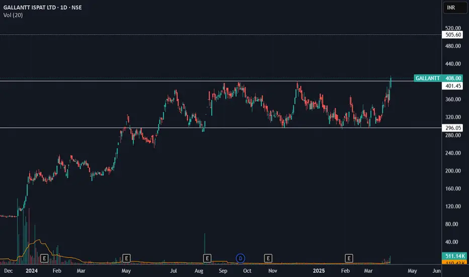
Range breakout in GALLANTT?GALLANTT has closed above 400 levels for the first time (with a good volume). With this close, it also broke out of the range (300-400) it has been trading since last year. A move to 500ish levels is likely if the pattern plays out.
Bajaj Finserv in a bullish trend; Watch and trade?Bajaj Finserv has been in a good trend even when overall market remained negative, the stock has been trading around the recent highs.
There has been a Break out of the resistance zone but the market has formed a Tweezer top after the break out on the weekly charts.
If there is trend reversal of the indices, high chance of it forming new high while be there.
YTD the stock has posted 17% positive returns while the markets are down by the approximately the same percentage.
Major Resistance levels :-1860-19410
Possible Target levels (as per fibonacci levels) :- 2304, 2771
This can be the stock of the year. 20-40% return can be captured as per the holding capacity. Keep strict SL
Wait for the price action and trade as per the trading plan/setup.

Positional or Longterm Opportunity in Axis BankGo Long @ 1005.05 for Targets of 1123, 1182, 1275.35, and 1320.4 with SL 960
Reasons to go Long :
1. On a Weekly timeframe if we draw the Fibonacci retracement tool from the recent swing low (point A) to the recent swing high (point B) then we see stock took support from the 0.382 Fibonacci level.
2. Besides, a bullish candlestick pattern Bullish Engulfing (marked with orange) is formed around the 0.382 Fibonacci level.
3. Also there is a strong Trendline (marked with green color) which supports the stock.

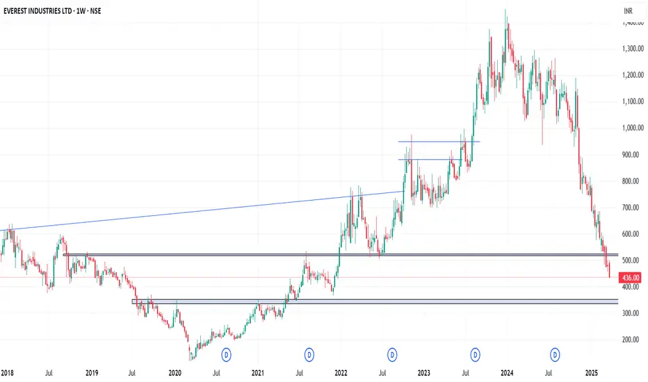
EVERESTIND - Weekly AnalysisIn the Weekly Chart of EVERESTIND ,
we can see that; selling is very strong.
It is leading it towards Strong support of 345-350.
If we see a Pinbar or W pattern recovery, we can have a Long term entry.
The correction is overdoneThere shall be a gradual recovery
The short term looks good
Inverted H&S in ultra short term
Parallel channel break in long term on the lower side is a good sign it can go back up
My Favorite Reversal Candle Pattern (Works Like Magic!)Hello Traders!
What if I told you that one single candlestick pattern could give you an 80% win rate — when traded with the right context and strategy? That’s right! Today, we’re talking about the powerful Engulfing Candlestick Pattern — backed by data, tested across timeframes, and loved by price action traders.
Let’s break it down properly so you can spot it, trade it, and win with it.
The Candle Setup: Bullish & Bearish Engulfing Patterns
Bullish Engulfing Pattern:
This forms at the end of a downtrend or pullback . A strong green candle completely engulfs the previous red candle’s body, signaling a shift from sellers to buyers.
This setup is most effective at key support zones, trendline bounces, or bullish reversals with volume confirmation .
Bearish Engulfing Pattern:
Seen after an uptrend or rally . A solid red candle engulfs the previous green candle’s body, showing a shift from buyers to sellers.
Best used near resistance levels, psychological zones, or after a parabolic price move .
Check the chart above to understand better!
Note: I’ve used real chart examples from the past to demonstrate Bullish & Bearish Engulfing patterns exactly as they appear in price action textbooks — so you can recognize them with clarity and confidence.
How to Trade the Engulfing Candle Effectively
Entry:
Enter above the bullish engulfing candle’s high (long) or below the bearish engulfing candle’s low (short) after the candle closes.
Stop Loss:
Place SL just below the bullish engulfing candle's low or above the bearish candle’s high.
Target:
Use a 1:2 or 1:3 risk-reward ratio, or set targets based on nearby support/resistance or Fibonacci levels.
When to Use:
Only trade engulfing patterns when they form at a confluence zone — such as support/resistance, trendlines, moving averages, or breakout retests .
Backtesting Insights
When tested across Nifty 50, Bank Nifty, and large-cap stocks on the 15 min, 1H, and Daily charts , the Engulfing pattern — when combined with structure — showed up to 80% success rate with proper risk management and discipline.
Rahul’s Tip
Don’t blindly trade the pattern—trade the location! Context is everything. Always confirm with structure and volume. Engulfing candles are powerful, but only when they appear where it actually matters.
Conclusion
The Engulfing Candle is one of the most reliable patterns if traded with patience and planning. Combine it with key zones and risk control , and it can become a high-probability weapon in your trading arsenal.
Have you used this pattern before? Share your success (or lessons) in the comments — let’s grow together!

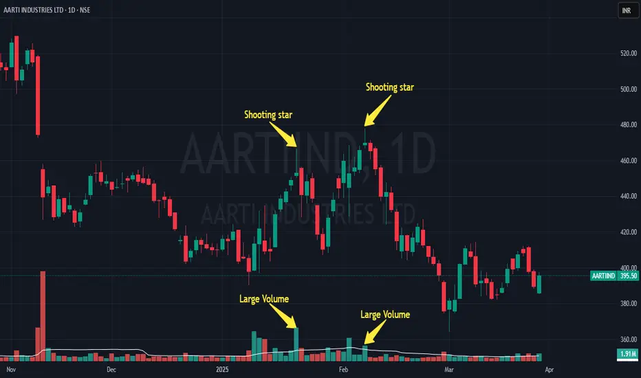
Shooting Star Candlestick Pattern The Shooting Star is a key candlestick pattern that signals the end of an uptrend. It looks like a small body with a long upper shadow, and very little or no lower shadow. This pattern often appears at the peak of an uptrend and can indicate a potential reversal.
How to Identify the Shooting Star:
1) Long upper shadow: The upper shadow should be at least twice as long as the body.
2) Gap up: Price opens higher than the previous day’s close.
3) Small body near the bottom: The body of the candle is small and near the bottom of the price range for the day.
4) No lower shadow: The lower shadow is very short or nonexistent.
What It Means:
The market opens strong and pushes higher during the day, but by the end, the price falls back down, showing that sellers are starting to take control. This could indicate that the uptrend is losing momentum and a reversal might be near.
Confirmation:
Look for a bearish candle or a gap down the next day to confirm the Shooting Star pattern.
Key Insights:
1) The longer the upper shadow, the stronger the potential for a reversal.
2) A gap up followed by a Shooting Star can signal an even stronger reversal.
3) High volume on the Shooting Star day can increase the chances of a significant price change.
Example with AARTIIND (Daily Chart) 📊:
This is a daily time frame chart of AARTIIND, where a Shooting Star pattern is forming at the top of an uptrend. This visual example will help you better understand how the pattern works in real market conditions.
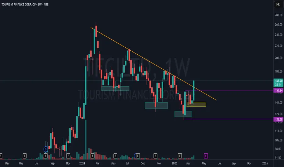
Tourism Finance Corp - Major Breakout in Progress!TFCI is showing a significant market structure shift on the weekly time frame (WTF) with strong confluence of technical signals! 📊
🔹 Lower Lows to Higher Low Transition:
Blue boxes indicate a series of lower lows, reflecting a prior downtrend.
The yellow box highlights a higher low, signaling a potential trend reversal!
🔹 Mother Candle Breakout:
The purple lines mark the high and low of the mother bar (key range).
Price is now breaking out from the upper side of the mother candle, confirming bullish momentum.
🔹 Counter Trendline (CTL) Breakout:
The orange line represents the main CTL on the weekly timeframe.
Price is successfully breaking out, indicating a potential trend shift to bullish!
Comment below your thoughts
Tata Technologies Stock: A Critical Moment AheadTata Technologies stock has recently been trading near its lifetime low. After reaching an all-time high of ₹1400, the stock dipped to its lifetime low of ₹626.65 and is currently at ₹698.
📊 Bullish Engulfing Pattern: On the weekly chart, the stock has formed a bullish engulfing pattern with volumes significantly higher than the average. This is a potentially strong reversal signal.
🔑 Key Support and Resistance Levels:
The stock has previously found support around ₹1000 multiple times. If the bullish engulfing pattern plays out, ₹1000 could act as a strong resistance going forward.
Target: If the pattern succeeds, the stock may move towards ₹1000 as a potential target.
Stop Loss: Our stop loss will be placed just below the low of the bullish engulfing pattern for a controlled risk strategy.

TATATECH - Weekly AnalysisIn the Weekly Chart of TATATECH ,
we can see that; it has given a bounce back.
Also, it has given closing above last 2 candles.
Let it create a halt candle and then enter with SL & Targets.
Expected momentum is shown in chart.

IREDA - Weekly AnalysisIn the Weekly Chart of IREDA ,
we can see that; it a given a comeback from last FIBO level of support after crossing it.
Let it create a Halt candle and take support of FIBO level and then we can see the continuity in momentum.
YATRA - Weekly AnalysisIn the Weekly Chart of YATRA ,
we can see that; it has given a W shape recovery from 65 levels.
Let it create a halt candle and then enter with SL & Targets.
Expected momentum is shown in chart.

Max Financial Services Ltd – Trend Reversal in Play?🚀 Technical Analysis Breakdown:
The yellow trendline shows a long-term support, which has held well despite recent corrections.
The red downtrend line indicates a recent bearish phase, which has now been broken with a strong bullish candle.
The stock has bounced from the trendline support, showing signs of strength.
Above all the strong Pinbar candle looks amazing for a candle close .
🔎 Your Take? Do you see further upside or a pullback? Comment below! 👇

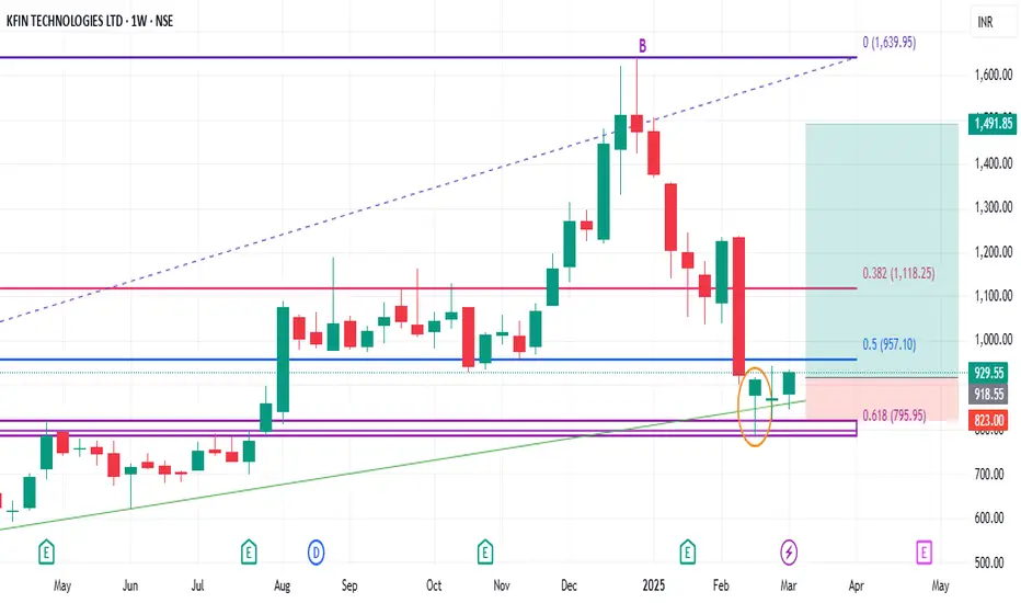
Positional or Longterm Opportunity in KfinechGo Long @ 918.55 for Targets of 1109.65, 1205.2, 1300.75, and 1491.85 with SL 439.15
Reasons to go Long :
1. On a Weekly timeframe if we draw the Fibonacci retracement tool from the recent swing low (point A) to the recent swing high (point B) then we see stock took support from the 0.618 Fibonacci level.
2. Besides, a bullish candlestick pattern Bullish Hammer (marked with orange) is formed around the 0.618 Fibonacci level.
3. In addition to this there is a strong demand zone (marked with purple) which earlier was acting like resistance but now is providing support to the stock.
4. There is also a strong Trendline (marked with green) that is providing support to the stock.
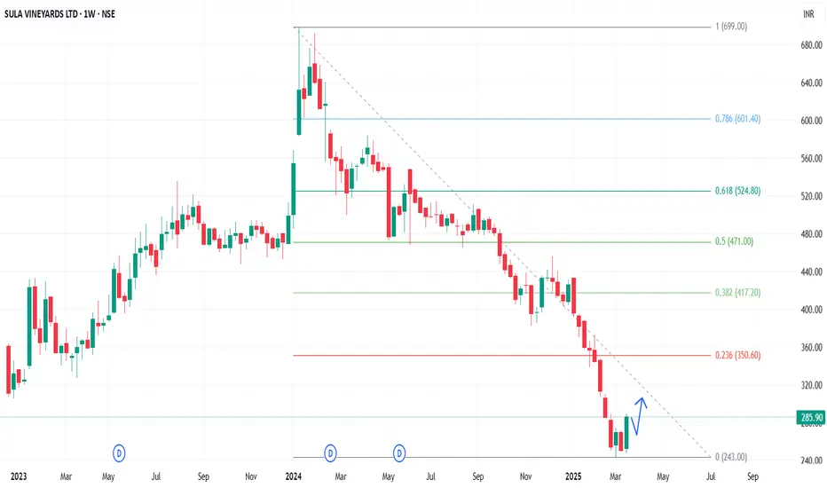
SULA - Weekly AnalysisIn the Weekly Chart of SULA ,
we can see that; it is showing a W shape recovery from 240-245 level.
wait for a Halt or retrace candle and then enter with SL and Targets.
Expected momentum is shared in chart.