ETH BIG HAMMERAfter good correction ETH has made a hammer at the previous liquidity zone (Support).
One can look for Buy on dip from here on in ETH.
SL- 4070
Target- 4300, 4370, 4400
Disclaimer- This is just for Education Purpose.
Follow for mor such content and learnings.
Jai Shree Ram.
Candlestick Analysis

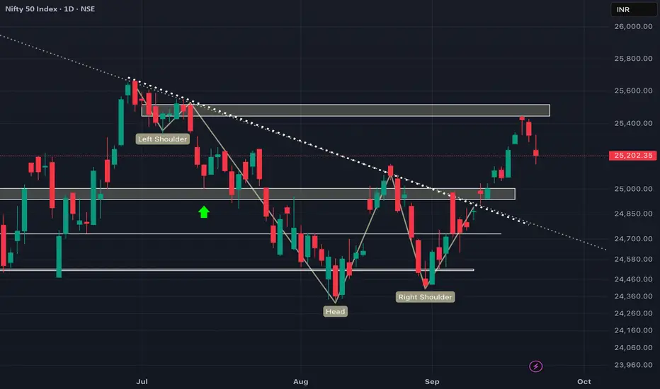
We are heading back to 25000 again!!! EXPLAINEDAs we can see NIFTY again fell strongly which was fueled by Trump's new policy for IT companies which led to this weakness. Further, viewing technically we can also see space for correction till 25000 level which is its next important demand zone which would also be a great area to buy for POSITIONAL view. so plan your trades accordingly as market is now trading at NO TRADING ZONE area which would lead to immense volatility. Better idea would be to wait for price to come at our demand and suppky zones and initiate trades accordingly.
SHRIRAM FINANCE LIMITED ( 1D ) 🔑 KEY LEVELS 🔑
✔ Fibonacci Retracement 50%
✔ Trend Line Act as Resistance.
✔ RSI Also Overbought Zone.
🎯 TRADING PLAN 🎯
✔ Near the key levels , Bearish Engulfing
Candlestick Pattern has formed.
✔ The Entry Point is @ 625.45
✔ The Stoploss Point is @ 638.00
✔ The First Target is @ 577.00
✔ The Second Target is @ 553.00
💡 A Trader must be Strategic , Patience ,
Confident , Discipline & Protective. Like
A Lion.
Disclaimer : All Information is for
Educational & Informational
Purpose Only. Not a Buy / Sell
Recommendation. You are
Solely responsible for your
Trading & Investment
Decisions.

Nifty weekly expiry analysis for 23/09/2025.Nifty has created 3 consecutive red candle on the daily charts and might touch its 20 EMA.
Market is around the All time high levels and chances of profit booking are there.
Today, nifty has closed 125 points lower than the pervious close.
Major Resistance levels :- 25311, 25438
Support levels :- 25094, 25010
On the hourly charts, the market seems to be taking rejection from the hourly 20 ema and it trading between 20 and 50 EMA.
It is trading in a close parallel channel range. If it remains in the range avoid trading or scalp as per the risk appetite.
Though nifty has taking down the 50 EMA and there are chance of it tested the higher moving averages soon.
Tomorrow is nifty weekly expiry. Wait and watch for the price action near the price levels before entering a trade.

Mazdock Long - Technical AnalysisMAZDOCK Technical Analysis Summary
Current Price : 2,985.00
Technical Reasons to Pick MAZDOCK
1 - Dow Theory Confirmation
- Higher Highs (HH) - Higher Lows (HL)
- Clear uptrend structure maintained
2 - EMA Support Structure - Took support from 100 EMA on a weekly Timeframe
- Trading above sorted EMA 100/200
- Strong momentum indication
- Bullish reversal from key moving average
4 - A clear Hidden RSI Divergence
- Indicates continuation of uptrend
- Target 1 : 3,240.00
- Target 2 : 3,502.30
- Target 3 : 3,774.00
- Grand Target : 4,094.00
Risk Management
Watch for sustained break below 100 EMA for trend reversal
Overall Bias : BULLISH
Strategy : Buy on dips near EMA support levels.

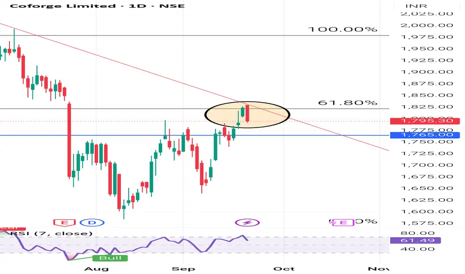
COFORGE LIMITED ( 1D ) 🔑 KEY LEVELS 🔑
✔ Fibonacci Retracement 61.80%
✔ Trend Line Act As Resistance.
✔ RSI Also Overbought Zone.
🎯 TRADING PLAN 🎯
✔ Near the key levels , Bearish Engulfing
Candlestick Pattern has formed.
✔ The Entry Point is Below @ 1792.10
✔ The Stoploss Point is @ 1830.00
✔ The First Target is @ 1681.00
✔ The Second Target is @ 1601.00
💡 Never, ever argue with your trading
System.
Disclaimer : Educational & Informational
Purpose Only. Not a Buy / Sell
Recommendation.
BIOCON LIMITEDPrice recently rebounded from the order block zone (₹340–350) with a strong hammer candle followed by bullish confirmation.
Current momentum is pushing price towards the ₹375–380 resistance. Sustaining above this zone can open the way for a rally towards ₹410 (external liquidity zone).
The ascending structure and repeated demand from discount zone indicate accumulation by buyers.
Support lies at ₹345–350, while short-term stop loss can be considered below ₹340.
👉 In short: Bullish bias; above ₹375 breakout, next target ₹410. Strong support at ₹345

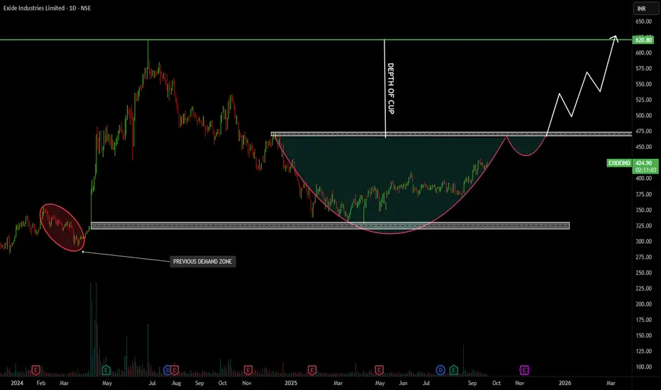
EXIDE INDUSTRIES LTDPrice has formed a Cup and Handle pattern, a classic continuation signal.
Breakout level is around ₹475, which if crossed, can trigger a strong rally.
Target zone after breakout is projected near ₹620.
Support lies around ₹350–370 (previous demand zone).
👉 In short: Bullish structure, breakout above ₹475 could open upside towards ₹620; strong base at ₹350.
ASIAN PAINTS LTD ( 1D ) 🔑 KEY LEVELS 🔑
✔ Fibonacci Retracement 38.20%
✔ Trend Line Act as Support.
✔ RSI Also Oversold Zone.
🎯 TRADING PLAN 🎯
✔ Near the key levels , Bullish Harami
Candlestick Pattern has formed.
✔ The Entry Point is Above @ 2496.90
✔ The Stoploss Point is @ 2474.50
✔ The First Target is @ 2601.00
✔ The Second Target is @ 2705.00
💡 Discipline is the bridge between goals &
accomplishment.
Disclaimer : Educational & Informational
Purpose Only. Not a Buy / Sell
Recommendation.

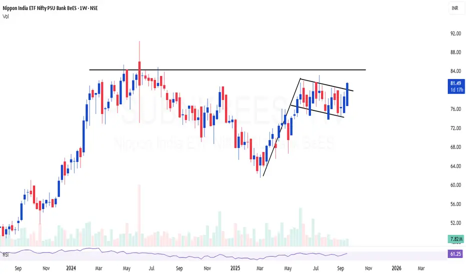
PSUBNKBEES | Excellent consolidation and flag formationPSUBNKBEES | Excellent consolidation and flag formation
Relatively safe bet on PSU Bank index, looks good for 30-40%
Kotak Swing Idea (Long)Kotak might move upside due to following logical reason:
1) Inside/doji candle on daily candle (trend reverse)
2)Trading above 20 EMA in 1 hr to 4 hr chart (Support)
3)GAP cover pending
4)Swing Low formation is shifting up
5)Consolidation from last 1.5 months
(Note: Author not responsible for anyone profits or loss, nor a sebi registered RA. Please do your own due diligence before taking any trades. For educational purpose only)

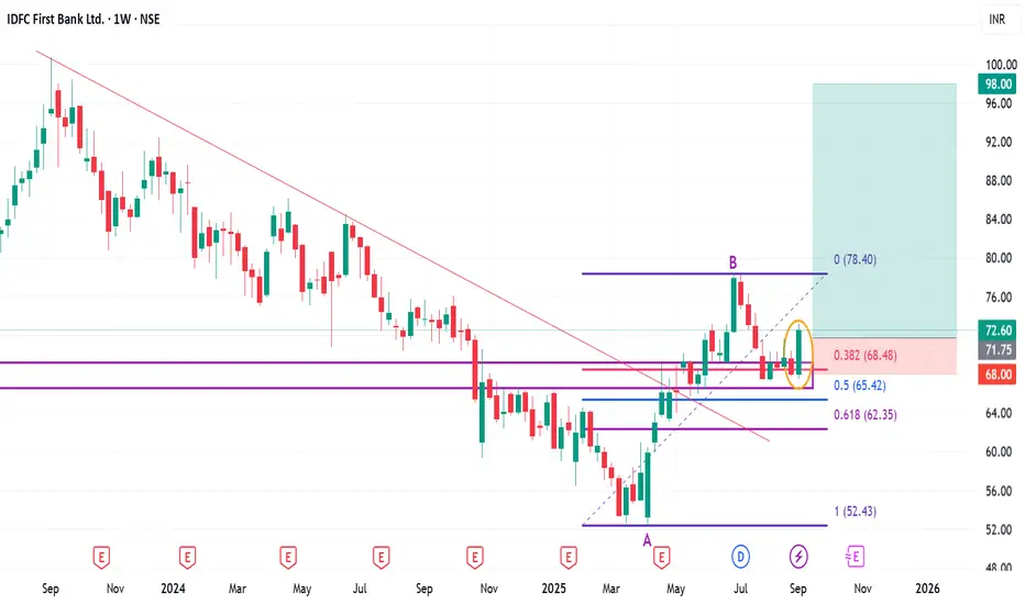
Positional or Long-term opportunity in IDFC First BankGo Long @ 71.75 for Targets of 82, 90.5, and 98 with SL 68
Reasons to go Long :
1. On Weekly timeframe If we draw Fibonacci retracement from the recent swing low (A) to the swing high (B) then the stock took support from the 0.382 Fibonacci level.
2. In addition to this, the stock formed a Bullish Engulfing Pattern (marked with a orange color) around 0.382 Fibonacci level.
3. Also there is a strong demand zone (marked with a purple color) from which the stock is taking support.
4. Besides the stock formed a Double Bottom (W) pattern at 0.382 Fibonacci level.
5. Also the stock gave a Trendline breakout (marked with a red color).
BRITANNIA INDUSTRIES LTD ( 1D ) 🔑 KEY LEVELS 🔑
✔ 6240 - 6300 Selling Zone.
✔ Trend Line Act As Resistance.
✔ RSI Also Overbought Zone.
🎯 TRADING PLAN 🎯
✔ Near the key levels , Bearish Harami
Candlestick Pattern has formed.
✔ The Entry Point is @ Below 6207.00
✔ The Stoploss Point is @ 6319.50
✔ The First Target is @ 5929
✔ The Second Target is @ 5777
💡 The goal of successful trader is to make
the best trades. Money is secondary.
Disclaimer : Educational & Informational
Purpose Only. Not a
Buy / Sell Recommendation.

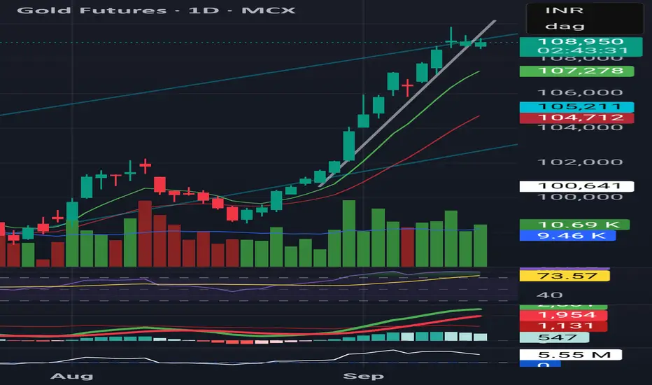
Technical View – Gold Futures (MCX)Trend: Sharp rally extended, but now showing pause with doji candles at the top.
Volume: Trendline breakout earlier came with strong participation; latest candles show reduced conviction.
Momentum: RSI near 74 → overbought, but stabilizing. MACD still positive, histogram flattening → signs of momentum cooling.
Support Levels: ₹107,250 (short-term EMA), ₹105,200 (swing support).
Bias: Rally intact, but risk of sideways/consolidation phase unless fresh volume confirms continuation.
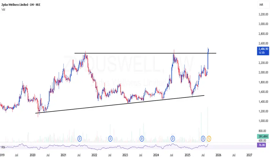
ZYDUSWELL | Simple channel breakout - Looks potential 60-70%ZYDUSWELL | Simple channel breakout - Looks potential 60-70%
CMP : 2486 (Dip : 2200)
SL below : 2000
Target : 4000+
BSE Ltd Cmp 2320 Triangle BOBSE Ltd Cmp 2320 dated 5-9-2025
1. Bullish Candle
2. RSI rise
3. Triangle BO @ 2350
Buy above 2325 SL 2220 target 2350-2360-2375-
2400-2420-2450-2475-2500-2525-2550
It is just a view please trade at your own risk.

USD/JPY(202509008Today's AnalysisMarket News:
Non-farm payroll growth fell significantly short of expectations, with June's data revised downward to negative territory, marking the first contraction since 2020. The unemployment rate hit a nearly four-year high.
Technical Analysis:
Today's buy/sell levels:
147.57
Support and resistance levels:
149.28
148.64
148.23
146.92
146.51
145.87
Trading Strategy:
On a breakout above 148.23, consider a buy entry, with the first target price being 148.64.
On a breakout below 147.57, consider a sell entry, with the first target price being 146.92

WE are still strong above 24700!As we can see despite weakness NIFTY managed to close above our demand zone and following our structure and analysis, we are still strong as long as we are above our demand zone and not closed below 24700 level so as long as we are above our demand zones, every dip can be bought.

Bearish Pressure Builds: Gold Poised for More RetreatGold retreated sharply today as expected, and directly hit my expected retracement target of 3520-3510 area; the lowest point happened to be around 3511. We added a lot of short positions around 3575 and 3578 overnight, which helped us to make considerable profits during the gold retreat. All short positions made a total profit of 1830pips after being closed.
Since gold has begun to retreat from 3578, and the retracement has reached 670 pips in the short term, a retracement that is rare in recent times, as gold has shown obvious signs of retreat, once large funds begin to withdraw, it may trigger serious selling sentiment in the market. Taking this opportunity, the gold market may usher in a round of sharp correction. Moreover, after gold retreats, 3578 is expected to become the interim peak, which will limit the room for gold to rebound while being conducive to the downward pressure on gold.
In addition, gold rose sharply before the NFP market, probably to reserve room for the NFP market to fall, so I think gold still has the demand and space to continue to retreat, so the current decline has not ended yet, and I think the current short-term rebound provides us with good conditions for entering the short market.
According to the current structure, gold still needs to retreat after fluctuating at high levels. Therefore, in trading, we can still look for suitable opportunities to short gold during the gold rebound. First of all, we need to pay attention to the short-term resistance area of 3545-3555. Once gold cannot effectively stand in this area during the rebound, gold will also test the 3510-3500 area. After falling below this area, it is expected to continue to the 3490-3480 area.

Bullish This chart is amazing price & volume suggest that some thing is cooking under the table,now stock is in accumulation zone of 150 to 200
One can enter only buy on dips or if break out above 200 this week closing at list
This chart is only for learning purpose

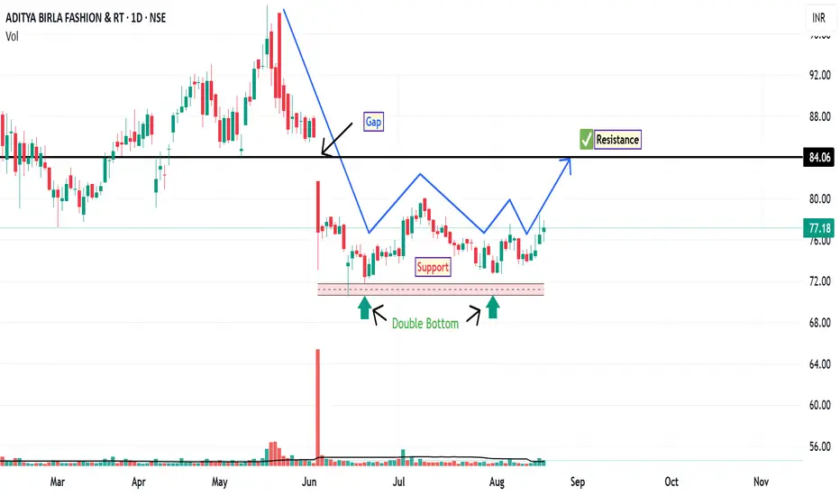
ABFRL: Price Action OverviewFollowing a gap-down opening on June 4, ABFRL entered a consolidation phase, trading within a well-defined supply and demand zone. This range-bound movement suggests a period of accumulation or indecision among market participants. During this consolidation, the stock has formed a double bottom pattern on the daily chart—a classical reversal structure that often indicates a potential shift from a downtrend to an uptrend, provided confirmation follows.
An inverted hammer appeared near the second bottom, signaling potential buying interest at lower levels. This was followed by a bullish pin bar, reinforcing the possibility of a short-term reversal. These candlestick formations, especially when occurring near support zones, can be interpreted as early signs of bullish momentum returning—though follow-through price action is essential.
If bullish momentum sustains than the stock may attempt to fill the gap left from the June 4 session. The gap resistance level is around ₹84 , which could act as a near-term target for traders monitoring this setup.
Disclaimer: This analysis is for educational and informational purposes only. It does not constitute investment advice or a recommendation to buy, sell, or hold any security. Always conduct your own research or consult a licensed financial advisor before making investment decisions.
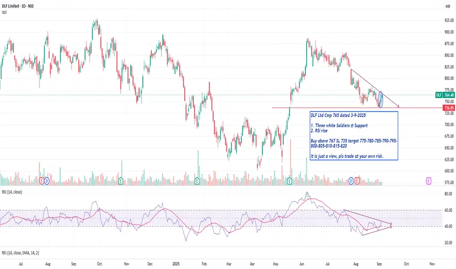
DLF Ltd Cmp 765 Three white Soldiers @ SupportDLF Ltd Cmp 765 dated 3-9-2025
1. Three white Soldiers @ Support
2. RSI rise
Buy above 767 SL 735 target 775-780-785-790-795-
800-805-810-815-820
It is just a view, pls trade at your own risk.
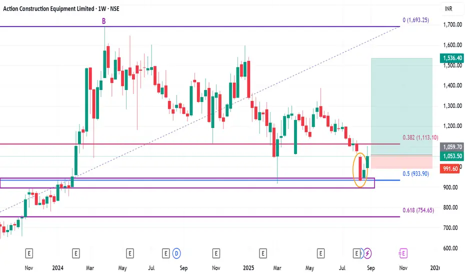
Positional or Long-term Opportunity in ACE Go Long @ 1059.7 for Targets of 1195.9, 1300, 1390, and 1536.4 with SL 991.6
Reasons to go Long :
1. On Weekly timeframe If we draw Fibonacci retracement from the recent swing low (A) to the swing high (B) then the stock took support from the 0.5 Fibonacci level.
2. In addition to this, the stock formed a Bullish Harami Pattern (marked with a orange color) around 0.5 Fibonacci level.
3. Also there is a strong demand zone from which the stock is taking support.