GSPL - Gujarat State Petroleum Corporation Bullish ViewGSPL charts have formed a bullish engulfing candlestick pattern.
You can use this opportunity because it has a very good risk to reward ratio.
Entry: Long above ₹389.80 (the high of the bullish engulfing candle)
Stop-Loss: Short below ₹368 (the low of the bearish candlestick before the bullish engulfing pattern)
Take-Profit: This will depend on your risk tolerance and trading goals. based on a 1:2 or trailing basis 1:3 Risk to reward Ratio
Risk Management: Always remember to practice good risk management. Only risk a small percentage of your capital on each trade.
Disclaimer: This is not financial advice. Please do your own research before making any trading decisions.
Remember, trading involves risk. I can't guarantee that this trade will be successful.
Also dont forget to share and boost, thank you for all your love and keep supporting like you do, helps me work harder..
Candlestickpattern

Tata Communication | Breakouts or Fakeouts ? ⭕️ Swing Trading opportunity: Price Action Analysis Alert !!!⭕️
💡✍️Technical Reasons to trade or Strategy applied :-
✅Inverted Head & Shoulder Chart Pattern Bull Breakout
✅Breakout confirmed
✅Rise in Volume
✅Good 3 touches Trendline Breakout with volume
✅Clear uptrend with HH & HLs sequence
✅ Order block as potential Supports
✅Check out my TradingView profile to see how we analyze charts and execute trades.
🙋♀️🙋♂️If you have any questions about this stock, feel free to reach out to me.
📍📌Thank you for exploring our idea! We hope you found it valuable.
🙏FLLOW for more !
👍LIKE if useful !
✍️COMMENT Below your view !

Nupur Recyclers a good RR setup. NRL is at a support level and trying to reverse.
The risk is 10.7%
Reward: 31%
RR: 1:3
RISKY- MicroCap company. ROE and ROCE are not so good. Please do your due diligence before investing. Volume needs improvement too.

Exide Industries Breakout & Retest | Swing Trade IdeaExide Industries has recently broken a counter trendline and is currently retesting the breakout level. The stock has also breached the mother candle, but it remains inside a parallel channel that could act as resistance. Keep an eye on how the price reacts within the channel – a breakout above could open up new opportunities, but the channel resistance may cause hesitation. Manage your risk and stay aware of the overall market structure before making a move.


Bullish divergence takes the price upwardsOverall trend is up
Bullish divergence
a morning star, but in the uptrend
Could be a box breakout also
Must follow target and stoploss strictly

Perfect Cup and Handle setup (Breakout really soon) - OnePoint
✅ Stock is ready to give a breakout really soon.
✅ Previous rallies very really steep. Hoping for upcoming rally to be similar.

morning star,price ready to shoot upA perfect morning star takesthe price upwards
Long position above the candle high
Good risk reward ratio
rsi showing bullish divergence
Follow with strict stoploss

GRANULES INDIA - Downtrend BreakoutGRANULES INDIA
1) Time Frame - Monthly.
2) Previous month candle strong breakout follwoed by current month cancle close with strong rejection / Retracement of the previous breakout & looking bullish.
3) Downtrend strong triangle pattern breakout.
4) Next target would be Previous All Time High - 437.95 followed by the primary trend target / resistance at around 192 in the long term.
5) Recommendation - Strong Buy

IFCI GOING TO HIT LIFE TIME HIGH!IFCI break out at 65 in the weekly time frame. If he hold these level then in coming week it will be hit life time high at level 80.
My target for IFCI
Long term : 120
Short term: 80
If you are long term investor, it will be good opportunity to buy at this level.

Bajaj Consumer - Rounding PatternThe "Rounding Bottom" or "Saucer Bottom" chart pattern is a technical analysis indicator that can signal a potential bullish reversal in the price of a stock. When observed in Bajaj Consumer's stock chart, this pattern suggests that the stock may have reached its lowest point and is poised for an upward trend.
Key points to note that when bullish curve started, started with Morning star then bullish piercing and finally bullish engulfing. Lows of the bullish candle indicate that the market has bottomed out.
Key Characteristics:
Shape: The pattern resembles a "U" shape, indicating a gradual shift from a downtrend to an uptrend.
Duration: It typically forms over a longer period, often several weeks to months, reflecting a slow shift in market sentiment. Here it takes more a year
Volume: Volume tends to decrease at the bottom of the pattern and increases as the price begins to rise, confirming the potential reversal.
Implications for Bajaj Consumer:
Market Sentiment: The pattern reflects a shift from bearish to bullish sentiment among traders and investors.
Entry Point: Investors might consider entering a long position as the stock breaks out from the rounding bottom pattern, signaling the start of a potential uptrend.
Target Price: The expected target price after the breakout can often be estimated by measuring the depth of the rounding bottom and projecting it upward from the breakout point.
How to Trade:
If Bajaj Consumer's stock shows a rounding bottom with the lowest point at ₹200 and the breakout occurs at ₹260, the depth is ₹60. Hence, the target price could be around ₹320 (₹260 + ₹60).
Regards
Arvind Yadav, Cfa
Arvind Share Academy

JUBLFOOD formation of Double BottomDouble bottom chart pattern formed in JUBLFOOD and pattern will active only after break and close above 470.
It is also important to note that JUBLFOOD is bounced back from prior support level with formation of bullish candlestick called Hammer.
Price is also pierced the downtrend line and currently price is consolidating near neckline.
We have also found inside bar pattern near the neckline, if upside breakout is sustained then we can get sharp up move or else pattern will be invalid.

WTICAB - 3 Months Consolidation Breakout Wise Travel India Ltd
1) Time Frame - Daily.
2) The Stock has been in a Consolidation since (March, 2024). Now It has given Consolidation breakout & Closed at it's Life Time High with good volume & good bullish momentum candle in Daily Time Frame.
3) The next resistance would be around the price (330 - 18.15% from the price 279.30).
4) Recommendation - Strong Buy.

IRCTC Long Trade OpportunityIRCTC stock is in a strong Uptrend & forming new highs.
There is a Rally-Base-Rally Demand Zone formation around 1045.
If the stock retraces to the demand zone , it will offer a good opportunity to go long and join the uptrend.
Stop Loss to be placed slightly below the demand zone, preferably on a candle closing basis.
First target will be the immediate swing high , where one can book partial profits & trail the rest for bigger gains.

Heg is readyThere is a one more stock Which is showing a great opportunity, stock is near resistance this stock is doing well when market is doing a correction and all stock are drooping this stock is rising. what is your view please comment it down. We are NISM Certified. All views shared on this channel are my personal opinion and is shared for educational purpose and should not be considered advise of any nature.

Deepak NitrateStock has closed with good volumes and good momentum and managed to close above Fibonacci No which is 61.8 one can look to buy abv 2405 sl 2220 tgt 2550.
Disclaimer: I am not SEBI registered Analyst Kindly consult your financial Advisor before taking any trading decisions.

2 Amazing swing trading support based ideas for 15 may I daily make educational content videos for swing / positional trading

XAUUSD or LongMy view on this script Bullish
Ofter breaking Resistance with good dynamics
I took long entry...💹💲


Indusind BankAfter Down Move stock went in consolidation so one can trade this stock on support and resistance basis

HDFCBANK Update Here, is the chart or projection of HDFC BANK for the future as usual as a part of update on our earlier projection....
I hope this will definitely help you a lot so we just expect your love by boosting our ideas to strengthen and energize to post such a valuable content for you guyz ..
use this as educational purpose...

Broken Out StockAfter Huge rally in the Market and most of the stocks are at all time high and given decent return what next? Sectoral Change is most important aspect to keep in the mind.
Here, is one of the most potential stock with decent upside of 40% around as stock was slide almost 60% from ATH and now we can see the in the chart it has bottomed out and also brokenout and ready to rally as mentioned it in the chart
the view is just educational purposes only.
Investment and Trading is Highly risky in nature so please take independent advice before investing.

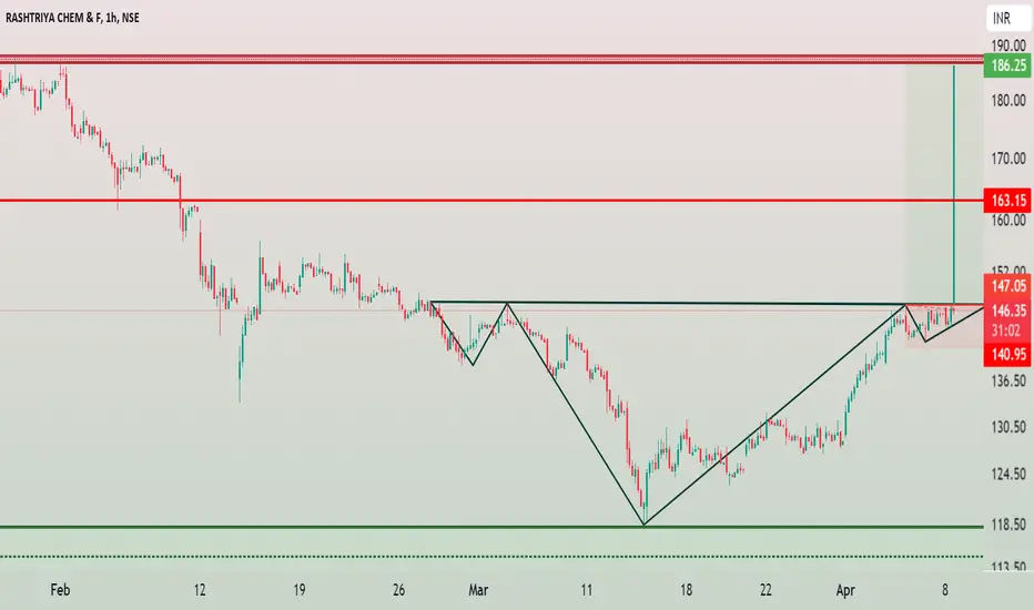
RCF - Head and Shoulder Chart PatternRashtriya Chemicals and Fertilizers Limited (RCF) has formed a bullish chart pattern called Head and Shoulder. Chart structure is bullish in every point of views like in a daily chart pattern you found RSI above 60 and also above 200 EMA is a very positive signal of uptrend.
Head is formed at very important zone which act as a resistance for than a decade almost (14 years). After successfully breakout of important resistance now price retest that level and formed strongest support zone with bullish piercing candlestick in daily timeframe. Change of Polarity, Prior resistance become support.
RCF buy above 148
Stop Loss below 142
Target 163 and 186