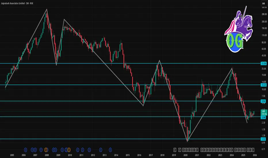
JPASSOCIAT 1 Month Time Frame 🔎 Current snapshot
Recent price (early Dec 2025): ~ ₹ 3.60–₹ 3.81.
52-week high / low: ~ ₹ 7.57 / ₹ 2.56.
Company remains under resolution/insolvency proceedings. Its balance sheet, according to data, shows negative book value and poor earnings metrics over recent years.
Because of this, the stock is highly volatile and speculative. Analysts have repeatedly flagged that such small-cap, distressed companies are “easy to enter but difficult to exit.”
🎯 My view (1-month horizon)
Given high uncertainty, best to treat this as a speculative trade rather than a “safe bet.”
Short-term upside is possible if there is news on resolution/acquisition or better-than-expected restructuring.
But downside risk remains high — if negative developments emerge, the stock may slip back.
Chartsneverlie
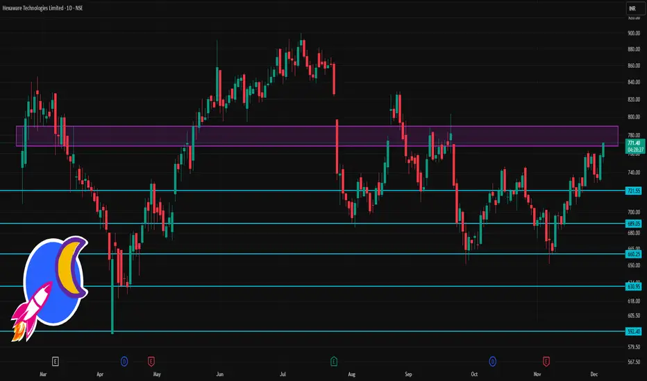
HEXT 1 Day Time Frame 🔎 Current Context & Price
Latest price: ~ ₹770–771.
Day’s trading range seen: roughly ₹750–772.
52-week range: ₹590.30 (low) – ₹900 (high).
⚠️ What to Watch / Risk Zones
If price falls below ~₹745–750 (support zone), risk of more significant slip toward ₹738–740.
Resistance around ₹775–785 could trigger profit-taking or consolidation — strength of buying volume matters.
As with all mid-cap IT stocks, macro factors (global demand, forex, sector sentiment) may override technicals.
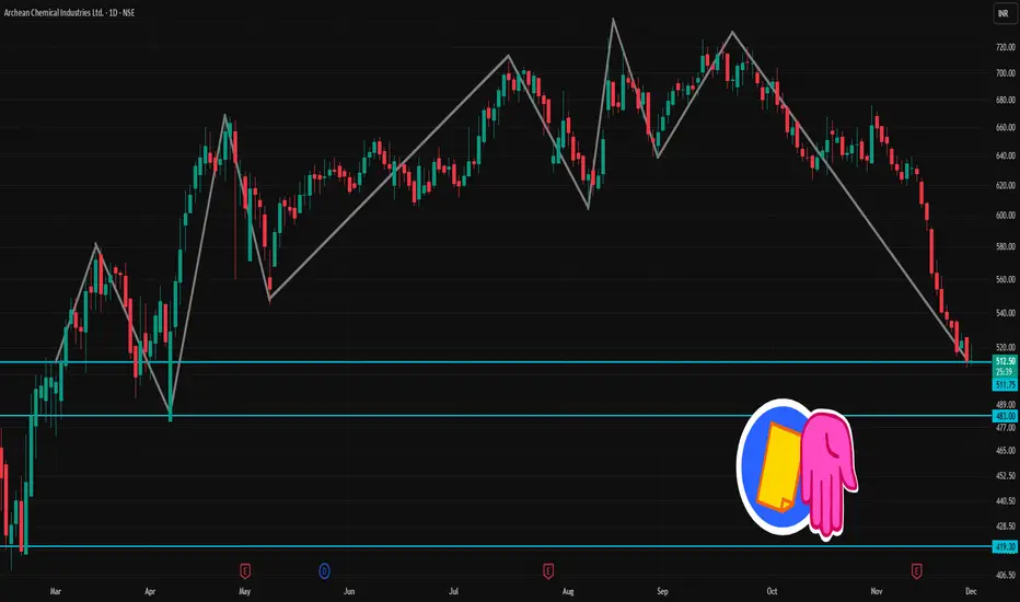
ACI 1 Day Time Frame 📊 Latest snapshot
Recent price ~ ₹ 512 – ₹ 513
52-week range: ~ ₹ 408 (low) to ~ ₹ 730 (high)
Recent technical-analysis summary: Mixed/Neutral to bearish — some moving averages give bullish bias but oscillators appear weak.
⚠️ Technical Signals (Short-Term)
According to one technical summary, short-term trend is marked as “sell”.
Oscillators (e.g. RSI/Stochastic) recently suggest weak or bearish momentum.
✅ What to Watch / Trading Cautions
Momentum is weak; oscillators don’t suggest a strong bullish bounce yet.
If price drops below support (~₹ 508), downside risk increases; need close stop-loss discipline.
Volume & broader market/sector conditions could swing price sharply — stay alert for volatility.
On a bounce, watch if resistance zones get challenged — a breakout may change short-term trend.
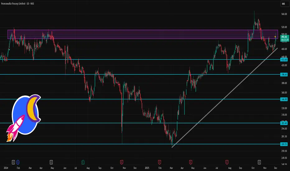
POONAWALLA 1 Day Time Frame 📌 Latest price & context
On one of the latest snapshots, the share price was ~ ₹ 492.65 (as per a public chart)
The stock remains among relatively volatile mid-cap / NBFC counters, with a fairly high beta (i.e. sensitivity to market swings).
✅ Technical Momentum & Risk Profile
Technical sources currently signal a “bullish / buy-leaning” bias based on moving averages (from short-term to long-term) for Poonawalla.
But high volatility & elevated beta mean risk — sharp swings are possible in either direction depending on market sentiment, NBFC-sector news, and macro cues.
⚠️ What to watch out for
The pivot-based levels assume relatively normal volatility — big sector-wide moves, news, or NBFC-specific developments can render them less reliable.
As an NBFC / mid-cap, the stock remains sensitive to interest-rate outlook, credit-sector sentiment, and macroeconomic conditions — not just its own chart.
The “buy bias” from moving averages doesn’t guarantee a smooth upward path — you should watch volume, daily chart pattern, and broader market context.
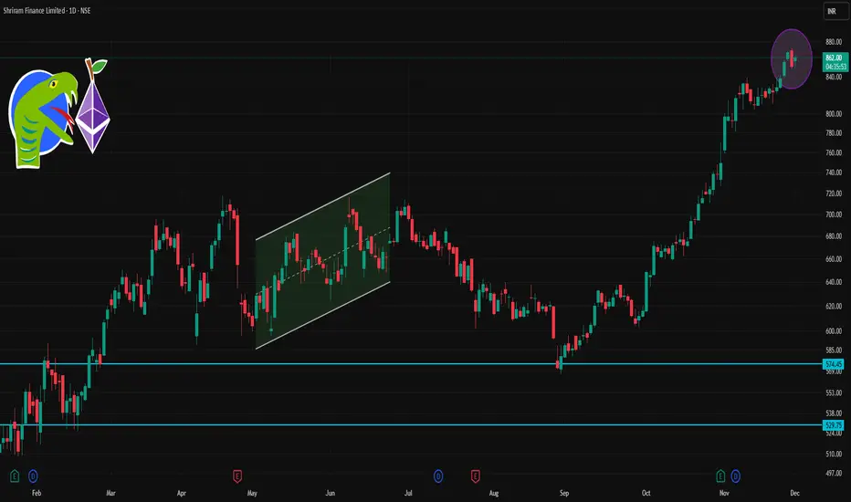
SHRIRAMFIN 1 Day Time Frame 📊 Current Snapshot
Latest live price: ~ ₹852–857 (depending on trade moment).
Today’s high / low range: ~ ₹861.95 high / ~ ₹850.40 low.
52-week range: ₹493.35 (low) ↔ ₹872.00 (high).
✅ What This Means for Intraday / Next Sessions
If price stays above ~₹857–858 (pivot) — bias remains bullish → could target ₹866 → ₹880–881.
If price dips but finds support near ₹842–843, watch for bounce (possible buying opportunity).
A break below ₹834 → ₹820 downward zone might signal risk of further downside — monitor overall market and sector trend.
Use stop-loss (if trading) near support zones to manage risk, given volatility and sensitivity to overall market moves.
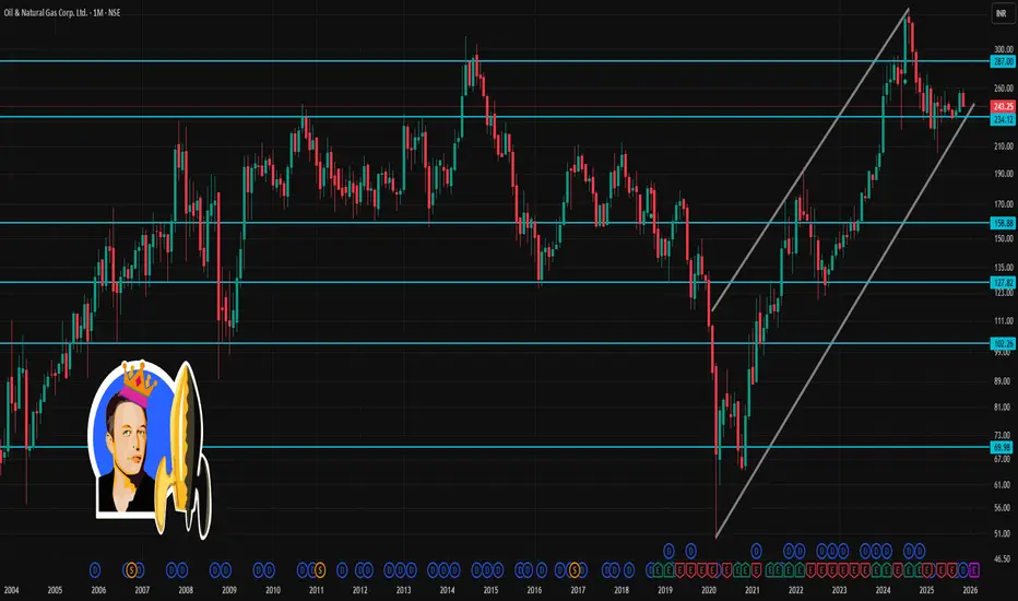
ONGC 1 Month Time Frame 📌 Current snapshot
ONGC last traded around ₹243–₹244.
Over the past month, the stock has dropped ~3–4%.
📈 What could happen in next month
Bearish scenario: If price slips below ₹241 and sentiment (oil prices, global energy demand, investor flows) remains weak — ONGC could test the lower support zone around ₹238–₹240.
Neutral / range-bound: The stock could hover between ₹241–₹251, especially if crude/oil-sector news remains mixed, or broader market is choppy.
Bullish scenario: If ONGC closes above ~₹251 with supportive macro (oil prices, global demand, corporate news) — next leg could push it towards ₹255–₹257 (near-term target).
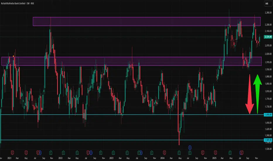
KOTAKBANK 1 Week Time Frame ✅ Current snapshot
Latest share price ≈ ₹ 2,124.40 on NSE/BSE
52-week high ~ ₹ 2,301.90, 52-week low ~ ₹ 1,723.75.
Key fundamentals: P/E ~ 22–23, Book Value ~ ₹ 844, PB ~ 2.5–2.7, dividend yield modest.
⚠️ What could upset the short-term view
Broader market weakness (macro-economic, interest-rate moves, global cues) could drag down banking stocks including Kotak.
Negative corporate/asset-quality news or sector-specific headwinds could hamper even good fundamentals.
Volatility: as with any financial-sector stock, sentiment can swing quickly based on news flow (regulatory announcements, RBI policies, etc.).
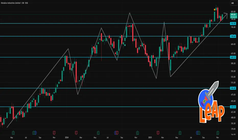
HINDALCO 1 Week TIme Frame 📌 Current Snapshot
Current price: ~ ₹810–812.
52‑week high / low: ₹864 / ₹546.45
Over the past week, the stock has gained roughly 4–5%.
📈 Key Technical Levels for This Week
If price holds above ~₹766–770, bias remains neutral-to-bullish.
A decisive close above ~₹820 could open upside toward previous highs / next resistance zones.
If price breaks below ~₹755–760, risk of downside increases — watch for potential decline toward lower support zones.
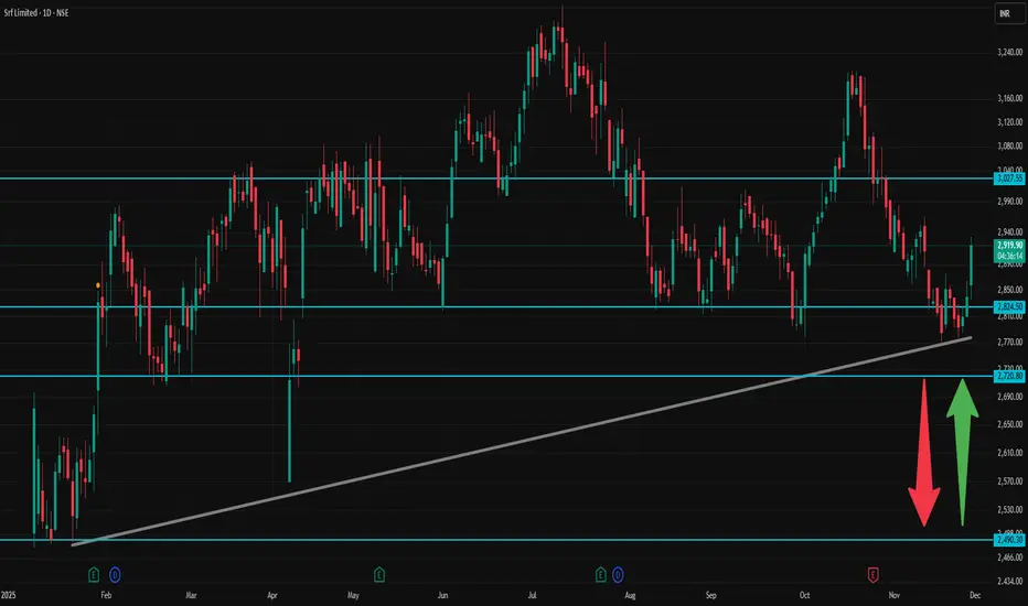
SRF 1 Day Time Frame ✅ Current context
According to public price data, SRF’s recent high for the day is ~ ₹ 2,933, low ~ ₹ 2,836.80.
As per a technical‑analysis summary: moving averages (short-to-medium term) and oscillators on daily timeframe show a bullish bias (Strong Buy on many signals).
🎯 How to interpret / trade with these levels
As long as price stays above Pivot (~₹ 2,866), bias remains mildly bullish — look for R1 → R2 → R3 as possible targets.
If momentum is strong (volume + positive broader market), a break above R2 (~₹ 2,920) could push toward R3 (~₹ 2,933–2,937+).
On downside, supports at ₹ 2,811.93 → ₹ 2,783.87 → ₹ 2,757.73 are key — loss of S1 may open S2/S3.
For conservative traders: good entry or add-on zones could be near S1 or pivot, with stop‑loss a little below S2/S3 depending on risk tolerance.
⚠️ Important caveats
These are static pivot-based levels, and real market moves may overshoot or not respect them depending on news, volume, macro‑market sentiment.
Given volatility (as seen in day’s high-low range), levels above R2 or below S2 can get tested — intraday discipline (stop-loss, position sizing) is crucial.
Always watch volume, overall index trend (Nifty/Sensex), sector news — technical levels work better when confirmed by context.
TATATECH 1 Day Time Frame 📌 Key recent data (approx as of last close):
Last traded price: ~ ₹676.75.
Day high / low: ~ ₹679 / ₹670.25.
52‑week high: ~ ₹973.85; 52‑week low: ~ ₹597.
🧮 What this suggests for today (intraday / short‑term only):
If Tata Tech trades above ₹672.7, it could aim for ₹677–684 as short‑term resistance.
A fall below ₹672.7 might push price toward ₹665–661 as support.
₹684–696 could act as a more extended intraday upside zone, if there’s bullish momentum.
🔎 Context & What to Watch Out For
The 52‑week high is still much higher — so in a broader sense, the stock remains far off prior highs.
On short‑term charts, some indicators (e.g. moving‑average crossovers / candle‑pattern heuristics) recently gave bearish / neutral signals.
Volatility and broader market sentiment (especially in the auto / engineering‑services / global tech outsourcing space) can swing prices significantly — so these levels are very approximate.
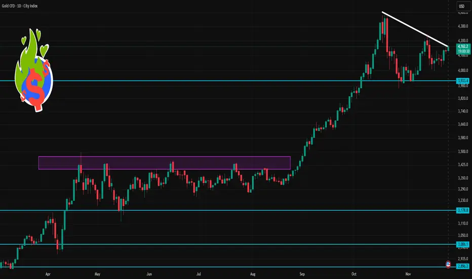
Gold 1 Day Time Frame 🔎 Current Context
1. Gold currently trades around US $4,160–4,165/oz.
2. Many technical-analysis services show daily momentum as bullish: moving averages, RSI/MACD and other indicators point toward a positive bias.
3. But macro factors (strong USD, Fed policy, global risk sentiment) remain important and may cause sharp swings.
⚠️ What to Watch Out For
Volatility: Gold remains sensitive to macro events — USD strength, rate expectations, major economic data — so price can easily break support/resistance zones.
False Breakouts: Even if price crosses a level, it may revert quickly. Combine with other indicators (volume, price action, confirmations) before acting.
Trend Shifts: A major change in global risk sentiment or central-bank moves can rapidly change trend direction, invalidating technical levels.
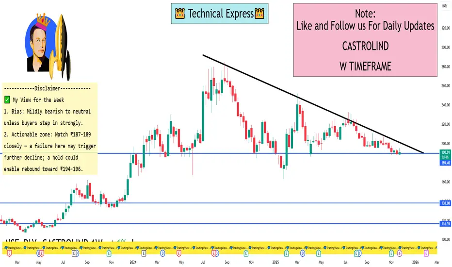
CASTROLIND 1 Week View 🔍 Key Levels
Based on recent technical data:
Support zone: ~ ₹187 – ₹189 (ET Money shows S3 ≈ ₹185.42, S2 ≈ ₹186.71)
Pivot / near-term equilibrium: ~ ₹190 – ₹191 (Weekly central pivot ~₹190.42)
Upside resistance: ~ ₹194 - ₹196 (Weekly R1 ~₹192.83, R2 ~₹196.64)
📈 Short-Term Bias & Likely Scenarios
The momentum indicators (RSI ~33, CCI negative) show the stock is under downward pressure/weak momentum.
If the price stays above ₹187-189, one could anticipate a bounce up into the ₹194-196 zone this week.
If it breaks below ~₹187-189 decisively, support further down could be ~₹183-185 (based on extension levels)
✅ My View for the Week
Bias: Mildly bearish to neutral unless buyers step in strongly.
Actionable zone: Watch ₹187-189 closely — a failure here may trigger further decline; a hold could enable rebound toward ₹194-196.
If you want a more aggressive trade setup (with stop-loss, reward ratio), I can map that too.
BEL 1 Day Time Frame✅ Current Status
Latest price around ₹407 – ₹410 on the NSE/BSE.
Technical indicators (daily time frame) are leaning bearish/weak: e.g., daily moving averages show more “sell” signals than “buy”.
📌 Key Levels to Watch (Daily Chart)
Based on available pivot/level data and recent price action, here are approximate levels:
Support levels:
S1 ~ ₹407–₹408
S2 ~ ₹405–₹406
A deeper support zone if this breaks might be ₹400-₹404.
Resistance levels:
Pivot ~ ₹413-₹414
R2 ~ ₹416-₹417
R3 ~ ₹419-₹420+
🔍 Short-Term Outlook
Because the stock is hovering just above support (~₹407-₹408), holding above this zone is important to maintain near-term structure.
If price breaks below ~₹405, risk of further weakness increases.
On the upside, a successful breakout above ~₹416-₹417 could open space towards ~₹419-₹420.
The current momentum is weak/negative, so any upside will likely need a catalyst (volume, news) to gain strength.
ENRIN 1 Day Time Frame 🔍 Key Price Info
Last traded ~ ₹3,090 (as of ~10:44 AM IST) on 25 Nov 2025.
Day’s high-low range: ~ ₹3,090 – ₹3,303 (intraday high reported ~₹3,303).
52-week range: ~ ₹2,508.80 – ₹3,625.00.
🎯 Support & Resistance Levels (Short Term)
Support Levels:
~ ₹3,050 – ₹3,070: close to current price, would be first level of support.
~ ₹3,000 – ₹3,030: if the stock breaks below the above, this zone becomes important.
~ ₹2,950 – ₹2,990: deeper support and closer to lower end of recent consolidation.
Resistance Levels:
~ ₹3,250 – ₹3,300: recent high zone around ₹3,303, so getting above this would be bullish.
~ ₹3,350 – ₹3,400: next significant zone before approaching the 52-week high.
~ ₹3,600+: near the 52-week high (₹3,625) and a major resistance barrier.
📉 Intraday Trading View
If the stock holds above ~₹3,050-₹3,070 with strong volume, it could attempt a push toward the resistance zone of ~₹3,250-₹3,300.
If it loses support at ~₹3,050, watch for potential slide toward ~₹3,000 or lower ~₹2,950 zone.
Volume, market sentiment & any corporate news will greatly influence whether it can break resistance or find support.

Nifty 50 1 Week Time Frame - Approximate value: ≈ 26,129.4 as of today.
- Weekly technical pivot support/resistance:
Weekly Bollinger Band top: ~ 26,166.78
Weekly Bollinger Band bottom: ~ 24,099.21
BEL 1 Month Time Frame📌 Key Levels & Observations
Current price: approximately ₹ 416.35 per share.
Recent range: Daily highs ~₹ 423–424, lows ~₹ 415.50.
52-week high ~₹ 436 and 52-week low ~₹ 240.25.
🎯 Short-Term (1-Month) Important Levels
Support zone: ~₹ 405-410 — falling below this may weaken short-term structure.
Resistance zone: ~₹ 430-435 — breaking above this could open scope toward ₹ 440.
Near-term target range: If bullish momentum holds, look toward ~₹ 430-440.
Risk zone: If momentum falters and the support zone fails, price may drift back toward ~₹ 400 or lower.
⚠️ Caveats
These levels are technical estimates, not fundamental valuations or guarantees.
Market sentiment, order flows (for BEL), defence‐policy changes, etc. can shift the picture quickly.
Always use stop-loss or risk controls.

AXISBANK 1 Week Time Frame 🔍 Key Levels for the Week
Based on recent pivot/technical data:
Resistance levels: ~ ₹1,276 to ₹1,282 (around daily R1/R2)
Higher resistance: ~ ₹1,290-₹1,302 if uplink happens
Support levels: ~ ₹1,252-₹1,246 as near-term floor
Broader weekly support: ~ ₹1,232-₹1,218 region if deeper pullback
⚠️ Things to keep in mind
Current price is near the 52-week high region (~₹1,284) which increases risk of resistance/strain.
Short-term signals/pivots are useful but market news, macro banking events, FII/DII flows can quickly shift dynamics.
Use stop-losses or risk-controls if trading around these levels given the tight range and possible whipsaw.
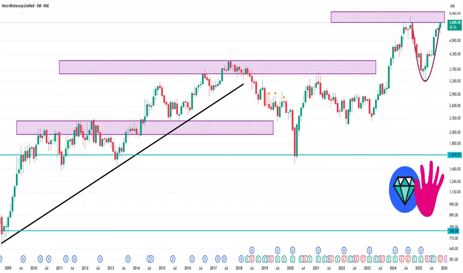
HEROMOTOCO 1 Month Time Frame 🎯 Key Price Levels (1-Month Timeframe)
Here are approximate support & resistance levels you may watch in the next month:
Resistance levels:
~ ₹5,850-₹5,900: Price is already trading around this band (Trendlyne shows ~₹5,850).
Next major resistance might lie closer to ~ ₹6,000-₹6,100 if momentum carries on (psychological level + prior swing highs).
Support levels:
First major support: ~ ₹5,600-₹5,650 (just under current trading zone)
Secondary support: ~ ₹5,300-₹5,400 zone — a deeper pull-back level if the first support gives way.
Pivot / mid-zone:
A pivot or neutral zone around ~ ₹5,700-₹5,800 may act as a battleground between bulls & bears.
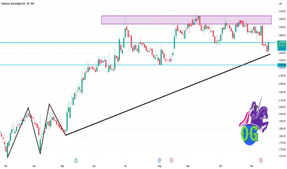
ENDURANCE 1 Day Time Frame 📌 Key Price Data
Last traded price: ~ ₹2,720.50 (as of 19 Nov 2025, ~11:57 AM IST)
Day’s high ~ ₹2,729.90, day’s low ~ ₹2,616.10
Previous close: ~ ₹2,615.10
📉 Daily Support & Resistance Zones
Based on the intraday range and recent levels:
Immediate support zone: ~ ₹2,620 – ₹2,650 (just above the day’s low)
Second support: ~ ₹2,580 – ₹2,600 (below current trading, potential break level)
Immediate resistance zone: ~ ₹2,730 – ₹2,760 (near day’s high)
Higher resistance: ~ ₹2,900 – ₹3,000+ (a more medium-term zone)
LICI 1 Week View 🔢 Current status
The stock is currently trading around ₹ 911 on the NSE.
Day-range recently: approx ₹ 906.60 to ₹ 920.60.
52-week range: approx ₹ 715.30 to ₹ 1,007.80.
📉 Key levels to watch for the coming week
Support zone: Roughly around ₹ 895-₹ 900 — the recent trading floor is around that area.
Resistance zone: Near ₹ 920-₹ 930 — this is where the recent high end of the day‐ranges have been.
If price breaks above ~₹ 930 with strength, that could open a move toward ~₹ 950 in the short term (assuming favourable market context).
If price falls below ~₹ 895, risk of a slip toward ~₹ 880 or lower until a new base is found.
⚠️ What to Watch / Risks
The 1-week gain is modest; there’s no strong breakout yet.
If broader market or sector weakens (insurance/financials), LICI could get caught in the drift.
Watch news / earnings triggers that could suddenly shift sentiment.
📝 Disclaimer
This is not a recommendation to buy or sell. Viewing over just one week is very short‐term and subject to high uncertainty. Please consider your own risk profile and possibly consult a financial advisor.

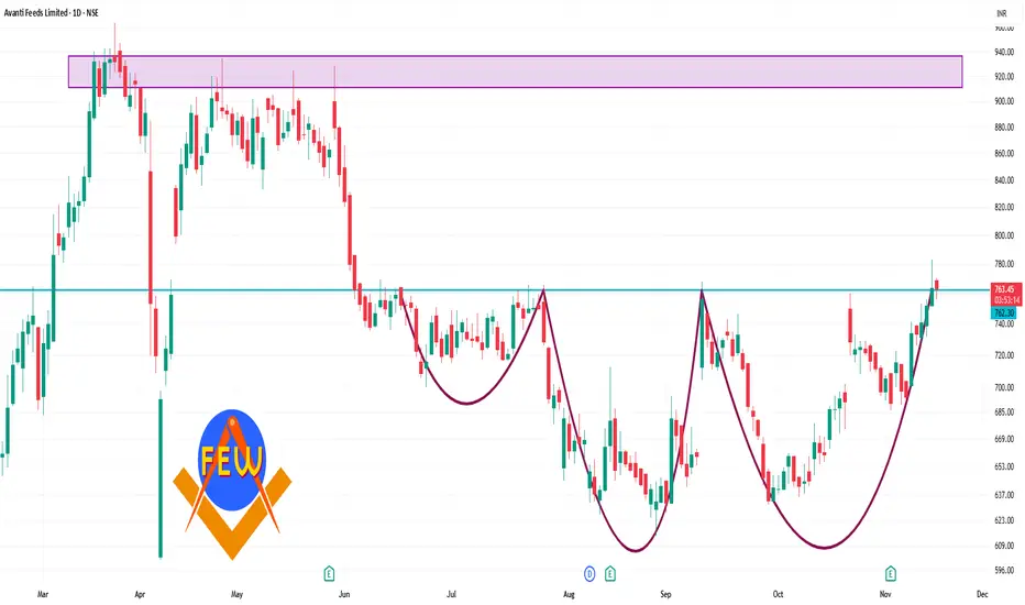
AVANTIFEED 1 Day Time Frame 🔍 Key Levels
Pivot (Daily): ~ ₹ 746.47
Resistance levels:
R1 ~ ₹ 761.48
R2 ~ ₹ 770.92
R3 ~ ₹ 785.93
Support levels:
S1 ~ ₹ 737.03
S2 ~ ₹ 722.02
S3 ~ ₹ 712.58
✅ Interpretation & Use
If price holds above ~₹ 746.47 and shows strength, the next meaningful resistance zone is ~ ₹ 761-771.
If price drops below the pivot, then supports around ~ ₹ 737, and further down ~ ₹ 722 or ~ ₹ 712 become relevant.
The momentum indicators (RSI ~67.6, MACD positive) suggest bullish bias but note: when RSI gets high → risk of pull-back increases.
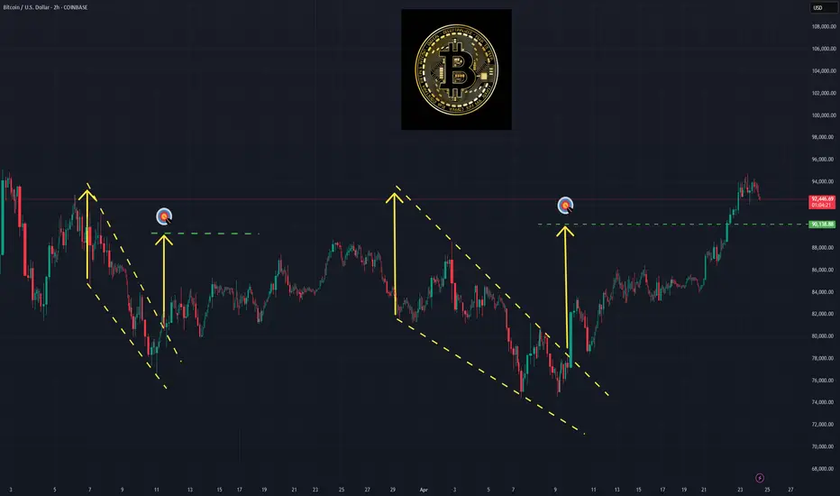
Bollinger Bands: How to Stop Being a Slave to the Markets.Bollinger Bands: How to Stop Being a Slave to the Markets.
Bollinger Bands are a technical analysis indicator widely used in trading to assess the volatility of a financial asset and anticipate price movements. Created in the 1980s by John Bollinger, they consist of three lines superimposed on the price chart:
The middle band: a simple moving average, generally calculated over 20 periods.
The upper band: the moving average to which two standard deviations are added.
The lower band: the moving average to which two standard deviations are subtracted.
These bands form a dynamic channel around the price, which widens during periods of high volatility and narrows when the market is calm. When a price touches or exceeds a band, it can signal an overbought or oversold situation, or a potential trend reversal or continuation, depending on the market context.
What are Bollinger Bands used for? Measuring volatility: The wider the bands spread, the higher the volatility.
Identifying dynamic support and resistance zones.
Detecting market excesses: A price touching the upper or lower band may indicate a temporary excess.
Anticipating reversals or consolidations: A tightening of the bands often heralds an upcoming burst of volatility.
Why is the 2-hour time frame so widely used and relevant?
The 2-hour (H2) time frame is particularly popular with many traders for several reasons:
Perfect balance between noise and relevance: The H2 offers a compromise between very short time frames (often too noisy, generating many false signals) and long time frames (slower to react). This allows you to capture significant movements without being overwhelmed by minor fluctuations.
Suitable for swing trading and intraday trading: This timeframe allows you to hold a position for several hours or days, while maintaining good responsiveness to take advantage of intermediate trends.
Clearer reading of chart patterns: Technical patterns (triangles, double tops, Wolfe waves, etc.) are often clearer and more reliable on H2 than on shorter timeframes, which facilitates decision-making.
Less stress, better time management: On H2, there is no need to constantly monitor screens. Monitoring every two hours is sufficient, which is ideal for active traders who don't want to be slaves to the market.
Statistical relevance: Numerous backtests show that technical signals (such as those from Bollinger Bands) are more robust and less prone to false signals on this intermediate timeframe.
In summary, the 2-hour timeframe is often considered "amazing" because it combines the precision of intraday trading with the reliability of swing trading, providing superior signals for most technical strategies, especially those using Bollinger Bands.
To summarize
Bollinger Bands measure volatility and help identify overbought/oversold areas or potential reversals.
The 2-hour timeframe is highly valued because it filters out market noise while remaining sufficiently responsive, making it particularly useful for technical analysis and trading decision-making.
Real Success Rates of the Falling Wedge in TradingReal Success Rates of the Falling Wedge in Trading
The falling wedge is a chart pattern highly valued by traders for its potential for bullish reversals after a bearish or consolidation phase. Its effectiveness has been extensively studied and documented by various technical analysts and leading authors.
Key Statistics
Bullish Exit: In 82% of cases, the exit from the falling wedge is upward, making it one of the most reliable patterns for anticipating a positive reversal.
Price Target Achieved: The pattern's theoretical target (calculated by plotting the height of the wedge at the breakout point) is achieved in approximately 63% to 88% of cases, depending on the source, demonstrating a high success rate for profit-taking.
Trend Reversal: In 55% to 68% of cases, the falling wedge acts as a reversal pattern, signaling the end of a downtrend and the beginning of a new bullish phase.
Pullback: After the breakout, a pullback (return to the resistance line) occurs in approximately 53% to 56% of cases, which can provide a second entry opportunity but tends to reduce the pattern's overall performance.
False Breakouts: False exits represent between 10% and 27% of cases. However, a false bullish breakout only results in a true bearish breakout in 3% of cases, making the bullish signal particularly robust.
Performance and Context
Bull Market: The pattern performs particularly well when it appears during a corrective phase of an uptrend, with a profit target reached in 70% of cases within three months.
Gain Potential: The maximum gain potential can reach 32% in half of cases during a bullish breakout, according to statistical studies on equity markets.
Formation Time: The wider the wedge and the steeper the trend lines, the faster and more violent the post-breakout upward movement will be.
Comparative Summary of Success Rates:
Criteria Rate ..........................................Observed Frequency
Bullish Exit ........................................................82%
Price Target Achieved ........................................63% to 88%
Reversal Pattern ..............................................55% to 68%
Pullback After Breakout .....................................53% to 56%
False Breakouts (False Exits) ...............................10% to 27%
Bullish False Breakouts Leading to a Downside ..............3%
Points of Attention
The falling wedge is a rare and difficult pattern to correctly identify, requiring at least five contact points to be valid.
Performance is best when the breakout occurs around 60% of the pattern's length and when volume increases at the time of the breakout.
Pullbacks, although frequent, tend to weaken the initial bullish momentum.
Conclusion
The falling wedge has a remarkable success rate, with more than 8 out of 10 cases resulting in a bullish exit and a price target being reached in the majority of cases. However, it remains essential to validate the pattern with other technical signals (volume, momentum) and to remain vigilant against false breakouts, even if their rate is relatively low. When mastered, this pattern proves to be a valuable tool for traders looking for optimized entry points on bullish reversals.