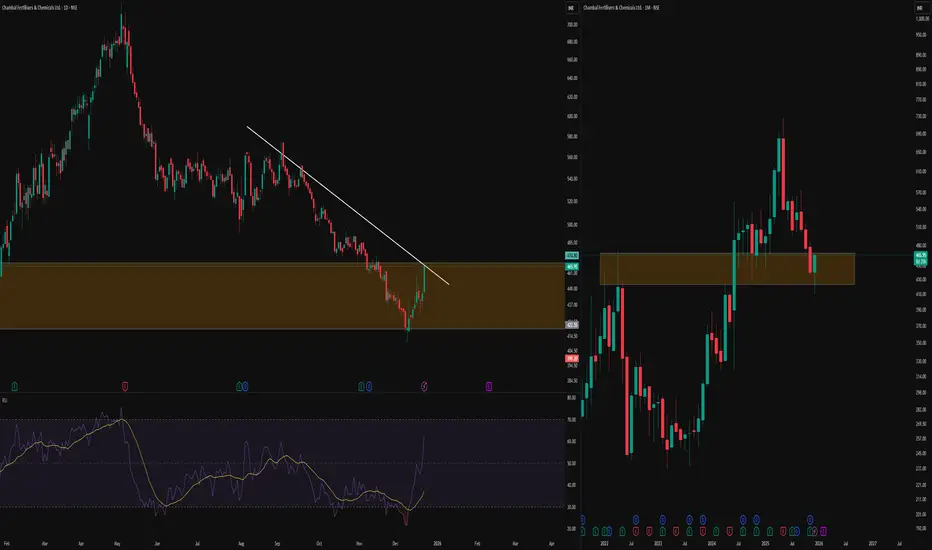
Daily vs Monthly: Counter Trendline Meets Cup Structure-This TradingView post contrasts multi-timeframe analysis, showing a clean counter trendline (CT) a white line connecting swing highs on the daily chart (left) with the monthly chart (right) revealing a classic cup pattern in the orange zone
-Key Concepts Explained
A counter trendline (CT) maps resistance from successive lower highs, highlighting areas where upward moves repeatedly stall and create liquidity zones below prior peaks. The cup breakout on monthly shows price emerging from a rounded base, followed by sustained action above the rim with multiple retests of those prior levels, demonstrating how higher timeframes contextualize lower timeframe lines.
-Educational Value
Observing CT interactions alongside cup structures illustrates price respect for dynamic resistance across timeframes, aiding in understanding market rhythm without directional assumptions. Traders use such alignments to study historical behavior at key zones.
Disclaimer: Educational content only. Not SEBI registered. No investment advice—do your own research
Multitimeframeanalysis
Multi‑Timeframe Flag & Fair Value Gap ObservationOn the left, the daily timeframe is highlighting a potential flag‑and‑pole structure after a strong one‑sided move.
Within this leg, a blue fair value gap has been marked, which price has interacted with multiple times, illustrating how an imbalanced area can act as a reference zone over time.
On the right, the monthly timeframe of the same instrument is added to provide broader structural context to the daily pattern.
This multi‑timeframe layout is meant purely to show how a lower‑timeframe pattern and an identified fair value gap can be viewed alongside the higher‑timeframe trend without attaching any directional bias.
Disclaimer: This post is for educational and illustrative purposes only and does not constitute investment, trading, or financial advice. Always do your own research and consult a registered financial professional before making any trading decisions.
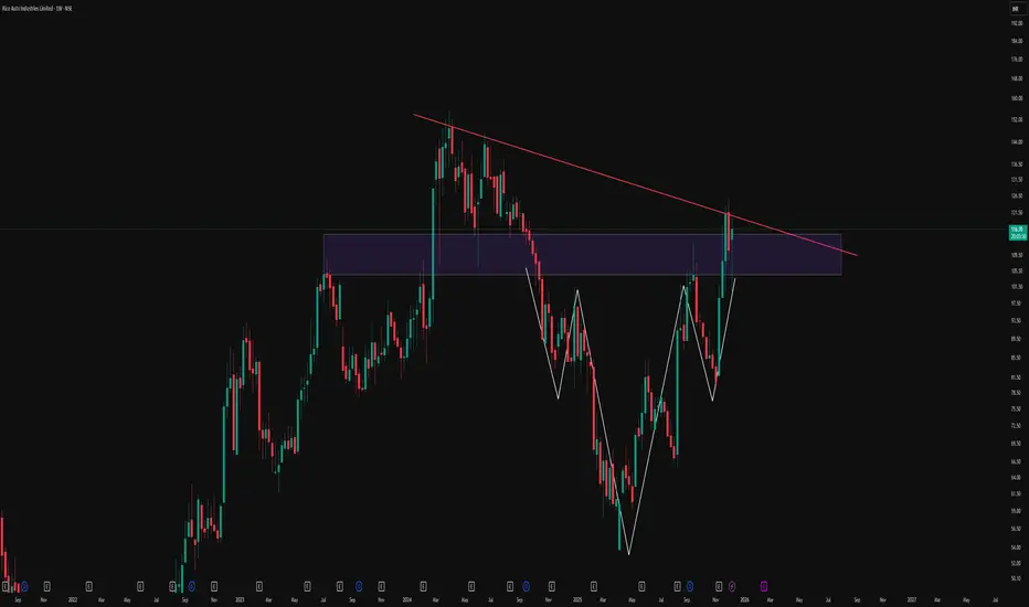
Reclaiming The Breakdown: Descending Triangle To Inverse HnSThis weekly chart of Rico Auto illustrates how structure can evolve over time and why rigid bias around a single pattern can be misleading. Price initially respected a clear descending trendline, forming a classic descending triangle and eventually breaking down below the support zone. Instead of continuing in a straight-line downtrend, the market absorbed that move and began to build a broader basing structure.
Over the following swings, price developed an inverted head and shoulders formation, highlighted here with the white structure, right inside and just below the prior breakdown area. As the pattern matured, price not only reclaimed the prior horizontal zone but also pushed back toward the original red counter-trendline that once acted as dynamic resistance. The same trendline that confirmed the initial triangle breakdown is now being revisited, showing how former breakdown structures can later turn into key decision zones rather than one-way signals.
This chart is shared purely to study how multiple patterns can co-exist and morph on higher timeframes:
-A descending triangle that initially breaks to the downside
-A subsequent inverse head and shoulders basing pattern
-A later reclaim of the old breakdown area and retest of the descending trendline
Disclaimer
This post is for educational and illustrative purposes only and is not investment, trading, or financial advice. Please do your own research and consult a registered financial professional before making any trading or investment decisions.
Always check the Higher Time frame but WHY ?I make educational content videos and Posts for Swing Trading based ideas - concepts and my full time trading experience .

AdityaBirlaCapital - Investment IdeasAditya Birla Capital Ltd - Technical Analysis
Simple Technical Analysis Summary
Aditya Birla Capital is breaking out from a multi-year resistance zone with a classic and perfect rounding bottom pattern playing out on the monthly timeframe.
Fibonacci targets have been activated!
Key Technical Observations
1. Multi-Year Rounding Bottom Pattern
The stock has completed a textbook rounding bottom formation spanning multiple years. This is one of the most reliable bullish reversal patterns in technical analysis, indicating a fundamental shift from bearish to bullish sentiment.
2. Breakout from Multi-Year Resistance
After years of consolidation and base building, the stock has successfully broken out from a significant resistance zone around ₹255. This breakout signals the potential beginning of a new uptrend cycle.
3. Monthly Timeframe Confirmation
The pattern is forming and confirming on the monthly timeframe, which carries significantly more weight than shorter timeframes. Monthly breakouts tend to lead to sustained moves.
4. Fibonacci Extension Framework
Multiple Fibonacci extension levels have been identified and activated, providing a clear roadmap for potential price targets based on the measured move from the rounding bottom pattern.
#Fibonacci Extension Target Levels
Based on the rounding bottom pattern measurement and Fibonacci extensions:
- Target 1: 314.20 (1.272 Fibonacci Extension)
- Target 2: 345.10 (1.414 Fibonacci Extension)
- Target 3: 389.90 (1.618 Fibonacci Extension)
- Extended Target: 472.00 (2.0 Fibonacci Extension)
Key Support Levels
- Immediate Support: 255.00 (Breakout level / Previous resistance turned support)
- Secondary Support: 171.86 (0.618 Fibonacci retracement)
- Critical Support: 146.17 (0.5 Fibonacci retracement)
- Base Support: 42.35 (Rounding bottom base)
- Pattern suggests long-term bullish structure - Risk-reward favorable for position building on dips
Risk Management:
- Maintain stoploss below 255 on monthly closing basis
- For aggressive traders: 240 (allowing some wiggle room)
- For conservative traders: 235 (below breakout zone)
Invalidation Level:
- Monthly close below 240 would weaken the bullish structure
- Break below 220 would invalidate the immediate bullish setup
DISCLOSURE & RISK WARNING:
This analysis is provided for educational and informational purposes only and should not be construed as financial advice, investment recommendation, or an offer to buy or sell securities. Past performance is not indicative of future results.

#Cipla - #ShortTerm #Inveatment IdeaCipla Ltd - Technical Analysis
Current Price: 1,639.10
Timeframe: Monthly Chart Analysis
This analysis utilizes:
- Monthly and Weekly timeframe analysis
- Fibonacci extension and retracement levels
- Support/resistance identification
- RSI momentum analysis
- Price action patterns
Technical Structure Overview
1. Monthly Consolidation Phase
After making a higher high, Cipla is currently in a consolidation phase on the monthly chart, forming a strong base. This consolidation suggests preparation for a potential significant move higher.
2. Breakout Level to Watch
The critical level to monitor for breakout confirmation is around the recent high zone. A decisive break above this level could trigger the next leg of the uptrend.
3. Weekly Timeframe Confirmation
For higher probability setups, confirmation should be sought on the weekly timeframe before taking any positions. This multi-timeframe approach reduces false signals.
4. Fibonacci Extension Targets
Based on Fibonacci patterns, the following extension levels have been identified as potential targets for future price movement.
5. Risk Management Strategy
Following a risk-reward approach is essential for this setup given the consolidation phase and potential for significant moves in either direction.
Fibonacci Extension Target Levels
Based on technical projections:
- Target 1: 1,872.70 (1.272 Extension at 1,878.05)
- Target 2: 1,986.95 (1.414 Extension at 1,987.15)
- Target 3: 2,145.45 (1.618 Extension at 2,143.95)
Key Support Levels
Primary Support: 1,345.75 (0.5 Fibonacci level)
Critical Support: 900.50 (0 level - invalidation zone)
Trading Considerations
Bullish Scenario:
- Wait for monthly candle close above consolidation range
- Confirm momentum on weekly timeframe
- Enter on weekly pullback for optimal risk-reward
Invalidation:
- Break and close below ₹1,345.75 would weaken the bullish structure
- RSI showing divergence patterns to monitor
DISCLOSURE & RISK WARNING:
This analysis is provided for educational and informational purposes only and should not be construed as financial advice, investment recommendation, or an offer to buy or sell securities. Past performance is not indicative of future results.

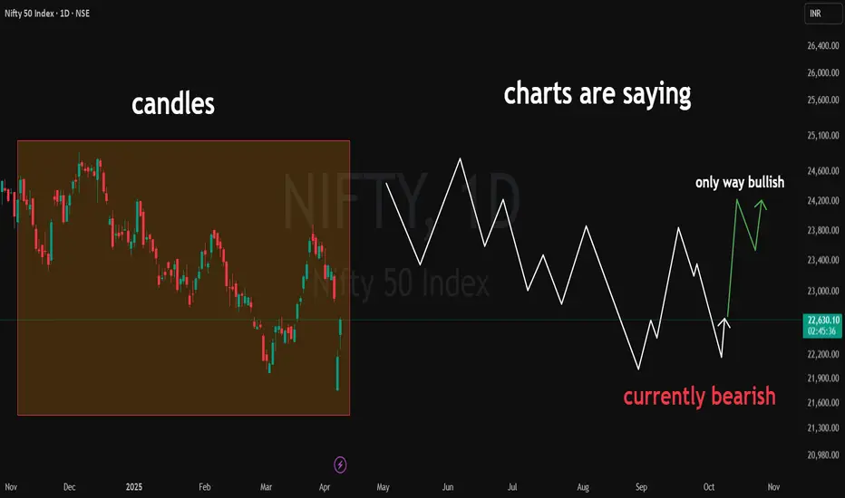
Nifty50 - Set to March towards 30KNifty is showing strong bullish momentum backed by multiple signals
Trendline Breakout from consolidation
Cup & Handle Formation indicating continuation
Three White Soldiers Candles
Reversal from Crucial Support near 24,300
Multi-Timeframe Alignment (Daily, 4H, Weekly)
Entry: 25,670
With strong confluence of bullish signals, Nifty50 looks set to march towards the 30K in Next 5-6 Months

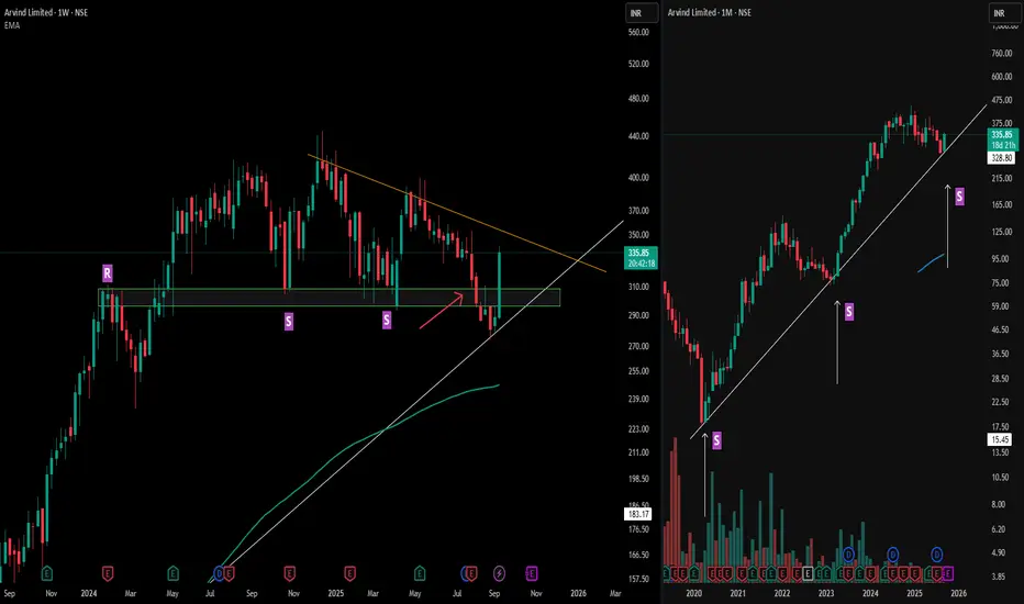
Arvind : Spotting Fake Breakdowns with Multi-Timeframe SupportArvind Limited highlights how a broader perspective can clarify deceptive price moves.
On the left (weekly), resistance ("R") flipped into support ("S") multiple times, with the orange counter trendline framing the recent structure. The red arrow marks a moment when weekly support appeared broken—a classic fake breakdown as price quickly reclaimed the zone with decisive strength.
Looking right (monthly), the MTFA view explains the recovery: a long-standing trendline support anchors the zone, helping absorb downside attempts and fueling the swift reversal. This alignment across timeframes illustrates how long-term technical structures often override short-term volatility, and why reviewing bigger picture charts is essential for pattern validation—not for prediction.
Disclaimer: This analysis is for educational purposes only and does not constitute investment advice. Always do your own research before making financial decisions.
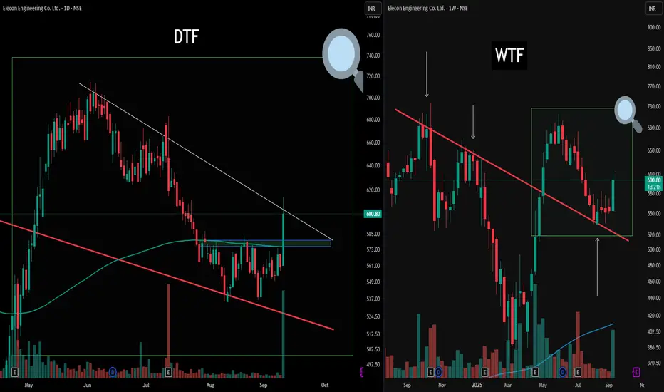
Unlocking Structure: Multi-Timeframe Mapping Today’s chart highlights the value of multi-timeframe analysis for structured observation.
On the right (WTF), the weekly perspective provides a broad structure, showcasing a clean counter trendline and its reaction zone. A green box and magnifier zoom into this region, framing the context for the daily (DTF) chart on the left.
On the DTF view, the same zone is explored in detail. Here, there's an active counter trendline (white) and a pronounced double bottom formation resting on a blue Flip zone—noted for educational reference rather than outcome prediction. Both timeframes display how structural overlaps and retests can be identified, serving as useful pattern recognition and risk management.
Disclaimer: Trading involves significant risk and is not suitable for all investors. Past performance does not guarantee future results. Always conduct your own research, consider seeking advice from a qualified financial advisor, and trade only with capital you can afford to lose.
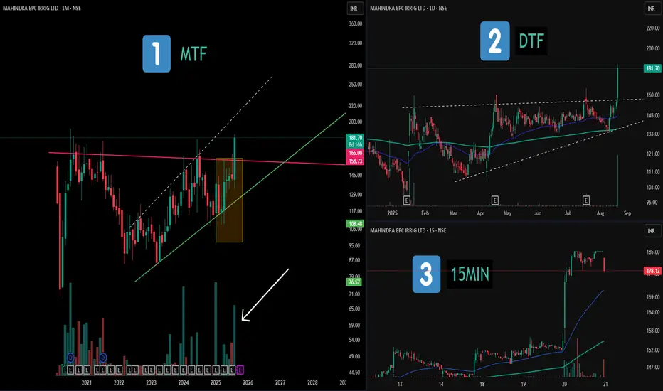
Multi-Timeframe Study: Consolidations and Patterns📝 Description:
1️⃣ MTF (Monthly) – Displays a broad consolidation structure with a hidden broadening formation and notable volume clusters marked in recent candles.
2️⃣ DTF (Daily) – Highlights an ascending triangle structure, with clear range boundaries and price compression before expansion.
3️⃣ 15MIN (Intraday) – Shows that the maximum price movement and volume activity occurred on a single candle, illustrating how momentum often concentrates in short bursts.
This chart setup serves as an educational view across multiple timeframes, showing how higher- and lower-TF structures can align.
⚠️ Disclaimer:
This post is purely for educational and structural analysis purposes. Not financial advice.
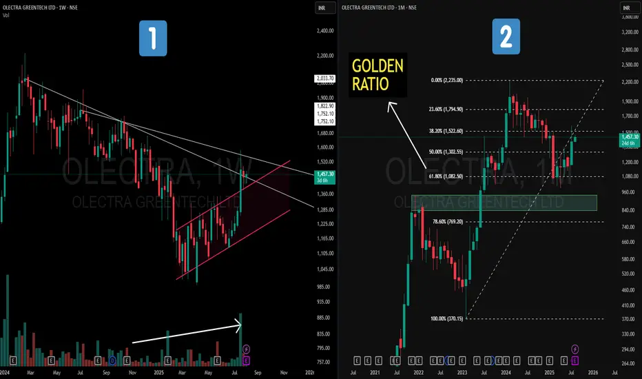
Olectra Greentech – Golden Ratio on MTF + Hidden channel on WTF📝 Description
📌On the Weekly Chart (Left) – Price action has formed a strong counter-trend (CT) breakout from a prolonged downtrend. Hidden within the structure is a parallel channel (highlighted in pink), with volume gradually increasing in the recent rally — a positive sign of accumulation.
📌On the Monthly Chart (Right) – A Fibonacci retracement drawn from the Feb 2023 low to the Feb 2024 high (a one-year strong uptrend) shows price taking support exactly at the 61.8% Golden Ratio. This reaction from a key retracement zone is aligned with historical technical behavior.
This is not a forecast, but rather a technical observation of structure, retracement behavior, and volume dynamics.
How I Identify High‑Probability Setups Using Weekly + Daily TFI daily make educational content videos for Posts for Swing Trading
📌 This post is for educational purposes only and is not financial or investment advice

Mastering Multi Time Frame Analysis | Swing and Intraday TradingWhether you're a price action trader or rely on indicators, mastering Multi Time Frame (MTF) Analysis can transform your swing and intraday trading decisions. In this video, I break down how to use MTF effectively to align your entries, spot fakeouts, and trade with higher conviction.

RELIANCE POWER | Cup and Handle Breakout | Multi-Year Bullish- Technical analysis (RELIANCE POWER LTD, Weekly timeframe):
Dark horse bet
---
### 📊 **Chart Pattern:**
**Cup and Handle** formation (long-term)
---
### 🧩 **Pattern Breakdown:**
* **Cup Formation:**
From \~2018 to mid-2023, the price shows a deep, rounded bottom formation, typical of a cup base. This indicates a long accumulation phase after a downtrend.
* **Handle Formation:**
A smaller consolidation happened after the breakout from the cup, forming a handle, suggesting a pause before a potential continuation.
---
### 🔍 **Key Technical Levels:**
* **Breakout Level:** ₹50.50
The breakout above this level confirms the completion of the cup and handle pattern.
* **Current Price:** ₹51.90
Price has broken out with strong volume, confirming bullish strength.
* **Targets based on pattern projection:**
* **Short-Term Target:** ₹68.09
(based on the height of the cup added to the breakout point)
* **Resistance Zone:** ₹68.00
* **Support Levels:**
* Immediate: ₹50.50 (breakout retest zone)
* Stronger: ₹34.44 and ₹21.59 (previous accumulation zones)
---
### 📈 **Volume Analysis:**
* Volume is significantly increasing during the breakout from the handle, confirming strong buying interest.
* Volume MA is trending up, indicating a sustained move.
---
### 🧠 **Conclusion:**
* **Bias:** Bullish
* **Pattern Strength:** Strong (due to multi-year formation and breakout with volume)
* **Risk Management:**
Watch for retest of ₹50.50–₹51 zone. A failure to hold here could lead to a pullback toward ₹34.44.
---

Sunday Swings 20 April 2025 | Stocks and NiftyI make educational content videos for swing / positional trading
No Tips, calls or any future Predictions are done in the video, just sharing what the charts are talking .

Simple CT-Based Price Action Breakout | Volume + Price Alignment✅ White Line: Represents a well-respected CT trendline — multiple touches before finally getting broken with conviction.
✅ Volume Breakout: Strong volume spike confirms the breakout — classic case of price and volume moving in sync.
✅ White Zones: Marking clear Higher Low formations — price respecting structure before launching up.
✅ Green-Cyan Line: Marks a multi-timeframe supply zone. This level will be critical for continuation or rejection watch.
Structure, volume, and context are lining up — keeping this one on radar for further price action development. 📊
NIFTY 50 – Top-Down Analysis Amidst Tariff TurbulenceWith global markets shaken by Trump’s recent tariff rhetoric, it's time we zoom out and analyze what Nifty 50 is actually saying — from a multi-timeframe lens. Price tells a story, and here's how it's unfolding across the Monthly, Weekly, and Daily charts:
🟩 Monthly Chart (1M) – The Bigger Picture
The macro trend is nearing a critical MTF decision point.
🔁 This is the make-or-break zone for the larger structure.
🟥 Weekly Chart (1W) – Bearish Momentum Still in Play
Structure is currently bearish, with lower highs and lower lows.
🧠 Key Thought: Don’t assume trend change without structure breaking clearly.
🟧 Daily Chart (1D) – Battle Zone
Price action is noisy but insightful.
We have a potential bullish scenario unfolding — but it’s fragile
Only bullish structure is if price defends recent lows and breaks above resistance in a clean impulse-retrace-impulse fashion.
Despite external triggers like Trump’s tariff announcements, the technical structure across timeframes is telling us one thing:
⚠️ “No bias until structure confirms.”
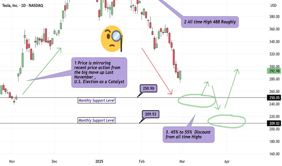
What is an Appropriate Tesla Discount? Multiple Timeframes!Hello Traders.. It's been too long.
We are back with our first analysis in over 4 months. We answer : What is an appropriate price to either jump on the train or scale into original positions on Tesla? Jumping in around 250, probably decent for at least a 4Hr to Daily Chart Swing. Safer Longs appear to be around 209 as I have outlined with green arrows, labeling the multiple pivots in the recent 5 Year range on Tesla. Tesla is coming down alongside the broader Indices which can be expected. Just because Friday Feb 28th showed us a Solid Hammer looking candle suggesting strong buying power, this does not mean much to me for 3 reasons.
1) This price action has developed in the middle of the move up we observed during Election week late last year.
2) The candle closed without a top wick and so the next daily candle , in theory, has no range to fill moving forward.
3) Momentum at the moment is also Bearish.
Discipline Traders! Leave a comment or Boosted rocket if you'd like to see similar analysis.
Hero MotoCorp I Bullish Signals – Time to Invest or Trade?Trade Plan
Enter after strong Breakout of 3,896 levels, Stop loss below entry candle 15m time frame(Not more than (0.5%)
Pro Tip
As we are on a weekly support of the stock and it is taking support from it we could be seeing a trend day where the price consistently moves in one direction throughout the trading session, with minimal price reversals. So to capture the big move You can trail stoploss on previous swing or an EMA of your preference. Eg:10,20
Buy above 3,896.70 ( after close on 15m TF)
Target 1 - 3,950.95
Target 2 - 3,976.15
Target 3 - 4,015.55
Not an Investment Advise

Weekly Breakout - Feb 1st Week / Best Stock To Watch Now ⚠️ Important: Always Exit the trade before any Event.
⚠️ Important: Always maintain your Risk & Reward Ratio.
✅#Boost, #Like & #Follow to never miss a new idea! ✅
Disclaimer: I am not SEBI Registered Advisor. My posts are purely for training and educational purposes.
Eat🍜 Sleep😴 TradingView📈 Repeat 🔁
Happy learning with MMT. Cheers!🥂

Top 4 Swing Trading Ideas for Jan 30, 2025!🚀Top 4 Swing Trading Ideas for Jan 30, 2025! 🚀
📢 Disclaimer: The 4 stocks discussed here are for educational purposes only. 📚💡
✅ First, learn how to trade, then focus on earning! 💰📈
💬 Got a stock in mind? Drop a comment, and I'll reply! 🔍📊
#LearnBeforeYouEarn #StockMarket

BAJAJCONS potential longThis stock has corrected significantly and is now within a monthly,weekly and daily DZ. The level is fine tuned on the 240 mins for precision. If the broader market supports we may expect to see a move to the upside on this stock

Reliance in confluence of demand zones- Long OpportunityReliance is currently sitting in the weekly and daily demand zones, providing strong support.
weekly zone
Daily zone:
However, the price has yet to reach the 4-hour and 2-hour demand zones, which are located near the bottom of the weekly and daily zones, adding further strength to this area.
For an ideal long entry, wait for the price to touch the 4-hour and 2-hour demand zones, as this will reinforce the potential reversal. Once these zones are tested, a breakout above the key trendline could signal a bullish move. Monitor the trendline breakout as confirmation to take a long position.
