Refining Margin Drag RIL to Below Median LINE - Result SeriesDue to Low AVG.Crude Oil Price in Last Quarter (Q1 of 2017-18)
Refining Margin may in pressure , Drag RELIANCE to Below Median LINE
Harmonic "Bearish CRAB in Progress".
PRZ: @ 1588 (if Pattern Confirms.)
All are Plotted in Chart.
Do SHORT in Higher Level, BEST Above @ 1560+
TARGET: Plotted on Chart.
FnO trader can LONG Nearer OTM PUT Option, when traded at or above @ 1555+
More Strategy on QUERY.
If enriched your knowledge and would help you in trading,
Please don't forget to Hit / Click Like button.
Your likes motivate me to post better ideas in future.
Disclaimer: Only For STUDY. For Taking Trade Decision Consult Financial Advisor.
Search in ideas for "PLOT"

HDFC is Good Time OVER?HDFC is Good Time OVER?
HDFC: @ 1647.5
Nearer End of EXTENDED WAVE - 5 at @ 1643 To @ 1679 ,
Fib EXT of 1.13 - 1.272 Respectively.
Trading Near Median (VIOLET Dotted) (@ 1625) of Parallel Channel.
Technical Indicators (Both Laggard & Lead) are OverBought.
ICHIMOKU Tenken (Conversion Line -Sky Blue) & Kijun (Base Line - Merun) turns flat.
In Hekin Ashi Reversal Candle. (Though Not plotted in Chart).
more on the chart.
SHORT Zone & Target Plotted in Chart .
Strategy for Future Trader: SHORT Future + Long 1680CE / 1700CE .
Intraday levels ( Future Basis):
Resistance: @ 1654, @ 1660, @1669 , @ 1675 - @ 1679
Support: @ 1645, 1640, @ 1633, @ 1627
# For Cash Traders, Add Premium or Discount with Future Price
PS: If you like Ideas/Analysis, please Like/Share & keep motivated.

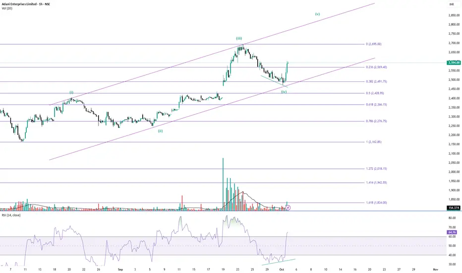
Adanient in 5th waveAdaniENT gained above 3% yesterday. I plotted the Elliott Wave and found it to be in the 5th wave. It can go upside.
Note: Not a buy/sell recommendation. For educational and paper trading purposes only.
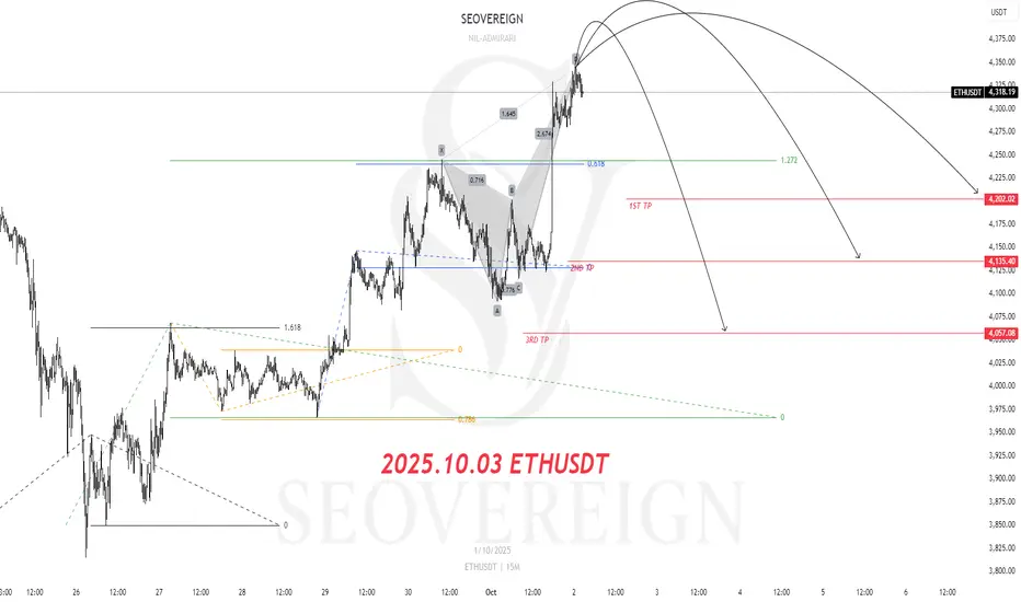
[SeoVereign] ETHUSDT BEARISH Outlook – October, 03 2025The key basis for presenting a bearish perspective in this idea is that the Crab pattern, one of the harmonic patterns, has been fully confirmed.
For clearer verification, I have directly plotted the relevant section on the chart for your reference.
For reference, the Crab pattern is an extended harmonic pattern with high volatility, typically forming point D at the 1.618 level relative to the XA wave, and is characterized by a strong reversal movement thereafter.
Due to these characteristics, it is evaluated as a highly reliable pattern within the Potential Reversal Zone (PRZ).
Accordingly, the average target price is set around 4,135.40 USDT.
Additional briefings will continue to be updated in this idea as the chart develops.
DIXON REACTING AT GANN LINE CROSSINGHere iwould like to show you how gann fan crossings are reacting for dixon.Look at the chart i plotted here two gann FAN symmetrical but opposite(180 DEGREE) .
Here you can see that after completion of inverse head and shoulder dixon is rallying down and penitrated neckline of H&S now trading near previous consolidation zone if it is broken, I am expecting that it will try to test T1 which is previous support and cross point of gann lines.
Cross lines are marked by RED coloured arrow. where dixon is reacting.
If you see closely there is a gap bellow previous consolidation zone,it might be possible that dixon coming down to fill this gap .
red lines are mentioned here as resistance and green as support.
this is not my buy/sell call please remember.

NIFTY 50 VIEWHere in this post I would like to explain NIFTY 50,As per the chart nifty is trying to form inverse head & shoulder pattern in weekly chart.
Some important point is that there is two parallel lines in BLUE color is left and right shoulders in yellow ellipse and marked by red and green arrow as well which height is same denoting price level but here formation of shoulder time taken is different left shoulder formed quickly than right shoulder means right shoulder is taken more time, So I can say that price is lagging than time.
if it has to cover price there is need to run fast it means, We may see fast movement in future in NIFTY.
Now one more pattern may appear in future is symmetrical triangle which is shown in white lines. Whenever it will competed as it is plotted bigger move can be seen after breakout otherwise reversal may might be seen.

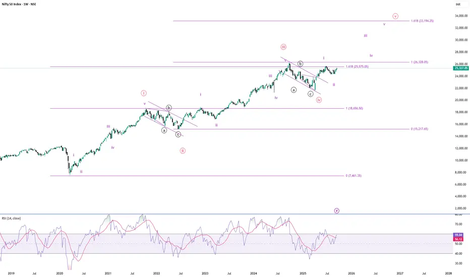
3rd wave of the 5th in Nifty 50 ?I plotted the EW taking the low of COVID-19 on a weekly timeframe. I believe we are in the 5th wave of the impulsive waves following the pandemic lows. The 3rd wave has travelled just above the 1.618 level (25575.05). The 4th wave retraced just about the 0.618 level of the 3rd wave, which is a little unusual for a 4th wave characteristic.
As it is a weekly chart, I expect the (33,194) level (1.618 level of the 3rd wave) to be the target for the 5th wave, unless it is a truncated one.
As the EWT is subjective in nature, I don't recommend following this analysis blindly. It's only for observational purposes. It's not a buy/sell recommendation.
It's a game of probability. I believe that risk management, and discipline, are more critical than analysis.
Note: For educational purposes only.
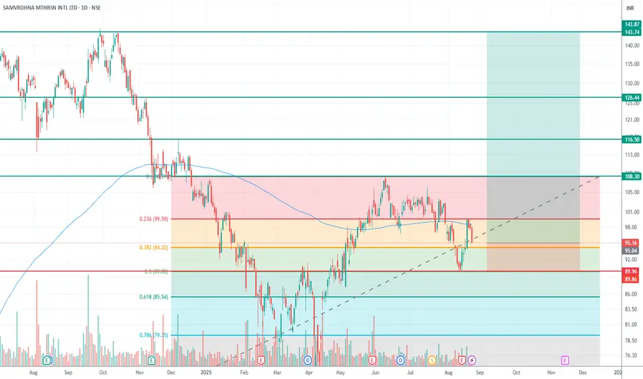
MOTHERSON (Weekly + Daily Analysis)Disclaimer: This is my personal analysis for educational purposes only. I am not SEBI-registered. Please consult your financial advisor before making any trading decisions.
🔎 Weekly Chart Setup
On the weekly timeframe, when plotting Fibonacci from the bottom (below 200 EMA) to the top (above 200 EMA):
Price retraced to the 0.5 level.
After holding this zone, it is again moving towards the highs.
📈 Daily Chart Confirmation
Entry near CMP ~95.16.
Stop Loss: below 0.618 Fibonacci retracement → around 85 (safer SL).
Once the price crosses the first target, SL can be revised upward to the 0.5 level (~89–90).
🎯 Targets
First Target: Weekly high → 103–108
Second Target: 116
Third Target: 126
Final Target: 143
⚖️ Risk-Reward
Initial SL: 85
Entry: 95.16
Multiple profit targets with an approximate R:R > 1:5.
📌 Summary:
Weekly chart supports a bullish continuation after holding the 0.5 retracement.
The daily chart provides a clear risk-defined setup with a stop below 0.618.
Scaling out at targets and trailing SL increases the probability of locking profits.
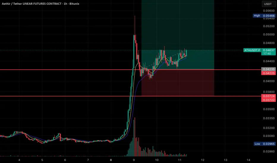
ATH/USDT Going for ATHHere’s the breakdown of what’s shown:
• Price Action:
The chart shows a massive spike in price on September 8th, followed by a retracement and consolidation phase.
Currently, the price is trading at 0.04634 USDT, with slight bullish movement (+1.58%).
• Indicators:
• Moving averages (likely EMA 9 & 21) are plotted, and the price is staying above them, showing bullish support.
• Volume spiked heavily during the breakout and has since decreased while consolidation is happening.
• Trade Setup (Highlighted Zone):
• Entry: Around the current price (0.0463 USDT).
• Stop Loss: Just below 0.0422–0.0423 support zone.
• Target Zone: Extends upward past 0.054 (previous high), indicating a long trade setup with a good risk-to-reward ratio.
• Support & Resistance:
• Support 1: 0.04225 – 0.04235
• Support 2: 0.03722 – 0.03724
• Resistance: 0.05466 (recent swing high)
👉 Overall, this looks like a bullish continuation setup after a breakout, with price consolidating in a higher range before a possible push toward the recent highs
WHY BSE REVERSED TODAYIn this chart solid red lines are resistance and green lines are support and here i shown red arrows which are revealing reversal from resistsnce then green arrows revealing reversal from support taken.
> Now here i would like to say that BSE gradually forming lower high and lower low swing between downward channel so you can decide easily what shoud you do.
> One horizontal green line is drawn that is shown as 50% of biggest swing it may take support once more.To show 50% of swing one vertical ractangle is plotted in chart.

Indian Railway Finance Corporation – Complex Correction in PlayDisclaimer: This analysis is for educational purposes only and does not constitute investment advice. Please do your own research (DYOR) before making any trading decisions.
Technical Picture
Indian Railway Finance Corporation (IRFC) stock rallied from the swing low of 65.75 to an all-time high of 229 in a strong impulsive move. Since then, the stock has entered a corrective phase.
The decline from 229 to 108.04 unfolded as a clear three-wave ABC zigzag.
From 108.04 to 148.95, the rise was overlapping and choppy, best counted as an X wave triangle rather than a fresh impulsive sequence.
The fall from 148.95 to 117.33 looks impulsive and is labelled as Wave A of the Y leg.
The ongoing bounce can be labelled as Wave B, with retracement levels around 124–129 acting as possible resistance.
Once Wave B completes, a Wave C decline is expected to finish Wave Y. This Y leg can either:
terminate near 108.04, forming a double bottom structure, or extend toward the 0.786 retracement of the 65.75–229 rally, around 100.70.
Momentum and Indicators
On the D,2D and Weekly charts, RSI is below the 50 mark, showing weak momentum.
Price remains under the 50, 100, and 200-day moving averages, which are acting as resistances (not plotted here to keep the chart uncluttered).
The invalidation level for this corrective view is 148.95. A break above this level would challenge the corrective structure and point to a new impulsive rally.
Fundamentals
Growth : FY25 sales at Rs 27,152 crore vs Rs 26,645 crore in FY24. Net profit at Rs 6,502 crore vs Rs 6,412 crore. Quarterly profits continue steady.
Cash flows : Operating cash flow improved to Rs 8,229 crore. Net cash flow turned positive at Rs 5,657 crore from negative last year.
Leverage : Debt-to-equity is high at 7.83, with interest coverage at just 1.3x, leaving little buffer.
Returns and margins : Return on equity stands at 12.3%, but margins have narrowed from earlier highs.
Valuation : P/E around 25 and P/B at 3.1 suggest the stock is not cheap given its nature as a financing PSU.
in.tradingview.com
Summary
IRFC appears to be in the final stages of a complex W–X–Y correction. Wave Y is unfolding, and price can either find support near 108.04 to form a double bottom or stretch further toward the 100.70 zone. The 129 area is key resistance for the current B wave bounce, and 148.95 remains the invalidation level.
While the company’s fundamentals are stable with steady sales and profits, the balance sheet remains heavily leveraged, and valuations are not inexpensive. Investors should watch for price action around 108–100 for signs of a structural bottom and confirmation before positioning for the next major trend.

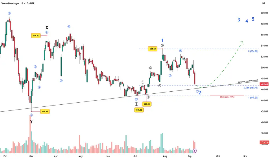
Varun Beverages Ltd – Wave 2 Setup at Trendline SupportVarun Beverages Ltd. (VBL), PepsiCo’s second-largest global bottling partner, has been through a long and exhausting corrective phase. On the Elliott Wave chart, this stretched out as a W–X–Y–X–Z sequence, finally bottoming out at ₹449.3 .
On the current chart you may not clearly see the entire W–X–Y–X–Z sequence, as it plays out on a slightly smaller scale — but it has been marked.
From that final low of ₹449.3, price started a fresh impulse :
Wave 1 up, then a tiny Wave 2 ending at ₹450 (just above the start of Wave 1).
A smooth, non-overlapping Wave 3, 4, and 5 followed, with Wave 5 topping at ₹534.20.
This whole structure completes a higher-degree Wave 1 .
The current decline from ₹534.20 is unfolding as a classic ABC zigzag , which fits perfectly as a Wave 2 correction .
Why this zone matters
Fibonacci retracement: Price is now testing the 0.786 retrace of the entire rally (449.3 → 534.2).
Trendline support: Aligns with a long-term rising trendline.
Invalidation: As per Elliott rules, Wave 2 cannot break below 449.3 (start of Wave 1). That level is the final stop-loss.
Trading roadmap
Entry Zone: Around 467–470 (Fib + trendline confluence).
Stop-loss: 449.3 (Wave 1 origin).
Targets: A move above 534.20 would confirm Wave 3 is in progress, with further Wave 4 and Wave 5 projections to be plotted as price action evolves.
This makes the setup very attractive from a risk–reward perspective : a tight stop vs. potentially large upside.
Fundamentals lining up
VBL just incorporated its joint venture with White Peak Refrigeration Pvt. Ltd . for visi-coolers and refrigeration equipment.
Q2 CY2025: despite a 3% volume dip, revenue grew 2.5% and net profit rose 5% , aided by efficiencies and lower finance costs.
International volumes (esp. South Africa, +16%) remain strong.
So, while the chart points to a possible Wave 2 bottom , the fundamentals also provide support.
(Source: in.tradingview.com)
Conclusion
If support holds at current levels, Varun Beverages could be setting up for a strong Wave 3 rally . If ₹449.3 is breached , the bullish impulse count is invalid and the structure must be re-evaluated.
Disclaimer: This analysis is for educational purposes only and does not constitute investment advice. Please do your own research (DYOR) before making any trading decisions.
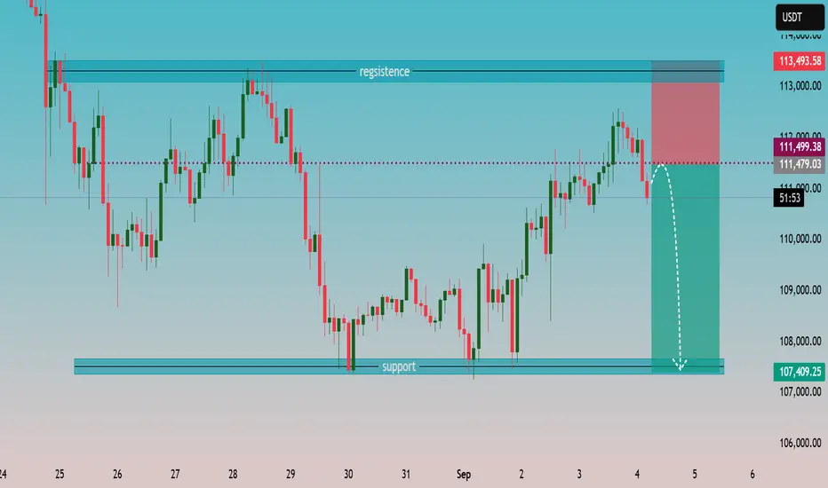
Technical Outlook: BTC/USDT – Key Levels Under Pressure🔹 Resistance Zone (📈💎)
The chart highlights a robust resistance band around 113,000–113,500 USDT. Price has repeatedly failed to sustain above this ceiling, showing strong selling pressure at the top of the range.
🔹 Support Zone (🛡️📉)
Well-defined support sits near 107,000–107,500 USDT, where buyers previously defended the level multiple times, leading to rebounds.
🔹 Current Price Action (⚡🧐)
Recent rally tested resistance and was firmly rejected, forming a bearish engulfing structure on the latest candles.
The dotted red line at 111,499 USDT indicates the short entry trigger; projected target is toward the lower support zone.
Stop-loss marked just above resistance (~113,493 USDT) suggests a clear risk-to-reward framework.
🔹 Bearish Scenario (🚨🐻)
If downward momentum holds, price may follow the plotted white arrow toward the 107k region. A break below could open room for further weakness.
🔹 Bullish Contingency (🚀🐂)
Reclaiming and closing decisively above 113,500 USDT would invalidate the short setup, signaling renewed upward momentum.
📌 Summary (📝)
Market shows rejection at resistance with sellers gaining control. The risk-reward favors a short toward strong support near 107k, unless buyers retake the 113k+ zone.
#MAMATAOpen: ₹394.00
High: ₹422.35
Low: ₹391.05
Close: ₹411.55
Change: +16.95 (+4.30%)
📊 Technical Analysis
Support & Resistance
Strong support around ₹390–395 (today’s low touched support and bounced).
Resistance zone near ₹425–430 (recent supply area).
Major overhead resistance around ₹500–520 (previous swing top).
Trend
Short-term: Stock was in a downtrend since mid-August, but today’s strong green candle shows signs of a possible reversal.
Medium-term: Sideways consolidation between ₹390–430.
Long-term: Still bullish above ₹375 (higher lows visible since March).
Candlestick Insight
Today’s bullish engulfing-type candle after a small downtrend indicates fresh buying interest.
Good volume confirmation (if checked) would make this setup stronger.
Indicators (visual without plots)
Likely oversold on RSI before today’s bounce.
Momentum improving — possible test of ₹430+ in near term.

Using Fibonacci Time Zone tool for Swing TradeThe Fibonacci Time Zone tool in TradingView is a technical analysis drawing feature that plots a series of vertical lines along the time (horizontal) axis of a price chart. These lines are spaced according to the Fibonacci sequence (starting with 0, 1, 2, 3, 5, 8, 13, 21, 34, 55, 89, etc.), where each subsequent number is the sum of the two preceding ones. Unlike price-focused Fibonacci tools (e.g., retracements or extensions), this tool ignores price levels entirely and focuses solely on time intervals to forecast potential market turning points. It is typically drawn by selecting two points on the chart—often a significant swing high or low as the starting point (time 0)—and then extending lines to the right at Fibonacci-based intervals. The first few lines (e.g., 1, 2, 3) often cluster closely and are less reliable, so traders commonly start analyzing from the 5th or 8th zone (13 or 21 periods ahead) for more spaced-out projections.
Key Benefits of the Fibonacci Time Zone Tool in TradingView
This tool adds a temporal dimension to technical analysis, complementing price-based indicators by helping traders anticipate when significant events might occur rather than just where in price.

How to draw Curve line with Fib Time Zone ToolThe Fibonacci Time Zone tool in TradingView is a technical analysis drawing feature that plots a series of vertical lines along the time (horizontal) axis of a price chart. These lines are spaced according to the Fibonacci sequence (starting with 0, 1, 2, 3, 5, 8, 13, 21, 34, 55, 89, etc.), where each subsequent number is the sum of the two preceding ones. Unlike price-focused Fibonacci tools (e.g., retracements or extensions), this tool ignores price levels entirely and focuses solely on time intervals to forecast potential market turning points. It is typically drawn by selecting two points on the chart—often a significant swing high or low as the starting point (time 0)—and then extending lines to the right at Fibonacci-based intervals. The first few lines (e.g., 1, 2, 3) often cluster closely and are less reliable, so traders commonly start analyzing from the 5th or 8th zone (13 or 21 periods ahead) for more spaced-out projections.
Key Benefits of the Fibonacci Time Zone Tool in TradingView
This tool adds a temporal dimension to technical analysis, complementing price-based indicators by helping traders anticipate when significant events might occur rather than just where in price.
The Curved Line tool in TradingView allows users to draw smooth, freeform curves on a chart to connect price points, highlight trends, or mark custom patterns. Unlike straight lines (e.g., trendlines or channels), the Curved Line adapts to non-linear price movements, offering flexibility to trace organic patterns like arcs, parabolas, or irregular price paths. It’s accessible via the drawing tools menu and can be customized with colors, thickness, and styles (e.g., solid or dashed). Traders use it to visualize patterns that don’t fit rigid geometric shapes, such as rounded tops/bottoms or complex wave structures.
Key Benefits of the Curved Line Tool in TradingView
The Curved Line tool provides unique advantages for technical analysis by accommodating the non-linear nature of price action. Below are its primary benefits:
Visualizing Non-Linear Price Patterns:
Benefit: The tool excels at mapping curved price movements, such as rounded tops/bottoms, parabolic trends, or smooth reversals, which straight trendlines can’t capture accurately. For example, during a parabolic run in a stock or crypto chart, a curved line can trace the accelerating trend better than a straight line.

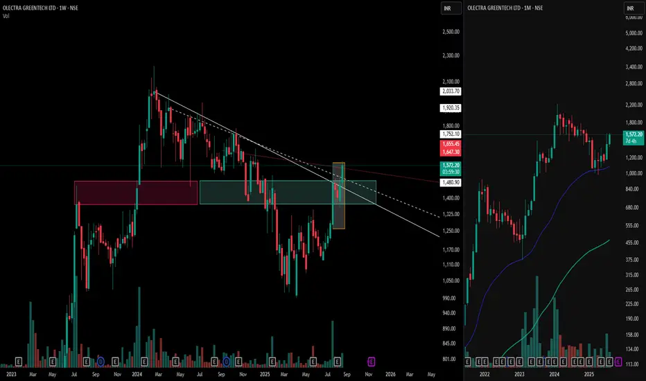
Olectra Greentech: Power of the Mother Candle & Zone Flip📊 White trendlines mark the crucial control trend and resistance levels.
🕯️ The bold Mother Candle (highlighted in the orange box) is marked .
💗 Notice the Pink Zone — formerly a tough resistance area — now flipped into strong support after the breakout, a classic supply-to-demand flip!
💎 The Cyan Box highlights an emerging demand zone, where buying interest gathers
⚡ Right side is a Representation of Market structure on the Biggest Time frame ( Monthly time frame ) showcasing a Higher high and Higher low formation and respecting the EMA plotted .
This is a stellar example of price structure and supply-demand dynamics in action—perfect study material for keen market observers.
⚠️ Disclaimer: This post is for educational and research purposes only. It does not constitute financial advice or a forecast. Always do your own analysis before making trading decisions.
Gold (XAU/USD) Short-Term Bearish Setup1. Well-Defined Resistance Zones
Two horizontal shaded areas labeled Resistance R1 and Resistance R2 mark zones near $3,360–$3,380, where price repeatedly failed to break higher.
Trading ideas from analysts on TradingView reinforce that the immediate resistance lies around $3,364–$3,370. As long as price stays below that, sellers remain in control
TradingView
+1
.
2. Descending Channel & Bearish Momentum
The chart highlights a shift from an earlier ascending channel (green), followed by breakdown and decline — a classic reversal from bullish to bearish.
In line with this, there’s also mention of a bearish flag pattern forming on the 30-minute (M30) timeframe, offering a potential shorting opportunity
TradingView
+1
.
3. Key Support Levels & Targets
Multiple support levels annotated: Support S2 (at two levels) and Support S3, with notable levels around $3,315, $3,301–$3,302, and $3,300.
The annotated price action indicates projected declines toward those levels—especially highlighting $3,314.94, $3,301.55, and $3,300.96 as intermediate and key targets.
Ultimately, the red “High support area” below suggests a broader demand zone, perhaps around $3,280–$3,300, where stronger support may emerge.
4. Trading Plan Illustrated
White arrows depict a descending trajectory: from current levels down to each support, suggesting a sell-on-rally approach.
Blue markers denote possible bounce points for pullbacks before continuation lower.
Broader Market Context
Gold prices have recently been tracking in the $3,330–$3,350 range, facing resistance near $3,350–$3,360 and support near $3,300. Analysts caution that a break below that could push it toward $3,245 or $3,150–$3,120
TradingView
+1
.
Overall momentum has turned cautious or bearish—bearish engulfing patterns, weakening rally strength, and below-average technical indicators emphasize the risk of further declines
FXEmpire
+2
FXEmpire
+2
.
Weak U.S. economic indicators or dovish signals from Fed officials (like Powell) could offer brief relief rallies; but failure to reclaim resistance may extend the slide
FXEmpire
+1
.
Key Levels at a Glance
Level Type Price Range Notes
Resistance ~$3,350–$3,360+ Strong ceiling—decline confirms bearish bias
Support S1 ~$3,315–$3,320 First potential reaction zone
Support S2 ~$3,301 Intermediate target for sellers
Support S3 ~$3,300 Psychological barrier; near high support zone
High Support Area ~$3,280–$3,300 Zone where bullish buyers might regroup
Conclusion
Your chart effectively captures a short-term bearish trend in gold (XAU/USD), showing:
Failed attempts to overcome resistance near $3,360.
A bearish flag breakout signaling potential continuation downward.
Clearly plotted support targets, with bounce zones drawn out.
A visual trade plan suggesting sell-on-rallies targeting declining support levels until reaching a strong demand zone.
To succeed with this setup, traders might wait for a brief rally into one of the identified sell zones (e.g. ~$3,314 or $3,325) before entering shorts, with stop-loss placements above the resistance areas and profit objectives aligned with support levels ($3,301 or near $3,300).

BTC TRYING TO FORM HEAD & SHOULDERHere in this chart i mentiond ..
1. A trendline in day time frame in blue colour and BTC is about to touch lower trend line.
NOTE:- If i follow the time there is 2 - 5 days remained to take reversal that will depends on lower trend line working as support/resistance.
2. I plotted a pattern HEAD & SHOULDER if it follow pattern it is sure that trend line may be broken by .
But But if BTC follow time it will not break the trend line and will get reversed.
Now this is not my buy/sell call.

Buy trade in Crude .crude can be brought from the shared levels . Proper Entry sl and targets are market . this levels . Today as per liquidity sweeep levels plotted by our indicator we are expecting and uptrend in crude . These levels are as per XTI USD charts.

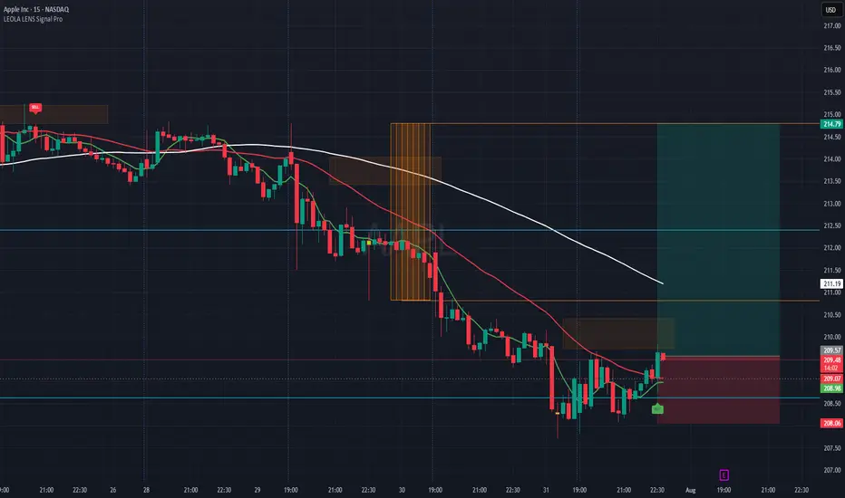
AAPL-Reaction Setup Lower Structure Zone-Eyes LongThis chart captures a structure-aware buy setup on Apple Inc. (AAPL), using Leola Lens SignalPro with momentum overlays and risk visualization.
What the Chart Shows:
🟢 A new BUY label appeared after price tapped a previously marked liquidity zone.
📉 Prior bearish momentum exhausted near 208.50–208.90 area — forming a potential base.
🟥 Overhead resistance is clearly defined, aligning with a recent rejection block and moving average confluence.
✅ A well-defined Risk:Reward setup is plotted — aiming for continuation toward 214.79, with risk below 208.06.
Key Levels to Monitor:
🔺 Break and hold above 210.50 could shift bias toward bullish continuation.
⚠️ Failure to hold above 209.00 could invalidate the current intraday structure.
This view is for educational purposes only — illustrating how price reacts around structure, liquidity, and confirmation signals.
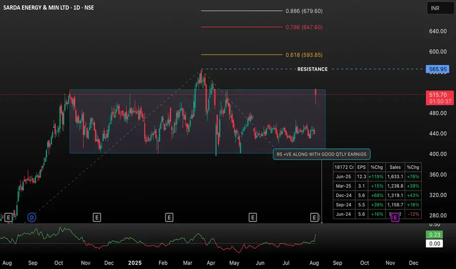
Sarda Energy Breakout Above Range – Key Fibonacci Levels Sarda Energy (NSE: SARDAE) has broken out of its multi-month consolidation zone (~400–515) with a significant surge, gaining 17.57% on the day. Key Fibonacci retracement levels are plotted, with 0.618 (593.85), 0.786 (647.60), and 0.886 (679.60) acting as potential resistance zones post-breakout. The move is supported by strong volume and improving fundamentals, as seen in the positive EPS and sales changes. Watch for sustained price action above the previous range and reactions at the highlighted Fibonacci levels for potential targets and stop-loss adjustments.
This title and description should help others quickly understand the context, technical significance, and what to watch for next in this setup.
GENUS POWER INFRASTRUCTURE LTD. (NSE: GENUSP) — Daily Chart This TradingView daily chart for Genus Power Infrastructure Ltd (GENUSP) shows detailed technical analysis, including price action, supply and demand zones, resistance levels, and harmonic patterns.
• Current Price: ₹382.60 (+5.15%)
• Timeframe: 1 Day (Daily)
• Marked Zones:
• Supply Zone: Around ₹390-425
• Demand Zone: Around ₹325-355
• Resistance: At ₹452.10
• Fibonacci Retracement Levels: 0.786 (₹498.35), 0.886 (₹517.70), 0.618 (₹465.80), 1.131 (₹565.15)
• Pattern Details: Harmonic patterns (XA, AB, BC, CD) are plotted to suggest price reversal or continuation points.
• Indicators: Includes moving averages for trend direction.
• Recent Action: The price is rebounding from the demand zone and approaching the supply zone, with an immediate resistance near ₹390.
This chart aids traders in identifying potential entry, exit, and stop-loss levels using advanced technical indicators and harmonic analysis.
