Types of Breakout in the Markets ( Monthly Time Frame )In this video I will showcase different type of Breakouts you can see in the markets, mostly Horizontal types and Trendline Types but even inside them which ones are best to follow
I have used charts older than 3 months to showcase this information
Stocks

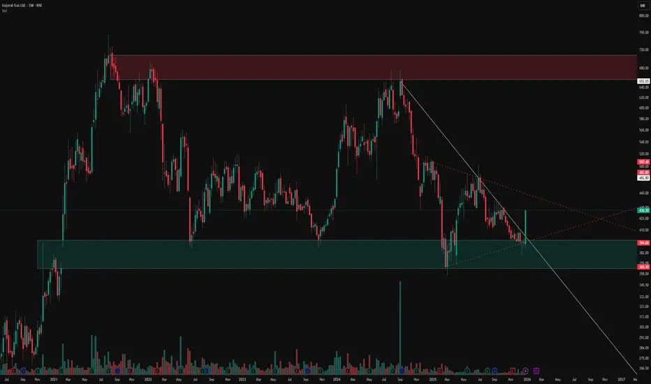
Triangle Contraction Symphony: Hidden Supports, Inverted H&SWitness the mesmerizing dance of price action in this chart masterpiece. A pristine triangle contraction pattern emerges, bounded by a supportive yellow trendline below and a red counter-trendline above, perfectly channeling price within tightening bounds.
Layered hidden dotted support/resistance lines add depth, illustrating how price meticulously respects each level—time and again.
Culminating in a textbook inverted head and shoulders formation, this setup showcases contraction elegance at its finest.
Purely educational: Reliving how these levels held in the past. No directional bias here—just the raw beauty of price action precision.
Disclaimer: This post is for educational purposes only, demonstrating historical price action behavior and level interactions. No directional bias or trading recommendations are implied. Past performance is not indicative of future results. Trade at your own risk.

Lets Talk about Nifty, Midcaps, Smallcaps and Banknifty A very general talk on the charts and where they are - more of a awareness sort of video- to exactly know where we are trading in terms of index . I make educational content videos for trading

Reading Price action and Candlesticks like a PROI make educational content videos for Trading
In this video I have used charts older than 3 months to share my experience in the markets by sharing my thinking and chart skills - I hope you will learn something out of it

Hidden Channels & Fib Golden Zone : Beauty of Price ActionObservational Post only Showcasing how price action works using historical price points only
Observe how price elegantly respects this counter trendline on the weekly chart (red line), forging consistent lower highs through precise rejections. A subtle parallel channel lurks beneath, acting as a hidden guardian. Channels like these shield against fakeouts, confirming pure breakouts only when breached alongside key lines.
Shifting to the monthly view, the Fib retracement from swing low to high highlights the golden zone (50 to 61%, white shaded), a magnet for retracements where price often pauses or reverses with stunning symmetry.
This interplay reveals price action's beauty: layers of structure working in harmony, rewarding patient observers.
Disclaimer: This is for educational purposes only, showcasing historical price action observations. Not financial advice. Always conduct your own analysis and manage risk appropriately.

Equitas Small Finance Bank – Swing Trade ViewPrice has broken out of a long-term falling channel, signaling a trend shift from bearish to bullish.
Post-breakout structure shows higher highs and higher lows, confirming strength.
Price has broken out of a long-term falling channel, signaling a trend shift from bearish to bullish.
Buy Zone :
₹66–₹67 on pullback to former resistance turned support
Or on daily close above ₹70 for continuation
Stop-Loss:
Below ₹65 (structure-based)
Targets:
T1: ₹73–₹75
T2: ₹78–₹80

BHARTIARTL (Airtel) – Daily Chart | Simple Long SetupBharti Airtel is currently pulling back after a strong up-move and has reached an important support area. Price is also near an upward trendline, which often acts as support.
🔹 Trend: Overall trend is up
🔹 Support Zone: Marked grey area
🔹 Entry Idea: Buy if price holds above support
🔹 Stop Loss: Below the red zone (support break)
🔹 Target: Previous highs / upper green area
📌 Why this setup makes sense (simple):
Price is in an uptrend
It came down to a support level
Trendline support is also present
Risk is small compared to reward
📈 If the price stays above support, it can move higher again.
⚠️ If it breaks and closes below support, avoid the trade.
💡 For learning purpose only. Always use stop loss.

Best Method to Trade Large Cap Stocks in 2026 ?Hello everyone, in this video I am explaining how to identify strategy locations - where exactly you need to look on the charts to create a better strategy in terms of Large cap stocks .
However the Mid and small ones do not follow these rules . I hope I was able to share my experience .
Charts used in the video explanation are older than 3 months

What is the Best Location / Area to Take a trade in the Markets I make educational content videos for trading
In this video I am sharing my experience on which areas are the best to trade with simple Price action using older than 3 months charts

How to Save yourself from a FAKEOUT - Learn this MethodI made educational content videos for trading
In this video I am telling about how to Identify a fakeout with this simple trick .

Resistance to Flip + Equilibrium Mastery: Pure Price ActionLeft Chart (Monthly TF):
- Classic resistance-turned-support flip. Price tested this level multiple times historically (data >3 months old), holding firm as dynamic support. Proof that prior barriers evolve with pure price behaviour.
Right Chart (Weekly TF):
- Equilibrium at 0.5: Stock has danced around this pivot, building multiple resistances above/below—trading in balance like clockwork.
- Parallel Channel Magic( Red lines ): Counter-trendline + parallel upper line forms a textbook channel, showcasing how price respects geometry over time.
- Respected Demand Zone (Green): Multiple bounces here confirm its strength—demand alive and kicking historically.
Disclaimer: This is for educational purposes only, showcasing historical price action (>3 months old). Not financial advice, trade recommendations, or predictions. Always DYOR and trade at your own risk.

Multi-Timeframe Channel Mastery UnveiledTradingView's multi-window layout reveals pristine price action across weekly and monthly charts, highlighting structural precision without forecasts.
Both timeframes demonstrate unwavering respect for key lines and zones, underscoring market geometry's reliability.
Monthly Chart Insights
The right-side monthly view features a robust supply zone where sellers dominate, enforcing repeated rejections with textbook accuracy. A white trend line provides dynamic support, paired with the red parallel channel line creating a textbook channel that price honors meticulously. This setup exemplifies how channels contain swings beautifully.
Weekly Chart Patterns
On the left, weekly timeframe displays two pivotal pattern lines: a counter trend line and a primary trend line, both tracked flawlessly through advances and retreats. These lines form the backbone of the structure, filtering noise and revealing order in motion.
Disclaimer
Purely educational analysis of past price action—no advice, signals, or predictions provided. Trading carries high risk of capital loss; perform independent due diligence and seek professional guidance.

Weekly Timeframe Price Action MasteryObserve the red supply zone where price consistently faces resistance, halting upward moves with precision. The green demand zone, formed after a decisive breakout from prior resistance, now acts as robust support for subsequent bounces. The white counter trend line serves as the pattern's key action line, guiding price movements with remarkable adherence across multiple tests.
Zone Dynamics
Supply zones in red mark areas of overhead selling pressure on weekly charts, often leading to rejections. Demand zones in green emerge post-breakout when former resistance flips, attracting buyers on retracements. These zones filter noise effectively in trending markets.
Counter Trend Line Role
This white line defines the counter-trend structure, respected through pullbacks and rallies. Price follows it as a dynamic guide, confirming pattern integrity without implying direction. Such lines enhance zone analysis by highlighting momentum shifts.
Disclaimer
This post showcases historical price action only and constitutes neither financial advice nor trading signals. Trading involves substantial risk of loss; conduct your own analysis and consult professionals.

National Aluminium Company Limited - Breakout Setup, Move is ON.#NATIONALUM trading above Resistance of 331
Next Resistance is at 443
Support is at 228
Here are previous charts:
Chart is self explanatory. Levels of breakout, possible up-moves (where stock may find resistances) and support (close below which, setup will be invalidated) are clearly defined.
Disclaimer: This is for demonstration and educational purpose only. This is not buying or selling recommendations. I am not SEBI registered. Please consult your financial advisor before taking any trade.

National Aluminium Company Limited - Breakout Setup, Move is ON.#NATIONALUM trading above Resistance of 216
Next Resistance is at 331
Support is at 142
Here are previous charts:
Chart is self explanatory. Levels of breakout, possible up-moves (where stock may find resistances) and support (close below which, setup will be invalidated) are clearly defined.
Disclaimer: This is for demonstration and educational purpose only. This is not buying or selling recommendations. I am not SEBI registered. Please consult your financial advisor before taking any trade.

The Elegance of Structure: Broadening Pattern, Breakout & EqSimplest Chart explanation ( no predications - using older than 3 months charts data only )
From 2012 to 2021, the price action formed a broadening structure defined by two converging white lines — a decade-long pattern showcasing expansion and volatility.
After a clean breakout and retest, the same trendline (highlighted in green) continued to act as dynamic support across multiple touchpoints.
Adding to the symmetry, the 0.5 Fibonacci equilibrium drawn from swing low to swing high aligns perfectly with the upper boundary of the original consolidation zone
A rare confluence that highlights the precision of market geometry. This chart isn’t about forecasting; it’s about appreciating how structure, equilibrium, and trend alignment narrate the story of price itself.
Disclaimer: This post is for educational and analytical purposes only. It is not financial advice or a recommendation to trade or invest. Always conduct your own research and analysis before making any trading decisions.

Difference btw Beginner, Pro and Full time Traders ( Mtfa view )In this Big 20 minutes video, I will try to explain the most beautfull conept of Multi time frame analysis from the perspective of 4 different types of trader .
Charts used are older than 3 months

Hidden Parallel Channel: Weighted Lines & Zones ExposedThis chart illustrates key technical elements where price interacts with multiple reference lines and zones, emphasizing their observed relevance based on proximity and historical behavior.
The red counter trend line, distant from price by 35-40%, carries less immediate weight, while the white counter trend line touched by price demonstrates stronger participation. Green highlights a long-term weekly demand zone from historical levels, and the white zone on daily timeframe marks a prior gap down with resistance reaction.
Parallel dotted white lines outline a hidden channel, repeatedly respected and rejected by price, underscoring its structural significance. These elements combine multi-timeframe context to showcase how markets organize around dynamic references rather than static predictions.
Motto is to showcase how one can create setup from any or all of the above ingredients, its all about perspective and how you approach and backtest in markets - experience is importnat - field experience in trading is scrolling Trading view and keep backtesting .
Disclaimer: This is purely educational content on price action, zones, and patterns. Not SEBI-registered advice. Charts use historical data >3 months old; NO forecasts, NO buy/sell recommendations, or guarantees of results. DYOR and consult professionals.

Unveiling Hidden Symmetrical Triangle and Saving from FakeoutsThis weekly chart post highlights key price action elements in a sideways pattern, focusing on zones, trendlines, and a subtle symmetrical triangle for educational observation. Green demand zones and red supply zones frame the overall range, while the white counter trend line traces internal fluctuations. The dotted red line uncovers a hidden symmetrical triangle, where converging lines often lead to breakout rejections observed as fakeouts
Key Chart Features
-Demand & Supply Zones: Green areas mark demand support, red zones indicate supply resistance, revealing price reactions within the sideways structure.
-Counter Trend Line: White line connects minor highs and lows, illustrating counter-trend swings that define the internal rhythm amid broader consolidation.
-Hidden Symmetrical Triangle: Dotted red outline exposes the converging pattern, a consolidation coil with balanced higher lows and lower highs, frequently trapping breakout attempts.
Disclaimer: Not a SEBI-registered advisor. This is purely educational on price dynamics, supply-demand, trendlines, and hidden patterns—no investment advice or forecasts. Past patterns do not guarantee future results; conduct your own analysis.
Gold Rewards Timing, Not Activity🟡 Gold Rewards Timing, Not Activity ⏳✨
Gold is not a market that rewards constant action.
It rewards waiting, observation, and precise timing.
Many traders believe that trading more means earning more. In Gold, this mindset often leads to overtrading, emotional decisions, and unnecessary losses.
⏱️ 1. Gold Moves in Phases, Not Constant Trends
Gold spends a large amount of time in:
consolidation 🔄
slow accumulation 🧩
controlled ranges 📦
During these phases, price appears “boring,” but the market is actually preparing.
Trading aggressively in these conditions usually means trading noise, not opportunity.
🧠 2. Activity Feeds Emotions, Timing Controls Risk
High activity leads to:
impatience 😤
forced entries 🎯
emotional exits ❌
Good timing, on the other hand, comes from:
understanding context 🧭
waiting for price to show intent 📊
acting only when conditions align ✅
Gold punishes impatience faster than most markets.
🏦 3. Institutions Trade Less, But Trade Better
Large players do not chase every candle.
They wait for:
liquidity to build 💧
weak hands to exit 🧹
price to reach meaningful zones 📍
When timing is right, Gold often moves fast and decisively — leaving overactive traders behind.
⚡ 4. Big Gold Moves Come After Quiet Periods
Some of the strongest Gold expansions begin after:
low volatility 😴
reduced participation 📉
trader boredom 💤
This is why patience is not passive — it is strategic.
🧩 Key Insight
In Gold, doing less at the right time often outperforms doing more at the wrong time.
🎯 Final Takeaway
❌ More trades ≠ more profits
✅ Better timing = cleaner execution
🟡 Gold rewards discipline, context, and patience
Master timing, and activity will take care of itself.

Breakout in CSB Bank Ltd...Chart is self explanatory. Levels of breakout, possible up-moves (where stock may find resistances) and support (close below which, setup will be invalidated) are clearly defined.
Disclaimer: This is for demonstration and educational purpose only. This is not buying or selling recommendations. I am not SEBI registered. Please consult your financial advisor before taking any trade.

Force Motors Ltd - Breakout Setup, Move is ON...#FORCEMOT trading above Resistance of 21123
Next Resistance is at 30646
Support is at 14435
Here are previous charts:
Chart is self explanatory. Levels of breakout, possible up-moves (where stock may find resistances) and support (close below which, setup will be invalidated) are clearly defined.
Disclaimer: This is for demonstration and educational purpose only. This is not buying or selling recommendations. I am not SEBI registered. Please consult your financial advisor before taking any trade.

Laurus Labs Limited - Breakout Setup, Move is ON...#LAURUSLABS trading above Resistance of 1091
Next Resistance is at 1512
Support is at 806
Here are previous charts:
Chart is self explanatory. Levels of breakout, possible up-moves (where stock may find resistances) and support (close below which, setup will be invalidated) are clearly defined.
Disclaimer: This is for demonstration and educational purpose only. This is not buying or selling recommendations. I am not SEBI registered. Please consult your financial advisor before taking any trade.
