The Elegance of Structure: Broadening Pattern, Breakout & EqSimplest Chart explanation ( no predications - using older than 3 months charts data only )
From 2012 to 2021, the price action formed a broadening structure defined by two converging white lines — a decade-long pattern showcasing expansion and volatility.
After a clean breakout and retest, the same trendline (highlighted in green) continued to act as dynamic support across multiple touchpoints.
Adding to the symmetry, the 0.5 Fibonacci equilibrium drawn from swing low to swing high aligns perfectly with the upper boundary of the original consolidation zone
A rare confluence that highlights the precision of market geometry. This chart isn’t about forecasting; it’s about appreciating how structure, equilibrium, and trend alignment narrate the story of price itself.
Disclaimer: This post is for educational and analytical purposes only. It is not financial advice or a recommendation to trade or invest. Always conduct your own research and analysis before making any trading decisions.
Stocks

Difference btw Beginner, Pro and Full time Traders ( Mtfa view )In this Big 20 minutes video, I will try to explain the most beautfull conept of Multi time frame analysis from the perspective of 4 different types of trader .
Charts used are older than 3 months

Hidden Parallel Channel: Weighted Lines & Zones ExposedThis chart illustrates key technical elements where price interacts with multiple reference lines and zones, emphasizing their observed relevance based on proximity and historical behavior.
The red counter trend line, distant from price by 35-40%, carries less immediate weight, while the white counter trend line touched by price demonstrates stronger participation. Green highlights a long-term weekly demand zone from historical levels, and the white zone on daily timeframe marks a prior gap down with resistance reaction.
Parallel dotted white lines outline a hidden channel, repeatedly respected and rejected by price, underscoring its structural significance. These elements combine multi-timeframe context to showcase how markets organize around dynamic references rather than static predictions.
Motto is to showcase how one can create setup from any or all of the above ingredients, its all about perspective and how you approach and backtest in markets - experience is importnat - field experience in trading is scrolling Trading view and keep backtesting .
Disclaimer: This is purely educational content on price action, zones, and patterns. Not SEBI-registered advice. Charts use historical data >3 months old; NO forecasts, NO buy/sell recommendations, or guarantees of results. DYOR and consult professionals.

Unveiling Hidden Symmetrical Triangle and Saving from FakeoutsThis weekly chart post highlights key price action elements in a sideways pattern, focusing on zones, trendlines, and a subtle symmetrical triangle for educational observation. Green demand zones and red supply zones frame the overall range, while the white counter trend line traces internal fluctuations. The dotted red line uncovers a hidden symmetrical triangle, where converging lines often lead to breakout rejections observed as fakeouts
Key Chart Features
-Demand & Supply Zones: Green areas mark demand support, red zones indicate supply resistance, revealing price reactions within the sideways structure.
-Counter Trend Line: White line connects minor highs and lows, illustrating counter-trend swings that define the internal rhythm amid broader consolidation.
-Hidden Symmetrical Triangle: Dotted red outline exposes the converging pattern, a consolidation coil with balanced higher lows and lower highs, frequently trapping breakout attempts.
Disclaimer: Not a SEBI-registered advisor. This is purely educational on price dynamics, supply-demand, trendlines, and hidden patterns—no investment advice or forecasts. Past patterns do not guarantee future results; conduct your own analysis.
Gold Rewards Timing, Not Activity🟡 Gold Rewards Timing, Not Activity ⏳✨
Gold is not a market that rewards constant action.
It rewards waiting, observation, and precise timing.
Many traders believe that trading more means earning more. In Gold, this mindset often leads to overtrading, emotional decisions, and unnecessary losses.
⏱️ 1. Gold Moves in Phases, Not Constant Trends
Gold spends a large amount of time in:
consolidation 🔄
slow accumulation 🧩
controlled ranges 📦
During these phases, price appears “boring,” but the market is actually preparing.
Trading aggressively in these conditions usually means trading noise, not opportunity.
🧠 2. Activity Feeds Emotions, Timing Controls Risk
High activity leads to:
impatience 😤
forced entries 🎯
emotional exits ❌
Good timing, on the other hand, comes from:
understanding context 🧭
waiting for price to show intent 📊
acting only when conditions align ✅
Gold punishes impatience faster than most markets.
🏦 3. Institutions Trade Less, But Trade Better
Large players do not chase every candle.
They wait for:
liquidity to build 💧
weak hands to exit 🧹
price to reach meaningful zones 📍
When timing is right, Gold often moves fast and decisively — leaving overactive traders behind.
⚡ 4. Big Gold Moves Come After Quiet Periods
Some of the strongest Gold expansions begin after:
low volatility 😴
reduced participation 📉
trader boredom 💤
This is why patience is not passive — it is strategic.
🧩 Key Insight
In Gold, doing less at the right time often outperforms doing more at the wrong time.
🎯 Final Takeaway
❌ More trades ≠ more profits
✅ Better timing = cleaner execution
🟡 Gold rewards discipline, context, and patience
Master timing, and activity will take care of itself.

Breakout in CSB Bank Ltd...Chart is self explanatory. Levels of breakout, possible up-moves (where stock may find resistances) and support (close below which, setup will be invalidated) are clearly defined.
Disclaimer: This is for demonstration and educational purpose only. This is not buying or selling recommendations. I am not SEBI registered. Please consult your financial advisor before taking any trade.

Force Motors Ltd - Breakout Setup, Move is ON...#FORCEMOT trading above Resistance of 21123
Next Resistance is at 30646
Support is at 14435
Here are previous charts:
Chart is self explanatory. Levels of breakout, possible up-moves (where stock may find resistances) and support (close below which, setup will be invalidated) are clearly defined.
Disclaimer: This is for demonstration and educational purpose only. This is not buying or selling recommendations. I am not SEBI registered. Please consult your financial advisor before taking any trade.

Laurus Labs Limited - Breakout Setup, Move is ON...#LAURUSLABS trading above Resistance of 1091
Next Resistance is at 1512
Support is at 806
Here are previous charts:
Chart is self explanatory. Levels of breakout, possible up-moves (where stock may find resistances) and support (close below which, setup will be invalidated) are clearly defined.
Disclaimer: This is for demonstration and educational purpose only. This is not buying or selling recommendations. I am not SEBI registered. Please consult your financial advisor before taking any trade.

Lets Backtest the High, New High Strategy on Monthly time frameHello everyone, My name is Apoorv ( Full time Trader )
I make educational content videos
Charts used in this video are 3 months or older

DIXON (Weekly) — Wave 4 Bottom Forming?Elliott Wave + Fibonacci Confluence 📈
The weekly chart of Dixon Technologies (India) Ltd. is unfolding a textbook Elliott Wave structure.
After a powerful Wave 3 impulse, the stock is currently digesting gains through a complex Wave 4 correction.
Price is now approaching a high-probability demand zone, where Fibonacci retracement meets Elliott Wave theory — often a fertile ground for trend resumption.
Let’s decode the structure and map the strategy ahead. 👇
📉 Technical Structure Breakdown
🔹 1. Elliott Wave Context (Weekly)
Wave 3 (Impulse Peak):
Strong vertical rally completing above ₹20,000, reflecting momentum expansion.
Wave 4 (Ongoing Correction):
A corrective, time-consuming phase — aligning well with the Principle of Alternation.
Internal Structure of Wave 4:
Wave (a): Sharp decline toward ₹12,000
Wave (b): Relief rally / dead-cat bounce into prior resistance
Wave (c): Final corrective leg now testing the Fresh Demand Generation Zone
📌 Key Demand Zone: ₹11,525 – ₹10,925
🔹 2. Fibonacci Confluence (Golden Zone)
The highlighted zone on the chart marks the probable Wave-4 completion area, aligning with:
0.382–0.5 Fibonacci retracement of the entire Wave-3 move
A classic Wave-4 retracement depth, which is typically shallow compared to Wave-2
This confluence strengthens the probability of structural support.
🔹 3. Price Action & Volume Clues
Price is attempting to stabilize and bounce from the lower end of the retracement band
Volume expansion at lower levels suggests:
Short covering by late sellers
Early accumulation by informed participants
📊 This behavior is commonly seen near intermediate cycle bottoms.
🎯 Trading & Investment Strategy
🛒 Entry Plan
Aggressive Entry:
Partial position around ₹12,165, with strict risk control
Conservative Entry:
Wait for a weekly reversal candle or strong demand reaction inside
₹10,925 – ₹11,525
🏁 Upside Targets
🎯 Short-Term: ₹15,369 (Previous structure resistance)
🎯 Mid-Term: ₹17,566 (Wave-(b) high / supply zone)
🚀 Long-Term (Wave-5 Projection):
Retest of ATHs with potential extension toward ₹22,000+, if impulse resumes
🛡️ Risk Management
Swing / Mid-Term SL: ₹10,915 (Below demand zone)
Hard Invalidation (Wave Count): ₹8,851
A break below this level invalidates the bullish Elliott Wave structure
⚠️ Position sizing is critical — Wave-4 trades require patience and discipline.
📚 Educational Insights (For Traders)
Principle of Alternation:
Wave-2 was sharp and deep → Wave-4 is expected to be complex / sideways
Why 0.382 Matters:
Wave-4 corrections often terminate near 38.2% retracement of Wave-3
Demand Generation Zones:
Areas where price consolidated before a breakout often act as magnets during corrections
💡 Final View
DIXON remains structurally bullish on the higher timeframe.
While the current correction feels uncomfortable, it is healthy and necessary within a long-term uptrend.
📌 The ₹11k–₹12k zone is a patience zone, where Wave-5 preparation may be underway.
➡️ Question for traders:
Is Wave-4 already complete, or do we see one final flush toward ₹10,900 before lift off?
Share your thoughts below 👇
⚠️ Disclaimer
This analysis is for educational purposes only.
I am not a SEBI registered analyst.
Markets are uncertain, and I may be wrong — please manage risk accordingly.

LTTS : Near Key Support | Trend Continuation WatchTimeframe: Daily
Trend Context: Corrective phase nearing completion
Current Price Zone: ~4,380
🔍 Market Structure & Technical Observations
Elliott Wave Perspective (Educational View):
The stock appears to be completing a corrective Wave-C near the 4,360–4,390 zone.
This zone aligns with prior demand and acts as a potential reversal pocket.
If Wave-C holds, the next impulsive leg (Wave-5) can begin.
Moving Average Insight:
Price has pulled back toward the short-term moving average, often seen near corrective endings.
Sustaining above this base improves odds of a trend resumption.
Support & Risk Zone:
Critical support: 4,360–4,390
Invalidation level: Daily close below 4,290
A close below this would indicate deeper correction, not accumulation.
Volume Behavior (Contextual):
No panic volume seen during decline, suggesting controlled profit booking, not distribution.
🎯 Trade Strategies
🟢 1. Swing Trading Strategy (Cash / Positional)
Buy Zone: 4,360–4,420 (on stabilization / reversal candle)
Stop Loss: Daily close below 4,290
Upside Targets:
Target 1: 4,770–4,830 (Major supply / F&O target zone)
Target 2: 5,120 (Swing projection)
📌 This setup offers a favorable Risk–Reward if price respects the Wave-C base.
🟡 2. F&O / Options Strategy (Educational)
Prefer bull call spreads or call buying only after confirmation.
Ideal confirmation:
Strong close above 4,480–4,500
OR bullish structure on lower timeframe from support
Avoid aggressive naked calls below 4,360, as volatility expansion works both ways.
🎓 Educational Notes (Why This Zone Matters)
Corrections often end where:
Prior breakout occurred
Fibonacci retracement clusters
Market sentiment turns pessimistic
The 4,360–4,390 zone ticks multiple boxes → making it a decision zone, not blind buy.
⚠️ Risk Management Guidelines
Do not average blindly below support.
Size positions assuming stop loss will be hit.
Options traders must factor in time decay — direction alone is not enough.
🧾 Summary & Conclusion
LTTS is currently at a make-or-break zone.
If the 4,360–4,390 support holds, the stock has the potential to resume its primary uptrend toward 4,830 and 5,120 in the coming weeks.
Failure to hold 4,290 on daily closing basis invalidates the bullish structure.
Disclaimer:
This analysis is for educational purposes only. I am not a SEBI registered analyst.
Markets are uncertain, and I may be wrong — please manage risk responsibly.

Trading view, Mountains, Back testing strategy & New yearHappy new year to the Trading view Family, Wishing everyone a strong Year Ahead and in green .
Keep back testing and learning .

Learn a NEW Trading Strategy before 2026 StartsI make educational content videos for swing trading - in this video I am showcasing a new strategy with market structure - trigger points and activation .
Charts used are 3 months or older for Backtesting only
Happy New Year to everyone .

Decoding Weekly Structure: Support, Resistance & Channel DynamicSummary -
This multi-window TradingView chart showcases a weekly time frame on the left, featuring a white counter line, a dotted hidden resistance line, and a monthly support/resistance zone highlighted in white on the right. Additionally, a pink parallel channel marks head and resistance zones, offering a visual guide to price structure without forecasting future movement. Each element helps identify historical areas where price has shown significant reactions.
Terms and Language explained -
Counter Line (White): A horizontal line used to mark a specific price level, often for tracking key reference points or psychological levels.
Hidden Resistance (Dotted Line): A resistance line that is not immediately obvious but is derived from less visible price action or volume analysis. It helps identify potential areas where price may struggle to move higher.
Monthly Support/Resistance Zone: A broader area on the chart where price has historically found support (demand) or resistance (supply) over the monthly time frame. These zones are often marked for their significance in longer-term analysis
Parallel Channel: A set of parallel lines drawn to connect consecutive highs and lows, forming a channel that helps visualize the current price trend and boundaries.
Disclaimer
The information presented in this chart is for educational purposes only. No part of this post constitutes financial advice, a recommendation, or a forecast of future price movement. Always conduct your own research and consult a qualified financial advisor before making any trading decisions.

Price action understanding that will change the way you tradeI make educational content videos for swing trading . In this video I have used concepts like Trendlines, Counter trendlines, zones, Support and Resistance, Market fall, Targets and Exit plan for any trade setup and most importantly use of lines with multi time frame analysis .
Charts used are 3 months or older

This Multi time frame Trick will save you from FAKEOUTSIn this video I am showcasing a daily, weekly and monthly time frame combination - also sharing a trick which can save you a lot of money from those regular sized fakeouts .
Charts used are 3 months old in this video and video is purely educational based .

HINDUNILVR: Smart Money Accumulation Zone After CHoCH?📘 HINDUNILVR (HUL) — Technical Analysis | Structure Shift & Golden Retracement Setup
(Timeframe: Daily)
HINDUNILVR is currently trading around ₹2,265 after a prolonged corrective phase.
The chart reflects a Change of Character (CHoCH) followed by a controlled retracement into a high-probability demand zone, where the next directional move is likely to emerge.
🔍 Market Structure & Price Action
The stock previously witnessed a strong bullish extension, reaching the 113%–128% Fibonacci extension zone, indicating an overextended move.
Post extension, price showed loss of bullish momentum, leading to a CHoCH — a clear signal of shifting market control.
CHoCH highlights early trend transition and often leads to range-bound or corrective price action, rather than an immediate trend reversal.
📌 CHoCH helps traders prepare for structural transitions before confirmation from higher highs.
📐 Fibonacci & Wave Context
The decline from point A to B appears corrective, not impulsive.
Price has now entered the Golden Retracement Zone (50%–78%) of Wave A.
This zone is typically where Wave B or Wave 2 attempts to develop.
Institutional participants often accumulate positions here due to favorable risk–reward.
📌 Failure to hold this zone often results in a deeper correction or trend reversal.
🎯 Key Levels from the Chart
Major Demand Zone: ₹2,230 – ₹2,200
Invalidation Level: Day close below ₹2,200
First Target: ~₹2,630 (≈ 78% retracement of Wave AB)
Second Target: ₹2,826 – ₹2,888
🧭 Trading Strategy (Swing / Positional)
Look for long opportunities only inside the ₹2,230–₹2,200 zone.
Prefer confirmation signals such as:
– Bullish rejection wicks
– Higher-low formation
– Minor CHoCH on lower timeframes
Avoid aggressive entries without confirmation.
🛑 Risk Management
Strict stop loss: Day close below ₹2,200
A close below this level indicates weak demand and opens the risk of extended downside correction.
Partial profit booking recommended near Target 1.
Trail stop aggressively if price sustains above ₹2,630.
📚 Educational Notes
Golden Retracement (50%–78%) is where institutions seek value-based entries.
CHoCH ≠ Trend Reversal — it signals momentum loss, not instant bearishness.
Confirmation always comes from structure + demand holding, not prediction.
🔮 Probable Scenarios
Bullish Case:
Holding above ₹2,200 → Base formation → Gradual recovery toward ₹2,630 → ₹2,826–2,888.
Bearish Case:
Day close below ₹2,200 → Demand failure → Deeper corrective phase.
📌 Conclusion
HINDUNILVR is positioned at a critical inflection zone.
Risk is clearly defined, while upside potential remains asymmetric.
This is a wait-for-confirmation accumulation setup, not a chase trade.
⚠ DISCLAIMER
I am not a SEBI-registered analyst.
This analysis is for educational purposes only and should not be considered investment advice.
Always use your own analysis and risk management.

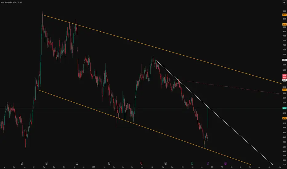
Classic Descending Channel With Clear Structural LevelsThe primary feature of this chart is the broad descending parallel channel marked by the orange lines, which frames the entire corrective phase in a neat, orderly manner. Price has repeatedly respected both the upper and lower boundaries, reinforcing the relevance of this channel as a dominant structure.
A trend‑changing resistance line is drawn in white, connecting swing highs and visually separating the prevailing downtrend from any potential shift in behavior. This line serves as a clear reference for how price has reacted to supply zones within the channel, without implying any future breakout or directional bias.
The red dotted line acts as an internal, hidden line derived from prior price interaction, helping to map out the internal rhythm of the move. Overall, the chart is intended purely as a structural illustration of how price respects channels and internal reference lines, without any forecast or trade signal.
PEL : Golden Retracement • Demand Reaction • Risk-Defined Trade📊 PRIMAL ENTERPRISES | 2H STRUCTURE-BASED SWING SETUP
Golden Retracement | Demand Reaction | Risk-Defined Trade
📌 Chart Context & Market Structure
Price has completed a strong impulsive decline from the prior swing high and is now reacting from the Golden Retracement Zone (Fib 50%–78%), which historically acts as a decision area between trend continuation and deeper correction.
This zone also overlaps with a higher timeframe demand pocket, increasing its technical significance.
Key observations from the chart:
Strong bearish impulse followed by slowing downside momentum
Price testing Fib 50%–78% retracement → value re-assessment zone
Clear invalidation level marked via hourly close below demand
🔍 Why This Zone Matters (Educational Insight)
📌 The golden retracement zone represents an area where:
Smart money evaluates whether the prior trend is still valid
Late sellers get absorbed by institutional demand
Failed demand here often leads to accelerated downside due to liquidity vacuum
If buyers defend this zone, price usually transitions into a corrective → impulsive recovery.
If demand fails, price seeks the next high-liquidity support below.
📈 Bullish Projection (Primary Scenario)
If price:
Holds above the golden retracement zone
Forms higher lows on lower timeframes
Shows acceptance above the immediate resistance
➡️ Expect a structural recovery phase.
Upside Path (Projection):
Near-term resistance breakout → momentum pickup
Sustained move above 1,237 confirms strength
Swing expansion toward 1,274 – 1,289 zone
This aligns with a mean-reversion + trend resumption structure.
📉 Bearish Risk Scenario (If Demand Fails)
If price:
Fails to attract buying interest within Fib 50%–78%
Breaks demand with an hourly close below 1,082
📌 It signals demand exhaustion and breakdown of value perception, increasing the probability of a deeper corrective leg toward the next higher-timeframe demand zone below.
This is why risk is clearly defined, not assumed.
🎯 Trade Strategy (Educational, Not Advisory)
Bullish Swing Strategy:
Entry: Demand hold + bullish structure confirmation
Stop Loss: Hourly close below 1,082
Targets: Partial near resistance → Swing target 1,274 – 1,289
Risk Management Logic:
Trade is invalid if demand fails — no hope-based holding
Position sizing based on SL distance
Patience required; no chasing breakouts
🧠 Key Learning Takeaway
📌 When price reacts at the golden retracement:
Acceptance = trend continuation
Rejection = deeper correction
The goal is not prediction — it is preparing for both outcomes with clarity and discipline.
🧾 Conclusion
This setup offers:
Clear structure
Defined risk
Favorable risk-reward if demand holds
Let price confirm. Let structure guide. Let risk stay controlled.
⚠️ Disclaimer
I am not a SEBI-registered analyst. This analysis is for educational purposes only. Please conduct your own analysis or consult a qualified financial advisor before taking any trades.
PLong

Clean Trendline Respect on Weekly Chart – 500 DaysPattern Context
Price has been respecting a well-defined descending trendline on the weekly timeframe, with each rally stalling below the previous swing high and reinforcing the broader lower‑high, lower‑low sequence.
Candlestick Behavior
Showing how supply continues to respond at the same diagonal zone. This reaction visually confirms how aggressively the market has been defending the pattern’s upper boundary without implying what comes next, keeping the focus strictly on how price has behaved historically around this line.
Observational Takeaway
This chart serves as a clear example of how a simple, clean trendline can organize price behavior over multiple months and frame where participation repeatedly shifts. The emphasis here is on observing how consistently the structure has been respected and how each touch has shaped the ongoing sequence, allowing traders to study price interaction with a dominant trend rather than anticipate future outcomes.
Disclaimer
This post is for educational and informational purposes only and is not investment advice, stock tips, or a recommendation to buy or sell any security. Readers should do their own research, consider their personal risk tolerance, and consult a registered financial professional if needed before making any trading or investment decisions.
The Calm Stocks Swing Strategy - Big Moves Start in Silence!Hello Traders!
Most people believe swing trades work only when stocks are moving fast.
Strong candles, news headlines, social media hype and suddenly everyone feels confident.
But after spending years studying stock charts, I have learned something very different.
The best swing trades in stocks usually begin when nothing looks exciting.
When a stock becomes quiet, volume dries up and nobody is talking about it
that is often when serious preparation starts.
Retail bolega “ye stock toh bilkul boring hai” and moves on 😄
What a Calm Stock Phase Really Means
A calm phase appears when a stock starts moving in a tight range with smaller candles and limited volatility.
Price keeps respecting the same support and resistance levels again and again.
Volume slowly reduces but price structure remains stable which shows balance not weakness
For swing traders, this boredom is not a problem. It is actually a signal to start paying attention.
Why Smart Money Loves Silence
Big players cannot build positions when price is moving fast because it attracts attention.
They prefer calm stocks where accumulation can happen slowly without pushing price.
Low volatility allows them to prepare before the real move begins.
Silence does not mean nothing is happening. It often means something is being built quietly.
Why Retail Traders Miss These Moves
Most retail traders want action and fast movement.
Calm stocks feel uninteresting so they get ignored.
When the breakout finally happens, retail notices it late and enters emotionally.
Retail chases movement. Swing traders prepare before movement.
How I Personally Trade Calm Stock Swing Setups
I scan daily and weekly charts to find stocks moving in tight consolidation ranges.
I check whether price is repeatedly reacting from the same support and resistance zones.
I focus on stocks where volume is reducing but structure is still clean.
Instead of chasing breakouts, I plan entries near the range with limited risk.
This keeps my mind calm and decisions logical. No pressure and no hurry.
Real Chart Example: Hero MotoCorp
To make this concept practical, I have explained it using the Hero MotoCorp daily chart above.
If you look closely, the stock spent a long time moving inside a tight consolidation zone.
Price reacted multiple times near resistance and support while volume kept reducing.
During this phase, many traders ignored the stock because it looked slow and boring.
But this calm structure was actually preparation.
Once the stock finally broke out, it delivered a clean swing move with strong follow through and very limited pullbacks.
This is exactly how calm stocks reward patience.
Main yahi karta hoon, I study the silence first and let the move come to me.
The Breakout Is the Result Not the Start
Most traders believe the breakout candle is the opportunity.
In reality, the real edge comes from preparation during consolidation.
When volatility expands, the swing trader is already positioned.
Jab sab excited😄hote hain tab smart planning already ho chuki hoti hai.
Rahul’s Tip
If a stock feels too quiet, too slow or too boring, do not ignore it immediately.
Sometimes silence is the market’s way of preparing something big.
Patience during calm phases has helped me far more than chasing excitement.
Conclusion
The Calm Stocks Swing Strategy teaches you to think opposite to the crowd.
Instead of chasing noise, you learn to prepare during silence.
In stocks, the loudest moves often begin when nobody is paying attention.
If this post helped you see calm stocks differently,
like it, share your view in the comments and follow for more practical swing trading insights.

Seeing vs Believing: Multi-Pattern Structure vs Single-Line BOOn the left, the weekly chart is mapped as a full A+ type setup, where multiple structural elements work together instead of relying on a single, convenient line.
-A red counter trendline marks a series of lower-high rejection points, visually defining the “least liquidity” supply line that price has repeatedly respected.
-A dotted parallel channel outlines a broader multi-pattern context.
-A dashed hidden line adds another layer of structure, hinting at less obvious inflection zones that are not visible at first glance but often align with prior reactions.
-Finally, an orange line represents a higher time frame resistance level, bringing in a top-down perspective so that the current weekly price action is seen in relation to a dominant, bigger-picture barrier.
On the right, by contrast, the chart is reduced to a single white line drawn in a way that “forces” the candles to appear as if they are breaking out.
This is a great example of chart psychology in action: instead of objectively mapping all relevant patterns, many traders draw what they want to see—one clean breakout line—ignoring hidden structures, multi-timeframe confluence, and complex pattern overlap.
The intention of this post is purely observational and educational, not forecasting.
It aims to show how a professional, multi-pattern approach (CT lines, channels, hidden lines, and higher timeframe levels) can radically change the way a chart is interpreted compared to the simplistic, single-line breakout mindset that dominates retail thinking.
Disclaimer: This post is for educational and illustrative purposes only and does not constitute investment, trading, or financial advice. Always do your own research and consult a registered financial professional before making any trading decisions.

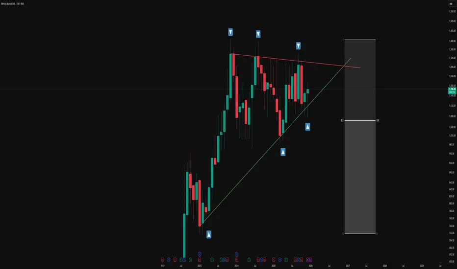
Simple Triangle Pattern on a Monthly Time FrameOverview -
This monthly chart illustrates a symmetrical triangle pattern defined by a series of higher lows and relatively stable swing highs, framed by a green ascending trendline and a red counter-trendline. The structure is presented in an observational manner to highlight how price has evolved within these converging boundaries over an extended period.
Triangle structure -
1.The green line represents the primary trendline, drawn from successive higher swing lows where price has repeatedly found support and turned back up. Each time price touches or approaches this green line, the contact is marked with a blue upward arrow box to emphasize how buyers have consistently responded around this rising level. Together, these points of contact visually document the stepping pattern of higher lows that contributes to the lower boundary of the triangle.
2.The red line acts as the counter-trendline, connecting multiple prominent swing highs where upward movement has stalled and reversed. Blue downward arrow boxes are placed at these touchpoints to highlight how price has respected this sloping resistance zone over time. The repeated interaction with the red line shows how sellers have been active around this upper boundary, creating a series of contained pushes to the upside.
Understanding -
The overall construction emphasizes how multiple touches on both the trendline (T) and counter-trendline (CT) are used to validate the presence of this symmetrical triangle. Rather than focusing on any single candle, the chart showcases the cumulative behaviour of price over many months, making it a useful visual example for studying how support and resistance can evolve into a geometric pattern on a higher time frame.
Disclaimer: This description is purely educational and observational, intended to explain chart structure and pattern formation. It does not constitute investment advice, trade recommendations, or any suggestion to buy, sell, or hold any financial instrument.