Part 2 How to Draw Accurate Support and Resistance LevelsParticipants in Option Trading
There are four primary participants in the options market:
Buyer of Call Option (Long Call) – Expects the price to rise.
Seller of Call Option (Short Call) – Expects the price to fall or remain flat.
Buyer of Put Option (Long Put) – Expects the price to fall.
Seller of Put Option (Short Put) – Expects the price to rise or remain flat.
Each participant has a specific risk-reward profile. Option buyers have limited risk (the premium paid) and unlimited profit potential. Option sellers, on the other hand, have limited profit (premium received) but potentially unlimited risk.
Supportandresistancezones

Part 1 How to Draw Accurate Support and Resistance LevelsThe Key Components of an Option Contract
Underlying Asset:
The financial instrument (e.g., stock or index) on which the option is based.
Strike Price:
The price at which the holder of the option can buy (for calls) or sell (for puts) the underlying asset.
Expiry Date:
The date on which the option contract expires. In India, options can be weekly or monthly.
Premium:
The price the buyer pays to purchase the option contract from the seller (also known as the writer). This premium is non-refundable.
Lot Size:
Each option contract represents a fixed quantity of the underlying. For example, one NIFTY option lot equals 50 units, while one BANK NIFTY option equals 15 units.

Part 2 Support ans ResistanceAdvantages of Options
High leverage (small money → big exposure).
Flexibility (profit in up, down, or sideways markets).
Risk defined for buyers (can lose only premium).
Useful for hedging portfolios.
Risks of Options
Time decay: Value decreases as expiry approaches.
High leverage can cause big losses (especially for sellers).
Complexity: Needs knowledge of Greeks, volatility, etc.
Emotions: Options move fast → fear & greed affect traders.
Options Greeks (Advanced but Important)
The “Greeks” help measure how option prices move with market factors:
Delta → Change in option price vs stock price.
Gamma → Rate of change of Delta.
Theta → Time decay (how much premium falls daily).
Vega → Impact of volatility on premium.
Rho → Impact of interest rates.
👉 Example: If an option has Theta = -10, it means the premium will lose ₹10 per day (if all else same).

Mastering the Intraday Sutra: An intraday trading strategyMastering the Intraday Sutra: A Professional Guide to Trading Indian Markets with Precision
(Adapting Globex Strategy-Inspired Concepts to India’s Unique Trading Hours)
Introduction
The Intraday Sutra strategy is a systematic approach designed for India’s equity/futures markets, inspired by the principles of identifying key price levels (similar to the Globex "high/low" concept) but tailored to India’s fixed trading hours (9:15 AM – 3:30 PM). This strategy leverages prior-day price action, supply-demand zones, and disciplined risk management to capitalize on intraday opportunities. Below, we break down its components for clarity and repeatability.
Strategy Overview
1. Core Instruments
Indices: All indices
Stocks: Nifty 50 constituents for alignment with index momentum
2. Ideal Time Frames
5-minute charts: For granular entry/exit precision.
15-minute charts: To filter noise and align with broader intraday trends.
Key Levels: Prior-Day High/Low & Supply-Demand Zones
1. Plotting Prior-Day High (PDH) and Prior-Day Low (PDL)
Purpose: These levels act as psychological benchmarks.
Method:
- Manually mark PDH/PDL on your chart.
- Use Trading View indicators (e.g., “Previous Day High-Low”) for automation.
2. Identifying Supply-Demand Zones
-Supply Zone:
- Formation: Rally → Base → Drop (RBD) or Drop → Base → Drop (DBD).
- Action: Potential sell zone; price often reverses downward here.
- Demand Zone:
- Formation: Drop → Base → Rally (DBR) or Rally → Base → Rally (RBR).
- Action: Potential buy zone; price often reverses upward here.
Zone Validation Rules:
1. Structure: The “base” (consolidation) must be ≤6 candles; the breakout must show ≥2 impulsive candles.
2. Freshness: Only trade untested zones (no prior price interaction).
3. Zone Merging: Combine overlapping zones or prioritize the one with the best risk-reward ratio.
Entry & Trade Triggers
1. Breakout Confirmation
Short Entry: Triggered when price breaks above prior-day high (PDH) and retests a fresh supply zone.
Long Entry: Triggered when price breaks below prior-day low (PDL) and retests a fresh demand zone.
2. Order Placement
Buy Limit Orders: Set at the demand zone’s proximal line
Sell Limit Orders: Set at the supply zone’s proximal line
Risk Management Framework
1. Stop Loss Placement
Long Trades: Below the demand zone (mechanical rule) or 5% of the Daily Average True Range (ATR) below the distal line of demand
Short Trades: Above the supply zone (mechanical rule) or 5% of Daily ATR above the distal line of supply
2. Position Sizing
Risk ≤1-2% of capital per trade to preserve longevity.
Trade Management & Profit Targets
1. Initial Target: 2:1 Risk-Reward (2R).
Example: If risking ₹1000, target ₹2000 profit.
2. Trailing Stop : Move stop loss to breakeven at 2R, then trail for 3R+ using price structure (e.g., swing lows/highs).
3. Priority: Focus on “A+ Setups” where zones align with higher timeframes (for example a 5 mins zone within a 15 mins zone or higher)
Critical Success Factors
1. Timing is Everything
Optimal Entry Window: 9:15 AM – 11:00 AM (peak liquidity, institutional participation).
Avoid Late Trades: Post-2:00 PM entries often lack momentum for robust risk-reward outcomes.
2. Confluence with Higher Timeframes
- Strengthen signals by aligning 5/15-minute zones with hourly/daily support/resistance/supply/demand zones
3. Event-Driven Volatility
Capitalize on gaps from overnight global news (e.g., US Fed, crude oil prices) or domestic catalysts (RBI policies, earnings).
Tools & Execution
Charting: Trading View for automated PDH/PDL and zone plotting
Mindset: Discipline to avoid overtrading and stick to fresh zones.
Example: The example taken here is on the Nifty 15 mins chart. See how the price broke the previous day's low and reacted nicely from a prior higher quality demand zone. These levels can act as trap levels trapping most of the retail traders and investors on the opposite side of the trade. The price gave a nice bounce from the demand zone and went on to rally to the opposing supply zone giving a greater than 3:1 R:R.
Conclusion
The Intraday Sutra strategy combines technical precision with rigorous risk management, offering a structured way to navigate India’s time-bound markets. By focusing on prior-day extremes, fresh supply-demand zones, and strategic timing, traders can systematically exploit intraday inefficiencies. Remember: Consistency beats complexity. Back test rigorously, refine your process, and let discipline drive profitability.
Final Note: Always validate this strategy in a simulated environment before deploying live capital. Use Trading View Bar Replay functionality to test your strategy.
Markets evolve—stay adaptive!

From Novice to Pro: Navigating Support & Resistance Like a BossGreetings to all. I trust that you are all thriving in both your personal lives and trading endeavors. Today, I present educational content aimed at understanding the concepts of support and resistance in chart analysis.
Support and resistance are key concepts in technical analysis used to identify potential price levels where an asset's price might reverse, stall, or consolidate. They are often visualized on a price chart and are critical for traders making decisions about entry, exit, and stop-loss levels.
1. Support:
Definition: Support is a price level at which a downward trend may pause or reverse due to a concentration of buying interest.
Why it works: Traders perceive this level as a "bargain," increasing demand and preventing further price drops.
Visualization: On a chart, support levels often appear as a horizontal line or a sloping line below the current price where previous price action reversed or consolidated.
Breakthroughs: If the price breaks below a support level, it may indicate a continuation of the downtrend.
2. Resistance:
Definition: Resistance is a price level where an upward trend might pause or reverse due to selling pressure or profit-taking.
Why it works: Traders perceive this level as "expensive," reducing demand and increasing selling activity.
Visualization: On a chart, resistance levels are horizontal or sloping lines above the current price where the price struggled to move higher in the past.
Breakthroughs: If the price breaks above a resistance level, it may indicate the start of a new upward trend.
Common Characteristics of Support and Resistance:
Role Reversal: Once a support level is broken, it often becomes a new resistance level, and vice versa.
Psychological Levels: Round numbers (e.g., $50, $100) often act as strong support or resistance due to psychological significance.
Volume Confirmation : High trading volume near these levels reinforces their strength.
Types of Support and Resistance:
Horizontal Lines: Based on past price action.
Trendlines : Diagonal lines formed by connecting higher lows (support) or lower highs (resistance) in a trend.
Moving Averages: Dynamic levels that adjust with price movement, often acting as support or resistance.
Fibonacci Retracement: Levels based on mathematical ratios indicating potential reversal zones.
How to Use Support and Resistance:
Entry Points: Buy near support levels or after a breakout above resistance.
Exit Points: Sell near resistance levels or after a breakdown below support.
Risk Management: Place stop-loss orders just below support (for long positions) or above resistance (for short positions).
Today, I decided to share some educational content, as my previous posts have primarily focused on trade ideas. I hope that you all would find this educational material valuable and engaging. If you appreciate this type of content, I encourage you to show your support by liking this post and following me for more educational insights in the future.

Technical Class 1 #SMC1In finance, technical analysis is an analysis methodology for analysing and forecasting the direction of prices through the study of past market data, primarily price and volume.
Technical analysis is a means of examining and predicting price movements in the financial markets, by using historical price charts and market statistics. It is based on the idea that if a trader can identify previous market patterns, they can form a fairly accurate prediction of future price trajectories.

Basic Understanding about Supply and Demand ZonesQ: What is a supply zone in trading?
A: A Supply Zone is a Price level or Area on a chart where Selling pressure is expected to be strong enough to overcome buying pressure, causing prices to fall.
It is typically identified by a concentration of previous price highs where sellers have historically emerged.
Q: What is a Demand zone in Trading?
A: A Demand zone is a Price Level or area on a chart where Buying pressure is expected to be strong enough to overcome selling pressure, causing prices to rise. It is usually identified by a concentration of previous price lows where buyers have historically stepped in.
Q: How can traders identify supply and demand zones on a chart?
A: Traders can identify Supply and Demand zones by looking for Areas where the price has previously made significant moves up or down. For Supply zones, they look for price peaks followed by sharp declines. For Demand zones, they look for price troughs followed by sharp increases. These zones are often marked by areas of consolidation or strong price rejection.
Q: How do Supply and Demand Zones integrate with other Technical Analysis tools?
A: Supply and Demand Zones can be used in conjunction with other Technical Analysis tools such as Trend lines, Moving Averages, and Candlestick Patterns.
For example, a Supply zone that aligns with a Resistance level can provide a stronger signal for potential price reversals. Combining multiple tools can enhance the accuracy of trading decisions.
Q: How can traders Manage Risk when trading Supply and Demand zones?
A: Traders can manage risk by using stop-loss orders just outside the supply or demand zone to limit potential losses. They should also consider the size of the zone and the volatility of the scrips when determining their position size.
Regularly reviewing and adjusting their zones based on market conditions can also help in managing risk effectively.
Keep Practicing & Learning Price Ac tion concepts

Learn Support Bounce- For Swing TradingSimply speaking a support is a zone where demand overcomes supply. There are more buy orders than the sell orders at this level, which could force the bids to go higher and hence the stock can rally.
I would like to discuss one of the efficient ways to trade support levels. This is not the only way and may not be the perfect one but still with good success rate.
There are a few simple points that needs to be followed.
🚀Step 1
There should be a support level from where the stock bounced significantly. Draw a horizontal line from the lowest point of the support.
🚀Step 2
Let the price pullback to this support zone and create a green candle. It could be a pin bar with long wick at the bottom or a full green candle that closes above support.
The setup may develop either at or near the support OR after the price breaks through the support and then fakes the break. Both ways we need a green candle above the support zone.
🚀Step 3
Buy few ticks above the high of the pin bar or full bar with stop loss few ticks below these candles.
Buying at the close of those bullish candles is another method to further reduce the risk (SL) but the first method will keep you from some awkward positions.
🚀Step 4
Here we are not looking for reversals. We are looking for 50% target of the previous down wave.
⚡Tip1:
Now we know the target and stop loss, before entering the trade please confirm that reward is 2 times, or more than the risk involved.
Ex if SL is 10 points, then target should be at least 20 points. So, the down wave must be more than 40 points.
⚡Tip2:
Once trade starts moving in your direction, keep trailing to bring your stop to breakeven or lock some profit on partial position if your like.
I will post some examples in the update section. One is right there on the SBI chart shown above. Two support zones and 3 buying opportunities that worked.
Keep boosting for more educational ideas in future.
Disclaimer: Examples shown in the idea are not an investment or trading advice. Apply your due diligence and backtest the strategy for good results.

What makes a Resistance Potential OneResistance and support are faces of a same coin the concept is same , if price reverses its direction after getting closer to a particular level or zone we call it resistance or support level or zone.
When you start learning about it more you will find that it is the most basic approach to analyze a price action, then you mix it up with trend line which is again nothing but a tilted support and resistances, concept is same.
Trading such levels & zone require an approach where you can benefit maximum from the upcoming move and the trade you take should have the potential to give you a good risk to reward ratio.
If you see, resistance and support are everyday happenings , they occurs so much times that taking a bet on every setup will make our trading random ,so filtering those blurry , OK-ok, less potential setup is very very important .
---------------------
Here I am giving you some of my observation over filtering such setups.
First do not try to make support and resistance everywhere , try to avoid making inside a range , can only make such resistances and support if they form on a large time frame or over a long period. This will filter out your 40% setups.
Second Let the support and resistance test 3 or more touches , when price behaves in an ideal way more than three times the level or zone become very crucial and price can tend to give you a big and sharp rally (see the direction still can be any side as it is not always breakdown it can also be a big reversal).
Third See the overall trend and recent price pattern , better if the setup is in order to the overall trend, reversals should also be in sync with overall trend as in this USD/INR chart the overall trend is bullish & the pattern is a bullish flag which is again a bullish one.
Fourth Volume formation when price reaches to a support or resistance if a spike in volume is there then you can say a big players is also betting on those levels or zones in big quantity (note : they betting in which direction you can't guess like that).
You can take entry at breakout and make your stop loss at the support simple....

lets understand support and resistance in detail support and resistance they play a truly crucial role in trading
If you want to trade like a pro, there's something you should know:
Support and resistance, they're the stars of the show!
this can be understood from the below:-
Support is like a floor, it holds prices up high,
Resistance is a ceiling, prices can't seem to fly.
When prices hit support, they tend to bounce back,
And when they reach resistance, they often lose track.
These levels are key, they're a trader's best friend,
They help you to enter, exit, and defend.
So pay attention to support and resistance, my friend,
They'll help you make profits and trade till the end!
volume confirmation along with breakouts are beautiful

Importance of Stoploss in TradingStop-loss is a risk management tool used by traders to limit their potential losses. It is an order placed with a broker to automatically sell or buy a security if it reaches a certain price level, known as the stop-loss level.
Here are some general guidelines on where to place stop-loss orders 👇
⚡ Support and Resistance Levels
A common approach is to place stop-loss orders at key levels of support or resistance. For example, if you are long in a stock, you may place your stop-loss order just below a support level. If the price falls below this level, it is an indication that the trend has changed and it's time to exit the trade.
⚡ Volatility
Another approach is to place stop-loss orders based on the volatility of the security. If a stock has high volatility, you may want to place your stop-loss order further away from the entry price to give it more room to move. Conversely, if a stock has low volatility, you may place your stop-loss order closer to the entry price. But you still need to give the stock enough room to breath in case of the latter.
⚡ Technical Indicators
Some traders use technical indicators to place stop-loss orders. For example, you may use the average true range (ATR) to set your stop-loss order. The ATR measures the average range of price movements, and you can set your stop-loss order at a multiple of the ATR.
Ultimately, where you place your stop-loss order will depend on your trading strategy, risk tolerance, and the specific security you are trading. It's important to have a clear plan for where to place your stop-loss order before entering a trade, as it can help you manage risk and avoid potentially large losses.
What are your thoughts on using stoploss and which method do you use? Do write in the comment section.
Trade safe and stay healthy.

Wyckoff Phases in PracticeWe all know that market moves in Phases. The four most popular phases are –
1️⃣Accumulation
2️⃣Markup
3️⃣Distribution and
4️⃣Markdown
Mr. Wyckoff analyzed these phases further, esp. Accumulation and Distribution, to understand the price behavior for potential opportunities to trade/invest in the market.
In this tutorial I am going to have a brief discussion about Accumulation-sub-phases of the market with the help of an example that I came across today.
✅ Phase A
🚩Starts after a major downtrend.
🚩Begins with a selling climax (SC) - Large down bars with abnormally high volume (see B).
🚩SC is followed by the largest rally in the major downtrend, associated with good buying volume. This Automatic Rally (AR) represents the change in character (ChoC) of the market - buyers taking over.
🚩Market retest the level B with a lower volume (supply) – Secondary Test (see D).
✅ Phase B
🚩Usually the longest phase.
🚩High volume during rallies (eg. E) and lesser during retracements.
🚩Even if volume is high during retracements, price fails to make new lows.
🚩More secondary tests (see F) held at the support zone (B and D).
🚩Market consolidates testing supply and demand with no particular direction – Consolidation.
✅ Phase C
🚩The smallest but most important.
🚩Usually ends with a Spring (not in the above case).
🚩You would see final shakeout of weak buyers. Price dips underneath the support zone (B, D and F) and reverse sharply back above support.
🚩Perhaps the best time enter for those who like to take low risk high probability trades.
🚩In the above case G was just another test of support Zone.
✅ Phase D
🚩You would see swift action in this phase. Wide up bars (with high volume) and small down bars (with low volume).
🚩This also represents the change in character which now differs from the consolidation phase.
🚩ChoC - Notice two blue rectangles and the price action in them.
🚩Price breaks the resistance zone (mostly the high of automatic rally).
🚩It again retests this resistance which now starts acting as support. This is called the Backup action.
🚩This is perhaps the best time for those who like to enter after confirmation.
✅ Phase E
🚀Accumulation is over and a trend is established.
Not all bear markets end with these accumulation-sub-phases. You may often see V-shaped recoveries just like what we experienced after March 2020 lows. But you will surely find some stocks or markets that moved in line with Wyckoff phases.
Thanks for reading.
Do like and comment.
📣Disclaimer: The views are personal and theoretical. Apply your own due diligence before making your investment decisions.

How to Study Price and Wave volume RelationshipHi 👋
In this post I would try to throw some light on the Price & Wave Volume relationship (popularized by late David Weis).
This method may help trades in two ways:
1️⃣Ride the trend
2️⃣Picking the end of a rally
I came across this chart randomly and found that there are a few principles that I can discuss with the help of this chart.
Before reading any further I want to disclose that this technique was not originally developed by me. However, different authors may have different interpretations when it comes to some techniques of discretionary trading. This is a small piece of what I have learnt as a big follower of price action trading.
I don’t want to go for bar by bar analysis here due to time and space constraints, so I have marked a few important places (as numbers in green rectangles) that are important and need to be discussed.
The numbers in white are the cumulative wave volume in crores. This means just keep on adding the volume of each up bar until there is a reversal. I have taken the reversal a 2points on closing basis. Which means I keep on adding the volume until the price closes 2points below the close of the previous bar. The opposite is true for down waves.
🚀 Point1
If you look at the upwave preceding the downwave at point1, it is the sharpest of the rallies from March 2020 lows (scroll back the chart a bit). Also wave volume is the highest (37cr) compared to 10,19 and 18cr on previous upwaves.
At point 1 there is 10cr volume on the downwave, which is the highest on any downwave in the rally from Mar2020 lows. This is an alarming signal that sellers are getting active. But this may not impress us to liquidate our trades as we need further evidence to confirm this weakness.
🚀 Point2
Here we have very high volume accompanied by the widest bar (in the rally) but closing in the middle. These three things confirm here that sellers have stepped in and the stock is weakening.
🚀 Point3
There is a rally back to the highs but this time with lesser volume (29cr compared to 37cr) than preceding rallies. This is our second confirmation that buyers are turning there back at this level, at least for now. This is a sure exit opportunity for investors who bought at the lows.
🚀 Point4
There was a sharp reaction with huge volume of 31cr and very wide bar, closing off of its lows. At this point there is still confusion that the trend has reversed or not. If it was a reversal then there would have been a follow through of 31cr volume on the downside but it is not so. For the next 3 days price sustained above the low of this wide downbar.
🚀 Point5
The sellers again tried to push to the stock down but look at the volume in this wave. Are you getting it now? Its just 13cr instead of 31cr on the last downwave. This infers here that seller are not interested. So if seller are not interested then what will happen? Buyers will take over.
🚀 Point6
The sellers tested the level of 1, 4 and 5 a few more times, buyers holds it and that develops a support. There was a very strong rally (compared to rallies in the last one year) back to the highs and volume is again 23cr which is lesser than volume at previous highs.
Lesser volume could have 2 interpretations – there are less sellers this time and/or buyers are not interested.
🚀 Point7
The stock is back to the support again. But volume on downwaves is much lesser in relative terms. In fact, it decreasing from 13 to 4 and then 2cr (see chart). Where have the sellers gone? They don’t want to sell at the support.
🚀 Point8
Lack of selling leads to buying and eventually to new highs. Notice that there in very less volume at point 8 (only 4cr). This time sellers attempt (5cr) was failed quickly (without hitting support) and new highs were made outside resistance (developed at 2, 3 and 6).
At this stage, when the price is closing outside the resistance, I would expect more volume to come in. More volume at this stage would indicate that buyers are interested but that is not the case here.
🚀 Point9
Point 8 looked like a failed breakout attempt. The price fell back into the trading range (between support and resistance). If I look at volume here, it is 15cr on this downwave. In the immediately preceding fall with 17cr it touched the bottom end of the range but this time with 15cr it is just at the middle of the range. This signifies re-accumulation at point 9.
🚀 Point10
Re-accumulation lead to a rally back into resistance. We have 13cr as of now. Its too early to say, before this upwave ends, but 13cr is less (for me at this point) to push it any further. It seems holding back in the range.
🚀🚀 Final thoughts
This is a very nice and rare example showing both distribution (by the seller at resistance level) and accumulation (by the buyers at support level). Normally the price peeps outside the range on both sides and fails to follow through, until there is a decisive break on either side.
I hope you learnt something new in this post.
Now you can do one thing, press 🚀 to encourage me to write more educational stuff.
Thanks for reading.

Support and Resistance done right.I will never trust anything that can be presented with some objective metrics. Unfortunately, support and resistance are highly subjective concepts so I had to do a lot of digging to find some statistical proof for this working. You can randomly draw lines and see price action acting like it's breaking out or breaking down. You can't rely on purely support resistance to build a trading career.
Here's how I trade using significant levels:
Folks, do a little research. Elliot Wave is fancy market explanation tool, very difficult to trade in real-time. If it works, good for you. This post is meant for people who want to trade differently or need a little direction. No harm, no foul. Gann's grandkids said he used to sell courses because he couldn't make money in the market. Again, if it works for you, good for you. I personally can't trust these. Don't draw lines no one else can't see! Don't fall for the price action trap. The stock market is a function of demand and supply, the objective is to be in sync with the market, don't try to be first, try to be right. You will come first/earlier sooner or later.
If you go through my previous ideas, you will see right from the beginning I have been trading breakouts and fake-outs. For a brief period of time, I tried long term investing but it does not suit my style. So, I dug deeper and improved on my old system that now has a risk reward of 1:10 and higher. Thanks to the research I have presented/am presenting.
Pivot swings are very good ways to detect price pauses and continuations, they will help you make way more informed decisions than anything else. Market structure is key to becoming a good trader. Remember, Strategy comes later, understanding the market comes first. Do not skip this bit. Get into the habit of marking pivots. I learned the same from a renowned trader, Adam Grimes.
It took one solid year of research, but now I have various tools built (some of which can't be disclosed) that help me generate trades of unheard magnitudes. You can too. Hope this helps! Happy trading. Any questions are welcome in the comment section. Follow me to learn how to be wrong most of the time and still come out on top. Learn how to go beyond old school 1:3 and join me at 1:10.
You can see how I combined subjective + statistical elements to build an objective trading plan. Thanks.

Ascending Broadening Wedge PatternsIt looks like Megaphone, Usually the price is hitting higher highs on the top resistance line and higher lows on the bottom support line.
Easily spot at the top of the trend.
How to trade it?
For downward breakouts, use the lowest valley in the pattern as the target. For upward breakouts, consider the difference between highest and lowest valley as height for the target from the highest valley price.
Since the bottom trendline slopes upward, do not short this pattern at the top trendline. Go long at the bottom when price bounces off the bottom trendline.
Short it below the lowest valley

Ascending Channel Pattern 1. What is the Ascending channel pattern?
- Price trade within the range in an up trend, it forms a higher high and higher
low.
- The channel provides support and resistance
- Until prices continue to advance trade within the channel
- Volume Activity turns stagnant
2. How to trade it?
- If it breaks above the resistance line, extrapolate the channel range from point of the breakout point.
- If it breaks down the support line, extrapolate the channel range from point of breakdown point.

Nifty: A Study through Time CyclesNifty is in consolidation phase. This may or may not lead to a bear market and let’s not discuss it as of now. I will try to analyze Nifty, on the basis of support and resistance levels and time cycles, for the next possible swing and its direction.
Support and Resistance levels
-------------------------------------
It can be seen on the chart that Nifty made a high in Oct21 and faced resistance, followed by a sharp reaction of 11%. It rallied till mid of Jan22 and again faced a sharp larger reaction of 14%. It then rallied 15% throughout Mar22, faced a trendline resistance and reacted 13%
If we draw important support and resistance lines through this price action we get three major levels
-Dynamic resistance level through the trendline
-16780 to 16850 multiple support zone which is now a potential resistance zone
-15670 to 15750 support zone which also coincides with a prior area of consolidation
Time Cycles
----------------
If we look at peaks, there is a 62bar high cycle followed by 51 bar cycle.
In this sequence, the next cycle could have been a 40bars for the market to test trendline resistance. But that is not the case and here the market is at 16780-16850 zone after 40 bar cycle.
This clearly reflects some weakness in Nifty as it was able to cover roughly half the distance on the upside compared to January and March rallies, in almost same number of days. It’s clear that the prior support zone is acting as resistance.
At the valleys, there are 53 and 43bar cycles. The next cycle could be a 33bar cycle where Nifty can either breaks the recent support 15670-17750 or retests it. The 33bar cycle coincides with June expiry so there is need to take a cautious approach on the upside until 16850 resistance is taken out.
I hope this idea will help you to understand the markets another non conventional perspective.
Keep liking and sharing your thoughts.
Disclaimer: This post is for educational purpose only and not a trading/investment advice.

Buying Climax: What, Why and HowBuying Climax:
is a situation on the chart that represents ‘exhaustion’. This is the sharpest upward price surge where the last set of buyers enter the stock, thinking that the stock is going to the moon and never look back. This also reflects ‘Greed’ entering in to the stock. Investors who bought at the lower prices, during accumulation, take it as an opportunity to exit from the stock. Therefore, it represents those pre-conditions that lead to price correction.
The climax is associated with very wide range up bars/candles with exceptional volumes, followed by supply in most cases.
I will take up the case of Dr. Reddy with no particular reason but as a good example that just came in front of me and I thought it will be a good idea to share with the trading community what a climactic action looks like.
Dr. Reddy had been in a downtrend between Oct2015 to Aug2017. It then consolidated for more than 2years before it decisively broke out of Rs2800 supply zone in Jan-Feb2020. It retested the supply zone in Mar2020 market correction and held it as a new support.
Thereafter we can observe three major breakouts seen on this weekly chart, which would help us in understanding a buying climax in a better way.
At every breakout you need to observe the range of the breakout candle and the volume involved in the breakout. A good breakout needs a wider candle with a strong closing and good volume. Let us see what happened.
Breakout 1
Range of the candle – 600 pts or around 18%
This seems an average type of range compared to the pre-breakout candles. So nothing alarming here.
Volume –
Slightly higher than the average volumes.
Breakout 2
Range of the candle – 600 pts or around 15%
It’s also an average type of range
Volume –
Is very high, more than any candle in this uptrend since 2020
Breakout 3
Range of the candle – 1160 pts or around 27%
This is exceptionally wide range
Volume –
Exceptionally high (More than 36mn). Not seen anywhere on the chart.
This is buying climax. You can see that, on the very next week, there was extremely high volume on the downside. This further validates that seller have entered the market and the upside could be limited.
We can draw a resistance line from this Sep2020 highs. Price corrected 25% from this resistance in the next 5-6months.
Also observe the Breakout4 (Jun2021) of the resistance (vertical dotted line)
Candle Range – narrow
Candle volume – very low compared to previous breakouts.
This is a weak breakout which could not sustain and is followed by a big supply candle. Further indication that the stock has lost steam.
I hope this idea was helpful.
Do like and comment for more such educational posts in the coming days.

A Tutorial on Support and Resistance - Part 1.A Tutorial on Support and Resistance - Part 1.
What are Support and Resistance ?
Support - Is the price level from where people expect maximum buying/demand to come.
1. Price is falling and it is expected to reverse and move up from Support.
2. Support level is always below current price level.
3. Is used to create buying positions or book profits in shorts.
Resistance - Is the price level from where people expect maximum selling/supply to come.
1. Price is rising and it is expected to reverse and move down from resistance.
2. Resistance level is always above current price level.
3. Is used to book profits in long positions or create shorts.
Other parts to be followed -
Part 2 - Why Support and Resistances are formed ? or Why they work ?
Part 3 - How to find/draw Support and Resistance ?
part 4 - How to trade using Support and Resistance ?

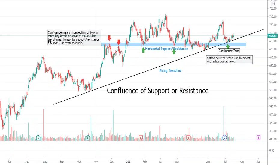
Confluence of Support or ResistanceA confluence of support or resistance is simply an intersection of two or more important levels. Market participants prefer to trade around a zone that involves two or more factors rather than a zone with just one. The probability of winning is higher around confluence zones.
A layman’s guide to Support and ResistanceForeward
In this thread, I would try with the best of my knowledge to explain the following questions as easily and briefly as possible.
1. What is a support level?
2. What is a resistance level?
3. What is their importance?
4. When and where to place Buy/Sell orders?
Introduction
Support and resistance levels are a critical part of trend analysis because they are used to make specific trading decisions. The fact that these levels flip roles between support and resistance can be used to determine the range of a market, trade reversals, bounces, or breakouts. They help in the identification of a trend reversal.
For example, you might identify an upcoming support level and decide to start buying the stock as it approaches the said support knowing that it will likely rebound higher. The support and resistance levels test and confirm the trends and should be closely tracked by every trader. These levels exist due to an influx of buyers and sellers at key junctures.
So, the question arises- what do support and resistance really mean?
What is a Support?
A support level/zone is a level where the price tends to find support as it falls. This means that the price is more likely to “rebound” from this level rather than pierce through it. However, once the price breaks down this level, it is likely to continue falling until meeting another support level.
What is a Resistance?
A resistance level/zone is a level where the price tends to find resistance as it rises. This means that the price is more likely to “bounce back down” from this level rather than break through it. However, once the price pushes above this level it is likely to continue rising until it meets another resistance level.
Trade setup:
1. Buying the support
The price gets rejected from the resistance level a few times. Finally, after a good attempt, the price manages to break out from the resistance. Don’t buy yet, wait for the retest since it can be a false breakout and you may end up losing your money. After a successful retest, open up your long positions. Make sure to lock in profits on the way up.
2. Selling the resistance
The price gets rebounded from the support level a few times. After a few attempts, the price finally breaks down of the support level. Don’t sell yet since it can be a false breakdown, wait for the retest. If the retest is successful, close your long positions on the breakdown point. Some may want to open short positions too.
Role Reversal/ Change of Polarity
A resistance level after a successful breakout turns into a support level and a support level turns into a resistance level after a breakdown. The turning of Resistance into a Support is or vice versa is known as "Change of Polarity".
Conclusion:
A zone keeps on flipping roles between support and resistance. Sometimes, it acts as a support, and other times it acts as a resistance. Hence, never consider a zone as fixed support or resistance. Moreover, consider these zones a potential support or resistance zones because there isn't any certainty that these will act as the desired zone.
Useful Tips:
1. Avoid placing orders at these major points since there exists a lot of volatility around these points.
2. Take care to not place buy/sell orders directly at these levels since there is a good chance of not hitting the exact levels. Use approximate margins for placing orders.
3. Never ever forget to use a stop loss if for an instance the trade doesn’t go as expected.

BANKNIFTY LEVELS 18/09/2020Currently sitting at a support zone of 22280-22300. Break below this can take us to 22090. Above 22300 we have 22505, 22650. Have a look on the chart for the support and resistance levels.
Share your opinion in the comment section below, and like and follow for daily market analysis !
Professional Trader | Experience: 2.5 Years
NOTE: The above mentioned views are for educational purposes only. You acknowledge the fact that you are alone responsible for your profits and losses, we won't be responsible for any kind of loss that you might incur by following our signals.
