Trading Journals & Performance Optimization1. What is a Trading Journal?
A trading journal is a systematic log where traders document every trade they make, along with the reasoning, conditions, and outcomes. Think of it as a diary—but instead of personal feelings alone, it captures data, analysis, strategy execution, and emotions related to trading decisions.
Key elements in a trading journal include:
Date and time of entry/exit
Asset traded (stocks, forex, commodities, crypto, etc.)
Position size and direction (long/short)
Entry and exit price levels
Stop-loss and take-profit levels
Rationale for taking the trade (technical, fundamental, sentiment-based)
Market conditions at the time (volatility, news, trends)
Emotional state during the trade (fear, greed, confidence, hesitation)
Outcome (profit/loss, percentage gain/loss, risk-to-reward ratio)
Unlike a broker statement, which only shows numerical results, a trading journal captures the story behind the trade—the reasoning, discipline, and psychology.
2. Importance of a Trading Journal
2.1 Accountability
Keeping a journal enforces responsibility. Every trade has a reason documented, which prevents impulsive or random entries. Traders cannot later excuse a loss as “bad luck”—they must revisit their decision-making process.
2.2 Pattern Recognition
Over time, journals reveal recurring mistakes or strengths. For example, a trader might realize they consistently lose money trading during low-volume sessions or when trading against the trend.
2.3 Emotional Control
By noting psychological states, traders begin to recognize how fear, greed, or overconfidence influence outcomes. This self-awareness is crucial in performance optimization.
2.4 Strategy Development
A journal helps test strategies by providing feedback. If a setup yields positive results over dozens of trades, it proves statistical viability. Conversely, poor results may suggest refinement or abandonment.
2.5 Performance Measurement
Beyond profit and loss, a journal allows tracking of metrics like win rate, risk/reward ratios, maximum drawdown, and expectancy. These indicators give a holistic view of trading effectiveness.
3. Designing an Effective Trading Journal
A trading journal must be structured, detailed, and easy to review. Traders can use simple spreadsheets, physical notebooks, or specialized trading journal software.
3.1 Core Data Fields
Date/Time: Helps track market conditions across different sessions.
Asset: Identifies which instruments are more profitable.
Position Size: Essential for risk management analysis.
Entry & Exit Prices: Core for profit/loss calculation.
Stop-Loss & Take-Profit: Tracks adherence to risk-reward planning.
Strategy Used: Notes whether the trade was based on trend-following, breakout, mean reversion, etc.
Market Conditions: Volatility, news events, earnings reports, macroeconomic announcements.
Emotional State: Helps connect psychology with execution quality.
Outcome: Profit/loss in absolute and percentage terms.
3.2 Additional Advanced Fields
Risk-Reward Ratio (RRR): Ratio between potential profit and risked loss.
Expected Value (EV): Calculated as (Win rate × Average win) – (Loss rate × Average loss).
Trade Grade: A subjective score (A, B, C) based on setup quality and discipline.
Screenshot/Chart: A visual reference for entry/exit to spot technical mistakes.
Improvement Notes: Lessons learned for future trades.
4. Types of Trading Journals
4.1 Manual Journals
Notebook or Spreadsheet
Best for beginners and discretionary traders
Provides flexibility but requires discipline
4.2 Digital Journals
Excel/Google Sheets
Can automate calculations like win rate, expectancy, and P/L
Easy to filter and analyze
4.3 Specialized Software
Examples: Tradervue, Edgewonk, Trademetria
Offers automated imports from brokers
Includes advanced analytics and visualizations
Tracks psychology and journaling in detail
4.4 Hybrid Journals
Combination of digital logs and handwritten notes (often for psychology tracking).
5. Metrics for Performance Optimization
5.1 Win Rate
Percentage of winning trades out of total trades. A high win rate does not guarantee profitability unless risk/reward ratios are managed.
5.2 Risk-to-Reward Ratio
The relationship between potential loss and potential gain. Even with a 40% win rate, a trader can be profitable if risk/reward is favorable (e.g., 1:3).
5.3 Expectancy
Measures the average amount a trader can expect to win or lose per trade. Formula:
E = (Win% × Avg Win) – (Loss% × Avg Loss)
5.4 Maximum Drawdown
The largest peak-to-trough decline in capital. Important for psychological endurance and capital preservation.
5.5 Sharpe Ratio
Performance adjusted for volatility. Higher Sharpe ratios indicate better risk-adjusted returns.
5.6 Consistency Score
Measures whether profits are concentrated in a few trades or evenly distributed.
6. Psychology and Emotional Tracking
A journal is not just about numbers—it’s about human behavior.
Fear: Leads to premature exits.
Greed: Causes overtrading and oversized positions.
Revenge Trading: Emotional retaliation after losses.
Overconfidence: Following winning streaks, leading to rule-breaking.
By tracking emotions alongside trades, traders identify behavioral biases that sabotage results. For example, noting “entered trade out of boredom” highlights non-strategic activity that must be eliminated.
7. The Feedback Loop: Journals as a Learning Tool
The journal enables continuous improvement through the feedback loop:
Plan – Define strategy and risk rules.
Execute – Place trades based on setup.
Record – Log data and emotions.
Review – Analyze performance, strengths, and weaknesses.
Adjust – Refine strategies, risk, and mindset.
Repeat – Apply lessons to the next set of trades.
Over time, this iterative cycle compounds into significant skill development.
8. Performance Optimization Techniques
8.1 Strategy Refinement
Using journal insights, traders identify which setups deliver the highest expectancy. Weak strategies can be discarded, while strong ones are scaled.
8.2 Risk Management Enhancement
Journals reveal over-leveraging, poor stop-loss placement, or frequent rule violations. Adjusting position sizes and risk exposure enhances long-term survivability.
8.3 Time Optimization
By tracking trades by time of day, traders discover when they perform best. For example, some excel during market open volatility, while others perform better in calmer sessions.
8.4 Market Condition Matching
Some strategies work best in trending markets, others in ranges. Journals help align tactics with conditions.
8.5 Eliminating Emotional Bias
Performance optimization is impossible without emotional discipline. Journaling makes psychological pitfalls visible, allowing traders to develop corrective actions like meditation, rule-based systems, or automation.
9. Advanced Applications of Trading Journals
9.1 Algorithmic Journals
Quantitative traders often integrate API-driven journals that automatically track trades, calculate advanced metrics, and analyze performance under different simulations.
9.2 Machine Learning Insights
Some modern platforms use ML to suggest improvements—e.g., alerting a trader that they perform poorly on Mondays or during high volatility.
9.3 Risk-of-Ruin Analysis
Helps determine the probability of account blow-up based on historical data and money management practices.
9.4 Peer Review
Professional prop traders often share journals with mentors or managers for external feedback. This increases accountability and learning speed.
10. Common Mistakes in Trading Journals
Incomplete entries – Logging only wins or skipping bad trades undermines honesty.
Too much complexity – Overloading with unnecessary details can make journaling tedious.
Not reviewing – A journal without regular review is just wasted effort.
Bias in notes – Rationalizing mistakes instead of admitting them.
Lack of consistency – Sporadic journaling fails to build meaningful data.
Conclusion
A trading journal is far more than a logbook—it is the mirror of a trader’s mind and methods. By capturing not just numbers but also psychology and context, it provides the raw material for meaningful self-improvement. Performance optimization is the natural outcome of this practice: refining strategies, managing risk, mastering emotions, and building consistency.
The path to successful trading is not about avoiding mistakes but about learning from them systematically. A journal transforms errors into lessons, and lessons into profits. Whether a beginner documenting first trades or a seasoned professional optimizing algorithms, the trading journal is an indispensable tool for sustained success in global markets.
Trading

Derivatives & Hedging Strategies1. Understanding Derivatives
1.1 Definition
A derivative is a financial contract whose value is derived from the performance of an underlying asset, index, interest rate, or event.
The underlying could be:
Equities (stocks, indices)
Commodities (oil, gold, wheat)
Currencies (USD, EUR, INR, etc.)
Interest rates (LIBOR, SOFR, government bond yields)
Credit events (default risk of a borrower)
The derivative itself has no independent value—it gains or loses value depending on the changes in the underlying.
1.2 History of Derivatives
Derivatives are not new. Ancient civilizations used forward contracts for trade. For example:
Mesopotamia (2000 BC): Farmers and traders agreed on grain delivery at future dates.
Japan (17th century): The Dojima Rice Exchange traded rice futures.
Chicago Board of Trade (1848): Standardized futures contracts began.
Modern derivatives markets exploded in the late 20th century with the development of financial futures, options, and swaps, especially after the collapse of the Bretton Woods system in the 1970s, which led to currency and interest rate volatility.
1.3 Types of Derivatives
Forwards
Customized contracts between two parties.
Agreement to buy/sell an asset at a fixed price in the future.
Traded over-the-counter (OTC), not standardized.
Futures
Standardized forward contracts traded on exchanges.
Require margin and daily settlement (mark-to-market).
Highly liquid and regulated.
Options
Provide the right, but not obligation to buy (call) or sell (put) the underlying at a specific price.
Buyer pays a premium.
Offer asymmetry: limited downside, unlimited upside.
Swaps
Agreements to exchange cash flows.
Examples:
Interest Rate Swaps (IRS): Fixed vs floating rate.
Currency Swaps: Principal and interest in different currencies.
Commodity Swaps: Exchange of fixed for floating commodity prices.
Exotic Derivatives
More complex structures like barrier options, credit default swaps (CDS), weather derivatives, etc.
1.4 Why Derivatives Matter
Risk management (hedging): Protect against adverse price movements.
Price discovery: Futures and options reflect market expectations.
Liquidity & efficiency: Provide easier entry and exit in markets.
Speculation & arbitrage: Opportunities for traders to profit.
2. Risks in Financial Markets
Before moving to hedging strategies, it’s important to understand the risks that derivatives are used to manage:
Market Risk: Price fluctuations in stocks, commodities, interest rates, or currencies.
Credit Risk: Risk of counterparty default.
Liquidity Risk: Inability to exit a position quickly.
Operational Risk: Failures in systems, processes, or human errors.
Systemic Risk: Risk that spreads across the financial system (e.g., 2008 crisis).
Derivatives don’t eliminate risk; they transfer it from one participant to another. Hedgers reduce their exposure, while speculators take on risk for potential reward.
3. Hedging with Derivatives
3.1 What is Hedging?
Hedging is like insurance—it reduces potential losses from adverse movements. A hedger gives up some potential profit in exchange for predictability and stability.
For example:
A farmer fears falling wheat prices → hedges using wheat futures.
An airline fears rising fuel costs → hedges using oil futures.
An exporter fears a weak USD → hedges using currency forwards.
3.2 Hedging vs. Speculation
Hedger: Uses derivatives to reduce risk (not to make a profit).
Speculator: Uses derivatives to bet on market direction (aims for profit).
Arbitrageur: Exploits price inefficiencies between markets.
4. Hedging Strategies with Derivatives
4.1 Hedging with Futures
Long Hedge: Used by consumers to protect against rising prices.
Example: An airline buys crude oil futures to lock in fuel costs.
Short Hedge: Used by producers to protect against falling prices.
Example: A farmer sells wheat futures to secure current prices.
4.2 Hedging with Options
Options are more flexible than futures.
Protective Put:
Buy a put option to protect against downside risk.
Example: An investor holding Reliance shares buys put options to protect against a price fall.
Covered Call:
Hold a stock and sell a call option.
Generates income but caps upside.
Collar Strategy:
Buy a put and sell a call.
Creates a range of outcomes, limiting both upside and downside.
Straddles & Strangles (for volatility hedging):
Buy both call & put when expecting high volatility.
4.3 Hedging with Swaps
Interest Rate Swap:
A company with floating-rate debt fears rising rates → swaps floating for fixed.
Currency Swap:
A US firm with Euro debt can swap payments with a European firm holding USD debt.
Commodity Swap:
An airline fixes jet fuel costs via commodity swaps.
4.4 Hedging in Different Markets
Equity Markets:
Portfolio hedging with index futures.
Example: Mutual funds hedge exposure to Nifty 50 via index options.
Commodity Markets:
Farmers, miners, oil producers hedge production.
Consumers (airlines, food companies) hedge input costs.
Currency Markets:
Exporters hedge against foreign exchange depreciation.
Importers hedge against appreciation.
Interest Rate Markets:
Banks, borrowers, and bond issuers hedge against rate fluctuations.
5. Case Studies in Hedging
5.1 Airlines and Fuel Hedging
Airlines face volatile jet fuel prices. Many hedge by buying oil futures or swaps.
Example: Southwest Airlines successfully hedged oil prices in the early 2000s, saving billions when crude prices surged.
5.2 Agricultural Producers
Farmers lock in prices using commodity futures.
For example, a soybean farmer may short soybean futures at planting season to secure revenue at harvest.
5.3 Exporters and Importers
An Indian IT company expecting USD revenues hedges via currency forwards.
An importer of machinery from Germany hedges by buying EUR futures.
5.4 Corporate Debt Management
Companies with large loans hedge interest rate exposure through interest rate swaps—converting floating liabilities into fixed ones.
6. Risks & Limitations of Hedging
While hedging reduces risk, it is not foolproof.
Cost of Hedging:
Options premiums reduce profits.
Futures may require margin and daily mark-to-market losses.
Imperfect Hedge:
Hedge may not fully cover exposure (basis risk).
Example: Using Brent futures while actual exposure is to WTI oil.
Opportunity Cost:
Hedging limits upside potential.
For instance, selling a covered call caps maximum gains.
Liquidity Risks:
Some derivatives (especially OTC) may be illiquid.
Counterparty Risks:
OTC contracts depend on the financial strength of the counterparty.
7. Advanced Hedging Techniques
7.1 Delta Hedging
Used in options trading to remain neutral to small price movements by adjusting positions.
7.2 Cross-Hedging
Using a related but not identical asset.
Example: Hedging jet fuel exposure using crude oil futures.
7.3 Dynamic Hedging
Continuously adjusting hedge positions as market conditions change.
7.4 Portfolio Hedging
Using index derivatives to hedge an entire portfolio instead of individual stocks.
8. Regulatory & Accounting Aspects
Regulation:
Derivatives markets are heavily regulated to avoid systemic risks.
In India: SEBI regulates equity & commodity derivatives.
Globally: CFTC (US), ESMA (Europe).
Accounting:
IFRS & GAAP have detailed rules for hedge accounting.
Mark-to-market and disclosure requirements are strict.
9. Role of Derivatives in Financial Crises
While derivatives are powerful, misuse can be dangerous.
2008 Crisis: Credit Default Swaps (CDS) amplified risks in mortgage markets.
Barings Bank Collapse (1995): Unauthorized futures trading led to bankruptcy.
These highlight that derivatives are double-edged swords—powerful risk tools but potentially destructive if misused.
10. The Future of Derivatives & Hedging
Technology & AI: Algorithmic trading and AI models are improving risk management.
Crypto Derivatives: Bitcoin futures, Ethereum options are gaining traction.
ESG & Climate Hedging: Weather derivatives and carbon credit futures are emerging.
Retail Participation: Platforms now allow smaller investors to access hedging tools.
Conclusion
Derivatives and hedging strategies form the risk management backbone of global finance. They allow businesses to stabilize revenues, protect against uncertainty, and make long-term planning feasible. From farmers to airlines, from exporters to banks, hedging is indispensable.
However, hedging is not about eliminating risk completely—it’s about managing risk intelligently. When used properly, derivatives act as shock absorbers in volatile markets, ensuring stability and growth. But when misused, they can magnify risks and create systemic failures.
Thus, successful use of derivatives requires:
A clear understanding of exposures.
Appropriate choice of instruments.
Discipline in execution.
Continuous monitoring and adjustment.
In short, derivatives and hedging strategies embody the balance between risk and reward, and mastering them is essential for anyone engaged in the modern financial world.
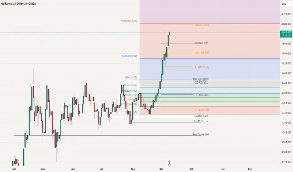
Gold Stretched but Strong Waiting for PullbackGold is moving aggressively and relentlessly, day by day, with no signs of exhaustion. The price has once again printed a fresh all-time high and is now trading around 3650, pushing higher without any meaningful rejection on the daily, weekly, or monthly charts. Momentum remains strong, but the rally is clearly stretched, and chasing buys at these levels looks more like FOMO than a high-probability setup. On the Fibonacci extension, the next major resistance is seen at 3681, which also aligns with the monthly R3 level, making it a critical zone to watch. Buying directly into this resistance is risky, and the better approach is to wait for a healthy pullback before looking for new longs. On the downside, 3600 now acts as immediate support, followed by 3550 as the secondary support level. As long as these supports hold, the broader structure remains bullish, but patience will be key for catching the next move.
Buy, Sell, or Skip? Backtesting Charts with Bar Replay!Using TradingView’s Bar Replay, I break down an old chart and reveal the exact logic behind whether it was a buy, sell, or skip trade. Perfect for traders who want to sharpen entry-decisions with real market context.

PCR Trading StrategiesCommon Mistakes & Myths about Options
Myth: Options are only for experts. (Truth: Beginners can use basic strategies safely.)
Mistake: Treating options like lottery tickets.
Mistake: Ignoring time decay and volatility.
Mistake: Over-trading due to low cost of buying options.
Future of Option Trading
Algo & Quant Trading: Algorithms dominate global options volume.
Retail Boom: Platforms like Zerodha, Robinhood, and Binance bring retail investors into options.
AI & Machine Learning: Predictive models for volatility and pricing.
Global Expansion: Options on new assets like carbon credits, crypto, and ETFs.
Conclusion
Option trading is a powerful tool — a double-edged sword. It can be used for risk management, speculation, or income generation. To master options, one must:
Learn the basics (calls, puts, pricing).
Understand strategies (spreads, straddles, condors).
Respect risk management and psychology.
Stay updated with market trends and regulations.
With proper discipline, options can transform how you interact with markets, offering opportunities that stocks and bonds alone cannot.

Part 1 Support and ResistanceThe Role of Options in Financial Markets
Options exist because they provide flexibility and risk management tools. Their role includes:
Hedging: Protecting portfolios from adverse price movements (insurance against loss).
Speculation: Betting on price direction with limited capital.
Leverage: Controlling large positions with small investment.
Income Generation: Selling options to earn premium income.
Arbitrage: Exploiting price differences between markets or instruments.
Why Traders Use Options
Options serve different purposes:
Investors: Hedge portfolios (e.g., protective puts).
Traders: Speculate on price moves (buying calls/puts).
Institutions: Manage risk exposure across assets.
Market Makers: Provide liquidity and earn spreads.
Psychology of an Options Trader
Trading is not just numbers, it’s emotions.
Fear and greed drive bad decisions.
Over-leverage leads to blowing up accounts.
Patience and discipline are more important than intelligence.
A successful trader has a trading plan, risk management, and psychological control.

Part 2 Candlestick PatternBasics of Options Contracts
To truly understand options, let’s break down the core components.
What is an Option?
An option is a contract that gives the buyer the right, but not the obligation, to buy or sell an underlying asset at a predetermined price (strike price) on or before a specified date (expiry date).
The buyer of the option pays a price called the premium.
The seller (or writer) of the option receives this premium and takes on the obligation.
Types of Options
Call Option – Gives the buyer the right to buy the underlying asset at the strike price.
Example: You buy a call on Reliance at ₹2500 strike price. If Reliance moves to ₹2700 before expiry, you can buy at ₹2500 and profit.
Put Option – Gives the buyer the right to sell the underlying asset at the strike price.
Example: You buy a put on Infosys at ₹1500. If Infosys falls to ₹1400, you can sell at ₹1500 and profit.
Key Terms in Options
Strike Price: The price at which the option can be exercised.
Premium: The cost of the option (paid by buyer, received by seller).
Expiry Date: The date when the option contract ends.
Lot Size: Options are traded in lots, not single units. For example, one NIFTY option lot = 50 units.
Moneyness:
In the Money (ITM): Option has intrinsic value.
At the Money (ATM): Strike price = current price.
Out of the Money (OTM): Option has no intrinsic value.
American vs European Options
American Options: Can be exercised any time before expiry.
European Options: Can be exercised only on expiry.
(India primarily uses European-style options.)

Part 1 Candlestick PatternIntroduction to Options
Options are one of the most fascinating and versatile instruments in financial markets. Unlike traditional investments where you buy and hold an asset (like stocks, bonds, or commodities), options give you choices — hence the name. They allow traders and investors to speculate, hedge risks, generate income, and create strategies that fit different market conditions.
At their core, options are derivative contracts. This means they derive their value from an underlying asset (like a stock, index, currency, or commodity). If you understand how they work, you gain the ability to control large positions with relatively small capital. That’s why options are often referred to as “leverage instruments.”
However, with great power comes great responsibility. Options can be rewarding, but they also involve risks that many beginners overlook. Learning options trading is like learning a new language: at first, the terminology may seem overwhelming, but once you understand the basics, it becomes logical and structured.
History & Evolution of Options
Options are not a modern invention. Their roots go back thousands of years.
Ancient Greece: The earliest recorded use of options was by Thales, a philosopher who secured the right to use olive presses before harvest. When olive yields turned out abundant, he profited by leasing the presses at higher prices.
17th Century Netherlands: Options became popular in the Dutch tulip mania, where people speculated on tulip bulb prices.
Modern Options: Organized option trading as we know it started in 1973 with the creation of the Chicago Board Options Exchange (CBOE). Alongside, the Black-Scholes model for option pricing was introduced, which gave traders a scientific framework to value options.
Today, options are traded globally — from U.S. exchanges like CBOE, CME, and NASDAQ to Indian platforms like NSE’s Options Market. They’ve also expanded into forex, commodities, and even cryptocurrencies like Bitcoin.

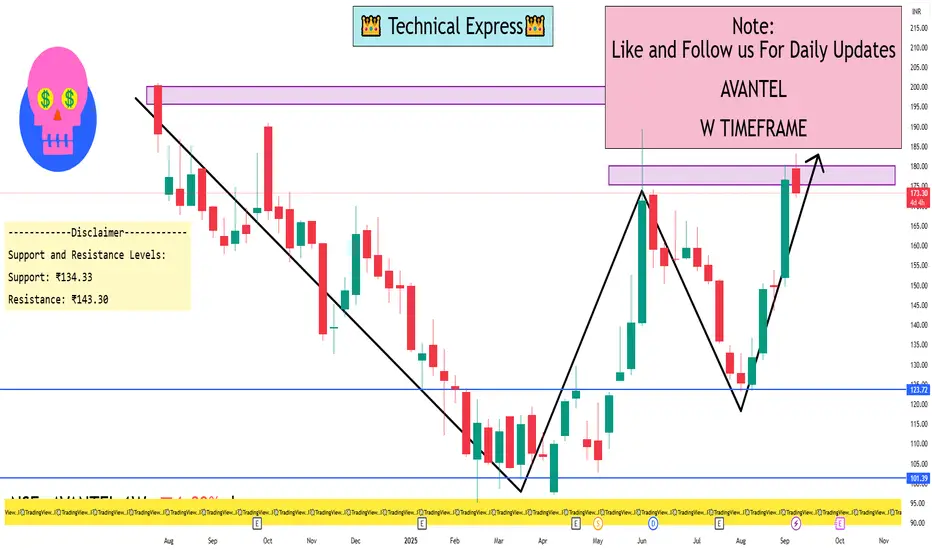
AVANTEL 1 Week ViewKey Technical Indicators:
Moving Averages: The stock is trading above its 200-day exponential moving average (EMA), indicating a long-term uptrend.
Stochastic RSI: The stochastic RSI is in the overbought zone, suggesting potential for a short-term pullback.
MACD: The Moving Average Convergence Divergence (MACD) is above the signal line, supporting the current bullish momentum.
Support and Resistance Levels:
Support: ₹134.33
Resistance: ₹143.30
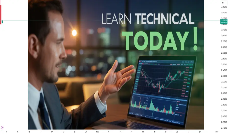
Technical Analysis Foundations1. Historical Background of Technical Analysis
Early Origins
Japanese Rice Trading (1700s): Candlestick charting was developed by Munehisa Homma, a rice trader, who discovered that market psychology and patterns could predict future prices.
Charles Dow (Late 1800s): Considered the father of modern technical analysis, Dow developed the Dow Theory, which laid the groundwork for trend analysis.
Evolution in the 20th Century
With the rise of stock exchanges in the U.S. and Europe, charting methods gained popularity.
The creation of indicators like Moving Averages, RSI, MACD, and Bollinger Bands in the mid-20th century expanded the technical toolkit.
Modern Era
Today, technical analysis is powered by computers, algorithms, and AI-based models.
Despite these advances, the core principle remains the same: history tends to repeat itself in markets.
2. Core Principles of Technical Analysis
Technical analysis is built on three central assumptions:
Price Discounts Everything
Every factor—economic, political, psychological—is already reflected in price.
Traders don’t need to analyze external events; studying price is enough.
Prices Move in Trends
Markets don’t move randomly. Instead, they form trends—uptrend, downtrend, or sideways.
Identifying and following the trend is the foundation of profitable trading.
History Repeats Itself
Human behavior in markets tends to repeat due to psychology (fear, greed, hope).
Chart patterns like Head & Shoulders or Double Tops repeat because investor reactions are consistent over time.
3. Types of Charts
Charts are the backbone of technical analysis. The three most commonly used chart types are:
1. Line Chart
Simplest chart, connecting closing prices with a line.
Best for long-term trend analysis.
2. Bar Chart
Displays open, high, low, and close (OHLC) in each bar.
Provides more detail than line charts.
3. Candlestick Chart
Invented in Japan, now the most popular.
Each candlestick shows open, high, low, and close with a body and wicks.
Offers visual insight into market psychology (bullish vs. bearish sentiment).
4. Understanding Market Structure
1. Trends
Uptrend: Higher highs and higher lows.
Downtrend: Lower highs and lower lows.
Sideways: Price consolidates within a range.
2. Support and Resistance
Support: Price level where buying pressure overcomes selling.
Resistance: Price level where selling pressure overcomes buying.
Key to identifying entry and exit points.
3. Breakouts and Pullbacks
Breakout: Price moves beyond support or resistance with strong volume.
Pullback: Temporary retracement before the trend resumes.
5. Technical Indicators
Indicators are mathematical calculations applied to price or volume data. They are divided into two main types:
1. Trend Indicators
Moving Averages (SMA, EMA): Smooth price data to identify trend direction.
MACD (Moving Average Convergence Divergence): Measures momentum and trend strength.
2. Momentum Indicators
RSI (Relative Strength Index): Identifies overbought (>70) or oversold (<30) conditions.
Stochastic Oscillator: Compares closing price to recent highs/lows.
3. Volatility Indicators
Bollinger Bands: Show price volatility around a moving average.
ATR (Average True Range): Measures market volatility.
4. Volume Indicators
OBV (On Balance Volume): Tracks cumulative buying/selling pressure.
Volume Profile: Highlights price levels where significant trading occurred.
6. Chart Patterns
Patterns represent the psychology of market participants. They are broadly classified into continuation and reversal patterns.
1. Reversal Patterns
Head and Shoulders: Signals a trend reversal from bullish to bearish.
Double Top/Bottom: Indicates a change in trend after testing a key level twice.
2. Continuation Patterns
Flags and Pennants: Short-term consolidations within a strong trend.
Triangles (Symmetrical, Ascending, Descending): Signal breakout in the direction of trend.
3. Candlestick Patterns
Doji: Market indecision.
Hammer / Shooting Star: Potential reversal signals.
Engulfing Patterns: Strong reversal signals based on candlestick body size.
7. Volume and Market Confirmation
Volume is a critical element in technical analysis:
Rising volume confirms the strength of a trend.
Low volume during a breakout may signal a false move.
Divergence between price and volume often hints at a reversal.
8. Timeframes in Technical Analysis
Intraday (1-min, 5-min, 15-min): For day traders and scalpers.
Swing (Hourly, 4H, Daily): For medium-term traders.
Position (Weekly, Monthly): For long-term investors.
The principle of Multiple Time Frame Analysis is key: Traders often analyze higher timeframes for trend direction and lower timeframes for precise entries.
9. Market Psychology and Sentiment
Technical analysis is rooted in psychology:
Fear and Greed: Drive most market movements.
Herd Behavior: Traders follow crowds, amplifying trends.
Overconfidence: Leads to bubbles and crashes.
Sentiment indicators like VIX (Volatility Index) or Put/Call ratios are often used to gauge market mood.
10. Risk Management in Technical Analysis
No strategy works without risk control. Key principles:
Position Sizing: Risk only 1–2% of capital per trade.
Stop Loss: Predetermine exit levels to minimize loss.
Risk-Reward Ratio: Aim for trades with at least 1:2 risk-reward.
Conclusion
Technical analysis is both an art and a science. It blends mathematical tools with human psychology to understand market behavior. While it has limitations, its principles of trend, support/resistance, and pattern recognition remain timeless.
For beginners, mastering chart basics, support/resistance, and risk management is the starting point. For advanced traders, integrating multiple indicators, refining strategies, and incorporating psychology make the difference.
Ultimately, technical analysis is not about predicting the future with certainty—it’s about increasing probabilities and managing risk. With discipline and practice, it becomes a powerful tool for navigating financial markets.
Price Action & Market StructurePart 1: Understanding Price Action
What is Price Action?
Price action refers to the movement of price plotted over time, without relying heavily on indicators. It studies the open, high, low, and close of candles or bars, combined with patterns, to forecast future movements.
Traders use price action to:
Identify market sentiment (bullish or bearish).
Spot areas of support and resistance.
Recognize chart patterns like triangles, flags, or head & shoulders.
Time entries and exits without clutter.
Core Elements of Price Action
Candlesticks – Each candlestick tells a story of supply and demand in a given time frame.
Bullish candles show dominance of buyers.
Bearish candles reflect sellers in control.
Long wicks indicate rejection of certain price levels.
Price Swings – Highs and lows are critical. They reveal whether the market is making higher highs/lows (uptrend) or lower highs/lows (downtrend).
Support & Resistance – Price action revolves around zones where price repeatedly reacts.
Support: a floor where buyers step in.
Resistance: a ceiling where sellers dominate.
Trendlines & Channels – Connecting swing highs or lows provides insight into the prevailing direction and potential breakout points.
Chart Patterns – Price action often forms recognizable patterns:
Continuation patterns: flags, pennants, triangles.
Reversal patterns: double top/bottom, head & shoulders, rounding bottom.
Part 2: Understanding Market Structure
What is Market Structure?
Market structure refers to the framework of how price moves through trends and consolidations. It is the “map” of the market, showing whether buyers or sellers are in control and how momentum shifts.
The structure can be broken into three main types:
Uptrend (bullish structure) – Higher highs (HH) and higher lows (HL).
Downtrend (bearish structure) – Lower highs (LH) and lower lows (LL).
Sideways (range-bound) – Price oscillates between support and resistance without clear trend.
Why Market Structure Matters
It provides context before placing trades.
Prevents trading against the dominant flow.
Helps identify when trends are about to reverse.
Acts as the backbone of supply and demand zones.
Anatomy of Market Structure
Impulse and Correction – Markets move in waves.
Impulse: strong directional move (trending leg).
Correction: smaller pullback before continuation or reversal.
Break of Structure (BOS) – A key event where price breaks past previous highs/lows, signaling trend continuation or reversal.
Market Phases
Accumulation: Institutions build positions quietly (range).
Markup: Trend begins (sharp price rally).
Distribution: Positions are offloaded (range or topping pattern).
Markdown: Price declines as sellers dominate.
Part 3: Price Action & Market Structure Combined
When combined, price action and market structure become a powerful toolkit:
Identify Market Structure – Determine if market is trending up, down, or sideways.
Use Price Action Signals – Look for candlestick rejections, patterns, or false breakouts at key structure points.
Validate with Support/Resistance or Supply/Demand Zones – Enter trades where price reacts strongly.
Set Risk Management – Place stops beyond structure zones (swing highs/lows).
For example:
In an uptrend, wait for price to pull back to a support level, then look for bullish candlestick patterns (hammer, engulfing) to confirm entry.
In a downtrend, wait for a retracement to resistance, then look for bearish rejection candles.
Part 4: Key Price Action Patterns within Market Structure
Pin Bar (Hammer / Shooting Star)
Signals rejection of price levels.
Works best at structure zones (support/resistance).
Engulfing Candle
A strong reversal signal when a large candle completely engulfs the previous one.
Inside Bar
Market consolidation before a breakout.
Double Top / Double Bottom
Classic reversal structures.
Head & Shoulders
Bearish reversal pattern at market tops.
Breakout & Retest
Price breaks structure and retests before continuation.
Part 5: Advanced Concepts
Supply & Demand Zones
Institutions leave “footprints” in the form of supply (where heavy selling originates) and demand zones (where aggressive buying starts). Identifying these zones within structure gives high-probability trade setups.
Liquidity Hunts (Stop Hunts)
Markets often move to trigger retail stop-losses before continuing in the intended direction. Recognizing liquidity pools near swing highs/lows is critical.
Order Flow & Market Manipulation
Big players manipulate price briefly before pushing it in the desired direction. Price action analysis allows traders to see these traps.
Part 6: Practical Trading Approach
Step 1: Multi-Timeframe Analysis
Start with higher timeframe (daily/weekly) to identify major structure.
Drop down to lower timeframes (1H/15M) for entries.
Step 2: Mark Structure & Zones
Draw key swing highs/lows.
Identify supply/demand or support/resistance.
Step 3: Wait for Price Action Confirmation
Look for rejection wicks, engulfing patterns, or BOS signals.
Step 4: Execute with Risk Management
Risk only 1–2% per trade.
Place stop beyond invalidation level (swing high/low).
Step 5: Trade Management
Scale out partial profits at key levels.
Trail stop-loss in trending markets.
Part 7: Psychology Behind Price Action & Structure
Trading without indicators forces traders to “see the market naked.” This can be intimidating but also liberating. Success depends on:
Patience: waiting for structure alignment and confirmation.
Discipline: not chasing every move.
Confidence: trusting the simplicity of price action.
Part 8: Case Studies
Example 1: Uptrend Continuation
Market forms HH & HL.
Pullback to demand zone.
Bullish engulfing candle appears.
Long entry → ride trend until new resistance forms.
Example 2: Trend Reversal
Market breaks below previous HL (BOS).
Retest as new resistance.
Shooting star candle appears.
Short entry → ride markdown phase.
Part 9: Common Mistakes in Price Action & Market Structure
Trading without higher timeframe context.
Misidentifying ranges as trends.
Entering trades without confirmation.
Overcomplicating with too many trendlines.
Ignoring risk management.
Part 10: Conclusion
Price action and market structure together form the backbone of professional trading. Instead of relying on lagging indicators, traders learn to read the “story” of price and align with institutional moves.
Key takeaways:
Price action reveals real-time market psychology.
Market structure provides the framework for trends and reversals.
Combining them gives a high-probability edge.
Success depends on patience, discipline, and risk control.
In essence, trading with price action and market structure is about aligning yourself with the natural rhythm of the market. The more you practice, the clearer the story of price becomes, and the greater your confidence in executing profitable trades.

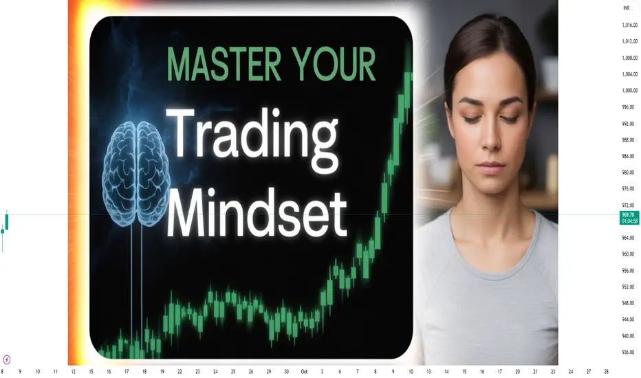
Psychology of Trading1. Introduction: Why Psychology Matters in Trading
Trading is not just about buying low and selling high. It is about making decisions under uncertainty, managing risk, and dealing with constant emotional swings. Unlike traditional jobs where performance is based on effort and skills, trading has an unpredictable outcome in the short term.
You can make a perfect trade setup and still lose money.
You can make a terrible decision and accidentally profit.
This uncertainty creates emotional pressure, leading traders to make irrational decisions. For example:
Selling too early out of fear.
Holding on to losing trades hoping for a reversal.
Over-trading after a big win or loss.
Without strong psychological control, traders often repeat these mistakes. That is why understanding and mastering trading psychology is the real secret to consistent success.
2. Core Emotions in Trading
Emotions are natural, but when unmanaged, they distort judgment. Let’s break down the four main emotions every trader faces:
(a) Fear
Fear is the most common emotion in trading. It shows up in two forms:
Fear of Losing Money – leading to hesitation, missed opportunities, or premature exits.
Fear of Missing Out (FOMO) – jumping into trades too late because others are making money.
Example: A trader sees a stock rallying rapidly and buys at the top out of FOMO. When the price corrects, fear of loss makes them sell at the bottom – a classic cycle.
(b) Greed
Greed pushes traders to take excessive risks, over-leverage, or hold winning positions too long. Instead of following a plan, they chase “unlimited” profits.
Example: A trader who plans for 5% profit refuses to book at target, hoping for 10%. The market reverses, and the profit turns into a loss.
(c) Hope
Hope is dangerous in trading. While hope is positive in life, in markets it blinds traders from reality. Hope makes people hold on to losing trades, ignoring stop-losses, and believing “it will come back.”
Example: A trader buys a stock at ₹500, it falls to ₹450, then ₹400. Instead of cutting losses, the trader “hopes” for recovery and keeps averaging down, often leading to bigger losses.
(d) Regret
Regret comes after missed opportunities or wrong trades. Regret often leads to revenge trading, where traders try to quickly recover losses, usually resulting in even bigger losses.
3. Cognitive Biases in Trading
Apart from emotions, psychology is also influenced by cognitive biases – mental shortcuts that distort rational thinking.
Overconfidence Bias – Believing your strategy is always right after a few wins, leading to careless trading.
Confirmation Bias – Only looking for information that supports your view, ignoring opposite signals.
Loss Aversion – The pain of losing ₹1000 is stronger than the joy of gaining ₹1000. This makes traders hold losers and sell winners too soon.
Anchoring Bias – Relying too heavily on the first price seen, e.g., thinking “I bought at ₹600, so it must go back to ₹600.”
Herd Mentality – Following the crowd without analysis, especially during hype rallies or crashes.
These biases prevent traders from making objective decisions.
4. Mindset of a Successful Trader
Successful traders think differently from beginners. Their mindset is built on discipline, patience, and acceptance of uncertainty. Key elements include:
Process Over Outcome: Focusing on following rules, not immediate profit.
Acceptance of Losses: Treating losses as part of the business, not as personal failure.
Probabilistic Thinking: Understanding that no trade is 100% certain; trading is about probabilities.
Long-Term Focus: Avoiding the need for daily wins, instead building consistent performance over months/years.
Emotional Detachment: Viewing money as “trading capital,” not personal wealth.
5. The Role of Discipline
Discipline is the backbone of trading psychology. Without discipline, even the best strategies fail. Discipline involves:
Following a Trading Plan – entry, exit, stop-loss, risk-reward.
Position Sizing – never risking more than 1-2% of capital on a single trade.
Consistency – sticking to strategy instead of changing methods after every loss.
Patience – waiting for the right setup instead of forcing trades.
Most traders fail not because of bad strategies but because they lack the discipline to follow their strategies.
6. Psychological Challenges in Different Trading Styles
(a) Day Trading
Constant pressure, quick decisions.
High temptation to over-trade.
Emotional exhaustion.
(b) Swing Trading
Requires patience to hold trades for days/weeks.
Fear of overnight risks (gaps, news).
Temptation to check charts every hour.
(c) Long-Term Investing
Emotional difficulty in holding through corrections.
Pressure from news and market noise.
Fear of missing short-term opportunities.
Each style demands a different level of emotional control.
7. Developing Emotional Intelligence for Trading
Emotional Intelligence (EQ) is the ability to understand and manage your emotions. Traders with high EQ can:
Recognize when fear/greed is influencing them.
Pause before reacting emotionally.
Maintain objectivity under stress.
Ways to improve EQ in trading:
Journaling – Writing down emotions and mistakes after each trade.
Mindfulness & Meditation – Helps calm the mind and reduce impulsive decisions.
Detachment from Money – Viewing trades as probabilities, not personal wins/losses.
Visualization – Mentally preparing for both winning and losing scenarios.
8. Risk Management & Psychology
Risk management is not just technical – it is psychological. A trader who risks too much per trade is more likely to panic.
Risk per trade: Max 1–2% of capital.
Use stop-loss orders to remove emotional decision-making.
Diversify to avoid stress from a single bad trade.
When risk is controlled, emotions naturally reduce.
9. Common Psychological Mistakes Traders Make
Overtrading – Trading too often due to excitement or frustration.
Ignoring Stop-Losses – Driven by hope and denial.
Chasing the Market – Entering late due to FOMO.
Revenge Trading – Trying to recover losses aggressively.
Lack of Patience – Jumping in before confirmation.
Ego Trading – Refusing to accept mistakes, trying to “prove the market wrong.”
10. Building Psychological Strength
Practical steps to master trading psychology:
Create a Trading Plan – Define entry, exit, stop-loss, risk-reward.
Keep a Trading Journal – Record reasons, outcomes, and emotions of each trade.
Use Small Position Sizes – Reduce stress by lowering risk.
Practice Visualization – Prepare for losses before they happen.
Regular Breaks – Step away from screens to avoid emotional burnout.
Focus on Process, Not Profit – Judge yourself by discipline, not daily P&L.
Accept Imperfection – No trader wins all trades; consistency matters more than perfection.
Final Thoughts
The psychology of trading is the bridge between knowledge and execution. Thousands of traders know strategies, but only a few succeed because they master their emotions.
To succeed in trading:
Build discipline like a soldier.
Accept uncertainty like a scientist.
Control emotions like a monk.
In short: Trading is less about predicting markets and more about controlling yourself.
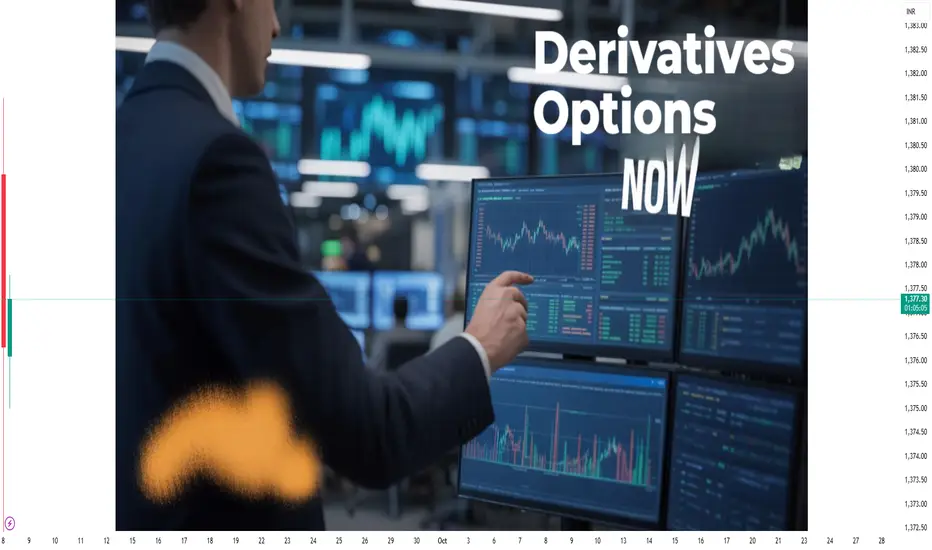
Derivatives & Options TradingPart 1: What Are Derivatives?
Definition
A derivative is a financial contract whose value depends (or is derived) from the value of an underlying asset, index, or interest rate. For example:
A wheat futures contract derives its value from wheat prices.
A stock option derives its value from the stock price of a company.
A currency forward derives its value from the exchange rate of two currencies.
Thus, derivatives do not have standalone intrinsic value—they only exist because of their relationship with something else.
History of Derivatives
Derivatives are not new. In fact, they date back thousands of years:
Ancient Greece (600 BCE): The philosopher Thales used an early version of an option contract to secure the right to use olive presses.
17th Century Japan: The Dojima Rice Exchange in Osaka was the world’s first organized futures market.
19th Century USA: The Chicago Board of Trade (CBOT) formalized futures contracts in commodities like wheat and corn.
20th Century: Derivatives expanded beyond agriculture into financial assets like stocks, bonds, and interest rates.
Today, derivatives markets are global, electronic, and worth trillions of dollars daily.
Part 2: Types of Derivatives
Derivatives can be classified into four major categories:
1. Forwards
Private agreements between two parties to buy/sell an asset at a future date at a predetermined price.
Customized and traded over-the-counter (OTC).
Example: A coffee exporter enters into a forward contract with a U.S. buyer to sell coffee at $2 per pound in six months.
2. Futures
Standardized contracts traded on exchanges.
Legally binding to buy/sell an asset at a set price and date.
Highly liquid, with margin requirements for risk management.
Example: Nifty 50 futures in India or S&P 500 futures in the U.S.
3. Options
Contracts giving the buyer the right (but not obligation) to buy or sell the underlying asset at a set price before/at expiration.
Two types:
Call Option → Right to buy.
Put Option → Right to sell.
Traded globally on exchanges like NSE (India), CME (USA), etc.
4. Swaps
Agreements to exchange cash flows, often involving interest rates or currencies.
Example: A company with floating-rate debt may enter into an interest rate swap to convert it into fixed-rate payments.
Part 3: Understanding Options in Detail
Among all derivatives, options stand out because of their flexibility, leverage, and strategic use.
1. Basic Terms
Underlying Asset: The stock, commodity, or index on which the option is based.
Strike Price: The pre-agreed price at which the option can be exercised.
Premium: The price paid by the option buyer to the seller (writer).
Expiry Date: The date on which the option contract ends.
Call Option: Right to buy the asset at the strike price.
Put Option: Right to sell the asset at the strike price.
2. Call Options Example
Suppose Reliance stock trades at ₹2,500. You buy a Call Option with a strike price of ₹2,600 expiring in 1 month.
If Reliance rises to ₹2,800, you exercise the call and buy at ₹2,600 (profit = ₹200 per share minus premium).
If Reliance falls to ₹2,400, you simply let the option expire (loss limited to premium).
3. Put Options Example
Suppose Infosys trades at ₹1,600. You buy a Put Option with strike price ₹1,550.
If Infosys drops to ₹1,400, you sell at ₹1,550 (profit = ₹150 minus premium).
If Infosys rises above ₹1,550, you let it expire.
4. Option Writers (Sellers)
Unlike buyers, sellers have obligations.
Call Writer: Must sell at strike price if buyer exercises.
Put Writer: Must buy at strike price if buyer exercises.
Writers earn the premium but face unlimited risk if the market moves against them.
Part 4: Option Pricing
Options pricing is complex because it depends on several factors. The most widely used model is the Black-Scholes Model, but conceptually:
Factors Affecting Option Premium:
Spot Price of Underlying – Higher stock price increases call premium, decreases put premium.
Strike Price – Closer strike to market price = higher premium.
Time to Expiry – More time = more premium.
Volatility – Higher volatility increases both call & put premiums.
Interest Rates & Dividends – Minor impact but factored in.
This combination of variables explains why options are dynamic instruments requiring constant analysis.
Part 5: Options Trading Strategies
Options are not only used for speculation but also for hedging and generating income.
1. Hedging
Example: An investor holding Infosys stock can buy a put option to protect against downside.
2. Speculation
Traders can bet on price direction with limited risk.
Example: Buying a call option before earnings announcement.
3. Income Generation
Option writers earn premiums by selling covered calls or puts.
Popular Option Strategies:
Covered Call – Holding stock + selling call option to earn premium.
Protective Put – Buying stock + buying put for downside protection.
Straddle – Buying both call & put at same strike → betting on volatility.
Strangle – Buying out-of-the-money call & put → cheaper volatility play.
Butterfly Spread – A limited-risk, limited-reward strategy based on three strikes.
Iron Condor – Popular income strategy using four legs (two calls + two puts).
These strategies allow traders to profit not only from direction but also from volatility and time decay.
Part 6: Risks in Derivatives & Options
While derivatives are powerful, they come with risks.
1. Market Risk
Prices can move unpredictably, leading to heavy losses.
2. Leverage Risk
Small moves in underlying can cause big gains/losses due to leverage.
3. Liquidity Risk
Some derivatives may be illiquid, making exit difficult.
4. Counterparty Risk
In OTC contracts, one party may default. (Exchanges reduce this via clearing houses).
5. Complexity Risk
Beginners may misunderstand how pricing works, especially with options.
This is why regulators like SEBI (India) and CFTC (USA) impose margin requirements and position limits.
Part 7: Global Derivatives Markets
Major Hubs
CME Group (USA): Largest derivatives exchange, trades in futures & options.
Eurex (Europe): Known for interest rate and equity derivatives.
NSE (India): World leader in options trading volume, especially index options.
SGX (Singapore): Popular for Asian index derivatives.
Indian Derivatives Market
Launched in 2000 with Nifty futures.
Now among the top in the world by volume.
Products include index futures, stock futures, index options, stock options, and currency derivatives.
Part 8: Real-World Applications
Hedging:
Farmers hedge crop prices with futures.
Importers hedge currency risk with forwards.
Investors hedge stock portfolios with index options.
Speculation:
Traders use leverage to profit from short-term moves.
Options allow betting on volatility.
Arbitrage:
Taking advantage of mispricing between spot and derivatives markets.
Example: Cash-futures arbitrage.
Portfolio Management:
Funds use derivatives to reduce volatility and enhance returns.
Part 9: Benefits of Derivatives & Options
Risk Management: Hedge against uncertainty.
Leverage: Control large positions with small capital.
Flexibility: Profit from direction, volatility, or even time decay.
Liquidity: Highly traded instruments (especially index options).
Price Discovery: Futures help determine fair value of assets.
Part 10: Risks & Criticism
Despite benefits, derivatives have faced criticism:
They were central in the 2008 Global Financial Crisis (credit default swaps).
Excessive speculation can destabilize markets.
High leverage magnifies losses.
Warren Buffett famously called derivatives “financial weapons of mass destruction” if misused.
Conclusion
Derivatives and options trading represent one of the most fascinating and powerful segments of financial markets. From their ancient roots in agricultural trade to their modern dominance in global finance, derivatives play a crucial role in hedging, speculation, and arbitrage.
Options, in particular, offer unmatched flexibility by allowing traders to design strategies suited to bullish, bearish, or neutral market conditions. However, with this power comes complexity and risk.
For investors and traders, the key lies in education, discipline, and risk management. Derivatives can either safeguard portfolios and create wealth—or, if misused, lead to catastrophic losses.
Thus, mastering derivatives and options trading is less about chasing quick profits and more about understanding risk, probability, and strategy in a dynamic market environment.
Basics of Financial Markets1. What are Financial Markets?
A financial market is a marketplace where financial instruments are created, bought, and sold. Unlike physical markets where goods are exchanged, financial markets deal with monetary assets, securities, and derivatives.
Key Characteristics:
Medium of Exchange – Instead of physical goods, money, credit, or securities are exchanged.
Standardized Instruments – Financial contracts such as stocks or bonds are standardized and legally binding.
Liquidity – Markets allow participants to buy or sell instruments quickly without drastically affecting prices.
Transparency – Prices and information are accessible, which reduces uncertainty.
Regulation – Most markets are regulated to ensure fairness, prevent fraud, and protect investors.
2. Why Do Financial Markets Exist?
The need for financial markets arises because of the following:
Capital Allocation – They help direct savings to businesses and governments that need funds.
Price Discovery – Markets determine the fair value of financial instruments through supply and demand.
Liquidity Provision – Investors can easily enter or exit positions.
Risk Management – Derivative markets allow participants to hedge against risks like currency fluctuations, interest rates, or commodity prices.
Efficient Resource Use – They reduce transaction costs and make capital flow more efficient across the economy.
3. Types of Financial Markets
Financial markets are broadly classified into several categories:
(a) Capital Market
Capital markets deal with long-term securities such as stocks and bonds. They are subdivided into:
Primary Market – Where new securities are issued (e.g., IPOs).
Secondary Market – Where existing securities are traded among investors (e.g., stock exchanges).
(b) Money Market
This is the market for short-term funds, usually less than one year. Instruments include:
Treasury bills
Commercial paper
Certificates of deposit
Repurchase agreements
Money markets are crucial for liquidity management by banks, companies, and governments.
(c) Foreign Exchange Market (Forex)
The largest and most liquid market in the world, where currencies are traded. Daily turnover exceeds $7 trillion globally. Forex enables:
International trade settlement
Speculation
Hedging currency risks
(d) Derivatives Market
These markets trade instruments that derive their value from underlying assets like stocks, bonds, commodities, or indices. Key instruments include:
Futures
Options
Swaps
Forwards
(e) Commodity Market
These markets allow the trade of raw materials such as oil, gold, silver, coffee, wheat, and natural gas. They play a vital role in price discovery and hedging for producers and consumers.
(f) Insurance and Pension Markets
Though sometimes overlooked, insurance and pension funds form part of financial markets as they pool resources and invest in capital markets to provide long-term returns.
4. Major Participants in Financial Markets
(a) Individual Investors
Ordinary people investing in stocks, bonds, mutual funds, or retirement accounts.
(b) Institutional Investors
Pension funds
Hedge funds
Insurance companies
Mutual funds
They often have large capital and dominate trading volumes.
(c) Corporations
Issue stocks and bonds to raise capital for growth and expansion.
(d) Governments
Issue treasury securities to finance deficits and manage national debt.
(e) Central Banks
Influence interest rates, liquidity, and currency stability. For example, the Federal Reserve (US) or RBI (India).
(f) Brokers and Dealers
Middlemen who facilitate transactions.
(g) Regulators
Organizations like SEBI (India), SEC (US), or FCA (UK) ensure fair practices, transparency, and investor protection.
5. Financial Instruments
Financial instruments are contracts that represent monetary value. Broadly divided into:
(a) Equity Instruments
Shares or stocks represent ownership in a company.
Provide dividends and capital appreciation.
(b) Debt Instruments
Bonds, debentures, or loans represent borrowing.
Fixed income with lower risk compared to equities.
(c) Hybrid Instruments
Convertible bonds
Preference shares (mix of equity and debt features)
(d) Derivatives
Contracts like futures and options used for speculation or hedging.
(e) Foreign Exchange Instruments
Spot transactions, forwards, swaps.
6. Functions of Financial Markets
Mobilization of Savings – Channels savings into investments.
Efficient Allocation of Resources – Ensures capital flows where it is most productive.
Liquidity Creation – Enables quick conversion of assets to cash.
Price Discovery – Determines fair asset prices.
Risk Management – Through diversification and hedging.
Economic Growth Support – Facilitates industrial expansion and infrastructure building.
7. Primary vs. Secondary Market
Primary Market
New securities are issued.
Example: An IPO of a company.
Investors buy directly from the issuer.
Secondary Market
Existing securities are traded among investors.
Example: Buying shares of TCS on NSE.
Prices are driven by demand and supply.
Both markets are essential – the primary market raises fresh funds, while the secondary market ensures liquidity.
8. Global Financial Markets
Financial markets today are interconnected. Events in one region impact others through global capital flows.
US markets (NYSE, NASDAQ) dominate equity trading.
London is a hub for forex trading.
Asia (Tokyo, Shanghai, Hong Kong, Singapore, Mumbai) is rising as a global financial powerhouse.
Globalization and technology have made markets operate 24/7, with information spreading instantly.
9. Role of Technology in Financial Markets
Technology has revolutionized finance:
Online trading platforms allow individuals to trade from anywhere.
Algo & High-Frequency Trading execute orders in microseconds.
Blockchain & Cryptocurrencies (Bitcoin, Ethereum) are creating new asset classes.
Fintech Innovations like robo-advisors, digital wallets, and payment banks are reshaping finance.
10. Risks in Financial Markets
Despite benefits, markets involve risks:
Market Risk – Loss due to price movements.
Credit Risk – Default by borrowers.
Liquidity Risk – Inability to sell assets quickly.
Operational Risk – Failures in processes, systems, or fraud.
Systemic Risk – Collapse of one institution affecting the entire system (e.g., 2008 crisis).
Conclusion
Financial markets are complex yet fascinating ecosystems that drive global economic growth. They connect savers with borrowers, facilitate price discovery, provide liquidity, and enable risk management. For individuals, they offer opportunities to grow wealth, while for nations, they are vital for development and stability.
Understanding the basics of financial markets is not just about investing—it’s about grasping how economies function in a globalized, interconnected world. With technological advancements and evolving regulations, financial markets will continue to transform, creating both opportunities and challenges for future generations.

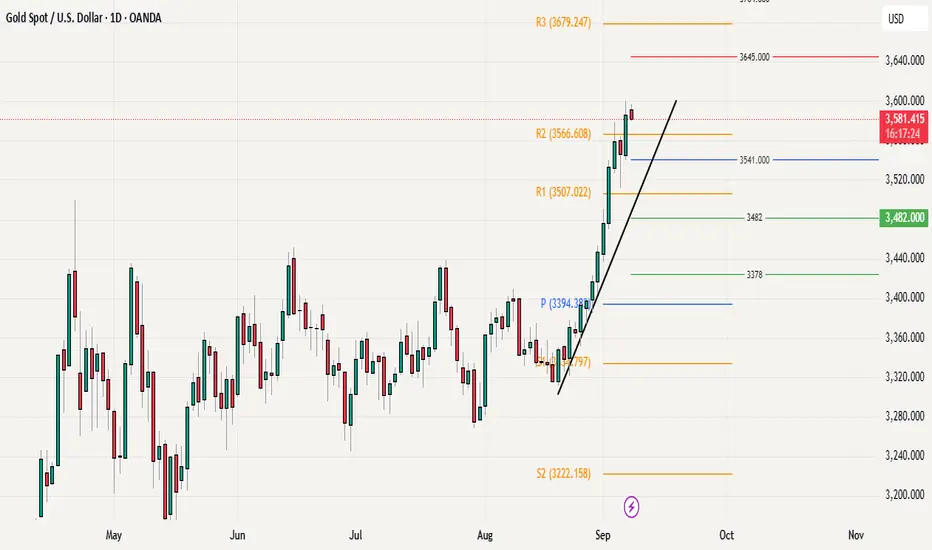
Gold Marks New ATH at 3600 – Bulls Still in ControlGold closed last week on a very strong note, posting its highest daily and weekly close and also printing a new all-time high at 3600, which now stands as an important psychological resistance Level. The overall price action structure continues to favor the bulls, with no major signs of reversal visible on any time frame.
For this week, the weekly pivot at 3541 will be going to act as the first line of support, followed by the previous ATH at 3500 as the secondary and more critical level to hold. While some consolidation or pullback from current levels cannot be ruled out given the stretched rally and overbought conditions (daily,H4) these dips can be viewed as healthy rather than bearish. As long as gold holds above 3500 on a closing basis, the broader trend remains bullish, and any corrective moves are likely to attract buying interest.
In short, unless bears can force a decisive break below 3500 (Daily close or week), gold bullish momentum remains intact, with scope for continuation above 3600 once consolidation is done.
XAUUSD – Early Week Trading ScenarioXAUUSD – Early Week Trading Scenario
Hello Traders,
The Asian session opened the new week with mild fluctuations in gold, followed by a pullback into the major liquidity zone created during last week’s bullish wave.
At present, price is showing signs of breaking below the 3585 support. If a strong M15 candle closes under this level, it can be considered a short-term correction signal. In that case, a light sell position may be initiated, targeting the 3560 zone.
The 3560 level stands out as a reliable support, aligning with the ascending trendline. This makes it a key area for buying in line with the prevailing uptrend, with the potential for price to extend higher and even revisit its all-time highs. However, if price climbs back to retest the trendline, any short positions from that area should be approached cautiously and only with clear confirmation.
Another potential buy zone lies near 3516, where the market previously cleared the liquidity from the closest FVG.
Overall, gold is likely to require some corrective moves before continuing its broader trend. In particular, short trades should only be considered when the reversal structure is clearly validated.
This is my trading perspective for gold today. Please take it as a reference for your own strategies.

Part 3 Learn Institutional Trading Key Terms You Must Know
Before diving deeper, let’s define some must-know option trading terminology:
Strike Price: The fixed price at which you can buy/sell the asset.
Premium: The cost of the option contract.
Expiry Date: The last day on which the option is valid.
In the Money (ITM): An option that already has intrinsic value.
Out of the Money (OTM): An option with no intrinsic value, only time value.
At the Money (ATM): When the asset’s price is equal to the strike price.
Lot Size: Options are traded in lots, not single shares. Example: Nifty option lots usually contain 50 units.
Writer/Seller: The person who sells the option and receives the premium.
Buyer/Holder: The person who buys the option and pays the premium.
Why Trade Options?
Beginners often ask: “Why not just buy stocks directly?”
Here’s why many traders prefer options:
Leverage: With a small premium, you can control a large quantity of shares.
Limited Risk (for Buyers): Your maximum loss is the premium paid.
Profit from Any Direction: Options let you benefit from rising, falling, or even stagnant markets.
Hedging: Protect your portfolio from adverse price moves. For example, buying puts on Nifty can protect your stock portfolio during market crashes.
Income Generation: By selling options, traders collect premiums regularly (popular among professionals).

Part 2 Ride The Big MovesWhat Are Options?
The Definition
An option is a financial contract that gives you the right, but not the obligation, to buy or sell an underlying asset (like a stock, index, or commodity) at a specific price within a specific time.
There are two main types of options:
Call Option – Gives the right to buy the asset at a fixed price (called the strike price).
Put Option – Gives the right to sell the asset at a fixed price.
Think of options like insurance policies. Just as you pay a premium for car insurance to protect against accidents, in options trading you pay a premium to gain control over an asset’s future without actually owning it upfront.
A Simple Example
Imagine you want to buy 100 shares of Reliance Industries at ₹2,500 per share, but you don’t want to spend ₹2,50,000 immediately. Instead, you buy a call option for ₹100 per share with a strike price of ₹2,500, expiring in one month.
If Reliance rises to ₹2,700, you can exercise your option and buy at ₹2,500, instantly profiting ₹200 per share (minus the premium).
If Reliance falls to ₹2,300, you don’t exercise. You only lose the premium you paid (₹100 per share).
This flexibility is the power of options.

Part 1 Ride The Big MovesIntroduction
The world of financial markets offers countless opportunities for investors and traders to grow wealth, hedge risks, and speculate on price movements. Among these opportunities, options trading stands out as both exciting and intimidating. For beginners, the term "options" might sound complex, but once you understand the building blocks, options open the door to powerful strategies that stocks alone cannot provide.
Options trading is not gambling, though many mistake it for that. Instead, it’s a sophisticated tool that—when used wisely—can help traders generate income, protect their portfolios, or profit from both rising and falling markets. In this guide, we’ll walk through every fundamental aspect of options trading, simplifying concepts for beginners while also highlighting practical examples.
By the end of this guide, you’ll know:
What options are and how they work
Key terms every beginner must understand
Why people trade options
The risks and benefits of options
Basic strategies suitable for beginners
Mistakes to avoid in your early journey
A roadmap to becoming a skilled options trader

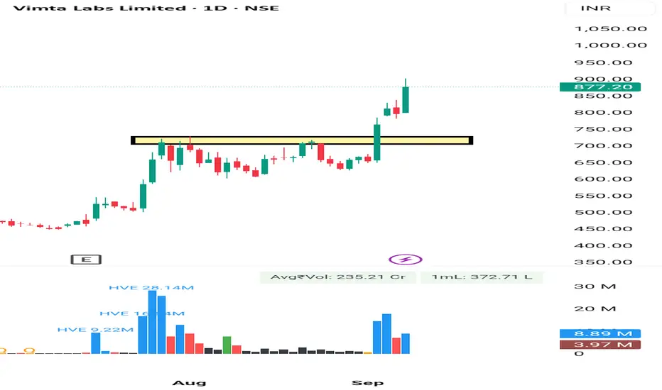
Vimta Lab Rounding Pattern Breakout Vimta Lab given Rounding Pattern Breakout on 1 Day as well as on 1 Week . It's a good movement after a good consolidation phase of 1 Month Approx . It may move 10 -15% Easily .
Entry Was Near 730
SL 5%
Tgt - Trial Basis . No body knows . Kitna Up jayega. So. Trail SL.
Consult your financial advisor before making any position in stock market.
ETH–USD 2 Hour ViewEthereum vs USD — 2-Hour Timeframe Levels
You asked for key price levels on a 2-hour chart. While I can't generate live 2-hour chart data here, I can share recent technical insights with support and resistance levels, plus your current price context.
⏺ Key Technical Levels (as of early September 2025):
Support Zones:
$4,360 — initial support area
$4,315 — next downside level
Below that: $4,260 and $4,220 are cited as further downside supports
Resistance Zones:
$4,500 — key resistance, blockage for current rally
If surpassed: $4,520 and $4,555 are possible next targets
Extended resistance: up to $4,620, then $4,660 or even $4,720 if momentum builds
Mid-range / Technical Sentiment:
Recent consolidation between $4,350–$4,450, holding above the 100-hour SMA with rebound potential
Daily chart structure remains bullish as long as ETH stays above $4,000; a breakdown below that could weaken structure
Next Steps for You:
Use a charting platform (e.g., TradingView) with a 2-hour timeframe and apply horizontal lines at these zones.
Watch for price action: Does ETH bounce at support? Does it stall or break through resistance? Candlestick patterns and volume around these levels help refine entries/exits.
Play momentum: Watch aggressiveness above $4,500 with targets at $4

Day Trading Secrets1. Understanding Market Structure: The Foundation of Day Trading
A critical secret in day trading is a thorough understanding of market structure. Day traders succeed by identifying trends, reversals, and consolidation patterns in the price action.
1.1 Trends, Ranges, and Volatility
Trending Markets: Prices move in a clear direction (up or down). Trading with the trend increases probability of winning trades. Common tools to identify trends include moving averages (e.g., 20 EMA, 50 EMA) and trendlines.
Ranging Markets: Prices oscillate between support and resistance levels. Here, traders often adopt mean-reversion strategies, buying near support and selling near resistance.
Volatile Markets: Characterized by large intraday swings. High volatility can provide opportunities for quick profits but increases risk. Traders should reduce position size during extreme volatility.
1.2 Support and Resistance
Support and resistance are fundamental in intraday trading. Key secrets include:
Multiple Confluences: Look for levels supported by prior price action, moving averages, and pivot points.
Breakouts vs. Fakeouts: True breakouts are accompanied by strong volume; fakeouts trap traders who enter prematurely.
1.3 Price Action Analysis
Reading price action is a secret skill that most beginners overlook. Candlestick patterns such as engulfing candles, pin bars, and inside bars provide high-probability setups. Intraday traders also pay attention to wick size and rejection patterns, which indicate potential reversals.
2. Risk Management: The Trader’s True Secret Weapon
The most overlooked secret in day trading is disciplined risk management. Without it, even the best strategy will fail.
2.1 Position Sizing
Never risk more than 1-2% of your trading capital on a single trade.
Example: If your capital is ₹1,00,000, maximum risk per trade should be ₹1,000-2,000.
2.2 Stop-Loss Discipline
Always use a stop-loss to limit losses.
Move stops only to reduce risk, not to give trades more room to breathe.
Intraday traders often use volatility-based stops, e.g., ATR (Average True Range) multiples, to adapt to changing market conditions.
2.3 Reward-to-Risk Ratio
Target at least 2:1 or higher.
Example: Risk ₹1,000 to make ₹2,000. This ensures profitability even with a 50% win rate.
2.4 Avoid Overtrading
Trading too frequently increases transaction costs and emotional fatigue.
Stick to high-probability setups and ignore low-confidence trades.
3. Timing the Market: Session Secrets
Day trading isn’t just about picking the right stock or asset; it’s about trading at the right time.
3.1 Market Sessions
Opening Hour: Most volatile. First 30-60 minutes see rapid price movements due to overnight news and order imbalances.
Midday: Lower volatility. Traders often reduce positions or avoid trading.
Closing Hour: The last hour (3:00–3:30 PM in India) often sees trend continuation or reversals, useful for final profit-taking or scalping.
3.2 Economic & News Catalysts
Earnings announcements, RBI rate decisions, and geopolitical news often create predictable intraday volatility.
Secret: Align trades with expected volatility; avoid trading before major news without proper hedging.
4. Technical Tools & Indicators: Using Them Wisely
While no indicator is a secret shortcut, smart day traders use them selectively to increase confidence in trades.
4.1 Volume Analysis
Confirms breakout strength.
High volume during a breakout often signals continuation, while low volume signals potential failure.
4.2 Moving Averages
Short-term MAs (9 EMA, 20 EMA) help spot intraday trend changes.
Long-term MAs (50 EMA, 200 EMA) provide dynamic support/resistance and trend direction.
4.3 VWAP (Volume Weighted Average Price)
VWAP helps determine intraday market value.
Secret: Price above VWAP = bullish bias; price below VWAP = bearish bias.
4.4 RSI & MACD
RSI helps identify overbought/oversold levels, especially in ranging markets.
MACD aids in spotting momentum shifts, but avoid using it in isolation.
5. Psychological Edge: Mastering Emotions
The biggest secret in day trading is controlling your mind. Emotional discipline separates profitable traders from losers.
5.1 Fear and Greed
Fear causes missed opportunities; greed causes overtrading.
Secret: Develop a calm, rule-based approach to reduce emotional interference.
5.2 Patience
Wait for confirmation before entering trades.
Avoid chasing moves or averaging down impulsively.
5.3 Focus on Probabilities
No trade is guaranteed. Focus on high-probability setups and statistical edges, not outcomes.
5.4 Journaling and Reflection
Track every trade: entry, exit, reasoning, emotional state, and result.
Secret: Reviewing mistakes is faster learning than practicing more trades blindly.
6. Advanced Day Trading Secrets
Beyond basic strategies, professional intraday traders employ advanced techniques to gain an edge.
6.1 Order Flow Analysis
Analyzing Level II market data reveals big players’ intentions.
Watching how bid-ask sizes change can indicate potential support/resistance flips.
6.2 Scalping
Involves taking quick, small profits repeatedly.
Requires high focus, fast execution, and low latency platforms.
6.3 Algorithmic Assistance
Some traders use automated strategies to identify setups or execute trades faster than manual execution.
Secret: Automation reduces emotional mistakes and ensures discipline in repetitive strategies.
6.4 Multi-Timeframe Analysis
Secret: Confirm intraday trades using multiple timeframes. For instance, a 5-minute trend aligned with a 15-minute trend increases probability of success.
6.5 Market Sentiment
Track news sentiment, social media trends, and institutional flows.
Secret: Extreme optimism or pessimism often precedes intraday reversals.
7. Common Mistakes and How to Avoid Them
Even seasoned traders fall into traps. Awareness of these common pitfalls is a secret advantage.
Chasing the Market: Entering late after a strong move often leads to losses.
Overleveraging: High leverage increases risk exponentially.
Ignoring Market Context: Technical setups fail if macro conditions are unfavorable.
Lack of Routine: Consistency comes from structured preparation, not luck.
8. Crafting Your Day Trading Blueprint
A practical secret to success is having a routine:
Pre-Market Preparation: Analyze key support/resistance, trending sectors, and news catalysts.
Market Open Strategy: Focus on high-volume setups, avoid impulsive trades.
Intraday Adjustments: Use technical confirmations, maintain strict stop-loss discipline, scale positions cautiously.
Post-Market Review: Analyze trades, document lessons, and adjust strategy.
9. Tools, Platforms, and Resources
Successful day traders rely on the right tools:
Trading Platforms: Fast execution and Level II data are essential.
Charting Software: High-quality charts for price action and indicators.
News Feeds: Real-time news helps anticipate intraday volatility.
Backtesting Tools: Test strategies using historical data to understand edge.
Conclusion
Day trading secrets are not about shortcuts; they are about disciplined habits, market understanding, and continuous improvement. The “secrets” professional traders use include:
Mastering market structure and price action
Strict risk management and position sizing
Timing trades around market sessions and news
Selective use of indicators
Psychological control and journaling
Advanced techniques like order flow analysis and scalping
Consistent profitability comes from following these principles day after day, maintaining discipline, and adapting to market conditions. While there is no guaranteed formula, applying these secrets systematically can give traders a real edge in the highly competitive world of intraday trading.
Algo & Quant Trading in IndiaIntroduction
Financial markets worldwide have witnessed a paradigm shift in the last two decades. Traditional trading, which once relied heavily on manual execution, intuition, and gut feeling, has now given way to sophisticated, technology-driven strategies. In India, this transformation has been especially visible with the rise of Algorithmic (Algo) Trading and Quantitative (Quant) Trading.
Algo trading refers to the use of computer programs that follow a defined set of instructions (algorithms) to place trades automatically. Quant trading, on the other hand, is rooted in mathematical, statistical, and computational models to identify trading opportunities. While the two often overlap, quant strategies form the brain of the model, and algos are the execution engine.
In India, the growth of algo and quant trading is not just a reflection of global trends, but also a product of domestic factors like regulatory changes, increased market participation, rapid digitization, and the rise of fintech. From institutional investors to retail traders, the Indian market is undergoing a revolution that is reshaping how trading is executed.
Evolution of Algo & Quant Trading Globally and in India
Global Origins
Algorithmic trading traces its roots back to the 1970s and 1980s in the US and Europe when exchanges began offering electronic trading systems. By the late 1990s and early 2000s, hedge funds and investment banks began adopting quant-driven models for arbitrage, high-frequency trading (HFT), and risk management. Today, in developed markets, more than 70–80% of trades on exchanges are executed through algos.
Indian Journey
India’s journey began much later but has picked up speed rapidly:
2000 – NSE and BSE adopted electronic trading, paving the way for automation.
2008 – SEBI formally allowed algorithmic trading in India, mainly targeted at institutional traders.
2010–2015 – Introduction of co-location services by exchanges allowed brokers and institutions to place their servers closer to exchange data centers, reducing latency.
2016–2020 – With fintech growth and APIs provided by brokers like Zerodha, Upstox, and Angel One, algo trading reached the retail segment.
2020 onwards – Post-pandemic, massive digitization, cheaper data, and increased retail participation fueled the adoption of quant-based strategies among traders.
Today, algo and quant trading in India account for over 50% of daily turnover on NSE and BSE in derivatives and equities combined.
Understanding Algo Trading
Definition
Algo trading uses predefined rules based on time, price, volume, or mathematical models to execute trades automatically without human intervention.
Key Features
Speed: Orders are executed in milliseconds.
Accuracy: Eliminates human error in order placement.
Discipline: Removes emotional bias.
Backtesting: Strategies can be tested on historical data before going live.
Common Algo Strategies in India
Arbitrage Trading – Exploiting price differences across cash and derivatives or across different exchanges.
Market Making – Providing liquidity by quoting both buy and sell prices.
Trend Following – Using indicators like moving averages, MACD, and momentum.
Mean Reversion – Betting that prices will revert to their historical average.
Scalping / High-Frequency Trading – Very short-term strategies capturing micro-movements.
Execution Algorithms – VWAP (Volume Weighted Average Price), TWAP (Time Weighted Average Price) used by institutions to minimize market impact.
Understanding Quant Trading
Definition
Quant trading involves developing strategies based on quantitative analysis – mathematical models, statistical techniques, and computational algorithms.
Building Blocks of Quant Trading
Data – Price data, fundamental data, alternative data (news sentiment, social media, macro indicators).
Models – Predictive models like regression, machine learning algorithms, time-series analysis.
Risk Management – Position sizing, stop-loss rules, drawdown control.
Execution – Often implemented via algorithms to ensure efficiency.
Popular Quant Strategies in India
Statistical Arbitrage (pairs trading, cointegration).
Factor Investing (momentum, value, quality factors).
Machine Learning Models (neural networks, random forests for pattern detection).
Event-Driven Strategies (earnings announcements, macro data, corporate actions).
Regulatory Framework in India
Algo and quant trading in India operate under the supervision of SEBI (Securities and Exchange Board of India). Key guidelines include:
Direct Market Access (DMA): Institutional traders can place orders directly into exchange systems.
Co-location Facilities: Exchanges provide space near their servers to reduce latency for HFTs.
Risk Controls: SEBI mandates pre-trade risk checks (price band, order value, quantity limits).
Approval for Brokers: Brokers offering algos must get SEBI approval and ensure audits.
Retail Algo Trading (2022 draft): SEBI expressed concerns about unregulated retail algos offered via APIs. Regulations are evolving to protect small investors.
While SEBI encourages innovation, it is equally cautious about market stability and fairness.
Technology Infrastructure Behind Algo & Quant Trading
Essential Components
APIs (Application Programming Interfaces): Provided by brokers to allow programmatic order execution.
Low-Latency Networks: High-speed internet and co-location access for institutional players.
Programming Languages: Python, R, C++, and MATLAB dominate strategy development.
Databases & Cloud Computing: MongoDB, SQL, AWS, and Azure for storing and analyzing data.
Backtesting Platforms: Tools like Amibroker, MetaTrader, and broker-provided backtesters.
Rise of Retail Platforms in India
Zerodha’s Kite Connect API
Upstox API
Angel One SmartAPI
Algo platforms like Tradetron, Streak, AlgoTest
These platforms democratized algo and quant trading, allowing retail traders to build, test, and deploy strategies without deep coding knowledge.
Advantages of Algo & Quant Trading
Speed & Efficiency – Execution in microseconds.
No Human Emotions – Reduces fear, greed, or panic.
Scalability – Strategies can run across multiple stocks simultaneously.
Backtesting Capability – Historical simulations improve reliability.
Liquidity & Market Depth – Enhances overall efficiency of markets.
Challenges and Risks
Technology Costs: Infrastructure for serious HFT/quant models is expensive.
Regulatory Uncertainty: Retail algo rules are still evolving.
Market Risks: Backtested strategies may fail in live conditions.
Overfitting Models: Quant strategies may look perfect on paper but collapse in reality.
Operational Risks: Server downtime, internet issues, or software bugs can lead to losses.
The Rise of Retail Algo Traders in India
Traditionally, algo and quant trading were limited to large institutions, hedge funds, and prop trading firms. However, in India, retail adoption is rapidly increasing:
Young traders with coding skills are building custom strategies.
Platforms like Streak allow no-code algo building.
Social trading and strategy marketplaces let retail traders copy tested models.
This democratization is changing market dynamics, as retail algos now contribute significantly to volumes.
Role of Prop Trading Firms and Hedge Funds
Several proprietary trading firms and domestic hedge funds are aggressively building quant and algo strategies in India. These firms:
Employ mathematicians, statisticians, and programmers.
Focus on arbitrage, high-frequency, and statistical models.
Benefit from co-location and institutional-grade infrastructure.
Examples include Tower Research, Quadeye, iRage, and Dolat Capital.
Impact on Indian Markets
Higher Liquidity: Algo trading has improved depth and bid-ask spreads.
Reduced Costs: Institutional investors save on execution costs.
Efficient Price Discovery: Arbitrage strategies ensure fewer mispricings.
Volatility Concerns: Sudden algorithmic errors can lead to flash crashes.
Retail Empowerment: Access to professional-grade tools has leveled the playing field.
Future of Algo & Quant Trading in India
Artificial Intelligence & Machine Learning: AI-driven algos will dominate pattern recognition.
Alternative Data Usage: News analytics, social sentiment, and satellite data will gain importance.
Expansion to Commodities & Crypto: Once regulatory clarity improves, algo adoption will rise in these markets.
Wider Retail Participation: With APIs and fintech growth, retail algo adoption will skyrocket.
Regulatory Clarity: SEBI will formalize frameworks for retail algo safety.
Case Studies
Case Study 1: Arbitrage in Indian Equities
A quant firm builds a model exploiting price differences between NSE and BSE for highly liquid stocks like Reliance and HDFC Bank. The algo executes hundreds of trades daily, making small but consistent profits with low risk.
Case Study 2: Retail Trader Using Streak
A retail trader builds a moving average crossover strategy on Streak for Nifty options. Backtests show consistent profits, and the algo runs live with automated execution. While returns are smaller than HFT firms, it brings consistency and discipline to retail trading.
Conclusion
Algo and Quant trading in India are no longer niche activities reserved for a few elite institutions. They have become an integral part of the Indian financial ecosystem, transforming how markets function. The synergy of technology, regulation, and retail participation is reshaping trading culture.
While risks remain in terms of technology dependence and regulatory gaps, the benefits – efficiency, transparency, and democratization – far outweigh the challenges. The next decade will likely see India emerge as one of the fastest-growing hubs for algo and quant trading in Asia, supported by its large pool of engineers, coders, and financial talent.
Algo & Quant trading are not just the future of Indian markets – they are the present reality shaping every tick on the screen.