#BEL - VCP BreakOut in Daily Time Frame Script: BEL
Key highlights: 💡⚡
📈 VCP BreakOut in Daily Time Frame
📈 Volume spike during Breakout
📈 Base BreakOut
📈 RS Line making 52WH
📈 MACD Crossover
⚠️ Important: Market conditions are BAD, Avoid entering any Trade. Protect Capital Always
⚠️ Important: Always Exit the trade before any Event.
⚠️ Important: Always maintain your Risk:Reward Ratio as 1:2, with this RR, you only need a 33% win rate to Breakeven.
✅ Boost and Follow to never miss a new idea!✅
Disclaimer: I am not SEBI Registered Advisor. My posts are purely for training and educational purposes. Not a BUY or SELL recommendation.
Eat🍜 Sleep😴 TradingView📈 Repeat 🔁
Happy learning with MMT. Cheers!🥂
Trend Analysis
BANKINDIA Pattern trade set up1. Trend - Bullish
2. Set up - Cup & Handle
3. weekly & daily both time frame has cup & handle
4. Pattern target profit levels are 207+ but there could be further upside.
5. This is pyramid set up 123.65 first entry levels

Possibility of some cooldown on GOLD for few months.Possibility of some cooldown on GOLD for few months.
Gold after Rally to ATH of 165000+ looks reached on top end of the Channel ... Possibilities are it can consolidate near 170-175K Level for few weeks before providing new direction to the commodity.
LTP - 164K
Range 150K to 175K.
View - Cautious / Consolidation
Technicals:
Crude is seen moving in upward direction ... Crude / Equities & Gold / Silver are seen moving in opposite directions in past ... With Equities market looking to bottomed out we can see big money moving from Metals to Equity in near months.
Happy Investing.

GOLD SPOT VIEWGOLD POSSIBLE MOVES
RESISTANCE 5360 5700
SUPPORT 5060 4825
View is for education purpose only , we are not recommend any trade or investment
Always do your own analysis
5350 above sustain or close invalidation

Data Pattern 3x Possibility in next 5 Years.Data Pattern 3x Possibility in next 5 Years.
LTP - 2600
Targets - 8400+
Timeframe - 5 Years.
Fundamentals:
Company is almost debt free.
Company has delivered good profit growth of 59.4% CAGR over last 5 years
Company's median sales growth is 19% of last 10 years
Happy Investing.

#GBP/USD Sell Trade Scenario.Here’s an up-to-date GBP/USD Sell trade outlook (technical + fundamental) to help you assess whether positioning for a Downside makes sense right now.
Thank You......

#ETH/USD Buy Trade Setup.Here’s an up-to-date ETH/USD Buy trade outlook (technical + fundamental) to help you assess whether positioning for a Upside makes sense right now.
Thank You......

JINDALSTEL Cup & Handle pattern trading set up1. Set up - Cup & Handle breakout
2. Trend - Bullish
3. Price Trading at 52 weeks high
4. Over all structure bullish

Tech Mahindra - Weekly Long On the weekly chart of Tech Mahindra, the recent candles show strong bullish behavior. After spending many months in a wide range, price has formed a rounded base and is now printing higher highs with solid green candles near the earlier resistance zone around 1,750. The latest candle closes near the high, showing that buyers are in control and sellers are not able to push price down. This kind of structure often appears at the start of a new medium-term uptrend.
The trend is clearly shifting upward. From the April 2025 low, the stock has made a series of higher lows and is now moving in a smooth rising arc. The previous supply zone from December 2024 has been tested again and price is holding above it. This change from resistance to support is a classic sign of trend reversal. As long as price stays above the rising trend path, the bias remains positive.
RSI is above 70 and has crossed and sustained above 60, which signals strong momentum. This shows that the stock has moved from a neutral phase into a bullish phase. In trending markets, RSI can stay in the upper zone for a long time, so this strength supports continuation rather than immediate weakness.
Volumes are rising during the recent upward move. The breakout candles are accompanied by higher volume compared to the previous weeks, which confirms genuine participation. When price rises with expanding volume, it reflects accumulation by stronger hands and improves the reliability of the move.
A safer entry can be on a weekly close above 1,770–1,780, or on a pullback towards 1,680–1,700 if price respects this zone as support. This allows better risk control. The stop loss can be placed below 1,600 on a closing basis, which lies below the recent swing low and trend support. The first target comes near 1,950, which is the next major supply area. If the trend remains strong, a higher target in the 2,200–2,280 zone is possible over the medium term.
This analysis is for educational purposes only. It is not a buy or sell recommendation. Stock market investments involve risk, and prices can move unpredictably. Always do your own research and consult a qualified financial advisor before making any trading or investment decision.

Highlight of the day: Silver again up by 6%Silver rose to a new high by 6% heading towards ₹ 4 lac / kg apparently.

Vedl ltd 2nd Entry price 529 tgt 750 positionalVedanta Ltd (VEDL) – Technical View
VEDL has given a strong breakout above the ₹500 resistance zone, confirming bullish momentum on the charts. The breakout is supported by improved price structure and volume expansion, indicating further upside potential.
The medium-term target is ₹750, based on the breakout range and higher-timeframe resistance projections.
For positional investors, ₹529–₹535 is a favorable buy-on-dips zone, provided the stock sustains above the ₹500 breakout level.
Fresh entries should be considered only on retracements or consolidation above support, while maintaining strict risk management.

Geopolitical Risk PremiumsUnderstanding the Concept and Its Market Implications
In global financial markets, the notion of risk is central to how investors price assets, allocate capital, and manage portfolios. Among the different forms of risk, geopolitical risk has become increasingly significant in the 21st century, as globalization, interconnected economies, and rapid information flows amplify the impact of political events on financial markets. The concept of a geopolitical risk premium refers to the additional return investors demand for holding assets that are exposed to uncertainties arising from political, military, or social instability across countries or regions.
At its core, the geopolitical risk premium represents compensation for potential negative outcomes stemming from events such as wars, terrorist attacks, political upheavals, trade disputes, sanctions, or abrupt policy changes. Unlike traditional financial risks, which are often quantifiable using historical data, geopolitical risks are inherently uncertain, discontinuous, and asymmetric, making the estimation of a risk premium both complex and subjective.
The Mechanism of Geopolitical Risk Premiums
Financial theory suggests that the expected return on an asset reflects not only the risk-free rate of return and market-wide risks but also idiosyncratic risks specific to that asset or region. Geopolitical events can introduce shocks that disrupt cash flows, trade, supply chains, or economic growth. As a result, investors demand a premium—essentially a cushion for potential losses—when investing in environments where such risks are prevalent.
For example, consider an investor evaluating bonds issued by a country with a history of political instability. Even if the bonds offer a higher yield relative to a stable country, the investor must assess the likelihood of default, currency devaluation, or capital controls triggered by political events. The additional yield above the normal market rate compensating for these uncertainties constitutes the geopolitical risk premium.
Factors Driving Geopolitical Risk Premiums
Political Stability and Governance: Countries with weak institutions, frequent government changes, corruption, or opaque policymaking tend to have higher geopolitical risk premiums. Investors perceive that sudden policy shifts, regulatory changes, or mismanagement could adversely impact investments.
Military Tensions and Conflicts: Wars, armed conflicts, or regional tensions create immediate and sometimes long-lasting disruptions to trade, energy supplies, and markets. For instance, heightened tensions in the Middle East often lead to spikes in oil prices, reflecting a premium priced by markets for geopolitical uncertainty.
Economic Sanctions and Trade Disputes: Sanctions imposed by one country on another, or protracted trade disputes, can significantly affect corporate profits and currency values. Investors factor these risks into asset pricing, demanding higher returns for exposure to affected regions.
Terrorism and Civil Unrest: Beyond formal military conflicts, terrorism, insurgencies, and civil unrest can damage infrastructure, reduce investor confidence, and impair economic growth. Markets respond by incorporating a risk premium for affected assets.
Resource and Energy Dependence: Countries heavily reliant on commodities or energy exports may experience higher geopolitical risk premiums. Political instability or conflict in resource-rich regions can disrupt global supply chains, influencing asset prices far beyond local borders.
Globalization and Contagion Effects: In an interconnected world, geopolitical events rarely remain isolated. An attack or policy change in one region can have ripple effects on global markets, magnifying the perceived risk and inflating the geopolitical risk premium.
Measurement of Geopolitical Risk Premiums
Unlike interest rate or credit risk premiums, which can be measured relatively directly, geopolitical risk premiums are derived indirectly through market pricing. Several approaches exist:
Bond Yield Spreads: Sovereign bonds issued by politically unstable countries often carry higher yields relative to similar-maturity bonds from stable nations. The excess yield can be interpreted as a geopolitical risk premium.
Equity Market Volatility: In periods of heightened geopolitical tension, equity markets typically experience increased volatility. Analysts may estimate the risk premium embedded in stock prices by comparing expected returns during calm periods versus times of uncertainty.
Commodity Price Spikes: Commodities like oil, gold, and precious metals are highly sensitive to geopolitical events. Price surges in these markets often reflect a risk premium for potential supply disruptions due to conflicts, sanctions, or political unrest.
Currency Fluctuations: Emerging market currencies are particularly susceptible to geopolitical shocks. A depreciating currency during periods of tension implies a higher required return for investors holding assets denominated in that currency.
Geopolitical Risk Indices: Academic and commercial entities, such as the Baker, Bloom, and Davis Geopolitical Risk Index (GPR), quantify geopolitical risk based on the frequency of news articles mentioning conflicts, terrorism, and international tensions. These indices can be correlated with asset returns to approximate the risk premium demanded by investors.
Implications for Financial Markets
Geopolitical risk premiums influence nearly every segment of financial markets, from equities and bonds to currencies and derivatives. The key implications include:
Capital Allocation: Investors may shift capital toward safer assets or regions with lower geopolitical risk, creating a "flight to safety." This can lead to increased demand for government bonds of stable economies and a temporary decline in emerging market investment.
Asset Pricing Volatility: Geopolitical events tend to induce sharp, sudden market reactions. Risk premiums fluctuate rapidly in response to news, making pricing more sensitive and increasing overall market volatility.
Portfolio Diversification: To manage geopolitical risk, investors often diversify across countries, sectors, and asset classes. However, systemic geopolitical events, such as global conflicts or major trade wars, can reduce the effectiveness of traditional diversification strategies.
Impact on Risk Models: Standard financial models often assume normal market conditions and historical correlations. Geopolitical events can invalidate these assumptions, resulting in underestimation of risk unless a geopolitical risk premium is explicitly incorporated.
Policy and Central Bank Response: Central banks and governments may intervene in markets to stabilize financial conditions during periods of heightened geopolitical risk. Such interventions can temporarily alter risk premiums and market dynamics.
Challenges in Managing Geopolitical Risk Premiums
While investors recognize the importance of geopolitical risk, accurately quantifying and managing it is challenging:
Unpredictability: Geopolitical events are often sudden and extreme. Unlike economic indicators, they cannot be forecasted reliably using historical trends alone.
Complex Interconnections: Events in one region may affect multiple countries and markets, making the assessment of the total risk premium difficult.
Behavioral Biases: Investor sentiment can exaggerate perceived risk, leading to temporary overshooting of premiums during crises.
Hedging Limitations: Instruments like options, futures, or insurance policies may provide partial protection but rarely eliminate geopolitical risk completely.
Examples of Geopolitical Risk Premiums in Action
Middle East Conflicts and Oil Prices: Tensions in the Strait of Hormuz or conflicts in oil-rich countries often trigger sudden spikes in crude prices, reflecting a risk premium for potential supply disruption.
Brexit and European Markets: The uncertainty surrounding the UK’s exit from the EU led to higher risk premiums for UK assets, including government bonds and equities, as investors demanded compensation for policy and market uncertainty.
Russia-Ukraine Conflict (2022 Onwards): Global markets priced in significant risk premiums due to sanctions, disrupted energy supplies, and economic fallout, affecting commodity prices, equities, and sovereign bonds worldwide.
Conclusion
The geopolitical risk premium is a crucial component of asset pricing in a globally connected economy. It represents the compensation investors require for bearing risks stemming from political instability, military conflicts, terrorism, trade disputes, and policy uncertainty. While difficult to quantify precisely, geopolitical risk premiums influence capital flows, asset prices, and portfolio strategies across markets. Understanding and monitoring these premiums is vital for investors seeking to navigate the uncertainties of global finance, manage risk exposure, and optimize returns in an increasingly complex geopolitical landscape.
By acknowledging both the magnitude and unpredictability of geopolitical events, financial professionals can make more informed decisions, incorporate appropriate risk-adjusted pricing, and better anticipate market reactions in times of political turmoil. In essence, geopolitical risk premiums are not just an abstract concept—they are a real, measurable, and actionable factor shaping the modern financial ecosystem.

ABB can be Buy on dips for 12000+ Targets in next 5 YearsABB can be Buy on dips for 12000+ Targets in next 5 Years
Fundamentals:
Company is almost debt free.
Company has delivered good profit growth of 40% CAGR over last 5 years
Promoter holding has increased by 75.0%
Technical:
Stock has corrected to 50% Levels from last upmove & ideally should consolidate at current levels to start new Uptrend Rally.
LTP - 4694
Breakout levels - 6100 - Aggressive accumulation above this levels can be started.
Targets = 12000+
Timeframe - 4-5 Years.
Happy investing.

BUY TODAY SELL TOMORROW for 5%DON’T HAVE TIME TO MANAGE YOUR TRADES?
- Take BTST trades at 3:25 pm every day
- Try to exit by taking 4-7% profit of each trade
- SL can also be maintained as closing below the low of the breakout candle
Now, why do I prefer BTST over swing trades? The primary reason is that I have observed that 90% of the stocks give most of the movement in just 1-2 days and the rest of the time they either consolidate or fall
Trendline Breakout in BEL
BUY TODAY SELL TOMORROW for 5%

Nifty Intraday Analysis for 28th January 2026NSE:NIFTY
Index has resistance near 25375 – 25425 range and if index crosses and sustains above this level then may reach near 25625 – 26675 range.
Nifty has immediate support near 24975 – 24925 range and if this support is broken then index may tank near 24725 – 24675 range.
Index is expected to open positive because of the conducive outcome of India EU FTA along with Security and Defense Partnership and low February’26 F&O Contract carry forward. Trend in the short term shall be decided as per formation of F&O contracts in February’26 Month by FIIs, DIIs and Retails.

Banknifty Intraday Analysis for 28th January 2026NSE:BANKNIFTY
Index has resistance near 59600 – 59700 range and if index crosses and sustains above this level then may reach near 60100 – 60200 range.
Banknifty has immediate support near 58800 - 58700 range and if this support is broken then index may tank near 58300 - 58200 range.
Index is expected to open positive because of the conducive outcome of India EU FTA along with Security and Defense Partnership and low February’26 F&O Contract carry forward. Trend in the short term shall be decided as per formation of F&O contracts in February’26 Month by FIIs, DIIs and Retails.

Nasdaq 100 soon to see life time High, Educational ContentNasdaq 100 buyside liquidity target, Nasdaq Looking to make Lifetime high

XAUUSD (H2) - Liam Plan (Jan 28)XAUUSD (H2) – Liam Plan (Jan 28)
New ATH, strong safe-haven flow | Follow trend, buy FVG pullbacks only
Quick summary
Gold continues to print new all-time highs as global capital rotates into safe-haven assets amid persistent economic and geopolitical uncertainty tied to recent US policy decisions. Additional support comes from concerns around Fed independence and expectations of lower US rates, keeping real yields capped.
Despite the bullish backdrop, price is now extended above equilibrium. The edge is not in chasing strength, but in waiting for pullbacks into imbalance and liquidity zones.
➡️ Bias stays bullish, execution stays patient.
Macro context (why gold stays bid, but volatile)
Ongoing geopolitical uncertainty keeps structural demand for gold intact.
Rate-cut expectations and doubts around Fed autonomy weaken the USD’s long-term appeal.
USD is attempting a technical bounce, but this has not shifted gold’s underlying bid.
➡️ Conclusion: macro supports higher prices, but short-term moves will likely rotate to rebalance inefficiencies.
Technical view (H2 – based on the chart)
Price is trending cleanly higher after multiple bullish BOS, riding an ascending structure and expanding into premium.
Key levels from the chart:
✅ Major extension / sell-side target: 5280 – 5320 (2.618 fib expansion)
✅ FVG / continuation buy zone: 5155 – 5170
✅ Structure support: 5000 – 5050
✅ Trend invalidation (deeper): below 4950
Current price action suggests a likely path of push → pullback → continuation, rather than straight-line expansion.
Trading scenarios (Liam style: trade the level)
1️⃣ BUY scenarios (priority – trend continuation)
A. BUY the FVG pullback (cleanest setup)
✅ Buy zone: 5155 – 5170
Condition: price taps FVG and shows bullish reaction (reclaim / HL / displacement on M15–H1)
SL (guide): below 5125 or below reaction low
TP1: recent high
TP2: 5280
TP3: 5320+ if momentum expands
Logic: This FVG aligns with prior buy-side liquidity and structure — a high-probability continuation zone.
B. BUY deeper structure support (only if volatility spikes)
✅ Buy zone: 5000 – 5050
Condition: liquidity sweep + strong rejection
TP: 5170 → 5280
Logic: This is value within trend. No interest in longs above premium if this level breaks.
2️⃣ SELL scenarios (secondary – reaction only)
SELL at extension (scalp / tactical only)
✅ Sell zone: 5280 – 5320
Condition: clear rejection / failure to hold highs on lower TF
TP: 5200 → 5170
Logic: Extension zones are for profit-taking and short-term mean rotation, not trend reversal calls.
Key notes
New ATHs invite FOMO — don’t be that liquidity.
Best trades come after pullbacks, not during impulse candles.
Reduce size around Fed headlines.
What’s your plan: buying the 5155–5170 FVG pullback, or waiting for a stretch into 5280–5320 to fade the reaction?
— Liam

25500 might cause some trouble for NIFTY As we can see NIFTY has shown great upmove after getting rejected from important demand zone as analysed in the analysis. Moreover we ca see NIFTY forming more like an W kinda pattern in smaller time frame but there can be seen an immediate SUPPORT turned RESISTANCE so until and unless NIFTY manages to sustain itself above that demand zone every rise can be sold so plan your trades accordingly and keep watching everyone

BUY TODAY SELL TOMORROW for 5% DON’T HAVE TIME TO MANAGE YOUR TRADES?
- Take BTST trades at 3:25 pm every day
- Try to exit by taking 4-7% profit of each trade
- SL can also be maintained as closing below the low of the breakout candle
Now, why do I prefer BTST over swing trades? The primary reason is that I have observed that 90% of the stocks give most of the movement in just 1-2 days and the rest of the time they either consolidate or fall
Trendline Breakout in KARURVYSYA
BUY TODAY SELL TOMORROW for 5%

BANKNIFTY Levels for Today
Here are the BANKNIFTY’s Levels for intraday (in the image below) today. Based on market movement, these levels can act as support, resistance or both.
Please consider these levels only if there is movement in index and 15m candle sustains at the given levels. The SL (Stop loss) for each BUY trade should be the previous RED candle below the given level. Similarly, the SL (Stop loss) for each SELL trade should be the previous GREEN candle above the given level.
Note: This idea and these levels are only for learning and educational purpose.
Your likes and boosts gives us motivation for continued learning and support.

Gold retraces after surge – trend remains intact.Quick Context
Recent geopolitical uncertainty continues to support safe-haven flows. Gold has already delivered a strong bullish impulse, and the current move looks like a healthy correction, not a reversal.
Technical Snapshot (H1–H4)
Strong bullish impulse already completed
Current price action = controlled retracement
No bearish CHoCH, no structural breakdown
Market is resetting momentum after expansion
This is typical impulse → retrace → continuation behavior.
Key Levels to Watch
Buy Zone: 5,180 – 5,160
Invalidation: H1 close below 5,120
Upside continuation targets:
5,300
5,360
Extension toward 5,440+
If – Then Logic
If price holds above 5,160 → expect continuation higher
If price sweeps into 5,180–5,160 and reacts → buy-the-dip opportunity
Only if H1 closes below 5,120 → bullish bias weakens
Bottom Line
Gold is not reversing — it is reloading.
Pullbacks are part of trend strength.
Wait for reaction, not confirmation at the highs.

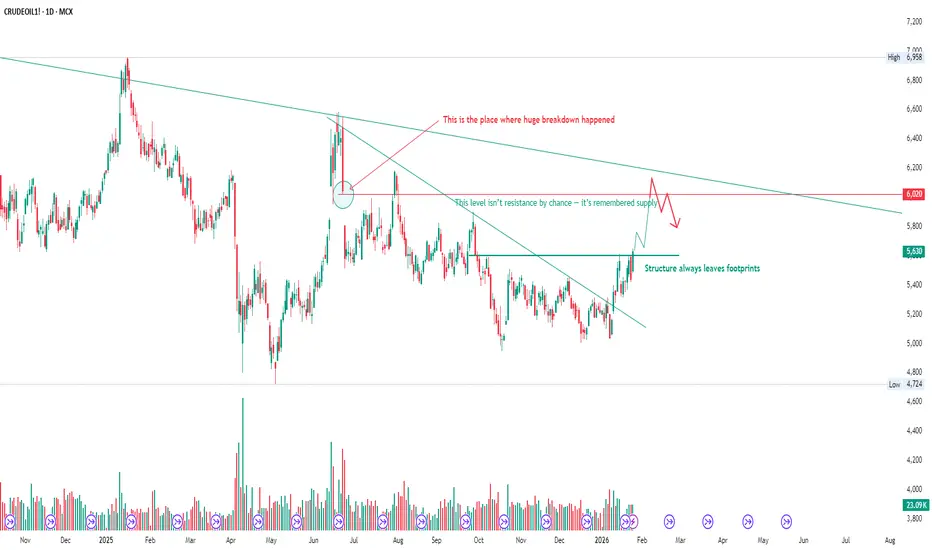
Crude Oil: The Market Is Revisiting the Scene of the BreakdownCrude Oil is revisiting a level where a major structural breakdown occurred in the past.
Markets don’t forget such zones easily. What once triggered aggressive selling often turns into active supply when revisited.
The recent move is not random strength — it’s a retest of prior imbalance, followed by a reaction.
From here, price has two honest options:
• Accept above the breakdown zone and build continuation
• Reject again and rotate back into the range
No prediction, no bias — only structure and reaction.
In commodities, headlines explain moves after they happen.
Structure explains them before.