US Sector CorrelationsA new and interesting way to look at Breadth. As for the usefulness of it, one would have to do some proper backtesting to get a full grasp of the capabilities. This is just a concept currently. But in general, SPX holding near ATHs with very low sector correlations can be a topping indicator. SPX selling off with Correlations all very positive across each sector...can be a sign of an impending bottom. But, needs the "full bake" of proper testing and analysis versus just guessing. I like the concept and want to explore it further, and I will. This is just the start.
Breadth

Мarket Breadth LabelsHistory and credits
The idea about this indicator, came from a friend teodorgun. www.tradingview.com
Special thanks to QuantNomad, whose courses got me started on programming on PineScript. www.tradingview.com
What it does
The indicator plots various values from market breadth indicators.
It shows the % stocks above certain moving averages for different indexes.
The first 3 cells, display the Advance Decline Ratios:
1. Total Advance Decline Ratio
2. NYSE Advance Decline Ratio
3. Nasdaq Advance Decline Ratio
- coloring for these is simple (value > threshold = color is green, value < threshold = color is red)
The rest of the columns display % stocks above the moving averages.
For example a value of 20 in column 4 ("Stocks above 5D MA), means that only 20% of the stocks are above their 5D moving average.
Line 1 shows current value of the indexes.
Line 2 shows value 5days ago (assuming that 5 trading days = 1 trading week).
- Line 1 Coloring: coloring here is divided between 2 tresholds ( value < lower treshold = color is red, value > lower treshold AND value < higher treshold = color is yellow, value > higher treshold = color is green)
- Line 2 Coloring: no coloring logic is applied here.
How to use it
There are several techniques for breadth indicators, many can be read online, but generally these indicators are considered contrarian. This means that high values indicate overbought conditions and low values indicate oversold conditions.

High-Low IndexHello All,
High-Low Index is a breadth indicator based on Record High Percent (RHP). RHP is based on new 52-week highs and new 52-week lows. RHP => 100 * (new highs) / (new highs + new lows). High-Low Index is a 10-day Simple Moving Average of the RHP, which makes it a smoothed version of RHP. You can find many articles about High-Low Index on the net.
High-Low Index above 50 indicates that there are more new highs than new lows, and considered as Bullish.
High-Low Index below 50 indicates that there are more new lows than new highs, and considered as Bearish.
High-Low Index = 0 indicates there is no new highs (0% new highs).
High-Low Index = 100 indicates that there is at least 1 new high and no new lows.
and High-Low Index = 50 indicates that new highs and new lows is equal.
by default 40 cryptos are used in the script and shows High-Low Index for these cryptos. but you can change them as you wish. for example you can set all of them as stocks and see High-Low Index for these stocks.
You can set " Time frame " and the " Length " using the options. For example; if you set " Time frame " = 1 Week and the " Length " = 52 then it finds High-Low Index for 52weeks .
or another example; if you set " Time frame " = 1 Day and the " Length " = 22 the High-Low Indexn it finds High-Low Index for 22days.
You can enable/disable Record High Percent or Simple Moving Average of High-Low Index. Some traders use High-Low Index with its SMA, for example; High-Low Index generates a buy signal when it crosses above its moving average, and a sell signal when it crosses below its moving average.
Optionally you can see the securities in a table on the left bottom, you can change table size by usşng the options.
In the Table, for each security/cell;
=> if background is green then it has New High
=> if background is red then it has New Low
=> if background is gray then no New High, no New Low
=> if background is back then Data is not available for the security
As you can see in the screenshot below, the securities were changed and stocks are used instead of cryptos, so it calculates & shows High-Low Index for these stocks.
you can also find explanation in this screenshot:
Enjoy!

TEWY - Breadth Based Bar ColorNSE:BANKNIFTY1!
⚠ Important: Before going into details of this script, in order to best use this indicator it is VERY VERY important to make some changes to the chart settings as mentioned below.
• REMOVE CANDLE BORDERS from Symbol settings
• CHANGE WICK COLOR to white/black/gray based on the chart theme you use, from Symbol settings
Make sure you have these settings done.
Detail about this indicator
1. This indicator is used to identify the trend based on the momentum of the counter selected.
2. This indicator is calculated differently for indices NSE:NIFTY and NSE:BANKNIFTY. As I take high weightage stock under these indices to get overall indices momentum.
3. I have used the rate of change and RSI of it to calculate momentum.
4. I would typically use this indicator to see momentum on the Monthly and Weekly first and daily timeframe to get proper entry.
5. Also please try to stay in the long position more than the short position as we all know that, the imminent nature of the market is to go upward only.
6. Please try to keep base inputs as defaults, though it allows you to change input parameters like changing the length of momentum indicator or bar color options. Below is the description of each input
• Smoothen: It changes source from CLOSE to OHLC4.
• Signal Length: It's the length(no of candles) for which the momentum is calculated. Like for RSI the default period/length is 14 or for Moving Average indicator default period/length is 9, I simply use 20 as the default length
• Timeframe: If you want to calculate momentum based on the momentum of different time frames.
• Change bar Color: Use the toggle to change the color of the bar. You can uncheck it so that no bar color is changed if you need so
• Set Bar Color Dynamically: With this even though the oscillator is in opposite direction to the trend it takes the candle close into consideration and sets bar color accordingly.
Always respect RISKS and follow stop loss.
Let's understand how to take a position using this indicator
• Long position:-
• If the latest candle color is GREEN and its preceding candle color is RED, then go long in the counter with the strict stop loss(SL) 1% below the preceding RED colored candle.
• Once you are in a long position, trail stop loss(SL) below each red candle you see on the chart.
• Exit strictly if initial SL or trailing SL is hit. And re-create long positions once you see the next green candle.
• Short Position:-
• If the latest candle color is RED and its preceding candle color is GREEN, then go short IF RED COLORED CANDLE LOW IS TAKEN OUT. Exit short once you see a green colored candle.
• Exit strictly if you see a GREEN-colored candle and create a long position.
If you are really interested and need access to this indicator please DM me.
I have given a sample illustrational image below, which should help you understand this indicator.
Best of luck

M.Right Bulls-V-Bears -Tug-of-War- SquidGame Themed(cc)Hello Traders,
I've decided to finally release an indicator I've spent several hours working to get just right and as far as I know, there isn’t one as accurate. And.... decided to add a little Squid Game theme to it just for fun.
……"The game is Tug of War, the side that pulls the rope from the middle to their side wins. Let the game begin."……
This indicator is not a typical one.
1) It shows visually when Bull volume or Bear volume is ‘pulling the rope to their side’.
2) It uses several different formulas to get an accurate read on the level of volume, but still keeps peaks and troughs within 100 for easy reading.
3) Update: It was originally meant to be used strictly with other indicators, but it can now be used as a standalone indicator.
Legend:
1) The top line signals give the major signals –
a. Red cross = Bearish volume strength and continuation.
b. Green cross = Bullish volume strength and continuation.
i. + Green Dot inside enhances signal.
ii. + Red Dot inside weakens signal.
c. Blue circle = Can indicate the beginning of a reversal to the upside or downside.
d. Pink circle = Can indicate the beginning of a reversal to the downside.
2) The Bottom signals are triggered when one circle-rope crosses over the other, these signals give confirmation to the top line signals – Red bearish / Green bullish.
3) As shown on the chart, the Reversal setup usually consists of a blue circle, followed by a red or green cross, then confirmation from the bottom signal.
4) Without the signals: green obviously is Bullish especially above the threshold set --Red bearish. The regular rope gives trend indication.
I've added tooltips to make it easy to understand, feel free to leave a comment if you still have a question!
Features:
-Tooltips (hover over - Info) for understanding.
-Works well on all timeframes; even 5min, I made a tooltip for recommended lengths.
-Customizable Signals; with the ability to turn on and off.
-Reversal signals: Pink and Blue circles can indicate reversals coming.
-Works well as a leading standalone indicator.
-Adjustable top signal row.
-Highlight background.
-Alerts
-Rules added (hover over).
Cheers,
Mike

[Unxi]McClellan Summation Index for DAX 30 (GER30) [modified]About McClellan Summation Index
The McClellan Summation Index is a market breadth indicator which was developed by Sherman and Marian McClellan. It is based on the McClellan Oscillator and add its values together, effectively running a total. The index goes up when the McClellan Oscillator is positive and goes down when it is negative. Signals can be derived from the index crossing the middle line (bullish when it's crossing up and bearish when it's crossing down). Other potential signals include divergences and overbought and oversold conditions. The indicator is best used in combination with other analysis techniques.
About this implementation
This version here is a modification of the McClellan Summation Index.
It runs the simple version of the McClellan Oscillator and uses the simple method to calculate the Summation Index. No ratios are used in this implementation.
Further information:
- It can only be used on the DAX index ( DAX 30 or GER 30)
- It only considers the DAX 30 stocks
- The data window will provide a summary about rising and declining stocks
- The data window will output the last change for each of the 30 stocks
- The script is pretty slow because it has to calculate the change for each bar individually (instead of receiving a complete calculation from the stock exchange).
DISCLAIMER
This script was mainly written for educational purposes (training myself how to write custom indicatotors).
As you can see, the code is really messy.
FOR YOUR INFORMATION: This script will work on any time period. It is recommended to use it with timeperiod = 1d, though. Just use whatever timeperiod you are comfortable with, the indicator will automatically adjust accordingly.
Credits
Based on the simple version of aftabmk and of code from lazybear.

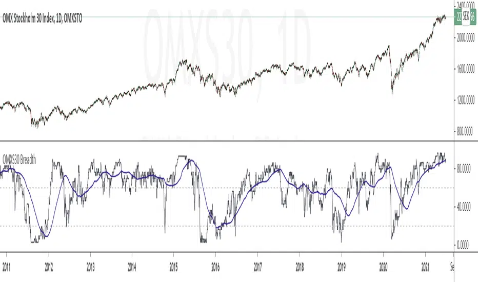
OMXS30 BreadthThis is a simple Breadth Indicator for the OMXS30 index. It shows how many percentage of the stocks in the index that are above a specified simple moving average (the default value is 200, can be changed in the settings for the indicator).
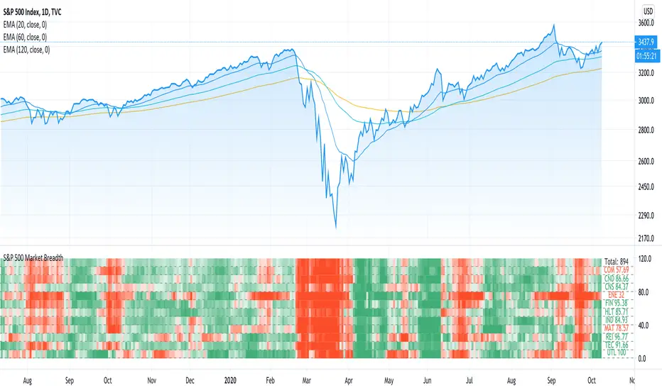
TradiKator 02 S&P500 Market BreadthTradiKator 02 S&P500 Market Breadth (MB 02 by TK) is a visual indicator that plots S&P500 Market Breadth ( the percentage of S&P500 securities that is above a certain SMA line ).
Market breadth indicates the wave-induced motion of the whole market.
Q&A
Function and Setting
1. 11 sectors for the S&P500's securities
You can open this indicator by multi times to check the different settings with "above ? SMA" in same time like the picture shows "above 50 days , above 20 days and above 20 days plot in lines"
Also, it is possible to combine this indicator with multiple setting to give the sum of the different "above? SMA"'s the result.
2. 6 choices for above ? SMA
Above 5 days, Above 20 days, Above 50 days, Above 100 days, Above 150 days or Above 200 days,
3. 2 methods to visualize the study result
Colorful grid, Green = more securities above ? SMA , Red = more securities below ? SMA
Line plot, High = more securities above ? SMA , Low = more securities below ? SMA
TradiKator is Traders' indicator.
Please visit TraiKator for more free scripts.
We also support the Chinese.
Happy new year!
Wishing you a great and successful journey in the Chinese Zodiac Bull Year.
This script is a revised version of jchang274's Multi-Sub script.
Thanks to jchang274's contribution.

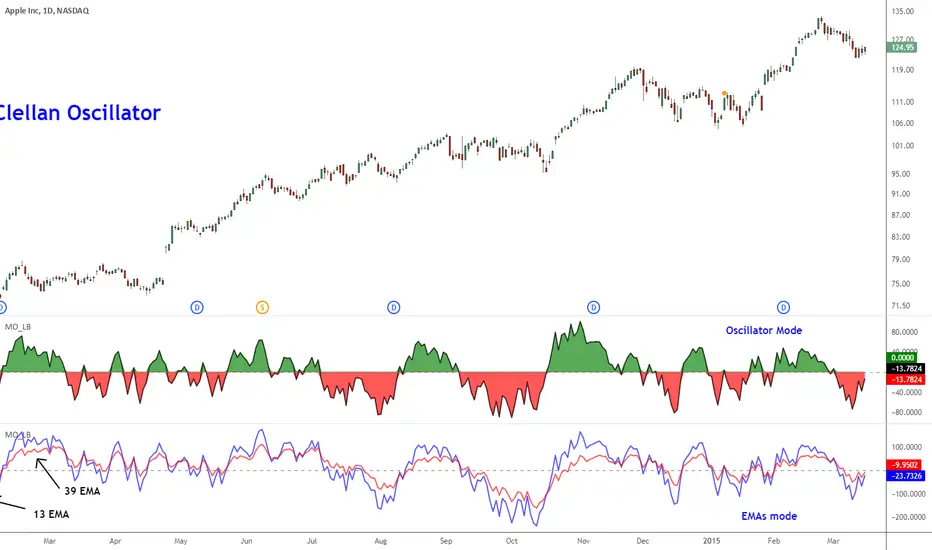
McClellan Oscillator [CC]The McClellan Oscillator was created by Sherman and Marian McClellan and it is essentially a MACD of the advancing and declining symbols of the day and is best used as a comparison with the biggest stocks such as my example Apple but that is just my opinion. I pulled the symbol names from a Trading View blog so I'm not 100% sure if they are accurate so please let me know if I'm wrong. Buy when the indicator is over 0 and sell when it falls below 0 but keep in mind that these values are for the market itself and not the individual symbol.
This was a special request so let me know if you would like me to publish more scripts or if you want something custom done!
Note: I'm republishing this because the original script couldn't be found in searches so this will fix that.

Breadth Indicator : RVC-BNifty-Adv-Dec-LineBreadth Indicators
Summary : Script calculates Advance and Declain value based on weightage of each Bank share in BankNifty Index
Bank NIfty is not an asset and it does not have value.
It is composition based on multiple bank stocks with different weightage.
This tool display the indicator based on "Number of Stocks Moving on UP TICK" and "Number of Stocks Moving on DOWN TICK"
Currently this calculation is based on 12 stocks based on their weightage.
Axis Bank , Bank of Baroda
Federal Bank, HDFC Bank
ICICI Bank, IDFC Bank Ltd.
IndusInd Bank, Kotak Mahindra Bank
Punjab National Bank , RBL Bank
State Bank of India (SBI), Yes Bank

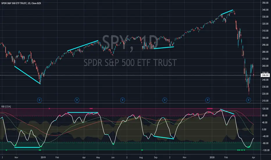
Relative Breadth IndexRBI is an intricate oscillator that calculates relative breadth of an asset according to its trend. If you want to detect reversals, continuations, trend strength, divergences, and confirm other signals, read on.
Relative Breadth Index has 4 main components:
Fast (White), Medium (Green), and Slow (Red) Oscillators
Overbought and Oversold Thresholds (Shaded Areas)
Pulse (Yellow)
Divergence Indicator (Rectangles)
How does it work?
The Medium and Slow Oscillators indicate the general trend.
The Fast Oscillator shows what price action is doing in reference to that trend.
Pulse suggests the probability that the current move (Fast) is an end of the trend defined by the Medium and Slow lines.
The Divergence Indicator also suggests a reversal and to look for divergences between the Fast line and price action.
What are the signals?
In general: green signals are bullish, red are bullish
Rectangles: Look for a divergence
Circles: Sell and buy signals
Triangles: Stronger sell and buy signals
Triangles: Reversal signal
What about the Pulse?
If Pulse is low, a signal may only be a short-lived move.
If Pulse is high, a signal may be a full-on trend reversal.
For access, please DM us or visit the link below in our Signature.

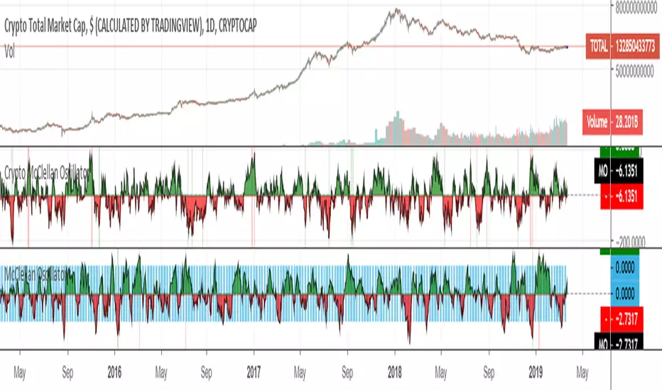
Crypto McClellan OscillatorMcClellan Oscillator for cryptocurrency, taking into account only the top 40 cryptos.
Original code was by LazyBear.
McClellan Oscillator [LazyBear ~ modified]The McClellan Oscillator is a market breadth indicator developed by Sherman and Marian McClellan.
It is calculated from Net Advances, which is the number of advancing issues minus the number of declining issues. Subtracting the 39-day exponential moving average of Net Advances from the 19-day exponential moving average of Net Advances forms the oscillator.
The McClellan Oscillator can be traded with breadth thrusts, centerline crossovers and divergences.
The original code was written by LazyBear - I just modified it to add together all advancing and declining issues from all stock exchanges (NYSE + NASDAQ + others), to make it available on the hourly time frame and also add alerts.
Godmode 4.0.2 [Supply/Demand]First off, a huge thank you to the following people:
LEGION:
LazyBear: www.tradingview.com
xSilas: www.tradingview.com
Ni6HTH4awK: www.tradingview.com
sco77m4r7and:
SNOW_CITY: www.tradingview.com
oh92: www.tradingview.com
alexgrover: www.tradingview.com
cI8DH: www.tradingview.com
DonovanWall: www.tradingview.com
shtcoinr: www.tradingview.com
This is the third iteration of Godmode. This time I borrowed the method used by shtcoinr to render supply/demand, resistance and support zones. The idea here is to input the appropriate benchmark tickerid to the asset class you're trading and to paint zones according to the price activity of the selected tickerid. This works very well trying to paint meaningful zones against noisy stocks, currencies, commodities etc. Use a correlation coefficient to determine the best benchmark for your asset class.
Want to Learn?
If you'd like the opportunity to learn Pine but you have difficulty finding resources to guide you, take a look at this rudimentary list: docs.google.com
The list will be updated in the future as more people share the resources that have helped, or continue to help, them. Follow me on Twitter to keep up-to-date with the growing list of resources.
Suggestions or Questions?
Don't even kinda hesitate to forward them to me. My (metaphorical) door is always open.

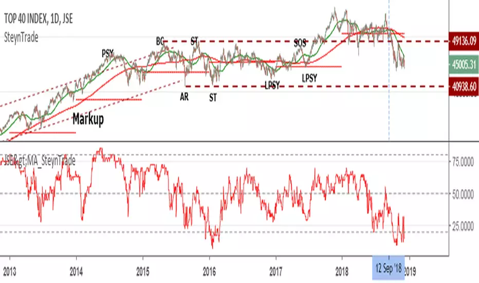
JSE Market Breadth Stocks>MAThis indicator is for the Johannesburg Stock Exchange (JSE) and indicates the number of stocks in the Top 40 Index above its selected Smooth Moving Average (SMA). Typically the 200SMA is used to see the longer term health of the market and the 50SMA for a short term view. Currently the market has reached a point that less than 2% of stocks were above their 200SMA which is the lowest since 2013.
Modulate 40 SymbolsModulates (multiplies) 40 securities
Useful for assessing breadth
Defaults with the Top 40 holdings in SPX
Change symbols to measure breadth in an ETF
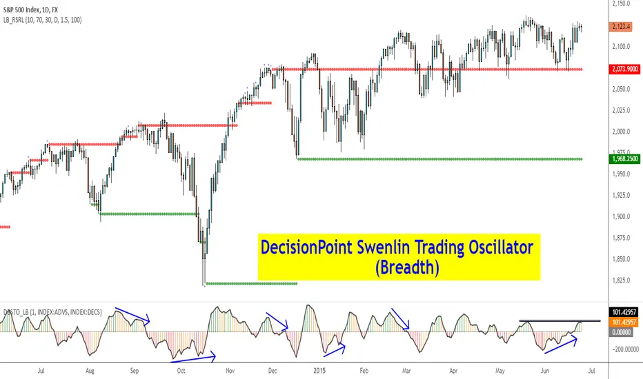
DecisionPoint Breadth Swenlin Trading Oscillator [LazyBear]DecisionPoint Swenlin Trading Oscillator can be used to identify short-term tops and bottoms. This is a breadth indicator. STO is designed to be calculated using either issues or volume, I will post a follow up indicator that makes use of volume.
You can read about the interpretation of the signals (& gotchas) in the link below.
I have added support for NYSE / NASD / AMEX and also a combined mode. You can specify custom advancing/declining mkt symbols too.
More Info:
stockcharts.com
List of my public indicators: bit.ly
List of my app-store indicators: blog.tradingview.com
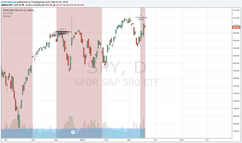
Hindenburg Omen - CleanThe Hindenburg Omen, is market breadth signal that marks when a critical set of market factors that can create the necessary conditions for a stock market crash.
Based on Technical Breadth Indicators of the NYSE, a broad equity market index.
More information on the conditions of the Hindenburg Omen can be found here,
en.wikipedia.org
www.investopedia.com
Please use at your own discretion.
If you find my work useful, my BTC tip jar is @ 1JSKKkqWCArgyqsZUQEdVYEYBbTGhw8sDp
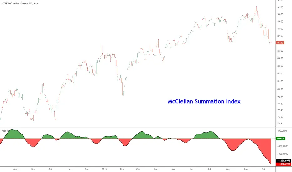
McClellan Summation Index [LazyBear]McClellan Summation Index is a breadth indicator derived from McClellan Oscillator ().
The Summation Index is simply a running total of the McClellan Oscillator values. Even though it is called a Summation Index, the indicator is really an oscillator that fluctuates above/below zero. As such, signals can be derived from bullish/bearish divergences, directional movement and centerline crossovers. A moving average can also be applied to identify upturns and downturns.
Indicator uses the advancing/declining stocks from NYSE by default, but you can change them to any market in the options dialog.
More info:
- www.mcoscillator.com
- stockcharts.com
Complete list of my indicators:
docs.google.com
McClellan Oscillator [LazyBear]Developed by Sherman and Marian McClellan, the McClellan Oscillator is a breadth indicator derived from Net Advances, the number of advancing issues less the number of declining issues. Subtracting the 39-day exponential moving average of Net Advances from the 19-day exponential moving average of Net Advances forms the oscillator.
As the formula reveals, the McClellan Oscillator is a momentum indicator that works similar to MACD.
McClellan Oscillator signals can be generated with breadth thrusts, centerline crossovers, overall levels and divergences.
I have added the following options:
- Can choose Advancing/Declining issues of any market. Default is NYSE.
- Can show the EMAs and/or oscillator.
- Ratio Adjusted Calculation mode (as explained in the stockcharts link below) or default mode.
- Can use custom timeframe. Default is chart timeframe.
More info:
stockcharts.com
Complete list of my indicators:
docs.google.com
Thanks @mpinky for pointing out the StockCharts version of this oscillator.