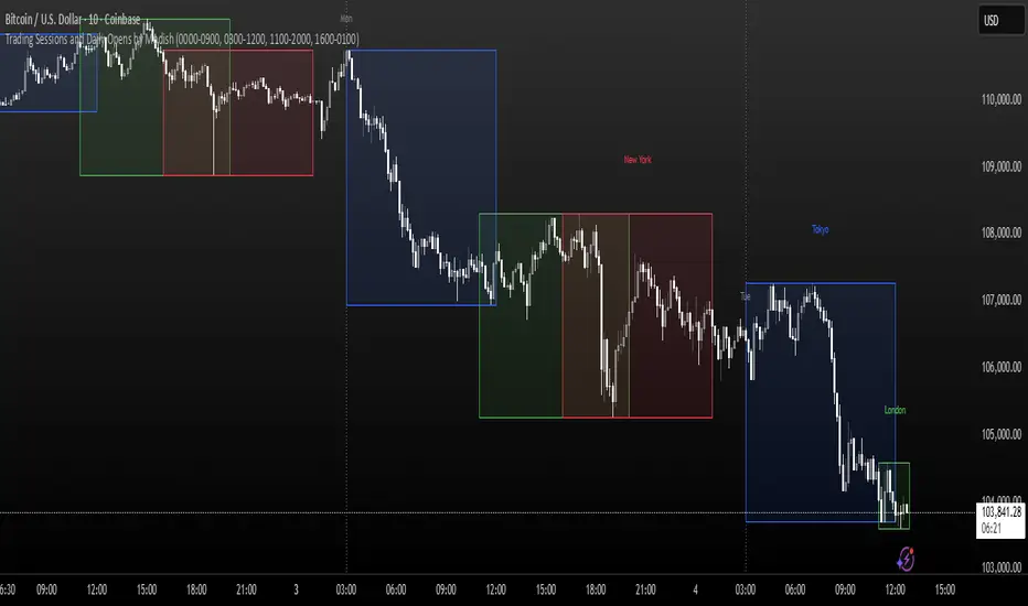
Trading Sessions and Daily Opens by ModishThis Pine Script indicator overlays key forex trading sessions (Sydney, Tokyo, London, New York) on your chart using Kenyan time (EAT/UTC+3), with customizable translucent boxes, borders, and labels positioned neatly above each session for clear visualization. It also plots dotted vertical lines at daily opens (Monday-Friday) with abbreviated day labels for quick reference. Toggle sessions on/off, adjust colors, and ensure seamless integration with candlesticks for dynamic, real-time analysis. Ideal for session-based traders seeking precise timing and structure.
Breadth Indicators
Santhosh VWAP + 3 EMA + Buy Sell AlertI have combined VWAP and EMA , along with this generated buy and sell alert based on ATR . Best for Scalping
Quanloki QQE + Smart TP/SL (v6.1 Entry Option)Version v6.1 has more complete functions. You can choose open next to enter prices faster. For any information about orders or indicators, you can contact tele @Quanloki for instructions and refunds.
PsyExpansionPanel_v5_KohlhaasThe PsyExpansionPanel measures the energy in the market, combining volatility, momentum, and volume into one composite signal.
It helps identify when a move is genuine and powerful — not just visually strong but backed by volatility and participation.
⸻
⚙️ Core Idea
When the blue line (Expansion Score) rises above the orange line (Threshold),
the market enters an expansion phase — volatility, speed, and participation all increase together.
This is the moment when a move becomes serious and emotionally charged.
⸻
📊 What Each Line Means
• Blue line → Expansion Score (combined energy from ATR%, ROC, and Volume)
• Orange line → Threshold (e.g. 0.75) — when crossed, expansion is active
• Gray line → Neutral zone — calm market, low activity
When the blue line crosses above the orange threshold,
the background turns orange, signaling: Expansion Active.
⸻
🧠 Market Psychology Behind It
During expansion, three things happen at once:
1. Volatility (ATR%) increases → traders become emotional (fear or greed rises)
2. Momentum (ROC) accelerates → price moves faster than usual
3. Volume rises above average → more participants join the move
This combination signals a transition from equilibrium to collective emotional action —
a moment when trends or reversals often begin.
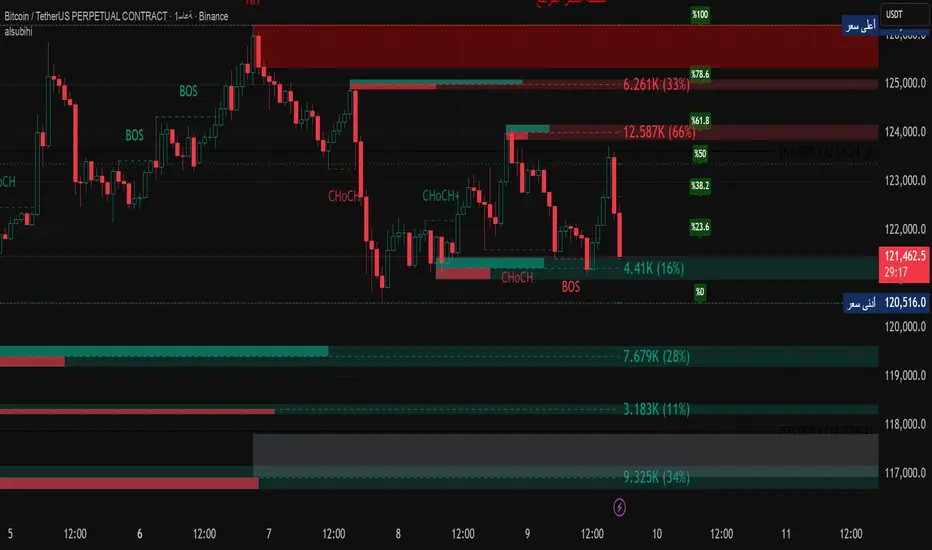
alsubihi.2Advanced Market Structure Indicator
This custom-built indicator provides an in-depth analysis of market structure changes to help traders identify key price levels, trends, and potential reversals. It combines multiple tools to give you a clearer picture of market behavior and improve your decision-making process.
Key Features:
Break of Structure (BOS):
The BOS indicator identifies significant changes in market structure, marking when the price breaks previous highs or lows, signaling a potential trend shift. Green lines represent upward breaks (bullish trend), while red lines show downward breaks (bearish trend).
Change of Character (Choch):
This feature helps to highlight subtle shifts in market dynamics. A change in character (Choch) indicates when the market transitions between bullish or bearish behavior. Green indicates a bullish character change, while red shows a bearish one.
Premium vs Discount Zones:
The indicator identifies price levels that are considered 'Premium' (high price levels) and 'Discount' (low price levels), assisting traders in recognizing overbought or oversold conditions and making better trading decisions based on market conditions.
Support and Resistance Levels:
Automatically drawn support and resistance lines are included to show critical price areas where reversals or breakouts might occur, helping traders anticipate price action.
Equilibrium Zone:
This is the price level where supply and demand balance out, acting as a key reference point for identifying potential market reversals or continuation.
Why Use This Indicator?
This all-in-one tool helps traders make informed decisions by combining multiple technical analysis concepts into a single, easy-to-use indicator. It reduces the complexity of analyzing price action and allows traders to quickly identify potential entry and exit points with greater accuracy.
Whether you are an experienced trader or just starting, this indicator provides you with the essential tools needed to identify trend shifts, key support and resistance zones, and price extremes, leading to more profitable trading decisions.
14 سبتمبر
ملاحظات الأخبار
📌 Summary of the Indicator
Market Structure (MS):
Detects swing & internal BOS, CHoCH, CHoCH+. Can color candles or bars by trend.
Multi-Timeframe Scanner (MTF):
Shows trend direction on multiple TFs (5m → 1W).
Highs/Lows (HTF):
Plots previous Day/Week/Month/Year highs & lows as liquidity levels.
Order Blocks (OB):
Draws volumetric order blocks, with filters (BOS/CHoCH), overlap rules, mitigation, and volume metrics.
Fair Value Gaps (FVG/VI/OG):
Detects price imbalances, extends them, and removes when mitigated.
Accumulation/Distribution Zones:
Highlights Wyckoff-style accumulation (green) or distribution (red).
Equal Highs/Lows (EQH/EQL):
Marks liquidity pools at equal highs or lows.
Premium/Discount Bands:
Splits swing range into premium, equilibrium, and discount zones.
RSI & ADX:
Momentum filters for overbought/oversold and trend strength.
DEMA-ATR Baseline:
Adaptive EMA with ATR constraints; alerts for trend shifts.
Regression Channel:
Auto-fits best regression length using Pearson-R, shows channel with std bands.
Fibonacci Ladder:
Auto plots levels 0.236 → 1.618 based on recent swing.
👉 In short: it’s a full SMC toolkit — structure + liquidity + OB/FVG + momentum filters + extra tools (fib, regression, ATR baseline).
📌 ملخص المؤشر
البنية الهيكلية (Market Structure):
يحدد BOS و CHoCH داخلي وسوينغ، ويقدر يلوّن الشموع حسب الاتجاه.
سكانر متعدد الأطر (MTF):
يعرض الاتجاه على عدة فريمات من 5m إلى 1W.
هاي/لو من أطر عليا (HTF Highs/Lows):
يرسم قمم وقيعان اليوم/الأسبوع/الشهر/السنة السابقة (مناطق سيولة).
بلوكات الطلب/العرض (Order Blocks):
يرسم بلوكات مع فلاتر (BOS/CHoCH)، خيارات تداخل، إزالة عند الكسر، ويعرض حجم التداول بداخلها.
الفجوات السعرية (FVG/VI/OG):
يحدد الفجوات غير المغطاة، يمددها، ويحذفها عند التغطية.
مناطق التجميع/التوزيع:
يوضح مناطق Wyckoff (أخضر للتجميع، أحمر للتوزيع).
قمم وقيعان متساوية (EQH/EQL):
يميز مناطق السيولة فوق القمم أو تحت القيعان المتساوية.
مناطق Premium/Discount/Equilibrium:
يقسم آخر نطاق إلى مناطق غالية (Premium)، توازن (Equilibrium)، ورخيصة (Discount).
RSI و ADX:
مؤشرات إضافية لقياس التشبع وقوة الاتجاه.
خط DEMA-ATR:
EMA متكيف مع قيود ATR، يتغير لونه حسب الاتجاه، مع تنبيهات جاهزة.
قناة الانحدار (Regression):
تختار أفضل طول باستخدام معامل الارتباط Pearson-R، وترسم قناة مع انحراف معياري.
فيبوناتشي (Fibonacci):
يرسم مستويات 0.236 حتى 1.618 حسب آخر حركة سعرية.
👉 باختصار: المؤشر هو أداة SMC متكاملة تجمع الهيكل، السيولة، البلوكات، الفجوات، والمؤشرات المساعدة.
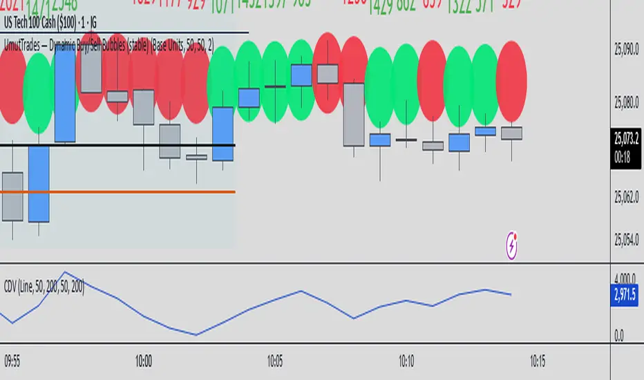
UmutTrades — Dynamic Buy/Sell Bubbles (stable)This indicator detects large buy and sell transactions based on user-defined thresholds (either in base units or quote value).
It places colored bubbles on the chart where those big orders occur green for buys and red for sells with the bubble’s color intensity and size reflecting how large the order is relative to your threshold.
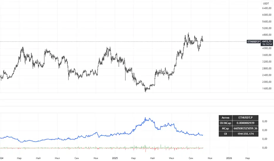
VSTrade OMCThe indicator calculates the ratio of Open Interest (OI) of a futures contract to the market capitalization (Market Cap) of the spot asset. OI is the number of open (unclosed) futures positions in the market, expressed in contracts. Market Cap is the total value of the asset (price * circulating supply). The ratio shows how "overheated" or "interesting" the futures market is relative to the size of the asset.This is not a direct trading signal, but a tool for analyzing liquidity, speculation, and market sentiment.
Индикатор рассчитывает отношение Open Interest (OI) фьючерсного контракта к рыночной капитализации (Market Cap) спотового актива. OI — это количество открытых (незакрытых) фьючерсных позиций на рынке, выраженное в контрактах. Market Cap — общая стоимость актива (цена * circulating supply). Отношение (ratio) показывает, насколько "перегрет" или "интересен" рынок фьючерсов относительно размера актива.
Это не прямой торговый сигнал, а инструмент для анализа ликвидности, спекуляции и рыночных настроений.
Sentiment NavigatorFREE|SuperFundedSentiment Navigator — Momentum × Volatility Heatmap
What it is
Sentiment Navigator blends momentum (RSI) with volatility (ATR normalized by price) to visualize market psychology using a background heatmap and a lower oscillator.
・Background: quick read of the market’s “temperature” → Extreme Greed / Greed / Neutral / Fear / Extreme Fear.
・Oscillator: a bounded sentiment score from -100 to +100 showing bias strength and potential extremes.
Why this is not a simple mashup
Instead of showing RSI and ATR separately, this tool integrates them into a single, weighted score and a state machine:
・Context-aware weighting: When volatility is high (ATR vs its SMA baseline), the score is amplified, reflecting that momentum matters more in turbulent regimes.
・Unified states: RSI thresholds classify regimes (Greed/Fear) and are conditioned by volatility to promote Extreme states only when justified.
・Actionable cues: Reversal labels appear at the extreme levels with candle confirmation to reduce noise.
How it works (concise)
1. Momentum: RSI(len) (default 21).
2. Volatility: ATR(len)/close*100 (default ATR=14), smoothed by SMA(volSmaLen) and compared using volMultiplier.
3. Sentiment score: transform RSI to (-100..+100) via (RSI-50)*2, then amplify ×1.5 when high volatility. Finally clamp to .
4. States:
・RSI > greedLevel → Greed (upgraded to Extreme Greed if high vol)
・RSI < fearLevel → Fear (upgraded to Extreme Fear if high vol)
・else Neutral
5. Plotting:
・Oscillator (area) with 0-line and dotted extreme bands.
・Background color by state (greens for Greed, reds for Fear, gray for Neutral).
6. Signals (optional):
・Buy: crossover(score, -extremeGreedLevel) and close > open → prints ▲ at -extremeGreedLevel
・Sell: crossunder(score, extremeGreedLevel) and close < open → prints ▼ at +extremeGreedLevel
Parameters (UI mapping)
Core
・RSI Length (rsiLen)
・ATR Length (atrLen)
・Volatility SMA Length (volSmaLen)
・High-Vol Multiplier (volMultiplier)
State thresholds
・Extreme Greed (extremeGreedLevel)
・Greed (greedLevel)
・Fear (fearLevel)
・Extreme Fear (extremeFearLevel)
Display
・Show Background (showBgColor)
・Show Reversal Signals (showSignals)
Practical usage
・Regime read: Treat greens as risk-on bias, reds as risk-off, gray as indecision.
・Entries: Use ▲/▼ as triggers, not commands—wait for price action (wicks/engulfings) at structure.
・Extreme management: At Extreme states, favor mean-reversion tactics; in plain Greed/Fear with low vol, trends may persist longer.
・Tuning:
・Raise greedLevel/fearLevel to reduce signals.
・Increase volMultiplier to demand stronger vol for “Extreme” states.
Repainting & confirmation
Signals rely on cross events of the oscillator; judge on bar close for stricter rules. Background/state can change intrabar as RSI/ATR evolve.
Disclaimer
No indicator guarantees outcomes. News/liquidity can override signals. Trade responsibly with proper risk controls.
Sentiment Navigator — クイックガイド(日本語)
概要
本インジは RSI(モメンタム) と ATR/価格(ボラティリティ) を統合し、背景のヒートマップと下部オシレーターで市場心理を可視化します。
・背景色:極度の強欲 / 強欲 / 中立 / 恐怖 / 極度の恐怖 を直感表示。
・オシレーター:-100〜+100 のスコアでバイアスの強さと過熱を示します。
独自性・新規性
・高ボラ状態ではスコアを増幅し、同じRSIでも環境次第で体感インパクトを反映。
・RSIしきい値×ボラで極端ゾーンの発生を制御し、意義のあるExtremeのみ点灯。
・反転ラベルは極端レベルのクロス+ローソク条件で点灯し、ノイズを抑制。
仕組み(要点)
1. RSI を算出。
2. ATR/close*100 を SMA と比較し、しきい値倍率で高ボラを判定。
3. score = (RSI-50)*2 を 高ボラで×1.5、 にクランプ。
4. 状態:RSI>Greed → Greed/Extreme Greed、RSI
High Volume & Near All-Time HighThe **High Volume & Near All-Time High Screener** is a simple yet powerful Pine Script tool designed to help traders identify stocks showing strong price momentum and trading activity. This screener automatically scans multiple tickers that you define in the settings and highlights those meeting two key conditions — daily trading volume greater than **500,000 shares** and the closing price being **within a set percentage (default 2%) of its all-time high**. The results are displayed in an easy-to-read table directly on your chart, making it ideal for traders who want to quickly spot potential breakout stocks without switching between multiple charts.
**How to Use:**
To use this script, open your **TradingView Pine Editor**, paste the code, and click **“Add to Chart.”** Make sure your chart is set to the **Daily timeframe (1D)**, as the script pulls daily data automatically. You can customize the list of symbols, the minimum volume threshold, and the proximity percentage in the settings panel to match your trading style. Once added, the screener will display a table on the right side of your chart showing each symbol, its latest closing price, and whether it currently meets the breakout conditions. A ✅ mark indicates that the stock meets both criteria. This tool works best for swing traders and momentum investors who want to focus on high-volume stocks nearing new highs for potential entries.

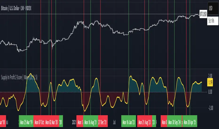
Supply In Profit Z-Score | Wave BackgroundSupply in Profit Z-Score
Modified by Quant_Hustler | Original by QuantChook
What it does
The Supply in Profit Z-Score measures how extreme the balance is between BTC addresses in profit versus those in loss compared to historical norms.
It highlights periods of excessive optimism or pessimism, helping traders identify market sentiment extremes that can signal potential turning points or confirm ongoing trends.
This version is designed for longer-term strategies, using smoothing and statistical normalization to focus on broader market sentiment cycles rather than short-term noise.
How it works
--Data Retrieval: Pulls on-chain data showing the percentage of Bitcoin addresses currently in profit and in loss.
--Spread Calculation: Finds the difference between the two to gauge overall sentiment balance.
--Alpha Decay Adjustment (optional): Normalizes extreme values to stabilize the signal over time.
--Smoothing: Applies a moving average to filter daily volatility and improve long-term clarity.
--Z-Score Conversion: Standardizes the data to show how far current sentiment deviates from historical averages.
--Visualization: Plots the result around a neutral midpoint (zero line) — positive values indicate profit dominance, negative values indicate loss dominance.
How to use it
--Above Zero: More addresses in profit → bullish sentiment and strong trend conditions.
--Below Zero: More addresses in loss → bearish sentiment or potential accumulation zones.
--Extreme Values: Mark overly optimistic or capitulated sentiment, often preceding major reversals.
Why use it in trend following
--This indicator serves as an on-chain sentiment confirmation layer for trend-following systems, especially on higher timeframes (daily or weekly).
--In uptrends, sustained positive readings confirm market strength and investor confidence.
--In downtrends, persistent negative readings confirm weakness and help avoid false reversal signals.
--Divergences between price and sentiment (e.g., rising price but weakening sentiment) often signal momentum loss or potential trend transitions.
Modifications from the original by QuantChook
Added EMA, adaptive Z-score smoothing and capping to reduce volatility and noise.
Introduced a wave-style visualization for intuitive sentiment shifts.
Improved calculation structure and upgraded for Pine Script v6 efficiency.
Tuned signal responsiveness and smoothing parameters for long-term trend accuracy.
Simplified user inputs and grouping for easier customization and integration.
In summary:
A refined, statistically grounded on-chain sentiment oscillator — originally developed by QuantChook and enhanced by Quant_Hustler — built to support long-term trend-following strategies by quantifying Bitcoin market sentiment through real-time profit and loss dynamics.
ULTIMATE Smart Trading Pro 🔥
## 🇬🇧 ENGLISH
### 📊 The Most Complete All-in-One Trading Indicator
**ULTIMATE Smart Trading Pro** combines the best technical analysis tools and Smart Money Concepts into a single powerful and intelligent indicator. Designed for serious traders who want a real edge in the markets.
---
### ✨ KEY FEATURES
#### 💰 **SMART MONEY CONCEPTS**
- **Order Blocks**: Automatically detects institutional zones where "smart money" enters positions
- **Break of Structure (BOS)**: Identifies structure breaks to confirm trend changes
- **Liquidity Zones**: Spots equal highs/lows areas where institutions hunt stops
- **Market Structure**: Visually displays bullish (green background) or bearish (red background) structure
#### 📈 **ADVANCED TECHNICAL INDICATORS**
- **RSI with Auto Divergences**: Classic RSI + automatic detection of bullish and bearish divergences
- **MACD with Signals**: Identifies bullish and bearish crossovers in real-time
- **Dynamic Support & Resistance**: Adaptive zones with intelligent scoring based on volume, multiple touches, and ATR
- **Fair Value Gaps (FVG)**: Detects unfilled price gaps (imbalance zones)
#### 📐 **AUTOMATIC TOOLS**
- **Auto Fibonacci**: Automatically calculates Fibonacci retracement levels on the last major trend
- **Pivot Points**: Daily, Weekly, or Monthly pivot points (PP, R1, R2, S1, S2)
- **Pattern Finder**: Automatically detects candlestick patterns (Hammer, Shooting Star, Engulfing, Morning/Evening Star) and chart patterns (Double Top/Bottom)
---
### 🎯 HOW TO USE IT
#### Quick Setup:
1. **Add the indicator** to your chart
2. **Open Settings** and enable/disable modules as needed
3. **Adjust parameters** for your trading style (scalping, swing, day trading)
#### Optimal Trading Setup:
🔥 **ULTRA STRONG Signal** when you have:
- An institutional **Order Block**
- Aligned with a **Support/Resistance** tested 3+ times
- An unfilled **FVG** nearby
- An **RSI divergence** confirming the reversal
- On a key **Fibonacci** level (50%, 61.8%, or 78.6%)
- Favorable market structure (green background for buys, red for sells)
---
### 💡 UNIQUE ADVANTAGES
✅ **Adaptive Intelligence**: Automatically adjusts to market volatility (ATR)
✅ **Volume Filters**: Validates important levels with volume confirmation
✅ **Multi-Timeframe Ready**: Works on all timeframes (1m to 1M)
✅ **Complete Alerts**: Notifications for all important signals
✅ **Clear Interface**: Emojis and colored labels for quick identification
✅ **Intelligent Scoring**: Levels ranked by importance (🔴🔴🔴 = very strong)
✅ **100% Customizable**: Enable only what you need
---
### 🎨 SYMBOL LEGEND
**Smart Money:**
- 🟢 OB = Bullish Order Block
- 🔴 OB = Bearish Order Block
- BOS ↑/↓ = Break of Structure
- 💧 LIQ = Liquidity Zone
**Candlestick Patterns:**
- 🔨 = Hammer (bullish signal)
- ⭐ = Shooting Star (bearish signal)
- 📈 = Bullish Engulfing
- 📉 = Bearish Engulfing
- 🌅 = Morning Star (bullish reversal)
- 🌆 = Evening Star (bearish reversal)
**Indicators:**
- 🚀 MACD ↑ = Bullish crossover
- 📉 MACD ↓ = Bearish crossover
- ⚠️ DIV = Bearish RSI divergence
- ✅ DIV = Bullish RSI divergence
**Support & Resistance:**
- 🟢/🔴 S1, R1 = Support/Resistance
- 🟢🟢🟢/🔴🔴🔴 = VERY strong level (3+ touches)
- (×N) = Number of times touched
---
### ⚙️ RECOMMENDED SETTINGS
**For Scalping (1m - 5m):**
- SR Lookback: 15
- Structure Strength: 3
- RSI: 14
- Volume Filter: ON
**For Day Trading (15m - 1H):**
- SR Lookback: 20
- Structure Strength: 5
- RSI: 14
- All filters: ON
**For Swing Trading (4H - Daily):**
- SR Lookback: 30
- Structure Strength: 7
- Pattern Lookback: 100
- Fibonacci: ON
---
### 🚨 DISCLAIMER
This indicator is a decision support tool. It does not guarantee profits and does not constitute financial advice. Always test on a demo account before real use. Trading involves significant risks.
---
## 📞 SUPPORT & UPDATES
For questions, suggestions, or bug reports, please comment below or contact the author.
**Version:** 1.0
**Last Updated:** October 2025
**Compatible:** TradingView Pine Script v6
---
### 🌟 If you find this indicator useful, please give it a 👍 and share it with other traders!
**Happy Trading! 🚀📈**

MACD cross over Buy/SellThis Indicator is purely on buying and selling the Script based on the MACD crossover Signals, which can be used for Scalping and finding the trend of the script for short and long term. When the MACD Line crosses the Signal line upwards, the script will move towards higher, and will move towards Lower when it crosses downwards. It's simple. Particularly, when the MACD line Crosses above the zero line after crossing the Signal line, the momentum will be high. Whereas when the MACD line Crosses below the zero line after crossing the Signal line downward, the momentum of falling will be high.

Niveles Históricos + EMA 200 (zoom fijo) by flavexIndicador estrategia minimos y maximos diarios de 4 h. muestra ema 200 suavizada.

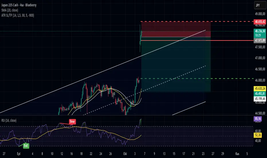
ATR-Based Stop Loss & TP (Last Bar Only, Styled, Dynamic RR)ATR-Based SL/TP (Last Bar Only, Styled, Dynamic RR)
This indicator calculates SL and TP levels based on the 30-bar Average True Range (ATR) and displays them as horizontal lines on the chart.
Features:
- Separate SL and TP lines for Long and Short positions.
- Long SL: red solid line
- Long TP: green solid line
- Short SL: red dashed line
- Short TP: green dashed line
- Lines extend to the right, based on the last bar only.
- Labels are displayed to the right of the lines and remain fixed.
- Risk:Reward ratio (R:R) is adjustable via input.
Inputs:
- ATR Length: period used for ATR calculation
- ATR Multiplier: ATR multiplier for SL/TP distance
- Bars for Average ATR: number of bars to calculate average ATR (default: 30)
- Risk:Reward: desired R:R ratio
- Label Right Offset Bars: number of bars to shift the label to the right for better visibility
Usage: Visualizes SL and TP levels for the last bar only. Lines and labels update automatically with each new bar.
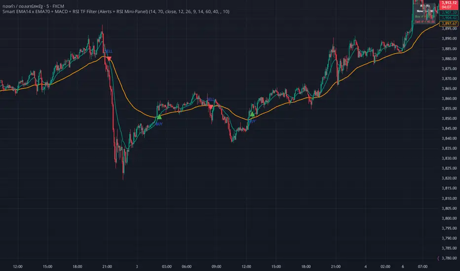
WHANG EMA-MACD🔥 Smart EMA14 x EMA70 + MACD Trend Alert System
Description:
Tired of chasing false signals?
This simple but powerful indicator helps you catch real trend moves — not the noise.
When EMA14 crosses EMA70 with MACD confirmation, and both EMAs point the same way, you’ll get a clean Buy or Sell alert right on your chart.
No messy settings, no guessing — just clear signals in strong trends.
✨ Features:
🔔 Real-time alerts via “Any alert() function call”
🟢 Buy when EMA14 crosses above EMA70 + MACD > 0
🔴 Sell when EMA14 crosses below EMA70 + MACD < 0
📈 Trades only when both EMAs slope in the same direction
⚙️ Customizable inputs for any market or timeframe
How to use:
Add the indicator to your chart
Create an alert → choose Any alert() function call
Relax and wait for your signals — no need to watch every candle!
Perfect for traders who want to follow the trend, avoid sideways traps, and get early alerts when momentum kicks in 🚀
Futures Correlation Dashboard# 📊 Futures Correlation Dashboard
## Track Multiple Market Indicators in One View
Monitor ES, NQ, YM, VIX, USI:ADD , and USI:TICK simultaneously to see how the futures markets are moving together in real-time.
---
## 🎯 What's Included
**6 Market Instruments:**
- **ES** - S&P 500 Futures
- **NQ** - Nasdaq 100 Futures
- **YM** - Dow Jones Futures
- **VIX** - Volatility Index
- ** USI:ADD ** - NYSE Advance-Decline Line
- ** USI:TICK ** - NYSE Tick Index
**Live Data Table:**
- Current prices and percentage changes
- Real-time status indicators
- Market sentiment overview
---
## 📈 Features
✅ Multi-panel layout showing all 6 instruments simultaneously
✅ Customizable alert thresholds for USI:ADD and USI:TICK
✅ Color-coded visual indicators
✅ Works on any timeframe
✅ Live updates with market data
---
## 🔔 Alert Conditions
Set alerts for:
- USI:ADD crossing your custom thresholds
- USI:TICK extreme readings
- VIX movement patterns
- Confluence between multiple indicators
*Configure alert levels in the indicator settings.*
---
## ⚙️ Customizable Settings
Adjust thresholds for:
- USI:ADD bullish/bearish levels
- USI:TICK bullish/bearish levels
- USI:TICK extreme readings
- Display options for each instrument
---
## 💡 Use Cases
**Monitoring Market Activity:**
See multiple futures contracts and market internals without switching between charts.
**Correlation Analysis:**
Watch how different instruments move relative to each other throughout the trading session.
**Data Aggregation:**
Consolidate key market data into a single, organized view for faster decision-making.
---
## ⚠️ Requirements
- TradingView Premium or higher (for real-time multi-symbol data)
- Data subscriptions for: CME futures, CBOE VIX, and NYSE internals ( USI:ADD , USI:TICK )
- Compatible with all timeframes
---
## 📊 Who Is This For?
- Futures traders wanting consolidated market data
- Day traders monitoring multiple instruments
- Anyone interested in tracking market breadth alongside price action
- Traders who want to see correlations between ES, NQ, YM and market internals
---
## Technical Specifications
- Built with Pine Script v5
- Uses `request.security()` for multi-symbol data
- Real-time calculations and updates
- Minimal chart space usage with organized panel layout
---
*This indicator displays market data and calculated values. It does not provide trading signals or recommendations. Use at your own risk and always practice proper risk management.*

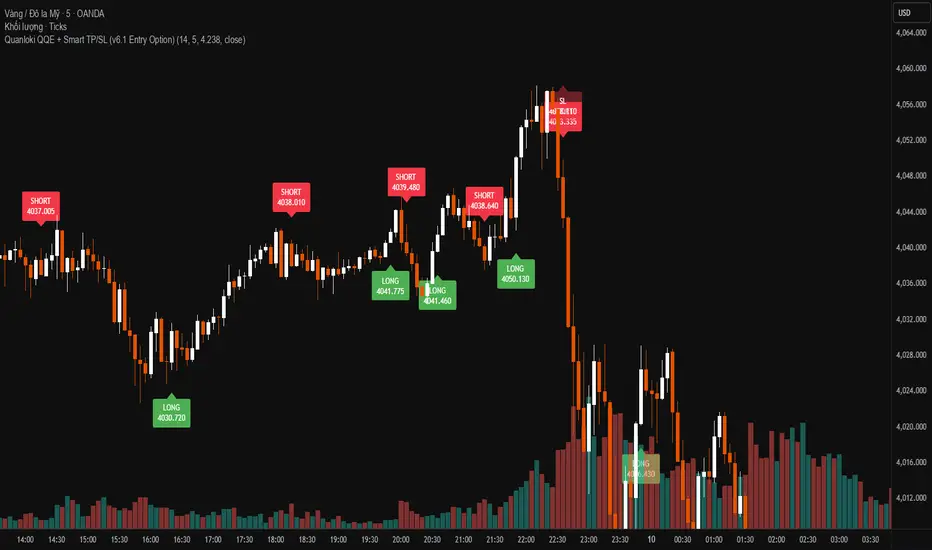
Quanloki v6OANDA:XAUUSD based on qqe trading on m15 or m10 is fine. Quick and concise trading with 6-10 prices with xauusd is too simple. Korean guys who need any code, just message me Quanloki xomgakorea

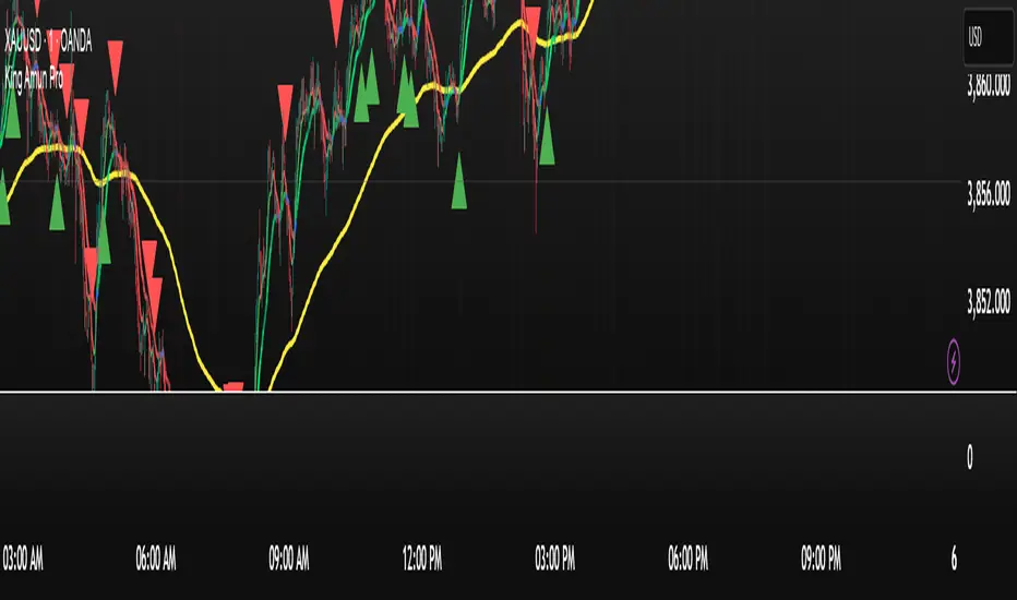
King Amun KING XAUUSD Pro Key Features of the Integrated Indicator:
1. Enhanced Moving Average System
EMA and SMA with Dynamic Colors
Buy/Sell Signals Based on Crossovers
Clear Visual Indicators
2. Advanced Kalman Filter
Advanced Noise Reduction
Multiple Models (Standard, Volume-Adjusted, Parkinson's Average)
Trend Strength with Color Gradient
3. Global Trading Sessions
Tokyo, London, New York Sessions
Open, Close, and Average Lines
Moving Range for Each Session
4. Smart Integration
All Signals Work in Harmony
Consistent Colors Across All Components
Unified Alerts
5. Ease of Use
Settings Organized into Groups
Helpful Hints
Flexible Customization
This integrated indicator provides a comprehensive trading system that can help you make more accurate decisions based on a multidimensional market analysis.
10/21 EMA + 50/200 Daily SMAAll four relevant moving averages in one script to allow you to add move indicators.

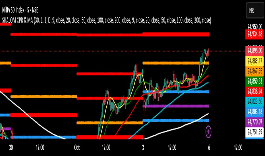
SHALOM TRADING HUB – CPR Camarilla & MASHALOM TRADING HUB – CPR Camarilla & MA (v4)
All-in-One Intraday & Swing Toolkit
Daily CPR (Prev Day), Weekly/Monthly Pivots, Prev Day/Week/Month High–Low, EMA/SMA pack, and Camarilla (H1–H4 & L1–L4). Plus Tomorrow CPR preview for next-session planning. 🔥
Features
Daily CPR: TC / PP / BC from previous day (value area & bias).
Floor Pivots: Daily/Weekly/Monthly R1–R4, S1–S4.
Previous High/Low: PDH/PDL, PWH/PWL, PMH/PML lines for breakout/mean-revert reads.
Camarilla Levels: H1–H4 & L1–L4 (popular 1.1 factor variant).
Moving Averages: EMA(9/20/50/100/200) & SMA(9/20/50/100/200) toggles.
Tomorrow CPR (Preview): Next session Pivot / BC / TC / R1 / S1 (D/W/M selectable).
Inputs (Settings)
Number of Daily/Weekly/Monthly pivots – show last N periods.
Show toggles – Daily CPR, Weekly/Monthly pivots, Prev H/L, Camarilla, Inner Camarilla, EMA/SMA.
Tomorrow CPR Type – D / W / M.
MA Lengths – fully customizable.
How to Use (Quick)
Trend bias: Price vs. CPR band & 20/50/200 MA stack.
Value zone: Inside TC–BC → balance; clean break & hold outside → trend continuation.
Reaction zones: Camarilla H3/L3 = bounce areas; H4/L4 = breakout/ breakdown lines.
Higher timeframe confluence: Add Weekly/Monthly pivots for swing levels.
Best Practices
Works on any timeframe; intraday (3–15m) recommended for CPR action.
Lines are derived using security(..., lookahead_on) on previous completed period → no forward repainting of those levels.
If too many lines: reduce “Number of … pivots” or turn off inner Camarilla/extra S/R.
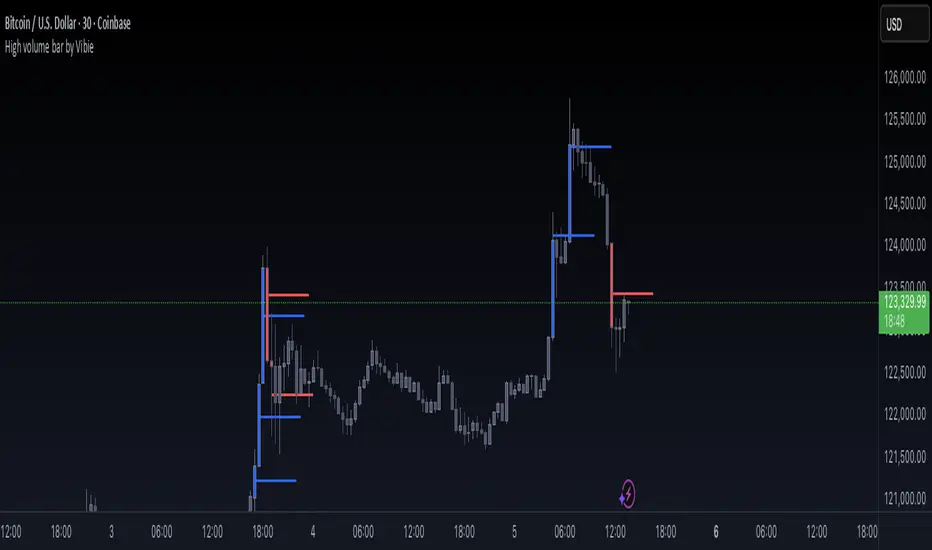
High volume bar by VibieHigh Volume Bar with Extended vPOC (Aggregation Enabled)
🧠 Concept
This indicator is designed to detect institutional activity and large traders by using statistical volume analysis and identifying key intrabar liquidity levels.
It applies Z-Score volume analysis to highlight unusually high volume candles and marks the Volume Point of Control (vPOC) inside each detected bar — the price level where the most volume was transacted.
⸻
⚙️ How It Works
1. Z-Score Volume Analysis
• The indicator calculates how far current volume deviates from its historical average using standard deviations (Z-Score).
• When the Z-Score exceeds the user-defined threshold, the candle is flagged as a High Volume Bar (HVB).
2. Multi-Exchange Aggregation
• Volumes from Binance, Bybit, and Coinbase can be aggregated into a composite volume metric.
• This provides a broader and more accurate market perspective, minimizing anomalies from individual exchanges.
3. Candle Coloring
• Bullish HVB → entire candle (body + wicks) is colored blue.
• Bearish HVB → entire candle is colored red.
• This makes large volume events immediately visible on the chart.
4. vPOC Detection
• The script examines a lower timeframe (e.g., 1 minute) within the HVB to find the price level with the highest traded volume.
• A horizontal line is drawn at that price and can be extended for multiple bars, marking a short-term liquidity zone that often acts as support or resistance.
⸻
🧭 How to Use
• vPOC levels frequently act as liquidity magnets and are often retested after the HVB appears.
• Bullish HVB + vPOC below current price = potential long entry zone.
• Bearish HVB + vPOC above price = potential short entry zone.
• Useful for identifying institutional absorption, stop runs, or hidden accumulation/distribution.
⸻
🌟 Why It’s Original and Useful
• Combines statistical volume analysis (Z-Score) with intrabar volume profiling.
• Aggregates multiple exchanges for broader accuracy.
• Offers precise liquidity levels that classic indicators don’t provide.
• Especially valuable for advanced traders looking for institutional footprints.
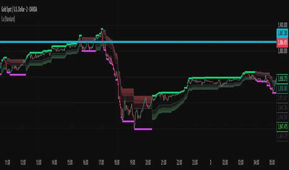
f.aYou can use it for Dow Jones as well. For gold at the 4:30 timeframe, you can occasionally enter with confirmation from liquidity and numeric signals—just follow the bars until you reach the target.
Euro Area vs US10YThe Euro Area GDP-Weighted Yield vs US10Y Spread is a macroeconomic indicator designed for forex traders and institutional investors who want to monitor the fundamental interest rate differential between the Eurozone and the United States. This tool aggregates sovereign bond yields from the major Eurozone member states using a weighted methodology based on outstanding government debt, providing a comprehensive view of the Euro Area’s fixed income market dynamics.
This indicator calculates a composite 10-year government bond yield for the Eurozone by combining data from seven major member countries: Germany, France, Italy, Spain, Netherlands, Belgium, and Austria. The weights are based on the proportion of government debt outstanding in each country, reflecting the actual composition of the European sovereign bond market rather than just GDP size.
The indicator then compares this Euro Area weighted yield against the US 10-Year Treasury yield (US10Y), producing a yield spread that serves as a powerful leading indicator for EUR/USD price movements.
