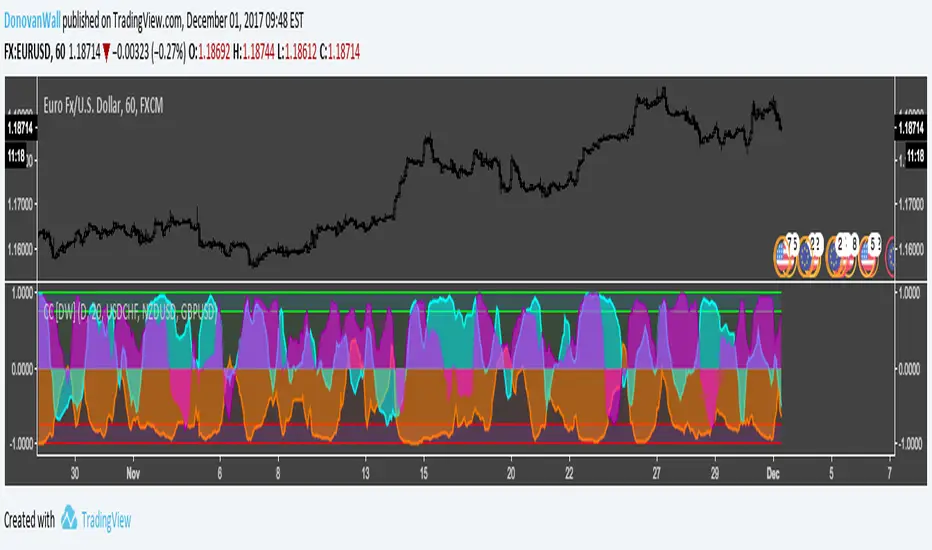
CBR - USD CorrelationFundamentals
The idea for this script is based on Fundamentals.
I wanted to verify the strength/weakness of the US dollar against other major economies
This will keep me on the right side of the "trend" .. bullish or bearish ?
In short, because Fundamentals Analysis are reflected via economic updates which influences what the price will be doing for the next couple of days
I think it is fair to have an "Indy" that will look at the moving averages across these pairs, because if the dollar sentiment changes, this will be reflected across the major economies
How to use it
This is not a buy/sell entry "Indy", nor a RSI type "Indy" where I tried to calculate overbought/oversold areas..
In fact, when this indy hits anything over 5 to max ( which is 12 ) ..that is a very strong signal and should be seen as such..bearish or bullish
If you want to test it out, I would suggest use a plain chart ( naked chart ) with a 20 or 50 MA ( depending on your TF) and see how the currency pair e.g EUR/USD correlates with this indy. The default pairs are AUD/USD, NZD/USD, GBP/USD and USD/JPY, with a main chart on EUR/USD
Timeframes
1m and 5m charts, change the MA values to 3 ( short), 20 ( medium), 50 ( long) or even more, else there are too many false positives.
1H and higher timeframes works well with the current default values.
I
Correlation

Correlate 3 - Correlation IndicatorThe code in contains a simple correlation indicator that can be used as an alternative to Tradingview’s built-in “Correlation Coefficient” indicator. The indicator allows users to correlate up to 3 separate instruments on the same subplot. This allows you, for example, to easily see the correlation of your instrument with stocks, bonds and FX. Alternatively, a user can also see the correlation with sector, industry peers or any other data available in Tradingview.
Features
Level Guides to easily see the key correlation coefficient levels
Multi-instrument:


Correlation Coefficient [DW]This is a simple study designed to visualize price correlation coefficients between multiple securities.
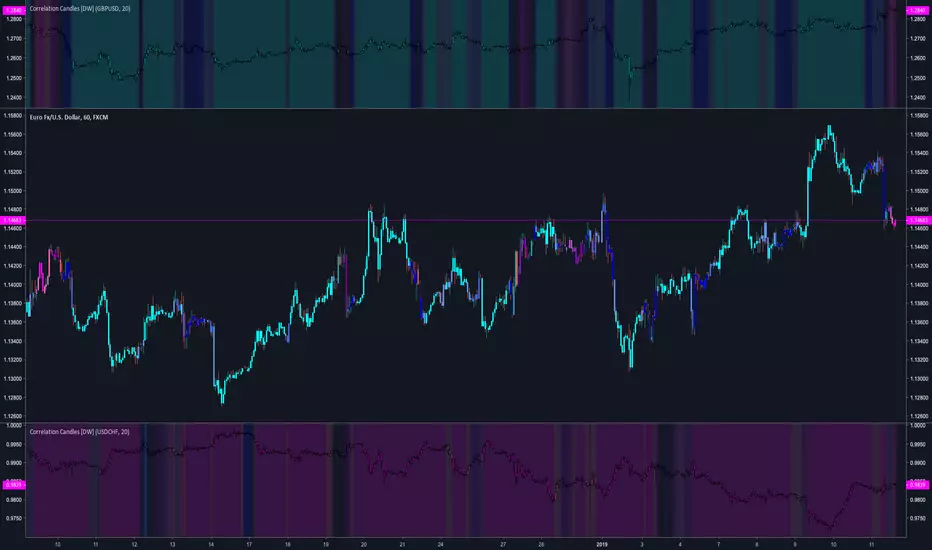
Correlation Candles [DW]This is a simple study designed to visualize price correlations between securities.
Bitcoin momentum correlation This is a pretty simple indicator, it measures the momentum of bitcoin as compared to usd,eur,eth,dash, and ltc, which you can see in all of the blue lines. If the red line is above zero then it means the overall value of btc is going up, opposite for down. The Ema_window controls how smooth the signal is. If you shorten the Ema_window parameter and open this on higher timeframe btc charts then the zero crossing gives pretty solid signals, despite being pretty choppy. A good way to interpret this is that if all the blue lines are moving in the same direction at once without disagreement, then the value of bitcoin has good momentum.
Mildly more technically:
Momentum is measured in the first derivative of an EMA for each ticker. To normalize the different values against each other they are all divided by their local maximums, which can be chosen in the parameter window, but shouldn't make a huge difference. All the checked values are then summed, as shown in the red line. To include a value into the red line simply keep it checked. Take a look at the script, it's kind of easy on the eyes.
It's pretty handy to look at, but doesn't seem too worthwhile to pursue much further. If someone wants much more out of the script then feel free to message me.
Remember rules #1 & #2
Don't lose money.
Happy trading
Price relation viewer - add percent change of two symbols (BETA)This script is very much beta!
This is a simple script to visualize how two symbols move in relation to each other. For example if the underlying symbol is a 2x Gold ETF (meaning the ticker moves at 2x the spot price of gold---if gold goes up 3% this ticker should go up 6%) and the comparison symbol is an 2x inverse gold ETF (at gold up 3% this should move down 6%). If these ETFs were 100% accurate at tracking the price of gold then this tool would report a value of zero at all times.
Day 1
Ticker - $10
Comparison - $10
Day 2
Ticker - $12
Comp - $11
This tool value - |20%| + -|10%| = 10%
It uses a short simple moving average to smooth things out a bit (see inputs). It is important to keep your axis scale in mind when using this! Two symbols that are always near zero mean they are offsetting each other very well but the value displayed might range from 0 to 0.005, but the graphed area can make it look extreme if autoscaled.
This is a tool with very specific uses : comparing how one digital currency moves in relation to bitcoin's price, comparing how gold moves in relation to silver, etc.
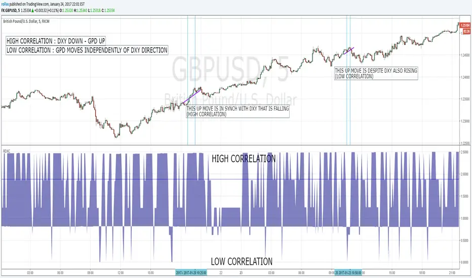
CorrelationGraph shows level of correlation between current source and another one and track current value of it. User can select source for comparison, graph period and number of candles for calculation, enter level of significal correlation (+-0.65 by default). Grapf contains 4 plots: Correlation - current level of correlation, Zero line , +Corr_level - minimum level of significant positive correlation, -Corr_level -maximum level of significant negative correlation between 2 sources.
Free BirdShows the move of the symbol When not correlated with the source index. Gives the upward or downward tendency when symbol moves uncorrelated that can be used to determine the flow.
The flow curve gives an general idea while the move is more precise showing pure price action.
Hersheys CoCo BarsThis is my latest attempt to show price movement differences between symbols. I want to see the buying and selling pressure... is that price movement going with the market or is it moving alone? It's VERY interesting to watch this indicator and see how things play out!
In my previous versions the arrows on the chart were too much clutter, while the single row of color under the chart was not enough info. Also, I removed the calculations to build a world index because the correlation between US and world markets is a hard nut to crack, plus it took many seconds to calculate.
So here is "CoCo Bars", which clearly show price moves with or against another symbol. The default symbol is the US index SPY. The coolest thing here is there are three rows of data in ONE INDICATOR! Many thanks to user rollas for helping with that code.
"CoCo" stands for correlation coefficient, which is what I was studying when I got the idea for this project.
GREEN bars in row #1 = Symbol up, US up, Symbol up more than US
RED bars in row #2 = Symbol down, US down, Symbol down more than US
In rows 1 and 2 the color intensity is based on the biggest difference, light, medium and dark colors.
green/red colors in bottom row are a 7 period average of the sum of price changes of both symbol and index, green = positive, red = negative
Enjoy, and good trading!
Brian Hershey

Hersheys CoCo World"CoCo World" helps to answer the following question... Is this stock moving alone or with other markets? No stock is an island, so it's important to see what everyone else is doing!
With limited screen real estate, I want to see as much info as possible as I'm evaluating US equities and deciding to pull the trigger to buy and sell. My "CoCo World" indicator packs a lot of info into a small space! I got the idea when looking at some Correlation Coefficient studies, hence the name "CoCo".
First I build three series to compare percent price changes...
#1 = Stock = Your chart symbol
#2 = US Index = SPY
#3 = World Index = This is an index of the top 10 world economies using the iShares country indexes. They are weighted by GDP and then the percent price change from last to current tick are summed together. For example, the US makes up 37%, China 22%, etc.
Why use iShares instead of the world markets directly, like the China SSE or Japan Nikkei? The iShares indexes are traded live at the same time as US markets. Measuring money flow in and out of these funds should naturally reflect broad sentiment about each country.
There are Green/Red bars in the indicator space under your chart, also Green/Red background colors.
Green Bar = Stock, US and World are UP, Stock up more than US, US up more than World.
Red Bar = Stock, US and World are DOWN, Stock down more than US, US down more than World.
Green Background = positive 7 period combined average direction of Symbol/US/World
Red Background = negative 7 period combined average direction of Symbol/US/World
This indicator works great all the way down to 1-minute bars... watch for green bars at the end of down-trends and red bars signalling the end of up-trends. Use caution if entering long trades while the background is red, this means the markets are against you!
Use "CoCo World" with your other favorite indicators to get a more complete picture.
Knowledge is POWER!
Good trading, and follow me for updates!
Brian Hershey

DXY SIGNALDXY Correlation indicator Version 2. Added adjustable parameters. Correlation factor is how many bars back for the colleration cumputing. Threshold adjusts the minimum correlation level to give signals. Default is 0.9. Value 1 equals %50 correlation while 2 is %100 correlation.
DXY SIGNALWorks on pairs including USD ticker. Gives buy and sell signals according to the relationship with DXY.
Hersheys CoCoThis is my variation of the Correlation Coefficient and I call it "Hershey's CoCo". The indicator identifies very specific Stock, Sector and Market pressures on whatever symbol you are evaluating.
If interested, follow me and send me requests to evaluate your stock or sector as I refine this tool.
***********************************************
Price movement does not happen in isolation.
Stocks are held by various "containers" that can be traded independently and can affect the price of each stock. The most important of those containers are Sector and Market, while others include Industry, MarketCap and others.
For example, Market is simply the top level representation of all stocks, or the sea that carries, or sinks, all ships. You can monitor this level by looking at various indexes, ETFs and/or Funds. I use "VTI", the Vanguard Total Stock Market ETF.
Sectors can be monitored using any number of containers, like Vanguard Sector Index Funds or ProShares Ultra Sector Indexes. I use the S&P SPDR Sector Funds. A list of those are listed below.
Most of the techniques and indicators that deal with correlation and sector/market comparisons are not very detailed. Many simply overlay one price series over another, while you tediously follow the price lines from left to right trying to judge movement.
Another critical piece missing from other compare tools is normalizing each data series. Hershey's CoCo does this, so you can have confidence that the alerts you see are based on accurate comparisons at every level.
***********************************************
So let's get to the details! Hershey's CoCo currently compares 2 containers, so for this discussion we'll do Stock to Sector. You'll see arrows above and below some ticks of the price chart, plus a faint red or green background color.
Very Bull = Blue Arrow = Stock and Sector prices are up, Stock price up more
Bull = Green Arrow = Stock and Sector prices are up, Sector price up more
Bear = Red Arrow = Stock and Sector prices are down, Sector price down more
Very Bear = Black Arrow = Stock and Sector prices are down, Stock price down more
Neutral = No Arrow = Stock and Sector price movement equal
Arrow Length = Strength (the longer the arrow the bigger the difference)
Green Background = Bull = Above zero Simple Moving Average of all arrow values
Red Background = Bear = Below zero Simple Moving Average of all arrow values
To review, the Blacks and Blues are the HEAVIEST pressure... the LONGER the STRONGER!

Check The CorrelationCheck the correlation of different assets on your preferred timeframe to find trends, patterns, new strategies or to minimize the exposure in correlated assets

Correlation of chart symbol to different Index-ETF-currencyScript plots correlation of chart symbol to a variety of indexes, symbols, equities. ** Original idea was to find Bitcoin correlation, which I did not. Built in correlations are: Nikie, DAX, SPY, AAPL, US Dollar, Gold, EURUSD, USDCNY, EEM, QQQ, XLK, XLF, USDJPY, EURGBP

Intramarket Correlator L-O-L-A excerptHere we have an intramarket correlator taken as an excerpt from the L-O-L-A institutional trading system.
The plot displayed on the screen is the correlation index of the correlated security plotted against the security data series. Suggest simple line plots of contrasting colors.
When the plot is below the security price this is an indication of a strong negative correlation. When the plot is above the security price this is indicative of a strong positive correlation.
Provided for free by Tarzan at tradingview. or noprism@hushmail.com
plz contact for more information on L-O-L-A
*** Past performance is not necessarily indicative of future results ***
Life is like a moving picture
Nothing in life is a permanent fixture
Ray Davies

[RS]Multiple Majors Currency Basket Power Oscillator V1Power oscillator to discern what currency's are stronger/weaker.
added option to use a smoothed source(close) for pooling the change, giving longer term directional bias, note that this causes lag in the results as MA's turn slower than price.

[RS]Multiple Majors Currency Basket Power Oscillator V0Power oscillator to discern what currency's are stronger/weaker.

Power Law Correlation Indicator 2.0 The Power Law Correlation Indicator is an attempt to chart when a stock/currency/futures contract goes parabolic forming a upward or downward curve that accelerates according to power laws.
I've read about power laws from Sornette Diedler ( www.marketcalls.in ). And I think the theory is a good one.
The idea behind this indicator is that it will rise to 1.0 as the curve resembles a parabolic up or down swing. When it is below zero, the stock will flatten out.
There are many ways to use this indicator. One way I am testing it out is in trading Strangles or Straddle option trades. When this indicator goes below zero and starts to turn around, it means that it has flattened out. This is like a squeeze indicator. (see the TTM squeeze indicator).
Since this indicator goes below zero and the squeeze plays tend to be mean-reverting; then its a great time to put on a straddle/strangle.
Another way to use it is to think of it in terms of trend strength. Think of it as a kind of ADX, that measures the trend strength. When it is rising, the trend is strong; when it is dropping, the trend is weak.
Lastly I think this indicator needs some work. I tried to put the power (x^n) function into it but my coding skill is limited. I am hoping that Lazy Bear or Ricardo Santos can do it some justice.
Also I think that if we can figure out how to do other power law graphs, perhaps we can plot them together on one indicator.
So far I really like this one for finding Strangle spots. So check it out.
Peace
SpreadEagle71

