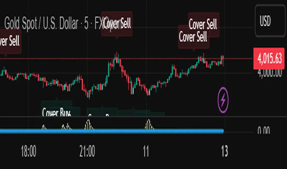
[NBK] Cover Buy Sell Cover Buy Sell — Engulfing Reversals with EMA/ATR Trend & Quality Filters
What it does
This indicator flags high-quality bullish/bearish reversal candles only when they align with a short-term trend and pass several objective quality filters. It is not a simple mashup: each component serves a distinct role and they work together to keep early/low-quality signals out.
How it works (components & interaction)
Pattern engine (entry candidates)
Bullish side (Cover Buy):
Body Engulf: current green body fully covers the prior red body, or
Piercing (relaxed): prior red → current green closes above the prior body’s midpoint (not beyond prior open).
Bearish side (Cover Sell):
Full-candle Engulf: current red candle (body + wicks) covers the entire prior candle, or
Body Engulf: current red body fully covers the prior body, or
Dark-Cloud (relaxed): prior green → current red closes below the prior body’s midpoint.
Short-term trend gate (non-repainting)
Trend is defined by the EMA slope between bar-1 and bar-2, scaled by ATR to require minimum strength.
Slope < 0 → only bullish candidates pass. Slope > 0 → only bearish candidates pass.
Body-size filter (noise control)
Rejects tiny candles: each body is compared with the lookback average body size.
For bearish candidates an additional ratio check requires current body ≥ a fraction of the prior body (to avoid weak top-ticks).
Peak filters for bearish signals (late, cleaner tops)
Distance above EMA: the high must be at least X × ATR above EMA (avoids mid-range noise).
Near local high: the high of the current bar (or bar-1) must be close to the highest high in a recent window.
Break confirmation: close must break low by at least Y × ATR (filters shallow dark-clouds).
Only when a candidate satisfies the pattern ➝ trend ➝ size ➝ peak sequence is a signal printed/alerted.
Inputs (key parameters)
EMA length, Min EMA slope vs ATR, ATR length: trend strength.
Lookback for average body, Min body vs average, Bear body ratio: body-quality filters.
High distance above EMA (×ATR), Local high lookback, Tolerance to local high (×ATR), Min break of low (×ATR): bearish peak confirmation.
Alerts
Built-in alerts fire on bar close for both Cover Buy and Cover Sell.
How to use
Increase High distance above EMA / Local high lookback / Min break of low to reduce early Cover Sell in ranges.
If you miss good tops, ease those thresholds slightly.
Works across symbols/timeframes; evaluated on bar close; no repaint from the trend gate.
Notes
This tool is a signal screener, not financial advice. For best results, combine with your structure/SR zones, risk management, and execution rules.
Forecasting
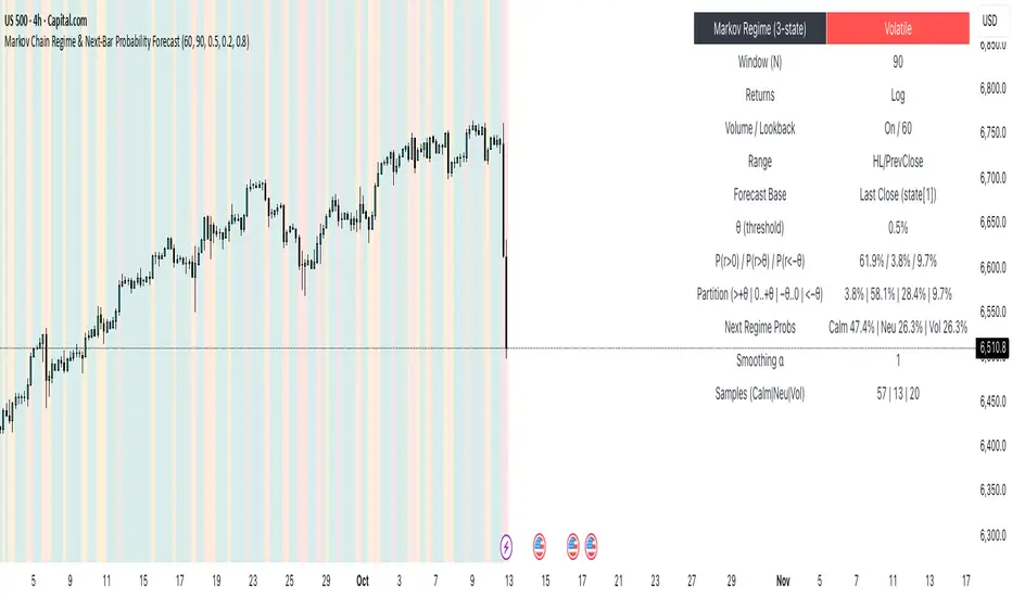
Markov Chain Regime & Next‑Bar Probability Forecast✨ What it is
A regime-aware, math-driven panel that forecasts the odds for the very next candle. It shows:
• P(next r > 0)
• P(next r > +θ)
• P(next r < −θ)
• A 4-bucket split of next-bar outcomes (>+θ | 0..+θ | −θ..0 | <−θ)
• Next-regime probabilities: Calm | Neutral | Volatile
🧠 Why the math is strong
• Markov regimes: Markets cluster in volatility “moods.” We learn a 3-state regime S∈{Calm, Neutral, Volatile} with a transition matrix A, where A = P(Sₜ₊₁=j | Sₜ=i).
• Condition on the future state: We estimate event odds given the next regime j—
q_pos(j)=P(rₜ₊₁>0 | Sₜ₊₁=j), q_gt(j)=P(rₜ₊₁>+θ | Sₜ₊₁=j), q_lt(j)=P(rₜ₊₁<−θ | Sₜ₊₁=j)—
and mix them with transitions from the current (or frozen) state sNow:
P(event) = Σⱼ A · q(event | j).
This mixture-of-regimes view (HMM-style one-step prediction) ties next-bar outcomes to where volatility is likely headed.
• Statistical hygiene: Laplace/Beta smoothing, minimum-sample gating, and unconditional fallbacks keep estimates stable. Heavy computations run on confirmed bars; “Freeze at close” avoids intrabar flicker.
📊 What each value means
• Regime label & background: 🟩 Calm, 🟧 Neutral, 🟥 Volatile — quick read of market context.
• P(next r > 0): Directional tilt for the very next bar.
• P(next r > +θ): Odds of an outsized positive move beyond θ.
• P(next r < −θ): Odds of an outsized negative move beyond −θ.
• Partition row: Distributes next-bar probability across four intuitive buckets; they ≈ sum to 100%.
• Next Regime Probs: Likelihood of switching to Calm/Neutral/Volatile on the next bar (row of A for the current/frozen state).
• Samples row: How many next-bar samples support each next-state estimate (a confidence cue).
• Smoothing α: The Laplace prior used to stabilize binary event rates.
⚙️ Inputs you control
• Returns: Log (default) or %
• Include Volume (z-score) + lookback
• Include Range (HL/PrevClose)
• Rolling window N (transitions & estimates)
• θ as percent (e.g., 0.5%)
• Freeze forecast at last close (recommended)
• Display toggles (plots, partition, samples)
🎯 How to use it
• Volatility awareness & sizing: Rising P(next regime = Volatile) → consider smaller size, wider stops, or skipping marginal entries.
• Breakout preparation: Elevated P(next r > +θ) highlights environments where range expansion is more likely; pair with your setup/trigger.
• Defense for mean-reversion: If P(next r < −θ) lifts while you’re late long (or P(next r > +θ) lifts while late short), tighten risk or wait for better context.
• Calibration tip: Start θ near your market’s typical bar size; adjust until “>+θ” flags truly meaningful moves for your timeframe.
📝 Method notes & limits
Activity features (|r|, volume z, range) are standardized; only positive z’s feed the composite activity score. Estimates adapt to instrument/timeframe; rare regimes or small windows increase variance (hence smoothing, sample gating, fallbacks). This is a context/forecast tool, not a standalone signal—combine with your entry/exit rules and risk management.
🧩 Strategies too
We also develop full strategy versions that use these probabilities for entries, filters, and position sizing. Like this publication if you’d like us to release the strategy edition next.
⚠️ Disclaimer
Educational use only. Not financial advice. Markets involve risk. Past performance does not guarantee future results.
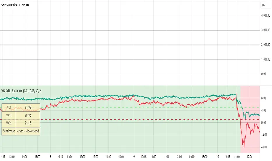
VIX Delta SentimentThis script uses the volatility index VIX and the two nearest futures VX1! and VX2! to calculate the market sentiment and trigger a crash alert before it happens.
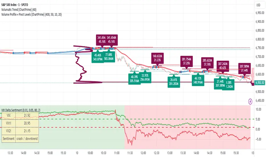
VIX Delta SentimentThis script opens a new panel underneath the main panel.
It displays a table with the values of the CBOE volatility index VIX, which measures the last 30 days implied volatility of the S&P500 index, the VX1! and the VX2! values, which are the front month and the second month VIX futures.
To curves are plotted: the relative difference or delta of the two VIX futures as well as the relative delta between VIX and the first futures month. The dotted lines visualize the thresholds of these two relative deltas.
These values are needed to determine the market sentiment and to trigger a crash alert before it happens. It can be used to trade the major indices SPX, QQQ, etc. or to avoid catastrophic losses.
The market sentiment is annotated in the table and also visualized as background color.
EquiSense AI Signals🇸🇦 العربي
المتنبئ الذكي المتوازن (AI v7)
وصف قصير:
مؤشر تجميعي ذكي يوازن بين الاتجاه والزخم والحجم والتذبذب وأنماط الشموع، ويحوّلها إلى نظام نقاط ونجوم يولّد إشارات شراء/بيع مؤكَّدة بتقاطع MACD. بعد الإشارة، يعرض أهدافًا ذكية (TP1/TP2/TP3) ووقف خسارة مبنيَّيْن على ATR مع رسومات مستقبلية ولوحة معلومات لإدارة الصفقة.
الإعدادات (Inputs)
الحد الأدنى للنقاط (min_score): افتراضي 6.0 — كلما ارتفع قلّت الإشارات وزادت جودتها.
الحد الأدنى للنجوم (min_stars): افتراضي 2 — فلتر لقوة الإشارة.
عدد الشموع المستقبلية (future_bars): افتراضي 15 — مدى رسم الأهداف والوقف للأمام.
استخدام الأهداف الذكية (use_ai_targets): تفعيل/إيقاف مضاعِف الذكاء الاصطناعي للأهداف والوقف.
كيف يعمل؟
يحسب المؤشر buy_score/sell_score من مجموعة عوامل: EMA8/21/50/200، RSI + متوسطه، MACD + Histogram، Stochastic، ADX/DMI، VWAP، الحجم، MTF 15m، ROC/المومنتَم، Heikin Ashi، وأنماط (ابتلاع/مطرقة/شهاب).
يحوّل الدرجات إلى نجوم (⭐⭐ إلى ⭐⭐⭐⭐⭐) حسب القوة.
تولّد الإشارة فقط إذا توفّر: درجة ≥ الحد + نجوم ≥ الحد + تقاطع MACD (صعودًا للشراء، هبوطًا للبيع).
عند الإشارة يبدأ سيناريو صفقة واحدة فقط حتى تنتهي (TP3 أو SL).
الأهداف والوقف (ذكاء اصطناعي)
تُشتق من ATR ثم تُعدَّل عبر مضاعِف AI مبني على: ATR%، الزخم (ROC)، الحجم مقابل متوسطه، قوة الاتجاه (ADX)، وعدد النجوم.
تقريبيًا:
TP1 ≈ 1.5×ATR × AI
TP2 ≈ 2.5×ATR × AI
TP3 ≈ 4.0×ATR × AI
SL ≈ 1.0×ATR ÷ AI
ماذا سترى على الشارت؟
علامات “شراء/بيع”، نجوم قرب الإشارة، خط دخول (أزرق)، وقف (أحمر منقّط)، TP1/TP2 (أخضر)، TP3 (ذهبي) مع صناديق مناطق للأهداف وخط ربط نحو الهدف النهائي.
وسم AI يعرض نسبة المضاعِف والنجوم بصريًا.
لوحة معلومات تعرض الحالة، القوة، AI%، السعر، الدرجات، وأثناء الصفقة: الدخول، TP1/TP2/TP3، والربح اللحظي.
التنبيهات (Alerts)
شرطان جاهزان: شراء وبيع عند تحقق الإشارة.
أضِف تنبيه: Right click → Add alert → اختر المؤشر → الشرط المطلوب.
أفضل الممارسات
استخدم الإطار المناسب للأصل:
سكالبينغ 5–15m: min_score 8 وmin_stars 3–4.
تأرجحي H1–H4: min_score 7 وmin_stars 3.
يومي/أسهم: min_score 6–7 وmin_stars 2–3.
فضّل التداول مع EMA200 واتجاه MTF 15m.
خفّض المخاطرة وقت الأخبار العالية.
التزم بإدارة مخاطر ثابتة (مثلاً 1% لكل صفقة).
حدود مهمة
الأفضل انتظار إغلاق الشمعة لتأكيد التقاطعات وتجنّب تغيّرها.
صفقة واحدة في المرة بفضل حالة in_trade.
يستخدم request.security مع lookahead_off لإطار 15m؛ التزم بالتقييم عند الإغلاق.
أسئلة شائعة
هل يستخدم منفردًا؟ نعم، لكن مع مناطق سعرية/ترند وخطة مخاطر يصبح أقوى.
لماذا تختلف الأهداف؟ لأن مضاعِف AI يكيّف TP/SL مع ظروف السوق.
إخلاء مسؤولية
هذه أداة تحليلية تعليمية وليست نصيحة استثمارية. اختبر الإعدادات تاريخيًا والتزم بالمخاطرة المناسبة.
ملاحظة للمبرمجين
Pine Script v6، متغيرات var لحفظ الحالة، تنظيف الرسومات على الشمعة الأخيرة، مع حدود مرتفعة للرسوم لتجنّب الأخطاء.
🇬🇧 English
Balanced Smart Predictor (AI v7)
Short description:
A smart, ensemble-style indicator that blends trend, momentum, volume, volatility, and candle patterns into a score & star system that produces Buy/Sell signals confirmed by MACD crosses. After a signal, it projects smart targets (TP1/TP2/TP3) and a stop-loss derived from ATR, with forward drawings and a control panel for trade management.
Inputs
Minimum Score (min_score): default 6.0 — higher = fewer but stronger signals.
Minimum Stars (min_stars): default 2 — extra filter for strength.
Future Bars (future_bars): default 15 — how far targets/SL are drawn ahead.
Use AI Targets (use_ai_targets): toggle the AI multiplier for TP/SL.
How it works
Computes buy_score/sell_score from: EMA8/21/50/200, RSI & its MA, MACD & Histogram, Stochastic, ADX/DMI, VWAP, Volume, 15m MTF tilt, ROC/Momentum, Heikin Ashi, and candle patterns (engulfing/hammer/shooting star).
Converts scores into Stars (⭐⭐ to ⭐⭐⭐⭐⭐) via tiered thresholds.
Signals fire only when: Score ≥ minimum + Stars ≥ minimum + MACD cross (up = Buy, down = Sell).
On a signal, one active trade is managed until TP3 or SL is reached.
Targets & Stop (AI-driven)
Targets and SL are ATR-based, then adjusted by an AI multiplier derived from: ATR%, momentum (ROC), relative volume, trend strength (ADX), and star rating.
Approximate formulas:
TP1 ≈ 1.5×ATR × AI
TP2 ≈ 2.5×ATR × AI
TP3 ≈ 4.0×ATR × AI
SL ≈ 1.0×ATR ÷ AI
What you’ll see on chart
“Buy/Sell” markers with small Star labels, an Entry line (blue), SL (red dotted), TP1/TP2 (green), TP3 (gold) with shaded target boxes and a guide line towards the final target.
A central AI badge showing the multiplier % and star rating.
A top-right Panel showing status, strength, AI%, price, scores, and during trades: entry, TP1/TP2/TP3, and live P/L.
Alerts
Two ready-made conditions: Buy and Sell when the respective signal triggers.
Add alert: Right click → Add alert → choose the indicator → select condition.
Best practices
Match timeframe to instrument:
Scalping 5–15m: min_score 8, min_stars 3–4.
Swing H1–H4: min_score 7, min_stars 3.
Daily/Equities: min_score 6–7, min_stars 2–3.
Prefer trades with EMA200 and 15m MTF trend alignment.
De-risk around major news.
Use fixed risk per trade (e.g., 1%).
Important notes
Prefer bar close confirmation to avoid mid-bar MACD flips.
Single trade at a time via the in_trade state.
15m MTF uses request.security with lookahead_off; evaluate at close for consistency.
FAQ
Use it standalone? You can, but it’s stronger when combined with S/R zones/trendlines and solid risk management.
Why do targets vary? The AI multiplier adapts TP/SL to current market conditions.
Disclaimer
This is an analytical/educational tool, not financial advice. Always backtest and use appropriate risk management.
Developer note
Built in Pine Script v6, uses var for trade state, clears drawings on the last bar to keep the chart tidy, and raises drawing limits to avoid runtime errors.

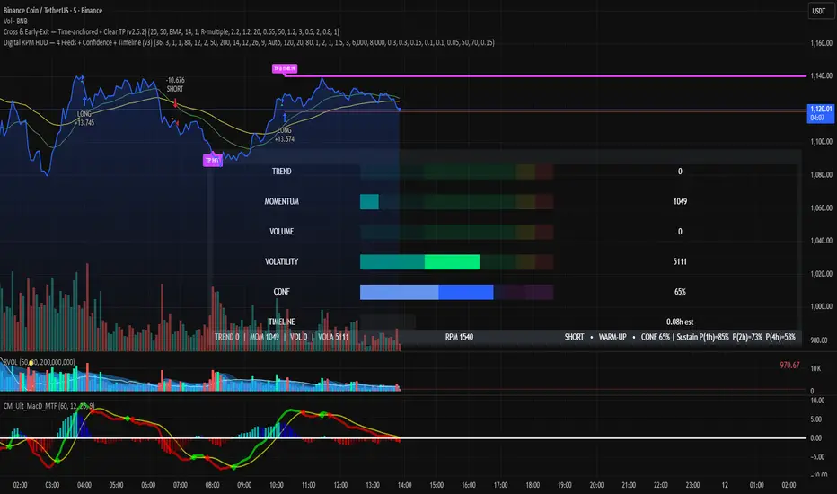
Digital RPM HUD — 4 Feeds + Confidence + Timeline (v3)🏎️ Digital RPM HUD — 4 Feeds + Confidence + Timeline (v3)
A performance-style trading dashboard for momentum-driven traders.
The Digital RPM HUD gives you an instant visual readout of market “engine speed” — combining four customizable data feeds (Trend, Momentum, Volume, Volatility) into a single confidence score (0–100) and a color-coded timeline of regime changes.
Think of it as a racing-inspired control panel: you only “hit the throttle” when confidence is high and all systems agree.
🔧 Key Features
4 Data Feeds – assign your own logic (EMA, RSI, RVOL, ATR, etc.).
Confidence Meter – blends the four feeds into one smooth 0–100 reading.
Timeline Strip – shows recent bullish / bearish / neutral states at a glance.
Visual Trade Cues – optional on-chart LONG / SHORT / EXIT markers.
Fully Customizable – thresholds, weights, smoothing, colors, layout.
HUD Overlay – clean, minimal, and adjustable to any corner of your chart.
💡 How to Use
Configure each feed to reflect your preferred signals (e.g., trend EMA 200, momentum RSI 14, volume RVOL 20, volatility ATR 14).
Watch the Confidence gauge:
✅ Above Bull Threshold → Market acceleration / long bias.
❌ Below Bear Threshold → Momentum loss / short bias.
⚪ Between thresholds → Neutral zone; stay patient.
Use the Timeline to confirm trend consistency — more green = bullish regime, more red = bearish.
⚙️ Recommended Setups
Scalping: Trend EMA 50 + RSI 7 + RVOL 10 + ATR 7 → Fast response.
Intraday: EMA 200 + RSI 14 + RVOL 20 + ATR 14 → Balanced signal.
Swing: Multi-TF Trend + MACD + RVOL + ATR → Smooth and steady.
⚠️ Disclaimer
This script is not a trading strategy and does not execute trades.
All signals are visual aids — always confirm with your own analysis and risk management.
NQ → NAS100The NQ → NAS100 Converter is a practical utility designed for traders who trade both the Nasdaq futures (NQ) and Nasdaq CFD (NAS100) markets.
It calculates and displays the converted stop-loss distance and price level on the NAS100 chart, based on a chosen number of NQ points.
This helps traders align their risk and position management between futures and CFD markets with precision.
🧮 Core Features:
Real-time conversion between NQ (CME) and NAS100 (OANDA) prices.
Automatic stop calculation for both Long and Short trade setups.
Optional display of NQ price, NAS price, and converted stop price.
Flexible visualization modes:
Candle-attached label that moves with price.
Chart-fixed panel for a clean dashboard-style view.
Full customization of colors, text size, alignment, and display position.
⚙️ How It Works:
Enter your NQ stop distance (in points).
The script converts that distance into the equivalent NAS100 distance, using the current NQ/NAS ratio.
The final converted NAS100 stop price is automatically displayed.
⚠️ Important Note:
This script does not place or execute trades.
It is designed solely for analysis and educational use to assist with risk management and cross-market price mapping.
Always confirm levels independently before trading.
📊 Recommended For:
Traders managing correlated exposure between NQ Futures and NAS100 CFDs.
Prop firm traders using NAS100 as a futures-correlated proxy.
Anyone seeking a clear, visual way to match stop distances across the two markets.

Rebound Sigma Pro - IndicatorOverview
Rebound Sigma Pro is a mean-reversion indicator that detects statistically oversold conditions in trending markets.
It helps traders identify potential short-term rebounds based on momentum exhaustion and volatility-adjusted entry zones.
Concept
The indicator combines two quantitative components:
Short-term momentum to detect short-term exhaustion
Trend filter to ensure setups align with the long-term direction
When a stock in an uptrend becomes temporarily oversold, a limit-entry signal is plotted.
The trade is then tracked until short-term conditions normalize or a time-based exit occurs.
Visual Signals
Green Triangle: Suggests placing a limit order for the next session
Green Circle: Confirms entry was filled
Red Triangle: Signals an exit for the next session’s open
Orange Background: Pending order
Green Background: Position active
Red Background: Exit phase
Yellow Line: Entry reference price
User Inputs
Limit Entry (% below previous close) – Default 1 %
Use Limit Entry – Switch between limit or market entries
Enable Time Exit – Optional holding-period constraint
Maximum Holding Days
All other internal parameters (momentum length, filters) are pre-configured.
Alerts
Limit Order Signal: New setup detected
Entry Confirmed: Order filled
Exit Signal: Exit expected next day
Usage
Designed for liquid equities and ETFs
Works best in confirmed uptrends
Backtesting encouraged to adapt parameters per symbol and timeframe
Notes
Not an automated strategy; manual order execution required
Past behavior does not imply future performance
Always apply sound position sizing and risk management
Disclaimer
This indicator is provided for educational and analytical purposes only.
It does not constitute financial advice or performance assurance.

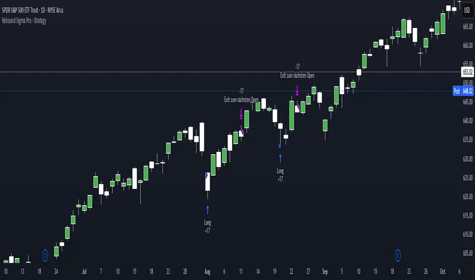
Rebound Sigma Pro - StrategyOverview
Rebound Sigma Pro is a mean-reversion indicator that detects statistically oversold conditions in trending markets.
It helps traders identify potential short-term rebounds based on momentum exhaustion and volatility-adjusted entry zones.
Concept
The indicator combines two quantitative components:
Short-term momentum to detect short-term exhaustion
Trend filter to ensure setups align with the long-term direction
When a stock in an uptrend becomes temporarily oversold, a limit-entry signal is plotted.
The trade is then tracked until short-term conditions normalize or a time-based exit occurs.
Visual Signals
Green Triangle: Suggests placing a limit order for the next session
Green Circle: Confirms entry was filled
Red Triangle: Signals an exit for the next session’s open
Orange Background: Pending order
Green Background: Position active
Red Background: Exit phase
Yellow Line: Entry reference price
User Inputs
Limit Entry (% below previous close) – Default 1 %
Use Limit Entry – Switch between limit or market entries
Enable Time Exit – Optional holding-period constraint
Maximum Holding Days
All other internal parameters (momentum length, filters) are pre-configured.
Alerts
Limit Order Signal: New setup detected
Entry Confirmed: Order filled
Exit Signal: Exit expected next day
Usage
Designed for liquid equities and ETFs
Works best in confirmed uptrends
Backtesting encouraged to adapt parameters per symbol and timeframe
Notes
Not an automated strategy; manual order execution required
Past behavior does not imply future performance
Always apply sound position sizing and risk management
Disclaimer
This indicator is provided for educational and analytical purposes only.
It does not constitute financial advice or performance assurance.
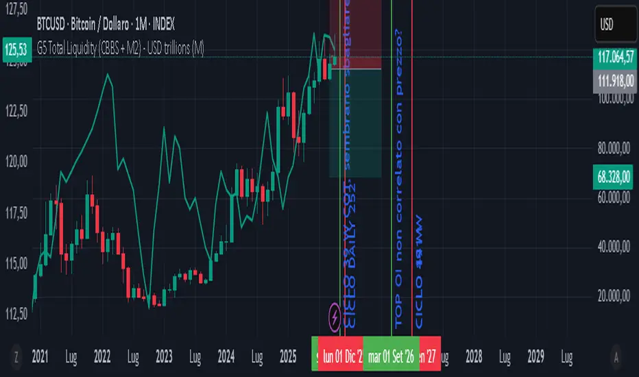
GLOBAL LIQUIDITY PROXY, G5 Total Liquidity (CBBS + M2) - USDG5 Total Liquidity (CBBS + M2) - USD
G5 (US, CN, EU, JP, GB)
Somma Balance Sheet Central Banks e M2 convertiti in USD
BND Trader (By Vahid.Jz) 🇮🇷🎉 The first Persian indicator on TradingView, released for free to celebrate my daughter's birthday. 🎉
**Trading Assistant (by Vahid.Jz)** is an all-in-one tool designed to simplify analysis and improve accuracy. It acts as an intelligent trading partner.
**Features:**
- Market Structure detection
- Multi-Timeframe “Third Eye” analysis
- Professional Order Blocks recognition
- Fair Value Gaps (FVGs) detection
- Customizable alerts
- Fully Persian interface
- Create Custom Alarm
Developed with love by **Vahid.Jz**, a trader and Pine Script enthusiast.
*“Trading is not a destination; it’s the journey — a path of learning, growth, and experience.”*

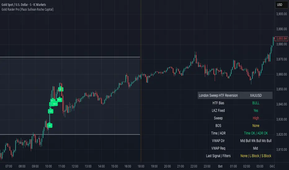
Gold Raider Pro [Plazo Sullivan Roche Capital]Core logic
During the London kill-zone, the script locks in the session high/low (LKZ).
After London ends, it looks for a liquidity sweep (price pokes beyond LKZ high/low) then a BOS (break of the first opposing swing) to confirm reversal.
Trades are only valid with higher-timeframe bias (D1 & H4 above/below EMA-50 in agreement).
Optional filters block weak signals: time gate (NY cutoff), ADR (skip if the day’s move is already stretched), and VWAP alignment (Midnight/Weekly/Monthly).
Output is a unified signal: BUY after low sweep + BOS in bull HTF, SELL after high sweep + BOS in bear HTF; labels + dashboard summarize state and reasons.
Best setup & usage
Chart & broker: XAUUSD on a high-liquidity feed (ICMarkets/FXPro/OANDA). Use 2m–5m for executions; confirm with 15m market structure.
Session: Set timezone to America/New_York. Default London kill-zone 02:30–04:30 NY; stop taking new signals after 11:00 NY (toggle in inputs).
HTF bias: Keep EMA length = 50 on D & H4 (default). Only toggle off bias if you’re deliberately testing counter-trend sweeps (not recommended live).
Structure/BOS: Use Swing Length = 3. Leave “Require BOS after the sweep” = ON for the cleanest signals; turn “Require close back inside LKZ” ON only if you want ultra-conservative entries.
VWAP filters: Keep Midnight VWAP = ON; add Weekly/Monthly only on trend days to avoid over-filtering range sessions.
ADR guardrail: Enable ADR filter once you go live; start with ADR Threshold = 0.9 and Lookback 14. This blocks chasing extended moves.
Execution playbook:
BUY: Wait for low sweep of LKZ → BOS up → dashboard shows BULL bias, Time/ADR OK, VWAP pass. Enter on the next pullback or at close; SL below BOS invalidation (or fixed 0.5–0.8× ADR14 of XAU).
SELL: Mirror logic after a high sweep in BEAR bias; SL above BOS invalidation.
TP: Scale at 1R, leave runner to 2–3R or to Midnight/Weekly VWAP touch; hard exit by NY lunchtime or on bias flip.
Risk: 0.25–0.5% per trade (XAU is spiky). One trade per direction per session; if ADR block triggers post-entry, manage to BE or flatten if structure weakens.
Alerts & dashboard: Turn on runtime alerts once parameters are set. Read the Last Signal / Filters row; only act when it shows your direction and “L:OK / S:OK” for your side.
Validation & tuning: Forward-test 3–4 weeks. If over-filtered, relax VWAP Weekly/Monthly first; if too chatty, enforce close-back-inside and keep NY cutoff tight.
Don’ts: Don’t trade during major news spikes, don’t counter the D1/H4 agreement, and don’t enter before BOS—sweeps without structure confirmation are bait.
Devil Marks - Multi TimeframeA handy completely new script that shows Devil Marks for several time frames on the current time frame.
Devil Marks are where candles have no wick at one end of the candlestick. These levels are seen as areas that price needs to go back to at some point to re-balance the imbalance. These levels can add confluence to a trade idea.
A table is included that shows the closest devil mark for each time frame.
Devil Marks should show until that level is mitigated by price trading at that level.

💎 Fade Core – RSI Pivots Hybrid + Adjustable EMAThis is a beta version that tries to catch extremes in the marker. It uses RSI extremes aligned with distance from 55EMA (reversion to mean).

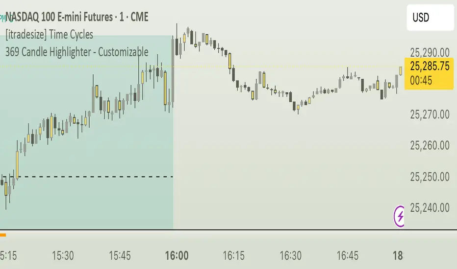
369 Candle Highlighter - Customizable. [V1]The final 3/6/9 Candle Highlighter is a TradingView indicator that scans each candle’s time in a user-selected timezone, calculates the sum of all digits in the hour and minute, reduces that sum to a single digit, and highlights the candle in a chosen color with customizable transparency whenever the result equals 3, 6, or 9. Users can select their timezone, pick the highlight color, adjust transparency, enable optional tiny wicks above or below the candle, turn on alerts with custom messages for each number, and activate a debug mode that shows the reduced digit and candle time. This ensures that only the correctly calculated 3/6/9 candles are visually marked on the chart while allowing full customization for aesthetics, performance, and alerting preferences.
QUBIC↔BTC ProjectionQUBIC↔BTC Projection — Short & Simple
WHAT IT DOES
- Shows where QUBIC might roughly land if BTC reaches a target price you choose.
- Draws a midline (estimate) and a band around it (safety margin).
HOW TO USE
1) Check symbols:
- QUBIC/USDT (e.g., GATEIO:QUBICUSDT)
- BTC/USDT (e.g., BINANCE:BTCUSDT)
2) Set at the top:
- "BTC Target ($)": enter your desired BTC price (e.g., 117000).
- "Lookback": number of candles used for the estimate (more = smoother, less = more reactive).
- "Band ±σ": width of the band (1 is a good start).
3) Info display:
- Choose "Panel top-right/bottom-right" (fixed corner) or "Label" (on chart).
- Adjust text size to your liking.
- Optional: "Compact format" for tiny QUBIC prices (e.g., 0.(5)156).
WHAT YOU SEE
- Midline = rough direction for QUBIC at your BTC target.
- Band = room to the downside/upside.
- The panel/label shows the numbers as text.
NOTE
- This is an estimate, not a promise. Use it as guidance, not a guarantee.

BLACK MAGIC RSIWhat Is the RSI?
The Relative Strength Index (RSI) is a momentum indicator used in technical analysis to measure the speed and strength of recent price movements. It was developed by J. Welles Wilder Jr. and is one of the most popular tools for identifying whether an asset is overbought or oversold.
🔹 How It Works
The RSI moves on a scale from 0 to 100 and compares the size of recent gains to recent losses.
When the RSI value is high, it means prices have risen quickly.
When the RSI value is low, it means prices have fallen sharply.
Liquidity ROC Z-Score (Composite) — kWhDealer_Developed by @kWhDealer_, this indicator tracks the rate-of-change and standard-deviation momentum of U.S. system liquidity by combining key Federal Reserve and Treasury data:
Composite Liquidity
=
WALCL
−
WTREGEN
−
RRPONTSYD
+
MTSDS133FMS
Composite Liquidity=WALCL−WTREGEN−RRPONTSYD+MTSDS133FMS
It measures the flow of liquidity available to markets—integrating monetary policy (Fed balance sheet, reverse repo, TGA) with fiscal policy (Treasury deficit spending).
The script converts this composite into a Rate-of-Change (ROC) oscillator and expresses it as a Z-Score, with ±1 σ / ±2 σ bands to highlight over- and under-injection regimes.
Z > +1 σ → expanding liquidity → risk-on bias
Z < –1 σ → contracting liquidity → risk-off bias
Crosses of 0 often precede equity index inflections by ~1–2 months
This oscillator serves as a leading macro gauge for shifts in liquidity-driven risk appetite across equities, credit, and crypto.
Zay Gwet AlertEMA 9, VWAP and ORB 15 minutes alert in Burmese. When the market across the EMA 9 will give alert to buy or sell. And when the market across the VWAP and ORB 15 will alert as well. Especially for Burmese community as it is in Burmese language.

Nifty vs Nifty Fut Premium indicator This indicator compares Nifty Spot and Nifty Futures prices in real-time, displaying the premium (or discount) between them at the top of the pane.
Trading applications:
Arbitrage opportunities: When the premium becomes unusually high or low compared to fair value (based on cost of carry), traders can exploit the mispricing through cash-futures arbitrage
Market sentiment: A rising premium often indicates bullish sentiment as traders are willing to pay more for futures, while a declining or negative premium suggests bearish sentiment
Rollover strategy: Near expiry, monitoring the premium helps traders decide optimal timing for rolling positions from current month to next month contracts
Risk assessment: Sudden spikes in premium can signal increased demand for leveraged long positions, potentially indicating overbought conditions or strong momentum
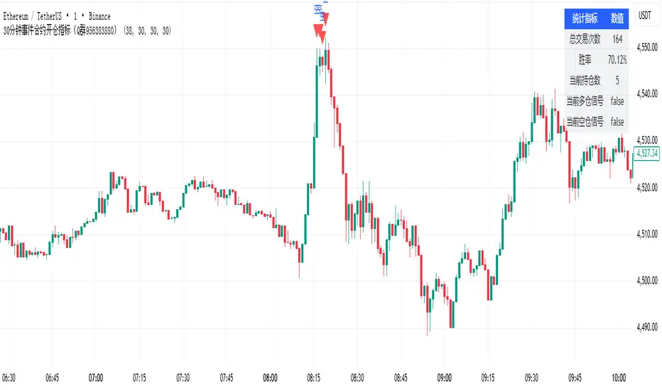
30分钟事件合约开仓指标(Q群956383880)This indicator is applicable to the Binance ETHUSDT spot 1-minute candlestick chart, and the order size can be adjusted based on the security level. Theoretically, the higher the security level, the smaller the order size and the higher the win rate.
本指标适用于币安ETHUSDT现货1分钟k线图,可以通过安全等级自行调节单量。理论上,安全等级越高,单量越少,胜率越高。
30分钟事件合约策略(Q群956383880)This strategy is applicable to the Binance ETHUSDT spot 1-minute candlestick chart, and the order size can be adjusted based on the security level. Theoretically, the higher the security level, the smaller the order size and the higher the win rate.
本策略适用于币安ETHUSDT现货1分钟k线图,可以通过安全等级自行调节单量。理论上,安全等级越高,单量越少,胜率越高。

ADAM Projection - Efficiency Ratio Adaptive)Overview
The ADAM Projection is a visualization of how a price path might extend from its recent motion, expressed as a continuation (trend reflection) or anti-trend (mean reversion) pattern. This indicator expands upon Jim Sloman’s original ADAM projection—introduced in “The Adam Theory of Markets or What Matters Is Profit” (1983)—by adding a modern quantitative framework for Efficiency Ratio (ER) weighting, time-scaled path normalization, and smooth blending between continuation and anti-trend projections.
What Is the ADAM Theory?
Jim Sloman’s original ADAM projection was designed to model pure trend continuation. He proposed that every market motion could be mirrored around a central anchor price (the “Adam line”), effectively reflecting past price movements forward in time to visualize what a continuation of the same geometric path would look like. This reflection concept captured the idea that market structure exhibits self-similarity and that price trends often extend symmetrically beyond recent pivots.
How This Script Extends It
This version generalizes Sloman’s concept by introducing an adjustable blend between continuation (reflection) and anti-trend (forward paste) behavior, weighted by an adaptive ER domain.
Anchor Axis
The reflection axis (anchorPrice) can be Close, HL2, HLC3, or OHLC4.
The projection is drawn forward from this anchor for a user-defined horizon (len bars).
Dual Paths
Continuation (Reflection): Mirrors historical closes across the anchor.
Anti-trend (Forward Paste): Extends historical closes directly forward without inversion.
Efficiency Ratio (ER)
The Efficiency Ratio measures how directional recent price movement has been: ER = |Net Change| / Σ|Δi|
Values near +1 indicate strong directionality (favoring continuation); values near 0 indicate noise or consolidation (favoring anti-trend behavior).
Signed ER Normalization
ER values are mapped into a user-defined domain between erMin and erMax, with:
erSharp (γ) controlling the steepness of the blend curve
erFloor providing stability when ER ≈ 0
beta (β) weighting volatility across time (β = 0.5 approximates √time scaling)
Blended Projection
Each projected point is a weighted combination of the two paths: y_proj = (1 − w) * y_fade + w * y_cont
The blend factor w is derived from the normalized ER domain and gamma shaping, producing a smooth morph between the anti-trend and continuation geometries.
Visualization
The teal projection line shows the dynamically blended continuation/anti-trend forecast for the next len bars.
The gray anchor line marks the reflection axis.
Each segment adapts in real time based on ER magnitude and recent path structure.
Key Parameters
Core: len, anchorPrice, lineThin — projection horizon and appearance
Lines: showProj, colProj — show or recolor projection
ER Domain: erMin, erMax, erSharp, erFloor, beta — control domain scaling, shaping, and time weighting
Practical Use
High ER values emphasize continuation (trend-following behavior).
Low or negative ER values emphasize fading or mean reversion.
The projection helps visualize whether recent structure supports trend persistence or weakening.
Interpretation
The ADAM Projection is not a predictive indicator but a geometric tool for studying market symmetry and efficiency. It provides a structured way to visualize how recent movements would look if extended forward under both continuation and anti-trend assumptions. This blends Sloman’s original reflection concept with modern ER-based adaptivity.
Summary
Origin: Jim Sloman (1983) — trend continuation via reflection symmetry.
Extension: Adds ER-driven blending to model both continuation and anti-trend regimes.
Concept: Price reflection vs. direct forward extension.
Purpose: Study of geometric price symmetry and efficiency, not a trade signal.
