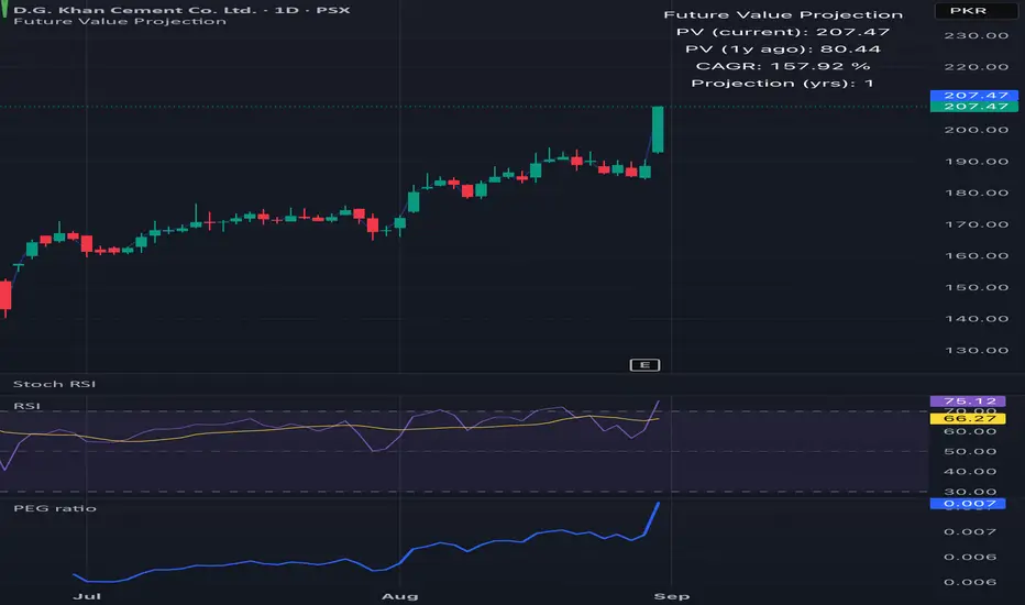
Future Value ProjectionFuture Value Projection with Actual CAGR
This indicator calculates the future value (FV) of the current ticker’s price using its historical Compound Annual Growth Rate (CAGR). It measures how much the price has grown over a chosen lookback period, derives the average annual growth rate, and then projects the current price forward into the future.
Formulae:
CAGR:
CAGR = ( PV_now / PV_past )^(1 / t) - 1
Future Value:
FV = PV_now × ( 1 + CAGR / n )^( n × T )
Where:
PV_now = Current price
PV_past = Price t years ago
t = Lookback period (years)
CAGR = Compound Annual Growth Rate
n = Compounding periods per year (1=annual, 12=monthly, 252=daily, etc.)
T = Projection horizon (years forward)
How it works:
Select a lookback period (e.g., 3 years).
The script finds the price from that time and computes the CAGR.
It then projects the current price forward by T years using the CAGR.
The chart shows:
Current price (blue)
Projected FV target (green)
A table with CAGR and projection details
Use case:
Helps investors and traders visualize long-term growth projections if the ticker continues growing at its historical pace.
Fundamental Analysis
Separators + MTF Box with Sessions
Indicator Description
Professional Multi-Timeframe Analysis Tool with Session Visualization
This comprehensive trading indicator combines advanced multi-timeframe analysis with session visualization, providing traders with a complete market structure visualization toolkit.
🚀 Key Features
Multi-Timeframe Separators
· Smart vertical lines marking period beginnings across 7 timeframes (5min to Weekly)
· Customizable colors, styles, and visibility ranges for each timeframe
· 30-minute separator option for enhanced precision
· Automatic visibility based on your current chart timeframe
Dynamic MTF Box
· Displays higher timeframe support/resistance levels as clear visual lines
· Two operating modes: Automatic (smart selection) or Manual (user-defined)
· Customizable colors for High/Low lines and Open/Close lines
· Optional Open/Close level display
Session Visualization
· Visualizes key market sessions with customizable time ranges
· Customizable session colors and labels
· Automatic high/low detection within each session
· Professional box displays with session labels
🎯 How It Works
The indicator automatically:
1. Draws timeframe separators based on your chart's current timeframe
2. Displays higher-timeframe structure through the MTF box
3. Identifies and marks sessions with their respective ranges
4. Provides clean visual representation of multi-timeframe market structure
⚙ Customization Options
· Separators: Enable/disable individual timeframes, adjust colors, styles, and visibility
· MTF Box:
· Choose between Automatic or Manual mode
· Select timeframes
· Customize colors for High/Low and Open/Close lines
· Toggle Open/Close display
· Sessions: Customize session times, colors, and toggle individual phases
· General: Overall on/off controls for separators
📊 Ideal For
· Multi-Timeframe Analysis: Perfect for traders who analyze across different timeframes
· Session-Based Trading: Identify key market sessions and their ranges
· Market Structure Traders: Clear visualization of support/resistance levels
· Swing & Day Traders: Suitable for various trading styles and timeframes
💡 Pro Tips
1. Use the Automatic mode for smart timeframe selection
2. Adjust separator visibility to avoid clutter on your preferred chart timeframes
3. Combine the MTF box with session visualization for comprehensive market analysis
4. Use different colors for quick visual recognition of various timeframes
⚠ Note
This indicator uses multiple security calls for MTF functionality. Performance may vary on very low timeframes with many enabled features.
Elevate your trading analysis with this all-in-one market structure tool that combines the power of multi-timeframe analysis with session visualization!
---
How to Use
1. Apply the indicator to any chart
2. Configure separator settings in the "Separators" groups
3. Set MTF Box preferences (mode, timeframe, colors)
4. Customize session times and colors in the "Sessions" group
5. The indicator will automatically display relevant market structure information
Compatibility
· Works on all chart types (candlestick, bar, line, etc.)
· Compatible with all TradingView instruments (stocks, forex, crypto, indices)
· Responsive design works on all timeframes from 1 minute to monthly
Transform your chart analysis with this powerful combination of timeframe separators, MTF structure visualization, and session analysis!

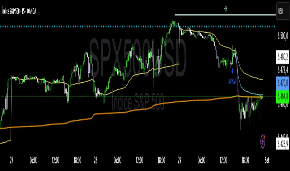
VWAP Confluência 3x VWAP Confluence 3x — Daily · Weekly · Anchored
Purpose
A pragmatic VWAP suite for execution and risk management. It plots three institutional reference lines: Daily VWAP, Weekly VWAP, and an Anchored VWAP (AVWAP) starting from a user-defined event (news, earnings, session open, swing high/low).
Why it matters
VWAP is the market’s “fair price” weighted by where volume actually traded. Confluence across timeframes and events turns noisy charts into actionable bias and clean levels.
What it does
Daily VWAP — resets each trading day; intraday “fair value.”
Weekly VWAP — resets each week; swing context and larger player defense.
Anchored VWAP — starts at a precise timestamp you set (e.g., news release).
Price source toggle — Typical Price
(
𝐻
+
𝐿
+
𝐶
)
/
3
(H+L+C)/3 or Close.
Visibility switches — enable/disable each line independently.
Anchor marker — labels the first bar of the AVWAP.
Inputs
Show Daily VWAP (on/off)
Show Weekly VWAP (on/off)
Show Anchored VWAP (on/off)
Price Source: Typical (H+L+C)/3 or Close
Anchor Time: timestamp of your event (uses the chart/exchange timezone)
How to anchor to a news event
Find the exact release time as shown in your chart’s timezone.
Open the indicator settings → set Anchor Time to that minute.
The AVWAP begins at that bar and accumulates forward.
Playbook (examples, not signals)
Strong long bias: price above Daily and Weekly VWAP; AVWAP reclaimed after news.
Strong short bias: price below Daily and Weekly; AVWAP reject after news.
Mean-revert zones: price stretches far from the active VWAPs and snaps back; size around VWAP with tight risk.
Targets: opposite VWAP, prior day/week highs/lows, or liquidity pools near AVWAP.
Best used with
Session highs/lows, liquidity sweeps, volume profile, and time-of-day filters.
Notes & limitations
Works best on markets with reliable volume (equities, futures, liquid crypto). FX spot uses synthetic volume—interpret accordingly.
Anchor Time respects the chart’s timezone. Convert news times before setting.
This is an indicator, not a backtestable strategy. No trade advice.
Disclaimer
For educational purposes only. Trading involves risk. Do your own research and manage risk responsibly.
Pivot ConnectPivot Connect –
a condensed and educational version
Objective
Automatically draws extended horizontal lines at the pivots (relevant highs and lows) of three timeframes:
The current chart (1 min, 5 min, 1 h… whatever you're looking at)
Weekly (W)
4-hour (240 min)
These lines are considered "protected levels": resistances (highs) or supports (lows).
The script also detects when the price breaks only the wick break to change the color/style of the line and warn that the level may have become invalid.
What is a pivot here?
ta.pivothigh / ta.pivotlow calculate a local high/low that has at least n bars on either side.
The pivotStrength parameter (default 12) is that n.
Therefore, a pivot high requires 12 candles to the left and 12 to the right lower than itself.
Lines drawn:
Highs and lows of the current timeframe (red and green)
Weekly highs and lows (blue and orange) if useWeekly = true
4-hour highs and lows (fuchsia and aqua) if use4H = true
Each line extends to the right by "extendLines" bars (default 100).
Wick break
This is reviewed bar by bar:
For a High level: if the high breaks above the line but the close remains below → it is considered a false break (wick break) and the line changes to purple and dashed style.
For a Low level: if the low breaks above the line but the close remains above → same warning.
The wickBreakBars (5) parameter is not used in the current logic; it was probably intended for future validation.
Cleaning Old Lines
Every 100 bars, lines with a right end older than 500 bars are removed to avoid memory overload (max_lines_count = 500).
Quick Customization
Colors and styles for each category.
Show or hide each line group (showHighs, showLows, useWeekly, use4H).
Thickness, solid/dash/dotted style.
Example of on-screen reading
Horizontal red line: resistance of the timeframe itself.
Horizontal blue line: important weekly high.
If a line changes to dashed purple: the price pierced it with the wick but did not close above it (at highs) – possible rejection.
This gives you a visual map of multi-timeframe support and resistance levels with quick alerts for "suspicious" breakouts.
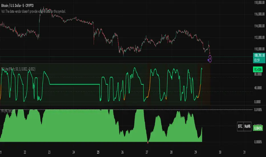
Snapfront Funding Stress IndexThe Funding Stress Index (FSI Lite) transforms raw funding rate data into a clear, intuitive stress gauge for crypto perpetual markets.
🔹 What it does:
Normalizes funding rates against their rolling baseline
Highlights extreme positive/negative funding as “stress zones”
Uses φ²-based coherence mapping for a sharper, sentiment-driven signal
Helps detect periods where traders are overpaying to stay long or short
🔹 How to use:
Add a Funding Rate feed (Bybit, Binance, OKX, etc.) to your chart.
Apply FSI Lite on top of it (Indicator on Indicator).
Watch stress levels as they enter:
🟢 High stress (positive funding) → longs paying shorts heavily, often overheated market.
🔴 Low stress (negative funding) → shorts paying longs, capitulation signals.
🟠 Neutral zone → balanced, less directional pressure.
🔹 Best for:
Identifying overheated long/short positioning
Timing entries around liquidation clusters
Adding funding context to your trading strategy
⚠️ Note: This is the Lite (free) version. It is educational only and not financial advice.
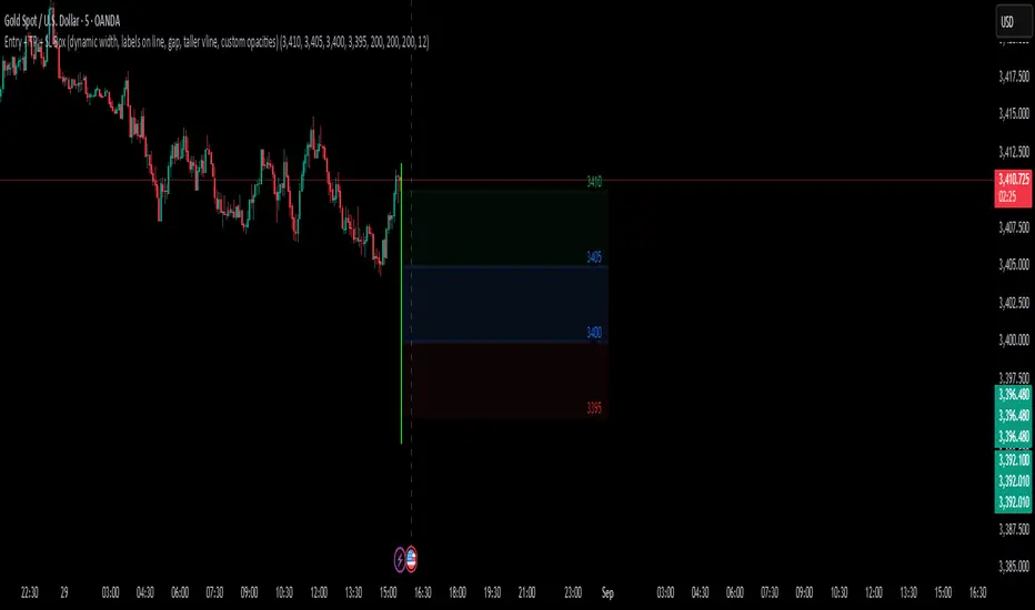
Entry + TP + SL Box (dynamic )The purpose of creating this indicator is to quickly draw the entry price range box, price target box, and price loss box.
Auto Pivot Entry SL TPDescription:
The Auto Pivot Entry SL TP indicator automatically detects Pivot Highs and Pivot Lows to generate precise BUY and SELL trade setups.
When a Pivot Low forms, a BUY setup is displayed with Entry, Stop Loss, and multiple Take Profit (TP1–TP3) levels.
When a Pivot High forms, a SELL setup is displayed with Entry, Stop Loss, and multiple Take Profit (TP1–TP3) levels.
Key Features:
Automatic detection of pivots for trade entries.
Clear visualization of Entry, SL, and TP levels directly on the chart.
Flexible Risk-Reward ratio settings for customizable targets.
Works on all symbols and timeframes.
This tool is designed for traders who want a simple yet effective method to plan trades using price action pivot points combined with predefined risk management (SL & TP levels).

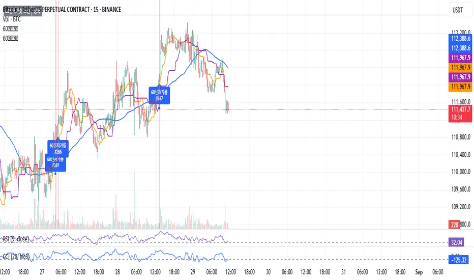
60 신저가 숏“60-Day New Low Short” is a momentum breakdown setup that sells short when price prints a fresh 60-day low, betting that failed support will extend the downtrend.
Entries are usually taken on the breakdown close (or next open) with confirmation like rising volume, relative weakness, and price below the 50/200-day MAs.
Manage risk with a stop above the recent swing high or 20-day high; take profits via ATR-based targets or a trailing stop, and avoid trades near major catalysts (earnings/news).
123Scalp-AHTDetector de patrones con confirmación para scalping.
Identifica Hammer/Shooting Star, Engulfing, Morning/Evening Star y Doji. Genera BUY/SELL con Entry/SL/TP (1R/1.5R/2R), opción 1-bar exit, filtro EMA, y alertas. Render Classic o Anchored (ABS) anclado al precio. No repinta tras la confirmación; pensado para intradía/scalping.
Scalp Pattern Signals — fast pattern/confirmation for intraday.
Detects Hammer/Shooting Star, Engulfing, Morning/Evening Star, and Doji. Produces BUY/SELL with Entry/SL/TP (1R/1.5R/2R), optional 1-bar exit, EMA trend filter, and alerts. Choose Classic or Anchored (ABS) rendering (anchored to price). No repaint after confirmation; built for scalping/intraday.

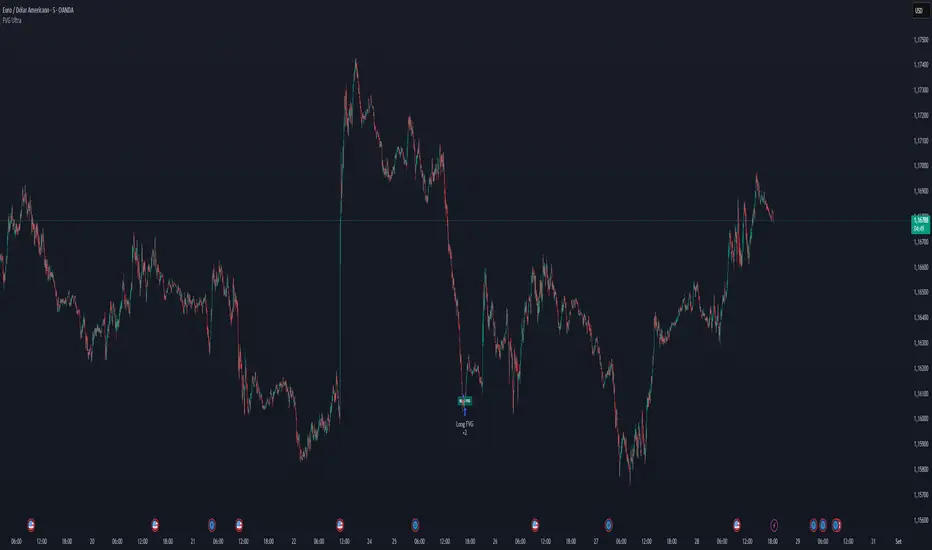
FVG Ultra Assertive - Individual Filters (mtbr)FVG Ultra Assertive - Individual Filters (mtbr)
What this script offers:
This strategy detects and highlights FVGs (Fair Value Gaps) on the chart, providing traders with a visual and systematic approach to identify potential price inefficiencies. The script plots bullish and bearish FVG zones using customizable boxes and labels, allowing users to easily spot high-probability trading areas. In addition, it opens and closes simulated trades based on the detected FVGs, enabling full backtesting and strategy performance evaluation. It integrates multiple independent filters to validate the strength of each FVG signal before entering a trade.
How it works:
The script identifies:
Bullish FVGs when the current low is higher than the high of two bars ago.
Bearish FVGs when the current high is lower than the low of two bars ago.
Once an FVG is detected, it applies three optional independent filters:
GAP/ATR Filter:
Measures the FVG size relative to the Average True Range (ATR). Only gaps exceeding a user-defined multiple of ATR are considered valid.
Support/Resistance (S/R) Filter:
Uses pivot points to check if the FVG overlaps with recent high/low pivot levels within a tolerance percentage. This ensures the gap aligns with meaningful market levels.
Stochastic Filter:
Applies a stochastic oscillator to confirm momentum. Bullish FVGs are validated when stochastic values are oversold, and bearish FVGs when overbought.
After passing the selected filters, the strategy opens trades:
LONG FVG for bullish signals (buy)
SHORT FVG for bearish signals (sell)
The strategy automatically closes positions when an opposite signal appears, generating a backtest report with trades, profits, and statistics. The final bullish or bearish FVG signals are plotted as colored boxes on the chart with labels “BULL FVG” or “BEAR FVG” for immediate visual reference.
How to configure it for use:
Use GAP/ATR Filter: Enable or disable the ATR-based filter and adjust the ATR period (ATR Length) and minimum gap multiplier (Minimum Gap x ATR).
Use S/R Filter: Enable or disable the pivot-based S/R filter. Configure the pivot lookback periods (Pivot Left and Pivot Right) and the tolerance percentage (Gap Tolerance %).
Use Stochastic Filter: Enable or disable stochastic confirmation. Adjust the K and D lengths (Stoch K Length and Stoch D Length) and the overbought/oversold thresholds (Stoch Overbought and Stoch Oversold).
Colors: Customize the colors for bullish and bearish FVGs (FVG Bull and FVG Bear) to match your chart preferences.
Usage Tips:
Apply this strategy to any timeframe; shorter timeframes generate more frequent FVGs, while higher timeframes highlight stronger gaps.
Combine FVG signals with other technical analysis tools for better trade confirmation.
Use the box and label visualization to quickly scan charts for trade opportunities without cluttering the chart.
The strategy’s trades (LONG and SHORT) provide backtesting results and performance statistics for each signal.
Multi-Asset Trend Background [SwissAlgo]Multi-Asset Trend Background
---------------------------------------------------------
Purpose
This indicator colors the chart background green (uptrend) or red (downtrend) to show the broad phases of a selected asset or ratio (for example SP500, or Gold), regardless of the current ticker on the chart (for example BTC).
The aim is not to generate signals, but to show when the selected asset (such as SP500 or Gold) was in a sustained uptrend or downtrend, so you can compare another chart (for example BTC) against that backdrop.
It helps frame price action in context, highlighting how macro drivers often align with or diverge from other markets.
From mid-2016 to late-2017, the SP500 was in a clear uptrend — Bitcoin rallied strongly in the same period, showing alignment between equities and crypto risk-taking.
When Gold trended higher, the SP500 often weakened, reflecting their tendency to move inversely in longer cycles.
As HYG/TLT turned down in early 2020, QQQ also struggled — illustrating how credit risk appetite is linked to equity performance.
During periods of DXY strength, Gold frequently showed the opposite trend, consistent with the historical dollar–gold relationship.
When RSP/SPY trended down, rallies in the S&P 500 were driven by a narrow group of large-cap stocks, while a rising ratio indicated broad market participation.
---------------------------------------------------------
Why it May Help You
Provides context for asset correlations.
Helps identify whether a chart is moving with or against its macro environment.
Useful for cycle mapping and historical study of market phases.
Filters noise and emphasizes established trends rather than short swings.
---------------------------------------------------------
How it Works
You select an asset or ratio from a dropdown.
The script calculates a mid-term moving average, then measures its slope, slope change, and slope acceleration to quantify the trend’s direction and consistency.
A longer-term moving average filter defines whether the long-term backdrop is bullish or bearish.
Background Coloring rules:
Green = slope strongly positive in line with long-term uptrend, or downtrend showing constructive reversal signs.
Red = slope strongly negative in line with long-term downtrend, or uptrend showing weakening slope.
No shading = neutral or mixed conditions.
This slope-based approach avoids the limitations of simple MA crosses, aiming to capture broad, consistent trend phases across different assets, with a mid/long-term view.
---------------------------------------------------------
Assets You Can Select
EQUITIES – good reference to gauge risk appetite in financial markets
SP500 = broad benchmark. Uptrend = strength in US equities signalling risk-on conditions; downtrend = weakness, risk-off market phase.
NASDAQ = tech and growth stocks. Uptrend = technology/growth leadership, risk appetite; downtrend = tech underperformance and fading risk appetite.
DOW = industrial and value stocks. Uptrend = industrial/value strength/economic strength; downtrend = weakness in traditional sectors and potential economic downturn.
RUSSELL2000 = small caps. Uptrend = typical in risk-on environments and FOMO; downtrend = small-cap underperformance, "flight to safety".
COMMODITIES – proxies for inflation, industry, and safe-haven demand.
GOLD = safe-haven. Uptrend = defensive demand rising/risk-off/inflation fears; downtrend = weaker demand for safety.
SILVER = partly industrial, partly safe-haven. Uptrend = stronger industrial cycle, or precious metals demand and risk appetite.
COPPER = industrial barometer. Uptrend = stronger industrial activity; downtrend = economic slowdown concerns.
CRUDE OIL = energy prices. Uptrend = rising energy/inflation pressures; downtrend = weaker demand or supply relief.
NATURAL GAS = volatile energy prices. Uptrend = higher energy costs and inflation pressure; downtrend = easing energy conditions.
BONDS / FX – monetary policy, credit, and risk appetite signals.
TLT = long-term US bonds. Uptrend = falling yields (bond demand)/flight to safety; downtrend = rising yields (risk on)
HYG = high-yield credit. Uptrend = strong credit appetite; downtrend = risk aversion in credit markets.
DXY = US dollar index. Uptrend = dollar strength (weaker EUR, GBP, SEK, etc); downtrend = dollar weakness.
USDJPY = carry trade proxy. Uptrend = stronger USD vs JPY (risk appetite); downtrend = JPY strength (risk-off).
CHFUSD = Swiss franc. Uptrend = franc strength (defensive flow); downtrend = franc weakness.
YIELD INVERSION = US10Y–US02Y. Uptrend = curve steepening; downtrend = inversion deepening (higher recession risk).
HOME BUILDERS = US housing sector. Uptrend = housing sector strength (risk on); downtrend = weakness (risk off).
EURUSD = euro vs dollar. Uptrend = euro strength (risk appetite); downtrend = euro weakness (risk aversion).
CRYPTO – digital asset benchmarks.
BITCOIN = digital gold. Uptrend = BTC strength; downtrend = BTC weakness.
CRYPTO_TOTAL = entire crypto market cap. Uptrend = broad crypto growth; downtrend = contraction.
CRYPTO_ALTS = altcoin market cap. Uptrend = altcoin expansion (often “alt season”); downtrend = contraction.
RATIOS – relative measures to extract macro signals.
COPPER/BTC = compares industrial cycle vs Bitcoin cycle. Uptrend = copper outperforming BTC; downtrend = BTC outperforming copper. Seems aligned with BTC macro tops and bottoms in the mid/long run.
RSP/SPY = market breadth (equal-weight vs cap-weighted). Uptrend = strong broad participation in market growth; downtrend = narrow leadership (fewer stocks leading the growth).
PCE/CPI = Fed’s inflation measure (PCE) vs consumer perceived inflation (CPI). Uptrend = PCE rising faster than CPI; downtrend = CPI running hotter than PCE. Fluctuates around 1; values above 1 may indicate hawkish Fed stands, values < 1 may indicate more dovish Fed stands.
HYG/TLT = credit vs bonds. Uptrend = risk appetite (high-yield outperforming long-term
treasury bonds); downtrend = risk aversion.
GOLD/SILVER = defensive vs cyclical metals. Uptrend = gold outperforming (risk-off tilt); downtrend = silver outperforming (risk-on tilt).
EURUSD/BTC = fiat vs crypto. Uptrend = EUR strengthening vs BTC; downtrend = BTC strengthening vs EUR. In general, the BTC trend is aligned EUR/USD trend.
---------------------------------------------------------
Limitations
Trend detection may lag by design to reduce noise.
Ratios rely on the availability and session rules of their components.
Background colors update on bar close; intra-bar values may differ.
Parameters are fixed and may not suit all assets equally.
---------------------------------------------------------
Disclaimer
This script is for educational and research purposes only. It does not provide financial advice or trade recommendations. Historical trend alignment does not guarantee future outcomes. Use with additional independent analysis.

Future 8 AM MarkerThis simple script marks the 8:00 AM New York open on the chart each day. It’s especially useful in Replay Mode to track price reactions and practice setups around this key time.

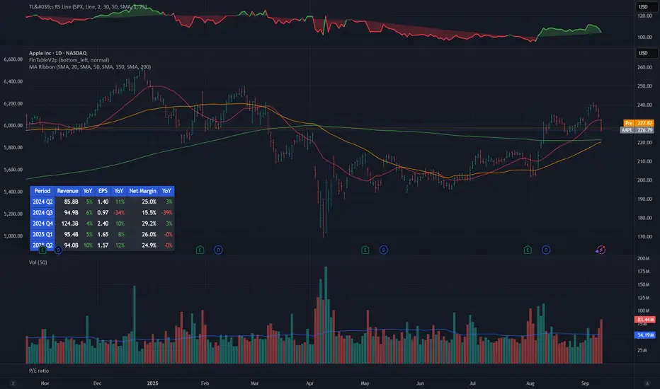
Mykung's Financial Table (Revenue, EPS, Net margin)A compact fundamentals dashboard that displays the last **8 fiscal quarters** for the current symbol. It’s designed for clarity (minimal decimals) and flexible presentation, with a dynamic column layout and accurate quarter labels.
## What it shows
**Columns (left → right):**
`Quarter | Revenue | YoY % | QoQ % | EPS | YoY % | QoQ % | `
* **Quarter** — formatted as `YYYY Q#` (e.g., `2025 Q2`).
Labels are derived from **fiscal period end dates** for accuracy.
* **Revenue** — compact notation (K/M/B/T), **no decimals**.
* **EPS** — uses **Diluted EPS** by default and falls back to **Basic EPS** if Diluted is unavailable. Displayed with **2 decimals**.
* **Net Margin** — displayed with **1 decimal**.
*Note:* Its YoY/QoQ columns represent **percentage-point** changes (absolute differences), not relative percent changes.
* **YoY % and QoQ %** — shown as **integers** (no decimals). Positive values are colored green; negative values red.
## Key features
* **Accurate quarter labels** from fundamentals (`FISCAL_PERIOD_END_DATE` → fallback `FINANCIAL_END_TIME`).
* **Dynamic layout:**
* Show all 10 columns (include Net Margin group), or
* Hide Net Margin to render a **7-column** table automatically.
* **Row order:** **Oldest at top → Latest at bottom** (chronological reading).
* **Customization:**
* Table position (nine presets: corners/centers).
* Text size.
* Table background color.
* **Header colors** (text & background) — also applied to the **Quarter** column cells for visual grouping.
* **Body text color** for data cells.
## Inputs (Settings)
* **Table Position** — place the table anywhere on the chart.
* **Text Size** — auto/tiny/small/normal/large/huge.
* **Table Background** — overall table BG color.
* **Header Background Color** — header & Quarter column background.
* **Header Text Color** — header & Quarter column text color.
* **Body Text Color** — data cells text color.
* **Show Net Margin Group (Cols 7–9)** — toggle between 10-col or 7-col layout.
## Calculations
* **QoQ %** = $(Current − Previous) / |Previous|$ × 100
* **YoY %** = $(Current − 4Q Ago) / |4Q Ago|$ × 100
* **Net Margin YoY / QoQ** = **difference in percentage points** (e.g., 12.4% → 10.9% = −1.5pp)
## Notes & limitations
* Requires symbols with **quarterly fundamentals** on TradingView. If a field is unavailable, it shows **N/A**.
* Fundamentals are updated by TradingView; values may refresh after earnings filings.
* Works on any chart timeframe; data comes from **fundamentals**, not price bars.
* Colors are indicative only and not investment advice.
**Built for readability**: minimal decimals (EPS 2dp, Net Margin 1dp), integer percentages, and compact revenue formatting—so you can scan eight quarters at a glance.
Big Mo’s Glaskugel — Macro Drawdown Risk (v1.1.2)What it does / what you see
An at-a-glance drawdown-risk oscillator that blends several macro US signals.
• A smooth, color-blended line (green→orange→red) shows the scaled risk score (0–100).
• Subtle shading marks “re-steepen warning windows” (starts when the yield curve re-steepens after an inversion; ends on normalization/cool-down).
• A compact status table summarizes: overall risk level, Yield Curve (10y–3m), Credit Stress (Baa–10y), Economy (LEI), and Valuation (CAPE).
Data used & why
Yield Curve (10y–3m) — FRED:T10Y3M. Inversions and subsequent re-steepens often precede recessions/equity drawdowns.
Credit Stress — FRED:BAA10Y vs its 1-year average (deviation in bps). Widening credit spreads flag tightening financial conditions.
Economy (LEI) — ECONOMICS:USLEI. 6-month annualized growth below a cutoff highlights macro deterioration.
Valuation (CAPE) — SHILLER_PE_RATIO_MONTH. Elevated valuations can amplify downside risk.
VIX spikes — optional boost that recognizes sudden risk repricings.
Important disclaimer
This is not a reliable or predictive indicator in all regimes. No guarantees or warranties of any kind are provided. It is not financial advice. Signals can be early, late, or wrong.
That said, it leans on well-studied warning factors (yield-curve dynamics, credit spreads, LEI weakness, valuation extremes) that have flagged major market downturns in the past.
Key customization / tweaks
Weights for each component (Yield, Credit, LEI, VIX, CAPE).
Thresholds: yield inversion months, re-steepen lookback, credit-stress bps, LEI cutoff, CAPE level, VIX spike levels.
Re-steepen boost: enable/disable, base points, half-life decay.
Shading behavior: cool-down bars to “unwarn,” max warning duration, only shade when risk ≠ green.
Scaling & smoothing: dynamic rolling max, EMA length, yellow/red thresholds.
Status table: position, and a snapshot mode to view values at a chosen historical time.

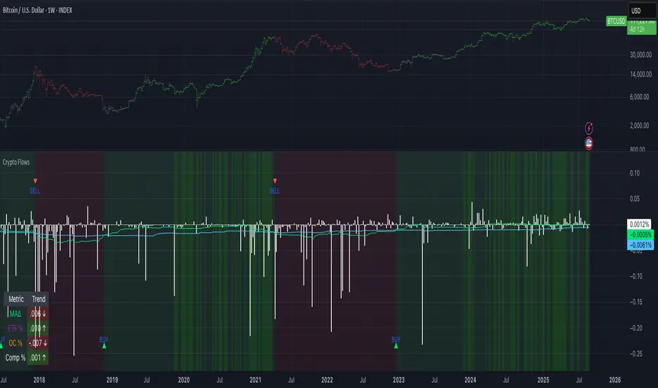
Crypto Flows [ETF|On-chain]The surge in Bitcoin and Ethereum spot ETFs has transformed how crypto is held and traded. By mid‑2025, U.S. spot Bitcoin ETFs already controlled roughly 1.28 million BTC, or about 6.5 percent of the circulating supply (Fosque, 2025). This accumulation has coincided with sharp price rallies and signals that regulated vehicles are absorbing a meaningful share of supply (Fosque, 2025; Wright, 2025). At the same time, on‑chain analytics show that exchange flows still influence markets: large inflows to exchanges often precede sell‑offs, whereas withdrawals to private wallets signal accumulation and reduced sell pressure (Singh, 2024; CryptoQuant, 2024). IntoTheBlock’s large‑holder inflow indicator even notes that spikes in whale buying frequently mark major bottoms (IntoTheBlock, 2022). I wanted to weave these pieces together, so I created this indicator.
Essence and logic
The script draws from two data streams: net flows into ETFs and net on‑chain flows from large holders, both scaled by the asset’s circulating market cap. ETF flows are aggregated across the ten largest INDEX:BTCUSD Bitcoin ETFs, the ten largest Ethereum INDEX:ETHUSD ETFs and the first CRYPTOCAP:SOL Solana ETF; each fund has its own checkbox and colour selection. On‑chain data uses IntoTheBlock’s large‑holder inflows and outflows, with dozens of coins available( CRYPTO:XRPUSD CRYPTOCAP:AVAX CRYPTOCAP:ADA CRYPTOCAP:LINK CRYPTO:DOGEUSD CRYPTOCAP:OTHERS ; if your coin isn’t shown in the dropdown you can manually enter its symbol. For each component, daily flows are converted into either a Z‑score or, by default, a percent‑of‑market‑cap series; users choose the weighting between ETF and on‑chain signals. These weighted series are summed into a composite, smoothed, and then two moving averages (a fast and a slow one) are applied to define bullish or bearish regimes. Because ETFs are a recent phenomenon, the early part of the composite is dominated by on‑chain flows; as ETF history lengthens, the fund‑flow component will become more influential. Trade signals are generated via moving‑average crossovers and optional dip triggers, and a trend table summarises current values and directions.
Why these components?
ETF flows reflect institutional adoption and supply absorption. Funds such as IBIT already hold about 744 000 BTC (roughly 3.3 percent of total supply), and cumulative ETF holdings have been growing faster than new coins are mined (Wright, 2025). Net inflows into these vehicles have tended to accompany rising prices and signal long‑horizon capital (Fosque, 2025). On‑chain flows, meanwhile, capture exchange liquidity dynamics. High inflows to exchanges often indicate that investors are preparing to sell, increasing tradable supply (Singh, 2024; CryptoQuant, 2024). Outflows into self‑custody suggest accumulation and reduced sell pressure, providing a bullish signal (Singh, 2024; CryptoQuant, 2024). IntoTheBlock points out that spikes in large‑holder inflows—whales moving coins into cold storage—have historically preceded price bottoms (IntoTheBlock, 2022). By weighting and standardising these flows relative to market cap, the composite aims to offer a more objective lens on risk‑on versus risk‑off regimes than price alone.
Limitations and outlook
ETFs a pretty new, so the data history is short. The list of tracked funds is currently limited to U.S. and European products; adding Asian or Canadian vehicles could provide a fuller picture. On‑chain flows can be noisy and occasionally give conflicting signals, and large‑holder data is not available for every crypto asset. The ETF and on‑chain components are also correlated through market cap, so equal weighting may amplify common trends. As macro conditions evolve and ETF redemption mechanisms change, the usefulness of fund flows could vary. I see this indicator as one tool among many, and I’m considering adding stablecoin flows, derivatives funding rates, or halving‑cycle adjustments. Suggestions are welcome.
Personal note
I’m a student who enjoys exploring the intersection of macro flows, on‑chain analytics and market psychology. This script is free to use. You can enable or disable each component, adjust weights, change the display mode and lookback, and select individual ETF tickers. If it brings you value, feel free to follow my work or reach out with feedback. I appreciate your support. Please remember that this indicator is for educational purposes and not investment advice. I built this indicator in addition to my Liquidity indicator, where I use Global M2, the yield curve, and the high-yield spread to define risk-on/risk-off regimes. If you are interested, you can find it here:
References
CryptoQuant Team. (2024). Exchange in/outflow and netflow user guide.
Fosque, J. (2025). Bitcoin ETFs pull $17.8 billion in 90 days as price surges past $118 K. The Digital Chamber.
IntoTheBlock. (2022). Large holders inflow indicator description.
Singh, O. (2024). Crypto exchange inflows and outflows explained: What they reveal about market trends. CCN.
Wright, L. (2025). Bitcoin ETFs to lock up 1.5 million BTC by New Year as supply squeeze tightens grip. CryptoSlate.
The Debasement IndexOVERVIEW
The Debasement Index measures asset prices relative to monetary debasement, providing a currency-neutral view of underlying economic fundamentals. Unlike traditional inflation metrics, it captures the sole impact of money supply expansion on asset valuations across different monetary regimes.
Key Innovation: Divides any asset by the ratio of Broad Money Supply (M2/M3) to Real GDP, reducing the impact of excess money creation on asset prices.
HOW IT WORKS
• Input 1: Select any symbol/asset for analysis (default: close price)
• Region: Choose country/currency for debasement calculation
• Display: Purple line overlay on main chart
Formula: Asset Price ÷ Debasement Index
i.e.
Formula: Asset Price ÷ (Money Supply / Real Output / last result (to rebased the index))
The indicator calculates neutralised security prices for each supported region:
• Numerator: M2/M3 money supply data
• Denominator: Real GDP (inflation-adjusted economic output)
• Number: rebases the index to the last updated value of the selected security
Supported Regions: US, UK etc. (regions may change based on availability)
DATA SOURCES
FRED (Federal Reserve Economic Data), TradingView Economics data feeds
INTERPRETATION
Rising Ratio: Asset outperforming monetary debasement (genuine value creation)
Falling Ratio: Asset underperforming relative to currency dilution (fundamental value loss)
Trend Analysis: Long-term slopes reveal whether assets maintain purchasing power against monetary expansion
The purple line represents the performance of the selected security after filtering out monetary noise, exposing fundamental economic trends that raw prices often obscure.
Take special note that most indices do not provide the total return, and the total return is necessary to understand actual value gains and losses.
APPLICATIONS
• Asset Allocation: Compare real returns across different monetary environments
• Cross-Country Analysis: Evaluate assets in countries with varying monetary policies
• Regime Identification: Spot asset price transitions that raw price measurements might obfuscate
• Value Assessment: Distinguish between monetary-driven and fundamental price movements
THEORETICAL FOUNDATION
Inspired by Anna Schwartz's monetary framework, the index attempts to measure currency dilution and remove that impact on the selected asset prices. It is a systematic attempt to filter out ‘monetary noise’ from financial data. The index addresses limitations of traditional inflation measures by:
1. Using real GDP (not nominal) to avoid circular causation of money creation
2. Capturing asset price effects beyond goods and services
3. Providing regime-aware analysis across monetary systems
LIMITATIONS
• Requires reliable M2/M3 and GDP data (scope and quality vary by country)
• Rebasing factors need periodic adjustment
• Most effective for medium to long-term analysis
• Not suitable for short-term trading signals
Note: This indicator reveals trends rather than providing entry/exit signals. Combining debasement-adjusted indices with comprehensive fundamental analysis can reframe and enhance your insights, providing a more complete understanding of price developments over time.

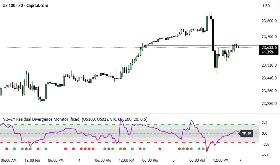
NQ–2Y CorrelationThis indicator tracks the relationship between the Nasdaq futures (NQ) and the US 2-Year Treasury yield (US02Y). The two typically move in opposite directions. This tool highlights when that relationship breaks down, and when moves become stretched to extremes. This can be useful for traders to find inflection points in price representing either overbought or oversold extremes.
Key Features
Residual Z-Score: Shows how far NQ’s returns deviate from what would be expected given moves in the 2Y. Useful for spotting stretched conditions (+/- 2σ bands).
Correlation Tracking: Fast and slow correlations between NQ and inverted 2Y returns. Helps identify regime shifts in the relationship.
Same-Direction Signals: Green dots mark when NQ and 2Y both move strongly in the same direction (rare alignment). Red dots mark strong opposing moves.
Alerts: Triggers available for residual stretches, correlation flips, and significant same-direction or opposite moves.
Usage
Monitor Z-Score to identify when the equity–rates linkage is stretched beyond typical bounds. I typically use this on the H1 or H4 timeframe.
Watch for correlation regime shifts to spot changing market dynamics. Typically price falling into support or moving into resistance as there is a false correlation or a flip.
Same-direction dots help flag unusual synchronized moves between risk assets and yields - these are especially useful for identifying false moves.
FX 2Y Spread AutoWhat it does
Plots the 2-year government bond yield spread for the current FX pair and timeframe you’re viewing.
Spread = Yield(Base currency) − Yield(Quote currency), shown in percentage points (pp).
How it works
Display & own scale
If you overlay it on price, pin the indicator to its own scale so it doesn’t flatten against the FX price scale.
Where to find it: Hover the indicator’s label, click More (⋯) → Pin to scale → choose Left or Right.
Automatically maps each currency to its 2Y benchmark:
USD→US02Y, EUR→DE02Y, CAD→CA02Y, CHF→CH02Y, GBP→GB02Y, AUD→AU02Y, NZD→NZ02Y, JPY→JP02Y
(EUR is represented by Germany’s 2Y Schatz: DE02Y.)
Pulls yields from TVC: symbols (e.g., TVC:US02Y, TVC:DE02Y) using the chart’s timeframe.
Many yield series are daily; on intraday charts the script forward-fills the last daily value so you always see a continuous line.
Interpretation (rule of thumb)
Spread ↑ (Base yields rising relative to Quote) → supports pair up (base currency appreciation).
Spread ↓ → supports pair down.
Short-end spreads (2Y) mainly reflect policy expectations; price can still diverge short-term due to risk sentiment, commodities (e.g., oil for CAD), positioning, or different maturities driving the move.
Examples
EURUSD → DE02Y − US02Y
USDJPY → US02Y − JP02Y
EURCAD → DE02Y − CA02Y
⚠️ Disclaimer
This indicator is for informational and analytical purposes only. It does not constitute financial advice, a trading signal, or a guarantee of future performance. Always perform your own research and consult with a qualified financial advisor before making trading decisions.

Beta Zones [MMT]Beta Zones
Overview
The Beta Zones indicator is a multi-timeframe analysis tool designed to identify and visualize price ranges (zones) across different timeframes on a TradingView chart. It draws boxes to represent high and low price levels for each enabled timeframe, helping traders spot key support and resistance zones, track price movements, and assess market signals relative to these zones. The indicator is highly customizable, allowing users to toggle timeframes, adjust colors, and control historical visibility.
Features
Multi-Timeframe Support : Tracks up to five user-defined timeframes (default: 15m, 1H, 4H, 1D, 1W) to display price zones.
Dynamic Price Boxes : Draws boxes on the chart to represent the high and low prices for each timeframe, updating dynamically as new bars form.
Signal Indicators : Provides directional signals (▲, ▼, →) based on the previous close relative to the current box's top and bottom.
Customizable Display : Includes options to show or hide historical boxes, adjust box colors, and configure a summary table.
Summary Table : Displays a table with timeframe status, price range, and signal information for quick reference.
Settings
Timeframes
Enable/Disable : Toggle each timeframe (e.g., 15m, 1H, 4H, 1D, 1W) to display or hide its respective zones.
Timeframe Selection : Choose custom timeframes for each of the five slots.
Color Customization : Set unique fill and border colors for each timeframe's boxes (default colors: green, blue, orange, purple, red).
Display
Max Historical Boxes : Limit the number of historical boxes per timeframe (default: 1, max: 50).
Show History : Toggle visibility of historical boxes (default: false, showing only the latest box).
Min Box Height : Ensures boxes have a minimum height in ticks (default: 1.0, currently hardcoded).
Table
Show Table : Enable or disable the summary table (default: true).
Background Color : Customize the table's background color.
Header Color : Set the color for the table's header row.
Text Color : Adjust the text color for table content.
Table Columns
Timeframe : Displays the selected timeframe (e.g., 15m, 1H).
Color : Shows the color associated with the timeframe's boxes.
Status : Indicates if the timeframe is "Active" (valid and lower than the chart's timeframe), "Invalid" (enabled but not lower), or "Disabled".
Range : Shows the price range (high - low) of the current box.
Signal : Displays ▲ (price above box), ▼ (price below box), or → (price within box) based on the previous close.
How to Use
Add to Chart : Apply the indicator to your TradingView chart.
Configure Timeframes : Enable desired timeframes and adjust their settings (e.g., 15m, 1H) to match your trading strategy.
Analyze Zones : Use the boxes to identify key price levels for support, resistance, or breakout opportunities.
Monitor Signals : Check the table's "Signal" column to gauge price direction relative to each timeframe's zone.
Customize Appearance : Adjust colors and historical box visibility to suit your preferences.
Ideal For
Swing Traders : Identify key price zones across multiple timeframes for entry/exit points.
Day Traders : Monitor short-term price movements relative to higher timeframe zones.
Technical Analysts : Combine with other indicators to confirm support/resistance levels.

Liquidity Sweep Breakout - LSBLiquidity Sweep Breakout - LSB
A professional session-based breakout system designed for OANDA:USDJPY and other JPY pairs.
Not guesswork, but precision - built on detailed observation of institutional moves to capture clear trade direction daily.
Master the Market’s Daily Bank Flow.
---
Strategy Detail:
I discovered this strategy after carefully studying how Japanese banks influence the forex market during their daily settlement period. Banks are some of the biggest players in the financial world, and when they adjust or settle their accounts in the morning, it often creates a push in the market. From years of observation, I noticed a consistent pattern, once banks finish their settlements, the market usually continues moving in the same direction that was formed right after those actions. This daily banking flow often sets the tone for the entire trading session, especially for JPY pairs like USDJPY.
To capture this move, I built the indicator so that it follows the bank-driven trend with clear rules for entries, stop-loss (SL), and take-profit (TP). The system is designed with professional risk management in mind. By default, it assumes a $10,000 account size, risks only 1% of that balance per trade, and targets a 1:1.5 reward-to-risk ratio. This means for every $100 risked, the potential profit is $150. Such controlled risk makes the system safer and more sustainable for long-term traders. At the same time, users are not limited to this setup, they can adjust the account balance in the settings, and the indicator will automatically recalculate the lot size and risk levels based on their own capital. This ensures the strategy works for small accounts and larger accounts alike.
🌍 Why It Works
Fundamentally driven: Based on **daily Japanese banking settlement flows**.
Session-specific precision: Targets the exact window when USDJPY liquidity reshapes.
Risk-managed: Always calculates lot size based on account and risk preferences.
Automatable: With webhook + MT5 EA, it can be fully hands-free.
---
✅ Recommended
Pair: USDJPY (best observed behavior).
Timeframe: 3-Minute chart.
Platform: TradingView Premium (for webhooks).
Execution: MT5 via EA.
---
🔎 Strategy Concept
The Tokyo Magic Breakout (TMB) is built on years of session observation and the unique daily rhythm of the Japanese banking system.
Every morning between 5:50 AM – 6:10 AM PKT (09:50 – 10:10 JST), Japanese banks perform daily reconciliation and settlement. This often sets the tone for the USDJPY direction of the day.
This strategy isolates that critical moment of liquidity adjustment and waits for a clean breakout confirmation. Instead of chasing noise, it executes only when price action is aligned with the Tokyo market’s hidden flows.
---
🕒 Timing Logic
Session Start: 5:00 AM PKT (Tokyo market open range).
Magic Candle: The 5:54 AM PKT candle is marked as the reference “breakout selector.”
Checkpoints: First confirmation at 6:30 AM PKT, then every 15 minutes until 8:30 AM PKT.
* If price stays inside the magic range → wait.
* If a breakout happens but the candle wick touches the range → wait for the next checkpoint.
* If by 8:30 AM PKT no clean breakout occurs → the day is marked as No Trade Day (NTD).
👉 Recommended timeframe: 3-Minute chart (3M) for precise signals.
---
📈 Trade Execution
Entry: Clean break above/below the magic candle’s range.
Stop-Loss: Opposite side of the Tokyo session high/low.
Take-Profit: Calculated by Reward\:Risk ratio (default 1.5:1).
Lot Size: Auto-calculated based on your risk model:
* Fixed Dollar
* % of Equity
* Conservative (minimum of both).
Visuals include:
✅ Entry/SL/TP lines
✅ Shaded risk (red) and reward (green) zones
✅ Trade labels (Buy/Sell with lot size & levels)
✅ TP/SL hit markers
---
🔔 Alerts & Automation (AutoTMB)
This strategy is fully automation-ready with EA + MT5:
1. Enable alerts in TMB settings.
2. Insert your PineConnector License Key.
3. Configure your risk management preferences.
4. Create a TradingView alert → in the message box simply type:
Pine Script®
{{alert_message}}
and set the EA webhook.
Now, every breakout trade (with exact entry, SL, TP, and lot size) is sent instantly.
👉 On your MT5:
* Install the EA.
* Use the same license key.
* Run it on a VPS or local MT5 terminal.
You now have a hands-free trading system: AutoTMB.

MSMT _ Position Size CalculatorFor apes who don't wanna do math. This is a position size calculator in USD value. You enter how much you want to risk per trade in dollars. It automatically shows your USD position size, in real time on the candle your watching or the previous candle position.
Economic Profit (Fixed & Labeled) — Rated + PeersFRAC (Fundamental-Rated-Asset-Calculate)
FRAC is a fundamentals-driven tool designed to measure whether a company is creating or destroying shareholder value. Unlike surface ratios, FRAC uses Economic Profit (ROIC – WACC) as its engine, showing whether a business truly outperforms its cost of capital.
🔹 What FRAC Does
Calculates ROIC (Return on Invested Capital) vs. WACC (Weighted Average Cost of Capital).
Shows whether a company is creating or destroying shareholder value.
Uses tiered color coding for clarity:
🔵 Superior (Aqua Blue) → Top tier; best of the best.
🟣 Elite (Purple) → Strong value creation.
🟢 Positive (Green) → Solid, creating shareholder value.
🟡 Marginal (Yellow) → Barely covering cost of capital.
🔴 Negative (Red) → Value destruction.
🔹 Composite Ranking System (1–4)
FRAC also assigns each company a Composite Rank so you can compare multiple names side by side. The rank works like this:
Rank 1 → Superior (🔵 Aqua Blue)
Best possible rating; wide gap between ROIC and WACC.
Rank 2 → Elite (🟣 Purple)
Strongly positive; above-average capital efficiency.
Rank 3 → Positive (🟢 Green)
Creating value but only moderately; not a top compounder.
Rank 4 → Marginal/Negative (🟡/🔴)
Weak or destructive; either barely covering WACC or losing money on capital.
✅ How to Use the Ranks
When comparing a set of peers (e.g., NVDA, AMD, INTC):
FRAC will display each company’s color rating + composite rank (1–4).
You can instantly see who is strongest vs. weakest in the group.
Best decisions = overweight Rank 1 & 2 companies, avoid Rank 4 names.
🔹 Key Inputs Explained
Risk-Free Asset → Typically the 10-Year US Treasury yield (US10Y).
Corporate Tax Rate → Effective tax rate for the company’s country (e.g., USCTR).
Expected Market Return → Historical average ~8–10%, adjustable.
Beta Lookback Period → Controls how far back Beta is calculated (longer = more stable, shorter = more reactive).
👉 These must be set correctly for FRAC to calculate WACC accurately.
🔹 Example Comparison
NVDA: ROIC 25% – WACC 7% = +18% → 🔵 Superior → Rank 1
AMD: ROIC 17% – WACC 8% = +9% → 🟣 Elite → Rank 2
INTC: ROIC 11% – WACC 9% = +2% → 🟢 Positive → Rank 3
FSLY: ROIC 5% – WACC 10% = –5% → 🔴 Negative → Rank 4
🔹 Why It Matters
Buffett said: “The best businesses are those that can consistently generate returns on capital above their cost of capital.”
FRAC turns that into a visual + numeric rating system (1–4), making comparisons across peers simple and actionable.
🔹 Credit
FRAC was created by Hunter Hammond (Elite x FineFir), inspired by corporate finance models of Economic Profit and Economic Value Added (EVA).
⚠️ Disclaimer: FRAC is a research framework, not financial advice. Always pair with full due diligence.

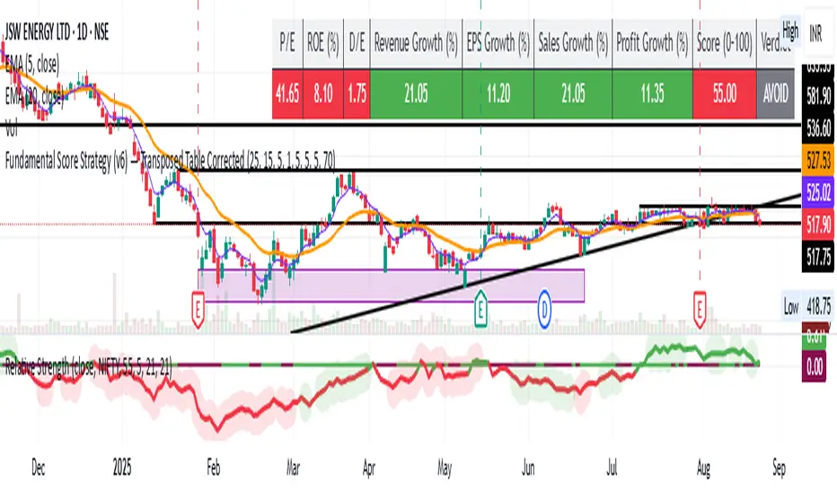
Fundamental Strategy - anuragmundraFundamental Score Based Backtest
This strategy combines fundamental analysis with automated backtesting to help identify long-term investment opportunities. Instead of relying only on price action or technical indicators, it evaluates the financial health of a company and generates simulated BUY/SELL signals accordingly.
🔑 Key Parameters Considered:
Price-to-Earnings (P/E Ratio): Ensures the stock is not overpriced.
Return on Equity (ROE): Indicates efficiency of management and business profitability.
Debt-to-Equity Ratio (D/E): Evaluates leverage and financial risk.
Revenue Growth (YoY): Shows business expansion and demand.
EPS Growth: Reflects consistent profit generation for shareholders.
Sales Growth: Confirms topline improvement.
Profit Growth: Measures bottom-line strength.
✅ Buy Condition
When the fundamental score ≥ 70/100, the strategy enters a long position.
Score is based on meeting/exceeding thresholds for P/E, ROE, Revenue Growth, EPS Growth, Sales Growth, Profit Growth, and Debt-to-Equity.
❌ Sell/Exit Condition
When the score falls below 70, the position is closed.
⚡ How to Use
Designed for medium to long-term investors who prefer fundamentally strong companies.
Can be run in the Strategy Tester to evaluate the historical performance of any stock.
Suitable as a stock-picking filter rather than a short-term trading system.
📊 Notes
Some ratios (like ROE) are based on annual values (FY), while others (EPS, Revenue, Net Income) use TTM for recency.
Not all symbols/exchanges provide full fundamental data. If data is missing, some metrics may show as N/A.
⚠️ Disclaimer: This is an educational tool for research and backtesting only. It is not financial advice. Always combine with your own due diligence before making investment decisions.