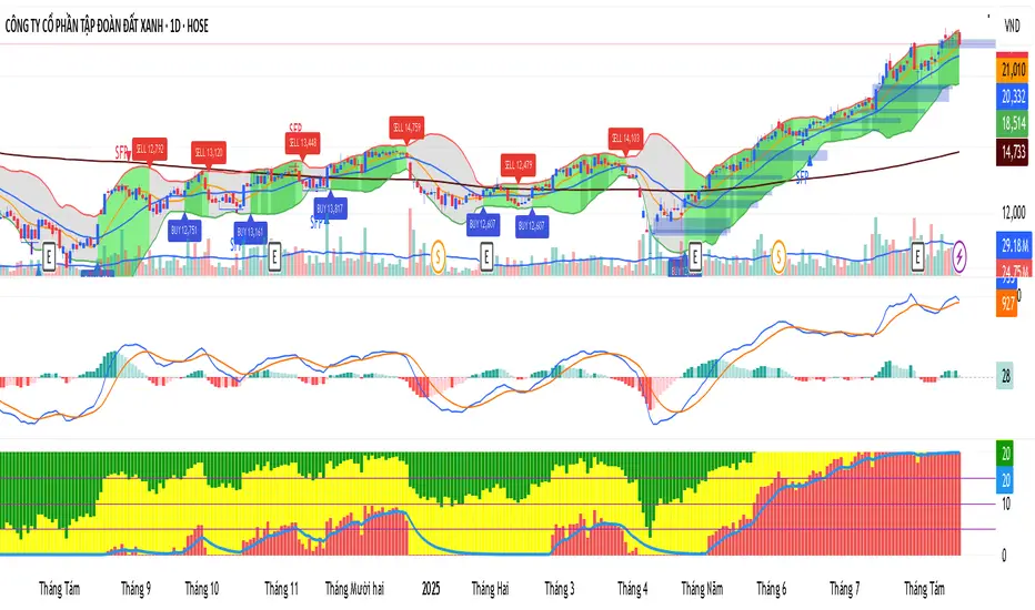
Elliott Wave Advanced Auto [CongTrader]🧾 INDICATOR DESCRIPTION
📌 Indicator: Elliott Wave Advanced Auto
Elliott Wave Advanced Auto is a professional automatic wave detection tool designed by CongTrader. It helps traders analyze market structure using Elliott Wave Theory, including:
📈 Automatic detection of impulsive waves (1-2-3-4-5)
🔷 Identification of triangle correction patterns (ABCDE)
⚠️ Detection of ending diagonal formations
🔮 Forecasting potential Wave 5 extension based on Fibonacci ratio
📊 Visually connecting waves with clean and clear lines
This indicator brings Elliott Wave analysis closer to all traders — whether beginner or advanced.
💡 How to Use It:
Add the indicator to your chart on TradingView.
Adjust Pivot Length to control the sensitivity of pivot detection.
Watch for wave labels (1 to 5 or A to E) appearing automatically on swing highs/lows.
Use signals to make trading decisions:
Wave 3 is often the strongest → possible entry point.
Wave 5 forecast gives a projected exit zone.
Ending Diagonal and Triangles warn of upcoming reversals.
Combine with other indicators (e.g., RSI, volume, support/resistance) for confirmation.
🎯 Features:
Automatic Elliott Wave labeling (1–5 / ABCDE)
Supports both bullish and bearish structures
Auto-line drawing between pivot points
Triangle pattern recognition (ABCDE)
Ending Diagonal pattern detection
Wave 5 forecast using 0.618 Fibonacci projection
Minimalist and clean layout, non-intrusive design
🙏 Credits & Thank You:
This indicator was developed by @CongTrader, a trader passionate about price action and algorithmic trading tools.
I hope this tool helps you improve your market timing and confidence in Elliott Wave analysis.
👉 If you find it helpful, don’t forget to leave a ⭐ or a kind comment to support!
⚠️ Disclaimer:
This script is for educational purposes only and does not constitute financial advice.
Use it with discretion and always validate with other tools.
You are responsible for your own trades. The author is not liable for any financial loss.#ElliottWave #WaveAnalysis #TechnicalAnalysis
#TradingViewScript #AutoElliott #WaveDetector
#TradingStrategy #PriceAction #CongTrader
#ImpulseWaves #Fibonacci #ForexTools
#CryptoTrading #StockTrading #WaveForecast
Indicators and strategies

Auto Fib Retracements – Confirmed PivotsDraws up to 24 Fibonacci retracement and extension levels from the most recent confirmed swing high/low.
Uses pivot detection with user-set left/right bar counts to identify swings and auto-determine direction, with manual overrides for Up or Down moves.
Features:
• Toggle visibility of each individual Fib level
• Per-level custom colors or pre-set palettes (Classic, Monochrome, Heatmap, Pastel)
• Optional log-scale Fib calculation
• Label options: show Fib level, price, or both; set horizontal & vertical placement; ATR-based offsets; background transparency
• Zoom-friendly — lines and labels stay anchored and scale with chart zoom
• Extend levels to the right or limit them to the swing only
Tips:
• Pivot Left / Pivot Right = bars to left/right used to confirm a swing
• In “Auto” direction mode, script chooses Low→High or High→Low based on most recent swings
• Turn on/off each Fib level under “Levels (toggle each)” group
• For sharp charts, keep only the most useful levels visible to avoid clutter

Becak I-series: Indicator Floating Panels v.80Becak I-series: Floating Panels v.80th (Indonesia Independence Days)
What it does:
This indicator creates three floating overlay panels that display MACD, RSI, and Stochastic oscillators directly on your price chart. Unlike traditional separate panes, these panels hover over your chart with customizable positioning and transparency, providing a clean, space-efficient way to monitor multiple technical indicators simultaneously.
When to use:
When you need to monitor momentum, trend strength, and overbought/oversold conditions without cluttering your workspace
Perfect for traders who want quick visual access to multiple oscillators while maintaining focus on price action
Ideal for any timeframe and asset class (stocks, crypto, forex, commodities)
How it works:
The script calculates standard MACD (12,26,9), RSI (14), and Stochastic (14,3,3) values, then renders them as floating panels with:
MACD Panel: Shows MACD line (blue), Signal line (orange), and histogram (green/red bars)
RSI Panel: Displays RSI line (purple) with overbought (70) and oversold (30) reference levels
Stochastic Panel: Shows %K (blue) and %D (orange) lines with optional buy/sell signals and highlighted overbought/oversold zones
Customization options:
Position: Choose Top, Bottom, or Auto-Center placement
Size: Adjust panel height (15-35% of chart) and spacing between panels
Positioning: Fine-tune vertical center offset and horizontal positioning
Appearance: Toggle panel backgrounds and adjust transparency (50-95%)
Parameters: Modify all indicator lengths and overbought/oversold levels
Signals: Enable/disable Stochastic crossover signals
Display: Control lookback period (30-100 bars) and right margin spacing
Universal compatibility: Works seamlessly across all asset types with automatic range detection and scaling.
DIRGAHAYU HARI KEMERDEKAAN KE 80 - INDONESIA ... MERDEKA!!!!!

Becak I-Series : Envelope Trading v.7.0Inspired by "Andean Oscillator: A New Technical Indicator Based on an Online Algorithm for Trend Analysis" (Alpaca Markets Research)
Core Concept
Inspired by the Andean Oscillator's online trend-detection algorithm, this indicator enhances traditional envelope strategies with real-time adaptive trend analysis and automated trade management.
📊 Key Innovations:
✅ Andean-Inspired Trend Detection – Dynamic envelope bands that adjust like the Andean Oscillator's real-time smoothing
✅ Self-Adjusting Targets – ATR-based profit-taking system with 3 customizable targets
✅ 5 Adaptive Modes – Switch between trend, reversal, pullback, squeeze, or hybrid strategies
✅ Smart Confirmation Filters – Volume (MFI), ADX strength, and RSI momentum
✅ Visual Trade Assistant – Auto-plots entry/exit zones with hit detection
🎯 How It Improves on Traditional Envelopes:
Real-Time Band Adjustment (like Andean's online algorithm)
Adaptive Target Zones (not static multiples)
Multiple Signal Philosophies in one tool
⚙️ Best For:
Traders who want Andean-like trend detection with clear rules
Systematic traders needing structured profit-taking
Swing traders looking for confirmed envelope breaks
How to Use the Becak I-Series Envelope Trading Indicator
This advanced indicator provides 5 trading modes with dynamic trend analysis and automated profit targets. Here’s how to use it effectively:
🔹 Step 1: Select Your Trading Mode
Choose from 5 signal types in the settings:
Momentum – Follows strong trends (best for trending markets)
Mean Reversion – Fades overextended moves (best for ranging markets)
Pullback – Enters retracements within trends (best for swing trading)
Squeeze – Trades volatility breakouts (best for consolidations)
Adaptive – Automatically blends strategies (recommended for all markets)
👉 Tip: Start with Adaptive mode if unsure.
🔹 Step 2: Understand the Signals
🔵 Blue Envelope (Upper Band) – Resistance in uptrends
🔴 Red Envelope (Lower Band) – Support in downtrends
⚪ Midline – Trend filter (price above = bullish, below = bearish)
Entry Signals
🟢 Buy Signal (⦿) – Price confirms bullish setup (depends on selected mode)
🟡 Sell Signal (⦿) – Price confirms bearish setup
Target Trend System (Auto Profit-Taking)
🎯 T1, T2, T3 – Profit targets (adjustable in settings)
🛑 SL – Dynamic stop-loss (trails with trend)
✔️ "HIT" Labels – Confirms when a target is reached
🔹 Step 3: Trade Execution Rules
For Trend-Following (Momentum/Pullback Modes)
✅ Long Entry:
Price breaks above midline
Buy signal appears (green dot)
Volume & ADX confirm strength
✅ Short Entry:
Price breaks below midline
Sell signal appears (yellow dot)
Volume & ADX confirm weakness
For Reversals (Mean Reversion Mode)
✅ Buy at Lower Band:
Price touches red envelope + RSI oversold
Volume confirms exhaustion
✅ Sell at Upper Band:
Price touches blue envelope + RSI overbought
Volume confirms exhaustion
🔹 Step 4: Manage Your Trade
Hold until T1, T2, or T3 is hit (adjust based on risk tolerance)
Stop-loss moves with the trend (trailing stop logic)
Exit early if the trend reverses (price crosses midline)
🔹 Step 5: Optimize Settings (Optional)
Envelope Length (50 default) – Adjust for sensitivity (shorter = faster signals)
ATR Multiplier (0.8 default) – Controls target distances
Volume/ADX Filters – Tweak for stricter/looser confirmations
PS:
thank you to pinecoder that previously write about andean envelope, learn much from you!!
TERIMA KASIH (Thank you) !!

Trend Signals with TP & SL Kang//@version=5
strategy("Buy/Sell with SL & TP", overlay=true, initial_capital=100000, default_qty_type=strategy.percent_of_equity, default_qty_value=10)
//===== Inputs =====
fastLen = input.int(9, "Fast MA Length")
slowLen = input.int(21, "Slow MA Length")
stopLossP = input.float(0.5, "Stop Loss %", step=0.1)
takeProfP = input.float(1.0, "Take Profit %", step=0.1)
//===== Indicators =====
fastMA = ta.ema(close, fastLen)
slowMA = ta.ema(close, slowLen)
plot(fastMA, color=color.new(color.green, 0))
plot(slowMA, color=color.new(color.red, 0))
//===== Conditions =====
longCondition = ta.crossover(fastMA, slowMA)
shortCondition = ta.crossunder(fastMA, slowMA)
//===== Entry Logic =====
if (longCondition)
strategy.entry("Long", strategy.long)
if (shortCondition)
strategy.entry("Short", strategy.short)
//===== Exit Logic =====
if (strategy.position_size > 0)
strategy.exit("Long Exit", "Long", stop=strategy.position_avg_price * (1 - stopLossP/100), limit=strategy.position_avg_price * (1 + takeProfP/100))
if (strategy.position_size < 0)
strategy.exit("Short Exit", "Short", stop=strategy.position_avg_price * (1 + stopLossP/100), limit=strategy.position_avg_price * (1 - takeProfP/100))

Currency Strength v3.0Currency Strength v3.0
Summary
The Currency Strength indicator is a powerful tool designed to gauge the relative strength of major and emerging market currencies. By plotting the True Strength Index (TSI) of various currency indices, it provides a clear visual representation of which currencies are gaining momentum and which are losing it. This indicator automatically detects the currency pair on your chart and highlights the corresponding strength lines, simplifying analysis and helping you quickly identify potential trading opportunities based on currency dynamics.
Key Features
Comprehensive Currency Analysis: Tracks the strength of 19 currencies, including major pairs and several emerging market currencies.
Automatic Pair Detection: Intelligently identifies the base and quote currency of the active chart, automatically highlighting the relevant strength lines.
Dynamic Coloring: The base currency is consistently colored blue, and the quote currency is colored gold, making it easy to distinguish between the two at a glance.
Non-Repainting TSI Calculation: Uses the True Strength Index (TSI) for smooth and reliable momentum readings that do not repaint.
Customizable Settings: Allows for adjustment of the fast and slow periods for the TSI calculation to fit your specific trading style.
Clean Interface: Features a minimalist legend table that only displays the currencies relevant to your current chart, keeping your workspace uncluttered.
How It Works
The indicator pulls data from major currency indices (like DXY for the US Dollar and EXY for the Euro). For currencies that don't have a dedicated index, it uses their USD pair (e.g., USDCNY) and inverts the calculation to derive the currency's strength relative to the dollar. It then applies the True Strength Index (TSI) to this data. The TSI is a momentum oscillator that is less volatile than other oscillators, providing a more reliable measure of strength. The resulting values are plotted on the chart, allowing you to see how different currencies are performing against each other in real-time.
How to Use
Trend Confirmation: When the base currency's line is rising and above the zero line, and the quote currency's line is falling, it can confirm a bullish trend for the pair. The opposite would suggest a bearish trend.
Identifying Divergences: Look for divergences between the currency strength lines and the price action of the pair. For example, if the price is making higher highs but the base currency's strength is making lower highs, it could signal a potential reversal.
Crossovers: A crossover of the base and quote currency lines can signal a shift in momentum. A bullish signal occurs when the base currency line crosses above the quote currency line. A bearish signal occurs when it crosses below.
Overbought/Oversold Levels: The horizontal dashed lines at 0.5 and -0.5 can be used as general guides for overbought and oversold conditions, respectively. Strength moving beyond these levels may indicate an unsustainable move that is due for a correction.
Settings
Fast Period: The short-term period for the TSI calculation. Default is 7.
Slow Period: The long-term period for the TSI calculation. Default is 15.
Index Source: The price source used for the calculations (e.g., Close, Open). Default is Close.
Base Currency Color: The color for the base currency line. Default is Royal Blue.
Quote Currency Color: The color for the quote currency line. Default is Goldenrod.
Disclaimer
This indicator is intended for educational and analytical purposes only. It is not financial advice. Trading involves substantial risk, and past performance is not indicative of future results. Always conduct your own research and risk management before making any trading decisions.

Pivot Points with CPR by Fin Virajఈ indicator ద్వారా మీరు Pivot Points మరియు Central Pivot Range (CPR) రెండింటినీ ఒకే chartలో చూడవచ్చు.
ఇది Intraday traders మరియు Swing traders కి చాలా ఉపయోగపడే tool, ఎందుకంటే ఇది clear support & resistance zones ని చూపిస్తుంది.
🔑 Key Features:
✅ Daily Pivot Points (Classic formula ఆధారంగా)
✅ Central Pivot Range (CPR) with Top, Bottom & Pivot levels
✅ Next Day Pivot Levels కూడా calculation ద్వారా చూపిస్తుంది
✅ Institutional traders ఎక్కువగా use చేసే Opening Range Reference తో confluence చెక్ చేయడానికి perfect
✅ Easy-to-use, clutter-free visualization
🎯 Why use this?
Intradayలో సరైన Support & Resistance levels identify చేయడానికి
CPR ద్వారా మార్కెట్లోని trend strength ని అర్థం చేసుకోవడానికి
Next day preparation కోసం pivot levels ముందే readyగా ఉండటానికి
Professional trading styleకి దగ్గరగా ఉండే price action + pivot confluence ను చూసేందుకు
👉 ఈ indicatorని consistentగా practice చేస్తే, మీ entries & exits మరింత confidentగా చేయగలరు.
Created & Published by Fin Viraj
📌 Visit: finviraj.com
🔥 "Master the market with the power of Pivots & CPR!"

KhoiHV - Bollinger Bands Buy/Sell Area ProBollinger Bands Buy/Sell Area Pro is a professional-grade indicator designed to identify potential trading opportunities based on Bollinger Bands. It highlights dynamic buy and sell areas by combining price action with volatility, helping traders quickly visualize market conditions.
✨ Key Features
Automatically plots upper, middle, and lower Bollinger Bands.
Marks Buy Areas when price enters oversold zones near the lower band.
Marks Sell Areas when price enters overbought zones near the upper band.
Configurable inputs for length, source, and multiplier to fit any trading style.
Easy-to-read chart visuals with colored zones for instant recognition.
💡 How to Use
Look for Buy Areas near the lower band in trending markets to catch potential rebounds.
Watch for Sell Areas near the upper band to anticipate possible pullbacks.
Combine with volume, momentum, or trend indicators for stronger confirmation.
This tool is especially useful for traders who want a clear, visual edge in spotting volatility-based entries and exits without constantly recalculating signals.
Мой скрипт// This Pine Script® code is subject to the terms of the Mozilla Public License 2.0 at mozilla.org
// © Mistab1009
//@version=6
indicator("MistaB SMC Navigation Toolkit", overlay=true, max_boxes_count=200)
// === USER INPUTS ===
extendBars = input.int(250, "Box Extension", group="Order Blocks")
opacity = input.int(75, "Box Opacity", group="Order Blocks")
showMidLine = input.bool(true, "Show Midline", group="Order Blocks")
bullColor = input.color(color.green, "Bullish OB Color", group="Order Blocks")
bearColor = input.color(color.red, "Bearish OB Color", group="Order Blocks")
useFractalSwings = input.bool(true, "Use Fractal Swings for OBs", group="Order Blocks")
useDisplacement = input.bool(true, "Require Displacement Candle", group="Order Blocks")
useHighVol = input.bool(true, "Require High Volume", group="Order Blocks")
obBuffer = input.float(0.0, "OB Buffer (points)", step=0.05, group="Order Blocks")
volLength = input.int(21, "Volume MA Length", group="Order Blocks")
volMultiplier = input.float(1.01, "Volume Multiplier", step=0.01, group="Order Blocks")
displacementMultiplier = input.float(1.0, "Displacement Multiplier", minval=0.5, maxval=1.0, step=0.05, group="Order Blocks")
lineExtendLength = input.int(20, "Structure Line Length", group="Structure")
showOB = input.bool(true, "Show Order Blocks", group="Order Blocks")
showFVG = input.bool(true, "Show Fair Value Gaps", group="FVG")
cleanupDelay = input.int(20, "Cleanup Delay (bars)", minval=1, group="Cleanup Settings")
fastCleanup = input.bool(false, "Fast Cleanup Mode", group="Cleanup Settings")
brokenColor = input.color(color.gray, "Broken OB/FVG Color", group="Cleanup Settings")
// Market Structure dimming
msDimOpacity = input.int(70, "Dimmed Structure/FVG Opacity (HTF mismatch)", minval=0, maxval=100, group="Structure")
// Premium/Discount Zones
showZones = input.bool(true, "Show Premium/Discount Zones", group="Premium/Discount Zones")
premiumColor = input.color(color.red, "Premium Zone Color", group="Premium/Discount Zones")
discountColor = input.color(color.green, "Discount Zone Color", group="Premium/Discount Zones")
// FVG Colors
bullish_fvg_color = input.color(color.new(color.green, 70), "Bullish FVG Color", group="FVG")
bearish_fvg_color = input.color(color.new(color.red, 70), "Bearish FVG Color", group="FVG")
// HTF Confirmation
confirmationTF = input.timeframe("60", "HTF Confirmation TF", group="HTF Confirmation")
requireHTF = input.bool(true, "Require HTF Alignment", group="HTF Confirmation")
// === ARRAYS ===
var box bullOBs = array.new_box()
var box bearOBs = array.new_box()
var line bullLines = array.new_line()
var line bearLines = array.new_line()
var int brokenTimestampsBull = array.new_int()
var int brokenTimestampsBear = array.new_int()
// === FRACTAL LOGIC ===
useFractal = input.string("5", "Fractal Type", options= , group="Structure")
fractalOffset = useFractal == "5" ? 2 : useFractal == "3" ? 1 : na
isSwingHigh = useFractal != "None" and not na(fractalOffset) and high > high and high > high and (useFractal != "5" or (high > high and high > high ))
isSwingLow = useFractal != "None" and not na(fractalOffset) and low < low and low < low and (useFractal != "5" or (low < low and low < low ))
// === OPPOSITE CANDLE FINDER ===
f_findOppositeCandle(_bull) =>
int retIndex = na
float retHigh = na
float retLow = na
for i = 1 to 50
bool isOpp = _bull ? (open > close ) : (close > open )
if isOpp
retIndex := bar_index - i
retHigh := high
retLow := low
break
// === HTF STRUCTURE DETECTION ===
htfTrendUp = request.security(syminfo.tickerid, confirmationTF, close > ta.sma(close, 20))
htfBullOB = request.security(syminfo.tickerid, confirmationTF, isSwingLow)
htfBearOB = request.security(syminfo.tickerid, confirmationTF, isSwingHigh)
// === HTF STATUS LABEL ===
var label htfLabel = na
var string htfTxt = ""
var color htfCol = color.gray
if barstate.islast
if not requireHTF
htfTxt := "HTF: Not Required"
htfCol := color.gray
else
if htfTrendUp
htfTxt := "HTF: Bullish ✅"
htfCol := color.green
else
htfTxt := "HTF: Bearish ✅"
htfCol := color.red
if na(htfLabel)
htfLabel := label.new(bar_index, high, text=htfTxt, style=label.style_label_left, textcolor=color.white, color=htfCol)
else
label.set_xy(htfLabel, bar_index, high)
label.set_text(htfLabel, htfTxt)
label.set_color(htfLabel, htfCol)
// === CLEANUP FUNCTION ===
f_cleanOB(_boxes, _lines, _timestamps, _isBull) =>
sz = array.size(_boxes)
if sz > 0
for i = sz - 1 to 0
b = array.get(_boxes, i)
l = array.get(_lines, i)
top = box.get_top(b)
bottom = box.get_bottom(b)
_broken = _isBull ? (close < bottom) : (close > top)
expired = bar_index - box.get_left(b) > extendBars
if _broken
if fastCleanup
box.delete(b)
if not na(l)
line.delete(l)
array.remove(_boxes, i)
array.remove(_lines, i)
if array.size(_timestamps) > i
array.remove(_timestamps, i)
continue
else
if array.size(_timestamps) <= i
array.push(_timestamps, bar_index)
else
array.set(_timestamps, i, bar_index)
box.set_bgcolor(b, color.new(brokenColor, opacity))
if not na(l)
line.set_color(l, brokenColor)
if expired or (array.size(_timestamps) > i and bar_index - array.get(_timestamps, i) >= cleanupDelay)
box.delete(b)
if not na(l)
line.delete(l)
array.remove(_boxes, i)
array.remove(_lines, i)
if array.size(_timestamps) > i
array.remove(_timestamps, i)
// === OB DETECTION ===
isDisplacementBull = close - open > ta.atr(14) * displacementMultiplier
isDisplacementBear = open - close > ta.atr(14) * displacementMultiplier
isHighVolume = volume > ta.sma(volume, volLength) * volMultiplier
if showOB and isSwingLow and bar_index > fractalOffset + 2
ok = (not useDisplacement or isDisplacementBull) and (not useHighVol or isHighVolume)
htfOK = not requireHTF or (htfTrendUp and htfBullOB)
= f_findOppositeCandle(true)
if ok and htfOK and not na(idxB)
hiB += obBuffer
loB -= obBuffer
array.push(bullOBs, box.new(left=idxB, top=hiB, right=bar_index + extendBars, bottom=loB, bgcolor=color.new(bullColor, opacity), border_color=bullColor, xloc=xloc.bar_index))
array.push(bullLines, showMidLine ? line.new(x1=idxB, y1=(hiB+loB)/2, x2=bar_index + extendBars, y2=(hiB+loB)/2, color=bullColor, style=line.style_dashed, xloc=xloc.bar_index) : na)
if showOB and isSwingHigh and bar_index > fractalOffset + 2
ok = (not useDisplacement or isDisplacementBear) and (not useHighVol or isHighVolume)
htfOK = not requireHTF or (not htfTrendUp and htfBearOB)
= f_findOppositeCandle(false)
if ok and htfOK and not na(idxS)
hiS += obBuffer
loS -= obBuffer
array.push(bearOBs, box.new(left=idxS, top=hiS, right=bar_index + extendBars, bottom=loS, bgcolor=color.new(bearColor, opacity), border_color=bearColor, xloc=xloc.bar_index))
array.push(bearLines, showMidLine ? line.new(x1=idxS, y1=(hiS+loS)/2, x2=bar_index + extendBars, y2=(hiS+loS)/2, color=bearColor, style=line.style_dashed, xloc=xloc.bar_index) : na)
f_cleanOB(bullOBs, bullLines, brokenTimestampsBull, true)
f_cleanOB(bearOBs, bearLines, brokenTimestampsBear, false)
// === MARKET STRUCTURE ===
var float lastHigh = na
var float lastLow = na
var bool trendUp = false
var bool prevTrendUp = false
if useFractal != "None" and bar_index > fractalOffset + 2
if isSwingHigh
swingHigh = high
if not na(lastHigh)
prevTrendUp := trendUp
trendUp := swingHigh > lastHigh
colorLine = trendUp ? color.green : color.red
structIsBull = trendUp
htfMatches = not requireHTF or (structIsBull and htfTrendUp) or (not structIsBull and not htfTrendUp)
colorUsed = htfMatches ? colorLine : color.new(colorLine, msDimOpacity)
txt = trendUp ? (prevTrendUp ? "HH BoS" : "HH CHoCH") : (prevTrendUp ? "LH CHoCH" : "LH BoS")
label.new(bar_index - fractalOffset - 1, swingHigh, text=txt, style=label.style_label_down, color=colorUsed, textcolor=color.white, size=size.small)
line.new(x1=bar_index - fractalOffset - 1, y1=swingHigh, x2=bar_index - fractalOffset - 1 + lineExtendLength, y2=swingHigh, color=colorUsed, width=1, xloc=xloc.bar_index)
lastHigh := swingHigh
if isSwingLow
swingLow = low
if not na(lastLow)
prevTrendUp := trendUp
trendUp := swingLow > lastLow
colorLine = trendUp ? color.green : color.red
structIsBull = trendUp
htfMatches = not requireHTF or (structIsBull and htfTrendUp) or (not structIsBull and not htfTrendUp)
colorUsed = htfMatches ? colorLine : color.new(colorLine, msDimOpacity)
txt = trendUp ? (prevTrendUp ? "HL BoS" : "HL CHoCH") : (prevTrendUp ? "LL CHoCH" : "LL BoS")
label.new(bar_index - fractalOffset - 1, swingLow, text=txt, style=label.style_label_up, color=colorUsed, textcolor=color.white, size=size.small)
line.new(x1=bar_index - fractalOffset - 1, y1=swingLow, x2=bar_index - fractalOffset - 1 + lineExtendLength, y2=swingLow, color=colorUsed, width=1, xloc=xloc.bar_index)
lastLow := swingLow
// === FVG LOGIC ===
var box bullish_fvg_boxes = array.new_box()
var label bullish_labels = array.new_label()
var box bearish_fvg_boxes = array.new_box()
var label bearish_labels = array.new_label()
var int bullFvgTimestamps = array.new_int()
var int bearFvgTimestamps = array.new_int()
if showFVG and bar_index >= 2
if low > high // Bullish FVG
htfMatches = not requireHTF or htfTrendUp
colorUsed = htfMatches ? bullish_fvg_color : color.new(bullish_fvg_color, msDimOpacity)
b = box.new(left=bar_index - 2, top=low, right=bar_index, bottom=high , bgcolor=colorUsed, border_color=na, extend=extend.right, xloc=xloc.bar_index)
array.push(bullish_fvg_boxes, b)
l = label.new(x=bar_index + 20, y=(low + high ) / 2, text="FVG", style=label.style_label_left, color=na, textcolor=color.green, xloc=xloc.bar_index)
array.push(bullish_labels, l)
if high < low // Bearish FVG
htfMatches = not requireHTF or not htfTrendUp
colorUsed = htfMatches ? bearish_fvg_color : color.new(bearish_fvg_color, msDimOpacity)
b = box.new(left=bar_index - 2, top=low , right=bar_index, bottom=high, bgcolor=colorUsed, border_color=na, extend=extend.right, xloc=xloc.bar_index)
array.push(bearish_fvg_boxes, b)
l = label.new(x=bar_index + 20, y=(low + high) / 2, text="FVG", style=label.style_label_left, color=na, textcolor=color.red, xloc=xloc.bar_index)
array.push(bearish_labels, l)
// === FVG Cleanup ===
f_cleanFVG(_boxes, _labels, _timestamps, _isBull) =>
sz = array.size(_boxes)
if sz > 0
for j = sz - 1 to 0
b = array.get(_boxes, j)
l = array.get(_labels, j)
bool filled = _isBull ? (bar_index > (box.get_left(b) + 1) and close < box.get_bottom(b)) : (bar_index > (box.get_left(b) + 1) and close > box.get_top(b))
if filled
if fastCleanup
box.delete(b)
label.delete(l)
array.remove(_boxes, j)
array.remove(_labels, j)
if array.size(_timestamps) > j
array.remove(_timestamps, j)
continue
if array.size(_timestamps) <= j
array.push(_timestamps, bar_index)
box.set_bgcolor(b, color.new(brokenColor, opacity))
label.set_textcolor(l, brokenColor)
if array.size(_timestamps) > j and bar_index - array.get(_timestamps, j) >= cleanupDelay
box.delete(b)
label.delete(l)
array.remove(_boxes, j)
array.remove(_labels, j)
array.remove(_timestamps, j)
f_cleanFVG(bullish_fvg_boxes, bullish_labels, bullFvgTimestamps, true)
f_cleanFVG(bearish_fvg_boxes, bearish_labels, bearFvgTimestamps, false)
// === PREMIUM / DISCOUNT ZONES ===
var box premBox = na
var box discBox = na
mid = (lastHigh + lastLow) / 2
if showZones and not na(mid) and not na(lastHigh) and not na(lastLow)
if not na(premBox)
box.delete(premBox)
if not na(discBox)
box.delete(discBox)
premBox := box.new(left=bar_index - 10, right=bar_index, top=lastHigh, bottom=mid, bgcolor=color.new(premiumColor, 85), border_color=na, xloc=xloc.bar_index)
discBox := box.new(left=bar_index - 10, right=bar_index, top=mid, bottom=lastLow, bgcolor=color.new(discountColor, 85), border_color=na, xloc=xloc.bar_index)

Correlation Heatmap Matrix [TradingFinder] 20 Assets Variable🔵 Introduction
Correlation is one of the most important statistical and analytical metrics in financial markets, data mining, and data science. It measures the strength and direction of the relationship between two variables.
The correlation coefficient always ranges between +1 and -1 : a perfect positive correlation (+1) means that two assets or currency pairs move together in the same direction and at a constant ratio, a correlation of zero (0) indicates no clear linear relationship, and a perfect negative correlation (-1) means they move in exactly opposite directions.
While the Pearson Correlation Coefficient is the most common method for calculation, other statistical methods like Spearman and Kendall are also used depending on the context.
In financial market analysis, correlation is a key tool for Forex, the Stock Market, and the Cryptocurrency Market because it allows traders to assess the price relationship between currency pairs, stocks, or coins. For example, in Forex, EUR/USD and GBP/USD often have a high positive correlation; in stocks, companies from the same sector such as Apple and Microsoft tend to move similarly; and in crypto, most altcoins show a strong positive correlation with Bitcoin.
Using a Correlation Heatmap in these markets visually displays the strength and direction of these relationships, helping traders make more accurate decisions for risk management and strategy optimization.
🟣 Correlation in Financial Markets
In finance, correlation refers to measuring how closely two assets move together over time. These assets can be stocks, currency pairs, commodities, indices, or cryptocurrencies. The main goal of correlation analysis in trading is to understand these movement patterns and use them for risk management, trend forecasting, and developing trading strategies.
🟣 Correlation Heatmap
A correlation heatmap is a visual tool that presents the correlation between multiple assets in a color-coded table. Each cell shows the correlation coefficient between two assets, with colors indicating its strength and direction. Warm colors (such as red or orange) represent strong negative correlation, cool colors (such as blue or cyan) represent strong positive correlation, and mid-range tones (such as yellow or green) indicate correlations that are close to neutral.
🟣 Practical Applications in Markets
Forex : Identify currency pairs that move together or in opposite directions, avoid overexposure to similar trades, and spot unusual divergences.
Crypto : Examine the dependency of altcoins on Bitcoin and find independent movers for portfolio diversification.
Stocks : Detect relationships between stocks in the same industry or find outliers that move differently from their sector.
🟣 Key Uses of Correlation in Trading
Risk management and diversification: Select assets with low or negative correlation to reduce portfolio volatility.
Avoiding overexposure: Prevent opening multiple positions on highly correlated assets.
Pairs trading: Exploit temporary deviations between historically correlated assets for arbitrage opportunities.
Intermarket analysis: Study the relationships between different markets like stocks, currencies, commodities, and bonds.
Divergence detection: Spot when two typically correlated assets move apart as a possible trend change signal.
Market forecasting: Use correlated asset movements to anticipate others’ behavior.
Event reaction analysis: Evaluate how groups of assets respond to economic or political events.
❗ Important Note
It’s important to note that correlation does not imply causation — it only reflects co-movement between assets. Correlation is also dynamic and can change over time, which is why analyzing it across multiple timeframes provides a more accurate picture. Combining correlation heatmaps with other analytical tools can significantly improve the precision of trading decisions.
🔵 How to Use
The Correlation Heatmap Matrix indicator is designed to analyze and manage the relationships between multiple assets at once. After adding the tool to your chart, start by selecting the assets you want to compare (up to 20).
Then, choose the Correlation Period that fits your trading strategy. Shorter periods (e.g., 20 bars) are more sensitive to recent price movements, making them suitable for short-term trading, while longer periods (e.g., 100 or 200 bars) provide a broader view of correlation trends over time.
The indicator outputs a color-coded matrix where each cell represents the correlation between two assets. Warm colors like red and orange signal strong negative correlation, while cool colors like blue and cyan indicate strong positive correlation. Mid-range tones such as yellow or green suggest correlations that are close to neutral. This visual representation makes it easy to spot market patterns at a glance.
One of the most valuable uses of this tool is in portfolio risk management. Portfolios with highly correlated assets are more vulnerable to market swings. By using the heatmap, traders can find assets with low or negative correlation to reduce overall risk.
Another key benefit is preventing overexposure. For example, if EUR/USD and GBP/USD have a high positive correlation, opening trades on both is almost like doubling the position size on one asset, increasing risk unnecessarily. The heatmap makes such relationships clear, helping you avoid them.
The indicator is also useful for pairs trading, where a trader identifies assets that are usually correlated but have temporarily diverged — a potential arbitrage or mean-reversion opportunity.
Additionally, the tool supports intermarket analysis, allowing traders to see how movements in one market (e.g., crude oil) may impact others (e.g., the Canadian dollar). Divergence detection is another advantage: if two typically aligned assets suddenly move in opposite directions, it could signal a major trend shift or a news-driven move.
Overall, the Correlation Heatmap Matrix is not just an analytical indicator but also a fast, visual alert system for monitoring multiple markets at once. This is particularly valuable for traders in fast-moving environments like Forex and crypto.
🔵 Settings
🟣 Logic
Correlation Period : Number of bars used to calculate correlation between assets.
🟣 Display
Table on Chart : Enable/disable displaying the heatmap directly on the chart.
Table Size : Choose the table size (from very small to very large).
Table Position : Set the table location on the chart (top, middle, or bottom in various alignments).
🟣 Symbol Custom
Select Market : Choose the market type (Forex, Stocks, Crypto, or Custom).
Symbol 1 to Symbol 20: In custom mode, you can define up to 20 assets for correlation calculation.
🔵 Conclusion
The Correlation Heatmap Matrix is a powerful tool for analyzing correlations across multiple assets in Forex, crypto, and stock markets. By displaying a color-coded table, it visually conveys both the strength and direction of correlations — warm colors for strong negative correlation, cool colors for strong positive correlation, and mid-range tones such as yellow or green for near-zero or neutral correlation.
This helps traders select assets with low or negative correlation for diversification, avoid overexposure to similar trades, identify arbitrage and pairs trading opportunities, and detect unusual divergences between typically aligned assets. With support for custom mode and up to 20 symbols, it offers high flexibility for different trading strategies, making it a valuable complement to technical analysis and risk management.

CleanBreak Lines (Break + First Retest)CleanBreak lines draws one robust support line (green) from swing lows and one robust resistance line (red) from swing highs, then optionally signals a confirmed break and the first clean retest back to that line. Lines are scored with a transparent W-Score (0–100) so traders can judge quality at a glance. The script is non-repainting and uses only confirmed bar data.
What it does
Auto-builds two trendlines that aim to represent meaningful support and resistance.
Uses a median-based slope so outliers and single spikes do not distort the line.
Computes a W-Score per line from three things: touches, span (how long it held), and respect (staying on the correct side).
Optionally triggers a single, tightly-gated signal on Break + First Retest.
How it works (plain English)
Detect recent swing highs and swing lows.
Fit one line through highs and one through lows using a robust, median-style slope estimate.
Score each line: more clean touches and longer span raise the W-Score; frequent violations lower it.
A break requires a candle close beyond the line by a small ATR margin.
A first retest requires price to come back to the line within a limited number of bars and hold on close.
A single arrow may print on that confirmed retest, with optional alerts.
What it is not
Not a prediction model and not a promises-of-profit tool.
Not a multi-signal spammer: by design it aims to allow one retest entry per break.
Not a regression channel or machine-learning system.
How to use
At a glance: treat the green line as candidate support and the red line as candidate resistance.
Conservative approach: wait for a break on close and then the first retest to hold; use the arrow as a prompt, not a command.
Context-only mode: hide arrows in Style if you want the lines and W-Score only.
Inputs (brief)
Core: Swing Length, Max Pivots, Min Touches, Min Span Bars.
Scoring: Touches Max (cap), Weights for touches vs span, Min W-Score to arm.
Break and Retest: Break Margin x ATR, Retest Tolerance x ATR, Retest Window (bars).
Visuals: Show Labels, Show Table, Line Width, Fade When Refit.
Recommended presets
Cleaner, fewer signals: Min Touches 4–5, Min Span Bars 100–150, Min W-Score 70–80, Break Margin 0.40–0.60 ATR, Retest Tolerance 0.10–0.15 ATR, Retest Window 8–12 bars.
Lines-only: keep defaults and uncheck the two plotshapes in Style.
Alerts
CB Long Retest: break above the red line and first retest holds.
CB Short Retest: break below the green line and first retest holds.
Use “Once per bar close” for consistency.
On-chart table (if enabled)
RES / SUP: W-Score and distance from price in ATR terms.
Status: “Waiting Long RT”, “Waiting Short RT”, or “Idle”.
Thresholds: MinScore and Retest bars for quick context.
Timeframes
Works well on 1h to 1D. On very low timeframes, raise Break Margin x ATR to reduce whipsaw effects. On higher timeframes, increase Min Touches and Min Span Bars.
Non-repainting policy
All logic uses confirmed pivots and confirmed bar closes.
Breaks and retests are validated on close; alerts reference only confirmed conditions.
No lookahead in any request.security call.
Original implementation focused on a median-based robust slope for auto trendlines, plus a transparent W-Score and a single retest gate.
Disclosure
This script is for education and charting. It does not guarantee outcomes, and past behavior does not imply future results. Always validate on historical data and practice risk management.

liquidity reversalThis script detects liquidity sweeps and confirms reversals based on price action. It looks for:
- A sweep of a recent high or low
- A reversal candle closing back inside range
- (Optional) Confirmation via market structure break (MSB)
When confirmed, it plots:
- BUY signals after low sweep + bullish break
- SELL signals after high sweep + bearish break
Works on any timeframe. Designed for MNQ scalping during NY open.
HTF Candles & ReversalsThis is a comprehensive multi-timeframe analysis tool designed to give you a broader perspective on market structure directly from your main chart. It overlays candles from up to six user-defined higher timeframes (HTF) and includes a built-in indicator to spot potential price reversals. This allows you to analyze the bigger picture and make more informed decisions without constantly switching between different chart layouts.
Key Features
Multi-Timeframe Candle Display: Renders candles from up to six different higher timeframes (the defaults are 5m, 15m, 1H, 4H, 1D, and 1W). You can see how the current price action fits within the larger trend.
Reversal Pattern Detection: The script identifies and highlights potential bullish and bearish reversal patterns. This works on both your main chart's candles and the displayed HTF candles, helping you spot potential shifts in momentum on multiple scales.
Imbalance (FVG) Highlighting: Automatically detects and draws Fair Value Gaps (FVGs) on the HTF candles, pointing out areas of inefficient price action that may act as magnets for future price movement.
Full Customization: You have complete control over the visual elements. Adjust the colors for candle bodies, borders, and wicks. Change the positioning of the HTF display, and toggle labels, timers, and imbalance boxes to create a clean workspace that fits your trading style.
How to Use This Indicator
Gain Market Context: Use the HTF candles to quickly gauge the dominant trend. For example, if the 4H and 1D candles are bullish, you might look for buying opportunities on your lower timeframe chart. The highs and lows of these HTF candles often serve as strong support and resistance levels.
Identify Reversals:
Triangles on the Main Chart: A green triangle below a candle suggests a potential bullish reversal, while a red triangle above suggests a potential bearish reversal. This pattern appears when a candle makes a new low/high but closes stronger/weaker than the previous one.
Colored HTF Candles: When an HTF candle is colored (lime for bullish, orange for bearish), it indicates that a reversal pattern has formed on that specific higher timeframe, which could signal a more significant change in market direction.
Utilize Imbalances: The highlighted FVG boxes can be treated as areas of interest. Price often revisits these zones, making them potential targets for trades or areas to watch for a reaction.
Settings Breakdown
Candle Color: Independently set the colors for bullish and bearish candle bodies, borders, and wicks.
Layout: Use the HTF Distance setting to control how far the displayed candles appear from the current price action.
Labels: Choose whether to display the timeframe name and a countdown timer for each HTF candle. You can position these labels at the top, bottom, or both.
Imbalances: Toggle the visibility of the FVG boxes and customize their color.
Reversal Indicator: Enable or disable the reversal triangles on your main chart and the special coloring for reversal candles on both the main chart and the HTF displays.
Disclaimer: This tool is intended for technical analysis and educational purposes. It does not provide financial advice or generate guaranteed trading signals. Always use risk management and conduct your own analysis before entering any trade.

Seasonality Monte Carlo Forecaster [BackQuant]Seasonality Monte Carlo Forecaster
Plain-English overview
This tool projects a cone of plausible future prices by combining two ideas that traders already use intuitively: seasonality and uncertainty. It watches how your market typically behaves around this calendar date, turns that seasonal tendency into a small daily “drift,” then runs many randomized price paths forward to estimate where price could land tomorrow, next week, or a month from now. The result is a probability cone with a clear expected path, plus optional overlays that show how past years tended to move from this point on the calendar. It is a planning tool, not a crystal ball: the goal is to quantify ranges and odds so you can size, place stops, set targets, and time entries with more realism.
What Monte Carlo is and why quants rely on it
• Definition . Monte Carlo simulation is a way to answer “what might happen next?” when there is randomness in the system. Instead of producing a single forecast, it generates thousands of alternate futures by repeatedly sampling random shocks and adding them to a model of how prices evolve.
• Why it is used . Markets are noisy. A single point forecast hides risk. Monte Carlo gives a distribution of outcomes so you can reason in probabilities: the median path, the 68% band, the 95% band, tail risks, and the chance of hitting a specific level within a horizon.
• Core strengths in quant finance .
– Path-dependent questions : “What is the probability we touch a stop before a target?” “What is the expected drawdown on the way to my objective?”
– Pricing and risk : Useful for path-dependent options, Value-at-Risk (VaR), expected shortfall (CVaR), stress paths, and scenario analysis when closed-form formulas are unrealistic.
– Planning under uncertainty : Portfolio construction and rebalancing rules can be tested against a cloud of plausible futures rather than a single guess.
• Why it fits trading workflows . It turns gut feel like “seasonality is supportive here” into quantitative ranges: “median path suggests +X% with a 68% band of ±Y%; stop at Z has only ~16% odds of being tagged in N days.”
How this indicator builds its probability cone
1) Seasonal pattern discovery
The script builds two day-of-year maps as new data arrives:
• A return map where each calendar day stores an exponentially smoothed average of that day’s log return (yesterday→today). The smoothing (90% old, 10% new) behaves like an EWMA, letting older seasons matter while adapting to new information.
• A volatility map that tracks the typical absolute return for the same calendar day.
It calculates the day-of-year carefully (with leap-year adjustment) and indexes into a 365-slot seasonal array so “March 18” is compared with past March 18ths. This becomes the seasonal bias that gently nudges simulations up or down on each forecast day.
2) Choice of randomness engine
You can pick how the future shocks are generated:
• Daily mode uses a Gaussian draw with the seasonal bias as the mean and a volatility that comes from realized returns, scaled down to avoid over-fitting. It relies on the Box–Muller transform internally to turn two uniform random numbers into one normal shock.
• Weekly mode uses bootstrap sampling from the seasonal return history (resampling actual historical daily drifts and then blending in a fraction of the seasonal bias). Bootstrapping is robust when the empirical distribution has asymmetry or fatter tails than a normal distribution.
Both modes seed their random draws deterministically per path and day, which makes plots reproducible bar-to-bar and avoids flickering bands.
3) Volatility scaling to current conditions
Markets do not always live in average volatility. The engine computes a simple volatility factor from ATR(20)/price and scales the simulated shocks up or down within sensible bounds (clamped between 0.5× and 2.0×). When the current regime is quiet, the cone narrows; when ranges expand, the cone widens. This prevents the classic mistake of projecting calm markets into a storm or vice versa.
4) Many futures, summarized by percentiles
The model generates a matrix of price paths (capped at 100 runs for performance inside TradingView), each path stepping forward for your selected horizon. For each forecast day it sorts the simulated prices and pulls key percentiles:
• 5th and 95th → approximate 95% band (outer cone).
• 16th and 84th → approximate 68% band (inner cone).
• 50th → the median or “expected path.”
These are drawn as polylines so you can immediately see central tendency and dispersion.
5) A historical overlay (optional)
Turn on the overlay to sketch a dotted path of what a purely seasonal projection would look like for the next ~30 days using only the return map, no randomness. This is not a forecast; it is a visual reminder of the seasonal drift you are biasing toward.
Inputs you control and how to think about them
Monte Carlo Simulation
• Price Series for Calculation . The source series, typically close.
• Enable Probability Forecasts . Master switch for simulation and drawing.
• Simulation Iterations . Requested number of paths to run. Internally capped at 100 to protect performance, which is generally enough to estimate the percentiles for a trading chart. If you need ultra-smooth bands, shorten the horizon.
• Forecast Days Ahead . The length of the cone. Longer horizons dilute seasonal signal and widen uncertainty.
• Probability Bands . Draw all bands, just 95%, just 68%, or a custom level (display logic remains 68/95 internally; the custom number is for labeling and color choice).
• Pattern Resolution . Daily leans on day-of-year effects like “turn-of-month” or holiday patterns. Weekly biases toward day-of-week tendencies and bootstraps from history.
• Volatility Scaling . On by default so the cone respects today’s range context.
Plotting & UI
• Probability Cone . Plots the outer and inner percentile envelopes.
• Expected Path . Plots the median line through the cone.
• Historical Overlay . Dotted seasonal-only projection for context.
• Band Transparency/Colors . Customize primary (outer) and secondary (inner) band colors and the mean path color. Use higher transparency for cleaner charts.
What appears on your chart
• A cone starting at the most recent bar, fanning outward. The outer lines are the ~95% band; the inner lines are the ~68% band.
• A median path (default blue) running through the center of the cone.
• An info panel on the final historical bar that summarizes simulation count, forecast days, number of seasonal patterns learned, the current day-of-year, expected percentage return to the median, and the approximate 95% half-range in percent.
• Optional historical seasonal path drawn as dotted segments for the next 30 bars.
How to use it in trading
1) Position sizing and stop logic
The cone translates “volatility plus seasonality” into distances.
• Put stops outside the inner band if you want only ~16% odds of a stop-out due to noise before your thesis can play.
• Size positions so that a test of the inner band is survivable and a test of the outer band is rare but acceptable.
• If your target sits inside the 68% band at your horizon, the payoff is likely modest; outside the 68% but inside the 95% can justify “one-good-push” trades; beyond the 95% band is a low-probability flyer—consider scaling plans or optionality.
2) Entry timing with seasonal bias
When the median path slopes up from this calendar date and the cone is relatively narrow, a pullback toward the lower inner band can be a high-quality entry with a tight invalidation. If the median slopes down, fade rallies toward the upper band or step aside if it clashes with your system.
3) Target selection
Project your time horizon to N bars ahead, then pick targets around the median or the opposite inner band depending on your style. You can also anchor dynamic take-profits to the moving median as new bars arrive.
4) Scenario planning & “what-ifs”
Before events, glance at the cone: if the 95% band already spans a huge range, trade smaller, expect whips, and avoid placing stops at obvious band edges. If the cone is unusually tight, consider breakout tactics and be ready to add if volatility expands beyond the inner band with follow-through.
5) Options and vol tactics
• When the cone is tight : Prefer long gamma structures (debit spreads) only if you expect a regime shift; otherwise premium selling may dominate.
• When the cone is wide : Debit structures benefit from range; credit spreads need wider wings or smaller size. Align with your separate IV metrics.
Reading the probability cone like a pro
• Cone slope = seasonal drift. Upward slope means the calendar has historically favored positive drift from this date, downward slope the opposite.
• Cone width = regime volatility. A widening fan tells you that uncertainty grows fast; a narrow cone says the market typically stays contained.
• Mean vs. price gap . If spot trades well above the median path and the upper band, mean-reversion risk is high. If spot presses the lower inner band in an up-sloping cone, you are in the “buy fear” zone.
• Touches and pierces . Touching the inner band is common noise; piercing it with momentum signals potential regime change; the outer band should be rare and often brings snap-backs unless there is a structural catalyst.
Methodological notes (what the code actually does)
• Log returns are used for additivity and better statistical behavior: sim_ret is applied via exp(sim_ret) to evolve price.
• Seasonal arrays are updated online with EWMA (90/10) so the model keeps learning as each bar arrives.
• Leap years are handled; indexing still normalizes into a 365-slot map so the seasonal pattern remains stable.
• Gaussian engine (Daily mode) centers shocks on the seasonal bias with a conservative standard deviation.
• Bootstrap engine (Weekly mode) resamples from observed seasonal returns and adds a fraction of the bias, which captures skew and fat tails better.
• Volatility adjustment multiplies each daily shock by a factor derived from ATR(20)/price, clamped between 0.5 and 2.0 to avoid extreme cones.
• Performance guardrails : simulations are capped at 100 paths; the probability cone uses polylines (no heavy fills) and only draws on the last confirmed bar to keep charts responsive.
• Prerequisite data : at least ~30 seasonal entries are required before the model will draw a cone; otherwise it waits for more history.
Strengths and limitations
• Strengths :
– Probabilistic thinking replaces single-point guessing.
– Seasonality adds a small but meaningful directional bias that many markets exhibit.
– Volatility scaling adapts to the current regime so the cone stays realistic.
• Limitations :
– Seasonality can break around structural changes, policy shifts, or one-off events.
– The number of paths is performance-limited; percentile estimates are good for trading, not for academic precision.
– The model assumes tomorrow’s randomness resembles recent randomness; if regime shifts violently, the cone will lag until the EWMA adapts.
– Holidays and missing sessions can thin the seasonal sample for some assets; be cautious with very short histories.
Tuning guide
• Horizon : 10–20 bars for tactical trades; 30+ for swing planning when you care more about broad ranges than precise targets.
• Iterations : The default 100 is enough for stable 5/16/50/84/95 percentiles. If you crave smoother lines, shorten the horizon or run on higher timeframes.
• Daily vs. Weekly : Daily for equities and crypto where month-end and turn-of-month effects matter; Weekly for futures and FX where day-of-week behavior is strong.
• Volatility scaling : Keep it on. Turn off only when you intentionally want a “pure seasonality” cone unaffected by current turbulence.
Workflow examples
• Swing continuation : Cone slopes up, price pulls into the lower inner band, your system fires. Enter near the band, stop just outside the outer line for the next 3–5 bars, target near the median or the opposite inner band.
• Fade extremes : Cone is flat or down, price gaps to the upper outer band on news, then stalls. Favor mean-reversion toward the median, size small if volatility scaling is elevated.
• Event play : Before CPI or earnings on a proxy index, check cone width. If the inner band is already wide, cut size or prefer options structures that benefit from range.
Good habits
• Pair the cone with your entry engine (breakout, pullback, order flow). Let Monte Carlo do range math; let your system do signal quality.
• Do not anchor blindly to the median; recalc after each bar. When the cone’s slope flips or width jumps, the plan should adapt.
• Validate seasonality for your symbol and timeframe; not every market has strong calendar effects.
Summary
The Seasonality Monte Carlo Forecaster wraps institutional risk planning into a single overlay: a data-driven seasonal drift, realistic volatility scaling, and a probabilistic cone that answers “where could we be, with what odds?” within your trading horizon. Use it to place stops where randomness is less likely to take you out, to set targets aligned with realistic travel, and to size positions with confidence born from distributions rather than hunches. It will not predict the future, but it will keep your decisions anchored to probabilities—the language markets actually speak.

Volume Imbalance Heatmap + Delta Cluster [@darshakssc]🔥 Volume Imbalance Heatmap + Delta Cluster
Created by: @darshakssc
This indicator is designed to visually reveal institutional pressure zones using a combination of:
🔺 Delta Cluster Detection: Highlights candles with strong body ratios and volume spikes, helping identify aggressive buying or selling activity.
🌡️ Real-Time Heatmap Overlay: Background color dynamically adjusts based on volume imbalance relative to its moving average.
🧠 Adaptive Dashboard: Displays live insights into current market imbalance and directional flow (Buy/Sell clusters).
📈 How It Works:
A candle is marked as a Buy Cluster if it closes bullish, has a strong body, and exhibits a volume spike above average.
A Sell Cluster triggers under the inverse conditions.
The heatmap shades the chart background to reflect areas of high or low imbalance using a color gradient.
⚙️ Inputs You Can Adjust:
Volume MA Length
Minimum Body Ratio
Imbalance Multiplier Sensitivity
Dashboard Location
🚫 Note: This is not a buy/sell signal tool, but a visual aid to support institutional flow tracking and confluence with your existing system.
For educational use only. Not financial advice.
MK_OSFT - Multi-Timeframe MA Dashboard with Alerts - v1.0Multi-Timeframe Moving Average Dashboard with Advanced Alerts
A comprehensive multi-timeframe moving average indicator that displays MA levels from 6 different timeframes simultaneously on your chart, complete with intelligent labeling, customizable alerts, and performance-optimized plotting.
*** Key Features ***
Multi-Timeframe Analysis
Monitor MA levels from 6 timeframes: 5m, 15m, 1H, 4H, Daily, and Weekly
Clean visual separation with customizable colors for each timeframe
Smart label positioning prevents overlapping and ensures readability
Intelligent Alert System
Individual alert toggles for each timeframe
Cross-above and cross-below MA alerts with once-per-bar frequency
Alerts only trigger on confirmed timeframe closes (no false signals)
Works across all trading pairs on your current chart
Flexible Display Options
Toggle individual timeframe visibility
Choose between SMA and EMA calculations
Adjustable MA length (default: 12 periods)
Two source options: Current Bar or Last Confirmed Bar
Customizable line widths, label sizes, and colors
Advanced Plotting System
Optional plot lines that don't clutter your Style tab
Performance-optimized line drawing with historical data support
"Wait till close" behavior for smooth higher timeframe representation
Clean horizontal segments that update only on timeframe closes
Real-Time Information Table
Live countdown timers showing time remaining until each timeframe closes
Visual indicators for current price position relative to each MA
Cross direction indicators (↑/↓) for quick trend assessment
Show/Alert status display for easy configuration verification
*** Settings Overview ***
Moving Average Settings
MA Length: Adjustable period (default: 12)
MA Type: SMA or EMA
Source: Current bar vs Last confirmed bar
Individual Timeframe Controls
Show/Hide toggles for each timeframe
Individual alert enable/disable
Optional plot line with custom width
Color customization per timeframe
Visual Customization
Label size options (tiny, small, normal, large)
Label offset positioning
Minimum gap between labels to prevent overlap
Drawing order preference (larger timeframes first/last)
Smart Features
Automatic label collision detection and adjustment
Real-time countdown timers (only on live bars)
Debug table with comprehensive timeframe information
Built-in alert setup instructions
Perfect For
Swing traders monitoring multiple timeframe confluences
Day traders seeking higher timeframe bias confirmation
Anyone wanting clean, organized multi-timeframe MA analysis
Traders who need reliable alerts without false signals
Performance Optimized
Efficient line drawing system (no Style tab clutter)
Smart historical data handling
Minimal resource usage with intelligent update cycles
Works smoothly on all timeframes and symbols
Transform your chart into a comprehensive multi-timeframe analysis dashboard with this professional-grade moving average indicator.

Key Levels & Session Highs/Lows by OdegosProfessional multi-timeframe support and resistance level indicator that automatically tracks and displays key price levels across different trading sessions and timeframes.
🎯 What it shows:
Session Open - Daily market open reference line
Asia & London Sessions - High/low levels from major trading sessions
Previous Day - Yesterday's actual high and low levels
Weekly & Monthly - Higher timeframe support/resistance levels
⚡ Smart Features:
Auto-combines overlapping levels with merged labels
Break detection - Lines stop when price breaks through (optional)
Timezone support - Works with any global timezone
Universal colors - Optimized for both light and dark chart themes
Clean interface - Organized settings with intuitive dropdowns
🛠️ Fully Customizable:
Individual show/hide toggles for each level type
Custom colors, line styles, and widths
Adjustable label text and positioning
Global text color override option
Perfect for day traders, swing traders, and anyone who relies on key support/resistance levels for market analysis.

Bullish Breakaway V2 (Publish)-FVG conceptThis is my Version 2 of the breakaway indicator based o the FVP concept.
In this version 2, I have session pre-set, ETH vs RTH, and your own session of choice ( The default setting is only for CME future product in New York timezone ).
ETH session is from 1800 to 1645.
RTH session is from 930 to 1645.
I have to end at 1645, so the data will reset at each day.
If you don't see anything on the screen, that is because you are not in an active session, so you should use replay to see the indicator.
This indicator will only work best at 1m, 5m, and 15m, if you use end time at 1645.
You may have to adjust the session time for stock product RTH vs ETH. I have not tried stock yet.
Version 2 has advanced display feature using shade, and a counter to count how many breakaway candle are in the chart.
There are several ways to use this indicator to help you trade.
In this chart 8-15-2025 NQ, you can see the 1st breakaway bullish direction formed at 1002am, if you long at 1003, you have enough space for a profitable trade in the long direction.
Notice if you even enter the low of the 2nd breakaway bullish candle, you still have room for profit in the long direction. You need to get comfortable about this trading experience. Basically you want to wait for the 1st bullish breakaway candle to form before you go for a long trade.

Bearish Breakaway V2 (Publish) FVG concept This is the version 2 of bearish breakaway indicator. This is the bearish version. Please also use the bullish v2 version in my page.
Here is an example, 8-15-2025, NQ,
you see the 1st 1m bearish breakaway candle formed at 941am, then you are looking for short entry, if you enter at the low of this breakaway candle, you still have enough room for a profitable trade in the short direction.
By no means, this indicator is telling to short the moment you see a bearish breakaway candle at anytime.
However, if you don't see the formation yet, it is better to not to enter the trade. It takes a lot of skills to execute the trade, how do you enter the trade based on the indicator , that will be your edge, and the indicator can only give you a visual signal.

Dynamic Support and Resistance V2 | AnonycryptousThe Dynamic Support and Resistance V2 indicator, an easy tool to identify key support, resistance, trendline levels, pivot points and volume data.
Pivot Points.
Calculates support, resistance and trendline levels using pivot points, which are derived from the high, low, and close prices of previous trading periods.
Customize the pivot calculation by using Close' or 'High/Low' and adjusting the lookback periods for both the left and right sides of the pivot calculation.
Pivot points are crucial for forecasting potential market turning points, so it allows traders to adapt the indicator to different market conditions and timeframes.
By using pivot points, traders can spot reversal and consolidation levels or trendlines early on, allowing them to react to them in time.
Volume Levels.
This option focuses on identifying support and resistance levels based on volume data, specifically the Point of Control.
The POC is the highest traded volume price level during a time period.
This POC calculation, allow traders to areas of significant trading levels as support or resistance zones.
Volume-based levels gives insights into market sentiment and showes strong support and resistance based on trading volume.
Traders can choose between pivot-based and volume-based levels or use both simultaneously, depending on their analysis.
The indicator offers custom colors, so the trader can customize their visual analysis to their own style.
It calculates the importance of each level based on the number of touches and the duration it holds.
This indicator is intended for educational and informational purposes only and should not be considered financial advice.
Trading involves significant risk, and you should consult with a financial advisor before making any trading decisions.
The performance of this indicator is not guaranteed, and past results do not predict future performance.
Use at your own risk.
Fibo & Gann Advanced Auto[CongTrader]🔍 Description:
"Fibo & Gann Advanced Auto by CongTrader" is a smart automatic indicator that combines Fibonacci Retracement & Extension levels with Gann Boxes and Fan lines, helping traders identify key support/resistance zones and potential turning points in the market.
This tool automatically detects recent swing highs/lows using pivots and overlays:
📏 Fibonacci Retracement & Extension (0.236 to 1.618)
🟪 Gann Box between 2 latest pivots
📐 Gann Fan Lines (1x1, 2x1, etc.)
🟢 Optional filtered Buy/Sell signals based on wave size and RSI
Designed for discretionary and technical traders who want a visual confirmation of price geometry and market structure.
📘 How to Use:
Apply to any chart & timeframe.
Adjust pivot sensitivity via “Pivot Length” input.
Look for confluence between Fib retracement/extension and Gann box edges for trade entries.
Gann fan lines help visualize trend angles or speed.
Combine with your own strategy for better confirmation (e.g., volume, candlestick pattern).
💡 Tip: Use in higher timeframes (H1, H4, D1) for cleaner and more reliable pivots.
🙏 Thanks:
Created with love and passion for the trading community by CongTrader.
If you find it helpful, please give a like or comment. Feedback is always appreciated!
⚠️ Disclaimer:
This script is for educational and informational purposes only.
It does not constitute financial advice and should not be used as a sole basis for trading decisions.
Always use proper risk management and perform your own analysis before entering any trade.
Trading involves risk, and past performance is not indicative of future results..#fibonacci #gann #gannbox #gannfan #elliottwave #marketstructure
#priceaction #autopivot #congtrader #tradingviewindicator
#technicalanalysis #tradingtools #forextrading #cryptoindicator
#tradingstrategy #tradingsetup #smartmoney #supportresistance

*【一分鐘找最佳進場】1-Mins Entry Point-1/5/15在 1 分鐘時間框架內尋找進場點,當 Stochastic 指標於 1 分鐘、5 分鐘、15 分鐘週期中,同時位於低檔(低於 15)或同時位於高檔(高於 85)時。
==================================
Stoch 1 / 5 / 15 Both Low(15) or Both High(85) , looking for entry point in 1 Min TimeFrame
