Trend Flow & Volatility Guard Strategy [ROSTOK V5]Description:
This strategy is a comprehensive trend-following system designed to identify high-probability entries by aligning long-term market direction with short-term momentum, while strictly filtering out low-quality "choppy" market conditions.
How it Works:
The strategy operates on a multi-stage logic system:
Trend Identification: The core direction is determined by a customizable Main Trend Line (selectable between a long-period EMA or Supertrend). Trades are only taken in the direction of the dominant trend.
Signal Generation: Entries are triggered when a fast-moving Signal Line crosses the Main Trend Line, confirmed by specific candlestick price action (Close > Open).
Advanced Filtering (Confluence): To avoid false signals, the strategy employs a robust set of filters. A trade is only valid if:
Momentum: RSI is within safe operating zones (avoiding extreme overbought/oversold unless a strong trend override is active).
Cycle: CCI and MACD histograms align with the trade direction.
Volatility: The ADX is analyzed to ensure sufficient trend strength, while a Choppiness Index filter blocks trades during sideways/ranging markets.
Risk Management & Recovery: The strategy features built-in money management tools, including:
ADR (Average Daily Range) Filter: Prevents entering trades when the asset has already moved its expected daily distance.
Daily Limits: Hard stops for Max Daily Loss and Target Daily Profit to preserve capital.
Recovery Logic: An optional mechanism to manage drawdowns on difficult days using calculated recovery targets.
Settings & Customization: Users can toggle individual filters (Volume, Choppiness, ADX) and adjust the sensitivity of the trend lines to fit different assets and timeframes (e.g., EURAUD 15m).
Disclaimer: Past performance is not indicative of future results. This script is for educational purposes and backtesting analysis.
Search in scripts for "CCI"

AIO+TX by Lucky-cbtThis system is not built on ordinary moving averages or textbook filters. It is a multi‑dimensional mathematical engine that interprets market rhythm through dynamic ratios, geometric alignments, and adaptive oscillations.
📐 Geometric Layering: The script measures the relative curvature of price trajectories against long‑term baselines, using proportional spacing rules derived from harmonic progressions.
🔄 Cross‑Dimensional Ratios: Instead of simple crossovers, it applies ratio‑based transitions where short‑term momentum vectors intersect with deep‑time anchors, producing signals only when multiple dimensions align.
📊 Volumetric Amplification: Market participation is filtered through a power‑law multiplier, ensuring that only statistically significant surges are considered valid.
🌫️ Cloud Dynamics: A dual‑span envelope evaluates whether price is floating above or below its equilibrium surface, acting as a probabilistic barrier rather than a fixed line.
🎯 Directional Memory: The algorithm embeds a trend memory function, smoothing directional impulses into a weighted regime that flips only after confirmation thresholds are satisfied.
🌀 Oscillatory Balance: Instead of naming RSI or CCI, the system checks whether the oscillatory balance remains within a bounded corridor, rejecting extremes that would otherwise distort the signal.
⚡ Adaptive Stretch: Volatility is normalized through a stretch‑compression model, where expansion and contraction are raised to fractional exponents, ensuring resilience across market conditions.
🔒 Confluence Gate: No single metric is decisive. Only when all mathematical gates unlock simultaneously does the system permit a directional flip, marking the chart with precision labels.
Multi Condition Stock Screener & Alert SystemMulti Condition Stock Screener & Strategy Builder
This script is a comprehensive Stock Screener and Strategy Builder designed to scan predefined groups of stocks (specifically focused on BIST/Istanbul Stock Exchange symbols) or a custom list of symbols based on user-defined technical conditions.
It allows users to combine multiple technical indicators to create complex entry or exit conditions without writing code. The script iterates through a list of symbols and triggers alerts when the conditions are met.
Key Features
• Custom Strategy Building: Users can define up to 6 separate conditions. • Logical Operators: Conditions can be linked using logical operators (AND / OR) to create flexible strategies. • Predefined Groups: Includes 14 groups of stocks (covering BIST symbols) for quick scanning. • Custom Scanner: Users can select the "SPECIAL" group to manually input up to 40 custom symbols to scan. • Directional Scanning: Capable of scanning for both Buy/Long and Sell/Short signals. • Alert Integration: Generates JSON-formatted alert messages suitable for webhook integrations (e.g., sending notifications to Telegram bots).
Supported Indicators for Conditions
The script utilizes built-in ta.* functions to calculate the following indicators:
• MA (Moving Average): Supports EMA, SMA, RMA, and WMA. • RSI (Relative Strength Index) • CCI (Commodity Channel Index) • ATR (Average True Range) • BBW (Bollinger Bands Width) • ADX (Average Directional Index) • MFI (Money Flow Index) • MOM (Momentum)
How it Works
The script uses request.security() to fetch data for the selected group of symbols based on the current timeframe. It evaluates the user-defined logic (Condition 1 to 6) for each symbol.
• Comparison Logic: You can compare an indicator against a value (e.g., RSI > 50 ) or against another indicator (e.g., MA1 CrossOver MA2 ). • Signal Generation: If the logical result is TRUE based on the "AND/OR" settings, a visual label is plotted on the chart, and an alert condition is triggered.
Alert Configuration
The script produces a JSON output containing the Ticker, Signal Type, Period, and Price. This is optimized for users who want to parse alerts programmatically or send them to external messaging apps via webhooks.
Disclaimer This tool is for informational purposes only and does not constitute financial advice. Since it uses request.security across multiple symbols, please allow time for the script to load data on the chart.

QLC v8.4 – GIBAUUM BEAST + ANTI-FAKEOUTQLC v8.4 – GIBAUUM BEAST + ANTI-FAKEOUT
QLC v8.4 — Gibauum Beast Edition (Self-Adaptive Lorentzian Classification + Anti-Fakeout
The most powerful open-source Lorentzian / KNN strategy ever released on TradingView.
Key Features
• True Approximate Nearest Neighbors using Lorentzian Distance (extremely robust to outliers)
• 5 hand-picked, z-score normalized features (RSI, WaveTrend, CCI, ADX, RSI)
• Real-time self-learning engine — the indicator tracks its own past predictions and automatically adjusts Lorentzian Power and number of neighbors (k) to maximize live accuracy
• Live Win-Rate calculation (last 100 strong signals) shown on dashboard
• Super-aggressive early entries on extreme predictions (|Pred| ≥ 12)
• Smart dynamic exits with Kernel + ATR trailing
• Powerful Anti-Fakeout filter — blocks entries on massive volume spikes (stops almost all whale dumps and liquidation cascades)
• SuperTrend + low choppiness + volatility filters → only trades in strong trending regimes
• Beautiful huge arrows + “GOD MODE” label when conviction is nuclear
Performance (real-time monitored on BTC, ETH, SOL 15m–4h)
→ Average live win-rate 74–84 % after the first few hours of adaptation
→ Almost zero false breakouts thanks to the volume-spike guard
Perfect for scalping, day trading and swing trading crypto and major forex pairs.
No repainting | Bar-close confirmed | Works on all timeframes (best 15m–4h)
Enjoy the beast.

Global Macro IndexGlobal Macro Index
The Global Macro Index is a comprehensive economic sentiment indicator that aggregates 23 real-time macroeconomic data points from the world's largest economies (US, EU, China, Japan, Taiwan). It provides a single normalized score that reflects the overall health and momentum of the global economy, helping traders identify macro trends that drive asset prices.
⚠️ Important: Timeframe Settings
This indicator is designed exclusively for the 1W (weekly) timeframe. The indicator is hardcoded to pull weekly data and will not function correctly on other timeframes.
What It Measures
The indicator tracks normalized Trend Power Index (TPI) values across multiple economic categories:
United States (7 components)
Business Confidence Index (BCOI) - Business sentiment and outlook
Composite Leading Indicator (CLI) - Forward-looking economic indicators
Consumer Confidence Index (CCI) - Consumer sentiment and spending intentions
Terms of Trade (TOT) - Import/export price relationships
Manufacturing Composite - Combines business confidence, production, and new orders
Comprehensive Economic Composite - Broad aggregation including employment, business activity, and regional indicators
Business Inventory (BI) - Stock levels and supply chain health
European Union (10 components)
Sentiment Survey (SS) - Overall economic sentiment
Business Confidence Index - EU business outlook
Economic Sentiment Indicator (ESI) - Combined confidence metrics
Manufacturing Production (MPRYY) - Industrial output year-over-year
New Orders - Germany, France, Netherlands, Spain manufacturing orders
Composite Leading Indicators - Germany, France forward-looking metrics
Business Climate Index (BCLI) - France business conditions
Asia (6 components)
New Orders - China, Japan, Taiwan manufacturing demand
Composite Leading Indicators - China, Japan economic momentum
The Formula
The indicator calculates a weighted average of normalized TPI scores:
Global Macro Index = (1/23) × Σ
Each of the 23 economic indicators is:
Converted to a Trend Power Index (TPI) using 4-day Bitcoin normalization
Weighted equally (1/23 ≈ 4.35% each)
Summed and smoothed with a 1-period SMA
The result is a single oscillator that ranges typically between -1 and +1, with extreme readings beyond ±0.6.
Z-Score Signal System
The indicator includes an optional Z-Score overlay that identifies extreme macro conditions:
Calculation:
Z-Score = (Current Value - 50-period Mean) / Standard Deviation
Smoothed with 35-period Hull Moving Average
Inverted for intuitive interpretation
Signals:
Green background (Z-Score ≥ 2) = Extremely positive macro conditions, potential overbought
Red background (Z-Score ≤ -2) = Extremely negative macro conditions, potential oversold
These extreme readings occur approximately 5% of the time statistically
How to Use It
Interpreting the Main Plot (Red Line):
Above 0 = Positive macro momentum, risk-on environment
Below 0 = Negative macro momentum, risk-off environment
Above +0.6 = Strong expansion, bullish for equities and crypto
Below -0.6 = Severe contraction, bearish conditions
Trend direction = More important than absolute level
Z-Score Signals:
Z ≥ 2 (Green) = Macro sentiment extremely positive, consider taking profits or preparing for pullback
Z ≤ -2 (Red) = Macro sentiment extremely negative, potential buying opportunity for contrarians
Works best as a regime filter, not precise timing tool
Best Practices:
Use as a macro regime filter for other strategies
Combines well with liquidity indicators and price action
Leading indicator for risk assets (equities, Bitcoin, emerging markets)
Lagging indicator - confirms macro trends rather than predicting reversals
Watch for divergences: price making new highs while macro weakens (bearish) or vice versa (bullish)
Settings
Show Zscore Signals: Toggle green/red background shading for extreme readings
Overlay Zscore Signals: Display Z-Score signals on the price chart as well as the indicator panel
Reference Lines
0 (gray) = Neutral macro conditions
+0.6 (green) = Strong positive threshold
-0.6 (red) = Strong negative threshold
Data Sources
Real-time economic data from TradingView's ECONOMICS database, including:
OECD leading indicators
Manufacturing PMIs and new orders
Consumer and business confidence surveys
Trade and inventory metrics
Regional economic sentiment indices
Notes
This is a macro trend indicator, not a day-trading tool. Economic data updates weekly and reflects the aggregate health of global growth. Best used on weekly timeframes to identify favorable or unfavorable macro regimes for risk asset allocation.
The indicator distills complex global economic data into a single actionable score, answering: "Is the global economy expanding or contracting right now?"

Super momentum DBSISuper momentum DBSI: The Ultimate Guide
1. What is this Indicator?
The Super momentum DBSI is a "Consensus Engine." Instead of relying on a single line (like an RSI) to tell you where the market is going, this tool calculates 33 distinct technical indicators simultaneously for every single candle.
It treats the market like a democracy. It asks 33 mathematical "voters" (Momentum, Trend, Volume, Volatility) if they are Bullish or Bearish.
If 30 out of 33 say "Buy," the score is high (Yellow), and the trend is extremely strong.
If only 15 say "Buy," the score is low (Teal), and the trend is weak or choppy.
2. Visual Guide: How to Read the Numbers
The Scores
Top Number (Bears): Represents Selling Pressure.
Bottom Number (Bulls): Represents Buying Pressure.
The Colors (The Traffic Lights)
The colors are your primary signal. They tell you who is currently winning the war.
🟡 YELLOW (Dominance):
This indicates the Winning Side.
If the Bottom Number is Yellow, Bulls are in control.
If the Top Number is Yellow, Bears are in control.
🔴 RED (Weakness):
This appears on the Top. It means Bears are present but losing.
🔵 TEAL (Weakness):
This appears on the Bottom. It means Bulls are present but losing.
3. Trading Strategy
Scenario A: The "Strong Buy" (Long Entry)
The Setup: You are looking for a shift in momentum where Buyers overwhelm Sellers.
Watch the Bottom Number: Wait for it to turn Yellow.
Confirm Strength: Ensure the score is above 15 and rising (e.g., 12 → 18 → 22).
Check the Top: The Top Number should be Red and low (below 10).
Trigger: Enter on the candle close.
Scenario B: The "Strong Sell" (Short Entry)
The Setup: You are looking for Sellers to crush the Buyers.
Watch the Top Number: Wait for it to turn Yellow.
Confirm Strength: Ensure the score is above 15 and rising.
Check the Bottom: The Bottom Number should be Teal and low.
Trigger: Enter on the candle close.
Scenario C: The "No Trade Zone" (Choppy Market)
The Setup: The market is confused.
Visual: Top is Red, Bottom is Teal.
Meaning: NOBODY IS WINNING. There is no Yellow number.
Action: Do not trade. This usually happens during lunch hours, weekends, or right before big news. This filter alone will save you from many false breakouts.
4. What is Inside? (The 33 Indicators)
To give you confidence in the signals, here is exactly what the script is checking:
Group 1: Momentum (Oscillators)
Detects if price is moving fast.
RSI (Relative Strength Index)
CCI (Commodity Channel Index)
Stochastic
Williams %R
Momentum
Rate of Change (ROC)
Ultimate Oscillator
Awesome Oscillator
True Strength Index (TSI)
Stoch RSI
TRIX
Chande Momentum Oscillator
Group 2: Trend Direction
Detects the general path of the market.
13. MACD
14. Parabolic SAR
15. SuperTrend
16. ALMA (Moving Average)
17. Aroon
18. ADX (Directional Movement)
19. Coppock Curve
20. Ichimoku Conversion Line
21. Hull Moving Average
Group 3: Price Action
Detects where price is relative to averages.
22. Price vs EMA 20
23. Price vs EMA 50
24. Price vs EMA 200
Group 4: Volume & Force
Detects if there is money behind the move.
25. Money Flow Index (MFI)
26. On Balance Volume (OBV)
27. Chaikin Money Flow (CMF)
28. VWAP (Intraday)
29. Elder Force Index
30. Ease of Movement
Group 5: Volatility
Detects if price is pushing the outer limits.
31. Bollinger Bands
32. Keltner Channels
33. Donchian Channels
5. Pro Tips for Success
Don't Catch Knives: If the Bear score (Top) is Yellow and 25+, do not try to buy the dip. Wait for the Yellow score to break.
Exit Early: If you are Long and the Yellow Bull score drops from 28 to 15 in one candle, TAKE PROFIT. The momentum has died.
Use Higher Timeframes: This indicator works best on 15m, 1H, and 4H charts. On the 1m chart, it may be too volatile.

NAMI Lite │ Zero-Repaint Momentum Wave + Reg Divergences (FREE)
NAMI Lite │ 100% Zero-Repaint Momentum Wave + Divergences (FREE)
The only zero-repaint, zero-lag momentum indicator that calls reversals hours early — even the free version beats all paid indicators.
No repainting on closed bars • Instant wave flips • Clean regular divergences • Money Flow confluence
Zero-Repaint Momentum Wave – CCI-based oscillator with real-time color flips (no lag, no lies)
Regular Bull/Bear Divergences – Faded lines on confirmed pivots only
Money Flow Oscillator – Volume-weighted filled areas for extra confirmation
This Lite version is intentionally limited — powerful enough to replace monthly subscriptions, but missing the pro features that make trading effortless.
Upgrade to Full NAMI Suite (One-Time Payment – Cancel Recurring Fees Forever):
Hidden Divergences with Divergence LABELS (catch 70% more massive moves)
200-Color Stochastic Heat Ribbon (gorgeous visual heatmaps)
True VWAP Oscillator + multi-source options
Buy/Sell Dots + Full Alerts (divergence, money flow, wave flips)
Full and Complete Customization (themes, lengths, colors)
Plus our other toolkits: TRAVIS, SMC Pro, and all future tools free
SEE IMAGE FOR COMPLETE NAMI VIEW
Over 800 traders already switched and saved thousands.
Quantum Market Analyzer X7Quantum Market Analyzer X7 - Complete Study Guide
Table of Contents
1. Overview
2. Indicator Components
3. Signal Interpretation
4. Live Market Analysis Guide
5. Best Practices
6. Limitations and Considerations
7. Risk Disclaimer
________________________________________
Overview
The Quantum Market Analyzer X7 is a comprehensive multi-timeframe technical analysis indicator that combines traditional and modern analytical methods. It aggregates signals from multiple technical indicators across seven key analysis categories to provide traders with a consolidated view of market sentiment and potential trading opportunities.
Key Features:
• Multi-Indicator Analysis: Combines 20+ technical indicators
• Real-Time Dashboard: Professional interface with customizable display
• Signal Aggregation: Weighted scoring system for overall market sentiment
• Advanced Analytics: Includes Order Block detection, Supertrend, and Volume analysis
• Visual Progress Indicators: Easy-to-read progress bars for signal strength
________________________________________
Indicator Components
1. Oscillators Section
Purpose: Identifies overbought/oversold conditions and momentum changes
Included Indicators:
• RSI (14): Relative Strength Index - momentum oscillator
• Stochastic (14): Compares closing price to price range
• CCI (20): Commodity Channel Index - cycle identification
• Williams %R (14): Momentum indicator similar to Stochastic
• MACD (12,26,9): Moving Average Convergence Divergence
• Momentum (10): Rate of price change
• ROC (9): Rate of Change
• Bollinger Bands (20,2): Volatility-based indicator
Signal Interpretation:
• Strong Buy (6+ points): Multiple oscillators indicate oversold conditions
• Buy (2-5 points): Moderate bullish momentum
• Neutral (-1 to 1 points): Balanced conditions
• Sell (-2 to -5 points): Moderate bearish momentum
• Strong Sell (-6+ points): Multiple oscillators indicate overbought conditions
2. Moving Averages Section
Purpose: Determines trend direction and strength
Included Indicators:
• SMA: 10, 20, 50, 100, 200 periods
• EMA: 10, 20, 50 periods
Signal Logic:
• Price >2% above MA = Strong Buy (+2)
• Price above MA = Buy (+1)
• Price below MA = Sell (-1)
• Price >2% below MA = Strong Sell (-2)
Signal Interpretation:
• Strong Buy (6+ points): Price well above multiple MAs, strong uptrend
• Buy (2-5 points): Price above most MAs, bullish trend
• Neutral (-1 to 1 points): Mixed MA signals, consolidation
• Sell (-2 to -5 points): Price below most MAs, bearish trend
• Strong Sell (-6+ points): Price well below multiple MAs, strong downtrend
3. Order Block Analysis
Purpose: Identifies institutional support/resistance levels and breakouts
How It Works:
• Detects historical levels where large orders were placed
• Monitors price behavior around these levels
• Identifies breakouts from established order blocks
Signal Types:
• BULLISH BRK (+2): Breakout above resistance order block
• BEARISH BRK (-2): Breakdown below support order block
• ABOVE SUP (+1): Price holding above support
• BELOW RES (-1): Price rejected at resistance
• NEUTRAL (0): No significant order block interaction
4. Supertrend Analysis
Purpose: Trend following indicator based on Average True Range
Parameters:
• ATR Period: 10 (default)
• ATR Multiplier: 6.0 (default)
Signal Types:
• BULLISH (+2): Price above Supertrend line
• BEARISH (-2): Price below Supertrend line
• NEUTRAL (0): Transition period
5. Trendline/Channel Analysis
Purpose: Identifies trend channels and breakout patterns
Components:
• Dynamic trendline calculation using pivot points
• Channel width based on historical volatility
• Breakout detection algorithm
Signal Types:
• UPPER BRK (+2): Breakout above upper channel
• LOWER BRK (-2): Breakdown below lower channel
• ABOVE MID (+1): Price above channel midline
• BELOW MID (-1): Price below channel midline
6. Volume Analysis
Purpose: Confirms price movements with volume data
Components:
• Volume spikes detection
• On Balance Volume (OBV)
• Volume Price Trend (VPT)
• Money Flow Index (MFI)
• Accumulation/Distribution Line
Signal Calculation: Multiple volume indicators are combined to determine institutional activity and confirm price movements.
________________________________________
Signal Interpretation
Overall Summary Signals
The indicator aggregates all component signals into an overall market sentiment:
Signal Score Range Interpretation Action
STRONG BUY 10+ Overwhelming bullish consensus Consider long positions
BUY 4-9 Moderate to strong bullish bias Look for long opportunities
NEUTRAL -3 to 3 Mixed signals, consolidation Wait for clearer direction
SELL -4 to -9 Moderate to strong bearish bias Look for short opportunities
STRONG SELL -10+ Overwhelming bearish consensus Consider short positions
Progress Bar Interpretation
• Filled bars indicate signal strength
• Green bars: Bullish signals
• Red bars: Bearish signals
• More filled bars = stronger conviction
________________________________________
Live Market Analysis Guide
Step 1: Initial Assessment
1. Check Overall Summary: Start with the main signal
2. Verify with Component Analysis: Ensure signals align
3. Look for Divergences: Identify conflicting signals
Step 2: Timeframe Analysis
1. Set Appropriate Timeframe: Use 1H for intraday, 4H/1D for swing trading
2. Multi-Timeframe Confirmation: Check higher timeframes for trend context
3. Entry Timing: Use lower timeframes for precise entry points
Step 3: Signal Confirmation Process.
For Buy Signals:
1. Oscillators: Look for oversold conditions (RSI <30, Stoch <20)
2. Moving Averages: Price should be above key MAs
3. Order Blocks: Confirm bounce from support levels
4. Volume: Check for accumulation patterns
5. Supertrend: Ensure bullish trend alignment.
For Sell Signals:
1. Oscillators: Look for overbought conditions (RSI >70, Stoch >80)
2. Moving Averages: Price should be below key MAs
3. Order Blocks: Confirm rejection at resistance levels
4. Volume: Check for distribution patterns
5. Supertrend: Ensure bearish trend alignment.
Step 4: Risk Management Integration
1. Signal Strength Assessment: Stronger signals = larger position size
2. Stop Loss Placement: Use Order Block levels for stops
3. Take Profit Targets: Based on channel analysis and resistance levels
4. Position Sizing: Adjust based on signal confidence
________________________________________
Best Practices
Entry Strategies
1. High Conviction Entries: Wait for STRONG BUY/SELL signals
2. Confluence Trading: Look for multiple components aligning
3. Breakout Trading: Use Order Block and Trendline breakouts
4. Trend Following: Align with Supertrend direction.
Risk Management
1. Never Risk More Than 2% Per Trade: Regardless of signal strength
2. Use Stop Losses: Place at invalidation levels
3. Scale Positions: Stronger signals warrant larger (but still controlled) positions
4. Diversification: Don't rely solely on one indicator.
Market Conditions
1. Trending Markets: Focus on Supertrend and MA signals
2. Range-Bound Markets: Emphasize Oscillator and Order Block signals
3. High Volatility: Reduce position sizes, widen stops
4. Low Volume: Be cautious of breakout signals.
Common Mistakes to Avoid
1. Signal Chasing: Don't enter after signals have already moved significantly
2. Ignoring Context: Consider overall market conditions
3. Overtrading: Wait for high-quality setups
4. Poor Risk Management: Always use appropriate position sizing
________________________________________
Limitations and Considerations
Technical Limitations
1. Lagging Nature: All technical indicators are based on historical data
2. False Signals: No indicator is 100% accurate
3. Market Regime Changes: Indicators may perform differently in various market conditions
4. Whipsaws: Possible in choppy, sideways markets.
Optimal Use Cases
1. Trending Markets: Performs best in clear trending environments
2. Medium to High Volatility: Requires sufficient price movement for signals
3. Liquid Markets: Works best with adequate volume and tight spreads
4. Multiple Timeframe Analysis: Most effective when used across different timeframes.
When to Use Caution
1. Major News Events: Fundamental analysis may override technical signals
2. Market Opens/Closes: Higher volatility can create false signals
3. Low Volume Periods: Signals may be less reliable
4. Holiday Trading: Reduced participation affects signal quality
________________________________________
Risk Disclaimer
IMPORTANT LEGAL DISCLAIMER FROM aiTrendview
WARNING: TRADING INVOLVES SUBSTANTIAL RISK OF LOSS
This Quantum Market Analyzer X7 indicator ("the Indicator") is provided for educational and informational purposes only. By using this indicator, you acknowledge and agree to the following terms:
No Investment Advice
• The Indicator does NOT constitute investment advice, financial advice, or trading recommendations
• All signals generated are based on historical price data and mathematical calculations
• Past performance does not guarantee future results
• No representation is made that any account will achieve profits or losses similar to those shown.
Risk Acknowledgment
• TRADING CARRIES SUBSTANTIAL RISK: You may lose some or all of your invested capital
• LEVERAGE AMPLIFIES RISK: Margin trading can result in losses exceeding your initial investment
• MARKET VOLATILITY: Financial markets are inherently unpredictable and volatile
• TECHNICAL ANALYSIS LIMITATIONS: No technical indicator is infallible or guarantees profitable trades.
User Responsibility
• YOU ARE SOLELY RESPONSIBLE for all trading decisions and their consequences
• CONDUCT YOUR OWN RESEARCH: Always perform independent analysis before making trading decisions
• CONSULT PROFESSIONALS: Seek advice from qualified financial advisors
• RISK MANAGEMENT: Implement appropriate risk management strategies
No Warranties
• The Indicator is provided "AS IS" without warranties of any kind
• aiTrendview makes no representations about the accuracy, reliability, or suitability of the Indicator
• Technical glitches, data feed issues, or calculation errors may occur
• The Indicator may not work as expected in all market conditions.
Limitation of Liability
• aiTrendview SHALL NOT BE LIABLE for any direct, indirect, incidental, or consequential damages
• This includes but is not limited to: trading losses, missed opportunities, data inaccuracies, or system failures
• MAXIMUM LIABILITY is limited to the amount paid for the indicator (if any)
Code Usage and Distribution
• This indicator is published on TradingView in accordance with TradingView's house rules
• UNAUTHORIZED MODIFICATION or redistribution of this code is prohibited
• Users may not claim ownership of this intellectual property
• Commercial use requires explicit written permission from aiTrendview.
Compliance and Regulations
• VERIFY LOCAL REGULATIONS: Ensure compliance with your jurisdiction's trading laws
• Some trading strategies may not be suitable for all investors
• Tax implications of trading are your responsibility
• Report trading activities as required by law
Specific Risk Factors
1. False Signals: The Indicator may generate incorrect buy/sell signals
2. Market Gaps: Overnight gaps can invalidate technical analysis
3. Fundamental Events: News and economic data can override technical signals
4. Liquidity Risk: Some markets may have insufficient liquidity
5. Technology Risk: Platform failures or connectivity issues may prevent order execution.
Professional Trading Warning
• THIS IS NOT PROFESSIONAL TRADING SOFTWARE: Not intended for institutional or professional trading
• NO REGULATORY APPROVAL: This indicator has not been approved by any financial regulatory authority
• EDUCATIONAL PURPOSE: Designed primarily for learning technical analysis concepts
FINAL WARNING
NEVER INVEST MONEY YOU CANNOT AFFORD TO LOSE
Trading financial instruments involves significant risk. The majority of retail traders lose money. Before using this indicator in live trading:
1. Practice on paper/demo accounts extensively
2. Start with small position sizes
3. Develop a comprehensive trading plan
4. Implement strict risk management rules
5. Continuously educate yourself about market dynamics
By using the Quantum Market Analyzer X7, you acknowledge that you have read, understood, and agree to this disclaimer. You assume full responsibility for all trading decisions and their outcomes.
Contact: For questions about this disclaimer or the indicator, contact aiTrendview through official TradingView channels only.
________________________________________
This study guide and indicator are published on TradingView in compliance with TradingView's community guidelines and house rules. All users must adhere to TradingView's terms of service when using this indicator.
Document Version: 1.0
Publisher: aiTrendview
________________________________________
Disclaimer
The content provided in this blog post is for educational and training purposes only. It is not intended to be, and should not be construed as, financial, investment, or trading advice. All charting and technical analysis examples are for illustrative purposes. Trading and investing in financial markets involve substantial risk of loss and are not suitable for every individual. Before making any financial decisions, you should consult with a qualified financial professional to assess your personal financial situation.

GTI - Overbought and Oversold indicatorFor this indicator I've merged 6 indicators (RSI, Stochastic, CCI, MFI, UO and William %R) that are decent to spot overbought and oversold conditions into one indicator.
The idea is the more indicators that agree on overbought and oversold conditions, the better chance that the condition is correct.
Possible input settings
Set your own values for the overbought and oversold bands.
Noise suppression (On/Off)
Length for noise suppression calculations
Overbought noise suppression
Oversold noise suppression
Plot divergences (On/Off)
Left/Right lookback settings for finding pivot highs/lows
Min/Max lookback range to compare pivots for divergences
Style settings
Enabled/Disable the line for reversal value
Set the color for the line (default is 100% transparent value)
Enable/Disable fill color between reversal value and the 0 line
Set the fill color
Precision for reversal value, default is 2
Explanations
The scale goes from 100 to -100, where outliners above 85 or below -85 is expected to be extremely rare. The overbought and oversold bands are calculated from the typical values from each indicator used in the calculation.
The noise suppression is a percentile calculation from the last X bars back, where X is the length you set in the settings. 100 is the default value. This is very good to use in strong trends as an asset in a strong bullish trend tend to not touch/breach the oversold band and vise versa. The percentile calculation might still be able to catch the overbought/oversold condition in a strong opposite trending asset. 85 is a default value, but keep in mind that every asset moves differently due to their liquidity pool. The default is only a guide line.
The divergence settings only plots normal divergences. Hidden divergences are not calculated.
If you want the possibility to plot/see hidden divergences too, let me know in the comments. If enough people wants it I'll consider adding them.
when it comes to the style, you might be a bit confused at first. The reversal value is enabled, but not showing. That's because it's enabled with 100% transparency as I like using the fill more than just a line.
If you want to use a line instead of the fill, Disable the fill -> edit reversal value color -> set your chosen color and make sure to remove the transparency to make it visible.
Exmaple, ticker NOVO_B
In the example ticker I've enabled "Noise suppression", using the default 100 length and set noise suppression for both OB and OS to 90.
The green and red circles are plotted when the "reversal value" falls below the percentile set, indicating that a possible top was just formed.
Keep in mind that strong bullish or bearish trends tend to stay overbought/oversold for a longer time and are likely to print several false signals before the eventual reversal. If a divergences is printed, normally that is either the bottom or close to the bottom before a stronger reversal.
Suggestion
As all other indicators, don't use this indicator alone to spot reversals. Use it together with 1-3 other indicators like MACD, ADX and OBV. I like to use MACD as a confirmation tool after this tool starts indicating overbought/oversold conditions.
For an overbought condition, wait for MACD to cross below the signal line.
For an oversold condition, wait for the MACD to cross above the signal line.
This way you don't act on false signal.
Another way would be to use a DCA strategy, where you buy on each signal. In such a situation I suggest starting small enough to be able to double the total for each time, example below.
First signal: $100, then another $100 on second signal, $200 on third signal, $400 on fourth signal and so on. The amounts are an example, find what works for you.

Volume Scope Pro - Order Flow Volume Analysis V1.01Volume Scope Pro — Order Flow Volume Analysis
Overview
Volume Scope Pro is a multi-faceted volume analysis indicator that separates volume into buy (up) and sell (down) components to reveal hidden order flow dynamics. It aggregates lower timeframe volume data to estimate buying vs. selling pressure on each bar, calculates the volume delta (buy volume minus sell volume) per bar, and highlights where price action diverges or converges with volume flow. The indicator provides visual output in the form of an on-chart table and chart markers, helping traders identify potential distribution (selling into strength) and absorption (buying into weakness) events, as well as support/resistance zones derived from volume extremes.
Volume Settings
• Global Volume Period – An integer (default 100) defining the shared lookback window (in bars) for all volume-based calculations. This period is used for identifying volume extrema and computing cumulative volume statistics. A larger period considers more history for averages and sums, while a smaller period focuses on recent bars.
• Use Custom Lower Timeframe – A boolean (default true) that lets you override the automatic choice of lower timeframe for volume breakdown. If enabled, the indicator will use the specific lower timeframe you provide (see next setting) to fetch intrabar volume data. If disabled, the script chooses a lower timeframe based on the chart’s resolution (for example, 1-second for second charts, 1-minute for other intraday charts, 5-minute for daily charts, etc.).
• Lower Timeframe – A timeframe input (default 15S, i.e. 15-second intervals) specifying the lower interval to request for up/down volume calculation. This is the resolution at which the script breaks each chart bar’s volume into buying vs. selling volume. Fifteen seconds is the default as it provides a fine-grained intrabar look on most charts. This setting only takes effect if Use Custom Lower Timeframe is true; otherwise, it is ignored in favor of the automatic timeframe resolution.
Table Display Settings
• A dropdown option that adjusts the text size used in the on-chart data table (Tiny, Small, Normal, Large, Huge; default: Tiny). The default Tiny setting is selected because many traders use the indicator on mobile devices where screen space is limited. If you are using a larger display such as a laptop, desktop, or tablet, you may increase the font size to your preference for improved readability.
• Table Font Color – A color picker for the table text (default is a shade of blue, #0068e6). All text in the table will be rendered in this color. You can change it to improve contrast against your chart background or personal preference.
• Time Offset (hours) – An integer offset in hours (default 3) applied to the current time display in the table. This shifts the real-time clock readout from UTC by the specified number of hours in the table’s header. For example, setting 0 uses UTC, while a value of 3 (default) shows local time for UTC+3. Negative values are allowed for time zones behind UTC. This does not affect any calculations – it only adjusts the displayed clock for user convenience.
Trend Line & Pivot Settings
• Pivot Left and Pivot Right – Integers (default 5 each) controlling the sensitivity of pivot high/low detection. A pivot high is identified when the price high of a bar is greater than the highs of the Pivot Left bars to its left and Pivot Right bars to its right. Similarly, a pivot low is a bar whose low is lower than the lows of the surrounding bars on its left and right as defined by these values. Smaller values make the pivots more local and frequent, while larger values require more significant swings.
• Pivot Count – An integer (default 5) specifying the number of recent pivot points to track. The indicator will remember up to this many pivot highs and pivot lows each, and use them for drawing trend lines. When the count is exceeded, the oldest pivot points are dropped to focus on the most recent ones.
• Lookback Length – An integer (default 100) defining the number of bars over which trend lines are extended and within which pivot points are considered relevant. Essentially, this is the length of the window (in bars) in which the detected pivots and their connecting trend lines will be shown. Trend lines will start at the beginning of this lookback window and end at the latest bar, updating as new bars form.
• High Trend Line Color / Low Trend Line Color – Color inputs for the drawn trend lines connecting pivot highs and pivot lows, respectively (both default to orange #ff7b00). High trend lines typically slope downwards (connecting recent highs), and low trend lines slope upwards (connecting recent lows). You can change these colors to visually distinguish the two or to fit your chart theme.
• Trend Line Thickness – An integer (default 2) setting the stroke width of the pivot trend lines. Higher values make the lines thicker and more prominent.
• Trend Line Style – A string option (default dashed, options: solid, dashed, dotted) determining the line style for both high and low trend lines. For example, choosing “dotted” will draw the trend lines as a series of dots. This purely affects the appearance and has no impact on calculations.
Support/Resistance (S/R) Zone Settings
• SR Lookback Length – An integer (default 100) that defines how many completed bars are scanned for support/resistance zone detection based on volume extrema. The indicator examines this many bars behind the latest bar (the current bar is excluded to avoid repaint issues) to find extreme buying and selling volume points that form the zones. A larger value means a longer historical window for finding significant volume-based zones.
• Projection Bars – An integer (default 26, range 0–200) specifying how far into the future to extend the S/R zone lines. When set above 0, the horizontal lines marking the zones will project to the right of the latest bar by the given number of bars. This helps anticipate where the zones lie ahead of current price. A value of 0 confines the zone markings to past bars only.
• Resistance Zone Color / Support Zone Color – Color inputs for the drawn zones identified as resistance and support (defaults are red for resistance and teal for support). These colors apply to both the zone’s border lines and its background fill (with adjustable transparency, see below).
• Resistance Line Width / Support Line Width – Integers (default 2 each, range 1–5) setting the line thickness for the top and bottom boundaries of the resistance zone and support zone, respectively. For example, if Resistance Line Width is 3, the drawn lines at the top and bottom of the resistance zone will be thicker than the default.
• Resistance Fill Transparency / Support Fill Transparency – Integers in percentage (default 90 each, range 0–100) controlling the opacity of the colored shading that fills the zone area. 0% means fully opaque (solid color fill), and 100% means fully transparent (no fill color). The default of 90% is very transparent, just lightly coloring the zone area for subtlety. Adjust these to highlight the zones more prominently or to make them nearly invisible, depending on preference.
Overbought/Oversold (OB/OS) Voting Settings
• Enable OB/OS Voting – A boolean (default true) that turns on the overbought/oversold “voting” module. When enabled, the indicator evaluates standard technical indicators (RSI, Stochastic, CCI, etc.) to determine if the market is overbought (OB) or oversold (OS). Each indicator contributes an OB or OS “vote” based on its classic threshold (for example, RSI > 70 is an OB vote, RSI < 30 is OS). The module aggregates these votes to identify consensus extreme conditions.
• Enable Volume Confirmation Filter – A boolean (default true) that requires volume confirmation for OB/OS signals. If enabled, an overbought condition will only be confirmed if there is unusually high sell volume at the same time, and an oversold condition will only confirm with unusually high buy volume. In practice, this means even if indicators vote OB/OS, the script will only mark it as confirmed when volume is spiking in the opposite direction of price (signaling distribution for OB or absorption for OS). This filter helps ensure that OB/OS signals align with significant volume imbalance, indicating potential involvement of larger market participants.
• Enable Dynamic ATR Threshold – A boolean (default true) that adjusts the overbought/oversold trigger threshold dynamically based on volatility (ATR). When true, the voting threshold or confirmation conditions may be eased or tightened depending on recent volatility, as measured by the Average True Range. In higher volatility environments, this can prevent premature OB/OS signals by requiring more extreme indicator readings.
• Enable OB/OS Sync Window – A boolean (default true) that allows an OB or OS condition to remain valid for a short window of bars. If enabled, once an OB or OS state is triggered, it can persist for a user-defined number of bars (see Bars for Hit Sync Window) even if not all indicators remain in agreement every single bar. This helps to capture a cluster of OB/OS signals as one event rather than flickering on and off.
• Volume Average Period – An integer (default 3) specifying how many recent bars of volume to average when determining “unusually high” volume for confirmation. The script calculates the average buy volume and sell volume over this many bars; then the Volume Spike Ratio inputs (below) are applied to decide if current volume is significantly above average. For example, with a period of 3, the buy/sell volume of the last 3 bars are averaged to use as a baseline.
• Minimum Vote Count for OB/OS – An integer (default 3) setting the minimum number of indicators that must agree on overbought or oversold to consider it a valid signal. If fewer than this number signal OB (or OS) at the same time, the condition is ignored. A higher threshold makes the OB/OS signal rarer but more robust (requiring broader agreement among indicators).
• Bars for Hit Sync Window – An integer (default 1) controlling the size of the synchronization window (mentioned above) in bars. If an OB/OS condition is identified, it remains “active” for this many subsequent bars, allowing slightly delayed volume confirmation or indicator agreement to still count as part of the same event. For example, with a value of 2, if an OB signal occurs on one bar and the volume spike confirmation happens on the next bar, the module will treat it as a continuous event and still flag it.
• ATR Adjustment Factor – A float (default 14, step 1.0) used when Dynamic ATR Threshold is enabled. This factor influences how much ATR-based volatility adjustment is applied to the OB/OS vote threshold or confirmation criteria. A larger number might increase tolerance in volatile conditions. (Note: 14 here likely corresponds to an ATR period internally, not a direct multiplier of ATR value. It effectively adjusts sensitivity but does not need frequent change.)
• Overbought: Sell Volume Spike Ratio – A float (default 1.5) that sets the multiple of average sell volume required to confirm an Overbought condition. If the current sell volume is at least this factor times the recent average sell volume (over the Volume Average Period), and indicators are signaling OB, then an Overbought state is confirmed. For instance, the default 1.5 means sell volume must be 150% or more of its average to validate an OB signal. This ensures that an overbought label is only shown when there’s evidence of heavy selling (distribution) accompanying the price being overbought.
• Oversold: Buy Volume Spike Ratio – A float (default 2.0) setting the multiple of average buy volume required to confirm an Oversold condition. With the default 2.0, the current buy volume needs to be at least 200% of its recent average for an OS signal to confirm. This indicates strong buying interest (absorption) when price is in an oversold state. Typically, oversold conditions with significant buy volume could precede upward reversals.
• Source – A price source input (default close) for OB/OS calculations. This is the series value passed into the 20 indicator calculations (RSI, Stoch, etc.). By default it uses closing price, but advanced users can change it (for example, to an HLC3 or other composite) if desired. Generally, leaving it as close is standard.
Indicator Calculations and Logic
Volume Data Aggregation and Delta Calculation
At the core of Volume Scope Pro is the separation of total volume into up-volume (buying) and down-volume (selling) on each bar. This is achieved by requesting lower timeframe data using TradingView’s built-in requestUpAndDownVolume() function. Specifically, for each chart bar, the script gathers volume from a lower timeframe interval (e.g., 15-second bars) that fits within the higher timeframe bar. It sums the volume of all lower-TF sub-bars where price moved up (buy volume) vs. down (sell volume), providing an estimate of how much of the volume was transacted at the ask (buys) versus at the bid (sells). The resulting values are stored as upVolume and downVolume for the current bar, and the volume delta is computed as deltaVolume = upVolume – downVolume. By default, the script ensures upVolume and downVolume are treated as absolute magnitudes, while deltaVolume can be positive or negative indicating net buy or sell dominance.
If Use Custom Lower Timeframe is disabled, the indicator automatically chooses an appropriate lower timeframe based on the chart’s resolution. This adaptive logic uses 1-second intervals for charts in seconds, 1-minute for intraday minutes, 5-minute for daily charts, and 60-minute for anything higher, ensuring that up/down volume can be computed across various chart periods. If even finer resolution is needed or the user prefers a specific timeframe (e.g., 15S), enabling the custom option allows that override.
Coverage:
Because not all historical bars will have lower timeframe data available (especially if looking far back or on certain assets/timeframes), the script tracks how many bars actually received a valid up/down volume calculation. Each bar with non-na deltaVolume is counted toward a coverage total . This coverage count is displayed in the table (as “Coverage: X Bars”) to inform the user how many bars in the dataset had full volume breakdown data. It also serves a technical purpose: certain moving averages or calculations are “gated” to only output values when enough data points exist. For example, a 20-bar average of buy volume will not be shown until at least 20 bars with volume data are present; until then it returns NA to avoid misleading results. This gating mechanism is implemented via helper functions that check coverage before computing moving averages or sums. In practice, if you apply the indicator to a fresh chart or after changing the lower timeframe setting, you may see “NA” placeholders for some values until sufficient bars accumulate.
Volume Averages and Recent Change Indicators
For both buy and sell volume, the script computes short-term and medium-term averages to contextualize the current bar’s activity. Specifically, it calculates a 3-bar simple moving average and a 20-bar simple moving average of upVolume and downVolume (these lengths are fixed and chosen to represent a fast vs. slow window). These averages are shown in the table to compare against the current volume:
• The “Buy Current Amount” is the current bar’s buy volume, shown in an engineered format (e.g., 1.25K for 1,250) for readability. Directly below it (in the same cell via a newline) is “Avg : (3 | 20)”, which lists the 3-bar average buy volume and 20-bar average buy volume. Each average value is followed by an arrow marker:
an upward arrow 🔼 means the current buy volume is higher than that average, whereas a downward arrow 🔻 means the current buy volume is lower than that average. These markers give a quick visual cue – for instance, a 🔼 next to the (3) average indicates a volume spike in the very short term (current bar’s buy volume exceeds the recent 3-bar norm). If not enough data exists to compute an average, “NA” is displayed with the window in parentheses (e.g., “NA (20)” if fewer than 20 bars of coverage). The same format is used for Sell volume, where “Sell Current Amount” is the current bar’s sell volume with its own 3-bar and 20-bar averages and markers.
In addition to the short/medium term averages, the script also computes a “global” average buy volume and sell volume over the full Global Volume Period (using a slightly different approach). It first finds the proportion of buy vs sell over that window (summing all upVolume and downVolume over L = Global Volume Period bars) and then multiplies that ratio by the average total volume on the chart timeframe. This yields an implied average buy volume and sell volume for the global window (taking into account that the chart’s own volume may differ from summed LTF volume due to how the LTF data is sampled). These global averages are used internally (for example, in the OB/OS volume filter logic) but are not explicitly printed in the table. Instead, the table provides a more direct insight: the Positive Δ Sum and Negative Δ Sum (explained later) show accumulated buying vs selling pressure over the lookback period.
Price and Volume Trend Convergence/Divergence
Volume Scope Pro analyzes the short-term and medium-term trends of price and volume to identify convergence or divergence between price movement and buy/sell activity. This is done by calculating the angle of linear regression (slope in degrees) for price and for volume over the same two windows (3 bars and 20 bars). In essence, it fits a line through the last 3 closes and measures its angle, and similarly fits lines through the last 3 buy-volume values, last 3 sell-volume values, and repeats for 20 bars. The angles for price vs. volume are then compared:
• For the buy side, the indicator computes the price angle (θ) over 3 bars and 20 bars, and the buy-volume angle over 3 and 20 bars. These are displayed in the table under a “Buy Volume Trend” row. For example, it might show: “Price θ: 12.5° (3) | 5.0° (20)” on one line and “BuyVol θ: 8.0° (3) | 2.0° (20)” on the next. Each angle is given in degrees (θ symbol) with one decimal precision. A positive angle means an uptrend (price or volume increasing), and a negative angle means a downtrend over that window.
• After listing the angles, a convergence/divergence label is shown for each window: either Convergent or Divergent for the 3-bar window and similarly for the 20-bar window. This indicates whether price and buy volume are moving in the same direction (convergent) or opposite directions (divergent). For instance, if price’s 3-bar trend is up (positive slope) but buy-volume’s 3-bar trend is down (negative slope), that would be Divergent (3), signaling a short-term anomaly (price rising on falling buy volume). Conversely, if both price and buy volume are rising together over 20 bars, that shows Convergent (20), indicating buy volume is supporting the uptrend. These convergence/divergence labels help identify potential early warning signs: divergence may precede a reversal or indicate that an observed price move lacks volume support.
The same analysis is done for the sell side. The table’s “Sell Volume Trend” row lists “Price θ: ... | ...” and “SellVol θ: ... | ...” for 3 and 20 bars , followed by labels showing whether price vs. sell volume trends are convergent or divergent over those periods. For example, if price is trending down (negative angle) while sell volume is also trending down, they are Convergent (both indicating selling pressure in line with price drop). If price is falling but sell volume trend is up, that’s Divergent – price decrease accompanied by increasing sell volume could indicate aggressive selling (potential capitulation or acceleration of downtrend). On the other hand, price falling with decreasing sell volume might suggest selling is drying up (potential for a bottom). These nuances can be gleaned from the convergence/divergence outputs.
All angle calculations use a normalized linear regression slope converted to degrees for easy interpretation. The use of a short (3) and longer (20) window provides a quick glance at immediate vs. recent trend alignment. In the table, the angles and convergence labels are organized in two lines for buy and two lines for sell to clearly separate the information.
Volume Delta and Cumulative Delta Sums
The Volume Delta (Δ) for the current bar is a key metric showing the net difference between buy and sell volume. In the table, it appears as a single-line entry like “Delta: 5.2K” (for example) in the volume delta row. The value is formatted with K/M/B suffix if large, and it is colored green if positive (indicating net buying pressure) or red if negative (net selling pressure), with a neutral color if essentially zero. This coloring provides instant visual feedback: a green Delta means buyers dominated that bar, whereas a red Delta means sellers dominated. The delta number itself helps gauge the magnitude of that dominance. For instance, “Delta: 1.5M” in green would signify a very large imbalance of buying volume on that bar. This row gives a per-bar order flow insight complementing the price action of the candle.
To assess the broader context, the indicator also computes cumulative delta sums over the Global Volume Period. It separately accumulates all positive delta values and all negative delta values within the lookback window (e.g., 100 bars). The results are shown in the table as two lines: Positive Δ Sum and Negative Δ Sum, each followed by a number. These represent the total volume imbalance accumulated in each direction over the window. For example, a Positive Δ Sum of 20K means that, summing all bars in the window where buy > sell volume, buyers were ahead by a total of 20,000 volume (volume units) in that period. Similarly, a Negative Δ Sum of 15K would mean sellers were ahead by 15,000 volume in other bars. These sums give a sense of who is in control over the recent horizon: if Positive Δ Sum greatly exceeds Negative Δ Sum, the market has seen net accumulation (buying) in the lookback; if the reverse, net distribution (selling). The values are shown in a neutral text color (since they are not inherently “good” or “bad”) and are formatted with K/M suffixes as needed. They can help confirm trends or identify subtle shifts – for instance, if price is flat but Positive Δ Sum is growing rapidly, it might indicate stealth accumulation even without price movement.
Support/Resistance Zone Detection from Volume Extremes
Volume Scope Pro identifies key support and resistance areas by analyzing how volume behaved in recent price movements. Zones are derived from points where buying or selling activity became unusually strong or unusually weak—areas that often act as reaction levels in future price action.
A high-activity region is highlighted as a Resistance Zone, showing where strong participation previously slowed upward movement.
A low-activity region forms a Support Zone, indicating price levels where the market tended to stabilize or absorb pressure.
These zones are displayed as horizontal regions projected forward on the chart, with customizable colors and styling. Their upper and lower boundaries are shown in the on-chart table, where the indicator also notes whether each zone currently acts as support or resistance based on price position.
🟥 Resistance Zone based on
Buy/Sell Amount: 1.2345 ~ 1.2500
This indicates a resistance zone between roughly 1.2345 and 1.2500 (the bottom and top of that zone). “Buy/Sell Amount” here refers to the fact that this zone was computed from extreme buy/sell volume events, and the values are the zone’s price range. Likewise, a support zone line would be prefixed with 🟩 and show its range. These zones give a unique volume-based perspective on support and resistance, complementing traditional price-based levels.
Pivot-Based Trend Lines
The indicator draws adaptive trendlines by tracking recent swing highs and swing lows. Whenever the market forms meaningful pivots, the tool connects these points to outline the active upward and downward trend structure. A line drawn through recent highs generally acts as a dynamic resistance guide, while a line drawn through lows often behaves as a rising support boundary.
As market structure evolves, the trendlines update automatically, keeping the analysis aligned with the most recent swings. The color, thickness, and style of these lines are fully customizable. At any moment, you may see one line tracking the upper structure and one line tracking the lower structure, helping identify potential breakout areas or trend-channel behavior without manual drawing.
Overbought/Oversold Voting and Volume Signals
Volume Scope Pro includes an Overbought/Oversold engine that evaluates market exhaustion by combining technical momentum signals with real volume behavior. Instead of relying on a single indicator, the system draws from a broad set of classical oscillators, creating a multi-layer confirmation approach.
The tool aggregates signals from a group of well-known indicators and identifies when several of them simultaneously reach extreme levels. When enough of these indicators align, the condition is considered overbought or oversold. To refine these readings, an optional volume filter checks whether buying or selling pressure is unusually strong at the same time.
• Overbought (OB) is highlighted only when technical exhaustion coincides with elevated sell volume.
• Oversold (OS) appears when oversold readings align with strong buy volume.
When confirmed, the indicator places clear visual markers on the chart:
• OB – potential topping conditions supported by heavy selling.
• OS – potential bottoming conditions supported by strong buying.
• Distribution (↑P ↑S) – price rising while selling pressure increases.
• Absorption (↓P ↑B) – price falling while buyers absorb the move.
• Combined signals (OB+DIST or OS+ABS) highlight the strongest forms of exhaustion.
These markings help traders quickly recognize areas where momentum is fading and volume behavior becomes important. While they do not predict exact turning points, they often appear during phases where the market prepares for a shift, consolidation, or slowing trend.
Usage Notes and Interpretation
Volume Scope Pro provides a detailed view into the internal dynamics of market volume, which can greatly aid analysis when used appropriately. Here are some important considerations and best practices:
• Data Availability (Coverage): The accuracy and utility of this indicator depend on the availability of lower timeframe data for the instrument. On very high timeframe charts (weekly/monthly) or illiquid symbols, the automatic lower timeframe (like 1 minute or 5 minutes) might not retrieve full historical intrabar data, resulting in limited coverage. This is indicated in the “Coverage: X Bars” readout. If coverage is low, many of the volume-based values (especially 20-bar averages or global sums) may show “NA” or be unrepresentative until more data accumulates. It’s often best to use this indicator on active symbols and reasonable timeframes (e.g., 1h, 4h, 1D with a few months of data or lower) to ensure plenty of sub-bar data is available. If needed, you can reduce the Global Volume Period to focus on a smaller window that has full coverage, or experiment with a different Lower Timeframe that might have more data available (for example, using 1min instead of 15s on very long histories).
• Interpreting Volume Delta and Trends: A key value to watch is the Delta (Δ) and how it changes. For instance, if price is making new highs but Δ is decreasing or negative, it indicates bearish divergence – fewer buyers are supporting the move, or sellers might be increasingly active (distribution). Conversely, price making new lows while Δ becomes less negative or turns positive is a bullish divergence, implying sellers are exhausting and buyers are stepping in (absorption). The convergence/divergence rows quantitatively highlight these situations. Use them as alerts to investigate further rather than automatic trade signals. For example, a divergent 20-bar trend (price up, buy volume down) doesn’t mean price will immediately reverse, but it does warrant caution as the rally may be on weak footing.
• Support/Resistance Zones: The volume-derived S/R zones offer levels that might not be obvious from price alone. They often pinpoint areas where the tug-of-war between buyers and sellers was most extreme (resistance zone) or where the market had a lull in volume (support zone). Treat these zones as you would conventional support/resistance: price may react when revisiting them. A common use is to watch how price behaves upon approaching a highlighted zone – for instance, if price rallies into a red resistance zone and you see volume delta start to flip negative, it could strengthen the case that the zone is indeed acting as resistance due to renewed selling. The zones update once a new volume extreme enters or exits the lookback window, so they are relatively static during most recent price action, shifting only when a significantly larger volume spike happens or the oldest bar in the window moves out. They are also non-repainting for completed bars (the algorithm excludes the current bar for zone calculation to avoid repaint issues). Keep in mind these zones are horizontal areas; they do not guarantee a reversal, but they mark where supply or demand was notably strong in the past, which is useful context.
• Trend Lines and Pivots: The automatic trend lines drawn from pivot highs and lows can help visualize short-term price channels or triangles. They update in real-time as new pivots form. Use them as guidance for potential breakout or breakdown levels – e.g., if price breaks above a descending high line, that could indicate a bullish breakout from the recent down trend. The pivot detection sensitivity (Pivot Left/Right) can be tuned: higher values will only draw lines across more significant swings, whereas lower values will catch minor swings too. Adjust according to the volatility of the asset (more volatile assets might need larger pivot settings to filter noise). The trend lines are an auxiliary feature in this volume tool, meant to save time drawing those lines manually for recent swings. They work best when recent pivots are clear; in choppy conditions with many equal highs/lows, you might see the lines adjust frequently.
• OB/OS Voting Signals: The overbought/oversold markers (OB, OS, distribution, absorption) are perhaps the most actionable signals from this script, but they should not be used in isolation. They effectively combine momentum and volume analysis. A prudent approach is to confirm these signals with price action or other analysis:
• An “OB” (Overbought) marker suggests a probable short opportunity or at least to be cautious with longs. When you see OB, check if it aligns with other factors: Is price at a known resistance or a volume zone? Is there a bearish candlestick pattern? Multiple OB signals in a cluster (with or without “DIST”) could indicate a topping process – you might wait for price to start rolling over before acting.
• An “OS” (Oversold) marker points to a potential long opportunity or caution with shorts. Look for confluence such as the price being at a support zone, a bullish divergence in delta, or a reversal candle. Sometimes one OS by itself might just lead to a small bounce in an ongoing downtrend, but a series of OS/ABS signals could mark a accumulation phase.
• Distribution (↑P↑S) and Absorption (↓P↑B) markers can appear even without full OB/OS votes. These warn of stealthy behavior: e.g., Distribution triangles showing up during a steady uptrend might precede larger profit-taking drops. Absorption triangles in a downtrend might precede a relief rally. They are early warnings – pay attention if they start to cluster or coincide with known S/R levels.
• The combined labels OB+DIST and OS+ABS are stronger alerts since they mean both the indicators and volume are screaming extreme. These are relatively rarer; when they appear, the likelihood of at least a short-term reversal is higher. Still, disciplined risk management is essential as markets can remain overbought/oversold longer than expected.
• No Guarantees & Context: It’s important to emphasize that none of these outputs guarantee a price will move in a certain direction. They highlight conditions that historically often precede moves. Volume Scope Pro should be used as an informational tool to augment your analysis. For example, you might use it to confirm a breakout (volume delta turning strongly positive on a price break) or to spot divergence (price making a new high but Δ Sum not increasing). Always consider the broader context: trend direction, higher timeframe signals, fundamental news, etc. A bullish signal in a strong downtrend may only yield a minor correction, and a bearish signal in a roaring uptrend might just be a pause.
• Avoiding Over-Optimization: The indicator comes with many inputs. It might be tempting to tweak them frequently, but it’s recommended to start with defaults and adjust only if you understand the effect. For instance, if you increase Minimum Vote Count for OB/OS, you’ll get fewer but more conservative signals – you might miss early warnings. Changing Volume Spike Ratios alters how sensitive the volume filter is – lower ratios give more signals (even on modest volume rises) but risk false alarms. Use these settings to tailor the indicator to the asset or timeframe (e.g., a very high-volume asset might justify a higher spike ratio). The defaults have been chosen to suit a wide range of scenarios reasonably well.
• Performance and Chart Load: Volume Scope Pro does heavy processing by requesting a lower timeframe and calculating many values. On some platforms, loading this indicator might be slightly slower or consume more memory. It’s invite-only and not open-source, which means the calculations happen behind the scenes. If you experience any slowness, you can try using a less granular lower timeframe (e.g., 1min instead of 15s) or reduce the Global Volume Period to lighten the load. Generally it runs efficiently, but be mindful if stacking it with many other complex indicators.
In summary, Volume Scope Pro provides a set of volume-centric insights: from basic buy/sell volume split and delta, to trend alignment, to volume-profile S/R levels, to multi-indicator OB/OS warnings with volume validation. It adheres strictly to providing factual, data-driven information with no predictive guarantees. Traders can utilize this tool to observe where large buyers or sellers might be operating (“smart money”), detect when volume behavior contradicts price (a sign of potential reversals), and identify hidden support and resistance zones. All these pieces of information, when combined with sound strategy and risk management, can improve decision-making. Always remember to use this indicator as one part of a comprehensive analysis.

CTI (Clear Trend Indicator) by Tony-Tech📌 CTI – Clear Trend Indicator (by Tony-Tech)
The Clear Trend Indicator (CTI) is a multi-timeframe trend and momentum confirmation tool designed to filter market noise and deliver high-quality Buy/Sell signals. It blends HTF EMA direction, RSI structure, ADX strength, CCI breakout detection, and optional volume confirmation into one compact system.
CTI automatically adapts to your trading style (Scalping, Intraday, or Position) and displays a real-time dashboard showing signal direction, trend status, volume conditions, ADX strength, and RSI zone. Alerts are included for Buy, Sell, RSI Overbought, and RSI Oversold.
Ideal for traders who rely on clean trend structure, momentum alignment, and higher-timeframe confirmation.

VSLRT with DivergencesOverview
This indicator combines Volume-Synchronized Linear Regression Trend (VSLRT) analysis with multi-indicator divergence detection to provide comprehensive market momentum and reversal signals. It displays volume-weighted price trends in both short-term and long-term timeframes, while simultaneously detecting divergences across 10 different technical indicators.
Key Features
VSLRT (Volume-Synchronized Linear Regression Trend):
Short-term and long-term trend analysis using linear regression
Volume-weighted calculations that account for buying vs selling pressure
Color-coded histogram showing trend strength and direction
Forecast projection showing anticipated trend continuation
Divergence-adjusted forecasting for enhanced prediction accuracy
Multi-Indicator Divergence Detection:
The indicator simultaneously monitors divergences across:
MACD (Moving Average Convergence Divergence)
MACD Histogram
RSI (Relative Strength Index)
Stochastic Oscillator
CCI (Commodity Channel Index)
Momentum
OBV (On-Balance Volume)
Volume-Weighted MACD
Chaikin Money Flow
Money Flow Index
Divergence Types:
Regular Bullish Divergence (potential reversal to upside)
Regular Bearish Divergence (potential reversal to downside)
Hidden Bullish Divergence (trend continuation upward)
Hidden Bearish Divergence (trend continuation downward)
How It Works
VSLRT Calculations:
The indicator calculates linear regression slopes for both price and volume, separating buying volume from selling volume. The histogram displays:
Green columns: Bullish price movement with strong buying volume
Red columns: Bearish price movement with strong selling volume
Shaded columns: Weaker conviction in the current trend
Thick line: Long-term trend direction
Divergence Detection:
The script automatically scans for divergences by comparing:
Price action (higher highs/lower lows)
Indicator values at pivot points
When price and indicators move in opposite directions, a divergence is detected
Divergences are displayed as labels on the histogram showing:
Which indicators are diverging
Number of simultaneous divergences (stronger signal when multiple indicators agree)
Color-coded by divergence type
Customizable Settings
VSLRT Settings:
Short-term length (default: 20)
Long-term length (default: 50)
Forecast bars (1-50, default: 10)
Divergence forecast adjustment factor
Custom colors for all trend states
Divergence Settings:
Pivot period for divergence detection
Source (Close or High/Low)
Divergence type (Regular, Hidden, or Both)
Minimum number of divergences to display
Maximum pivot points and bars to check
Toggle individual indicators on/off
Custom colors for each divergence type
Label display options (Full names, First letter, or Don't show)
Show divergence count option
Trading Applications
Trend Following:
Use VSLRT histogram to identify trend direction and strength
Enter trades when short-term and long-term trends align
Monitor forecast bars for potential trend continuation
Reversal Trading:
Watch for multiple regular divergences (3+ indicators)
Confirm with VSLRT color changes
Higher divergence count = stronger reversal signal
Trend Continuation:
Hidden divergences suggest trend will continue
Use during pullbacks in strong trends
Combine with VSLRT forecast for entry timing
Risk Management:
Divergence alerts can signal potential exits
VSLRT color changes can indicate stop-loss levels
Forecast helps anticipate trend exhaustion
Alert Conditions
Built-in alert conditions for:
Positive Regular Divergence Detected
Negative Regular Divergence Detected
Positive Hidden Divergence Detected
Negative Hidden Divergence Detected
Any Positive Divergence
Any Negative Divergence
Tips for Best Results
Multiple Timeframe Analysis: Check divergences on higher timeframes for more reliable signals
Confirmation: Wait for bar close (enabled by default) to avoid false signals
Volume Context: Stronger VSLRT signals occur during high volume periods
Divergence Count: More simultaneous divergences = higher probability signal
Trend Alignment: Best results when divergences align with overall trend direction
The Butterfly Elephant EffectStrategy Overview: The Butterfly Elephant Effect
Concept & Philosophy:
Welcome to "The Butterfly Elephant Effect," a sophisticated multi-indicator strategy that operates on the principle that small, precise technical signals (the Butterfly) can trigger significant market moves (the Elephant Effect). This strategy is designed to identify high-probability reversal points by combining three powerful analytical systems into one cohesive framework. It seeks to catch major trend reversals at key support and resistance levels, using a confluence of volume, momentum, and overbought/oversold oscillators.
Core Components:
The strategy intelligently synthesizes three distinct systems:
Lucky Balls System (Volume & Trend):
Utilizes the Negative Volume Index (NVI) and Positive Volume Index (PVI) to understand smart money activity and trend strength.
Plots these indices on the price chart, scaled to the recent price range for actionable signals.
Generates signals when price interacts with a moving average envelope, identifying potential exhaustion points.
Momentum Confirmation System:
Combines RSI, CCI, and PPO momentum oscillators into a single, refined line.
This "Momentum Composite" line is used to confirm the strength of a reversal signal as it crosses the dynamic envelope bands.
Lucky Table System (Market Breadth & Confluence):
This is the heart of the strategy's filtering mechanism. It runs 36 different oscillator readings across 6 different timeframes for Stochastic, Williams %R, RSI, and MACD.
It counts the number of these oscillators that are in extreme overbought or oversold territory.
A "Lucky Table" signal is generated when the number of matching oscillators exceeds your customizable threshold (e.g., 30 out of 36), indicating a massive, multi-timeframe consensus on market exhaustion.
The Ultimate Signals:
The strategy's most powerful entries are the specially named signals that require a perfect storm of conditions:
🐘 Elephant Long Signal: Triggers when the Momentum System gives a buy, the Lucky Table shows extreme oversold consensus, AND the price is at or below the adjusted lower envelope band. This represents a potential major bullish reversal from a support zone.
🦋 Butterfly Short Signal: Triggers when the Momentum System gives a sell, the Lucky Table shows extreme overbought consensus, AND the price is at or above the adjusted upper envelope band. This represents a potential major bearish reversal from a resistance zone.
Key Features:
Visual Clarity: A rich set of plotshapes (🪜, 🐍, 🐸, ✈️, ⚽) makes it easy to identify the contributing signals from each subsystem on the chart.
Comprehensive Dashboard: A real-time table displays all 36 oscillator values from the Lucky Table, color-coded for quick assessment of market conditions.
Flexible Risk Management: Includes optional Profit Target and Stop Loss based on a percentage of entry price.
Highly Customizable: Every parameter—from lookback lengths and scale factors to the crucial match threshold—can be adjusted to fit your trading style and instrument.
How to Use:
Add the strategy to your chart.
Look for the primary Elephant (🐘) or Butterfly (🦋) signals near the envelope boundaries.
Use the Lucky Table on the top-right to confirm the strength of the oversold/overbought conditions.
Manage your trade using the built-in PT/SL or your own discretion.
Ideal For: Swing traders and position traders looking for high-conviction entries at potential market turning points.
Disclaimer: This is a complex strategy designed for educational and research purposes. Always test and forward-test any strategy in a simulated environment before committing real capital. Past performance is not indicative of future results.
PS Look out for the Frog :-)

BaH4iK_StaategyThis indicator is a flexible strategy builder for TradingView, allowing traders to combine and customize popular entry/exit signals, filters, and overlays into a single tool. The indicator supports a wide range of technical methods and provides modular configuration for advanced strategy design.
How it works:
The user can select from dozens of entry types (trend, breakout, oscillator signals), confirmation filters (EMA, SMA, MA crosses, volatility, custom range filters), overlays, dashboards, and risk settings.
Key logic includes conditional sampling for EMAs and SMAs, multiple range and trend-detection systems (Range Filter, Supertrend, Half Trend, Rational Quadratic Kernel), and integration of classic confirmation indicators (TSI, VWAP, RSI, MACD, CCI, Ichimoku, Donchian, Bollinger Bands, etc.).
Signal expiry features, alternate signals, and dashboard visualization are built-in. Filters can be stacked/combined or toggled via the settings panel.
Features:
Entry/exit signals: LONG/SHORT labels, arrows, dashboard summary
Signal confirmation: EMA/SMA/MA crosses, trend, range, oscillator filters
Custom overlays: supply/demand zones, pivot levels, ranges, fractals, volume bands
Modular configuration: choose methods, combine signals, tune sensitivity and cooldown
Advanced filters: trend alignment, volatility breakout, multiple timeframe signals
Risk management: automate signal expiry, stop-loss, TP projections, risk/reward display
Dashboard panel: flexible position, size, session overlays, instant summary of conditions
UI: All interactive controls and outputs (labels, tooltips, dashboard text) default to English; if other language is used in UI, translation is provided in this description.
How to use:
Add the indicator to your chart, then use the settings panel to select entry type, confirmation logic, overlays, and dash display. Combine filters to custom-build rules. Use labels/arrows and dashboard to monitor entries and manage risk. Designed for manual, semi-automatic and automated strategy development.
Originality:
This tool is not just a mashup of popular methods but provides a true framework for custom strategy creation directly on TradingView, with unique stacking, dynamic dashboard, and advanced filter/expiry management.

Machine Learning Moving Average [BackQuant]Machine Learning Moving Average
A powerful tool combining clustering, pseudo-machine learning, and adaptive prediction, enabling traders to understand and react to price behavior across multiple market regimes (Bullish, Neutral, Bearish). This script uses a dynamic clustering approach based on percentile thresholds and calculates an adaptive moving average, ideal for forecasting price movements with enhanced confidence levels.
What is Percentile Clustering?
Percentile clustering is a method that sorts and categorizes data into distinct groups based on its statistical distribution. In this script, the clustering process relies on the percentile values of a composite feature (based on technical indicators like RSI, CCI, ATR, etc.). By identifying key thresholds (lower and upper percentiles), the script assigns each data point (price movement) to a cluster (Bullish, Neutral, or Bearish), based on its proximity to these thresholds.
This approach mimics aspects of machine learning, where we “train” the model on past price behavior to predict future movements. The key difference is that this is not true machine learning; rather, it uses data-driven statistical techniques to "cluster" the market into patterns.
Why Percentile Clustering is Useful
Clustering price data into meaningful patterns (Bullish, Neutral, Bearish) helps traders visualize how price behavior can be grouped over time.
By leveraging past price behavior and technical indicators, percentile clustering adapts dynamically to evolving market conditions.
It helps you understand whether price behavior today aligns with past bullish or bearish trends, improving market context.
Clusters can be used to predict upcoming market conditions by identifying regimes with high confidence, improving entry/exit timing.
What This Script Does
Clustering Based on Percentiles : The script uses historical price data and various technical features to compute a "composite feature" for each bar. This feature is then sorted and clustered based on predefined percentile thresholds (e.g., 10th percentile for lower, 90th percentile for upper).
Cluster-Based Prediction : Once clustered, the script uses a weighted average, cluster momentum, or regime transition model to predict future price behavior over a specified number of bars.
Dynamic Moving Average : The script calculates a machine-learning-inspired moving average (MLMA) based on the current cluster, adjusting its behavior according to the cluster regime (Bullish, Neutral, Bearish).
Adaptive Confidence Levels : Confidence in the predicted return is calculated based on the distance between the current value and the other clusters. The further it is from the next closest cluster, the higher the confidence.
Visual Cluster Mapping : The script visually highlights different clusters on the chart with distinct colors for Bullish, Neutral, and Bearish regimes, and plots the MLMA line.
Prediction Output : It projects the predicted price based on the selected method and shows both predicted price and confidence percentage for each prediction horizon.
Trend Identification : Using the clustering output, the script colors the bars based on the current cluster to reflect whether the market is trending Bullish (green), Bearish (red), or is Neutral (gray).
How Traders Use It
Predicting Price Movements : The script provides traders with an idea of where prices might go based on past market behavior. Traders can use this forecast for short-term and long-term predictions, guiding their trades.
Clustering for Regime Analysis : Traders can identify whether the market is in a Bullish, Neutral, or Bearish regime, using that information to adjust trading strategies.
Adaptive Moving Average for Trend Following : The adaptive moving average can be used as a trend-following indicator, helping traders stay in the market when it’s aligned with the current trend (Bullish or Bearish).
Entry/Exit Strategy : By understanding the current cluster and its associated trend, traders can time entries and exits with higher precision, taking advantage of favorable conditions when the confidence in the predicted price is high.
Confidence for Risk Management : The confidence level associated with the predicted returns allows traders to manage risk better. Higher confidence levels indicate stronger market conditions, which can lead to higher position sizes.
Pseudo Machine Learning Aspect
While the script does not use conventional machine learning models (e.g., neural networks or decision trees), it mimics certain aspects of machine learning in its approach. By using clustering and the dynamic adjustment of a moving average, the model learns from historical data to adjust predictions for future price behavior. The "learning" comes from how the script uses past price data (and technical indicators) to create patterns (clusters) and predict future market movements based on those patterns.
Why This Is Important for Traders
Understanding market regimes helps to adjust trading strategies in a way that adapts to current market conditions.
Forecasting price behavior provides an additional edge, enabling traders to time entries and exits based on predicted price movements.
By leveraging the clustering technique, traders can separate noise from signal, improving the reliability of trading signals.
The combination of clustering and predictive modeling in one tool reduces the complexity for traders, allowing them to focus on actionable insights rather than manual analysis.
How to Interpret the Output
Bullish (Green) Zone : When the price behavior clusters into the Bullish zone, expect upward price movement. The MLMA line will help confirm if the trend remains upward.
Bearish (Red) Zone : When the price behavior clusters into the Bearish zone, expect downward price movement. The MLMA line will assist in tracking any downward trends.
Neutral (Gray) Zone : A neutral market condition signals indecision or range-bound behavior. The MLMA line can help track any potential breakouts or trend reversals.
Predicted Price : The projected price is shown on the chart, based on the cluster's predicted behavior. This provides a useful reference for where the price might move in the near future.
Prediction Confidence : The confidence percentage helps you gauge the reliability of the predicted price. A higher percentage indicates stronger market confidence in the forecasted move.
Tips for Use
Combining with Other Indicators : Use the output of this indicator in combination with your existing strategy (e.g., RSI, MACD, or moving averages) to enhance signal accuracy.
Position Sizing with Confidence : Increase position size when the prediction confidence is high, and decrease size when it’s low, based on the confidence interval.
Regime-Based Strategy : Consider developing a multi-strategy approach where you use this tool for Bullish or Bearish regimes and a separate strategy for Neutral markets.
Optimization : Adjust the lookback period and percentile settings to optimize the clustering algorithm based on your asset’s characteristics.
Conclusion
The Machine Learning Moving Average offers a novel approach to price prediction by leveraging percentile clustering and a dynamically adapting moving average. While not a traditional machine learning model, this tool mimics the adaptive behavior of machine learning by adjusting to evolving market conditions, helping traders predict price movements and identify trends with improved confidence and accuracy.

MILLION MEN - Capitulation Hunter What it is
MILLION MEN – Capitulation Hunter detects potential capitulation buy-limits using a confluence of momentum, volatility, and liquidity cues. It combines a 5-oscillator sentiment (RSI / Stoch / CCI / MFI / MACD histogram) with EMA200 trend context, Bollinger lower band proximity, volume climax, and an optional liquidity sweep check. When all filters align, the tool paints a BUY-LIMIT zone and proposes SL/TP levels.
How it works (high-level)
Oscillator sentiment (0–100%): counts how many of the five oscillators are bullish; capitulation candidate = 0%.
Trend & location: price below EMA200 and at/through BB lower band (basis ± mult×σ).
Selling climax: current volume ≥ X × volume SMA.
Liquidity sweep (optional): current low sweeps the prior N-bar low but closes back above it.
Confirmation: optional 0–2 extra bars (close > low and bullish bodies) before validating.
On validation, the script draws: BUY-LIMIT zone, dotted SL = zone bottom − ATR×mult, TP by R:R, and a mini sentiment table.
How to use
Look for zones after fast, extended selloffs into BB-L with volume spike and oscillators at 0%.
Place pending BUY-LIMIT inside the painted zone; use the plotted SL/TP as a starting point.
Works across timeframes; adjust volume multiplier, sweep length, confirmation bars, and ATR×SL to your market.
For added confluence: HTF structure, session/flow, or order-book/liquidity context.
Originality & value
Instead of a generic mashup, this tool enforces a strict confluence: (1) five-oscillator capitulation, (2) location at BB-L under EMA200, (3) volume climax, (4) optional sweep/recapture, and (5) bar-based confirmation—then auto-renders a practical trade plan (zone + SL/TP) and a readable sentiment table. All calculations are manual (no lookahead) and designed for clarity and execution.
Limitations & transparency
Capitulation can persist during strong downtrends; always use structure and risk management.
SL/TP visuals are hints, not orders; adapt to instrument volatility and liquidity.
Non-standard chart types aren’t supported for signals. No future data is used.
This is not financial advice; past performance does not guarantee future results.
(ملخص عربي )
مؤشر يلتقط سيناريوهات الاستسلام البيعي (Capitulation) عبر شروط متشددة: مزاج مؤشرات الزخم = 0%، السعر تحت EMA200 وعند/أسفل BB-L، ذروة فوليوم، واختياري سويب قيعان ثم ارتداد. عند التأكيد يرسم منطقة BUY-LIMIT ويقترح SL/TP. استخدمه مع هيكل السوق وإدارة المخاطر.
Simplified Percentile ClusteringSimplified Percentile Clustering (SPC) is a clustering system for trend regime analysis.
Instead of relying on heavy iterative algorithms such as k-means, SPC takes a deterministic approach: it uses percentiles and running averages to form cluster centers directly from the data, producing smooth, interpretable market state segmentation that updates live with every bar.
Most clustering algorithms are designed for offline datasets, they require recomputation, multiple iterations, and fixed sample sizes.
SPC borrows from both statistical normalization and distance-based clustering theory , but simplifies them. Percentiles ensure that cluster centers are resistant to outliers , while the running mean provides a stable mid-point reference.
Unlike iterative methods, SPC’s centers evolve smoothly with time, ideal for charts that must update in real time without sudden reclassification noise.
SPC provides a simple yet powerful clustering heuristic that:
Runs continuously in a charting environment,
Remains interpretable and reproducible,
And allows traders to see how close the current market state is to transitioning between regimes.
Clustering by Percentiles
Traditional clustering methods find centers through iteration. SPC defines them deterministically using three simple statistics within a moving window:
Lower percentile (p_low) → captures the lower basin of feature values.
Upper percentile (p_high) → captures the upper basin.
Mean (mid) → represents the central tendency.
From these, SPC computes stable “centers”:
// K = 2 → two regimes (e.g., bullish / bearish)
=
// K = 3 → adds a neutral zone
=
These centers move gradually with the market, forming live regime boundaries without ever needing convergence steps.
Two clusters capture directional bias; three clusters add a neutral ‘range’ state.
Multi-Feature Fusion
While SPC can cluster a single feature such as RSI, CCI, Fisher Transform, DMI, Z-Score, or the price-to-MA ratio (MAR), its real strength lies in feature fusion. Each feature adds a unique lens to the clustering system. By toggling features on or off, traders can test how each dimension contributes to the regime structure.
In “Clusters” mode, SPC measures how far the current bar is from each cluster center across all enabled features, averages these distances, and assigns the bar to the nearest combined center. This effectively creates a multi-dimensional regime map , where each feature contributes equally to defining the overall market state.
The fusion distance is computed as:
dist := (rsi_d * on_off(use_rsi) + cci_d * on_off(use_cci) + fis_d * on_off(use_fis) + dmi_d * on_off(use_dmi) + zsc_d * on_off(use_zsc) + mar_d * on_off(use_mar)) / (on_off(use_rsi) + on_off(use_cci) + on_off(use_fis) + on_off(use_dmi) + on_off(use_zsc) + on_off(use_mar))
Because each feature can be standardized (Z-Score), the distances remain comparable across different scales.
Fusion mode combines multiple standardized features into a single smooth regime signal.
Visualizing Proximity - The Transition Gradient
Most indicators show binary or discrete conditions (e.g., bullish/bearish). SPC goes further, it quantifies how close the current value is to flipping into the next cluster.
It measures the distances to the two nearest cluster centers and interpolates between them:
rel_pos = min_dist / (min_dist + second_min_dist)
real_clust = cluster_val + (second_val - cluster_val) * rel_pos
This real_clust output forms a continuous line that moves smoothly between clusters:
Near 0.0 → firmly within the current regime
Around 0.5 → balanced between clusters (transition zone)
Near 1.0 → about to flip into the next regime
Smooth interpolation reveals when the market is close to a regime change.
How to Tune the Parameters
SPC includes intuitive parameters to adapt sensitivity and stability:
K Clusters (2–3): Defines the number of regimes. K = 2 for trend/range distinction, K = 3 for trend/neutral transitions.
Lookback: Determines the number of past bars used for percentile and mean calculations. Higher = smoother, more stable clusters. Lower = faster reaction to new trends.
Lower / Upper Percentiles: Define what counts as “low” and “high” states. Adjust to widen or tighten cluster ranges.
Shorter lookbacks react quickly to shifts; longer lookbacks smooth the clusters.
Visual Interpretation
In “Clusters” mode, SPC plots:
A colored histogram for each cluster (red, orange, green depending on K)
Horizontal guide lines separating cluster levels
Smooth proximity transitions between states
Each bar’s color also changes based on its assigned cluster, allowing quick recognition of when the market transitions between regimes.
Cluster bands visualize regime structure and transitions at a glance.
Practical Applications
Identify market regimes (bullish, neutral, bearish) in real time
Detect early transition phases before a trend flip occurs
Fuse multiple indicators into a single consistent signal
Engineer interpretable features for machine-learning research
Build adaptive filters or hybrid signals based on cluster proximity
Final Notes
Simplified Percentile Clustering (SPC) provides a balance between mathematical rigor and visual intuition. It replaces complex iterative algorithms with a clear, deterministic logic that any trader can understand, and yet retains the multidimensional insight of a fusion-based clustering system.
Use SPC to study how different indicators align, how regimes evolve, and how transitions emerge in real time. It’s not about predicting; it’s about seeing the structure of the market unfold.
Disclaimer
This indicator is intended for educational and analytical use.
It does not generate buy or sell signals.
Historical regime transitions are not indicative of future performance.
Always validate insights with independent analysis before making trading decisions.

Hikaru's FV Comparison
Hikaru's FV Comparison allows you to compare any two assets using Hikaru Bands. This indicator shows where your comparison asset sits within its own bands while you're viewing another chart. Perfect for spotting divergences between correlated markets - see if SPX is overbought while BTC isn't, or check if ETH and SOL are aligned in their band positions.
The orange line (customizable color) represents the comparison asset's relative position mapped to your current chart's Hikaru Bands. When the comparison asset touches its lower extreme band, the line appears at your chart's lower extreme. When it's overbought, the line moves to the corresponding overbought zone on your chart.
█ FEATURES
Comparison Symbol Selection
• Choose any symbol to compare against your current chart (default: CRYPTO:ETHUSD)
• Works with stocks, crypto, forex, indices, or any TradingView symbol
• Confirmation dialog on first load to select your comparison asset
Visual Clarity
• Customizable comparison line color (default: orange) for easy visibility
• Grey line indicates periods with no data available for the comparison symbol
• Single clean line overlay - no clutter, just the essential information
Full Hikaru Bands Customization
All original Hikaru Bands features are included:
• 10 component indicators: EMA Spread, CCI, BB%, Crosby Ratio, Sharpe Ratio, ROC, Z-Score, PGO, RSI, and Omega Ratio
• Multiple color schemes: Extremes, VAMS Style, Copper, Ocean, Washed Out, Neon, Warm, Cool
• Adjustable normalization lookback, basis length, band multiplier, and smoothing
█ HOW TO USE
Setting Up
1 — Add the indicator to your chart. A dialog will prompt you to select a comparison symbol.
2 — Choose the asset you want to compare (e.g., TVC:SPX to compare with the S&P 500).
3 — Adjust the comparison line color in the Style settings if needed (it's at the top for easy access).
Interpreting the Comparison Line
• When the line is near your chart's upper bands: The comparison asset is in its overbought zone
• When the line is near your chart's lower bands: The comparison asset is in its oversold zone
• When the line is near the middle basis: The comparison asset is trading near its equilibrium
• Grey line: No historical data available for the comparison asset during that period
Trading Applications
• Divergence Detection: Spot when correlated assets are moving in opposite band directions
• Correlation Confirmation: Verify that related markets are showing similar strength or weakness
• Leading Indicators: Watch for one asset reaching extremes before the other follows
• Risk Assessment: Check if macro indices like SPX are overbought when considering crypto longs
█ EXAMPLES
ETH vs SOL
Compare Ethereum against Solana to see if they're aligned. If ETH is at its lower bands but SOL shows (via the comparison line) at its upper bands, this divergence might indicate a rotation between the two assets.
Crypto vs GOLD
Compare your crypto chart against TVC:GOLD (GOLD Index) to see money flow correlations.
█ DISCLAIMER
This tool is designed for technical analysis and should not be used as a standalone signal for trading.
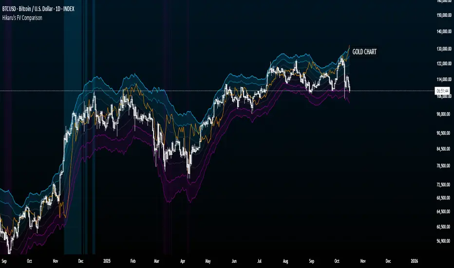
CUBE's V17CUBE’s V15.1 — Sparkles ⚡ + Cubes 🟨 + Smart/LC 🟫 + Golden ✨ (multi-signal scalper & trend helper)
CUBE’s V15.1 is a multi-module toolkit for intraday momentum and quick-scalp decision making. It blends a trend engine, VWAP/EMA50 band logic, CRT + Volume pair detection, weighted divergence, OBV-MACD regime flips, and “Sparkles” presets—then fuses them into readable Cube labels and higher-conviction Golden combos.
What it prints (signal taxonomy)
🟨 Cube ++ Incoming — pre-signal when price enters VWAP/EMA50 “yellow” bands with trend alignment.
🟨 Cube’s Buy ++ / Sell ++ — the “plus-plus” confirmations after CRT context; gated to avoid spam.
🟫 Last Chance → 🟫 Last Chance ++ — RSI + divergence-weighted follow-through (waits for a tiny UT flip).
🟪 Smart Cube — post-Cube, waits for KC(1.2) location + OBV presence + divergence stack (more selective).
✨ Golden (Sparkles + Cube) — objective confluence labels that require Sparkles (preset wins) plus a Cube event inside a short window. Comes in Golden-2 (2+ sparkles in 3 bars) and Golden-1 (tight 0–1 bar proximity).
Each label automatically shows “(Quick Scalp)” when price is inside the careful bands, so you know when to downshift risk.
The engines (under the hood)
Trend: Pivot-Point SuperTrend (PPST 2/10/3) drives bullish/bearish context (invertible).
Bands: 5-minute VWAP + EMA50 zones with symbol-aware tolerances (majors/ETFs/crypto/megacaps tuned).
CRT + Volume Spike Pair: detects recent hammer/shooter + volume conditions and uses them to gate higher tiers.
Weighted Divergence: RSI / Stoch (weighted) / CCI / MOM / OBV (weighted) / CMF / MFI (and more) with CRT-recency gates to keep it relevant.
UT micro-flips: tiny ATR trail crosses used to “arm” Last Chance ++ entries.
OBV-MACD regime: structural flips for the Super7 and Smart Cube filters.
Super7 Sparkles: five presets (4/8/15/24/40 bars) that score 9 modules; you can show compact ✨ icons or 9/9 text.
Quick start (60 seconds)
Add to a 1–5m chart of your instrument.
Leave defaults on; optionally toggle “Sparkle Settings” (the presets are already on).
Watch for:
✨ Golden Buy/Sell → higher-quality scalp setups.
🟨 Cube’s Buy/Sell ++ → momentum continuation outside the yellow bands.
🟪 Smart Cube → selective continuation after a Cube with KC/OBV/div confluence.
Use the built-in alerts (see list below) to automate.
Inputs & customization highlights
Invert Trend Logic — flips bull/bear interpretation (useful in range regimes).
Reference TF label anchoring — place labels using a reference timeframe; optional “(tf)” tag.
Careful (Quick-Scalp) palettes — swap label colors when inside bands; hide/show quick-scalp labels per mode.
Duplicate filters — suppress Cube repeats within a window.
Session tools — optional 6:00 PM 5m “reset” box (purple) and 9:30 AM 1m NY Open box (yellow).
Backgrounds — optional ST(10,1) 0.5–0.7 ATR ribbons for context.
Presets — five Sparkle presets with per-side alternation and wipe logic.
Alerts (names as they appear in TradingView)
⬜ Cube’s Buy / Sell (or 🟨 Incoming if trend is inverted)
🟨 CUBE’S BUY ++ / CUBE’S SELL ++ (or “Cube’s … ++” if inverted)
🟫 Buy Last Chance / 🟫 Incoming (Sell Last Chance)
🟫 Cube’s Last Chance Buy ++ / Cube’s Last Chance Sell
🟪 Smart Cube’s Buy / Smart Cube’s Sell
🔔 ALL Cube Alerts (one catch-all)
✨ G✨lden Buy/Sell (Sparkles+Cube) and G✨lden-1/2 variants
Tip: Set close-bar alerts for most signals; if you want early heads-up, allow “once per bar” but expect more noise.
Reading the labels
“(Quick Scalp)” suffix = price inside the VWAP/EMA50 careful bands; tighten targets/size.
Some labels include indicator names + a weighted count (e.g., “Hist RSI MOM 3”) to hint at divergence depth.
Star ⭐ near a label means a CRT+VOL pair was detected within the recent window.
Golden text shows the most recent cube subtype (“Cube ++”, “Smart Cube”, etc.) that satisfied the window rule.
Recommended markets & timeframes
Built-in tuning for: NQ/ES/RTY/YM, GC/CL, XAU/XAG, FX majors, BTC/ETH/SOL, SPY/QQQ/IWM/DIA, and mega-caps (AAPL, MSFT, NVDA, etc.).
Best experience on 1m–5m for intraday. Works on higher TFs but is designed around the 5-minute VWAP/EMA50 backbone.
Best practices
Confluence over single prints: Use ✨ Golden or 🟪 Smart Cube + trend + structure.
Location matters: Prefer signals near session boxes, prior day H/L, and liquidity pools.
Risk first: Size down in (Quick Scalp) zones and during lunch hours/illiquid sessions.
Avoid double-counting: The script already suppresses blatant duplicates—don’t force extra alerts.
Repainting & transparency
Core signals evaluate on confirmed bars; major request.security calls use lookahead_off.
The 1m open/6pm boxes use alignment tricks for placement; they don’t feed signal logic.
As with any multi-TF logic, real-time bars can update intra-bar—use “on close” alerts for strict confirmation.
Disclaimer
This script is for educational purposes. It’s not financial advice and does not guarantee results. Markets carry risk—always test on replay/paper first, know your instrument’s tick/fee structure, and use hard stops.

Hikaru BandsHikaru Bands is a volatility indicator designed to provide a view of market dynamics. Unlike traditional banding tools like Bollinger Bands, which rely solely on standard deviation, Hikaru Bands incorporate a Composite Volatility Index (UVI). This index is built from a customizable blend of up to ten different technical indicators, including momentum, trend, and risk metrics.
Core Concept & Calculation
The script first calculates the values of up to ten different technical indicators, which you can enable or disable individually. These include RSI, CCI, Sharpe Ratio, Omega Ratio, Z-Score, Rate of Change (ROC), and more. Each selected indicator's output is then normalized into a percentile rank (a scale of 0-100) to ensure they can be compared and combined effectively. Finally, the normalized values are weighted and averaged to create a single Universal Volatility Index (UVI). A high UVI suggests strong bullish momentum and volatility/overbought, while a low UVI suggests strong bearish momentum/oversold.
How to Use & Interpretation
Interpreting the bands is intuitive and provides multiple layers of analysis:
Extreme Bands (Outer Bands): When the price touches or exceeds these bands, it suggests a potential exhaustion point or a climax in the current trend. These are often areas to watch for potential reversals or pullbacks.
Warning Bands: These act as an early signal that momentum is becoming stretched. Price action within this zone indicates a strong trend that may be approaching overbought or oversold territory.
Neutral Bands: The area between these bands and the basis line represents typical price action. When the price remains within this zone, it often signals a consolidating or ranging market.
Features & Customization
This script offers extensive customization to tailor the indicator to your specific needs and analysis style:
Modular Component Selection: Individually enable or disable any of the ten underlying indicators to build your own custom UVI. You can also adjust the weight of each component to give more importance to the indicators you trust most.
Detailed Parameter Control: Fine-tune the settings for each individual indicator, such as the period for RSI, the lookback for the Sharpe Ratio, or the fast/slow lengths for the EMA Spread.
Visuals: Comes with eight built-in color schemes (including Classic, Neon, and Ocean) to match your chart's aesthetic.
Band Smoothing: Apply an optional smoothing filter to the bands and the basis line to reduce noise and focus on the underlying trend.
Disclaimer
This tool is designed for technical analysis and should not be used as a standalone signal for trading. The effectiveness of the bands depends on the selected components and market conditions. Always use this indicator in conjunction with other forms of analysis and a robust risk management strategy.
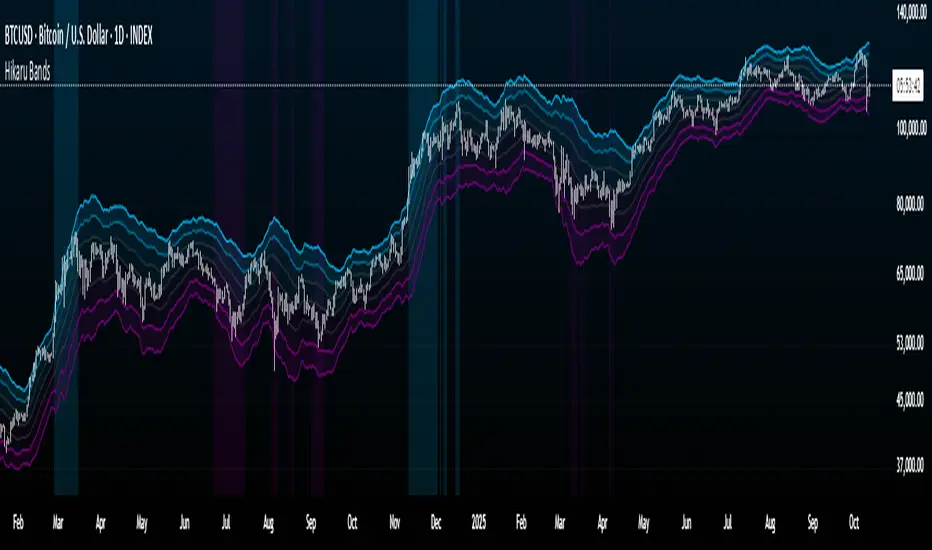
[ZP] Fixed v6 testDISCLAIMER:
This indicator in Pine V6 as my first ever Tradingview indicator, has been developed for my personal trading analysis, consolidating various powerful indicators that I frequently use. A number of the embedded indicators within this tool are the creations of esteemed Pine Script developers from the TradingView community. In recognition of their contributions, the names of these developers will be prominently displayed alongside the respective indicator names. My selection of these indicators is rooted in my own experience and reflects those that have proven most effective for me. Please note that the past performance of any trading system or methodology is not necessarily indicative of future results. Always conduct your own research and due diligence before using any indicator or tool.
===========================================================================
Introducing the ultimate all-in-one DIY strategy builder indicator, With over 30+ famous indicators (some with custom configuration/settings) indicators included, you now have the power to mix and match to create your own custom strategy for shorter time or longer time frames depending on your trading style. Say goodbye to cluttered charts and manual/visual confirmation of multiple indicators and hello to endless possibilities with this indicator.
Available indicators that you can choose to build your strategy, are coded to seamlessly print the BUY and SELL signal upon confirmation of all selected indicators:
EMA Filter
2 EMA Cross
3 EMA Cross
Range Filter (Guikroth)
SuperTrend
Ichimoku Cloud
SuperIchi (LuxAlgo)
B-Xtrender (QuantTherapy)
Bull Bear Power Trend (Dreadblitz)
VWAP
BB Oscillator (Veryfid)
Trend Meter (Lij_MC)
Chandelier Exit (Everget)
CCI
Awesome Oscillator
DMI ( Adx )
Parabolic SAR
Waddah Attar Explosion (Shayankm)
Volatility Oscillator (Veryfid)
Damiani Volatility ( DV ) (RichardoSantos)
Stochastic
RSI
MACD
SSL Channel (ErwinBeckers)
Schaff Trend Cycle ( STC ) (LazyBear)
Chaikin Money Flow
Volume
Wolfpack Id (Darrellfischer1)
QQE Mod (Mihkhel00)
Hull Suite (Insilico)
Vortex Indicator

Bubble ChartBubble Chart- Visual Market Intelligence
⸻
⚡ Quick Start - Here is how you get started in 30 seconds
Default view (Y-axis: None) = market heatmap
X-axis always = performance
Bubble size = importance (your choice of metric)
Hover any bubble for details
Switch timeframes to change the measurement window
Pick any stock ticker to see their friends
Pick one of the 143 etfs listed below and see their top constituents
That's it. Everything else is deeper cuts of data
⸻
Overview
The Bubble Chart is a market-wide visual map designed to instantly reveal how thousands of stocks and ETFs are performing relative to their peers, all in a single glance.
It dynamically builds relationships between ~3,400 stocks and 143 ETFs , each with its own “friends list” of most-connected tickers. It’s a bit unlike all the other indicators, which you’ll see shortly. It’s a very Tops Down, then Sideways view of the market.
The 144 ETFs covered in the Bubble Chart indicator are listed here in this watchlist: www.tradingview.com
Each bubble represents a security.
X-axis → performance (% change)
Y-axis → variable (you choose the insight)
Bubble size → market cap, relative weight, or %volume
Color → relative performance (green up, red down)
Border → sector color
Your current chart’s timeframe determines the measurement window:
Intraday chart → today so far
Daily chart → week-to-date (WTD)
Weekly chart → month-to-date (MTD)
Monthly chart → year-to-date (YTD)
Everything is relative to that timeframe’s performance window — making it as useful for morning scans as for long-term sector rotations. I recommend starting with an intraday chart. The bubbles represent the day so far on this timeframe.
⸻
📦 Version Differences
Bubble Chart Lite (Free):
✓ All features and dimensions
✓ Up to 5 bubbles displayed
✓ Perfect for tracking top movers
Bubble Chart (Invite-Only):
✓ All features and dimensions
✓ Up to 38 bubbles displayed
✓ See actual market breadth and structure
✓ Indicator name: “Bubble Chart”
✓ Available under the indicator “Bubble Chart” (Invite-Only) — details on my profile
⸻
📊 Y-Axis Options
1. “None” - Heatmap Mode
By default, the Y-axis is set to “None”.
In this mode, the chart functions as a market heatmap, with:
Left-to-right representing relative performance (% change)
Bubble color indicating gain/loss
Bubble size reflecting your chosen metric (Market Cap, Weight, or %Volume)
Up-down randomized just for bubble separation
Think of it as a fancy heatmap with extra context — sector coloring, bubble sizing, and tooltips that surface live data.
Perfect for a quick snapshot of the day’s winners and losers across your selected universe.
⸻
1. %Turnover
This measures conviction behind each move.
Turnover = current money flow vs. average money flow over your lookback window.
A large % move with low turnover = a weak move with little backing.
A moderate % move with high turnover = strong participation, higher conviction.
This is my personal favorite morning setup — it instantly reveals where real buying and selling pressure is emerging as the session unfolds.
A horizontal line across your selected ticker acts as a benchmark, so you can compare others’ conviction levels relative to it.
Any %turnover score >100 means more money than average is flowing in and out of this name. In the example above, ELS, AMT, SUI, and PSA were positive on the day and saw more than the average amount of money being transacted on these tickers today. Do the same for the negative (KIM, ESS, HST, etc), and you know where the money is going. Below 100, the move lacked conviction.
⸻
2. %ATR
Measures range expansion or compression relative to average volatility.
A stock can move big in price but stay inside a tight range → no expansion.
A stock can move little but break its typical volatility boundary → range expansion.
Expansion often signals momentum continuation; compression after large moves can precede turnarounds or consolidations.
This view helps you spot early volatility inflection points.
In the example above, in XLRE, you can see there are a lot of companies that are experiencing a range expansion to the downside. These stocks are now short setup stocks, as the power is pretty overwhelming (number of top companies as well as magnitude over the 100 index). However, there are 3 Stocks that are doing something completely different than the rest. AMT, SBAC, and CCI are experiencing range expansion (volatility) to the upside. These may become the new leaders. You would have to inspect each ticker to see what’s going on.
⸻
3. ROC(5) Z-Score
Z-Score quantifies how far a data point deviates from its mean, measured in standard deviations.
Here it’s applied to 5-period Rate of Change (ROC5).
A high positive Z-Score = performance far above its historical average.
A low (negative) Z-Score = deeply oversold vs. history.
Use this view to identify stretched momentum or mean-reversion candidates:
Stocks high on the Y-axis and green = extended upside momentum
Stocks high but red = potential reversal zones
Stocks low and red = extreme washouts that may soon rebound
This makes it a powerful stock-picking lens for traders who look for reversions or contrarian entries.
The following is the XLU and its 5 top holdings. Looked at on the daily timeframe, which means the ROC(5) score is for its weekly ROC (see timeframe discussion above).
What you can see here is most stocks are within their normal acceleration band. However BIIB is very close to -200. This is uncommon.As you can see from the chart of BIIB with it’s ROC(5) graphed below it, this does indicate a short term turn, and is a high probability long setup.
⸻
4. RSI(15) Z-Score
Similar to the ROC version, but based on RSI(15).
It contextualizes RSI against its own historical distribution, not the fixed 0–100 scale.
When RSI’s Z-Score is above +100 → historically overbought.
Below -100 → historically oversold.
A stock with a high RSI Z-Score but negative performance may be starting to roll over.
A stock with a low RSI Z-Score but positive performance could be beginning a rebound.
This lens is especially powerful for early spotting of turning points in swing and position trades.
In this view, we can see a bunch of stocks that are at or below their -200 Z-Score which suggests RSI is going to increase soon. Taking a look at KKR, we see that it is indeed an area where we might want to look for a short term bounce. .
⸻
5. %52-Week High / %52-Week Low
These two let you visualize positioning within the broader yearly range.
%52-Week High:
Shows how close each ticker is to its highs. Stocks near the top may be in breakout mode.
%52-Week Low:
Shows distance from the lows. Watching these can highlight potential recovery trades — many reversals start when beaten-down stocks begin to cluster and climb from their lows.
Are you really going to want to mess around with VZ? Other companies are winning the race
⸻
⚙️ Bubble Size Options
Market Cap-
Larger companies = larger bubbles.
Ideal for weighting visibility by overall size of influence in the market or sector.
ETF/Friend Weight-
Scales bubbles by their relationship weight to the target ETF or stock.
This helps identify which peers or constituents exert the most pull within the current context.
%Volume-
This scales by relative volume to average volume.
Big bubbles here mean unusual activity, perfect for spotting where participation is surging.
⸻
👥 Friends — Relationship Mapping
Every ticker on the chart has its own “friends list.”
These aren’t arbitrary. They’re discovered through a multi-stage algorithm that analyzes co-occurrence of holdings across ETFs and sectors, roughly like social network analysis for stocks. This is what allows a chart of one stock to intelligently surface others that behave like it, whether through shared ETFs, sector overlap, or statistical co-presence.
Why Friends Matter: When you load AAPL, the chart doesn't just show random stocks. It shows AAPL's "friends", the tickers most connected to it through:
Shared ETF holdings
Sector relationships
Statistical co-movement
This means you're seeing AAPL's context, not just AAPL. Example: AAPL up 2% might look strong, but if all its friends are up 3-4%, AAPL is actually lagging. The chart reveals this instantly.
In this friendship look, you can see companies that are in better (and worse) shape for the month (we are looking at it on the “W” timeframe). If I didn’t own ORCL, INTC, or MU (hidden use tooltip), I should start looking at them.
⸻
Common Setups - do these today
Morning Momentum Scan: - Y-axis: %Turnover - Bubble Size: %Volume - Look for: Top-right quadrant (high performance + high conviction)
Reversal Hunting: - Y-axis: RSI(15) Z-Score - Look for: Red bubbles above +100 (overbought rolling over) Green bubbles below -100 (oversold bouncing)
Sector Rotation: - Y-axis: None (heatmap mode) - Bubble Size: Market Cap - Look for: Color clustering by sector (border colors)
⸻
🧩 Data Sources
ETF Constituents:
ETF holdings are derived from information filed with the SEC’s EDGAR database, specifically N-PORT-P filings. These filings are public records submitted by ETF issuers.
Because EDGAR data can vary in structure and naming conventions, additional parsing, fuzzy matching, and ticker reconciliation logic were applied. Some inconsistencies may remain, and minor inaccuracies are possible.
EDGAR filings can also lag slightly behind real-time changes to ETF portfolios; however, for this visualization tool, that level of latency does not materially affect its purpose or insights.
Exchange & Share Count Data:
Information on exchanges and outstanding shares primarily comes from the SEC Company Facts API.
When unavailable, supplemental values are inferred from public SEC filings such as 8-K, 10-Q, and 10-K reports, and the SEC Company Submissions API for general company metadata.
All such data is publicly accessible through the SEC’s online systems.
I will update the SEC information on the ETFs once every 3 months to ensure etf constituent accuracy.
Sector & Industry Classification:
Sector and industry classifications were developed through a custom workflow that combines automated and human-reviewed methods.
An internal AI system analyzed each company’s publicly available website information to summarize business activities and assign one of 144 custom-defined industry categories.
Results were cross-checked by multiple independent classification models, and any uncertain outputs were manually reviewed for accuracy.
To improve interpretive consistency, publicly available information from StockAnalysis.com was also referenced (not republished) to inform final classifications.
Their content was used in accordance with their stated policy allowing limited reference with attribution — no full content or proprietary data was reproduced.
⸻
🚀 How to Use It
Load the Bubble Chart on any stock, ETF, or futures symbol.
Choose your Y-axis insight — start with “None” for the heatmap.
Adjust bubble size to highlight capital weight or activity.
Switch timeframes to shift context (today, this week, month, or year).
Hover bubbles for details: sector, turnover, z-scores, %volume, and more.
⸻
❓ Frequently Asked Questions
Q: Why do I only see 5 bubbles?
A: You're using Bubble Chart Lite. The full version shows up to 39 bubbles simultaneously for complete market breadth..
To get access:
Find the "Bubble Chart" (invite-only) indicator on TradingView
Read the description for access instructions
Or visit my TradingView profile for details
Q: Can I customize which tickers appear?
A: The indicator automatically selects the most relevant tickers based on the current chart's symbol and the friends algorithm. This ensures you're seeing context, not random stocks.
Q: What timeframe should I use?
A: Any timeframe works. The chart adapts: - Intraday = today's performance - Daily = week-to-date - Weekly = month-to-date - Monthly = year-to-date
Q: How often does the friends list update?
A: Friends relationships are recalculated periodically as ETF holdings change (once every 3 months). The relationships are stable enough that daily changes are minimal.
Q: Does this work on crypto/forex?
A: Currently optimized for US equities and ETFs. Other asset classes may show limited friends data.
Q: The chart looks cluttered. Help?
A: Start with Y-axis: None and Bubble Size: Market Cap. You can also choose to pick less number of bubbles which will clear up the chart
⸻
The Bubble Chart is a market topology engine that visualizes participation, conviction, volatility, and sentiment in real time.
Whether you’re scanning morning momentum, identifying exhausted moves, or exploring ETF ecosystems, it gives you a spatial view of where the action really is.

Total Info Indicator by MikePenzin
Install & Add to Chart
• Copy the script into Pine Editor → click Add to Chart .
• Open the ⚙️ Settings → Inputs to customize.
What It Does
• Displays key info in a floating table — trend, volume, ATR, RSI, stop loss, and more.
• Detects breakouts , smart SELL signals , and opening strength .
• Uses emojis and colours to make trends easy to read: 🟢 good, 🟡 neutral, 🔴 risky.
For Swing Traders
• Works best on Daily or 4H charts.
• Watch for 🟢 Uptrend + ⚡BUY / 🔥BUY breakout signals.
• Use ATR-based Stop Loss (shown in table).
• Avoid new entries a few days before earnings.
Suggested Setup
• 20/50/150 MA Lines: ON
• 200 MA Line: optional
• ATR Multiplier: 1.3
• Breakout Detection: ON (Volume + RSI + Trend filters)
• Smart SELLs: ON (RSI 70, EMA 20)
• Pivots: ON for quick swing levels
How to Read
• MA Row: 🟢 = price above MA (bullish).
• ATR/Stop Loss: Suggests where to place protective stop.
• Volume Info: Today’s vs 20-day average, plus pace.
• RSI & CCI: Shows momentum and overbought/oversold levels.
• Breakouts: ⚡BUY (early), 🔥BUY (confirmed).
• Smart SELLs: RSI🔴 / DIV🟣 / EMA🔵 mean potential exit zones.
Example Use
1️⃣ Find stocks with Uptrend 🟢 , rising volume, and ⚡BUY signal.
2️⃣ Enter near breakout; set Stop = shown level.
3️⃣ Take profits or trail when Smart SELLs appear or RSI peaks.
Tips
• Choose table corner under “Table Visualization.”
• Reduce clutter on small timeframes (turn off Pivots/200 MA).
• Use “Volume speed” to spot surging interest before breakouts.
• Compatible with most equities and ETFs.
Disclaimer
This script is for education & analysis only .
Not financial advice — always manage your own risk.
