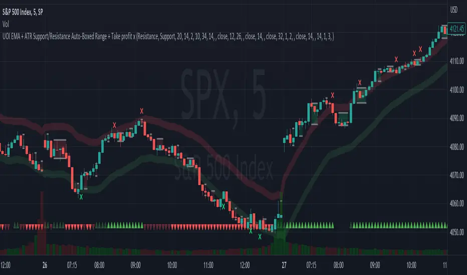
EMA + ATR Support/Resistance Auto-Boxed Range + Take profitUnveiling the 'EMA + ATR Support/Resistance Auto-Boxed Range + Take profit signal' tool, an innovative resource engineered for discerning traders to pinpoint crucial dynamic support and resistance levels (not like the common pivot based support and resistance indictors). The tool ingeniously amalgamates the power of EMA and ATR indicators to delineate these levels as green and red bands, offering invaluable insights into potential trading windows.
The real game-changers in this tool are the newly incorporated 'Auto Boxed Range Detector' and the 'Bull Bear Tug of War' detector. The Auto Boxed Range Detector is at the core of this update, illuminating price ranges to give you the upper hand in detecting breakouts or breakdowns. This feature has been designed meticulously to automate the identification of trading ranges, thereby increasing the accuracy and speed of your decision-making process. Also, this helps avoiding fake breakouts. If the top of the boxed range is near resistance line it is less likely to breakout unless we are on a trend day.
Simultaneously, the Bull Bear Tug of War detector (the little red and green triangles at the bottom) introduces an entirely new dimension of market dominance visualization. This detector embodies market power struggles through vivid red and green triangles, supplemented by translucent colors for transitional periods or potential false-outs. It's a dynamic, real-time pictorial representation of the ceaseless tug of war between bulls and bears captured by a combination of RSI, CCI, MACD, STOCHASTIC, AND VWAP, enabling you to anticipate market swings better. You can change the position of the triangles in the setting and move the red ones to top and keep the green ones in the bottom.
Customization options are plentiful, including the ability to tweak the EMA and ATR lengths, with default values set at 20 and 14 respectively. Additionally, you can modify the ATR multiplier in the S/R length setting, defaulted at 2, and the line width for optimal visibility. The EMA line can be made visible in the settings, while support and resistance lines are color-coded in green and red for instant recognition.
When prices make contact with these levels, the tool generates visual cues in the form of crosses above or below the price bars, thus serving as potential take profit or entry/exit points. Should you prefer, take profit signals can be deactivated in the settings.
To leverage this tool to its maximum potential:
- Fine-tune the EMA and ATR lengths to resonate with your trading strategy. Longer lengths yield smoother lines but may trail current prices.
- Determine the S/R length to govern the spacing of support and resistance lines from the EMA line.
- Stay alert for crosses above or below the price bar, signaling when prices have met support or resistance levels. These are key indicators for potential take profit or entry/exit decisions.
- For best results, this tool should be used in conjunction with other indicators to corroborate signals and minimize false alerts. The ultimate aim is to utilize other indicators to initiate a trade and rely on this tool to provide timely take profit reminders.
Bear in mind, this tool should not be the sole determinant in your investment decisions. Comprehensive research and a multifaceted approach are indispensable when contemplating any trades.
Supply_and_demand
Weis Wave With Speed Index SignalsWeis Wave with Speed Index Signals
The Concept
This indicator has been created to try to quantify "Change in Behavior" concept and provide buy and sell based on this concept. What is Change in Behavior? Price is moving at speed rate based on the trading volume direction (buyers and sellers) until there is imbalance of Supply/Demand. An algorithm has been created to identify this change of Supply/Demand behavior producing a number called "Speed Index". Abnormal Speed Index notes this change in behavior when compared with previous Speed Index numbers of the same pair and in the same timeframe. Speed Index is a relevant number and it's use is to be compared with previous Speed Index numbers and not as an absolute number. Based on Speed Index Behavior of recent waves, price and price wave structure buy and sell signals are available called Plutus.
What it does
This indicator draws a waveline of price waves swings. Up swing is when price goes up and down swing is when price goes down. It adds the volume of each bar within the wave swing, it measures the distance in pips of each swing and measure the numbers of bars of each swing. Furthermore, it creates the Speed Index of each swing, the average Speed Index of x selectable wave swings back as well as the average of Speed Index of the x up swings back and the average of the down swing. The indicator is also able to designate a Fast wave which means large pip move with small volume with the letter "F" displayed next to Speed Index and a Slow wave which small pip move with small volume with the letter "S". Finally based on price, Speed Index history and structure it creates eight buy/sell signals called Plutus.
Information available for display all selectable
For each wave swing: Total Volume, Pip Distance, Number of Bars or Total Volume + Pips or Total Volume + Pip Distance+Total Number of Bars
For each wave swing: Speed Index or Total Volume + Speed Index or Speed Index + Average Speed Index or Speed Index+(F or S).
Plutus buy and sell signals when criteria of price location, speed index comparison (abnormal speed index) and wave price structure have been met.
How it does it
This indicator draws a wave-line of price waves swings. Wave Sensitivity can be adjusted by AutoSensitivity parameter (min value =2 and max value=11). The larger the number the more sensitive it is, which means more wave swings will be created. All calculations are based on each wave swing. The code calculates all the above mentioned on the "Information available for Display" section. Based on price, Speed Index history, Speed Index ratio and structure Plutus buy and sell signals are created. The default value of Speed Index ratio is 2. Decreasing Speed Index ratio will create more signals while increasing it will create less signals.
Note: last wave re-paints and no information is displayed on the forming wave, but the whole trading methodology is based on reading previous waves information.
Technical Information
Speed Index
High Speed Index number means a slow wave "S" = Abnormal Speed (high volume small pip move)
Low Speed Index number means a fast wave "F" =Anormal Speed (small volume large pip move)
Normal Speed Index number (are the more frequent numbers seen in the chart which means that the market agrees with the move).
Plutus Signals
PL - Plutus Long, this is when the price will follow in the same direction of the wave with the High Speed Index. When signal is generated we enter when price close breaks the previous two wave structure Resistance Level
PS - Plutus Short, same as above, this is when the price will follow in the same direction of the wave with the High Speed Index. When signal is generated, we enter when price close breaks the previous two wave structure Support Level
PRL - Plutus Reversal Long, this is when the price will go in the opposite direction of the wave with the High Speed Index.
PRS - Plutus Reversal Short, same as above, this is when the price will go in the opposite direction of the wave with the High Speed Index.
PFL - Plutus Fake Long, this when price will do a fast break of the previous down swing bottom and then comes back within the previous swing range (fake break)
PFL - Plutus Fake Short, this when price will do a fast break of the previous up swing top and then comes back within the previous swing range (fake break)
WU - Wyckoff Upthrust plutus (short signal)- this is when the last two swings resemble(are) Wyckoff's UpThrust pattern price swings. This resemblance together with Speed Index criteria and price break of structure create this signal.
WS - Wyckoff Spring plutus(long signal)- this is when the last two swings resemble(are) Wyckoff's pattern price swings. This resemblance together with Speed Index criteria and price break of structure create this signal.
How to use it
Draw Support/Resistance and Fib - usually supply and demand imbalance happens at his level
First and most important of all adjust AutoSesnsitivity to get your swings correct, meaning that are catching the tops and bottoms of each price wave swing.
Monitor Speed Index behavior. Be alerted from Abnormal Speed Index number. You can also set using the Extreme Threshold parameter that provide you an alert if the current Speed Index is above or below average Speed Index of x waves back and also meets the min and max bar criteria. For example if we would like to be alerted for a an Abnormal Speed Index of a Slow wave of at 3 bars then we have set the Min Slow Bar parameter to 3, the Extreme Threshold parameter to 0.5 (50%) and the Avg Waves back to 8 then an alert will be produced if the wave before the forming has at least 3 bars and the Speed Index of the wave is 50% higher than the Average Speed Index calculated from 8 waves back. For a Fast wave we can set the Min Fast Bars to 1, Extreme Threshold to 50% and Avg Waves back to 8 which means that we will get an alert if the wave before the forming one has at least 1 bar and it's Speed Index is at least 50% less than the Speed Index Average of 8 waves back.
Plutus signals provide buy and sell entries after specific criteria have been met. These signals have a higher success rate when price is exiting a range or when price is leaving from Support/Resistance or Fib. Consider Plutus signals invalid within a range unless is the exit of the range (Range Break)
What makes it unique
The ability to identify, quantify and be alerted of the Change in Behavior of waves swings when compared with recent previous wave swings making it easier for the trader to be notified about Supply / Demand imbalance. Furthermore, another unique point of this indicator is the Plutus signals providing buy and sell entries. Plutus entries take into consideration this Abnormal Behavior, the wave swings structure and price location.
Example Trades
Wyckoff Up- rust formation strategy- Reading the chart
1. We have broken a Resistance Level with a Fast Speed Index of 0.7F
2. Abnormal Speed Index of 2.3 provides the alert for abnormal Speed Index behavior. There is not a high Speed Index like that in all the up wave swings which automatic makes it abnormal Supply Demand imbalance.
3. WU - Wyckoff Up-trust plutus signal has been created, which means Short.
4. PRS - Plutus Reversal Short also created at the same location which makes the Short even a higher probability trade
5. Entry: We enter Short on the close of the bar
Exit from Range Strategy - Reading the chart
1. We are in a Ranging environment
2. PS and PRS are invalid signals because according to the rules mentioned previously we do not trade any signals created within the range when the price does not break the range.
3. PRL - Plutus Reversal Long which means that price will move in the opposite direction of the High Speed Index (the 2.2) is a valid signal since price breaks the top of the range
4. Entry Long after breaking the top of the range
PRL after Support hit Strategy and Exit from Range Strategy - Reading the chart
In this we have two different strategies available. The first one is Plutus Reversal Long signal after hitting support and the second on an Exit from Range.
The Story:
1. We have hit support (double bottom)
2. Speed Index 2.2 at the bottom is on the High side, not too extreme but on the high side.
3. A PRL long signal is generated which means that price will move in the opposite direction of the 2.2 Speed Index
4. Entry Long on the close of the bar- This trade has provided 482 pips of profit
5. Price goes into Range
6. Classic textbook strategy Exit from Range with Plutus. We get a PL Plutus Long signal which means price will follow the directions of the high Speed Index wave and in this case is the 2.7 wave
7. Entry Long after the range break. This trade provided 384 pips up to now.

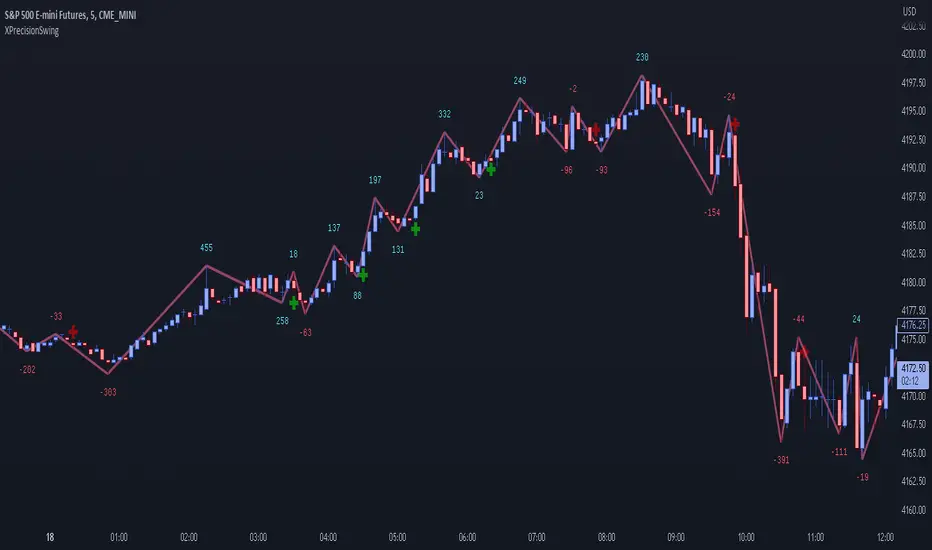
XPrecisionSwing (XPS)* XPrecisionSwing (XPS) Indicator *
Is a visual representation of the Forces of Supply / Demand in the markets in the form of UP and DOWN waves. The Supply / Demand (denoted by a number on top or below the wave line) is computed using the *MBox Precision Supply / Demand* algorithm. These numbers diligently show the forces of Supply and Demand moving price in the markets. The algorithm for computing the numbers on the top and bottom of the wave lines measures the strength of the Supply / Demand. It is this algorithm that makes this indicator unique as it gives an accurate representation of the forces pulling the market up and down. When forces oppose each other, meaning when the direction of price does not agree with the direction of the Supply or Demand it creates a divergence and an opportunity in the markets. These situations are called BUY / SELL Imbalances. Explanation about this below.
* WHAT THE SCRIPT DOES *
The XPrecisionSwing indicator draws swing waves lines going up and down. These waves lines are representative of Supply and Demand. Waves going up are Demand, while waves going down are Supply. The strength of the Supply / Demand corresponds to the number drawn either on top of the wave line or below it. The numbers drawn on the chart are powered by the *MBox Precision Supply / Demand* algorithm, which are representative of the Forces of Supply / Demand in the markets. This is not just volume added up like in a regular zig zag indicator, since volume alone does not show Supply / Demand, and regular volume will not show BUY / SELL Imbalances as depicted by XPrecisionSwing. Volume summated will not show both positive and negative numbers on the chart. Having Supply / Demand split into both positive and negative numbers allows us to see BUY / SELL Imbalances, which can be a very powerful divergence. Information on how these numbers are computed are in the "HOW IT WORKS" section.
The numbers drawn on the chart can be either negative or positive. Positive relates to Demand, while negative relates to Supply. In this manner the strength of Supply and Demand can be gauged in each wave. If the price goes up but the number is negative (More Supply) it is a divergence and called a SELL Imbalance. This means there was more Supply even though price went up. It is important to pay attention to these scenarios, as often it can be indicative of NO DEMAND. Conversely. if the price goes down but the number is positive (No Demand) it is a divergence and is called a BUY Imbalance. This means there was more Demand even though price went down. This is indicative of NO SUPPLY. As such, it now becomes possible to know when there is a sign of Supply, Demand, No Supply, No Demand, Supply Exhaustion, and Demand exhaustion. Supply occurs when the negative numbers on the charts begin to increase (more negatively). Demand occurs when the positive numbers on the chart begin to increase (more positively). A Supply Exhaustion pattern happens when the price is starting to move down more slowly, while Supply is decreasing, and Demand is increasing. This means that the behavior of the market is changing and also a signal to look to reverse positions. A Demand Exhaustion pattern happens when the price is starting to move up more slowly, while Demand is decreasing, and Supply is increasing. The behavior of the market here is also changing.
* HOW IT WORKS *
- Technical Details for the Numbers on the Swing -
The numbers on the chart represent Supply / Demand. Supply or Demand is determined by analyzing the movement of price and quantity of volume.
When price goes up and is combined with an increase in volume it is Expansion of Demand.
(Positive Numbers get larger)
However if price goes up and is combined with a decrease in volume it is Contraction of Demand.
(Positive Numbers get smaller)
When price goes down and is combined with an increase in volume it is Expansion of Supply.
(Negative Numbers get larger)
However if price goes down and is combined with a decrease in volume it is Contraction of Supply.
(Negative Numbers get smaller)
- Technical Details for the Swing -
The way XPrecisionSwing draws the swings is fractal in nature, which make it very convenient and easier to use over the traditional zig zag indicator. The traditional zig zag indicator uses a tick reversal which needs to be adjusted every time you change time frames. However, with XPrecisionSwing you do not have to change any settings every time you load a different time frame since it will adjust to any time frame you are loading. How the swing is drawn is explained below.
XPrecisionSwing uses 3 bars (by default) to define a swing
This parameter can be adjusted. Can be 1, 2, 4 bars, etc...
Swings are always drawn using High / Low of the bar
- Rules -
To start upswing, bar high needs to be higher than previous 3 candle highs
To start downswing, bar low needs to be lower than previous 3 candle lows
If in upswing, a higher high will continue the upswing
if in downswing, a lower low will continue the downswing
- Exceptions -
If outside bar (both high and low exceeds previous 3 bars) swing will continue in current direction
- Swing Confirmation -
Swing wave line in progress (unconfirmed) is denoted by a brown box around the swing number
Once the brown box disappears, that swing wave and number is confirmed
* HOW TO USE IT *
As the numbers on the down waves increase (negatively), this shows that the bears have taken control of the markets. Conversely, as the numbers on the up waves increase (positively), this shows the bulls have taken control of the markets. Whoever is in control is the direction you generally want to place your trades in. When you see an increase in Supply (numbers on down wave) accompanied with a decrease in Demand (numbers on up wave) this shows a Supply + Demand Exhaustion Pattern. This is stronger than if you only see an increase in Supply without a decrease in Demand.
- The Buy / Sell Imbalances -
If you see a positive blue number on the bottom of a DOWN Wave, this means that there was more buying than selling even though price moved down.
If you see a negative red number on the top of an UP Wave, this means that there was more selling than buying even though price moved up.
Both of these cases signify and imbalance and a divergence.
* EXAMPLE AND USE CASES *
- Sell Imbalance Example -
If you see a large negative number with a lower low on a down wave, and then the next up wave is a lower high also with a negative number it shows that there is only Supply flooding the market and no sign of Demand. This is a very powerful combo.
- Buy Imbalance Example -
If you see a large positive number with a higher high on an up wave, and then the next down wave is a higher low also with a positive number it shows that there is only Demand flooding the market and no sign of Supply. This is a very powerful combo.
- Supply Exhaustion example -
If you see price movement struggling to make newer lows and the Supply numbers on the down waves are decreasing, while the Demand numbers on the up waves are increasing this is indicative of a *Change of Behavior*, and that the market is showing signs of reversal.
- Break out on Demand example -
If you see price has been ranging and now the numbers on the UP waves begin to increase while breaking out of a previous area of resistance, it is a good sign that the movement is backed by the strength coming from the Demand.
* BUY / SELL IMBALANCE ALERTS *
The Green / Red crosses on the chart show exactly where the Buy / Sell Imbalance Alerts trigger.
These will NEVER repaint! The crosses can be hidden in Styles if you wish to.
Alerts can be set very easily with the instructions below.
1. Right Click Chart -> Add Alert...
(Ignore Caution Warning. These alerts will *ONLY* trigger on Confirmed BUY / SELL Imbalances and will NOT repaint)
2. Select Condition to be "XPrecisionSwing"
3. Select "Buy Imbalance" or "Sell Imbalance"
4. Select "Greater Than" with Value = 0
5. Options set "Once Per Bar"
6. Customize Any other Alert Options you want
* WHAT MAKES IT ORIGINAL *
XPrecisionSwing gives an inside look into the markets by showing price movements as a series of waves going up and down with their corresponding Supply / Demand numbers associated with each wave. Reading the numbers shows the strength of Supply / Demand. The bigger the number the stronger the Supply / Demand is. The smaller the number the weaker the Supply / Demand is. It becomes possible to see where Supply / Demand comes in, along with Exhaustion of Supply / Demand to spot opportunities to place trades. The Buy / Sell Imbalances show imbalances where price movement and the direction of the Supply / Demand diverge to create potential opportunities as well.
* AUTHOR *
This script is published by MBoxWave LLC
Volume-based Support & Resistance Zones-V1 By Trade Mastership™ The all-new Support & Resistance Zones indicator, which has been upgraded to offer traders more powerful features and functionality. This innovative indicator identifies high-volume fractal lows or highs to create zones based on the size of the wick for that timeframe's candle. This makes it easy for traders to visualize which price levels are the most significant for either a trend continuation or a reversal when zones are broken and retested.
The original script for this indicator was created by Trade Mastership, with additional modifications by L N Behera. Credit goes to both of them for the majority of the logic behind this script. Since then, the script has been improved with several changes, including:
Changing the default S/R lines from plots to lines, and giving users the option to change between solid, dashed, or dotted lines for both S/R lines
Adding additional timeframes and more options for TF1, beyond the current TF. Now, users have four timeframes to plot S/R zones from
Giving users the option to easily change the line thickness for all S/R lines
Making it easier to change the colors of S/R lines and zones by consolidating the options under settings (rather than under style)
Adding extensions to active SR Zones to extend all the way right
Adding the option to extend or not extend the previous S/R zones up to the next S/R zone
Adding optional timeframe labels to active S/R zones, with left and right options, as well as the option to adjust how far to the right the label is set
Fixing an issue where the higher timeframe S/R zone was not properly starting from the high/low of fractal. Now, any higher timeframe S/R will begin exactly at the High/Low points. Note that this may not work perfectly on stocks, and if a fractal high/low is too many bars in the past, it will revert to a default max bars back to avoid script errors.
Adding a function to prevent S/R zones from lower timeframes displaying while on a higher timeframe. This helps clean up the chart quite a bit.
Creating arrays for each timeframe's boxes and lines so that the number of S/R zones can be controlled for each timeframe and limit memory consumption.
Adding new alert options and customized alert messages
Here's how this indicator works: it looks for fractal highs or fractal lows with volume that pierces above the volume's Moving Average. This moving average value can be modified in the settings for each timeframe. The fractal highs will be confirmed with three successive higher highs followed by two successive lower highs and vice versa for the fractal lows. The zone is created from the fractal high/low and the close of the candle for whatever timeframe you selected. The bigger the zone, the more significant that zone is.
Traders can disable any zone, change the zones to show lines only, and modify all the colors, transparencies, and thickness of lines for all the zones. To create alerts, traders can enable the types of alerts they want for each timeframe in the indicator's settings. After applying changes, right-click on one of the zones on the chart, and click "Add Alert on Vol S/R Zones." You do not need to add a title, as the correct alert messages are already built-in.
The latest update has migrated the script to Pine Script Version 5 and added a higher number of total boxes/lines to show on the chart. It has also increased the max bars count to the maximum Pine Script allows, enabling traders to utilize as many bars as possible when drawing the left side of SR zones that are very far back on the chart. Additionally, the update fixed issues where the indicator would not load on 1 minute and 3-minute charts unless higher timeframe SR zones

Supply and Demand Visible Range [LuxAlgo]The Supply and Demand Visible Range indicator displays areas & levels on the user's chart for the visible range using a novel volume-based method. The script also makes use of intra-bar data to create precise Supply & Demand zones.
🔶 SETTINGS
Threshold %: Percentage of the total visible range volume used as a threshold to set supply/demand areas. Higher values return wider areas.
Resolution: Determines the number of bins used to find each area. Higher values will return more precise results.
Intra-bar TF: Timeframe used to obtain intra-bar data.
🔶 USAGE
The supply/demand areas and levels displayed by the script are aimed at providing potential supports/resistances for users. The script's behavior makes it recalculate each time the visible chart interval/range changes, as such this script is more suited as a descriptive tool.
Price reaching a supply (upper) area that might have been tested a few times might be indicative of a potential reversal down, while price reaching a demand (lower) area that might have been tested a few times could be indicative of a potential reversal up.
The width of each area can also indicate which areas are more liquid, with thinner areas indicating more significant liquidity.
The user can control the width of each area using the Threshold % setting, with a higher setting returning wider areas. The precision setting can also return wider supply/demand areas if very low values are used and has the benefit of improving the script execution time at the cost of precision.
The Supply and Demand Zones indicator returns various levels. The solid-colored levels display the average of each area, while dashed colored lines display the weighted averages of each area. These weighted averages can highlight more liquid price levels within the supply/demand areas.
Central solid/dashed lines display the average between the areas' averages and weighted averages.
🔶 DETAILS
Each supply/demand area is constructed from volume data. The calculation is done as follows:
The accumulated volume within the chart visible range is calculated.
The chart visible range is divided into N bins of equal width (where N is the resolution setting)
Calculation start from the highest visible range price value for the supply area, and lowest value for the demand area.
The volume within each bin after the starting calculation level is accumulated, once this accumulated volume is equal or exceed the threshold value ( p % of the total visible range volume) the area is set.
Each bin volume accumulation within an area is displayed on the left, this can help indicate how fast volume accumulates within an area.
🔶 LIMITATIONS
The script execution time is dependent on all of the script's settings, using more demanding settings might return errors so make sure to be aware of the potential scenarios that might make the script exceed the allowed execution time:
Having a chart's visible range including a high number of bars.
Using a high number of bins (high resolution value) will increase computation time, this can be worsened by using a high threshold %.
Using very low intra-bar timeframe can drastically increase computation time but can also simply throw an error if the chart timeframe is high.
Users facing issues can lower the resolution value or use the chart timeframe for intra-bar data.

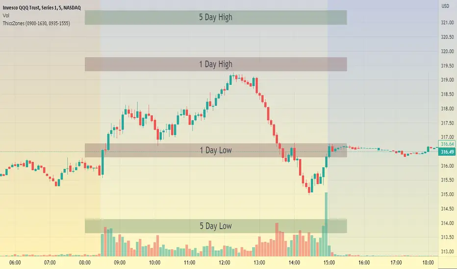
ThiccZonesThis indicator is a formula that includes 4 different zones which are different sizes based on the ticker you decide to use. It was optimized for SPY and other market ETFs but works well for all stocks on the market. The formula puts a zone at the previous day's high and low, and the previous 5 day's high and low. These zones are meant to be used as support and resistance and can even overlap, creating a 'master zone'. This is different than other zone indicators because the formula for these zones is something I created myself and have been unable to find on here. I have had the most success using a 1-15 minute chart and using my zones for reversal areas. I often look for other indications of reversal as well that line up with the area of the zones. It can also be used on the break and retest of these zones. I have found that when a stock breaks one of these zones it will often retest and continue that trend.
Supply and Demand w/ Higher Timeframe and Hidden Zones█ OVERVIEW
This indicator draws Supply and Demand zones using the common methodology of a basing candle followed by a drop/rally candle. The indicator user inputs allow you to configure the parameters for zone identification in two ways. First, by increasing the intensity of the drop/rally candle. Second, by increasing the number of candles that should be grouped to form a base and it's following drop/rally. This allows you to chart zones from higher timeframes and zones that may not be identifiable on the higher timeframes (aka Hidden Zones).
For example, when viewing a chart on the 5min timeframe the "Number of Candles" user input can be set according to the higher timeframe that you want to use to draw zones.
Setting "Number of Candles" to 3 draws zones from the 15min timeframe. (5min * 3 candles = 15min)
Setting "Number of Candles" to 6 draws zones from the 30min timeframe. (5min * 6 candles = 30min)
This functionality also allows for the identification of hidden zones because the first candle in a set on the lower timeframe does not have to align with the candles on the higher timeframe.
█ CONCEPTS
Intensity
For demand zones, the distance between the close of a rally candle and the high of the basing candle is what this indicator refers to as "Intensity".
For supply zones, it is the distance between the close of the drop candle and the low of the basing candle.
Higher Timeframe Zones
This indicator finds higher timeframe zones through the use of the "Number of Candles" user input.
The higher timeframe used will be the product of the chart's current timeframe and the value set for "Number of Candles".
Hidden Zones
A hidden zone is a zone from a higher timeframe that can not be seen when charting with that timeframe.
It can only be found on lower timeframes by grouping candles together to emulate higher timeframe candles.
█ USER INPUTS
Lookback
The Number of Bars back used to find zones.
Zone Configuration
• Drop/Rally Intensity - Increase this to require the drop/rally candle to make a greater move from the basing candle to qualify as a zone.
• Number of Candles - Increase this to draw zones from higher timeframes. The timeframe used will be the product of the chart's current timeframe and the value selected.
Zone Drawing Options
• Include Broken Zones - When unchecked zones that have been broken through will not be drawn.
• Demand Fill/Border - Allows customization of the color and transparency of demand zones.
• Supply Fill/Border - Allows customization of the color and transparency of supply zones.
█ TIPS
1 — Use the indicator multiple times on the chart with the "Number of Candles" input set to different values to have zones from multiple higher timeframes on the chart.
2 — Drop/Rally Intensity set to 0 is not recommended. It will lead to very weak zones being drawn.

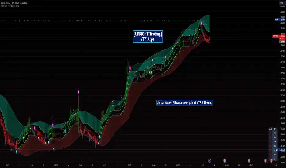
[UPRIGHT Trading] Volatility Trend Filter (VTF) AlgoHello Traders,
As some of you know, I have had this in Beta for a long while now and it's finally time for a full release.
I originally designed this to be an Unreal Algo add-on to track & stay in the trade a little better, but the VTF Algo has become a full Algorithm and can be used standalone with supreme accuracy.
It's for beginners and advanced traders alike. I've made the settings very customizable, but also easy to just jump right in.
How it works:
It uses volatility , deviations, and tons of statistical calculations, confirmations, moving averages, and filters to bring you the most accurate Supply & Demand predictive algorithm possible. The VTF Algo will automatically normalize different volatility in any type of market to help avoid getting Chopped up and give a forward-looking approach to accurate Price Action and confirmation. It will automatically show support and resistance in real-time. The channel that The VTF Algo creates will help traders confirm whether they should stay in the trade or get out fast. As the green top grows it naturally acts as Supply and as the red bottom grows it acts as Demand, when one of them far exceeds the other the direction price will proceed to is clear to see.
Features:
-Easy-to-read Price Action & Trend channel.
-Exceptional Chop Filter (grayed center).
-Accurate Buy/Sell and Topline Continuation Signals.
-Rejection Signals.
-Multiple-Timeframe Customizable Trend Table. Showing Directional Arrows (see bottom right of picture).
-Bullish / Bearish Growing Blocks.
-Fully Customizable with Clean and Cleaner Mode.
The VTF Algo was made with all different types of traders in mind.
Some like things Ultra Crispy Clean:
Others like things a little more clean but can move their focus to where it's needed:
Lastly, there are those who don't mind things looking a little busy:
Topline Continuation Signals, Auto-Supply/Demand, and a Real-Time Multiple Timeframe Trend Table (in the bottom-right) corner:
Meshes perfectly as an Algo Add-on for Unreal Algo © (as originally designed) to enhance "The Simple Strat" © :
I tried to make everything as customizable as possible. So adding or removing or color-changing is super easy.
Happy Trading.
Cheers,
Mike
support and resistance on multi timeframe [parsimaj] Description:
support and resistance and trendline on two timeframes by your choice
This indicator is capable of showing you the current and higher timeframe support and resistance by your strategy choice (two timeframes alongside each other). It also helps you to monitor the trend direction in short and long term by trend lines . You can change the depth of every levels and trend lines from the panel. Use this indicator in all markets because it follows the basic principles of levels but is unique in changing second timeframe by your choice.
_its smart , if the levels are too close together ,it will choose the deeper ones for you.
How it works:
By default, there is no higher timeframe and you can select your desire higher timeframe from the panel. Higher timelines will be displayed thicker and your current levels would be thin lines. (Levels that are higher than the current price will be red and those that are lower will be green). The number of levels to display is also by your choice, the default is 4 levels for each timeframe.
We have two types of trend lines , long terms as trend 1 (blue below and purple above trend line )- short term as trend 2(dashed ones).
Bouncing on levels and breaking trend line are the best triggers for entry and exit points.
Setting:
First, choose your higher timeframe then the depth of levels for each time (current and higher), The deeper it is, the more precise the lines. After that you can set the depth of trend lines by your choice. Trend 1 is the longer term So put it deeper and then set the short trend line (dashed ones) if you want to change it.
We have put the settings in the best mode, but you can also change it according to your strategy and inform us about the results.
This indicator has been obtained with hours of effort and codding , hope you enjoy
The Zone Seeker Supply and Demand - by Karoshi TradingThe Zone Seeker Supply and Demand - by Karoshi Trading
The Zone Seeker is based on the Supply & Demand Methodology.
Activating this indicator will mark all the zones of your chart.
Depending on your setting preferences, some zones will be showed or not.
The indicator code works as follow:
We will use the number of consecutive candles, body size compared to the wick and body length to calculate the zones.
Here is an example of the indicator.
1# Consecutive Candles
The indicator will search for minimum 2 consecutive candles of the same color. That means, that both candles has to close above the opening price of each candle (Bullish) or close below there opening prices (Bearish).
2# Body Size
After the first condition is met, the Code will now look into each candles of step #1.
Each of the candles should be equal or above 50% body, to meet the second requirement.
It will calculate the body size, compared to the full candle size to determine the percentage of the body itself.
3# Body Length
If the first two steps are positive, the code will jump into the 3rd phase of the indicator, the „Body Length“. With 2 options (ATR & MA) the code will calculate within a 14 candles period the average range of the candles. With that information, the code will now compare the average range to our candles from step #1.
The candles from step #1 has to be equal or bigger than 1.5 times the range/size of the average candle to met our last requirement.
4# Demand & Supply Zones
After all 3 requirements are met, the code will search for the last candle of the opposite color, to mark a zone. As example, if we have a demand zone with all conditions met, the indicator will search for the latest candle where the price closed below the opening price.
After finding such a candle, the indicator will mark the whole range of this candle (body + wick) and create a colored rectangle with a description in it. As example „Demand CTF“
CTF = Current Time Frame
5# Testing the Zones
As a test, we only count if the price went inside or touched the zone and left it and closed outside the zone. (You can choose by yourself if touched is on or off in the settings).
The code will not count each candle as a test, but each phase where the price went into the zone and closed outside the zone. As an example, if price went into a demand zone and closes 2 candles within the zone and the 3rd candle closes above the demand zone, that will count as one test.
Each test, will change the color of the zone, to keep in track of the freshness of the zones. After the 3rd test of a zone, the zone will be automatically deleted.
6# Flipping Zones
As a flipping zone is meant, that if the demand zone get broken to the downside by 2 or less candles it will automatically turn into a fresh supply zone. Important to know is, it will only occur if the candles closes below the demand zone. Same occurs for supply zones.
7# Multiple TimeFrames
It is possible, to choose one more time frame on top of the current time frame your are actually trading.
The code will separate both time frames, so you can choose how many zones you want to see in each time frame.
The supplementary time frame zones will be in 3 different grey colors, to destinguish the zones.
Also, overlapping zones will have a little info box, to avoid overlapping text.
On top of that, you can also show "all" time frames at once.
Current Time Frame = Colorized Zones
Supplementary Time Frames = Grey Zones
ASE Supply & Demand█ Introduction
ASE Supply & Demand is a multi-timeframe Supply and Demand zone indicator based on the Order Block concept. Order Blocks are a price action concept defined as a basing candle followed by a breakout candle (as seen in the chart below). A basing candle typically shows a slowing down in price action, foreshadowing a reversal and initial institutional activity. The breakout candle then confirms institutional activity with a displacement candle in the opposite direction of the basing candle. Additionally, there is an advanced feature called “Potentials,” which allows us to see price action forming S&D zones beforehand & trapped positions live through the same Order Block concept.
█ Supply and Demand Zones
The Supply & Demand zones are plotted on 8 timeframes (5m, 15m, 30m, 1hr, 2hr, 3hr, 4hr, D). In addition, there are custom settings that allow the trader to filter for the most significant zones and to cohere to their trading style:
Range Multiplier
Filters the creation of a zone based on the basing candle of Supply/Demand(0-5)
The size of the basing candle must be smaller than 0-5 times the True Range Index to create Supply/Demand.
If the basing candle range is smaller than the True Range Index, this can foreshadow the potential of institutional activity as price slows down, and a potential reversal might occur.
True Range Index
The number of bars to calculate the True Range in Range S+D mode.
Displacement Sensitivity
Filters the creation of a zone based on the displacement from the base (0-20)
Calculated by taking the breakout range (as seen in the chart below) divided by the range of the basing candle
0 = less significant, more zones
20 = more significant, fewer zones
Zone Strength Filter %
Filter out current zones based on how strong they are (0-100)
Calculated by the amount of fill within a zone. By changing the Zone Strength Filter, you can display zones that have not breached the filter % you select. For example, if you choose 80% Zone Strength, that means it will only show zones that are 20% filled or less; in other words, zones that have 80% or more yet to be filled.
0 = All Zones
100 = Completely unused zones
With these advanced filters and plotting on multiple timeframes, we have created the best Supply and Demand Indicator . In addition, these filters help to eliminate insignificant zones and noise in the market, leaving us a clean chart.
█ Potentials
Potentials foreshadow the possibility of a Supply or Demand Zone forming, the possibility of a Trapped concept, and it works great as targets or influence in our trades.
Potentials are calculated by the same Order Block concept, which allows us to see Supply & Demand/Order Blocks forming in real-time.
When a potential is triggered and holds, the line turns solid. If it continues to hold, it has the potential of forming a Supply/Demand zone based on the trader's Zone Filters. If the price pulls back and fails to hold, it will go back to dotted. Inferring it used the potential as liquidity and is potentially trapping market participants at that potential.
█ How To Use:
Supply and Demand Zones are the ‘Where’ to our trade but not the ‘Why.’ This means that the zones are our POI (Point of Interest) and ‘Where’ we want to be looking for a trade. It is not our ‘Why’ because we do not enter just because we are in a zone. This is because we expect pivots or reversals inside our Supply & Demand zones, and this rarely happens quickly.
What we want to look for in our zones is a solid base for our reversals. Simply put, we want to see new demand forming at our Demand Zones and new supply forming at our Supply Zones. This can be achieved by observing the ‘Potentials’ feature which allows us to see new Order Blocks or ‘Base Candles’ forming. With a trained eye, the ‘Potentials’ feature is highly effective in addition to its ‘Trapped’ logic which can offer entries on their own. The "Trapped" label on potentials shows potential trapped buyers or sellers after we reach that level. Observing and understanding how price action facilitates, especially around the zones, is crucial to its usability. In addition, other strategies or indicators can be used in confluence to support bounces out of demand and rejections out of supply.
Ultimately once we find a viable entry, we want to see a complete cycle. For example, if we caught a bounce out of demand with new demand forming, we would want to see the cycle complete and us reach the next supply or manufacture new supply. The ‘Potentials’ feature is the easiest way to gather multiple targets and at the same time offers stop loss management.
█ Settings:
Enable Supply/Demand/ Zones and Potential Liquidity
STF S&D Zones - Enables 5 minute and 15 minute timeframe for zones
LTF S&D Zones - Enables 30 minute and 1 hour timeframe for zones
HTF S&D Zones - Enables 2 hour, 3 hour, and 4 hour timeframe for zones
Daily S&D Zones - Enables Daily timeframe for zones
Enable Potentials
Supply Demand Zone Models
Range - Filters zones based on the range of candles before supply/demand
Displacement - Filters zones based on the displacement of the breakout candle
Range + Displacement - Filters zones based on the displacement of breakout candle and range of the candles before supply/demand
Supply Demand Zone Filters (see “Supply and Demand Zones” section for usage)
Range Multiplier
True Range Index
Displacement Sensitivity
Zone Strength Filter %
Deletion Conditions
Confirmed - Deletes zone upon time-frame close above supply or below demand
On Break - Deletes zone upon break above the top of supply or break below bottom of demand
On Tap - Deletes zone upon the touch of supply or demand
Other Settings
Price Labels - Turns on Zone Price Levels
Supply/Demand Color Input - Customize color of zones to your liking
Supply Demand Border Width - Change the border width of zones (0 would be completely borderless zones)
Supply Demand Transparency - Change transparency of zones (0 is completely solid zones, 100 is completely transparent)
Transparency Input - "Normal" Transparency stays at the level that's set; "Decrease with price" as price moves through, the zones become more transparent
Default Color - Changes color of any text/labels (default is gray)
Text size - Change size of text on labels
Support and Resistancewhat is "Support and Resistance"?
it is a support and resistance indicator.
what it does?
it draw support and resistance zones on the chart.
how it does it?
It determines the zones where the price leaves with a big candle after going horizontal for a while as support or resistance zones according to the price movement direction. while doing this, it compares the size of the candles and the elapsed time.
how to use it?
Red zones represent resistance and green zones represent support. You can buy in the support zone or sell in the resistance zone. my advice is to make your own interpretation by taking into account the price movement with different indicators. they are considered useful if there is a closure beyond the zones. otherwise, they continue to be shifted to the right.
notice: As new zones are created, old ones may disappear. so it might be wise to draw boxes using drawing tools where the old zones are.
Support and resistance are very important concepts for technical analysis. so I am thinking of updating and improving this indicator many times in the long run. but I couldn't wait long to post it.
examples:

Bagang Pivot Zones | Supply & Demand, Support & ResistanceBagang Pivot Zones detects imbalances from classic reversal and momentum price actions.
Imbalances create pivot zones, a.k.a Supply & Demand / Support & Resistance / Orderblock zones.
Use Cases
1. Traders using Supply & Demand theory can quickly pinpoint imbalance zones created by BUY-to-SELL and SELL-to-BUY candles.
2. Trend Following traders can systematically catch and follow a trend based on pivot zones analysis.
3. Breakout traders can easily target pivot zones’ breakout and breakdown.
4. Take the guesswork out of risk management: manage stop-loss precisely behind pivot zones.
5. Analyze contrary pivot zones to set realistic profit targets.
Objectivity
By only comparing OHLC values to identify notable price actions, Bagang Pivot Zones avoids derived calculations with subjective parameters.
Chart Issue
If the chart zooms out after adding an indicator, right-click the price scale and toggle "Scale price chart only” on.

BIAS NotesUsage: This indicator allows you to note on your desired pair what is the current state of the trends.
!! How to use: You have to input the values for each table case to your desire in the indicator settings. !!
With this indicator you can note :
-what is the timeframe Bias
-which supply or demand we`ve just hit
I use this as a tool for my analysis with Insitutional Orderflow/SMC (Smart Money Concepts).

Professional Zones - Institutional Demand and Supply Imbalances
Intro to Supply and Demand Zone Technical Analysis
Supply and demand is an increasingly common strategy among day and swing traders in equity, forex, and the futures markets. The goal of analyzing supply and demand zones is to pre-determine where price action may pivot before that pivot happens, thus giving us an edge over the market. There are many unique charting/trading strategies that fit under the supply and demand umbrella, however we are going to focus primarily on Institutional Zones of Demand and Supply Imbalances, as this is what our TradingView indicator actively displays.
What are Institutional Zones of Demand and Supply Imbalances?
First, let’s break down the phrase above. The first word is ‘institutional’, which is a key aspect in our trading. As a retail trader, you must understand that retail traders (individual traders like you and I) have very little control and very little effect on price action in the major markets. The price action that we see everyday is caused by large institutions and hedge funds buying and selling equities in massive quantities.
This chart displays the price action for ES, which is the S&P500 E-mini futures .
At the time this guide was created, that chart for ES displays the low of this year (2022). You can see major highs and major lows, as well as steep drops and momentous runs.
Price action like this appears random to the naked eye, however it is all controlled by major institutions. These institutions place large buy and sell orders for markets such as the S&P 500 Index which causes these moves.
Our Institutional Demand and Supply Analysis attempts to discover the price zones where institutions have placed their buy/sell orders. Their buy orders create “demand zones”. And their sell orders create “supply zones”. Knowing where these zones exist allows us to anticipate price trend reversals so we can profitably participate in them alongside the major institutions when these key moves take place.
We are looking for areas in the chart where institutions have created major imbalances (more buy orders than sell orders or vice versa) which creates demand and supply zones that impact price action and trend reversals in predictable ways.
What Causes These Supply and Demand Zones?
Understanding that institutions control the price of the markets is crucial for understanding how these zones of supply and demand imbalances are formed, and it can be derived from historical price action.
There are two types of price action, balanced and imbalanced. Balanced price action is flat, consolidatory price action where the overall direction is sideways. Imbalanced price action is an exaggerated move in price either up or down. Now here is the key: institutional supply and demand imbalances are formed when price action goes from balanced to imbalanced. Below is an example of balanced price action .
There are clearly areas of institutional buy and sell orders that are causing price action to oscillate between the areas of demand and supply. The longer price action consolidates and moves sideways, the larger the volume profile will be in this range. In other words, more institutional orders will build up as price remains relatively the same for a longer period of time.
Here is how a demand zone is formed :
Due to bullish CPI news, price action went from balanced to imbalanced by exploding to the upside. This bullish price action filled all of the sell orders and broke past the previous area of supply. Because price moved up so fast, the buy orders did not get a chance to fill, essentially leaving an area with a high concentration of buy orders remaining. Hence, a new demand zone is formed which is shown here .
Our state-of-the-art indicator automatically scans for these historical shifts in price action (balanced to imbalanced) via our supply and demand zone detection formula, and displays them on your chart instantly. Remember the first image sent of blank price action? Here it is below:
The image below shows the exact same chart of ES, however, our advanced Professional Zones - Institutional Demand and Supply Imbalances indicator has been applied to the chart.
Just like that, price action has been transformed from unexplainable chaos to an orderly sequence of demand bounces and supply rejections.
Yes, all of these zones may be charted manually if one were to acquire the knowledge required to chart them by hand, and spend numerous hours going back in time to find all these zones. Additionally, these charts would then have to be constantly monitored and updated, which would require hours of work each day. This powerful indicator automates all of that work to give you more precious time to analyze and trade these zone-driven pivots in the markets.
How To Measure the Strength of Supply and Demand Zones?
The longer the consolidation takes place, the larger the demand/ supply zone will be. This strength is measured by the time frame of the origin of the zone.
Each zone may be formed on a different time frame, the biggest being the 1 Month time frame, and the smallest being the 30 Minute. Each supply and demand zone is automatically labeled based on the time frame from which the zone originated.
The weakest zones are derived from the 30 minute time frame. This means the zone only took two 30 minute candles to form, which is not a lot of time for institutions to place large orders. This means that the bounces and rejections off of these zones will usually be smaller, and usually won’t last more than a few days.
Larger zones such as 1 Day, 1 Week, and 1 Month often cause large swings in the market lasting weeks, months and even years. So pay attention not just to where the demand and supply zones currently appear, but also to the strength of that zone. You can see below that the demand zone that the market bottomed in and reversed out of in 2022 was in fact, a very strong weekly zone.
What is the Significance of Supply and Demand Zone Breaks?
These zones are order-based. This means that a supply zone level doesn’t turn into demand when price action breaks above it, and demand doesn’t turn into supply when price action breaks below it. It is unlike standard trend-based support and resistance levels. If price action breaks below demand by even $0. 01 , all of the buy orders have been filled and the demand must be deleted from the chart (and vice versa for a supply zone ).
While it is possible to play these zone breaks as continuation plays off of current momentous price action, it is unpredictable how far price will go up or down after breaking supply or demand during that leg.
However, in my years of supply and demand experience, I have noticed that if demand breaks, the market will eventually come down to the next viable demand zone . This is because without a pivot caused by an institutional-created demand or supply imbalance, there is often not enough participation to cause a sustainable trend reversal for a long period of time. Below is an example of this:
Above is the 4 Hour chart of TSLA bouncing up off of a demand zone . We call this a bounce in “no man's land”, as there is no major demand bounce to support this reversal to the upside. So in theory, price action should return lower to the next major historical zone of demand before it has a chance of pulling off a solid reversal. Here is what happened:
As you can see above, TSLA did indeed end up heading back down into the next major demand zone before getting a sustainable reversal to the upside. So you may play these supply and demand zone breaks as continuation trades, either long or short, with a price target at the next major zone. Just make sure to use proper risk management and position sizing, as timing the trigger of a price target can be difficult.
How Might I Place a Trade Using the Indicator?
Now that the basics of institutional supply and demand zones have been discussed, there will come a time that this strategy must be actively applied to personal trading with a goal of becoming profitable. Here is a step-by-step process to place a trade using supply and demand paired with an example of a day trade from the 1 minute time frame.
Step 1: Find a highly institutionally traded stock that is currently in supply or demand as shown by our indicator. For example, AAPL:
Step 2: Look for an above-average (exaggerated) volume spike. Because we are in one of the green zones at the bottom of the chart, we know that we are in demand where large institutional buy orders reside. We need to wait for some of these orders to actually fill before we take our trade. This is known as volume confirmation. The color of the volume usually does not matter in this situation.
Step 3: Now that we have a volume spike which is confirmation of large orders being filled, we need more confirmation that the institutional orders are not only a buy, but large enough to actually reverse the current trend.
This is ultimately a judgment call. A few green candles may be good enough to dictate a reversal, or a trend break. It comes down to personal preference and how aggressive you would like to be. Keep in mind, the longer you wait, the more confirmation your trade has, but also, the longer you wait, the greater the risk of missing the new trend. In this example, we will use a trend line to confirm our trend reversal.
Step 4: Enter the trade. Now that you have proper demand confirmation, you may place your trade. Be sure to determine your stop loss, price target, position size, and all other risk management factors along the way.
In this example, AAPL ran all the way up to supply before rejecting; making for a perfect demand to supply call trade. Also, more short trade entries could have been taken based off of the multiple supply rejections AAPL had.
The Bottom Line
There are many ways one may go about trading the stock market. However in my years of trading and teaching, there has never been a strategy that has not only changed my career, but improved the trading careers of my students, more dramatically than Institutional Zones of Demand and Supply Imbalances.
Though charting new zones and deleting broken ones everyday was time consuming and repetitive, the results of trading these zones made it well-worth the hours of charting. However, after months of development and fine-tuning, the painful charting process has been automated by this powerful indicator, completely replacing the tedious charting work for myself and my students.
While numerous other indicators include the name “Supply and Demand Zones”, we believe that no supply and demand indicator remotely this advanced and accurate available on TradingView. I am very blessed to finally bring this revolutionary tool to the market.
Introduction to the Aurora Demand and Supply Indicator for TradingView and its Functionality
This page is dedicated to providing a thorough walk-through of our Professional Zones - Institutional Demand and Supply Imbalances indicator. The settings functionality, customizability, and purpose will be discussed to give you an in-depth understanding of the indicator. Understanding the purpose of the different functions and settings is crucial to utilizing this powerful tool at its full potential.
First Look Upon Indicator Addition
After purchasing the indicator, your chart may initially appear cluttered, zoomed out, and hard to read. But do not worry, it just means the indicator settings must be fine-tuned to optimize your experience. Tt may appear overwhelming. However this page will discuss each major customizable setting and the functionality behind it to streamline your TradingView set up.
Filter Options Settings Category
This is the first customizable feature that appears when accessing the settings of the indicator. What Filter Zone Ranges does is allow you to filter the range at which zones appear both above and below the current asset price. With this setting unchecked, every single demand and supply zone within the 5k candle limit (or 20k limit if you have a premium TradingView account) will appear on your chart. This causes chart clutter which limits the visibility of price action.
If you have this setting activated, you can choose exactly the range of zones visible to you. This range is percent based and is measured both above and below the current market price. For example, if you activate Filter Zone Ranges and set the Filter Percentage at 7%, only zones within the range of 7% above, and 7% below the current asset price will be shown.
Demand/ Supply Zone Options Settings Category
The next two categories contain the majority of the customizability for supply and demand zones. The first option in both the Demand/ Supply Zone Options is Create Demand/Supply Zones. This toggle is very straight forward, you may choose whether or not to display all demand zones, or all supply zones.
The next two options are Demand/ Supply Zone Border and Demand/ Supply Zone Fill. Again, these are straight forward. The border setting allows you to edit both the color and opacity of the zones’ border lines. The fill setting allows you to edit the color and opacity of the interior of the supply/demand boxes.
Following the first pair of visual settings, you will see Demand/ Supply Zone Box Offset. This allows you to toggle how much the indicator offsets each zone from its origin point. In other words, move it to the left or right from the point in time at which the zone was created. The 0 offset is the base setting which is actually a slight offset to the right of the origin point to ensure that the candlesticks remain unobstructed visually.
After the offset options, you will find Demand/ Supply Zone ERC Multiple. This is a key setting which inputs the value our formula utilizes to scan the areas of institutional supply and demand imbalances. Unless you are extremely experienced with supply and demand analysis or you are running backtesting, it is highly recommended this value is left at ‘2’ for both the demand and supply options.
The next two options you will see in your indicator settings are Extend Demand/ Supply Zone and Demand/ Supply Zone Size. This feature allows you to customize exactly how far your zones will extend from the point of origin into the future.
The three options on the drop down menu are Extend, Fixed, and Dynamic. Each of these options extend your zones in a different fashion. It is important to note that the value inputted in the size option is the amount of units the zones will extend to the right for both Fixed and Dynamic options. The larger this input is, the further out the zones will extend into the future, and vice versa.
The final setting in the Demand/ Supply Zone Options category is Broken Zones to Keep and Broken Demand/ Supply Zone Fill. The Broken Zones to Keep input allows you to see recent supply or demand zones that have been broken and deleted from your chart. This may be useful for a trader in a few different ways. The Broken Demand/ Supply Zone Fill setting allows you to customize the number of broken zones displayed as well as their color and opacity. The most prominent example of this option’s utility is for traders that do not observe price action during the entirety of the market open.
If an individual left their charts for a few hours and missed a demand break, it may give the illusion that there was never a demand there and price action has been in “no-man's land” all day. However if that individual inputted ‘1’ in the Broken Zones to Keep setting, they would be able to see that a demand has broken. This may be useful as the trader may have an altered sentiment after knowing that a zone did in fact break.
Note: the value inputted is the amount of previously broken zones that will appear on your chart. For example, if the value ‘3’ is inputted, the three most recently broken zones will appear on your chart.
Time Frame Options Settings Category
Time Frame Options Settings allows you to toggle which supply and demand zones appear on your chart by time frame. For example, if you are analyzing a chart on a larger time frame such as the daily or weekly, the small 30 minute and 45 minute zones will often clutter your chart. By deselecting the weaker and smaller time frame zones, it will clean your chart up, allowing you to only see the zones that assist your analysis.
However the first two options in the category are unique.The first is Show Forming Zones. This option is extremely useful if you are watching price action play out live, when seeing the possibility of a supply or demand zone forming may be of benefit during your day trading. By toggling this setting ON, you will see all possible supply and demand zones forming in real time. However, this could cause clutter if multiple zones are forming at once in which case, toggling it off may be more beneficial.
The second option in the Timeframe Options category is the Show Zones Inside toggle, which controls the table at the top right of your screen (you may get rid of this table by deselecting tables in display settings).
This setting simply is a “yes” or “no” as to whether or not the table located at the top right of your screen will display the number of zones price action is currently sitting in. This setting is useful as zones may sometimes pile up on top of one another, making it hard to know exactly how many zones price action is currently sitting in.
Gap Options Settings Category
Just below the Timeframe Options category, is the Gap Options category. Gaps appear when two daily candles highs and lows do not overlap. These are often created when a catalyst is released into the market overnight causing a large move, resulting in a “gap” up or down the next morning.
A Gap often forms due to a strong move to the upside, and the indicator highlights this gap with a gray box. Gaps are important to many traders as there is often a large lack of liquidity inside the gap area, which often acts as a magnet that attracts future price action to fill it. If toggled on, the indicator displays the gap among the supply and demand zones seamlessly. The rest of the settings for this category are options to customize the color, opacity, size, and offset. These have the same effect as the options in the Demand/ Supply Zone Options category.
Text Options Settings Category
The final category in the indicator input settings is Text Options. This category allows you to toggle zone labeling on or off, and to specify how you would like the zone labels to appear. It’s strongly recommended that zone labeling is left ON because knowing the time frame a supply or demand zone originated from is a massive indicator of its strength. Top right alignment causes labeling such as “3H” to appear at the top right of each zone.
Indicator Data Limitations
There are a few limitations of TradingView which impact the Professional Zones - Institutional Supply and Demand Imbalances indicator. The first is the data TradingView provides to its users. With a basic TradingView account, a user only has access to 5,000 candles of data. So if a user is on the 1 minute time frame, that user can only see 5,000 candles before that current point. This is important because our advanced indicator scans historical price action that has formed supply and demand zones and displays it on your chart. This means that if a user is on a 1 minute time frame chart, they will only be able to see zones formed within the last 5,000 candles. Older supply and demand zones can not be displayed. However if a user has the Premium TradingView subscription, they can access up to 20,000 candles, which greatly increases the potential zones the user may see on the smaller time frames.
To counter this, we strongly recommend checking the larger time frames before starting your trading day, as there could be an old zone lurking behind the scenes. Once you spot it on the 30 minute time frame, for example, you may easily take note of the demand zone and its location.
The Bottom Line
This indicator has been intricately and powerfully designed to not only display institutional supply and demand imbalances more accurately and efficiently than any other TradingView indicator, but it has also been designed to give the user full control. Full control means the user has the ability to customize the appearance and inputs, as well as toggle specific objects visible to the trader.
We have meticulously designed the Professional Zones - Institutional Supply and Demand Imbalances indicator to be extremely valuable as a stand-alone strategy, as well as versatile enough to incorporate multiple other trading strategies on top of supply and demand .
However, in order for this indicator to be utilized by you at its full potential, it is important that you understand all of its features, capabilities and configuration options before you dive into trading.
Gap ZonesSharing a simple gap zone identifier, simply detects gap up/down areas and plots them for visual reference. Calculation uses new candle open compared to previous candle close and draws the zone, a mid point is plotted also as far too often it's significance is proven effective.
Works on any timeframe and market though I recommend utilizing timeframes such as weekly or daily for viewing at lower timeframes such as 5, 15 or 30 minutes.
Often price is observed reaching towards zone high/mid/low before rejection/bouncing. These gap zones can give quantitative basis for trade management.
Future features may include alerts based on price crossing up/down gap low, mid and highs. Feel free to message with any other suggestions.
SuperTrend Support & Resistance(My goal creating this indicator) : Provide a way to categorize and label key structures on multiple time frames so I can create a plan based on those observable facts.
The Underlying Concept / What is Momentum?
The Momentum shown is derived from a Mathematical Formula, SUPERTREND. When price closes above Supertrend Its bullish Momentum when its below Supertrend its Bearish Momentum. On the first bar bearish momentum is detected a resistance Level is made at the highest point of the previous bullish condition. On the first bar bullish momentum is detected a support Level is made at the lowest point of the previous bearish condition. As I become a better analyst I will find better techniques and this source code may become open-source, but as of now it remains protected. This indicator scans for bullish & bearish Momentum on the Timeframes selected by the user and when there is a shift in momentum on any of those time frames (price closes below or above SUPERTREND ) it notifies the trader with a Supply or Demand level with a unique color and Size to signify the severity of said level.
What is Severity?
Severity is How we differentiate the importance of different Highs and Lows. If Momentum is detected on a higher timeframe the Supply or Demand Level is updated. The Color and Size representing that higher timeframe will be shown. Demand and Supply Levels made by higher Timeframes are more SEVERE then a demand level made by a lower Timeframe.
Technical Inputs
- If you want to optimize the rate of signals to better fit your trading plan you would change the Factor input and ATR Length input. Increase factor and ATR Length to decrease the frequency of signals and decrease the Factor and ATR Length to increase the frequency of signals.
- to ensure the correct calculation of Support and Resistance levels change BAR_INDEX. BAR_INDEX creates a buffer at the start of the chart. For example: If you set BAR_INDEX to 300. The script will wait for 300 bars to elapse on the current chart before running. This allows the script more time to gather data. Which is needed in order for our dynamic lookback length to never return an error(Dynamic lookback length cant be negative or zero). The lower the timeframe the greater the amount of bars need. For Example if I open up a 30 sec chart I would enter 5000 as my BAR_INDEX since that will provide enough data to ensure the correct calculation of Support and Resistance levels.
Time Frame Inputs
- The indicator has 3 Time Frame Displays where you can choose how SEVERE You want the Supply and Demand Levels. For Example: 1min, 3min, 5min, 15 min Levels, 60 min levels Weekly Levels, etc.....The higher the Timeframe Selected the more SEVERE the Level.
- Use the Amount of time Frames input to increase or limit the amount of time frames that will be displayed onto the chart.
Display Inputs
- The toggle (Trend or Basic) option Lets the trend determine the colors of the Support and Resistance Levels or Basic where the color is strictly based on if its a high or a low ( Trend = HH,HL,LL,LH)
- Toggle options (Close) and (High & Low) creates Support and Resistance Levels using the Lowest close and Highest close or using the Lowest low and Highest high.
Toggle on both or toggle off both in order to use both these values when determining the trend of your chart. For Example this would mean (Price has to close higher then the highest high. Not only make a higher high or a
higher close) and the inverse (Price has to close lower then the lowest low. Not only make a lower low or a lower close)
How Trend Is being Determined ?
(Previous Supply Level > Current Supply Level ) if this statement is true then its s LH so the trend is bearish if this statement is false then its a HH so the trend is bullish
(Previous Demand Level > Current Demand Level ) if this statement is true then its a LL so the trend is bearish if this statement is false then its a HL so the trend is bullish
(Close > Current Supply Level ) if this statement is true technically price made a HH so the trend is bullish
(Close < Current Demand Level ) if this statement is true technically price made a LL so the trend is bearish
- Fully customize how you display and label Market Structure in specific timeframes. Line Length, Line Width, Line Style, Label Distance, Label Size, Label Background Size, and Background Color can all be customized.
- Lastly Is the Trend Chart. To Easily verify the current trend of any timeframes displayed by this indicator toggle on Chart On/Off . You also get the option to change the Chart Position and the size of the Trend Chart
*****The Current charts timeframe has to lower then a month to ensure correct calculation of Supply and Demand Levels*****
How it can be used ?
(Examples of Different ways you can use this indicator) : Easily categorize the severity of each and every Supply or Demand Level in the market (The higher the time frame the stronger the level)
: Quickly Determine the trend of any Timeframe
: Get a consistent view of a market and how different time frames are behaving but just use one chart.
: Take the discretion from hand drawing support and resistance lines out of your trading
: Find and categorize strong levels for potential breakouts
: Trend Analysis, Use multiple time frames to create a narrative based on observable facts from these time frames
: Different Targets to take money off the table
: Use labels to differentiate between different trend line setups
: Find Great places to move your stop loss too.
SUPER GCOV5 MAPSCALP > MAPPING & SCALPING SUPER GCOV5 MAPSCALP indicator is built specifically for mapping/prediction measurement and fast trading i.e. scalping/intraday in the commodity market or cryptos market. It uses an indicator instrument consisting of ATR TRAILING STOP (ATR), EXPONENTIAL MOVING AVERAGE, PIVOT POINT, FIBONACCI KEY LEVEL, and LINEAR REGRESSION CHANNEL(LRC).
Rebuild of Instrument & Parameter
This indicator is also an upgraded instrument that is sourced from the previous indicator-FUTURES SCALPV2.This R&D of course makes trading activities more effective, and dynamic to increase the confidence of traders in current trading activities. The indicator has been upgraded in terms of parameters as well as additional instruments. Among them are;
1. ATR Trailing Stop
2. ATR BUY/SELL signal
3. Exponential Moving Average(EMA) – fastMA/slowMA Length
5. Breakout/breakdown signal
6. Pivot low/high level
7. Fibonacci extends & retracement
8. Linear Regression Channel(LRC)
9. Alert condition ( a dozen alerts )
> The best timeframe for entry is 3 minutes for FCPO and 15 minutes for other futures & cryptos.
> The best timeframe mapping/prediction is 1 hour & 4 hours.
>The candle/bars have been colored to make it easier for traders to see the price trends whether in bullish or bearish conditions.
Easier SOP of ENTRIES/POSITIONING:
1. entry by signal BUY/SELL after signal bar ( 2nd bar) for confirmation.
2. The best entries BUY at support(pivot low-Blue line) after price rebound then signal appears. The best buy also when the price is at lower
low pivot + fibo support level + lower trendline(LRC) + and the price went rebound.
3. The best entries SELL at resistance(pivot high-red line) after price pullback then signal appears.
The best buy also when the price is at a higher high pivot + fibo resistance level + upper trendline LRC + and the price went pullback.
4. Profit-taking areas are usually measured by support and resistance levels. Please refer to the bold line( support & resistance), fibo key level,
and trendline.
*To avoid false signals/wrong positions, you can use the EMA line as a guide and follow the trends, which are the buying weight when the price is above the 20/50 ema, and the selling weight when the price is below the 20/50 ema. EMA can be reset on the input setting.
STEPS of MAPPING/PROJECTION:
1. Use a bigger timeframe such as 4 hours or 1 hour
2. Use LRC to identify buy/sell weights when the price makes a zig-zag patent
3. Use monthly and weekly fibo levels to know support and resistance. This fibo is very important to see if the price will make an extension or
retracement based on the regression channel earlier. So here we can evaluate which area to buy/sell/take-profit/exit and the reversal of a
market price.
You can also create an ALERT CONDITION to help you get a reminder of signals and price trend changes
The original instrument has been retained but changed in terms of display & facelift features.
Hopefully, the new one will assist you in making analysis and strategy of trading activities successfully.
THIS IS NOT A BUY/SELL CALL, ONLY STUDY IDEAS AND ANALYSIS BASED ON MEASUREMENT TOOLS FOR EDUCATION AND GUIDANCE PURPOSES.PLEASE TAKE AT YOUR OWN RISK.
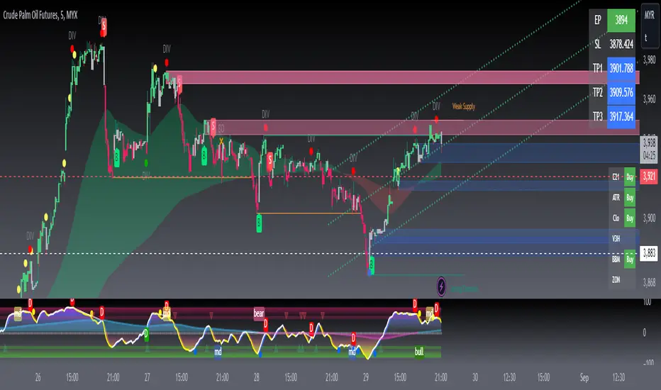
ECHO FX IMBALANCE CANDLEThis indicator helps with ECHO TRADING GROUPS trading style in order to find institutional order zones. It repaints the candles which are less than 50% made up of body rather than wick. It will color those candles in blue, but the user can change the color to what they desire. By spotting these zones it can help identify potential supply and demand areas. Which help us traders find and use the mechanical edge.
The script and indicator simply put, indicates where there is indecesion in the market.
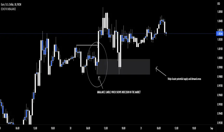
Market GloryV1 -Introducing the new Market Glory indicator! In this indicator you will find:
- Dynamic Trends: a beta feature that takes into account both the maximum high and lowest low values anywhere between 5 to 200 bars back to determine the respective resistance and support levels at all times, with a trailing guidance middle bar that can serve as a meter for direction and takes into account only the close values of the defined 5-200 lookback bars! ( ***Strictly based on the 1 minute timeframe. )
- Engulfing bars: a beta feature that allows you to seek out potential reversal bars, based on the dema tema clouds and the respective bar's open and close!!
- Cycle bars: a Market Sniper classic feature, enabling you to catch momentum, consolidation, and continuation via hollow candles! This is achieved by detecting whether the open and close values stem from within the dema tema cloud's boundaries!
- Levels: also a Market Sniper classic, which lets you see support and resistance levels based on previous daily, weekly, and monthly opening and closing values! Also takes into account current closing price action, which will update the levels after being broken!! Furthermore, takes into account fibonacci steps (0.236, 0.382, and 0.5) per timeframe to determine where the nearest level will draw out. **The Calibration feature enables you to look ahead for potential upcoming resistances, with maximum precision.
- EMA crossings: A legacy feature in almost any popular indicator, as a means to correspond with the dema tema cycles for better entries and exits!!
- Multi-timeframe popup labels: By hovering (or long pressing in mobile) over the support and resistance level labels, you can see each dedicated timeframe's current cycle and crossing, to assess whether the stock is following a particular direction! (based solely on real-time close value)
- Lastly...
--- Fully customizable options in coloring and values, including ready-to-go defaults with tooltips to guide you to the Glory you deserve!!!
PT OrderBlockVersion 1.0 of the PT OrderBlock indicator was developed to visually identify supply & demand zones within price. This indicator can be used on all timeframes. My preferred method is swing trading the higher timeframe.
Orderblocks are formed when there is a break in structure once a big buy/sell candle has formed. These "blocks" will eventually get revisited on a retest acting as major support/resistance. An orderblock for a demand zone is populated on the chart when there is a bearish candle before a swift move to the top side (opposite direction). The same goes for the orderblock that is formed for a supply zone, it is the last bullish candle before a swift move to the downside. Once you see such behavior, the indicator will populate the orderblock for you. When an orderblock gets mitigated (tapped into) the indicator will change colors of the block to allow you to distinguish between a fresh and already taped supply/demand zone. It has been proven effective to enter entries based on retests of the orderblocks which take place AFTER a break in market structure.
*PT OB Features:
-OBs that have been partially filled will remove a portion of the background zone to indicate how much of the orderblock is left to fill in the full zone (Toggle Highlight remaining OB).
-OB trigger can be switched between candle open & wick. I prefer wick because it increases the probability of catching a low/high.
Video with strategy will be uploaded shortly! It is included as part of the library. Just message us for access!

Manoj S/Rsupply and demand zone
supply and demand zone
supply and demand zone
supply and demand zone
Trend101 v5Welcome to what I believe to be the best indicator on TradingView. Trend101 v5
"Not all trends are made equal"
You should be only trading the trends that matter most... The basis of this script is using volume to rank price trends and give more prominence to the trends that are backed by volume, enabling you to only focus on riding the trends that matter.
If we see a trend with high volume, this will show up in the indicator with larger green or red columns / bars & the trends with low volume will cause little movement in the indicator.
Some indicators are great at showing price trends, some are great at showing volume... Trend101 v5 is great at showing both of these.
This indicator can be used in a variety of ways:
1) The most simplistic is to trade crossovers from Bull > Bear trends and vice versa. This alone can be profitable with a "scalping" mindset where you ride the trend until it shows signs of weakness.
2) The other way I use this indicator is to act as a confirmation tool... for example if price is approach a level of support, you can wait until the price shows signs of rejection and then your confirmation for entry is that Trend101 v5 will change to green. (& the opposite for levels of resistance).
Finally you are also able to use the Timeframe input to select different timeframes, this is useful to use two Trend101 indicators together to filter trade entries. An example would be using one Trend101 indicator set on the 15min timeframe and one set on the Daily timeframe and when both of these align in the same trend direction you are able to enter your trade.
I will produce a video "How To..." guide for this indicator shortly to explain other details.
Let me know in the comments below how you are using the indicator and all feedback is welcome.
