A.I. Optimus Prime [RubiXalgo]A.I. 👑 Optimus Prime – Advanced AI-Driven Trend Indicator
**Inspired by the Rubik's Cube**: Just as speed cubers execute precise, rapid rotations to solve complex puzzles — even while juggling — this indicator mimics market dynamics through adaptive "rotations" of trend, volume, and momentum data. Powered by machine learning, Kalman filters, k-NN predictions, and dynamic scaling, it visualizes market "solutions" with intuitive color gradients and overlays.
**Core Features**:
- **Dual Kalman Trend Lines**: Fast (reactive) and Slow (stable) lines for trend direction, smoothed with adaptive noise filtering (volume or volatility models).
- **AI Candle Coloring**: Gradient-based bar colors for bullish/bearish bias (Classic: green/red; Crypto: teal/purple).
- **Multi-Timeframe Moving Averages**: Up to 5 customizable MAs (SMA/DEMA/TEMA/VWMA) with on-chart lines and trend table.
- **Volume Profit-Trend Polyline**: Forward-projected volume delta prediction for potential price targets.
- **Liquidation Window (LiqD)**: Dynamic trade setup with entry, stop loss, and multiple profit targets based on momentum and liquidations.
- **Dynamic Volume Profile**: Linear regression-based channel with VPOC, highlighting high-volume nodes and liquidation zones.
**Key Settings**:
- VSQC Dynamic Scaling Lookback (default: 9) – Core speed for fast adaptations.
- Maximum Length (default: 188) – Controls slower trend calculations.
- Accelerator Multiplier (default: 6.6) – Adjusts responsiveness.
- Trend Momentum Window & k-Neighbors – Fine-tune ML predictions.
- Color Themes: Classic or Crypto.
**Trading Signals** (High-Probability Setups):
- **Longs**: Green fast/slow lines, price above dynamic EMA, green volume polyline up, bullish liquidation window active. Enter at green entry/target alignment; aim for 3:1+ RR.
- **Shorts**: Red lines, price below EMA, red volume polyline down. Mirror for bearish setups.
- Confluence: Combine with MTF table (green arrows dominant = bullish bias) and volume profile bounces.
**Disclaimer**: For educational purposes only. Not financial advice. Trading involves risk; use at your own discretion. Past performance is not indicative of future results.
Volume

TriPulse Volume Bounds | QuantEdgeBTriPulse Volume Bounds | QuantEdgeB
🔍 Overview
TriPulse Volume Bounds | QuantEdgeB (𝓣𝓟𝓥𝓞) is a volume-weighted, volatility-adaptive oscillator built to spot high-conviction expansion moves. It first applies a triple-smooth price engine as a refined input, then computes a VWMA anchored to volume participation and measures how far price deviates from it (in %). Dynamic upper/lower bounds are then generated from the oscillator’s own volatility (standard deviation), creating a self-adjusting channel. When the oscillator breaks above/below these bounds, 𝓣𝓟𝓥𝓞 flips into clear Long / Short regimes—supported by rich visuals, alerts, optional backtest tables, and a dedicated TPVO Sensor table that grades momentum/impulse/drive and conviction strength.
✨ Key Features
1. 🧠 TriPulse Source Engine (Triple-Smooth Input)
- Uses a triple-smoothed price series as the oscillator’s “signal-grade” input to reduce noise while staying responsive.
2. 📊 Volume-Weighted Anchor (VWMA)
- Builds a VWMA baseline using volume as weight, so moves backed by participation matter more than thin-market drift.
3. 📏 Percent Deviation Oscillator
- Computes oscillator value as: 100 × (close − VWMA) / VWMA, producing a clean “distance-from-value” readout.
4. ⚡ Dynamic Volatility Bounds
- Upper/lower thresholds are derived from stdev(avwo) over a lookback length and scaled by:
– Adaptive Multiplier (volatility scaling)
– Upper/Lower multipliers (asymmetric sensitivity)
5. 🎯 Regime Signals
- Long when AVWO > Upper Bound
- Short when AVWO < Lower Bound
- Neutral otherwise (inside bounds)
6. 🎨 Visual & Alerts
- Plots the oscillator with regime-sensitive coloring and fill behavior.
- Highlights the active bound when a long/short is triggered.
- Colors candles to match the current regime.
- Optional Long/Short labels on confirmed flips.
- Alert conditions on regime crossovers.
7- 📊 Backtest Table (Optional)
- Built-in backtest table from a chosen start date.
- Two display modes: standard table or overlaid table.
8. ♞ TPVO Sensor Table (Built-In Intelligence Layer)
- A dedicated on-chart dashboard that summarizes direction + quality of the current move using strength bars and momentum staging.
💼 Use Cases
• Breakout Confirmation: Catch expansion moves only when deviation exceeds adaptive bounds.
• Volume-Validated Momentum: Filter out weak pushes that aren’t supported by volume-weighted structure.
• Trend Regime Filter: Use TPVO state (Long/Short/Neutral) to gate entries from other strategies.
• Market Condition Read: Quickly determine whether price is drifting (neutral) or expanding (signal).
🎯 For Who
• Momentum & breakout traders who want confirmation beyond simple crosses.
• Volatility-aware traders who prefer thresholds that expand/contract automatically.
• System builders who need a robust regime variable plus strength grading.
• Discretionary traders who want fast visual clarity (fills, candle colors, sensor table).
⚙️ Default Settings
• Tripple Smooth Length (VWMA base input): 30
• Volume Weighted Length: 30
• Threshold Volatility Length: 27
• Upper Threshold Multiplier: 1.8
• Lower Threshold Multiplier: 0.8
• Adaptive Multiplier: 0.85
• Color Mode: Alpha
• Color Transparency: 60
• Labels: Off by default
• Backtest Table: On (toggleable)
• Backtest Table Overlaid: On (toggleable)
• Backtest Start Date: 09 Oct 2017
• TPVO Sensor Table Position: Top Right (default input)
♞ TPVO Sensor Table (What It Shows)
The TPVO Sensor is an on-chart dashboard designed to summarize both direction and signal quality:
• Direction:
o “Up / Down / Flat” determined by the oscillator’s short-term slope.
• Momentum:
o A normalized rate-of-change read, labeled as Positive / Negative / Neutral.
• Impulse:
o A velocity label derived from smoothed momentum (Strong / Weak / Stalling).
• Drive:
o A staged classification combining momentum + velocity:
o Strong Upside / Fading Upside / Strong Downside / Fading Downside / Neutral
• Bull / Bear Strength Bars:
o Two progress bars that visualize current strength as a percentage.
o In neutral regimes, it shows potential; in active long/short regimes, it shows conviction.
• Signal Line:
o Displays: Signal ⟹ Long / Short / Cash, matching the active TPVO regime.
📌 Conclusion
TriPulse Volume Bounds | QuantEdgeB (𝓣𝓟𝓥𝓞) combines a triple-smooth input, a volume-weighted anchor, and adaptive volatility bounds to produce a clean oscillator that highlights true expansion moves. With regime states, rich fills, alerts, backtest options, and the TPVO Sensor table for momentum/impulse/drive + strength grading, it’s a compact all-in-one tool for spotting and validating regime shifts.
🔹 Disclaimer: Past performance is not indicative of future results. Always backtest and align settings with your risk tolerance and objectives before live trading.
🔹 Strategic Advice: Always backtest, optimize, and align parameters with your trading objectives and risk tolerance before live trading.

Hybrid Market Score Suite - Impulse Monitor🔬 HYBRID MARKET SCORE SUITE - Impulse Monitor — Algorithmic Imbalance Scoring & Compact 28-Indicator Dashboard
Monitoring regular divergences, OB/OS zones, statistical deviations, and 28 metrics simultaneously is impractical to do manually. HMSS - Impulse Monitor updates them every tick in one compact dashboard, with an optional scoring layer.
━━━━━━━━━━━━━━━━━━━━━━━━━━━━━━━━━
🎯 WHAT IS THIS
HMSS - Impulse Monitor
Performs **Real-Time Monitoring** of 28 technical metrics across 3 fixed timeframes ( 5m / 15m / 30m ) simultaneously.
It processes market data on a **tick-by-tick** basis without lookahead, designed to detect developing market imbalances and local exhaustion points as they happen.
Since the indicator analyzes fixed multi-timeframe streams, it is chart TF-independent : switching your main chart timeframe does not affect the internal logic or scoring.
━━━━━━━━━━━━━━━━━━━━━━━━━━━━━━━━━
🔧 "SWISS ARMY KNIFE" — Daily Monitoring Tool
A compact table with extensive data that you use every day :
28 indicators across 3 timeframes (5m / 15m / 30m):
Divergences (9): RSI DIV, MFI DIV, CCI DIV, CMF DIV, MACD DIV, CVD DIV, DELTA RSI (DRSI) DIV, Elder DIV, STOCH DIV
OB/OS (5): RSI OB/OS, MFI OB/OS, CCI OB/OS, DRSI OB/OS, STOCH OB/OS
Z-Score (8): RSI Z-Score, MFI Z-Score, CCI Z-Score, STOCH Z-Score, DRSI Z-Score, CMF Zone, CVD Z-Score, MACD Z-Score
Special (6): Elder Force, Volume Climax, ZMO EXT, (Nadaraya Watson Envelope) NW ENV, ATR Spikes, VWAP Dev
A few "Special" metrics may be less familiar than classic oscillators, so here are quick notes on what they flag (not "better" indicators — just more niche tools):
NW ENV (Nadaraya–Watson Envelope): A kernel-smoothed price envelope (period 8) with deviation multipliers 2.25 (inner) and 7.75 (extreme). Labels reflect band breaches: !! = price outside the inner band (strong extension), !!! = outside the upper extreme band (rare upside extension), !!!! = outside the lower extreme band (rare downside extension). These are context tags for extension/mean-reversion risk, not trade commands.
ATR Spikes: Compares the current candle range (High–Low) to the recent average ATR(14) over the last 10 bars. A spike triggers when the candle is ≥ 2.0× larger than the average — often seen during climax-like moments (sharp expansion), useful as a “caution marker” for late-move entries.
Volume Climax: A Z-Score of volume over 20 periods. Flags unusually high volume above about 1.9σ . In practice, it helps highlight “crowd intensity” moments: heavy volume on a down candle can resemble panic-like supply; heavy volume on an up candle can resemble aggressive chasing. Treat it as context, not a directional guarantee.
normalized via Z-Score over a 100 -bar history. It highlights statistically stretched momentum when it deviates beyond roughly 2.0σ from its mean — a way to spot overheated acceleration.
All of this — across multiple timeframes simultaneously, in one compact table, without cluttering your chart with a dozen oscillators below. Works on any chart TF — your timeframe selection does not affect calculations.
Each block can be toggled in settings:
Divergence Block — forming regular divergences across oscillators/flows
OB/OS Block — overbought/oversold zones (RSI/MFI/CCI/Stoch etc.)
Z-Score Block — statistical deviations in sigmas (σ)
Special Indicators Block — special indicators and regime filters
Scoring Block — Hybrid Engine (Score, Pattern, Breakdown, Attention, Trade Type, Veto)
Use it as a dashboard for quick market assessment — like a Geiger counter for market anomalies.
━━━━━━━━━━━━━━━━━━━━━━━━━━━━━━━━━
🧠 SCORING SYSTEM — For Extreme Imbalances
An innovative data-driven engine that activates during moments of extreme imbalance :
• Calibrated using 380,000+ historical market data records
• Compares current indicator combinations with historical patterns
• Assigns a Score when significant combinations are detected
Think of the scoring system as a Storm Radar — it doesn't predict volatility explosions, but it "lights up" during storms and shows when the turbulence reaches its peak and begins to subside.
It is designed to assist in identifying potential impulse reversals during liquidation events, if that aligns with your approach.
The system is calibrated on a multi-month historical dataset of 380,000+ records collected minute-by-minute from cryptocurrency markets (BTC, ETH, SOL). During this period, the market showed both multi-month lows and several ATH (All-Time High) events. Statistical dependencies and indicator combination patterns were identified from this data.
━━━━━━━━━━━━━━━━━━━━━━━━━━━━━━━━━
🧠 SCORING ENGINE ARCHITECTURE
Concept & Logic:
This system utilizes a hybrid approach, combining classical technical analysis with statistical profiling. Instead of simply summing up indicator signals, the algorithm compares the current market state against a proprietary database of historical patterns ("Profiles") collected for specific assets.
The calculation logic is layered:
1. Base Layer (Indicator Analysis):
The system monitors 28 metrics (RSI, MFI, Z-Scores, CVD, ATR Spikes, VWAP DEV, etc.).
Standard Deviation (25 pts, Dim Cell): Occurs when an indicator exceeds a standard volatility threshold (e.g., Z-Score > 1.5). This registers as a common local anomaly.
Profile Alignment (50 pts, Bright Cell): Occurs when a value hits specific historical thresholds recorded in the Asset Profile. These are values where impulses or structural shifts occurred in the past data samples.
2. The Core Pattern Recognition (compressed historical scenarios):
The system scans for ~14 compressed market scenarios (Patterns). A pattern becomes active only when its specific "Kernel" of indicators fires simultaneously with a Coverage Ratio > 70%.
3. Confluence & Weighting:
The final score reflects the density of these matches. It identifies the "Winning Side" (Long vs. Short bias) based on the accumulated weight of base and profile scores.
Score Breakdown (The "X-Ray" Row):
The dashboard displays a breakdown row ( L:… S:… C:… A:… K:… ) to visualize the components of the Total Score:
L / S (Baseline): Cumulative weight of active indicators for Long or Short bias.
C (Core Multiplier): A dynamic coefficient applied when the match with a historical pattern "Kernel" is high.
A (AddSig): Points for secondary confirming factors that reinforce the active pattern.
K (Key Features): Internal code for High-Impact Anomalies . These are rare statistical outliers (e.g., extreme Z-Scores > 3.0) that carry significant weight due to their historical correlation with volatility expansion.
System States (Dashboard Output):
The text labels on the UI represent the statistical context of the market, not direct trade commands:
NEUTRAL: Balanced market, no dominant patterns.
SIGNAL FORMING: Early detection of potential accumulation or distribution structures.
TREND — WAIT: Market is in a directional phase; algorithm is monitoring for exhaustion or pivot points.
ON WATCH: High statistical confluence detected.
MAYBE LONG/SHORT: Directional statistical bias is present.
MAX SCORE: Indicates an "Extreme Score" condition. Historically, such values appear during significant market extensions (Global Lows/Highs) where pattern coverage can approach 100% alongside statistical anomalies.
BREAKOUT: Context suggests impulse continuation or level breach.
Disclaimer: This tool provides a statistical context assessment based on historical pattern matching. "Global Lows/Highs" / "New Low/High" are dataset-derived pattern names, not a directional claim. "Max Score" and "Key Features" describe rarity levels, not guaranteed outcomes. Past market behavior is not indicative of future performance.
━━━━━━━━━━━━━━━━━━━━━━━━━━━━━━━━━
🛡️ DRSI VETO — SAFETY MECHANISM
Sometimes "the setup exists by score", but the market is overextended — which can make timing riskier. This is where DRSI Veto comes in:
If the system indicates LONG , but DRSI Z-Score shows extreme overbought conditions (or vice versa for SHORT), the VETO activates, significantly reducing the final Score.
This helps filter out overextended "exhaustion" setups — technically valid by score, but stretched enough to increase mean-reversion risk without proper context. A clear VETO label appears in the table.
━━━━━━━━━━━━━━━━━━━━━━━━━━━━━━━━━
🎯 USE CASES — WHEN IT WORKS BEST
Dual Purpose: Efficiency & Detection
While the Scoring Engine hunts for invisible imbalances, the dashboard serves as your primary daily workstation . It replaces the need for multiple oscillator panes, keeping your charts clean while providing a "Heads-Up Display" for Oscillators, Money Flow, and Statistical Anomalies across three timeframes at once.
Identifying Liquidation-Driven Reversals:
The scoring system is most effective during high-impulse market movements — large liquidation cascades, stop-loss hunts, sharp imbalances. HMSS - Impulse Monitor helps spot potential exhaustion points within seconds or minutes, highlighting reaction zones during high-impulse moves.
When NOT to expect detections:
Markets can and often WILL reverse without the indicator firing. This tool is designed for high-volatility moments with significant liquidations . Reversals in low-volatility, "quiet" markets will likely occur without elevated readings.
This is intentional: higher-score conditions are designed to be relatively rare, not a daily occurrence. If your approach values selectivity, it may help to treat elevated readings as “patient-wait” moments — markets often reward waiting for cleaner, high-confluence regimes rather than forcing a setup every session.
Think of the scoring system as an airbag — most of the time you don't need it, but when it activates, its informational value is high. It's your storm radar: particularly useful when markets enter rare and dangerous regimes.
━━━━━━━━━━━━━━━━━━━━━━━━━━━━━━━━━
💡 FORMING DIVERGENCES — Real-Time Monitoring
Important note for experienced traders:
The indicator shows divergences that are CURRENTLY FORMING , not confirmed ones. This is Real-Time Monitoring mode — scoring updates every tick , allowing you to see the situation as it develops.
⚠️ No lookahead / no future leak: This script strictly uses lookahead=barmerge.lookahead_off (no future data is used in calculations).
On historical data, scores are always displayed based on closed candles. For better historical detail, use candles down to 1-10 seconds.
If a "forming" pattern disappears — this is a normal part of real-time monitoring: the market changes, and the assessment/confluence recalculates accordingly.
━━━━━━━━━━━━━━━━━━━━━━━━━━━━━━━━━
📈 DIVERGENCE PERCENTAGES — WHAT THEY MEAN
Percentages next to divergences show "Divergence Intensity" — how strongly price and oscillator have diverged between points.
Note: The presence of a divergence itself is factored into the scoring system. However, the percentage values (intensity) are currently NOT included in Score calculation. We may add them in the future if we accumulate sufficient data confirming their statistical significance. For now, percentages serve as a visual hint for your own analysis — an additional confirmation filter.
Note: The indicator also draws forming divergence lines directly on the price chart — for 6 key oscillators (RSI, MACD, MFI, CCI, DRSI, CVD).
━━━━━━━━━━━━━━━━━━━━━━━━━━━━━━━━━
🔧 SCORING SYSTEM COMPATIBILITY
Statistical data profiles are available for: BTC, ETH, and SOL
- Default mode is AUTO : BTC/ETH/SOL detected automatically; all other assets use 'ALTS' (ETH-based) profile
- Manual Override: You can select a specific profile in settings if Bar Replay testing shows it tracks your asset's volatility better
- Indicator readings as tools work on ANY assets and markets
- For non-crypto instruments (Forex, Stocks): if alerts trigger too often or too rarely, adjust MAX SCORE Thresholds in settings
Note: Alert threshold settings (Base, Total, MAX SCORE) also affect "Attention Level" and "Trade Type" display in the UI.
━━━━━━━━━━━━━━━━━━━━━━━━━━━━━━━━━
🔔 ALERT SYSTEM (4-STEP)
The alert system is tiered (each step can be toggled on/off):
Step 1: Base Score — Triggers when mathematical confluence reaches base threshold
Step 2: Core Pattern — Triggers when algorithmic pattern is detected (Breakout/Formation)
Step 3: Total Score — Triggers when total Score reaches threshold
Step 4: MAX SCORE Alert — Final high-score alert (individual thresholds for BTC/ETH/SOL/ALT)
Important: Alert thresholds simultaneously calibrate Attention and Trade Type in the UI.
For automation (bots / webhook-based tools): use Webhook URL. Keep in mind that maximum score is often reached at the wick tip, not at candle close — backtesting on longer TFs may show delayed data.
━━━━━━━━━━━━━━━━━━━━━━━━━━━━━━━━━
🧩 HMSS ECOSYSTEM: HMSS - Impulse Monitor vs. HMSS - Context Engine
This script (HMSS - Impulse Monitor) is one half of a specialized two-module system. It is designed to work either as a standalone tool or alongside its companion, HMSS - Context Engine.
Why separate scripts? To maximize responsiveness and detail without hitting Pine Script resource limits (memory/execution time), the ecosystem is split into two specialized engines. Merging them would compromise real-time performance.
Note: HMSS - Context Engine is not a different preset of the same script — it is a separate engine with its own indicator set, pattern library, and calibration profiles designed for a different purpose and a different analytical scope.
Key Differences & Synergy:
Distinct Purpose (Micro vs. Macro): HMSS - Impulse Monitor (This Script): Designed for "Market Reaction." It monitors 5m/15m/30m specifically to detect local exhaustion, liquidation wicks, and immediate imbalances. HMSS - Context Engine (Companion): Designed for "Market Context." It analyzes 1h/4h/1D/1W structures to identify global trends and major structural pivots.
Distinct Indicator Sets: Each engine includes components better suited for its timeframe domain. HMSS - Impulse Monitor features VWAP Deviation and ATR Spikes — metrics more relevant for intraday dynamics. HMSS - Context Engine incorporates structure-oriented indicators not present here: ADX Exhaustion, OBV Divergence & Z-Score, Delta Histograms, VixFix (WVF), Basis, Williams A/D, and Pivot Distances.
Distinct Calibration Profiles: While both engines are developed using historical market observations, their pattern libraries and threshold values are calibrated independently for their respective metric sets and use-cases. The same market event may register as "Extreme" on HMSS - Impulse Monitor while appearing "Neutral" on HMSS - Context Engine if the broader trend structure remains intact — and vice versa.
💡 Synergy Scenarios (How to use them together): Experienced traders often combine both modules to refine market context and decision-making:
• Trend Pullback (Scalp): If HMSS - Context Engine indicates a strong Trend, but HMSS - Impulse Monitor shows "Extreme Overbought/Oversold" (correction against trend) — this often highlights a short-term counter-trend opportunity or a re-entry point.
• Major Reversal Risk: If BOTH HMSS - Impulse Monitor and HMSS - Context Engine indicate "Max Score" / "Extreme Imbalance" simultaneously — this is a rare statistical event (confluence of micro and macro exhaustion) that historically correlates with significant structural reversals.
━━━━━━━━━━━━━━━━━━━━━━━━━━━━━━━━━
⚙️ TECHNICAL NOTES
🕰️ Real-Time Monitor (No Past Labels):
Crucial Concept: This tool is a Real-Time Monitor , not a "signal painter." It shows the market state HERE AND NOW — it does NOT draw historical Buy/Sell arrows or preserve past dashboard states. The only elements drawn on the chart are currently forming divergence lines.
Calculation Heavy:
We utilize maximum Pine Script limits for calculations. Initial loading may take up to 12-15 seconds — this reflects the precision and volume of processed data. After loading, the indicator operates without noticeable delays, processing data every tick .
Chart TF Independence:
The indicator analyzes fixed MTF streams, so your chart timeframe selection does not affect results. For reduced load and faster response, 5-60 minute charts are preferred.
Recommended Chart Timeframe:
For speed and lower load: 5–60 minutes (optimal)
For super-detailed history, you can go down to second-level candles, but this is a performance/memory tradeoff
Bar Replay — How to See Past Performance:
To understand how the Scoring Engine reacted to specific market moves (e.g., a past crash or pump), use Bar Replay Mode :
1s to 30s: Best accuracy (precise tick-emulation)
1 min: Acceptable (if your plan lacks seconds-based intervals)
> 5 min: Not recommended — accuracy drops as intrabar price action is lost
⚠️ > 15 min: Not recommended — may exceed memory limits (TradingView constraint)
To manage the extensive database of pattern weights and profiles while maintaining high performance, this engine utilizes a custom optimized data structure. This ensures the script operates smoothly within Pine Script's resource limits without compromising the depth of historical analysis.
━━━━━━━━━━━━━━━━━━━━━━━━━━━━━━━━━
🔬 TECHNICAL APPROACH (for the curious)
The indicator uses a proprietary compact data encoding system that allows transmitting information about divergences, their type, length, and intensity in a single numeric value. This enables efficient aggregation of data from multiple timeframes without exceeding Pine Script limits.
The scoring system is built on the Statistical Pattern Matching principle: current indicator combinations are compared against a library of statistically significant patterns, each with its own weight and type (Formation/Breakout).
━━━━━━━━━━━━━━━━━━━━━━━━━━━━━━━━━
🚀 QUICK START
Add HYBRID MARKET SCORE SUITE - Impulse Monitor to your chart.
Position table (recommended: bottom-right ) and adjust Offset / Spacer so it doesn't overlap price action.
In settings, toggle blocks by groups: Divergences / OB-OS / Z-Score / Special / Scoring — to match your trading style and load preferences.
For comfortable operation, use chart TF 5–60m .
━━━━━━━━━━━━━━━━━━━━━━━━━━━━━━━━━
🔄 DEVELOPMENT
The indicator receives periodic updates, including statistical pattern refinements as new market data is accumulated, to maintain relevance with current market conditions. Update schedule is not guaranteed.
━━━━━━━━━━━━━━━━━━━━━━━━━━━━━━━━━
🛡️ DISCLAIMER
This script is provided for informational and educational purposes only and does NOT constitute financial advice, investment advice, or a recommendation to buy/sell any asset.
All examples, descriptions, and statistics are based on historical observations. Market conditions can change, patterns can fail, and signals/labels may disappear or update in real time. No results are guaranteed.
Use this tool as one input among many. Always apply your own judgment, risk management, and independent verification (DYOR). Trading — especially with leverage — involves substantial risk, including the risk of total loss. You are solely responsible for your decisions and outcomes.

Wyckoff Pro Detector + Dashboard & Alerts [Gemini]Description
Overview The Wyckoff Pro Detector is an advanced Price Action tool designed to automatically identify market structures based on Richard D. Wyckoff's theory. Its main goal is to help traders spot Accumulation and Distribution phases, highlighting critical turning points and institutional manipulation.
Development Logic This script was engineered using Pine Script v5 with a focus on institutional footprint tracking.
Structure Algorithm: It utilizes a custom Pivot High/Low detection mechanism with a variable lookback period (configurable) to filter out market noise and identify valid trading ranges.
Volume Anomaly Detection: Instead of raw volume, the script uses a Relative Volume logic (comparing current volume to a Moving Average) to mathematically identify "Climatic Action" typical of Smart Money intervention.
State Machine: The code operates on a state-based logic, meaning it remembers the previous market phase (Accumulation or Distribution) to validate subsequent signals like Springs or UTADs, reducing false positives.
Key Features
Automated Phase Detection: Identifies and draws dynamic boxes for Accumulation (Green) and Distribution (Red) structures.
VSA Integration: Highlights candles with "Ultra High" volume to signal Selling/Buying Climaxes.
Manipulation Signals:
SPRING (Buy): Detects false breakouts of support with an immediate return into the range.
UTAD (Sell): Detects false breakouts of resistance (Upthrust After Distribution).
Live Dashboard: An on-screen table showing the current Phase, Last Event, Event Time, and Volume Status.
Alert System: Fully configurable alerts for Climaxes, Structure Tests, and Entry Signals.
How to Use
LONG Signal: Wait for an Accumulation phase (Green Box). Look for the yellow "SPRING!" label. This indicates a "bear trap" and potential markup.
SHORT Signal: Wait for a Distribution phase (Red Box). Look for the orange "UTAD!" label. This indicates a "bull trap" and potential markdown.
Settings
Pivot Length: Higher values (20-30) filter noise for macro-structures.
Volume Factor: Adjusts the sensitivity for climatic volume detection.
Credits & Acknowledgements
Concept and Methodology based on the works of Richard D. Wyckoff.
Code logic, optimization, and Pine Script development provided by Google Gemini AI.
Disclaimer This tool is an aid for analysis and does not provide financial advice. Use it in combination with your own risk management.

ParetoCapital Volatility AlgorithmParetoCapital Volatility Algorithm — Strategy Description
This strategy is a volatility-driven breakout system designed to participate only in markets that exhibit sufficient price activity and structural clarity. All signals are evaluated on candle close to ensure stable, non-repainting behavior.
The strategy adapts its execution logic based on long-term market context while maintaining consistent risk exposure across changing volatility regimes.
Volatility Filter
Trades are taken only when current market volatility exceeds a defined baseline. This filter is intended to suppress signals during low-activity or range-bound conditions and to focus execution on periods where directional movement is more likely to persist.
Market Regime Assessment
A long-term reference is used to classify the prevailing market environment:
When price is positioned above the long-term reference, the market is treated as trend-favorable.
When price is below the reference, the market is treated as non-trend or transitional.
This classification determines how entries are structured but does not attempt to forecast direction.
Entry Logic
In trend-favorable conditions, the strategy seeks continuation trades in the direction of the prevailing trend. Entries are triggered only after price confirms strength through a breakout beyond recent levels.
In non-trend conditions, the strategy prepares for volatility expansion in either direction. Trades are initiated only when price breaks decisively beyond recent boundaries, allowing the market to determine direction.
All entries are confirmation-based and are not executed at market without prior price expansion.
Position Sizing and Risk Control
Position size is dynamically adjusted according to current market volatility. Risk per trade is kept proportional and consistent, while overall capital usage is constrained to prevent overexposure.
This approach allows the strategy to remain risk-controlled during both high- and low-volatility environments.
Exit Logic
Positions are exited when price action indicates a material loss of momentum relative to recent market structure. The exit logic is designed to tolerate minor counter-moves while responding decisively to structural weakness.
Key Characteristics
Candle-close confirmation
Non-repainting behavior
Volatility-adaptive execution
Regime-aware trade logic
Systematic risk management
Strategy Objective
The objective of this strategy is to capture a limited number of structurally strong price movements while minimizing exposure during non-productive market conditions. It prioritizes selectivity, confirmation, and risk discipline over trade frequency.
Usage Notes
The strategy is optimized for major cryptocurrencys, where volatility expansion and momentum continuation are more prevalent.
Best results have been observed on BTCUSD using the 15-minute and 30-minute timeframes.
Performance on other assets or timeframes may vary and should be evaluated through independent testing.

Simple VWMA Smooth | QuantEdgeBSimple VWMA Smooth (SVS) | QuantEdgeB
🔍 What Is Simple VWMA Smooth?
SVS is a smoothed, volume-aware trend filter that blends a Gaussian-pre-filtered, low-lag moving average with dynamic standard-deviation bands. It identifies trends by measuring when price moves decisively above or below a VWMA (Volume-Weighted Moving Average) baseline—filtering out noise while letting high-volume moves carry more influence than low-volume noise.
⚙️ Core Components
1) DEMA Pre-Filter
A double-EMA smoothing step to reduce initial noise before further processing.
2) Gaussian Smoothing
Applies a small-kernel Gaussian filter to produce a cleaner input series that suppresses rapid spikes.
3) VWMA Baseline (Volume-Weighted Average)
Computes a moving average where each bar is weighted by volume, so the baseline tracks “meaningful” price moves more than low-liquidity fluctuations.
• In high volume → the baseline reacts more to those candles
• In low volume → price changes have less impact
4) Volatility Bands
Surrounds the VWMA line with ± N × SD bands (separate multipliers for upper and lower) to capture current market volatility, creating dynamic thresholds for trend detection.
5) Trend Signal
• Long when price closes above the upper band
• Short when price closes below the lower band
• Otherwise neutral
💡 Why It’s Special
• Volume-Validated Responsiveness: VWMA prioritizes moves backed by volume, helping reduce signals caused by thin-market noise.
• Multi-Stage Filtering: The DEMA → Gaussian → VWMA sequence suppresses noise while keeping trend structure clear.
• Asymmetric Bands: Separate multipliers for upper/lower bands let you tune bullish vs bearish sensitivity independently.
• Visual Clarity: Color-coded candles and filled bands highlight trending phases at a glance, while backtest tables quantify performance.
📊 Backtest Mode
SVS includes an optional backtest table, enabling traders to assess historical effectiveness before using it live.
Backtest Metrics Displayed:
• Equity Max Drawdown
• Profit Factor
• Sharpe Ratio
• Sortino Ratio
• Omega Ratio
• Half Kelly
• Total Trades & Win Rate
💼 Ideal Use Cases
• Trend Identification: Spot cleaner trend starts/exits across stocks, FX, or crypto with reduced lag and fewer false breakouts.
• Volume Regimes: Helps distinguish “real” moves (high participation) from weak moves (low participation).
• Multitimeframe Alignment: Confirm direction across timeframes before entries.
• System Building Block: Use as a volume-aware filter inside broader strategies.
🎨 Default Configuration
• DEMA Length: 7
• Gaussian Kernel: length = 4, sigma = 2.0
• VWMA Length: 14
• Volatility Bands: SD length = 40
📌 In Summary
Simple VWMA Smooth | QuantEdgeB is a volume-weighted, noise-suppressed trend filter that combines DEMA smoothing, Gaussian filtering, a VWMA baseline, and dynamic SD bands to separate genuine directional moves from market noise—across any asset or timeframe.
🔹 Disclaimer : Past performance is not indicative of future results. Always backtest and align settings with your risk tolerance and objectives before live trading.
🔹 Strategic Advice : Always backtest, optimize, and align parameters with your trading objectives and risk tolerance before live trading.

Volume-Based Candle ColoringDisable your Candle Borders, Body and Wicks from the Symbols Settings of your Chart to properly use this Indicator
You can Customize colors and use it to trade as per your Volume preference (Eg. You can turn all the other candles to white if you want to only Trade around breakout of Strong Volume Candles)
Comment Below to request changes
🐍🐢

Delta Pressure SpectrumWhat this indicator is (brief)
Delta Pressure Spectrum (DPS-3) is a volume-pressure oscillator that estimates buy vs sell imbalance (a delta proxy), then normalizes it into a robust z-score so “significant” pressure means the same thing across different volatility regimes and market conditions. It visualizes that pressure as delta candles + a histogram, and only “lights up” with three breach tiers (plus an ultra-rare white core) when the move is statistically extreme for the current environment.
How to use it:
1) Read it like a pressure gauge, not an entry signal
-Histogram/candle height = intensity of net pressure (buy-dominant vs sell-dominant).
It’s best at telling you: “Is this move real pressure or just price wiggling?”
2) The 3 tiers tell you “how abnormal” the pressure is
-Tier-1 (weak breach): meaningful but common; “something’s happening.”
-Tier-2 (strong breach): rare enough to care; often aligns with real expansions / squeezes / liquidation events.
-Tier-3 (extreme breach): statistically extreme; often shows climactic behavior (either continuation impulse or blow-off/flush conditions).
-White core: only when Tier-3 overshoots hard—treat as “exceptional event.”
Key idea: tiers are adaptive. Tier-2 on BTC 1m and Tier-2 on ES 1h should both represent “strong for that regime.”
3) Best ways to trade with it (high-signal)
-Trend continuation confirmation: In an uptrend, repeated Tier-2/Tier-3 on the up side = real demand; avoid fading unless structure breaks.
-Exhaustion / climax watch: Tier-3 + white core after an extended run = “crowded pressure.” That can precede either: continuation (if structure holds), or reversal / mean reversion (if structure fails).
So you use it as a warning light, then let price structure confirm.
-Compression → expansion detection:
-Quiet baseline for a while, then sudden Tier-2/Tier-3 = expansion regime shift.
-Divergence (use carefully): Price makes new high, DPS-3 fails to reach prior tier intensity → weakening participation. This is most useful on HTFs or at major levels.
4) What the alerts should mean (how you set them)
-Tier-3 breach alerts: your “something serious just hit the tape” alert.
-Pressure flip alerts: best used as contextual reversal confirmation (it requires strong context in your logic).
-White core alert: extremely rare “event mode” notification—use sparingly.
5) One simple rule that keeps you out of trouble
-Don’t fade Tier-2/Tier-3 pressure just because it’s extreme. Fade only when price structure says the move failed (break of trend / reclaim failure / key level loss). DPS-3 tells you strength, structure tells you directional validity.

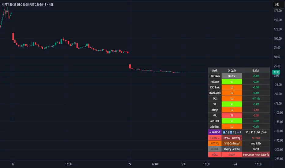
Smart Money Flow - Institutional OI & Volume Analyzer [Pro]# 🎯 Nifty Smart Money Flow - Institutional OI & Volume Analyzer
## What It Does
Professional-grade indicator that tracks **Open Interest (OI) cycles, volume footprints, and basis analysis** across Nifty 50's top 10 heavyweight stocks (representing ~54% of index weight). Identifies institutional accumulation/distribution using **4-quadrant OI analysis** combined with volume surge detection and ATR-based regime filtering.
## 🔥 Key Features
### Institutional-Grade Analytics
- **OI Cycle Detection**: Identifies Long Buildup (LB), Short Covering (SC), Short Buildup (SB), and Long Unwinding (LU) for top 10 Nifty constituents
- **Volume Validation Layer**: Detects institutional footprints via volume spikes >150-200% of 20-period MA
- **Cost of Carry Analysis**: Real-time basis tracking between spot and futures prices
- **Signal Quality Score (0-100)**: 4-component scoring system measuring alignment strength, weighted momentum, trend purity, and basis confirmation
### Advanced Regime Detection
- **Percent-Based ATR Filter**: Normalized volatility comparison prevents false signals across different price levels
- **Consecutive Bar Confirmation**: Requires 3+ bars of sustained signal before regime classification
- **Dynamic Strategy Recommendations**: Suggests optimal option structures (Call/Put Spreads, Iron Condor, Straddle) based on market regime
### Smart Money Divergence Alerts
- **Top Stock Divergence Detection**: Warns when heavyweight stocks (HDFC, Reliance, ICICI) contradict index signal
- **Pareto Principle Application**: Weights top 3 stocks (~30% index weight) for maximum predictive accuracy
## 📊 Visual Dashboard
Clean, dark-theme optimized table displaying:
- Individual stock OI cycles with color coding
- Basis/premium percentages for each heavyweight
- Alignment metrics (Bullish/Bearish/Neutral count)
- Quality score with position sizing guidance (Full Size/Spreads Only/No Trade)
- Institutional volume confirmation count
- Real-time regime status with ATR ratio
## 💡 How To Use
### For Intraday Traders (1m-15m)
1. Enable "Institutional Volume Filter" for noise reduction
2. Wait for Quality Score ≥60 for directional trades
3. Use regime-based structure recommendations (displayed in INDEX row)
### For Swing/Positional Traders (1H-Daily)
1. Focus on consecutive bar count ≥3 for trend confirmation
2. Check for divergence warnings before major positions
3. Use basis analysis to time entries (premium = bullish sentiment)
### For Options Traders
1. **Quality Score 60-100**: Full size directional (Buy Calls/Puts)
2. **Quality Score 30-60**: Spreads only (Call Spread/Put Spread)
3. **Quality Score 0-30**: Avoid directional; use Iron Condor in choppy regime
## ⚙️ Customization Options
- **10 Toggle Switches**: Show/hide individual stocks for cleaner dashboard
- **Volume Threshold**: Adjust institutional detection sensitivity (default 1.5x)
- **Regime ATR Length**: Fine-tune volatility measurement period (default 14)
- **Alignment Thresholds**: Set minimum bullish/bearish stock count for signals (default 5/10)
## 📈 Best For
- Nifty 50 Index traders (Futures & Options)
- Bank Nifty analysis (3 major banks included)
- Institutional flow tracking
- Multi-stock correlation analysis
- Regime-based strategy adaptation
## 🚨 Alerts Included
✅ Strong Bullish Signal (7+ stocks aligned + volume confirmation)
✅ Strong Bearish Signal (7+ stocks aligned + volume confirmation)
✅ Divergence Warning (Top stocks contradict index move)
✅ Institutional Volume Surge (7+ stocks with volume spikes)
## 📚 Technical Foundation
Based on institutional trading principles:
- **Order Flow Analysis**: Price + OI correlation for position identification
- **Smart Money Concepts**: Volume profile + basis analysis for institutional tracking
- **Regime Filtering**: Adaptive strategy selection based on volatility environment
- **Weighted Aggregation**: Pareto principle ensures top stocks drive signal quality
## 🔧 Version History
- v6.0: Initial release with 10-stock coverage
- Optimized request.security() calls: 30 total (3 per stock)
- Dynamic table rendering with barstate.islast efficiency
## 📌 Important Notes
- **Data Source**: NSE India (Spot + Futures + OI)
- **Update Frequency**: Real-time (dependent on chart timeframe)
- **Best Timeframes**: 5m, 15m, 1H, Daily
- **Avoid**: Pre-market hours (OI data may be stale)
---
**Category**: Volume / Order Flow
**Market**: NSE India - Nifty 50
**Timeframe**: Multi-timeframe (1m to Daily)
**Complexity**: Advanced (suitable for intermediate to professional traders)
## Tags (for SEO)
#nifty50 #orderflow #openinterest #institutional #smartmoney #volume #regime #niftyfutures #niftyoptions #oi #banknifty #heavyweights #basis #costofcarry #divergence #qualityscore #nseindia #optionstrading #algorithmic #quantitative
Exhaustion Levels[Sahebson] v2.0🎯 Overview
Exhaustion Levels is a sophisticated price action indicator designed to identify market exhaustion points — moments when buying or selling pressure has potentially reached its limit and a reversal may be imminent.
Unlike traditional oscillators that lag behind price, this indicator analyzes real-time price dynamics to pinpoint high-probability reversal zones before they fully develop.
✨ Key Features
🔺 Exhaustion Detection
Bullish Exhaustion (Green Triangle): Identifies potential bottoming patterns where selling pressure appears exhausted
Bearish Exhaustion (Red Triangle): Detects potential topping patterns where buying pressure appears exhausted
📊 Dynamic Support & Resistance
Automatically plots key levels based on exhaustion points
Levels persist until new exhaustion events occur
Visual confirmation of significant price zones
🤖 Bot-Ready Alerts
JSON-formatted alerts for webhook integration
Compatible with 3Commas, Cornix, Alertatron, and custom bots
Includes ticker, exchange, price, and timestamp data
Human-readable + machine-parseable format
⚙️ Fully Customizable
Adjustable sensitivity parameters
Toggle exhaustion arrows on/off
Toggle support/resistance levels on/off
Customizable line thickness
📈 How To Use
Entry Signals
Buy Signal (🟢): When a green triangle appears below a candle, it suggests potential bullish exhaustion — consider long entries
Sell Signal (🔴): When a red triangle appears above a candle, it suggests potential bearish exhaustion — consider short entries or exits
Support & Resistance
Use the automatically generated levels as potential take-profit zones
Previous exhaustion levels often act as future support/resistance
Combine with your existing S/R analysis for confluence
Best Practices
✅ Use on higher timeframes (1H, 4H, Daily) for more reliable signals
✅ Combine with volume analysis for confirmation
✅ Wait for candle close before acting on signals
✅ Use proper risk management — no indicator is 100% accurate
✅ Backtest on your preferred assets before live trading
🎨 Visual Guide
ElementColorMeaning🔺 Green TriangleBelow candlePotential bullish reversal🔻 Red TriangleAbove candlePotential bearish reversal🟩 Green LineSupport levelPrevious bullish exhaustion zone🟥 Red LineResistance levelPrevious bearish exhaustion zone
⚙️ Settings Explained
SettingDefaultDescriptionShow Exhaustion Arrows✅ OnDisplay buy/sell trianglesShow Exhaustion Levels✅ OnDisplay S/R linesExhaustion Swing Length40Lookback period for analysisExhaustion Bar Count10Sensitivity thresholdLine Thickness2Width of S/R lines
Tip: Lower values = more signals (higher sensitivity), Higher values = fewer signals (higher quality)
📊 Recommended Assets
This indicator works on any liquid market:
✅ Stocks (SPY, QQQ, AAPL, TSLA)
✅ Crypto (BTC, ETH, SOL)
✅ Forex (EUR/USD, GBP/USD)
✅ Futures (ES, NQ, CL)
✅ Indices (US500, US100, US30)
⚠️ Disclaimer
This indicator is provided for educational and informational purposes only. It is not financial advice. Past performance does not guarantee future results. Always do your own research and use proper risk management. Trading involves substantial risk of loss.

Volume Spread Analysis with Cues⚖️Volume Spread Analysis with Cues (VSA)
Volume Spread Analysis with Cues is an indicator that analyzes the relationship between price spread and volume to reveal market intent. Instead of treating volume in isolation, this script classifies each candle into meaningful VSA conditions such as accumulation, distribution, absorption, momentum, exhaustion, and traps.
🔑Key Features
True price spread calculation (optional gap-inclusive mode)
Candle spread analysis
Volume analysis
Candle close quality analysis (strong, weak, or neutral)
Visual emoji cues
Detailed tooltips explaining each signal and its confirmations
Built-in alerts for demand, supply, and trap scenarios
📏 How to Use
This script is context-driven, not a signal generator. It is designed to be used alongside:
Support & resistance
Market structure
Higher-timeframe bias
The strongest setups occur when VSA cues align with key levels and trend direction! Confluence is your friend.
🚨Alerts Included
VSA Demand Cue – potential accumulation or continuation
VSA Supply Cue – potential distribution or absorption
VSA Trap Cue – exhaustion or false breakout behavior
⚠️ Beware
Not every cue is tradable on its own
Confirmation and location are critical

VORB DJB Trades V1VORB by DJB Trades (Version 1) is a complete intraday framework built around the New York session Opening Range Breakout (ORB), combined with higher-timeframe VWAPs and precise Fair Value Gap mapping.
This tool is designed to give you context, levels and confluence at a glance – no more stacking 5 different indicators on your chart.
🔶 Core ORB Logic (NY Session)
• Uses the 09:30–09:45 NY time 15-minute ORB range.
• Draws an ORB box from high to low during the ORB window.
• Projects clean high/low ORB lines across the session (up to your chosen end time, default 18:00 NY).
• Displays the ORB size in points above the box
• 1 point = 4 ticks (futures-style logic).
This gives an instant sense of how “wide” or “tight” the opening drive was, and how much room you have for trend or mean-reversion plays.
📐 Daily VWAP (Intraday Bias)
• Custom anchor time (default 18:00, NY session close style).
• Plots Daily VWAP plus +/-1 standard deviation bands.
• Full styling controls: colors, line widths, band fill etc.
• You can limit visibility to specific timeframes via dropdown (e.g. only show on 1–5m, or just intraday).
VWAP +/-1 deviation bands gives you intraday bias and “fair value” zones to frame trades around the ORB.
🕒 Higher Timeframe VWAPs (Weekly, Monthly, Yearly)
All three higher-TF VWAPs are calculated the same way (volume-weighted, streaming) but anchored at different structural points:
• Weekly VWAP – resets at the start of each week
• Monthly VWAP – resets at the start of each month
• Yearly VWAP – resets at the start of each year
Each has:
• Main VWAP line
• ±/-1 standard deviation bands
• Independent color / width / band fill settings
• Timeframe visibility controls (“show from TF” & “show up to TF”) so you can do things like:
⁃ Weekly VWAP only from 5m and above
⁃ Monthly on 1h and higher
⁃ Yearly only on Daily/Weekly/Monthly
Use these as higher-timeframe bias references and key dynamic value areas above/below the ORB.
📊 1m FVGs (Outside ORB & VWAP Bands)
For precision entries:
• Detects 1-minute Fair Value Gaps (classic 3-candle pattern):
⁃ Bullish FVG: low > high
⁃ Bearish FVG: high < low
• Only plots FVGs that are:
⁃ Outside the ORB range, and
⁃ Outside the Daily VWAP +/-1 bands
• FVG boxes are auto-extended to the right (4× original width) for clear “liquidity pockets”.
• Separate colors for bullish and bearish FVGs.
This helps you focus only on “clean” imbalances away from the opening chop and mid-range value.
⚙️ Customisation & Use
• Works best on US indices, FX and futures during the NY session.
• Optimised for 1m–15m ORB trading, but higher-TF VWAPs shine on 5m, 15m, 1h and Daily.
• Every visual element (ORB box, lines, VWAPs, bands, FVGs, label text/bg) is fully customisable in the settings.
⚠️ Disclaimer
This script is for educational and informational purposes only.
It does not constitute financial advice or a signal service.
Always test on a demo account and use your own risk management before trading live.

Scooby SpecialThis indicator detects bullish and bearish divergences between price and 5-period RSI using confirmed pivot points. Signals only trigger below RSI 40 for bullish setups and above RSI 60 for bearish setups.

Daily Volume ProfileThis indicator is identical to the Fixed Range Volume Profile,
except that it automatically fixes the range to a daily basis.
SETUP XANDAO ETFEste setap é usado para operar nos futuros, usamos essas métricas para poder achar entradas


RAHUPrice Action Entry Signals is an intraday trading indicator designed for traders who want clear, uncluttered charts with high-probability entry signals.
The script combines multiple market-strength and trend-confirmation tools internally, while displaying only actionable buy signals and predefined targets on the price chart.Optimized for 5-minute timeframe
Clean chart – no indicator lines displayed
Generates directional buy signals only
Automatic three target levels (T1, T2, T3)
Suitable for index, stock, and intraday tradingEach valid entry automatically plots:
T1 – Short-range target
T2 – Medium-range target
T3 – Extended target
Targets are plotted relative to the entry price, helping traders manage exits objectively.
Who This Indicator Is For
Intraday traders
Options traders
Traders who prefer minimal visual clutter
Traders who use rule-based entriesBest Practices
Use with proper risk management
Avoid trading during low-liquidity periods
Combine with higher-timeframe market context
Always confirm with market conditionsDisclaimer
This indicator is a technical analysis tool only.
It does not guarantee profits and should not be considered financial advice.
All trading involves risk.

PowerWave Oscillator Suite [BOSWaves]PowerWave Oscillator Suite - Multi-Dimensional Momentum & Trend Oscillator with Adaptive Divergence Insight
Overview
PowerWave Oscillator Suite is a cutting-edge analytical toolkit designed to provide traders with a sophisticated understanding of momentum, trend strength, and divergence behavior in financial markets. Unlike conventional oscillators that rely solely on price-based calculations, PowerWave combines adaptive, multi-dimensional computation engines with advanced visualization tools and divergence detection systems. The suite offers a unique blend of trend-following, mean-reversion, and contrarian trading insights, allowing users to analyze markets from multiple angles simultaneously. Each module within the suite has been designed to offer precision, clarity, and adaptability, ensuring that traders of all levels - from novice to professional - can extract actionable intelligence without unnecessary chart clutter or signal ambiguity.
PowerWave Oscillator Suite focuses on three primary trading paradigms: momentum measurement, volume-based filtering, and smoothed trend oscillation. These paradigms are accessible via three core modules - Aroon Oscillator, Adaptive Volume Filter, and HyperSmooth Oscillator - each equipped with advanced smoothing, dynamic source selection, reduced-lag computation, and divergence detection, offering a comprehensive approach to market analysis. By leveraging the full capabilities of this toolkit, traders can identify market turning points, confirm trend strength, detect hidden divergences, and refine entries and exits, all within a single integrated framework.
Configuration Panel and Customization Options
At the heart of PowerWave is a robust configuration panel that allows users to tailor the suite to their individual trading preferences and market conditions. The first level of customization is the Module Selection, allowing users to toggle between the Aroon Oscillator, Adaptive Volume Filter, or HyperSmooth Oscillator. Each module is designed with a distinct analytical purpose:
Aroon Oscillator : Measures trend strength and provides early signals for trend reversals or continuation.
Adaptive Volume Filter : Uses volume-based filtering to highlight momentum shifts, smoothing out noise from price fluctuations.
HyperSmooth Oscillator : Delivers finely smoothed oscillations, designed to capture micro-trend shifts and acceleration patterns.
Users can enhance the responsiveness and filtering behavior of each module via the Enhancement Level setting, a numeric input that applies a series of multi-stage exponential smoothing layers, ensuring signals are robust against market noise without introducing excessive lag. Additionally, the Source Type option allows traders to determine the price input methodology - ranging from adaptive combinations of open, high, low, and close values to more traditional sources - granting flexibility to align the indicator with preferred strategies or asset characteristics.
Engineered Visual Intelligence and Module-Specific Color Systems
PowerWave employs purpose-built, module-specific color systems that are tightly integrated with each oscillator’s underlying computation model. Rather than treating color as a cosmetic layer, the suite uses color as an informational channel, encoding state, momentum bias, and structural context directly into the visual output.
Each module operates with a dedicated color logic aligned to its analytical role:
The Aroon Oscillator uses polarity-driven gradients to express time-based trend dominance and directional strength.
The Adaptive Volume Filter applies contrasting color states to distinguish expanding versus contracting volume pressure.
The HyperSmooth Oscillator utilizes a dynamic HSV-based color spectrum that continuously maps momentum acceleration and deceleration into the oscillator line itself.
These color systems are reinforced through coordinated visual elements, including bar coloring, background state highlighting, histogram fills, and cross-condition shading. Users can further tune visual intensity and emphasis through enhanced mode and opacity controls, allowing the same engineered color logic to be amplified or subdued depending on chart density and personal workflow.
By designing color behavior as an extension of the calculation engine - rather than an arbitrary styling choice - PowerWave ensures that visual cues remain consistent, data-driven, and immediately interpretable across assets, timeframes, and market regimes.
Dynamic Source and Zero-Lag Computation
A defining characteristic of PowerWave Oscillator Suite is its Dynamic Source Calculation engine, which adjusts the input price series according to the trader’s chosen source type and enhancement level. This system ensures that signals are computed from a refined, noise-filtered base, enhancing reliability across asset classes and timeframes. Each stage of the multi-level smoothing hierarchy incrementally reduces erratic price fluctuations while preserving meaningful structural movement, allowing traders to differentiate between minor price noise and genuine momentum shifts.
Complementing this is the Adaptive Reduced-Lag Filter, a highly specialized algorithm that minimizes lag inherent in traditional moving averages or oscillators. This filter uses a gain-optimized EMA structure that continuously self-adjusts based on recent price dynamics, providing traders with fast yet reliable signals. By incorporating zero-lag calculations, PowerWave ensures that trend reversals and momentum inflections are detected in near real-time, allowing for earlier entries, faster confirmations, and more accurate exits. The reduced-lag filter also dynamically adjusts its internal gain coefficients, minimizing error while accounting for varying market volatility.
Aroon Oscillator Module
The Aroon Oscillator module within PowerWave is designed to quantify trend strength and identify emerging directional shifts. Utilizing a dual-period calculation, the module compares the relative timing of recent highs and lows, producing a normalized oscillation that reflects the market’s current momentum. Advanced zero-lag filtering ensures that even minor reversals or trend accelerations are captured with minimal delay, while additional smoothing can be applied via the configuration panel to match the trader’s preferred sensitivity.
The module includes trend and mean-reversion signal detection:
Trend Signals : Generated when the oscillator crosses the zero line, indicating potential trend continuation or initiation.
Reversion Signals : Triggered by crossovers between the oscillator and its internal signal line, highlighting potential pullbacks or temporary counter-trend behavior.
Visual overlays, including bar coloring and gradient plots, highlight bullish and bearish momentum zones, making it immediately apparent whether the market is in a trending or consolidating state. By combining trend and reversion insights with divergence detection, traders gain a multi-layered understanding of market structure, allowing for well-timed entries and exits.
Use Case:
Use the Aroon Oscillator when your primary objective is identifying real trend shifts early and staying aligned with structure. This model excels in markets transitioning from consolidation into expansion, where timing matters more than micro-entries. Zero-line crosses define directional regime changes, while signal-line crossovers expose mean-reversion pullbacks within a dominant trend. Divergences here are high-quality because Aroon measures time-based strength, not just price movement - making this ideal for swing traders and intraday trend followers who want confirmation before committing size.
Adaptive Volume Filter Module
The Adaptive Volume Filter takes a fundamentally different approach, analyzing volume-driven market behavior. By transforming price inputs with volume-weighted calculations and applying an adaptive multi-stage smoothing engine, this module emphasizes genuine buying and selling pressure while suppressing noise caused by small, indecisive bars.
Key features include:
Dynamic Thresholding : Traders can set threshold levels to define oversold or overbought regions based on relative volume patterns.
Multi-tiered Signal Generation : Local trend signals identify moderate momentum shifts, while oversold/overbought conditions trigger stronger trade opportunities.
Volume-Cycle Adaptation : The filter adapts to cyclical volume patterns, ensuring that signals remain valid during periods of high or low market participation.
This module is particularly effective for spotting institutional accumulation/distribution, validating trends, and detecting early inflection points where price action alone might be misleading.
Use Case:
Select the Adaptive Volume Filter when you want to validate price movement with participation, not guess momentum in a vacuum. This oscillator shines during breakouts, distribution phases, and deceptive price moves where volume tells the real story. Overbought and oversold zones highlight statistically stretched volume conditions, while the adaptive smoothing engine filters short-term noise caused by small, indecisive bars. This is the model you use to confirm whether a move is being supported or starved - making it lethal for spotting exhaustion, fake breakouts, and accumulation/distribution zones.
HyperSmooth Oscillator Module
The HyperSmooth Oscillator represents the most sophisticated module in the suite, combining adaptive smoothing, dual-cycle EMA differentiation, and volatility-normalized scaling. It calculates momentum by comparing fast and slow EMA cycles of a dynamically smoothed price series and then normalizes this difference using ATR-based volatility adjustments. This ensures that the oscillator is sensitive to micro-momentum changes while remaining robust against extreme volatility spikes.
Additional innovations in this module include:
Hyper-smoothing and acceleration detection : Captures micro-trend shifts and identifies momentum acceleration or deceleration, providing early insight into potential trend reversals.
Dynamic color mapping : Uses HSV-based gradient calculations to indicate the intensity and direction of momentum, enhancing immediate visual interpretation.
Threshold-based cross-validation : Ensures that only meaningful crossovers are flagged as buy or sell signals, reducing false positives in noisy markets.
Combined, these mechanisms give traders access to both subtle and strong market moves, allowing nuanced position sizing and timing strategies.
Use Case:
Use HyperSmooth when you need speed, sensitivity, and volatility-aware momentum detection. This model is built for fast markets, aggressive entries, and momentum continuation plays where standard oscillators lag. By normalizing momentum with ATR and dynamically adjusting signal thresholds, HyperSmooth filters weak crosses and only reacts when momentum actually matters. Color-shifted acceleration highlights when force is increasing or decaying, making this the go-to mode for scalpers and momentum traders hunting explosive continuation or sharp reversals with minimal delay.
Enhanced Divergence Detection System
PowerWave includes a robust divergence detection engine, capable of identifying regular and hidden bullish and bearish divergences across all modules. Divergences are detected by analyzing oscillator pivots against corresponding price highs and lows, ensuring that traders can spot structural weaknesses or strengths in trend continuation.
Key enhancements include:
Pivot-based analysis with lookback control : Allows customization of sensitivity to short-term vs. long-term divergences.
Priority system : Regular divergences are highlighted first, while hidden divergences are only displayed if no regular divergence is present, reducing chart clutter.
Visual representation : Divergences are drawn on both the oscillator and price chart using solid or dashed lines with opacity gradients, enabling clear interpretation of potential reversal zones.
This system equips traders to anticipate trend exhaustion points, early reversals, and high-probability pullbacks, a critical advantage in both trending and range-bound markets.
Visualization and Chart Interpretation
Every module in PowerWave is accompanied by enhanced visual aids, including histogram fills, line overlays, bar coloring, and shape-based trade markers. These features provide instant clarity on:
Trend direction : Bullish vs. bearish zones are highlighted via gradient fills and bar color overlays.
Signal strength : Minor, regular, and strong trade setups are distinguished using shape markers (triangles, circles, diamonds).
Momentum confirmation : Histogram fills indicate whether the oscillator is accelerating or decelerating relative to its signal line.
By integrating these visualizations, PowerWave transforms complex calculations into immediately actionable chart insights, enabling both manual and automated strategies to be executed with confidence.
General Use Cases and Trading Applications
Trend-following : Combine oscillator zero-line crossovers with divergence confirmation for disciplined entries.
Counter-trend trading : Utilize hidden divergence signals to identify potential reversal points before visible trend exhaustion.
Volume-sensitive trades : Adaptive Volume Filter highlights accumulation/distribution phases, providing context for institutional participation.
Scalping and swing strategies : HyperSmooth Oscillator captures micro-momentum changes, ideal for both short-term scalping and multi-day swing trades.
The suite is designed for flexibility and adaptability, allowing traders to integrate multiple modules, fine-tune parameters, and create customized signals aligned with personal strategies or specific market conditions.
Final Notes
PowerWave Oscillator Suite is designed as an analytical decision-support system. It provides structured market insight based on historical price and volume behavior and does not constitute predictive or outcome-guaranteed functionality. Its core design philosophy emphasizes clarity, adaptability, and risk-aware decision-making. Every calculation, filter, and visual cue is intended to provide insight, not guarantees. Traders are encouraged to combine the suite’s outputs with proper risk management, contextual market awareness, and disciplined strategy execution.
Risk Disclaimer
This indicator is provided for educational and informational purposes only and does not constitute financial advice. Trading involves significant risk, and past performance is not indicative of future results. Users are responsible for their own analysis, risk management, and execution decisions.

Falcon HeatWaveIntroducing the MyFXSchool Falcon HeatWave Leading Indicator™, a next-generation market prediction tool designed exclusively for traders who want accuracy, clarity, and early trend identification. Built using advanced price-action logic, institutional order-flow concepts, and dynamic volatility algorithms, this indicator gives you a true leading advantage—not just lagging signals.

Quant_DCA**Quant_DCA - Smart Dollar-Cost Averaging with Dynamic Position Sizing**
Designed for SPY,QQQ,BTC
Transform your DCA strategy with intelligent dip-buying. Instead of buying a fixed amount every week, Quant_DCA identifies quality dips and scales position sizes dynamically - buying more during significant corrections.
**✨ KEY FEATURES**
• 4% Minimum Threshold - Quality dips only, eliminates noise
• Volume Confirmation - Requires 2x average volume spike
• Volatility Confirmation - ATR and StdDev elevation required
• 9-Tier Multiplier System - 1x to 20x based on dip severity
• Conservative Risk - Max 20x multiplier, not extreme
• Capital Efficient - Deploys ~60% of DCA capital, not 2-3x more
• Real-Time Comparison - See DCA vs Quant performance live
• Color-Coded Signals - Visual strength indicators
• Smart Alerts - Detailed execution instructions
**💰 POSITION SIZING**
4% dip → 1.0x
7.5% dip → 2.0x
10% dip → 2.8x
17% dip → 5.5x
28% dip → 10.5x
35% dip → 15.0x
Max → 20.0x
**📈 EXPECTED RESULTS (Realistic)**
Based on QQQ 4H, 2022-2024 backtest:
✅ +10-20% share advantage vs DCA
✅ 15-20% better average cost
✅ ~60% capital deployment (similar to DCA)
✅ 30-45 quality signals per year
✅ +15-30% ROI advantage over 5-10 years
**💡 CAPITAL REQUIREMENTS**
**⚙️ QUICK START**
1. Add to QQQ 4H chart (optimized timeframe)
2. Keep default settings (pre-optimized)
3. Backtest from 2022-01-01 to present
4. Verify 10-20% share advantage shown
5. Create alerts for buy signals
6. Start with 50% position size
7. Execute ALL signals for 3 months
8. Scale to 100% after confidence built
**🎯 WHO IS THIS FOR**
✅ Long-term investors (5+ year horizon)
✅ Accounts $25k+ (preferably $50k+)
✅ Those wanting better DCA results
✅ Disciplined traders who execute all signals
✅ Comfortable buying during crashes
✅ SPY/QQQ/GLD/BTC or any Index that always goes up over the long period of time
❌ NOT for: Day traders
**⚠️ IMPORTANT DISCLAIMERS**
• works best in volatile conditions
• Requires 75%+ signal execution to achieve results
• Need liquid reserves (5x max buy) ready at all times
• Some years will lag DCA (wins over full market cycles)
• Past performance does not guarantee future results
• This is NOT financial advice - educational purposes only
• Always do your own research and consult a financial advisor
**🔧 SETTINGS**
Pre-optimized for QQQ 4H timeframe. All settings are customizable:
Dip Detection:
• Min Dip: 4.0% (adjustable 1-10%)
• Lookback: 10 bars
• Fast EMA: 20 / Slow EMA: 50
• Volume: 2.0x threshold
• Volatility: 1.5x threshold
Multipliers:
• 9 customizable tiers
• Conservative 1-20x range
• Exponential scaling
Strategy:
• Base: $1,000 (match your DCA)
• DCA Frequency: Weekly
• Start Date: Any backtest period
**📊 RESULTS TABLE**
Real-time metrics displayed:
• Portfolio values (DCA vs Quant)
• ROI percentages
• Capital deployed (with ratio)
• Share counts (with advantage %)
• Average cost per share
• Buy frequency and averages
• Winner declaration
**💡 PRO TIPS**
1. Execute within 1 hour of signal
2. Keep 5x max buy in liquid reserves
3. Don't skip signals - even small dips matter
4. Track actual vs backtest monthly
5. Think long-term (5-10 years)
6. Accept that some years lag DCA
7. Start conservative (50% size)
8. Build to 100% over time
**🎓 WHY THIS WORKS**
Academic research shows buying dips beats random timing over long periods:
• Price advantage from buying declines
• Psychological edge (buy fear)
• Mean reversion tendency
• Volume spikes mark capitulation
• Volatility premium rewards patience
Quant_DCA systematizes this with objective rules, quality filters, and conservative position sizing.
**📝 VERSION INFO**
Version: 1.0 - Balanced Edition
License: Mozilla Public License 2.0
Author: Sahebson
Optimized For: QQQ 4H timeframe
**💬 FEEDBACK WELCOME**
Share your backtest results or real-world performance in the comments! Questions? Ask below.
Like this indicator? Give it a boost! 👍
Have suggestions? Comment! 💬
---
*Disclaimer: This indicator is for educational purposes only and does not constitute financial advice. Trading involves risk of loss. Past performance does not guarantee future results. Always do your own research and consult with a qualified financial advisor before making investment decisions. The author is not responsible for any trading losses incurred using this indicator.*
---
**Tags:** #DCA #SmartInvesting #DipBuying #QQQ #LongTerm #PositionSizing #RiskManagement #TradingStrategy

Delta Divergence Alarm - XWiseTradeDetect hidden buying/selling pressure with real-time delta divergence alerts.
This indicator aggregates lower timeframe volume to calculate delta and triggers alerts when:
• Price makes a lower low/higher high but delta shows opposite pressure (hidden divergence)
Features:
• Supports ultra-low timeframes (1s, 15s, 1-15min)
• Visual labels on divergence candles
• Built-in alerts
• Debug mode for data issues
Perfect for spotting absorption, exhaustion, and potential reversals.

Trend Speed & ALMA vs VWAP Oscillator# Trend Speed ALMA VWAP Oscillator (TSAV Osc)
## Overview
The **Trend Speed ALMA VWAP Oscillator** is a MACD-style oscillator that combines three powerful concepts: the Trend Speed Analyzer's dynamic EMA, ALMA (Arnaud Legoux Moving Average) bands, and Volume Weighted Average Price (VWAP). It measures trend strength and momentum relative to VWAP, providing clear visual signals for trend direction and potential reversals.
## Key Features
- **MACD-Style Display**: Familiar oscillator layout with lines, signal lines, and histogram
- **Multiple VWAP Types**: Session, Rolling (1-24 hours), and Weekly anchored VWAP
- **Dynamic Trend Analysis**: Adaptive EMA with acceleration factor from Trend Speed Analyzer
- **ALMA Band Integration**: Fast and slow ALMA for crossover signals
- **Chart Overlay**: Optional plots of Dynamic Trend, VWAP, and ALMA bands on price chart
- **VWAP Standard Deviation Bands**: +/- 1, 2, 3 standard deviation bands
## Indicator Components
### Oscillator Pane
| Component | Description |
|-----------|-------------|
| **Trend vs VWAP Line** | Distance between Dynamic Trend EMA and VWAP (blue) |
| **Trend Signal Line** | EMA of Trend vs VWAP for crossover signals (cyan) |
| **ALMA vs VWAP Line** | Distance between fast ALMA and VWAP (orange) |
| **ALMA Signal Line** | EMA of ALMA vs VWAP (yellow) |
| **Histogram** | Configurable: Trend Strength, Trend vs VWAP, or ALMA vs VWAP |
| **Zero Line** | White reference line at zero (VWAP level) |
### Chart Overlay (Optional)
| Component | Description |
|-----------|-------------|
| **Dynamic Trend** | Dotted line colored by histogram gradient |
| **VWAP** | Thick solid line, green above/red below trend |
| **VWAP Bands** | Standard deviation bands (+/- 1, 2, 3 std) |
| **ALMA Bands** | Fast and slow ALMA with optional fill |
### Signal Markers
| Signal | Shape | Meaning |
|--------|-------|---------|
| **Triangle Up** (green) | Bottom | Trend vs VWAP crossed above signal line |
| **Triangle Down** (red) | Top | Trend vs VWAP crossed below signal line |
| **X Cross** (green) | Zero line | Dynamic Trend crossed above VWAP |
| **X Cross** (red) | Zero line | Dynamic Trend crossed below VWAP |
| **Circle** (green) | Oscillator | ALMA bullish cross (configurable source) |
| **Circle** (red) | Oscillator | ALMA bearish cross (configurable source) |
| **Background Highlight** | Full bar | Ideal entry condition met |
## VWAP Types
### Session VWAP
Resets at a configurable anchor time (default 9:30 AM EST). Best for intraday trading with regular market hours.
### Rolling VWAP
Uses a moving window of 1, 2, 3, 4, 8, 12, or 24 hours. Best for continuous markets or when you want a shorter-term volume-weighted reference.
### Weekly VWAP
Resets at the start of each trading week using `timeframe.change("W")`. Works across all market types:
- **Stocks**: Resets Monday morning
- **Futures**: Resets at futures week open
- **Crypto**: Resets at calendar week start
## Settings Guide
### VWAP Settings
- **VWAP Type**: Session, Rolling, or Weekly
- **Anchor Time**: Reset time for Session VWAP (EST timezone)
- **Rolling Period**: Window size for Rolling VWAP
- **VWAP Source**: Price source for VWAP calculation (default: hlc3)
### Trend Speed Settings
- **Maximum Length**: Upper limit for dynamic moving average (default: 50)
- **Accelerator Multiplier**: Responsiveness to price changes (default: 5.0)
- **Speed Smoothing**: Hull MA period for speed smoothing (default: 5)
### ALMA Settings
- **ALMA 1 (Fast)**: Length, Offset, Sigma for fast ALMA
- **ALMA 2 (Slow)**: Length, Offset, Sigma for slow ALMA
### MACD Settings
- **Signal Line Length**: EMA period for signal lines (default: 9)
### Display Settings
- **Histogram Source**: Choose what the histogram displays
- **ALMA Cross Source**: "ALMA Bands" (ALMA1 vs ALMA2) or "Oscillator Signal" (vs signal line)
- **Show/Hide**: Toggle individual components
### Chart Overlay
- **Show Dynamic Trend**: Dotted trend line on chart
- **Show VWAP**: Thick VWAP line on chart
- **Show VWAP Std Dev Bands**: +/- 1, 2, 3 standard deviation bands
- **Show ALMA Bands**: ALMA1 and ALMA2 on chart
- **Show ALMA Fill**: Fill between ALMA bands
## Trading Guidelines
### Bullish Signals
1. Trend vs VWAP line crosses above signal line (triangle up)
2. Dynamic Trend crosses above zero/VWAP (green X)
3. ALMA bullish cross (green circle)
4. **Ideal Long**: All three align with positive histogram
### Bearish Signals
1. Trend vs VWAP line crosses below signal line (triangle down)
2. Dynamic Trend crosses below zero/VWAP (red X)
3. ALMA bearish cross (red circle)
4. **Ideal Short**: All three align with negative histogram
### Reading the Histogram
- **Bright Green**: Strong bullish momentum (trend accelerating up)
- **Light Green**: Weak bullish momentum (trend slowing)
- **Light Red**: Weak bearish momentum (trend slowing)
- **Bright Red**: Strong bearish momentum (trend accelerating down)
### VWAP as Support/Resistance
- Price above VWAP with positive oscillator = bullish bias
- Price below VWAP with negative oscillator = bearish bias
- Oscillator crossing zero = potential trend change at VWAP
## Installation
1. Copy the source code from `trend-speed-alma-vwap-oscillator.pine`
2. Open TradingView's Pine Editor
3. Paste the code and click "Add to Chart"
4. Configure settings based on your trading style
## Files Included
- `trend-speed-alma-vwap-oscillator.pine` - Main indicator implementation
- `README.md` - This documentation file
## Based On
- **Trend Speed Analyzer** by Zeiierman - Dynamic EMA and speed calculations
- **ALMA** (Arnaud Legoux Moving Average) - Built-in TradingView function
- **VWAP** - Volume Weighted Average Price with custom anchoring
## Disclaimer
Trading involves substantial risk of loss and is not suitable for all investors. Past performance is not indicative of future results. This indicator is for educational purposes only and should not be considered as investment advice.

NexTrade Concept NTC Strategy v3.3 BTCNexTrade Concept NTC – Strategy v3.2 BTC
NexTrade Concept NTC – Strategy v3.2 BTC is a rule-based trading strategy developed for educational and analytical purposes, focused on BTC market behavior under structured, volatility-aware conditions.
This strategy is not a signal service and does not guarantee profitability. Its objective is to provide a systematic framework to study how market structure, volatility regimes, and risk-defined execution interact in Bitcoin environments.
Core Concept
The strategy is built around clean structural logic, prioritizing:
Directional bias via recent market structure (BOS / CHoCH logic)
Volatility filtering to avoid low-quality conditions
Risk-controlled execution using ATR-based stop validation
Premium / Discount contextual positioning
Displacement confirmation to avoid weak price movement
All entries are generated only when multiple independent conditions align, reducing noise and over-trading.
Key Components
Market Structure
Swing-based structure detection
Trend direction tracking
Recency filter to avoid outdated breaks
Volatility Regime Control
ATR mean comparison
Optional blocking of low-volatility environments
Cooldown system after position exits
Displacement Validation
Optional requirement of real price expansion
Body-to-ATR proportional confirmation
Risk & Execution Logic
Fixed percentage risk per trade
Dynamic position sizing based on stop distance
Predefined Risk-to-Reward framework
One-position-at-a-time logic (no pyramiding)
Important Notes
This script is intended for backtesting, research, and learning purposes only.
It does not provide financial advice.
Performance results depend on market conditions, execution settings, and user configuration.
Always validate any strategy in a simulated environment before considering real-world use.
Recommended Use
BTC-focused analysis
Intraday to swing timeframes
Study of volatility-adjusted structure-based trading
Strategy optimization and parameter research
