Oil Supply and Demand Balances1. Understanding Oil Supply
Oil supply refers to the total quantity of crude oil and petroleum products available for consumption at a given time. It can be categorized into several sources:
a) Crude Oil Production:
Crude oil production is the primary component of oil supply and is influenced by geological availability, technological capabilities, investment in exploration, and political factors. Major oil-producing countries such as Saudi Arabia, the United States, Russia, and members of the Organization of Petroleum Exporting Countries (OPEC) play a pivotal role in global production levels.
b) Inventories and Stockpiles:
Strategic and commercial oil reserves contribute to supply. Strategic reserves are maintained by governments to stabilize domestic markets in times of disruption, while commercial stockpiles are held by oil companies to meet demand fluctuations. Changes in inventory levels can signal either oversupply or shortages, impacting market prices.
c) Refinery Output:
Oil supply also depends on the capacity of refineries to process crude oil into usable products such as gasoline, diesel, jet fuel, and heating oil. Refinery utilization rates, maintenance schedules, and technological improvements can affect the amount of refined products available in the market.
d) Geopolitical Factors:
Supply is highly sensitive to geopolitical events. Conflicts in oil-producing regions, sanctions, or trade restrictions can constrain supply, while agreements among producers to cut or increase output (such as OPEC+ decisions) directly influence global supply levels.
e) Technological Advances and Unconventional Sources:
The development of unconventional sources, such as shale oil and oil sands, has significantly expanded supply options. Advances in hydraulic fracturing and horizontal drilling, particularly in the U.S., have shifted the global supply landscape by increasing production flexibility.
2. Understanding Oil Demand
Oil demand represents the quantity of crude oil and petroleum products that consumers are willing and able to purchase at prevailing prices. It is shaped by multiple factors:
a) Economic Activity:
Oil is a critical input for industrial production, transportation, and power generation. Economic growth drives higher energy consumption, especially in emerging economies such as China and India, which have rapidly growing industrial sectors and expanding transportation networks.
b) Transportation Sector:
The transportation sector accounts for the largest portion of oil demand. Demand for gasoline, diesel, and jet fuel is highly correlated with vehicle ownership, freight movement, and air travel. Shifts toward electric vehicles and public transportation can gradually reduce oil demand growth.
c) Seasonal Variations:
Oil demand fluctuates seasonally. For example, gasoline consumption typically rises during the summer driving season, while heating oil demand peaks in winter in colder regions. These seasonal patterns create temporary imbalances in supply and demand.
d) Energy Policy and Substitutes:
Government policies, such as fuel efficiency standards, carbon taxes, and subsidies for renewable energy, can affect oil demand. Increased adoption of alternative energy sources, biofuels, and electric mobility reduces reliance on oil and shifts the demand curve downward.
e) Population Growth and Urbanization:
Long-term oil demand trends are influenced by population growth and urbanization. Growing populations increase energy consumption, while urbanization often leads to higher transportation fuel usage, expanding the overall demand for oil.
3. Balancing Supply and Demand
The balance between oil supply and demand is crucial for maintaining price stability. When supply exceeds demand, inventories build up, leading to falling prices. Conversely, when demand outstrips supply, inventories decline, creating upward pressure on prices. This balance can be analyzed in several ways:
a) Global Oil Market Equilibrium:
Oil markets aim to reach an equilibrium where the quantity supplied matches the quantity demanded at a certain price. This equilibrium is rarely static due to continuous changes in production, consumption patterns, and external shocks.
b) Short-term vs Long-term Balances:
Short-term balances are influenced by seasonal fluctuations, weather events, refinery outages, and geopolitical crises. For instance, hurricanes in the Gulf of Mexico can temporarily disrupt U.S. production, tightening supply and pushing prices higher.
Long-term balances are determined by structural factors such as new oil field developments, technological innovation, energy transitions, and long-term economic growth trends.
c) Market Signals:
Oil prices serve as a signal for both producers and consumers. High prices incentivize increased production and energy efficiency, while low prices can reduce exploration investment and promote consumption. Futures markets also reflect expectations about future supply-demand balances.
4. Factors Disrupting the Balance
Oil supply-demand balances are highly sensitive and prone to disruption. Key disruptive factors include:
Geopolitical Tensions: Wars, sanctions, and political instability in oil-producing regions can reduce supply unpredictably.
Natural Disasters: Hurricanes, earthquakes, and other natural events can damage infrastructure, affecting both production and transportation.
Technological Changes: Breakthroughs in extraction or renewable energy can shift the balance. For example, the shale revolution dramatically increased U.S. oil production.
Economic Shocks: Global recessions reduce industrial activity and transportation, causing oil demand to fall sharply.
Policy Shifts: Regulatory changes, carbon pricing, and subsidies for alternative energy can either suppress or stimulate oil consumption.
5. Measurement of Supply-Demand Balances
Organizations such as the International Energy Agency (IEA), U.S. Energy Information Administration (EIA), and OPEC regularly monitor oil supply-demand balances. Key metrics include:
Supply Figures: Crude oil production, refinery output, and stock changes.
Demand Estimates: Consumption data across sectors and regions, including transportation, industrial, residential, and power generation.
Inventory Levels: Changes in crude and product stocks, signaling tightness or oversupply in the market.
Market Indicators: Futures prices, backwardation/contango structures, and spreads between crude grades.
These metrics allow analysts to forecast potential shortages or surpluses and anticipate price trends.
6. Implications for the Oil Market
The supply-demand balance has profound implications:
Price Volatility: Imbalances lead to sharp fluctuations in oil prices, affecting energy costs globally.
Investment Decisions: Producers rely on supply-demand forecasts to plan new exploration, production, and refining capacity.
Policy Formulation: Governments monitor the balance to ensure energy security, manage strategic reserves, and design energy policies.
Global Economic Impact: Oil prices influence inflation, trade balances, and economic growth worldwide. Surplus supply tends to lower prices, benefiting consumers, while shortages raise prices and strain economies.
7. Future Trends in Supply-Demand Balances
Several emerging trends are reshaping oil supply-demand dynamics:
Energy Transition: Shift toward renewables, electric vehicles, and energy efficiency may reduce long-term oil demand growth.
Peak Oil Demand: Some analysts project a peak in global oil demand in the next few decades, driven by technological innovation and policy shifts.
Geopolitical Realignments: Changes in OPEC+ strategies and new producers entering the market will influence future supply levels.
Climate Policies: Decarbonization commitments and emission reduction targets are likely to constrain fossil fuel consumption.
Conclusion
Oil supply and demand balances form the foundation of global energy markets. Supply is shaped by production levels, inventories, refinery capacity, technology, and geopolitics, while demand is influenced by economic activity, transportation, policies, population growth, and energy alternatives. Maintaining equilibrium is critical for price stability and economic planning. Disruptions in either supply or demand can lead to volatility, affecting markets worldwide. As the world moves toward cleaner energy sources, the dynamics of oil supply-demand balances will continue to evolve, making careful monitoring and analysis increasingly vital for stakeholders across the energy sector.
Supply and Demand

Bullish Reversal Setup - Simple & Practical GuideIntroduction to the Setup
In this educational post, we will discover a low-risk bullish reversal setup,
We all know that markets are dynamic & getting more and more efficient, and in such conditions, we also need to take a dynamic approach to the markets in different situations, you can't have a edge if you stick to only one setup in every market situation. For Example If you are a breakout trader then you will only look range breakouts but the current market situation is kind of end phase of A correction. So there you won't find stocks with good ranges building up for breakout At that point You either will have bad entries or either you need to wait for the range to build.
But here let's say you have another setup of reversal trading then you can find many good entries with low risk.
This setup a combination of price action and moving averages, Let's explore great setup in detail.
1. You need to identify the The trend
👉🏻Market was already in an uptrend.
👉🏻Higher highs and higher lows were present earlier.
Once you have identified a uptrend then you are ready to move to the second step.
2. Correction Phase – Healthy Pullback, Not Breakdown
👉🏻Price made a deep correction from the top.
👉🏻This correction came into the EMA support area.
👉🏻No panic selling, no long red candles exploding downward.
A correction should show signs of weakness when it reaches into 3rd step.
3. The Demand Zone
👉🏻 You need to find a area on the left side of chart (in uptrend) from where Massive up move has started.
👉🏻 On the chart you will find we have marked a rectangle box in blue color starting from the previous higher area, From this point the price has good up move Hence it's a demand zone.
👉🏻 When falling price reaches this area the price should react
by giving wicks from below in a candle or the size falling candle should reduce or some indecision candle form like Doji, spinning top etc.
4. Demand Zone Marking
👉 On the higher low you area you will find range candle just before the upmove bursts so that candle is used to mark the demand zone
5.EMA + Demand Zone = Support Cluster
👉Price reacts exactly where EMA support and demand zone overlap.
👉This zone is where buyers previously stepped in.
👉Market is basically saying: “This area still matters.”
⭐️ One support is weak. Multiple supports together are strong.
6. Holding demand zone
👉🏻After touching demand, price does NOT make a lower low.
👉🏻Instead, it forms a higher low.
👉🏻This is the first real signal that sellers are losing control.
7. Entry Action
👉🏻 Usually when the price hit demand zone and it forms few bullish candles, it tries to retest the demand zone once again but this time it reverses a little above from demand zone at that time you need to act and place your buys.
8. Setting The Stoploss
👉🏻 The stop loss is below the demand zone, If the demand zone fails to hold the prize then you will get a very early exit, Usually these kind of entries have 1% to 2% of stop loss because we do not want to trade any demand zone which is bigger than 2%
9. The Reward
👉🏻 In a reversal setup you at least need to maintain 1:2 risk to reward ratio.
👉🏻 Pay attention last Higher High Zone From where this correction has started That point will be called as a supply zone and there also you will find range bar just the starting of down move so that supply zone is the maximum target that you need to aim for.
👉🏻 Make sure that the last supply zone is not too near from your entry you need to give price some room to make movements.
Practice Time - With Live Examples🗒
This is HOSE:TVS motor 1h chart and we have applied a 200 EMA.
First you will find a very good uptrend then a pullback that has stopped for the first time just above 200 EMA and then it gave a very good high making new swing high then it corrected down into the last reversal area which we have marked as a demand zone and there 200 EMA is also acting as a support so we have a very good cluster of supports there,
At that time you will strike and place your buy orders.
I hope you have a good Clarity on this Setup, simple and actionable with a good price action understanding.
Hit the Boost Button & Comment down your Doubts, Queries and ideas
Keep Learning,
Happy Trading.

Practical Study On Supply and Demand Concept NSE:ICICIBANK
Most traders fail at Supply & Demand for one simple reason:
They draw zones…
but don’t understand context, intent, or execution.
Zones don’t make money.
Decisions do.
📘 Supply & Demand – Practical Application
All the charts are annotated in very much details no description is needed so study these charts in detail and that will be self-explanatory.
1.
2.
3.
4.
5.
6.
7.
8.
9.
10.
11.
12.
13.
14.
15.
16.
Keep Learning,
Happy Trading.

BTCUSD (Bitcoin) ViewBTCUSD (Bitcoin) has filled its gap down and is now consolidating in a sideways range between 92,972 and 88,564. A breakout from this range will likely determine the next directional move.
📉 Current Market Structure
Gap Down Filled: Bitcoin opened with a gap down today, but price action has since retraced to fill that gap, a common behavior in CME futures trading.
Sideways Range: BTCUSD is now consolidating between 92,972 (resistance) and 88,564 (support). This range-bound behavior reflects indecision in the market, often preceding a breakout move.
Volume & Momentum: Sideways movement typically shows declining volume and momentum, which aligns with the current structure seen on daily charts.
📊 Strategy Considerations
Breakout Traders: Watch for a strong candle close above 92,972 or below 88,564 with volume confirmation.
Range Traders: Until breakout, consider fading moves near the edges of the range with tight stops.

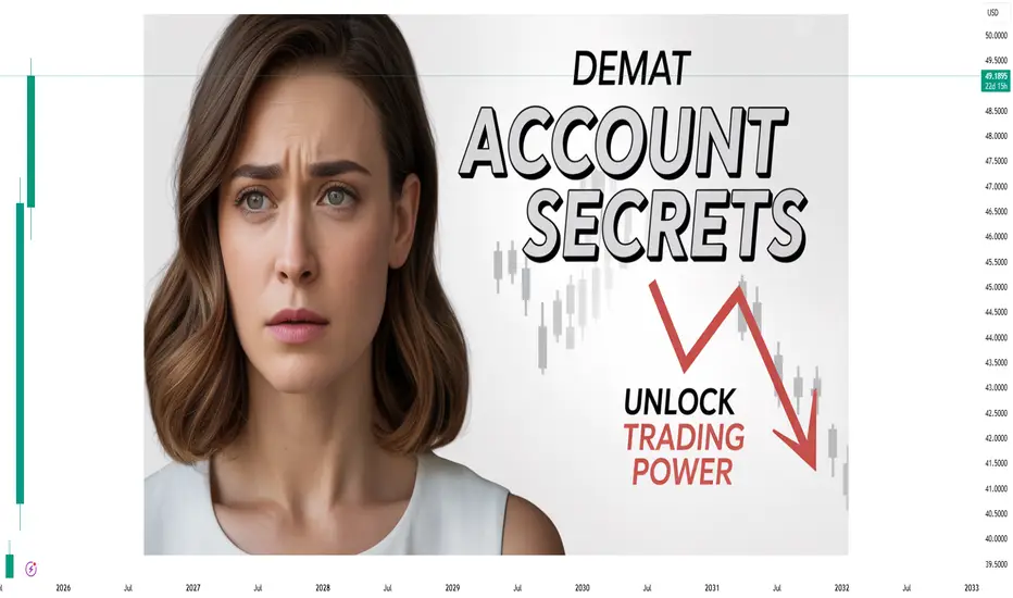
Demat Account Secrets in Trading —Every Traders Should KnowIntroduction
A Demat account is the digital locker for your shares and securities — the backbone of equity investing and trading in modern markets. But beyond opening an account and watching prices, there are plenty of practical, operational, and strategic “secrets” that experienced traders and long-term investors use to reduce costs, manage risks, and extract real value. This guide unpacks those lesser-known but high-impact insights: from choosing the right Depository Participant (DP) and optimizing charges, to advanced features like pledging, e-voting, corporate actions handling, fraud prevention, and tax implications. Whether you’re a frequent intraday trader, a swing trader, or a buy-and-hold investor, these tips will help you use your Demat account more intelligently.
1. Demat 101 — the fundamentals (so you can stop guessing)
A Demat (dematerialized) account holds securities in electronic format. In India, two depositories — NSDL and CDSL — maintain the records; brokers or banks act as Depository Participants (DPs) who provide the interface. When you buy shares, they land in your Demat account; when you sell, they are debited.
Key components:
DP (Depository Participant): Your broker/bank managing the Demat.
Client ID / Beneficiary Owner (BO) ID: Unique identifier for holdings.
ISIN: International Security Identification Number for each instrument.
Statement of Holdings (MSOH): Periodic summary of your holdings.
Understanding the basics helps avoid simple but costly mistakes, like missing corporate action deadlines or confusing a brokerage trading account fee with a DP demat charge.
2. Choosing the right DP — the biggest hidden lever for costs & convenience
Everyone talks about brokerage, but DP fees and service quality quietly shape net returns.
What to compare:
Account opening fees and annual maintenance charges (AMC) — DPs vary widely.
Transaction fees / custodian charges — per scrip or flat per transaction?
Pledge/unpledge fees — important if you use margin funding.
Speed & UI of the DP portal/app — corporate actions, e-voting, and statements are handled through the DP interface.
Customer service responsiveness — when issues arise (frozen shares, IPO refunds), fast support saves money.
Integration with your broker — some brokers offer bundled Demat+trading at lower cost.
Value-adds — auto-pay for corporate actions, consolidated statements, or tax reports.
A little fee shopping can save hundreds per year for active traders. If you trade frequently, prioritize low transaction/DVP (delivery versus payment) costs. If you hold long-term, low AMC and reliable corporate action handling matter more.
3. Know every charge — the micro-fees that add up
Demat-related costs are often small, but they compound.
Common fees:
Account opening fee
Annual maintenance charge (AMC)
Transaction charges (debited shares, off-market transfer)
Rematerialization fee (if you want physical certificates)
Pledge/unpledge fee
Dematerialization fee (converting physical to electronic)
Re-registration fee (if transferring DP)
Pro tip: Ask for a clear fee schedule before opening. Some DPs waive AMC for the first year or if you maintain a minimum balance.
4. Pledging shares — a secret weapon (and its pitfalls)
Pledging lets you use your Demat holdings as collateral for loans or margin from your broker or financial institution without selling them. This is a powerful tool but needs careful handling.
When to pledge:
To avoid selling for short-term margin calls.
To take loans against shares for diversification, emergency liquidity, or tax planning.
Risks & secrets:
Margin haircut: Lenders apply haircuts; volatile scrips get lower borrowing value.
Forced unpledge/sell: If the borrower (you or broker) defaults, the lender can liquidate.
Pledge charges & delays: Unpledging can take time; if markets move quickly you might not recover positions in time.
Keep pledged shares low proportion of total holdings to preserve flexibility.
Best practice: Use pledging conservatively and document the exact terms — interest, margin maintenance, and liquidation triggers.
5. Corporate actions — don’t let freebies slip away
Corporate actions include dividends, bonus shares, rights issues, stock splits, and buybacks. These affect your holdings and tax position.
Secrets:
Auto-execution settings: Some DPs auto-apply rights/renunciation choices; others require manual action. Know your DP’s default.
Track ex-dates and record dates: Missing a record date can mean missing a dividend or allocation.
Tax implications: Dividends and buybacks have different taxation; plan around holding periods to optimize capital gains tax.
Fractional shares from corporate actions may be paid out in cash — watch your account for small value credits.
Tip: Set calendar reminders for big corporate events for your core holdings.
6. Intraday trading & Demat — what traders often misunderstand
Many intraday traders think Demat doesn’t matter because intraday uses the trading account. But Demat still influences some things:
Delivery cycles: If you convert an intraday position to delivery, shares will land in your Demat only after settlement — check T+1/T+2 rules for the exchange.
Transaction vs delivery charges: No Demat debit for intraday (since shares aren’t delivered), but frequent delivery trades create more DP debits and costs.
Avoid unnecessary delivery: If you don’t intend to hold beyond the day, use intraday product to avoid DP transaction costs.
Secret: Using product/overnight margin vs MIS/Intraday modes changes margin requirements and whether shares actually hit your Demat account.
7. Security & fraud prevention — protect the locker
Scams target accounts everywhere. Protecting your Demat is non-negotiable.
Practical measures:
No POA unless necessary: Power of Attorney allows brokers to debit shares; while convenient, it’s a risk if given indiscriminately.
Two-factor authentication for broker/DPS portals.
Regularly reconcile your MSOH with transactions — report discrepancies immediately.
Keep KYC up to date — mismatches slow down corporate actions and transfers.
Beware phishing & SMS frauds: Never share OTPs, passwords, or UCCs.
Freeze facility: Many DPs offer "freeze" on holdings to prevent off-market transfer — useful if you detect suspicious activity.
Secret: If you must grant POA for ease of trading, limit it and use a reputable broker with transparent audit logs and insurance cover.
8. Reconciliation and statements — the daily routine of pros
Make it a habit:
Check daily trade reports and weekly Demat statements.
Match buy/sell confirmations with Demat credits/debits.
Track corporate action updates and small credits (fractional payouts, interest).
Why this matters: Small reconciliation catches — like a miscredited dividend or a failed transfer — can save disputes and losses later.
9. Off-market transfers & gifts — tax and legal subtleties
Off-market transfer (transfer of shares between Demat accounts without exchange) is common for gifts, family transfers, or private transactions.
Secrets:
Stamp duty & documentation: Gifts may require stamped transfer forms and declarations.
Gift taxation: In many jurisdictions, gifts from non-relatives have tax consequences. Document relationship and value.
Lock-in periods for ESOPs: Employee stock plans often have restrictions — off-market transfers may be blocked until vesting or expiry.
Always get the paperwork right to avoid future audits or blocked transfers.
10. IPO allotment & ASBA — how Demat helps get allocations
When you apply for IPOs, you must provide your Demat beneficiary ID. ASBA (Application Supported by Blocked Amount) ties refunds to the bank account, but Demat ensures shares — if allotted — are credited cleanly. Tip: Keep your Demat details updated and ensure PAN/DP mapping is correct to avoid allotment or transfer failures.
11. Taxation & reporting — your Demat is a tax record
Demat statements are primary source documents for capital gains calculations. Hidden advantages:
Broker consolidated statements often include trade-wise P&L and tax reports — use them for accurate filings.
Record holding periods precisely to differentiate between short-term and long-term rates.
Track cost basis across corporate actions — splits, bonus shares, and mergers alter cost per share; your DP statement and ISIN mapping help reconstruct basis.
Secret: Use consolidated transaction history from DP + broker to build an auditable trail for taxes.
12. Advanced tricks traders use (legitimately)
Scrip selection for pledge-margins: Keep a small basket of high-liquidity, low-volatility blue-chips for emergency pledges — they attract better haircuts.
Arbitrage of corporate actions: Professional traders sometimes buy before bonus/record dates to capture specific corporate actions, but account for ex-dates and tax impacts.
Fractional sell tactic: For small fractional leftover holdings after corporate actions, monitor for cash credits or plan an off-market consolidation to reduce micro-lots.
Caveat: All strategies must respect exchange rules and insider trading laws.
13. Common mistakes & how to avoid them
Giving POA to unknown brokers. Fix: Use limited POA or avoid if not necessary.
Ignoring AMC & small fees. Fix: Annual review of DP and renegotiate or switch.
Not tracking corporate action timelines. Fix: Subscribe to alerts and maintain a calendar.
Assuming all charges are the broker’s responsibility. Fix: Read fee schedule and keep records.
Failure to reconcile statements. Fix: Weekly reconciliation habit.
14. Switching DPs — the painless way
If you’re unhappy, transfer holdings using the Off-Market Transfer or Consolidation process. You’ll submit a DIS (Delivery Instruction Slip) at your current DP or use electronic transfer forms. Watch for transfer fees and timing — sometimes it’s cheaper to transfer slowly to avoid peak fees.
Secret: Coordinate transfer during low market activity to avoid missing corporate action deadlines.
15. Final checklist — your Demat hygiene
Know your DP’s fee schedule inside out.
Keep KYC & bank details updated and linked.
Avoid giving unrestricted POA; prefer limited authorizations.
Reconcile statements weekly.
Use pledge sparingly and understand haircut rules.
Track corporate action dates and tax implications.
Enable strong authentication and freeze options if suspicious activity occurs.
Use consolidated broker/DP tax reports at filing time.
Conclusion
A Demat account is more than a passive repository — it’s an operational hub for your market activity. Traders who master its mechanics and hidden levers (fee optimization, pledge use, corporate action handling, security practices) gain efficiency, reduce unexpected costs, and protect themselves from fraud. Whether you’re day-trading, swing trading, or building a long-term portfolio, treat your Demat account with the same discipline you apply to strategy and risk management. Small operational advantages compound over months and years — and often separate consistent winners from unlucky participants.
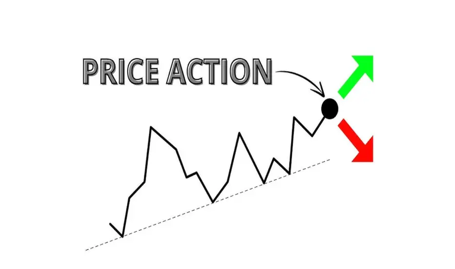
The Language of Charts: How Price Action GuidesHello fellow traders! Wishing you happy trading, may the charts guide you well. Today, we’ll discuss price action and how it helps us in our routine trading, And very Grateful to TradingView for providing such powerful charts that make understanding price action simpler
Introduction--::
In the trading world, price is the ultimate truth. While many traders rely on moving averages, oscillators, and other indicators, seasoned professionals often focus on something simpler yet more powerful: price action.
Price action is the study of how price moves on a chart—through candles, patterns, and levels. It reflects the ongoing battle between buyers and sellers, revealing the sentiment of the market in real time.
Unlike indicators, which are often lagging, price action is immediate, showing what’s happening now. By learning to read it, traders gain a clear picture of market psychology, trends, and potential reversals.
1. What is Price Action?
Price action trading is the art of making trading decisions based solely on the price chart, without relying heavily on external tools. Every candle, every bar, every level tells a story.
Key idea: Price action is the reflection of supply and demand.
When buyers dominate---price rises.
When sellers dominate---price falls.
When buyers and sellers balance---price consolidates.
A skilled trader can “read” these shifts and decide when to enter or exit trades.
2. Core Elements of Price Action
🔼Market Structure
Uptrend: Higher highs, higher lows.
Downtrend: Lower highs, lower lows.
Range/Consolidation: Price moves sideways between support and resistance.
Example: On a daily NIFTY chart, repeated higher highs indicate a bullish trend.
🔼Support & Resistance Levels
Support = price levels where buying pressure appears.
Resistance = price levels where selling pressure appears.
Tip: Look for areas where price has reacted multiple times.
🔼Candlestick Patterns
Pin Bar / Hammer / Shooting Star: Reversal signals.
Engulfing Candles: Momentum shift between buyers and sellers.
Doji: Indecision in the market, often preceding a reversal.
🔼Supply & Demand Zones
Supply zone = excess selling; price likely to fall.
Demand zone = excess buying; price likely to rise.
Example: A BTC chart showing a strong rejection from a previous demand zone.
3. Popular Price Action Patterns
Pin Bar Rejection: Shows price rejection from a key level.
Engulfing Candles: Bullish or bearish, indicate strong reversals.
Breakouts and Retests: Price breaks a level, retraces, then continues the trend.
Chart Patterns: Head & Shoulders, Triangles, Flags, Pennants.
4. How Traders Use Price Action
🔼Identifying Entries and Exits
Enter near support in an uptrend after bullish candle confirmation.
Exit near resistance or after a reversal candle forms.
🔼Stop-Loss and Risk Management
Place stop-loss just beyond the invalidation point (e.g., below pin bar tail).
🔼Trend Following
Join the trend only after a clear price action signal.
🔼Volume Confirmation
Higher volume on breakout/reversal signals strengthens the validity.
5. Advantages of Price Action Trading
Simplicity: No cluttered indicators.
Flexibility: Works on any market or timeframe.
Clarity: Shows real-time market psychology.
Versatility: Applicable to intraday trading, swing trading, or investing.
6. Limitations & Common Mistakes
Subjectivity: Interpretation can differ between traders.
Overtrading: Seeing patterns everywhere can lead to losses.
Requires Discipline: Consistency and patience are key.
Practice Needed: Cannot learn overnight; requires chart study.
7. Real-World Example
Imagine NIFTY is trending upward. It touches a prior resistance zone but forms a bullish engulfing candle at a support level. A price action trader sees this as:
Buyers are strong.
Trend likely to continue.
Entry near support, stop-loss just below candle tail, target near next resistance.
This decision is based purely on price movement, no indicators required.
Conclusion
Price action is the language of the market. Every candle, pattern, and level tells a story about what traders are thinking and doing. By learning to read it, you can trade with confidence, clarity, and simplicity.
Remember: Indicators lag, but price is always present. If you master price action, you master the market’s story itself.
Best Regards- Amit
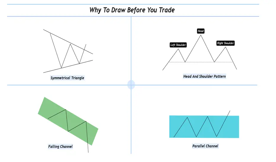
Why To Draw Before You Trade ?Hello fellow traders and respected members of the trading community, In a fast paced market dominated by automation and algorithms, we often forget the value of simply picking up a tool and drawing on our charts. Let’s revisit why this fundamental habit still holds the power to sharpen our edge and elevate our decision-making.
Why We Should Draw and Trade? Turning Charts Into Clarity
Introduction-:
In an age of auto-generated indicators, black-box algorithms, and AI-driven signals, many traders are drifting away from one of the most fundamental trading tools: manual chart drawing.
But what if the very act of drawing is not just an old habit—but a powerful trading edge?
This publication explores why actively drawing on charts and trading based on visual context can elevate your market understanding and execution like nothing else.
1. What Does It Mean to “Draw and Trade? Drawing isn’t just technical analysis it’s interactive thinking. When you draw, you're mapping the structure of the market using tools like
Trendlines
Support & Resistance zones
Chart Patterns (Head & Shoulders, Flags, Triangles, etc.)
Supply & Demand levels
Gaps, Fibonacci levels, and more
Once the chart is marked, you’re no longer entering trades blindly you’re entering with context, clarity, and confidence.
2. The Psychology Behind Drawing
Manual drawing engages your focus, discipline, and decision-making. You don’t just predict, you process and It forces you to slow down helping reduce impulsive trades. Drawing anchors your emotions and keeps you mindful. The act of drawing becomes a psychological filter—helping you trade from structure, not stress.
3. Why It Beats Indicator Only Trading?
Indicators are reactive. Drawing is proactive.
Here’s the difference:
Indicators show what already happened
Drawing lets you prepare for what could happen
You learn to-:
Anticipate breakouts, fakeouts, and reversals, Understand market structure and Develop your own strategy not depend on someone else's signal. In short you become the strategist, not just a follower.
4. The “Chart Time” Advantage
Just like pilots need flight hours, traders need chart hours. Drawing charts manually gives you those hours.
You start to see patterns that repeat and notice behavior shifts before they show on indicators. Build a visual memory of how the market moves and It’s this visual experience that separates analysts from traders.
5. Real-World Edge: Case Studies
Wyckoff Distribution: Mapping the structure—BC, AR, ST, UT, LPSY—helps anticipate smart money exits.
Gap Zones: Marking an old breakaway gap can help predict future rejection or support
Demand Zones + Fib Confluence: Drawing reveals high-probability reversal zones most indicators miss
Each drawing becomes a trade-ready story with logic and risk control.
6. From Drawing to Discipline
Drawing is not just prep it’s planning. You trade with a clear plan and pre-identified entry/exit zones this reduced emotional interference and It becomes your personal visual rulebook. No noise no randomness just structure driven action.
7. Final Thoughts: The Trader’s Mind vs. The Machine
Yes, AI and indicators are useful.
But your most powerful edge?
Your mind.
Your eyes.
Your experience sharpened through drawing.
If you want to evolve from a reactive trader to a consistent performer, here’s the golden rule:
Stop watching. Start drawing. Trade what you see, not what you hope.
I hope you will like this post, Thanks for giving your valuable time for reading.
Regards- Amit.
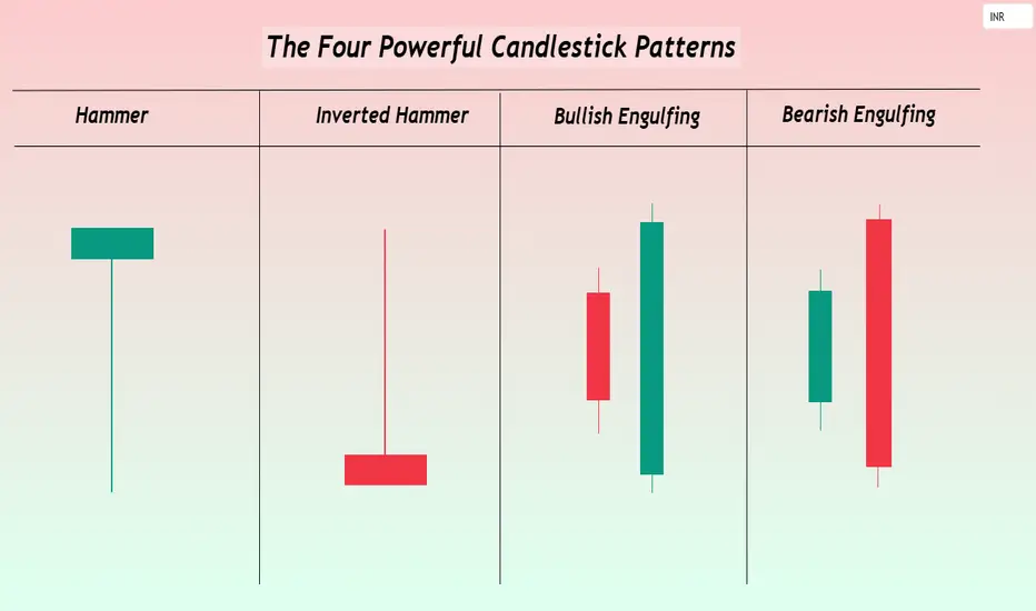
The Four Powerful Candlestick PatternsHello TradingView Community and Friends here I am sharing the four of the most powerful candlestick patterns every trader should know especially to the new entrants to technical analysis and that are-: Hammer, Inverted Hammer, Bullish Engulfing, and Bearish Engulfing.
These patterns are not just visual shapes they reveal critical shifts in market sentiment and offer high probability trading opportunities when interpreted correctly.
I hope this article adds real value to your trading journey. Feel free to share your thoughts and experiences in the comments, sharing below the Four Powerful Candlestick Patterns.
1-Hammer: The Bullish Reversal Indicator Structure and Appearance-:
A small real body located near the top of the price range.
A long lower wick that is at least twice the size of the body.
Little or no upper shadow.
Psychology-:
During the session, bears push the price significantly lower, but bulls step in aggressively, driving the price back near the open.
The result is a strong potential bottoming signal showing that buyers are regaining strength.
Trading Strategy-:
Most effective after a steep downtrend or during oversold conditions.
Confirmation is essential: the next candle should close above the Hammer’s high to validate the reversal. A prudent stop-loss can be placed just below the low of the Hammer.
2-Inverted Hammer: a Subtle Bullish Rreversal signal, Structure and appearance-:
A small real body located near the bottom of the trading range.
A long upper wick that is at least twice the size of the body.
Very little or no lower shadow.
Psychology-:
Buyers attempt to push prices higher during the session but face selling pressure.
However the very presence of buying pressure after a downtrend hints at underlying bullish interest starting to emerge.
Trading Strategy-:
Most useful after a strong downtrend when signs of exhaustion appear.
The confirmation is again crucial a strong bullish candle following the Inverted Hammer gives a higher probability setup.
Risk can be controlled by placing a stop-loss below the Inverted Hammer’s low.
3-Bullish Engulfing: Buyers Taking Over Structure and Appearance-:
A large bullish (green) candle that completely engulfs the previous small bearish (red) candle’s body.
Ideally, the bullish candle opens lower and closes higher than the previous candle’s range.
Psychology-:
Initial selling pressure is absorbed and reversed with strong buying momentum.
A complete shift in sentiment from bears to bulls is reflected in the engulfing candle.
Trading Strategy-:
Most powerful when appearing after a sustained downtrend or at key technical support levels.
Traders often enter on a break above the Bullish Engulfing candle’s high.
Volume confirmation higher than average during the pattern significantly strengthens the signal.
4-Bearish Engulfing: Sellers Seizing Control, Structure and Appearance-:
A large bearish (red) candle that fully engulfs the previous small bullish (green) candle’s body.
Ideally, the bearish candle opens higher and closes lower than the previous candle’s range.
Psychology-:
An initial bullish attempt is overwhelmed by aggressive selling pressure.
Bears decisively regain control, warning of a potential downside move.
Trading Strategy-:
Highly effective when occurring after an extended uptrend or near strong resistance zones.
Traders can initiate short positions on the break below the Bearish Engulfing candle’s low, with stops placed just above the pattern’s high.
Increased volume during the engulfing candle boosts the credibility of the reversal.
Key Techniques for Trading These Patterns Successfully-:
Always wait for confirmation a single candle is never enough subsequent price action is critical.
Volume matters- Candlestick signals accompanied by a surge in volume are generally more reliable.
Focus on key price zones- Patterns occurring near major support, resistance, or Fibonacci levels have a much higher success rate.
Risk management remains supreme- No pattern guarantees success. Appropriate stop-loss placement and calculated position sizing protect against false signals.
Conclusion-:
The Hammer, Inverted Hammer, Bullish Engulfing, and Bearish Engulfing patterns remain among the most trusted tools in a trader’s arsenal.
They capture critical moments when the balance of power between buyers and sellers shifts often leading to strong follow through moves.
However even the most powerful candlestick setups require patience, discipline, and proper confirmation.
By mastering these patterns and integrating them into a well rounded trading plan, traders can anticipate key market moves, time their entries better, and ride trends with greater confidence.
Focus on learning the language of price, and the markets will start speaking to you more clearly.
Hope you like this publication.
Best regards-Amit
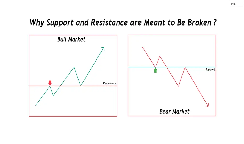
Why Support and Resistance are Meant to Be Broken ?Hello fellow traders! Hope you're all doing well. As we navigate the markets, it's crucial to remember that support and resistance are only temporary momentum and trend strength matter more. This article dives deep into how these levels break and how to position yourself smartly. Stay adaptive, trade with confidence, and let the market guide your decisions. Wishing you profitable trades ahead!
Support and Resistance Are Meant to Be Broken-:
Support and resistance levels are widely used in technical analysis, but one key truth often gets overlooked they exist to be broken. No matter how strong a level appears, the market will eventually decide its fate not us. The real edge lies in anticipating when these levels will fail and positioning accordingly.
No Resistance in a Bull Market, No Support in a Bear Market-:
A strong bull market disregards resistance; price keeps climbing as buying pressure overwhelms selling interest. Similarly, in a bear market, support levels fail as fear and liquidation take over. Instead of focusing on static levels, traders should shift their mindset toward momentum and trend strength.
Understanding the Nature of Support and Resistance-:
Support and resistance levels are areas where price has historically reversed or consolidated. They act as psychological zones where traders expect a reaction. However, these levels are not fixed barriers; they shift over time due to changes in market sentiment, liquidity, and institutional activity.
When traders treat support and resistance as rigid, they often fall into the trap of expecting price to react the same way every time it reaches these levels. This can lead to false confidence and poor risk management. Instead, traders should recognize that these zones are fluid and influenced by broader market conditions.
Why Support and Resistance Are Temporary-:
Markets are driven by supply and demand dynamics. What once acted as strong resistance in a bullish market often becomes a stepping stone for higher prices. Similarly, in a bear market, previous support levels eventually collapse, leading to further declines. Understanding this concept helps traders avoid the common mistake of assuming levels will hold indefinitely.
A classic example of this is the support-turned-resistance (or vice versa) principle. When a support level is broken, it often turns into resistance as traders who were once buyers at that level now see it as a place to exit positions. The same applies to resistance turning into support in an uptrend. These shifts happen due to changes in trader behavior and order flow dynamics.
The Illusion of Strong Support and Resistance-:
Many traders believe in so-called “strong” support and resistance levels, expecting price to reverse exactly at these points. However, the truth is that markets evolve, and sentiment shifts. Institutions and large traders do not rely on fixed levels; instead, they adjust based on liquidity zones, order flow, and momentum.
Consider how large institutions trade. They do not place all their orders at a single price level. Instead, they spread their orders over a liquidity range where they can execute large trades without causing excessive slippage. This means that what retail traders see as a “strong level” may just be a general area where larger players are accumulating or distributing positions.
How to Identify Breakouts Before They Happen-:
The difference between an average trader and an exceptional one is the ability to anticipate breakouts and breakdowns. Here’s how you can do it:
Volume Confirmation – A breakout with increasing volume is more reliable. If a resistance level is being tested repeatedly with rising volume, it signals strong buying interest.
Market Structure Shifts – A series of higher highs in an uptrend or lower lows in a downtrend signals a potential breakout.
Liquidity Traps – Watch for false breakouts where price quickly reverses, trapping retail traders before the real move begins.
News and Catalysts – Major events often trigger breakouts beyond key levels. Earnings reports, economic data, or geopolitical events can create strong momentum.
Break and Retest Strategy – Sometimes, after breaking a level, price retests it before continuing in the breakout direction. This is a strong confirmation signal.
Divergence and Momentum Indicators – Tools like RSI, MACD, or moving averages can help confirm whether a breakout has strength behind it.
Practical Trading Strategies
Breakout Trading
Identify key support and resistance levels using daily or weekly charts.
Wait for price to approach these levels with increasing volume.
Confirm the breakout using momentum indicators or a retest.
Enter after confirmation, setting stop-losses slightly below (for long positions) or above (for short positions) the breakout zone.
Range Trading-:
🔹If price is consolidating between support and resistance, trade within the range.
🔹Look for signs of rejection at key levels, such as long wicks or reversal patterns.
🔹Use oscillators like RSI to gauge overbought/oversold conditions.
🔹Trend Following
🔹Identify the prevailing trend using moving averages or higher highs/lows.
🔹Avoid counter-trend trades unless there is strong reversal confirmation.
🔹Let winners run by trailing stop-losses instead of exiting too early.
Psychological Aspect of Support and Resistance:
One of the biggest mistakes traders make is placing too much faith in these levels without considering market conditions. Emotional biases like fear and greed often cloud judgment. For example, if a trader repeatedly sees price bounce off a support level, they may hesitate to sell when a clear breakdown occurs. Conversely, traders who expect resistance to hold may short too early, only to get stopped out as price breaks higher.
To overcome these psychological traps-:
🔹Always trade with a plan and predefined risk-reward ratio.
🔹Be flexible and adapt to new market information.
🔹Understand that no level is guaranteed to hold indefinitely.
Conclusion-:
Support and resistance are useful tools, but they are not unbreakable barriers. The market’s direction ultimately determines whether a level holds or fails. The ability to read price action, volume, and sentiment will always be more powerful than relying solely on predefined levels.
Instead of asking, “Will this support hold?” start asking, “What happens when this support breaks?” That shift in perspective is what separates skilled traders from the rest.
Best wishes and happy trading!
Mastering the Intraday Sutra: An intraday trading strategyMastering the Intraday Sutra: A Professional Guide to Trading Indian Markets with Precision
(Adapting Globex Strategy-Inspired Concepts to India’s Unique Trading Hours)
Introduction
The Intraday Sutra strategy is a systematic approach designed for India’s equity/futures markets, inspired by the principles of identifying key price levels (similar to the Globex "high/low" concept) but tailored to India’s fixed trading hours (9:15 AM – 3:30 PM). This strategy leverages prior-day price action, supply-demand zones, and disciplined risk management to capitalize on intraday opportunities. Below, we break down its components for clarity and repeatability.
Strategy Overview
1. Core Instruments
Indices: All indices
Stocks: Nifty 50 constituents for alignment with index momentum
2. Ideal Time Frames
5-minute charts: For granular entry/exit precision.
15-minute charts: To filter noise and align with broader intraday trends.
Key Levels: Prior-Day High/Low & Supply-Demand Zones
1. Plotting Prior-Day High (PDH) and Prior-Day Low (PDL)
Purpose: These levels act as psychological benchmarks.
Method:
- Manually mark PDH/PDL on your chart.
- Use Trading View indicators (e.g., “Previous Day High-Low”) for automation.
2. Identifying Supply-Demand Zones
-Supply Zone:
- Formation: Rally → Base → Drop (RBD) or Drop → Base → Drop (DBD).
- Action: Potential sell zone; price often reverses downward here.
- Demand Zone:
- Formation: Drop → Base → Rally (DBR) or Rally → Base → Rally (RBR).
- Action: Potential buy zone; price often reverses upward here.
Zone Validation Rules:
1. Structure: The “base” (consolidation) must be ≤6 candles; the breakout must show ≥2 impulsive candles.
2. Freshness: Only trade untested zones (no prior price interaction).
3. Zone Merging: Combine overlapping zones or prioritize the one with the best risk-reward ratio.
Entry & Trade Triggers
1. Breakout Confirmation
Short Entry: Triggered when price breaks above prior-day high (PDH) and retests a fresh supply zone.
Long Entry: Triggered when price breaks below prior-day low (PDL) and retests a fresh demand zone.
2. Order Placement
Buy Limit Orders: Set at the demand zone’s proximal line
Sell Limit Orders: Set at the supply zone’s proximal line
Risk Management Framework
1. Stop Loss Placement
Long Trades: Below the demand zone (mechanical rule) or 5% of the Daily Average True Range (ATR) below the distal line of demand
Short Trades: Above the supply zone (mechanical rule) or 5% of Daily ATR above the distal line of supply
2. Position Sizing
Risk ≤1-2% of capital per trade to preserve longevity.
Trade Management & Profit Targets
1. Initial Target: 2:1 Risk-Reward (2R).
Example: If risking ₹1000, target ₹2000 profit.
2. Trailing Stop : Move stop loss to breakeven at 2R, then trail for 3R+ using price structure (e.g., swing lows/highs).
3. Priority: Focus on “A+ Setups” where zones align with higher timeframes (for example a 5 mins zone within a 15 mins zone or higher)
Critical Success Factors
1. Timing is Everything
Optimal Entry Window: 9:15 AM – 11:00 AM (peak liquidity, institutional participation).
Avoid Late Trades: Post-2:00 PM entries often lack momentum for robust risk-reward outcomes.
2. Confluence with Higher Timeframes
- Strengthen signals by aligning 5/15-minute zones with hourly/daily support/resistance/supply/demand zones
3. Event-Driven Volatility
Capitalize on gaps from overnight global news (e.g., US Fed, crude oil prices) or domestic catalysts (RBI policies, earnings).
Tools & Execution
Charting: Trading View for automated PDH/PDL and zone plotting
Mindset: Discipline to avoid overtrading and stick to fresh zones.
Example: The example taken here is on the Nifty 15 mins chart. See how the price broke the previous day's low and reacted nicely from a prior higher quality demand zone. These levels can act as trap levels trapping most of the retail traders and investors on the opposite side of the trade. The price gave a nice bounce from the demand zone and went on to rally to the opposing supply zone giving a greater than 3:1 R:R.
Conclusion
The Intraday Sutra strategy combines technical precision with rigorous risk management, offering a structured way to navigate India’s time-bound markets. By focusing on prior-day extremes, fresh supply-demand zones, and strategic timing, traders can systematically exploit intraday inefficiencies. Remember: Consistency beats complexity. Back test rigorously, refine your process, and let discipline drive profitability.
Final Note: Always validate this strategy in a simulated environment before deploying live capital. Use Trading View Bar Replay functionality to test your strategy.
Markets evolve—stay adaptive!

Options Trading Strategies on Budget Day 2025A Comprehensive Guide on Nifty, Niftybank, and Sensex Options
Introduction
Trading options on Union Budget day can be an exhilarating yet challenging endeavour. The Indian stock market sees significant volatility on this day, influenced by the budget announcements made by the Finance Minister. This guide will provide insights into trading options on the three major indices in the Indian markets: Nifty, Nifty Bank, and Sensex. We will also analyse the past data of these indices on budget days and examine how India VIX have fluctuated during these days. Based on this data we will deploy 4 delta neutral strategies and see how these strategies have performed on the budget days for all the 3 indices. The basic idea of this study is to find out the optimal strategy that can be deployed on budget day. Also please note since Sensex is a new instrument for weekly options data for the strategies is only available for 2024
Understanding the Major Indices
• Nifty: The Nifty 50 index, representing 50 of the largest companies listed on the National Stock Exchange (NSE).
• Niftybank: The Nifty Bank index, comprising the most liquid and large capitalized Indian banking stocks.
• Sensex: The Sensex or BSE 30 index, representing 30 of the largest and most actively traded stocks on the Bombay Stock Exchange (BSE).
Historical Performance on Union Budget Days
To make informed trading decisions, it is essential to analyse how these indices have performed on budget days over the past decade. The following tables provide detailed data on the indices' performance, including values for Open, High, Low, Close, and percentage changes from Open to Close and High to Low. Additionally, the tables include India VIX movement throughout the day.
Analysing Implied Volatility and India VIX
On Union Budget day, implied volatility and the India VIX are crucial indicators to watch. Typically, an IV crush occurs post the Finance Minister's speech, leading to a significant drop in volatility. This section will explore these trends based on historical data and provide insights into how traders can capitalize on these movements.
PS: The IV considered here will be the ATM Straddle IV
Options Trading Strategies
Although multiple options strategies can be deployed on budget day we are going to consider deploying a Directional and a Non-Directional Straddle with protective hedges. We will compare the strategies to see which strategy has given the best back testing performance and we will compare the performance of these strategies for all indices Nifty, Bank Nifty and Sensex.
Short Straddles using Wait & Trade
A conventional short straddle involves selling an ATM call and an ATM put option. However instead of entering both the legs at once we are going to perform a wait and trade directional straddle. This means that we will enter the call leg or the put leg only when the premium falls below 5%. We will take the reference time of entry as 9:20 am and exit time for the strategy will be 3:25 pm. We will check the reference price of both the calls and put options at 9:20 am for the ATM Straddle strike price. Let us say the Nifty on budget day is trading at 22500 then we will check the premium of the 22500 CE and 22500 PE and note down these prices. Let us say both are trading close Rs 100 each then we will enter only when the price of those options goes below Rs 95 implying that there is some direction in the market. So we will enter only that leg and avoid executing the other leg. If the market takes a direction we are bound to profit from the leg that has been executed. If the market moves up first and then down then it is likely that both the legs will get executed. The stop loss on the individual legs will be 70% each. One can execute this simple strategy via an algo execution platform.
Pros: This strategy profits from the decrease in implied volatility and can be profitable if the market remains sideways or directional.
Cons: This strategy will tend to loose money in a V-shape or U-shape market since there is a possibility of both stop losses triggering.
Iron Butterfly
An Iron Butterfly strategy involves selling an ATM straddle and buying protective wings (an OTM call and an OTM put) to limit risk. The offset units will be purely selected on the basis of the breakeven points of the straddle to keep it simple. This strategy is limited risk limited reward strategy. We will execute this strategy on all indices at 9:20 am and exit at 3:25 pm on all budget days.
Pros: On budget days the usual tendency of the market is to make some extreme movements but tend to close flat or closer to the open. If on the budget day the market tends to behave in this manner then the strategy turns out to be a high profitable strategy.
Cons: On budget day if the market becomes extremely directional then this strategy will end in a limited loss
Back tested Results
The back tested performance of short straddles and Iron Butterfly on Nifty, Nifty Bank, and Sensex indices are summarized in the following tables. These tables will help traders understand the potential profitability and risks associated with each strategy. For some strategies there is lack of back tested data available, so it is denoted as NA in the column of the strategy name
Note: All the strategies deployed as a part of this exercise are time based straddles. To optimize the performance of these strategies one can look at ATM straddle charts and can add some technical indicators such as super trend, vwap or moving averages to plan precision entries and exits for these strategies. The usage of these will definitely help increase the probability of the trade.
Please find the link below for your reference with all the data
Historical Data Indices.xlsx
The software used for backtesting the strategies in StockMock.
Conclusion
Budget week brings volatility; traders should employ delta neutral strategies to benefit from price fluctuations and implied volatility changes
Some of the key highlights of all budget days:
1. Budget week is highly volatile, with significant price movements expected.
2. Historical analysis shows an average 2-2.5% movement from high to low on budget days.
3. Implied volatility typically decreases around 11 AM on budget day.
4. Delta neutral strategies are recommended for traders lacking directional clarity.
5. Various strategies like straddles, strangles, and iron condors can be employed.
6. One should use algo platforms to automate executions since markets will tend to move very fast and in such situations, execution becomes extremely critical
7. Also do your own study by backtesting, forward testing and only then deploy your strategy in the live market
Hope you found the above article useful in helping you to prepare yourself in advance for Budget Day. All the best!

How to define the Daily Bias for the Day? Determining the likely direction of the market for a particular day can be both challenging and cumbersome. Many traders find themselves overwhelmed by the multitude of data points and differing indicators. However, using a structured methodology, one can systematically analyze the chart and create a daily bias for the day.
If you are an intraday trader, you can use a combination of the Daily chart for the bias and the 15-minute chart for the entry, or alternatively, you can use a 75-minute chart for the bias and a 5-minute chart for the entry.
Steps to Identify the Daily Bias
1. Identify the Most Recent Swing High and Swing Low
The first step in defining the daily bias involves identifying the most recent swing high and swing low. This can be done manually, or you can use ready-made indicators available on trading platforms such as TradingView to plot these points on the chart. Understanding swing highs and lows are fundamental concepts in technical analysis, representing the highest and lowest points within a specific time period. These points can indicate potential reversal areas where the market may change direction.
2. Divide the Region into Two Equal Parts
Once the swing high and swing low are identified, the next step is to divide this region into two equal parts. This can be achieved using the rectangle tool in TradingView. Make sure to enable the middle line feature within the rectangle tool to visually divide the two sections. The middle line acts as a crucial reference point, providing a clear visual boundary between areas of perceived higher and lower value.
3. Define Retail and Wholesale Areas
After dividing the region into two parts, the upper section is termed the “Retail Area,” where prices are considered expensive. Conversely, the lower section is called the “Wholesale Area,” where prices are deemed cheap. This concept stems from the basic economic principle of supply and demand, where higher prices in the Retail Area suggest selling opportunities, and lower prices in the Wholesale Area indicate buying opportunities.
4. Focus on Buying and Selling Opportunities
With the areas defined, the next step is to focus on the appropriate trading opportunities. When prices are in the Retail Area, the focus should be on “Selling” opportunities. When prices are in the Wholesale Area, the focus should be on “Buying” opportunities. This methodology, known as “Curve Analysis” or determining your Bias for the day, simplifies the decision-making process by providing a clear framework for evaluating market conditions.
Example: BankNifty 75-Minute Chart
Let’s look at an example to understand this better. Here we have the BankNifty 75-minute chart. We have identified the most recent swing high and swing low on the chart and divided the section into two parts. The current market price is in the Wholesale Area, which means that on your execution time frame, which is 5 minutes, you will be focusing on buying or “Long” opportunities.
Now, proceed to the lower time frame and identify your key levels of interest using support, resistance, demand, supply, or any other technical analysis tools. Observe how the supply zone on the chart played out beautifully and how prices fell from the Retail Area. This example illustrates the practical application of the methodology, demonstrating how historical price movements can inform future trading decisions.
While the above steps provide a solid foundation for defining the daily bias, incorporating the following advanced tips can enhance your trading efficiency:
1. Use Multiple Time Frames
Integrate multiple time frames to gain a comprehensive view of the market. For example, use the Daily chart to determine the overall bias and the 15-minute or 5-minute chart for precise entries and exits. This multi-time frame analysis allows traders to align shorter-term trades with the broader market trend, increasing the likelihood of successful outcomes.
2. Incorporate Technical Indicators
Employ technical indicators such as Moving Averages, RSI, and MACD to corroborate your bias. Confirming signals from multiple sources can provide greater confidence in your trades. These indicators serve as additional tools to validate the defined bias, offering insights into market momentum, overbought or oversold conditions, and potential trend reversals.
3. Monitor Economic News
Stay updated with economic news and events that could influence market movements. Important news releases can cause significant price fluctuations, impacting your defined bias. Economic indicators, such as GDP reports, employment data, and central bank announcements, can have profound effects on market sentiment and price action.
4. Practice Risk Management
Always practice sound risk management strategies. Define your risk tolerance levels and use stop-loss orders to protect your capital. Never risk more than you can afford to lose on any single trade. Effective risk management involves setting appropriate position sizes, diversifying trades, and adhering to pre-defined risk parameters to safeguard against unforeseen market movements.
5. Keep a Trading Journal
Maintain a trading journal to record your trades, strategies, and outcomes. Analyzing past trades can help you refine your methodology and improve future performance. A detailed journal provides valuable insights into trading patterns, strengths, and areas for improvement, fostering continuous learning and development.
Conclusion
Defining the daily bias for the day is crucial for successful intraday trading. By following the structured steps of identifying swing highs and lows, dividing the price region into Retail and Wholesale areas, and focusing on appropriate buying and selling opportunities, traders can streamline their market analysis. Remember to use multiple time frames, incorporate technical indicators, stay informed about economic news, practice risk management, and maintain a trading journal. With these strategies in place, you can effectively navigate the markets and enhance your trading performance.
I hope you all find this article useful. Do give your valuable feedback in the comments section.

Phases of the market - The "AMD" Effect In trading, the terms accumulation, manipulation, and distribution represent distinct phases of market behavior, driven by the strategies of large institutional players such as banks, hedge funds, or market makers. These phases reflect how these entities operate to achieve their objectives while influencing market psychology and price movements.
At the core of these phases lies the concept of supply and demand. However, recognizing where these phases occur within the market is crucial for traders. Let’s break them down for better understanding:
Let us breakdown these terms to understand them in a better way :
1. Accumulation Phase : This is when big players, like banks or hedge funds, start buying a lot of shares of a stock or asset without causing the price to rise too much. They do it quietly so that others don’t notice what they’re up to.
The price tends to remain flat and trades within a narrow range since fewer trades are happening. A lot of traders tend to loose the plot here since they are unable to understand if this accumulation is occurring in the wholesale area or the retail area and this is the KEY!!!
If prices are accumulating in the wholesale area it is more likely the prices are going to push to the upside than downside. This phase is generally ignored by most retail traders and investors as they consider this as a dull market environment. This is highlighted in a yellow rectangle on the chart.
2. Manipulation Phase : This is a phase where big players intentionally create sharp price swings to confuse or scare smaller traders (retail traders). The goal is to trick people into making the wrong moves, like selling too early or buying at the wrong time. Usually the big players create sudden spikes to the upside or downside. These spikes in general trend to hit majority of the stop losses of the retail traders causing them to loose money more frequently. Many smaller traders lose money here because they react emotionally or fall for fake signals, not realizing they’re being played by smarter, bigger players. This is highlighted in a blue rectangle on the chart
3. Distribution Phase: This is the stage where the big players move the market significantly to the upside or to the downside depending upon the prices being in the wholesale or the retail section. This phase generally tends to have higher volumes. Majority of the retail traders tend to enter at the very end of this phase and get trapped in the market. This is highlighted in an orange rectangle on the chart
This cycle often repeats itself forming the basis of the Wyckoff Market Cycle. Since price is fractal in nature these phases occur on all time frames. For illustration purposes we have taken an example of a Nifty chart. I have manually plotted the phases of the market and illustrated how these phases play out however these phases can be coded using pine script as well. I have divided the swing high and the swing low in two parts.
The lower section signifies" wholesale area" where the big players would be buyers and the upper section signifies retail prices where the big players would be sellers. Now if you watch the wholesale area carefully all the manipulations are taking place in the downward direction(highlighted in blue rectangle) which is signifying that prices are moving down first before moving up. The retail trader is getting trapped in the false breakout to the upside and the moment that happens he wants to "Buy" and keeps a stop loss below the consolidation only for the stop loss to get triggered first and then price moving in the intended direction.
Similarly, in the "retail area", manipulations often occur in the upward direction (highlighted in the blue rectangle). This means prices initially move higher before reversing downward. Retail traders frequently fall into the trap of reacting to a **false breakdown**. When prices appear to break down, these traders rush to "sell" and place their stop-loss orders above the consolidation. Unfortunately, their stop-losses are often triggered first, only for the price to then move in the intended direction afterward.
This pattern is a common occurrence in the market, happening almost daily. It underscores the importance of understanding these manipulative moves to strategically place stop-loss orders in safer locations.
Relying solely on market phases to make trading decisions is not enough to ensure consistent success. Instead, combining this knowledge with an understanding of the **bigger picture**—the overall price structure and market context—is essential. Once this framework is established, traders can confidently apply any price action strategy for entry and exit points.
With practice, identifying these phases on your charts becomes much easier. I hope you find this information valuable, and with some effort, you’ll be able to spot these patterns regularly. Good luck, and happy trading!

How to draw support and resistance The most reliable source for identifying support and resistance levels is historical prices, making them invaluable to traders. The key is to familiarise yourself with past patterns – sometimes from very recent activity – so you can recognise them if they appear again.
Simply mark visible highs and lows on your chart; the higher highs and lower highs will serve as resistance levels, whereas the lower lows and higher lows will serve as support levels. It is always recommended that these lines are marked on longer timeframes to have reliable support and resistance levels.

How moving average works on chartsHello mates sharing a view
How Moving Averages Work
A moving average works by calculating the average price of a security over a specific period of time, and then updating that average as new price data becomes available. The purpose is to help eliminate noise (short-term price fluctuations) to provide a clearer view of the underlying trend.
Types of Moving Averages
Simple Moving Average (SMA)
Definition: The most basic type of moving average. It is calculated by taking the arithmetic mean of a security’s price over a specified number of periods.
Formula:
SMA=Sum of closing prices over a periodNumber of periods
SMA=Number of periodsSum of closing prices over a period
Example: A 10-period SMA adds up the last 10 closing prices and divides by 10. As each new closing price comes in, the oldest price is dropped, and the new price is added.
Use: The SMA smooths out price data and provides a basic view of the average price over the chosen period.
Exponential Moving Average (EMA)
Definition: A more sophisticated type of moving average that gives more weight to recent prices, making it more responsive to price changes compared to the SMA.
Formula: The calculation is more complex than the SMA but it’s designed to give more emphasis on the latest price data.
Use: The EMA is often preferred in volatile markets because it reacts more quickly to price movements, providing more timely signals.
Weighted Moving Average (WMA)
Definition: Similar to the EMA but with a simpler calculation. It assigns a specific weight to each data point, with more weight placed on the more recent prices.
Use: Like the EMA, the WMA is more sensitive to recent price changes compared to the SMA.
Common Periods for Moving Averages
Short-Term (Fast) MAs: 9, 10, 20 periods (e.g., 10-day or 20-day SMA or EMA)
Medium-Term MAs: 50 periods (e.g., 50-day SMA or EMA)
Long-Term (Slow) MAs: 100, 200 periods (e.g., 200-day SMA or EMA)
Key Uses of Moving Averages
Trend Identification
Uptrend: When the price is above the moving average, it signals an uptrend.
Downtrend: When the price is below the moving average, it signals a downtrend.
Sideways (Neutral) Trend: When the price moves sideways and stays close to the moving average, this indicates no clear trend.
Support and Resistance Levels
Moving averages can act as dynamic support and resistance levels. In an uptrend, the price might repeatedly bounce off a moving average, using it as support. In a downtrend, the moving average might act as resistance.
For example, in a strong uptrend, the 50-day or 200-day moving average might act as a support level, where price tends to pull back to and then bounce up again.
Crossovers (Golden and Death Crosses)
Golden Cross: A bullish signal occurs when a short-term moving average (like the 50-day SMA) crosses above a long-term moving average (like the 200-day SMA). This is seen as a confirmation of an uptrend.
Death Cross: A bearish signal occurs when a short-term moving average crosses below a long-term moving average. This is seen as a confirmation of a downtrend.
Momentum and Buy/Sell Signals
When the price crosses above a moving average: This is often considered a bullish signal, suggesting that an upward trend could be starting.
When the price crosses below a moving average: This is typically a bearish signal, suggesting a potential downward trend.
Smoothing Volatility
By averaging out price data over a set period, moving averages help reduce the "noise" of daily price fluctuations and provide a clearer view of the overall trend.
How to Use Moving Averages in Charts
Plotting Moving Averages: On most charting platforms, you can easily overlay a moving average by selecting the tool from the indicators list and choosing the period (e.g., 50-day or 200-day).
Adjust the Time Period: You can experiment with different time periods to adjust the sensitivity of the moving average. Shorter periods (e.g., 10-day) react faster to price changes, while longer periods (e.g., 200-day) provide a smoother, slower-moving trend line.
Example of Using Moving Averages
Trend Confirmation:
If the price is consistently above the 50-day moving average, the market is likely in an uptrend, and you might look for buy opportunities.
If the price is consistently below the 50-day moving average, the market is in a downtrend, and you might look for sell opportunities.
Golden Cross (Bullish Signal):
Suppose the 50-day SMA crosses above the 200-day SMA — this is the "Golden Cross," a classic signal that suggests the start of a strong uptrend. Traders may start looking for long (buy) positions.
Death Cross (Bearish Signal):
Conversely, if the 50-day SMA crosses below the 200-day SMA, it forms a "Death Cross," signaling a potential downtrend, and traders may look for short (sell) opportunities.
Using Moving Averages as Support/Resistance:
In an uptrend, the price might pull back toward the 50-day moving average and then bounce back up. This makes the 50-day MA act as a dynamic support level.
In a downtrend, the price might approach the 50-day MA and then reverse downward. This makes the 50-day MA act as a resistance level.

How to draw support and resistance level on chart1. Identify the Trend
Support: This is the price level where a downtrend can pause or reverse. It occurs when buyers are expected to step in and push the price upward.
Resistance: This is the price level where an uptrend can pause or reverse. It occurs when sellers are expected to step in and push the price downward.
Key tip: The more times the price touches a particular level and reverses, the stronger the support or resistance.
2. Locate Significant Highs and Lows
Support: Look for the lowest points where the price has previously bounced. These are the bottoms where price failed to drop further.
Resistance: Look for the highest points where the price has previously been unable to break through. These are the tops where price failed to rise further.
Key tip: You want to find significant turning points — areas where price made a sharp reversal.
3. Use Horizontal Lines to Mark Levels
Support: Draw a horizontal line along the most recent low or lows where price reversed or consolidated. This will mark the support zone.
Resistance: Draw a horizontal line along the most recent high or highs where price reversed or faced rejection. This will mark the resistance zone.
Key tip: You can use multiple points to validate a support or resistance level. If a price has touched and reversed at the same level multiple times, it becomes more reliable.
4. Adjust for Areas (Zones, Not Just Exact Price Points)
Often, support and resistance are not exact price points but zones where price action tends to cluster. For example, if a stock often bounces between $100 and $105, you might draw a support level around $100-105 rather than at one specific price.
Key tip: Consider the range of price movement around these levels. Drawing the lines as zones can provide more flexibility for trading.
5. Look for Volume Confirmation
High trading volume near a support or resistance level adds strength to the level. A breakout or breakdown accompanied by high volume suggests that the level is more significant.
Key tip: Pay attention to volume spikes when the price approaches key support or resistance levels. This may indicate that a breakout or breakdown is imminent.
6. Dynamic Support and Resistance
These levels are not always static. Trends can create dynamic support (in uptrends) or dynamic resistance (in downtrends), where support or resistance is aligned with trendlines or moving averages.
Key tip: In trending markets, you can use tools like trendlines or moving averages (like the 50-day or 200-day moving average) to spot dynamic support and resistance.
7. Check for Price Patterns
Price patterns such as triangles, channels, or head-and-shoulders can also help you identify key support and resistance zones.

What is Price Action ? Beginners Guide in Easy Steps Part -2In our previous discussion, we delved into the fundamental techniques of reading a price chart with key price action strategies. This time, we're set to expand our understanding even further. By the end of this article, you'll have a fresh perspective on analyzing charts and interpreting price movements, empowering you with deeper insights and more confident trading decisions.
1. Identify the direction of trend with the help of price action candlesticks
a.)Strong Uptrend:
Green candlesticks moving upwards continuously.
Indicates strong buying pressure with no selling pressure.
b.)Uptrend with Deep Retracement:
Green candlesticks with some pullbacks.
Sellers present, causing temporary price dips.
c.)Indecisive Market:
Alternating red and green candlesticks.
No clear market direction, prices moving up and down without strong conviction.
d.)Tight Range Before Breakout:
Small red and green candlesticks within a tight range.
Usually occurs before a significant breakout.
e.)Weak Uptrend with Choppy Price Action:
Alternating red and green candlesticks, choppy pattern.
Indicates weak buying pressure and strong selling presence.
f.)Healthy Uptrend:
Green candlesticks with few red ones.
Strong buying pressure with minimal selling, indicating a solid upward trend.
2. Importance of Wicks and the closing of candle
Wick and a Doji Candle: Indicates early signs of buyers attempting to stop the price decline,
If you observe closely there is a wick in previous candle also, on the break of high of the candle price hit trendline resistance and fallen again.
Second Wick at the Same Zone: Sellers tried to push the price down again, but buyers stopped it, forming a bullish pin bar. First wick formed a demand zone but the second wick confirmed
of buyers activity.
After Some Fight, Buyers Win: Buyers managed to push the price up From the range, kicking out the sellers.
More Lower Wicks: Indicates both buyers and sellers are active, but buyers are gradually winning, which is bullish.
Lower Wick Shows Demand: After a downturn, the lower wick signals demand coming in.
Inside Bar with Bigger Upper Wick: Shows bearish bias. The break of the low led to the continuation of the fall.
NOTE: Wicks are an early indication of demand or supply presence, but the location of formation will be more important.It would help if you determined whether it's in an uptrend, downtrend, or range.
3. Multiple Candle Rejection
A)Exhaustion Gap:
At one point, the chart shows a gap up, where the opening price equaled the high of the day. This indicates an exhaustion gap, suggesting potential for a larger correction. Despite this, only a single bar correction occurred initially, showing resilience.
B)Brutal Correction:
A sharp, one-bar correction is seen, followed by buyers trying to push the prices back up within the same candle. This indicates a strong fight between buyers and sellers.
C)Inside Bars and Tight Range:
The presence of multiple inside bars with tight ranges and prominent lower wicks signals consolidation and market indecision. This is a period where neither buyers nor sellers dominate, often preceding a significant move.
D)Break and Continuation:
Eventually, the price breaks and closes above the range of the inside bars. This breakout triggers a continuation of the uptrend, evidenced by the subsequent series of green candles and higher prices.
#Understanding Candlestick Wicks:
Wicks/Tails: These are crucial as they indicate early signs of demand or supply. In this chart, the lower wicks suggest that buyers are stepping in at lower prices, even during pullbacks, showing underlying strength.
4.Importance of Close Of Candle
If you wait for close of the Candle beyond support or resistance zone then it can help you take high-probability entries only and avoid fake breakouts.
Fake breakout means when the price breaks the support or resistance area but it failed to sustain beyond that area and quickly comes inside the range.
That's all for today's idea I hope you have gained good insights into how to read market direction with the help of candlesticks structure If you read market direction in consideration with the factors explained in Part 1 then the outcomes will be Great.
If this idea helped you learn something new hit the boost button and share with your friends,
Stay tuned new ideas in this series coming soon.
Keep Learning,
Happy Trading.
NSE:NIFTY

Navigating the Bullish Surge: A Cautious Approach to InvestingThe Indian markets are experiencing an extraordinary rally, with major indices soaring to unprecedented heights. This surge is undoubtedly enticing for retail traders and investors eager to capitalize on the momentum. However, the pressing question remains: Are these elevated levels truly the right time to enter the market? Perhaps not.
To gain insight, we can turn to a diagram by Dr. Jean-Paul Rodrigue that illustrates the typical stages of a market bubble. When we overlay this framework onto the current landscape of Indian indices, it becomes apparent that we may be on the brink of significant market movement—potentially in the coming weeks.
History has shown us that markets can swing from euphoric bullishness to sharp corrections. Notable examples include the catastrophic crash of 2008 and the rapid declines during the COVID-19 pandemic in 2020. While we may not face declines as drastic as those events, it’s essential for retail traders to be proactive in safeguarding their investments.
One effective strategy to mitigate downside risk is to consider purchasing long dated put option. A put option provides the holder with the right to sell the underlying asset without the obligation to do so. This means that if the market experiences a downturn—whether in the immediate future or after a few weeks or months—the put option can yield significant profits during a substantial decline. On the flip side, if the market continues its upward trajectory, the put option will gradually lose value and may eventually become worthless as indices continue to set new records.
The key takeaway here is to keep your investment strategy straightforward and avoid unnecessary complexity. This is merely one of many strategies available for investors looking to protect their portfolios.
Final Thoughts: As we navigate these exciting yet unpredictable market conditions, it’s crucial to remain vigilant and informed. While the allure of all-time highs is compelling, prudent risk management is essential for long-term success in investing.
Disclaimer: All investments carry inherent market risks. This article is not a recommendation; please conduct your own analysis before making any trading or investment decisions.

Unlocking Options Trading : The Power of Demand and Supply Part1The Indian options market has experienced a remarkable growth of nearly 8 times since the pre-COVID era. This surge in volume and transactions has created new opportunities for retail traders and investors. While the NSE initially traded only Nifty and Bank Nifty, it now offers a wider range of indices like Midcap Nifty, Nifty Financial Services, Sensex, and Bankex. Despite increased participation, liquidity remains a concern for some instruments.
This article explores how the Demand and Supply strategy can be applied to options trading. I have been personally trading demand and supply strategy for over 13 years and have seen the power of this strategy working for any asset class for that matter be it the Indian markets or even the Global markets. Now the question arises can we use the Demand and Supply strategy for trading options and the plain simple answer is “Absolutely Yes!!”.
Today I am going to show how we can combine demand and supply and Options together to gain a superlative edge. Let us basically talk first about what is a demand zone? A demand zone is an area on the price chart where price has significantly moved to the upside creating a footprint of “Strong Buyers” and a supply zone is an area on the price chart where price has moved down significantly creating a footprint of “Strong Sellers”. As you can see in the above chart I have plotted the demand zone(Green) and supply zone(Red). These are the areas on the price chart where one can expect the price to turn.
Now if one want to switch gears and trade options what are the options that are available for a trader.
a. Upside Movement( Demand Zone)
b. Sideways Movement ( Middle of Demand & Supply)
c. Downside Movement( Supply Zone)
So the trader first needs to identify where the price is in context of the Demand and Supply zones. If the price is closer to Demand one can plan a bullish trade, if price is closer to supply zone one can plan a bearish trade and if prices are in the middle one can plan a sideways trade. As per the above example price is closer to a supply zone on the BNF so it will be more prudent for the trader to setup a trade in Options with a bearish perspective based on the demand and supply strategy.
In the world of options there are 2 types :
1. Call Options
2. Put Options
Buying Calls gives the right to buy and buying puts give the right to sell however one can even sell options and when one does that he has the obligation to sell in case of calls and obligation to buy in the case of puts
For an absolute layman this makes the process of understanding options a lot harder than what options actually are so we are going to breakdown these 4 positions and corelate these 4 positions with demand and supply. As an options trader one can create 4 positions.
1. Buy Call
2. Buy Put
3. Sell Call
4. Sell Put
We are going to break down these 4 positions into simple mathematical signs to arrive at a decision that out of the above 4 options strategies which is to be implemented in Demand Zone and which one is to be implemented in a Supply Zone. Let us break down these 4 positions as follows :
Buy --> “+”
Calls-->“+”
Sell --> “-“
Puts -->”-“
1. Buy Calls => + * + = +
Since the outcome is positive, we always implement a positive position at a Demand Zone therefore Buy Call as a strategy should be implemented only at Demand and cannot be implemented at Supply
2. Buy Puts ==> + * - = -
Since the outcome is negative, we always implement a negative position at a Supply Zone therefore Buy Put as a strategy should be implemented only at Supply and cannot be implemented at a Demand Zone
3. Sell Calls --> - * + = -
Since the outcome is negative, we always implement a negative position at a Supply Zone therefore Sell Call as a strategy should be implemented only at Supply and cannot be implemented at a Demand Zone
4. Sell Puts --> - * - = -
Since the outcome is positive, we always implement a positive position at a Demand Zone therefore Sell Put as a strategy should be implemented only at Demand and cannot be implemented at Supply
Thus by using simple mathematical signs we have made a complex understanding easy to follow where now a demand and supply trader knows and understand that which are the two strategies he can implement at a Demand Zone and which are the two strategies that can be implemented at a Supply Zone
Based on these calculations, we can determine the appropriate options strategies for different price levels:
• Demand Zone: Buy Call or Sell Put
• Supply Zone: Buy Put or Sell Call
I hope you found the previous explanation clear. Now that you understand how to connect demand and supply with options, let's discuss how to determine whether to buy or sell options. Is the Demand and Supply strategy enough or are there other factors to consider?". We will talk about that in Part 2 of Unlocking Options Trading : The Power of Demand and Supply Strategy

Basic Understanding about Supply and Demand ZonesQ: What is a supply zone in trading?
A: A Supply Zone is a Price level or Area on a chart where Selling pressure is expected to be strong enough to overcome buying pressure, causing prices to fall.
It is typically identified by a concentration of previous price highs where sellers have historically emerged.
Q: What is a Demand zone in Trading?
A: A Demand zone is a Price Level or area on a chart where Buying pressure is expected to be strong enough to overcome selling pressure, causing prices to rise. It is usually identified by a concentration of previous price lows where buyers have historically stepped in.
Q: How can traders identify supply and demand zones on a chart?
A: Traders can identify Supply and Demand zones by looking for Areas where the price has previously made significant moves up or down. For Supply zones, they look for price peaks followed by sharp declines. For Demand zones, they look for price troughs followed by sharp increases. These zones are often marked by areas of consolidation or strong price rejection.
Q: How do Supply and Demand Zones integrate with other Technical Analysis tools?
A: Supply and Demand Zones can be used in conjunction with other Technical Analysis tools such as Trend lines, Moving Averages, and Candlestick Patterns.
For example, a Supply zone that aligns with a Resistance level can provide a stronger signal for potential price reversals. Combining multiple tools can enhance the accuracy of trading decisions.
Q: How can traders Manage Risk when trading Supply and Demand zones?
A: Traders can manage risk by using stop-loss orders just outside the supply or demand zone to limit potential losses. They should also consider the size of the zone and the volatility of the scrips when determining their position size.
Regularly reviewing and adjusting their zones based on market conditions can also help in managing risk effectively.
Keep Practicing & Learning Price Ac tion concepts

breakout trading !In technical analysis, a breakout refers to a substantial price movement of a financial instrument, such as a stock or commodity, surpassing a specific level of support or resistance. This occurrence is of paramount importance, as it frequently signifies the initiation of a new trend, offering traders and investors valuable insights for informed decision-making.
Outlined below are key aspects related to breakouts in technical analysis:
Definition: A breakout occurs when the price of an asset surpasses a well-defined level of support or resistance. The breakout can manifest as either an upward movement (bullish breakout) or a downward movement (bearish breakout).
Significance: Breakouts carry significance as they indicate a shift in market sentiment, suggesting that the prevailing trend may be weakening or reversing, potentially giving rise to a new trend.
Types of Breakouts:
Bullish Breakout: This occurs when the price surpasses a resistance level, signaling potential upward momentum.
Bearish Breakout: In contrast, a bearish breakout happens when the price drops below a support level, indicating potential downward momentum.
Volume Confirmation: Successful breakouts are often accompanied by an uptick in trading volume, serving as confirmation of the robustness of the new trend. Volume analysis is instrumental in validating the legitimacy of the breakout.
False Breakouts: It is important to note that not all breakouts lead to sustained trends. False breakouts can occur, wherein the price briefly breaches a support or resistance level but subsequently reverses. Traders commonly employ additional technical indicators or await confirmation before acting on a breakout.
Measuring Target: Traders frequently use the height of the pattern preceding the breakout, such as a triangle or rectangle, to estimate the potential price target. This aids in setting profit targets.
Common Chart Patterns Leading to Breakouts:
Triangles: Symmetrical, ascending, or descending triangles often precede breakouts.
Head and Shoulders: Both inverse and regular head and shoulders patterns can signal potential breakouts.
Rectangles and Flags: Consolidation patterns like rectangles and flags can lead to breakouts.
Role of Trendlines: Trendlines are commonly employed to identify potential breakout points. The intersection of a trendline with a support or resistance level is deemed a critical zone for a potential breakout.
Risk Management: Traders typically incorporate risk management strategies, such as setting stop-loss orders, to safeguard against false breakouts or adverse market movements.
In summary, breakouts in technical analysis are pivotal events offering valuable information to traders and investors about potential shifts in market trends. Effective breakout trading strategies involve confirmation, volume analysis, and meticulous consideration of various chart patterns.

Supply & Demand Part 1We will talk about ranges, Premium & Discount levels and trading them.
I'm going to explain the basics of Supply & Demand simply. This is Part 1 of a 2-part series. We’re going to cover the concept of buying high & selling low, ranges, Premium & Discount zones and taking entries & exits based on what we learned.
Buying high & selling low
Before we get into the topics, let's quickly understand the concept of buying high and selling low. We'll be using this concept throughout this idea.
Why is it good to buy low and sell high?
Let's imagine that we're trying to buy & sell a pair of shoes.
If you buy at the 0.25 level and price goes up to 0.75, you make a profit.
But if you bought at 0.5 and price goes up to 0.75, you would make less profit.
If you buy at 0.25 and price goes down to 0, you make a loss.
But if you buy at 0.5, you make much more of a loss.
In the examples above, we can see that buying low is beneficial because it reduces how much money we lose and at the same time increases how much we can earn.
The same logic can be applied to a sell. If we sell high at 0.75, we have less money to lose if price goes to 1 AND at the same time, we have more money to gain if price goes down to 0.25.
But if we sell at 0.5, we have more money to lose (if price goes up to 1) and less money to gain (if price goes down to 0.25)
The point is that it’s best to sell high and buy low.
Range
Let’s talk about what a range is. A range is the area between the latest swing high and swing low. A new range is formed when structure is broken and confirmed.
Let’s look at how structure is broken. (a bearish structure break)
We have our swing high and swing low to the left of the chart. This is currently our range. Then, price pulls back up and closes below the swing low (it breaks structure to the downside). A structure break only happens when a candle’s close is below the last swing low. Always check this on the previous candle and not on the current realtime bar which is forming. The current realtime bar will repaint and we won’t be sure if the close of the candle will actually remain below the last swing low (until the candle has finished forming).
Now that our break of structure happened, we have to confirm the new low which just formed. We confirm this low by waiting for price to come up again and close (and not just form a wick) inside the range we had. Now, we know that our new low is confirmed.
Once our new low has been confirmed, we can draw our new range. The new range’s top will be the highest high (i.e. the high which caused that confirmed low). The new range’s bottom will be the confirmed low.
Let’s look at how a bullish structure break is formed.
We have our range to the left of the chart. then, price comes down and then closes above the range. Now, we have an unconfirmed high.
To confirm this high, we wait for price to close back inside the range. Once that’s done, we have our new range.
Premium & Discount zones
To understand Premium and Discount zones, let’s use a fib. The fib is divided into 4 zones: 0%, 25%, 75%, 100%
A premium zone is the upper 25% (75% - 100%) of the fib and a discount zone is the bottom 25% (25% - 0%) of the fib.
The other area in the middle (25% - 75%) is fair pricing.
Aim to buy when price reaches the Discount zone (buy low) and sell when price reaches the Premium zone (sell high).
Combining ranges with zones
Let’s look at a way we can use what we learned to take entries and exits.
For a buy: look for a bullish structure break. Then wait for price to close inside the range (to confirm the bullish structure break). Now, we have a new range.
Draw a fib on the new range. Wait for price to reach the Discount zone of that fib. A candle low should be within the discount zone. You can buy there. Exit when price reaches the bottom/top part of the premium zone.
If price fails to go down to the Discount zone to give us an entry and instead reaches the Premium zone and goes even higher above the new range, that means that a new range formed and we have to wait for this new range to be confirmed. This new range’s top will be the high that was broken, and the bottom will be the low that caused the move up which broke the high. Wait for price to close inside this new range for it to be confirmed. Then we have to wait for our buy signal again.
For a sell: look for a bearish structure break. Then wait for price to close inside the range (to confirm the bullish structure break. That is our new range.
Draw a fib on the new range and wait for a candle high to reach within the Premium zone. Sell there. Exit when price reaches the bottom/top part of the Discount zone.
If price fails to go up to the Premium zone to give us an entry and instead reaches the Discount zone and goes even lower below the new range, that means that a new range formed and we have to wait for this new range to be confirmed. Our new range’s bottom will be the low that was broken, and the top will be the high that caused the move that broke the low. Wait for price to close inside this new range for it to be confirmed. Then we have to wait for our sell signal again.
I hope you find this useful!

Mastering Trade Setup with simplicity of dow theorySimplifying Trade Strategies with Dow Theory Wisdom
Welcome to the world of trading, where the Dow Theory can be your trusty guide. Let's break down an easy trade strategy that suits different market situations.
Dow Theory Insights
Dow Theory, a key tool in technical analysis, says understanding trends is crucial. Figuring out the trend is where we start, setting the stage for smart trade decisions.
Bullish View
If we're feeling positive
Higher Lows: Check if prices keep going up.
Near Support: Make sure prices are close to a support zone.
Reversal Signs: Look for any candle patterns signaling a turnaround.
Buying Setup:
Stoploss: Think of it like a safety net, set it at the recent lowest point.
Execute a buy trade when these factors line up, always keeping an eye on that stoploss.
Bearish View
If we're feeling negative
Lower Highs: Check if prices keep going down.
Near Resistance: Make sure prices are close to a resistance zone.
Reversal Hints: Look for any candle patterns signaling a potential shift.
Selling Setup:
Stoploss: Your safety measure, set it at the recent highest point.
Execute a sell trade when these conditions come together, always mindful of that stoploss.
Sideways View
For a market that's just hanging out
Draw Lines: Sketch lines above and below the current prices (Support and Resistence Trendlines)
Be Patient: Hang tight until prices break above or below those lines.
Only jump into a trade when the market decides where it's going.
In the lively world of trading, Dow Theory keeps us wise. By using these strategies, along with clever stoploss placements, you can navigate the markets with ease
This post is for educational purposes only. Trading involves risk, and past performance is not indicative of future results. Always do your research and consider consulting a financial advisor before making any investment decisions. I am not sebi registered analyst. My studies are for educational purpose only. Please Consult your financial advisor before trading or investing. I am not responsible for any kinds of your profits and your losses.
Most investors treat trading as a hobby because they have a full-time job doing something else.
However, If you treat trading like a business, it will pay you like a business.
If you treat like a hobby, hobbies don't pay, they cost you...!
Hope this post is helpful to community
Thanks
RK💕
Disclaimer and Risk Warning.
The analysis and discussion provided on in.tradingview.com is intended for educational purposes only and should not be relied upon for trading decisions. RK_Charts is not an investment adviser and the information provided here should not be taken as professional investment advice. Before buying or selling any investments, securities, or precious metals, it is recommended that you conduct your own due diligence. RK_Charts does not share in your profits and will not take responsibility for any losses you may incur. So Please Consult your financial advisor before trading or investing.
