Gold Trade forecastForecast of Gold and Analysis for future target dates.
Gold is Currently trading at 1712 levels on 1st Sept 2022 at 12am IST.
What we have here is a typical formation of Elliot waves in which 5 waves are already completed and we are in process of formation of corrective ABC pattern in which wave B is likely appearing to be in completion stage.
So, from here we are targeting the formation of Wave C and by analysis we will find the time and price level where the Wave C is likely to be completed.
The Elliot wave started on 18th March 2022 with a Daily close at 2050.17
The 5th wave completed on 21st July 2022 with a Bullish open at 1696.61
1) When we plot the Fib based trend line from 18th Mar to 21st July, a correction time range (0.382 to 0.618) is falling in the range of 12 Sept 2022 to 13 Oct 2022.
Red lines plotted on the chart.
2) When we make alternate Fib time projection (ATP) from corrective pattern of Wave 5 to Wave A, we have 3 different date projections.
Purple lines plotted on the chart
a) 14th Sept 2022 (0.618)
b) 22nd Sept 2022 (1.00)
c) 6th Oct 2022 (1.618)
The Alternate time projections (ATP) have narrowed down the dates to the range of 14th Sept to 6th Oct and eliminated 2 days in Sept (12th and 13th Sept) and 7 days of Oct (7th to 13th Oct) of Fib retracement time zone calculated in 1)
3) A Low to High cycle were formed till now.
a) Wave 1 to Wave 2 (23 bars)(33 days) - Corrective waves
b) Wave 3 to Wave 4 (20 bars)(28 days) - Corrective waves
c) Wave 5 to Wave A (16 bars)(22 days) - Motive waves
There is a high probability that Wave B to Wave C will form between 22 days to 33 days, i.e., 22nd Sept to 3rd Oct.
This calculation has further narrowed down our target days which was calculated earlier in ATP.
All above calculations are done to calculate the Time retracement. A range of date in future time where the price will retrace.
4) The following calculation is based on Fib Price retracement levels.
When we select the entire Trend from Wave 0 to Wave 5, we get the Internal retracement Fib levels.
When we plot Alternate price projections (APP), similar to ATP in which we measure Wave A for Fib Levels and Plot those Fib levels from Wave B.
When we plot some external Fib retracement levels from Wave 5 to Wave A.
We get the following checklist.
Sr No. Internal retracement Alternate price projections External Fib retracement levels
a) (0.382) 1831.67 (1.00) 1818.82 (1.272) 1827.06
b) (0.5) 1873.39 (1.618) 1884.38 (1.618) 1858.98
We have 2 different price zones where there is a high probability of Wave C completion.
1) 1827.06 to 1831.67 (4.61 pips)
2) 1858.98 to 1873.39 (14.41 pips)
Lets see how it transpires in future.
Search in ideas for "PLOT"

Script for test//@version=4
study(title="BUY SELL", overlay=true, resolution="")
short = ema(close, 8)
long = ema(close, 21)
plot(short, color = color.red)
plot(long, color = color.green)
plotshape(crossover(short,long) , style = shape.triangleup , location = location.belowbar, color = color.green , size = size.normal)
plotshape(crossunder(short,long), style = shape.triangledown , location = location.abovebar, color = color.red , size = size.normal)
NIFTY TOMORROWnifty tomorrow,an intraday setup for beginers,those who are not expert in chart reading.weekly support resistance lines plotted.daily rejection also plotted.

Cgg
//@version=2
//supertrend strategy multitimeframe analysis...
strategy("EBT TOOL", overlay=true, default_qty_value=100)
res = input(title="Main SuperTrend Time Frame", type=resolution, defval="720")
Factor=input(2, minval=1,maxval = 100)
Pd=input(10, minval=1,maxval = 100)
tp = input(500,title="Take Profit")
sl = input(400,title="Stop Loss")
Up=hl2-(Factor*atr(Pd))
Dn=hl2+(Factor*atr(Pd))
MUp=security(tickerid,res,hl2-(Factor*atr(Pd)))
MDn=security(tickerid,res,hl2+(Factor*atr(Pd)))
Mclose=security(tickerid,res,close)
TrendUp=close >TrendUp ? max(Up,TrendUp ) : Up
TrendDown=close MTrendUp ? max(MUp,MTrendUp ) : MUp
MTrendDown=Mclose TrendDown ? 1: close< TrendUp ? -1: nz(Trend ,1)
Tsl = Trend==1? TrendUp: TrendDown
MTrend = Mclose > MTrendDown ? 1: Mclose< MTrendUp ? -1: nz(MTrend ,1)
MTsl = MTrend==1? MTrendUp: MTrendDown
linecolor = Trend == 1 ? green: red
plot(Tsl, color = linecolor , style = line , linewidth = 4,title = "SuperTrend")
Mlinecolor = MTrend == 1 ? black : red
plot(MTsl, color = Mlinecolor , style = line , linewidth = 4,title = "Main SuperTrend")
plotshape(cross(close,Tsl) and close>Tsl , "Up Arrow", shape.triangleup,location.belowbar,black,0,0)
plotshape(cross(Tsl,close) and close


Elliot Wave analysis of Nifty - Part 4 - We see the result Today doing a different analysis - Considering the recent tops.
We are doing 2 analysis, From recent 2 tops
1. Elliot wave count from 12103 top , Here we plotted ABC, our A-B are clear, and trying to plot C and the target.
2. Elliot wave count from 11982 top, Here we plotted 1-2-3-4-5, Our 1-2-3-4 are clear and trying to plot 5 and the target.
(The 2nd analysis does not look proper as 11982 was made as 4 cycle from 12103 top. But if we take that as zero, Recent top )
Previously we had done Elliot analysis Part 3 where we saw the clear indication of short time market up movement. ( or the opportunity to sell from the top ? ).
Analysis 1 resu lt:
- Got Fib Ratio Target for wave 5 which looks should reach 10527. If we see the chart with Option 1 marking, the fib ratios are looking ideal.
Analysis 2 result:
- Got AB-C Target, C should reach 10513-10598.
( Assumption 1. If C = A, 2. C Direction is based on line connecting lower lows of C )
What we learn from this analysis : The grand cycle level analysis could need correction. The last leg part where we had marked 1,2,3,4,5 and taking 12102 as the top 5, the subwave 1 of that needs to be corrected, We are able to move subwave 1 to 10300 odd, but below that, we can not move 1 to downside. That means if Nifty is moving down below 11500, we can invalidate the Elliot wave markings, It will be incorrect. So The perspective of subwave 3 running could change and 1 will actually move up. That will bring us ? Joy why ? If we are moving 1 up, then we could be making the 2, and 3 will be steep and moving upwards sharp. That means, we will get strong news after all this which could bring Nifty sharply upwards. Those are assumptions.
Purpose of the analysis : We started learning Elliot wave and trying to predict market based on elliot wave only. From our part1-part4, we are learning and correcting ourselves. Correcting towards ? The other ways to use elliot or the alternatives
References to our previous posts :
-----------------------------------------------------
1. Elliot wave analysis of Nifty part 3
2. Will Nifty repeat 2010 trend. This was our initial analysis when started learning technicals. Tried to find the previous instance where similar pattern is there and if the repeatation of the same will occur or not. Based on 2010 trend on lower degree, the target and bearishness analysis was done, much before, we imagined !

July 29 Gold AnalysisJuly 29 Gold Analysis
🔥 1. Current Market Structure: A Deep Game of Bulls and Bears
Current Gold Price: Surging around $3,325/oz, at the intersection of the early July rising trend line and the key support zone ($3,310-3,325).
Core Conflicts:
Short-selling Suppression: The US-EU trade agreement (EU increased its holdings of US goods by $1.3 trillion) stimulates risk appetite, while a rebounding US dollar suppresses gold.
Bull Support: Global central banks accelerate their "de-dollarization" gold purchases (structural buying), lurking geopolitical risks (Russia-Ukraine/Middle East standoff), and expectations of a Fed rate cut.
🌪️ 2. Key Drivers
1. US Dollar: Short-Term Strength vs. Long-Term Concerns
Rebound Momentum: Growth in US core capital goods orders and trade optimism are driving the dollar's recovery, increasing the cost of gold for holders of non-US currencies.
Potential Bearish Factors: Trump's pressure for a rate cut and the Fed's cautious stance led to the dollar's largest drop in a month last week, raising questions about its sustainability.
2. Risk Sentiment: Agreement Reached, But Hidden Cracks
Market Reaction: The US-EU Framework Agreement Boosted Stock Markets, While Safe-Having Gold Demand Suffered Short-Term Setbacks;
Pigments of the Agreement: Criticism Within the EU (Will Harm the Regional Economy), and Uncertainty About Subsequent Implementation.
3. Geopolitical Risks: Low-Level Risks Continue to Fester
The Gaza Ceasefire Deadlock, the Thai-Cambodian Conflict, and the US-Israel Confrontation Over the Palestinian Issue—Any escalation could trigger a return of safe-haven buying.
📉 III. Technical Analysis: Converging Triangle Awaiting a Break
Lifeline: Support at 3310-3300 (July Rising Trend Line + Previous Platform). A break below this level opens the door to a decline towards 3285-3295.
Rebound Signal: After stabilizing within the current range, resistance is expected at 3330/3350.
Market Implications: The daily chart is entering the final stages of consolidation, and major events this week could trigger a unilateral rally.
💣 IV. A Complete Perspective on Super Week Events
▶ Federal Reserve Interest Rate Decision (July 31st) - Eye of the Storm
Market Expectations: Maintain interest rates at 4.25%-4.50% (probability >95%);
Focus:
Dot Plot: Does it signal a September rate cut?
Powell's Speech: Responding to Trump's pressure for a rate cut (dovish = bullish for gold);
Policy Tone: "Higher and Longer" vs. "Data-Dependent" Wording Changes.
🎯 V. Institutional Differences and Trading Strategies
Bull-Short Battle
Bears (36% of Institutions): A rebound in the US dollar and pressure on risk appetite will push the market down to $3,250;
Bullish (66% of Retail Investors): Central bank gold purchases and geopolitical buffer zones support medium- to long-term value;
Wait-and-See (50% of Institutions): Wait for the Fed to finalize its tone before making any moves.
Today's Recommended Strategy:
Trading After a Breakout: (Enter the market after waiting for confirmation)
Short Opportunities: Go short if the price breaks below $3310, target $3260, stop loss $3320.
Long Opportunities: Follow the price if the price breaks through $3330 with large volume, target $3360, stop loss $3320.
Range-bound Trading: Buy low and sell high between $3310 and $3330 (stop loss $3 if the price breaks through).
Trade with caution and manage risk! Wish you good luck!

#Angelone - Stock outlook !!NSE:ANGELONE
Key Points:
Trends:
Two trendlines are plotted:
Upward trendline (dotted line): Displays the earlier uptrend in the stock's graph (higher lows).
Downward trendline (descending resistance): indicates the resistance level that forms when the stock starts to drop from its recent highs.
Important Information:
Support Level at ₹2701.45: This flat black line shows an important area where the stock went back up or stayed the same before. It's a strong place where buyers are active.
Resistance Zone at ₹3367.80 – ₹3393.00: It is the highest zone. It is the targeted range as indicated on the chart. This has been an important resistance in the context of previous price actions.
Fake-Out Indication:
There is a fake-out noted just below the horizontal support line of ₹2701.45. That means that the price did fall briefly below the support but quickly reverted, and hence the bearish breakout is not valid.
Breakout.
The stock seems to be going above the downward trendline, which could mean a possible upward breakout if it continues.
Future Expectations:
Bullish Scenario (Orange Rectangle): If the breakout stays above the downward trendline, it may drive the stock up to the resistance zone of ₹3367.80–₹3393.00.
Bearish Scenario (Arrow pointing down): If the breakout does not work and the price goes back below ₹2701.45, it might show a strong trend downward toward the next support levels (for example, ₹2025.00).
Explanation:
Trend Reversal:
Stock, breaking the downward trendline above indicates that the stock is on a changing pattern, from the decline, and probably into an uptrend.
Artifactual Meaning:
The fake-out close to ₹2701.45 shows how important support zones are. It shows that buyers took charge again after a first drop in price.
Possible Risk and Benefit:
Traders could expect a bounce towards the orange area, or resistance zone, if the breakout is valid. Stop-loss levels are likely set below ₹2701.45 to risk manage.
Useful Information:
For a bull trade, Wait for confirmation of the breakout, like the daily close above the trendline. Target: ₹3300–₹3393 range. Stop Loss: ₹ 2700. For a bearish trade: It could again begin a downtrend if prices go back into ₹2701.45. Target: ₹2300 or less. Stop Loss: Above ₹2800. This chart shows a mix of price movements with false signals, trendline breaks, and important levels. It gives positive and negative scenarios based on how the stock acts around these levels.
Ps note: NOT A SEBI REGISTERE.
ANY QUERIES @thetradeforecast :)

AATMANIRBHAR INDICATOR//@version=5
strategy("Aatmanirbhar Indicator with Buy/Sell Orders and Alerts", overlay=true)
// Input parameters
fast_length = input.int(9, "Fast MA Length")
slow_length = input.int(21, "Slow MA Length")
// Calculate moving averages
fast_ma = ta.sma(close, fast_length)
slow_ma = ta.sma(close, slow_length)
// Determine buy and sell signals
buy_signal = ta.crossover(fast_ma, slow_ma)
sell_signal = ta.crossunder(fast_ma, slow_ma)
// Place buy and sell orders
strategy.entry("Buy", strategy.long, when=buy_signal)
strategy.entry("Sell", strategy.short, when=sell_signal)
// Plot buy and sell signals on the chart
plotshape(series=buy_signal, title="Buy Signal", location=location.belowbar, color=color.green, style=shape.triangleup, size=size.small)
plotshape(series=sell_signal, title="Sell Signal", location=location.abovebar, color=color.red, style=shape.triangledown, size=size.small)
// Send alerts for buy and sell signals
alertcondition(condition=buy_signal, title="Buy Signal", message="Buy Signal Detected")
alertcondition(condition=sell_signal, title="Sell Signal", message="Sell Signal Detected")
BUY AND SELL INDICATOR//@version=5
indicator("Buy/Sell Signal with Alerts", overlay=true)
// Define input parameters
fastLength = input.int(9, title="Fast MA Length")
slowLength = input.int(21, title="Slow MA Length")
// Calculate moving averages
fastMA = ta.sma(close, fastLength)
slowMA = ta.sma(close, slowLength)
// Generate buy/sell signals
buySignal = ta.crossover(fastMA, slowMA)
sellSignal = ta.crossunder(fastMA, slowMA)
// Plot buy/sell signals
plotshape(buySignal, style=shape.triangleup, location=location.belowbar, color=color.green, size=size.small, title="Buy Signal")
plotshape(sellSignal, style=shape.triangledown, location=location.abovebar, color=color.red, size=size.small, title="Sell Signal")
// Send alerts
alertcondition(buySignal, title="Buy Signal", message="Buy Signal Detected")
alertcondition(sellSignal, title="Sell Signal", message="Sell Signal Detected")
Sensex plotting: Will it happen or will it not?Not a financial advice. Use your own judgement to make decisions.

3 EMA with Visible ANGLEHello Friends, I observed that on lower timeframes, traders find it hard to visualize the angle of Multi plotted EMAs due to fast moving value. To overcome the problem, EMA’s emerging angles have been plotted on the chart by extending the lines to defined points. Further, MTF, Source, Offset points, Deviation by %, Plotting on/off, Repainting on/off, Extension Line on/off options have also been included in the script.
I find it useful, so hopes, it will be useful to others too. Thanks

Lt- A pick for the investment.Lt is giving us some signs to keep an eye on this.
Let's look at some views:-
One more View:-
Along with this i have plotted one more pattern i.e triangle pattern with price action.
2 Targets have been plotted.
Remember longer the target longer the wait time is..
Keep an eye ladies and gentleman.
Cheers and Happy Trading.


BANK NIFTY trade setup for 04 Jan 2021BANK NIFTY trade setup for 04 Jan 2021
Bank nifty traded in a tight parallel zone for the last couple of days and closed below the today cpr levels.
But we can expect a positive upwards movement in the bank nifty today as the global news are all good. Any dip to the support zones will be good buying opportunity and we can look out for the upper targets as plotted.
The currently plotted Buy & sell zones are calculated based on historic price values and the exact levels will be updated by the indicator once the market opens up.

Gautam HG#Indicator
#PARAM "UpperMarker", .75
#PARAM "LowerMarker", .25
Dim fPivotRange As Single
fPivotRange = ((FLOOR_PIV(1) - FLOOR_PIV(-
1))/FLOOR_PIV(0)) * 100
PlotHIST("PRHIST", fPivotRange, .5, red, 3)
PlotLabel(UpperMarker)
PlotLabel(LowerMarker)
SetScales(0, 1)
Return 0

NIFTY (SAR & TIME CYCLE ANALYSIS)PLOT EXPLANATION:
This study is just an extension of the previous NIFTY OUTLOOK predicting the Nifty downside reversal on 2ND Dec (Pinned to the Chart). Previously we noticed that Nifty follows a 55 Trading sessions Cycle, where it makes important Lows & Highs after every 55 Trading sessions. It has been plotted on the chart for a better understanding.
A parallel channel has been plotted to mark the important intermediary support and resistance. The upper part of the channel has been marked as “A” and lowers one as “B”. Line B acts as a support; Nifty has taken support on 27 July 2022, 30 Sept 2022 & 1 Feb 2023. Line “A” acts as a resistance, Nifty has taken Resistance on 6 Oct 2022 and finally break out.
Nifty has already given breakout from the 2 months downtrend on 14th Feb 2023. Currently from 16 Feb 2023, Nifty is taking resistance at the same line but it is expected to breakout gradually on the upper side, until the 17750 level is not violated for continuously 3 sessions. And going by the 55 Trading sessions cycle, the upside reversal date remains to be at 21st Feb to 23rd Feb 2023.
CONCLUSION:
So hypothetically an upside reversal in Nifty may start in-between 21st to 23rd Feb 2023. A good momentum can be seen once Nifty Moves above Line “A”. Once Nifty trades above the Line "A", then I will update with the targets. If Nifty starts trading below 17750 for 2 to 3 trading session, then this study remains negated.
Updated image of the previous NIFTY TIME CYCLE Study for a better understanding of ‘55 Trading sessions’ Time Cycle in NIFTY
CHART & ANALYSIS
ADARSH DEY

TIME CYCLES & PRICE STUDYThe correction in HIKAL LTD seems to be done, the wave counting has been mentioned in the chart. Currently the stock is trying to a time wise correction and has consolidated for a time being try to form a rounded bottom structure and taking support on a curve during the correction phase.
Interestingly HIKAL LTD has a trading cycle of forming a low in every 88 trading Sessions or roughly 128 to 130 days. Lows has been plotted in Rectangular plots and the time between each low has been plotted using date range in the bottom of the chart. However after the low is formed, the high is formed within 43-46-50 trading sessions ie.60 to 70 days.
The expected date for recent low formation was 17th Nov 2022, although the low was formed one month back on 26th Sept 2022 but still the stock was not rallying and lying roughly on the same level. Surprisingly on 17th Nov 2022 the stock made a low near the closing price of 26th Sept 2022 showing a support and the importance of the low formation cycle of 88 trading Sessions. That’s the power of Time cycles .
But after 17th Nov 2022 the stock has been forming higher lows and even an Ascending triangle. Isn’t it interesting that after 17th Nov 2022, the stock gives a clearer picture of curved support and also forms an ascending triangle showing bullishness.
It’s already been 13 Trading sessions or 19 days over after the Low formation date of 17th Nov 2022 so the stock is expected to do good in the month of December as roughly 40 to 45 days are remaining for the new expected high.A good up move can be seen once the breakout occurs. On a conservative approach using Fibonacci retracement the target stands to be at 416-420 with a SL below 335 on closing basis. But it is always advisable to enter once the breakout occurs and there is a proper confirmation for entry
CHART & ANALYSIS
ADARSH KUMAR DEY

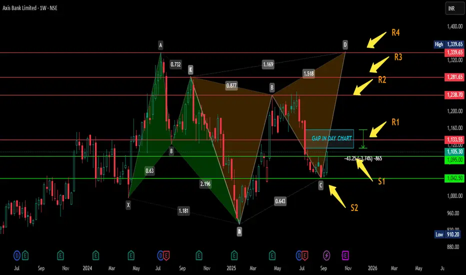
AXIS BANK WEEKLY ANALYSIS USING PATTERNIn this chart two butterfly patterns are plotted here one of them ia green which is comleted it's pattern as butterfly.
> Now other one is orrange in colour which is started to form BUTTERFY OR BAT i don't know, but my view is clear in this plot as i am expecting buttrfly.let's see what would be.
> Let me explain this chart is weekly where i mentioned support and resistance in green and red lines and marked by arrows.this support and resistances are on the basis of previous high or low so there should no one to be confused.
> Here weekly candle is closed above previous week high which is mentioned as S1.
> One more thing which i would like to say tou all that there is huge gap of almost 4% is mentioned as rectangle if you go in day chart it will be visible and i am expecting that this gap may be filled .
this is not my buy/sell call.
BITCOIN NEAR COMPLETOIN OF ITS CYCLEHere ploted fib circle which is showing what i want to say you all and what i told in my previous post you can see here resistance and symmetrical triangle is ploted as it is now you should be carefull however it has potential to go up but it may take some rest after squaring its previous price.Cycle is going to comlete but squaring is remained to comlete even after this biger move.this is not my buy/sell call just informing you all.

Best Commodity layoutBest Commodity layout
Crafting Your Optimal Commodity Technical Chart Layout in TradingView
The "best" commodity technical chart layout in TradingView is highly personalized, depending on your trading style, strategy, and the specific commodities you're analyzing. However, a well-structured layout should provide a clear, comprehensive view of price action and key technical indicators to aid in decision-making.
Here's a guide to creating an effective commodity technical chart layout in TradingView, incorporating common practices and versatile tools:
1. Choosing Your Main Chart Type:
Candlestick Charts: This is the most popular choice for most traders. Candlesticks provide detailed information about the open, high, low, and close (OHLC) prices for a specific period, making it easier to identify patterns and market sentiment.
Bar Charts: Similar to candlesticks, bar charts also display OHLC data but in a different visual format.
Line Charts: Useful for a quick overview of the overall trend, typically plotting the closing prices.
Heikin Ashi: These charts can help filter out market noise and make trends easier to identify by averaging price data.
Renko or Kagi Charts: These focus solely on price movement, ignoring time, and can be useful for identifying support and resistance levels.
Recommendation: Start with Candlestick charts for their detailed information. You can always switch to other types for different analytical perspectives.
2. Essential Technical Indicators for Commodities:
While the "best" set of indicators is subjective, here are some widely used and effective ones for commodity analysis in TradingView:
Moving Averages (MAs):
Types: Simple Moving Average (SMA) and Exponential Moving Average (EMA) are common. EMAs react faster to recent price changes.
Use: Identify trend direction, support/resistance levels, and potential crossover signals. Common periods include 20, 50, 100, and 200.
Layout: Add 2-3 MAs of different lengths directly onto your main price chart. For example, a 21-period EMA for short-term trends and a 50-period EMA for medium-term trends.
Volume Indicators:
Types: Volume (displays trading activity) and On-Balance Volume (OBV).
Use: Confirm the strength of price movements. A significant price move accompanied by high volume is generally considered more valid.
Layout: Typically displayed in a separate pane below the main price chart.
Oscillators (for identifying overbought/oversold conditions and momentum):
Relative Strength Index (RSI): Measures the speed and change of price movements. Values above 70 often indicate overbought conditions, while below 30 suggest oversold conditions. Standard period is 14.
Moving Average Convergence Divergence (MACD): Shows the relationship between two moving averages of an asset's price. It consists of the MACD line, signal line, and histogram.1 Used for trend identification and momentum.
1.
medium.com
medium.com
Stochastic Oscillator: Compares a particular closing price of an asset to a range of its prices over a certain period. Also used to identify overbought/oversold conditions.
Commodity Channel Index (CCI): Identifies cyclical trends and can signal overbought/oversold levels.
Layout: Oscillators are usually placed in separate panes below the main chart. You might choose 1 or 2 that best suit your strategy (e.g., RSI and MACD).
Volatility Indicators:
Bollinger Bands: Consist of a middle band (typically an SMA) and two outer bands representing standard deviations. They help identify volatility and potential price breakouts or mean reversion.
Keltner Channels: Similar to Bollinger Bands but use Average True Range (ATR) for the outer bands. Can be used for breakout and trend-following strategies.
Average True Range (ATR): Measures market volatility. Useful for setting stop-loss orders.
Layout: Bollinger Bands and Keltner Channels are overlaid on the main price chart. ATR is usually in a separate pane.
Trend-Following Indicators:
Ichimoku Cloud (Ichimoku Kinko Hyo): A comprehensive indicator that defines support/resistance, identifies trend direction, and provides trading signals. It includes several components like the Kumo (Cloud), Tenkan-sen, and Kijun-sen.
Donchian Channels: Plots the highest high and lowest low over a set period. Useful for identifying breakouts and trend direction.
Layout: Ichimoku Cloud and Donchian Channels are overlaid on the main price chart.
Recommendation for a Balanced Layout:
Main Chart: Candlesticks, 2-3 EMAs (e.g., 21, 50, 200), Bollinger Bands or Keltner Channels.
Pane 1 (below main): Volume.
Pane 2 (below main): RSI (14) or MACD.
Pane 3 (optional): CCI or ATR if your strategy heavily relies on them.
3. Drawing Tools:
Effective use of drawing tools is crucial for technical analysis:
Trendlines: Connect swing highs or lows to identify the direction and strength of trends.
Support and Resistance Levels: Horizontal lines drawn at key price levels where the price has historically struggled to break above (resistance) or fall below (support).
Fibonacci Retracement and Extension Levels: Help identify potential support/resistance levels and price targets based on Fibonacci ratios.
Channels: Parallel trendlines that can define a price range.
Chart Patterns: Use tools to identify patterns like head and shoulders, triangles, flags, and pennants.
Layout Tip: Keep your most frequently used drawing tools easily accessible in the TradingView drawing panel.
4. Multi-Timeframe Analysis & Multi-Chart Layouts:
Analyzing commodities across different timeframes can provide a broader market perspective. TradingView allows you to set up multi-chart layouts (the number of charts available depends on your subscription plan).
Common Setup:
Chart 1 (Long-Term): Weekly or Daily chart to identify the major trend.
Chart 2 (Medium-Term): 4-hour or Daily chart for more detailed trend analysis and identifying key levels.
Chart 3 (Short-Term): 1-hour or 15-minute chart for entry and exit signals.
Synchronization: TradingView allows you to synchronize symbols, crosshair, interval, and drawings across multiple charts in a layout, which can be very efficient.
5. Customization and Saving Your Layout:
Appearance: Customize chart colors (background, candles, grids), scales, and lines to your preference for better visual clarity and reduced eye strain. Access these via Chart Settings (the gear icon).
Saving Layouts: Once you have a setup you like, save it as a chart layout in TradingView. You can create multiple layouts for different commodities, strategies, or analytical purposes.
Indicator Templates: Save combinations of indicators as templates for quick application to new charts.
Tips for the "Best" Layout:
Keep it Clean: Avoid cluttering your chart with too many indicators. Focus on a few that you understand well and that complement your strategy.
Consistency: Use consistent settings for your indicators across different charts and timeframes.
Practice: The "best" layout is one that works for you. Experiment with different indicators and setups on a demo account or through backtesting to see what yields the best results for your trading style.
Stay Informed: Be aware that some commodities (e.g., agricultural products) can be influenced by seasonal patterns or specific reports (like USDA reports for crops, EIA for oil). While not a direct part of the "chart layout," integrating this knowledge with your technical analysis is crucial. TradingView has features to display key events like earnings reports or dividends, which can be relevant. Some community scripts on TradingView even offer overlays for planting and harvesting seasons for agricultural commodities.
By following these guidelines and experimenting to find what suits your individual needs, you can create a powerful and effective commodity technical chart layout in TradingView. Remember to regularly review and refine your layout as your trading strategies evolve.
My new parash//@version=5
strategy("Nifty 15-Min Intraday Strategy", overlay=true, margin_long=100, margin_short=100)
// Inputs
emaLength = input.int(20, "EMA Length")
rsiLength = input.int(14, "RSI Length")
stopLossPoints = input.int(15, "Stop Loss (Points)")
takeProfitPoints = input.int(30, "Take Profit (Points)")
useTimeFilter = input.bool(true, "Restrict Trading Hours (9:45-14:30 IST)")
// Calculate Indicators
ema20 = ta.ema(close, emaLength)
rsi = ta.rsi(close, rsiLength)
volumeUp = volume > ta.sma(volume, 5)
// Define Trading Session (9:45 AM to 2:30 PM IST)
timeAllowed = time(timeframe.period, "0945-1430")
// Trend Identification
bullishTrend = close > ema20
bearishTrend = close < ema20
// Entry Conditions
longCondition =
bullishTrend and
ta.crossover(rsi, 50) and
(low <= ema20) and
volumeUp and
(useTimeFilter ? timeAllowed : true)
shortCondition =
bearishTrend and
ta.crossunder(rsi, 50) and
(high >= ema20) and
volumeUp and
(useTimeFilter ? timeAllowed : true)
// Execute Trades
if (longCondition)
strategy.entry("Long", strategy.long)
strategy.exit("Exit Long", "Long", stop=close - stopLossPoints, limit=close + takeProfitPoints)
if (shortCondition)
strategy.entry("Short", strategy.short)
strategy.exit("Exit Short", "Short", stop=close + stopLossPoints, limit=close - takeProfitPoints)
// Plotting
plot(ema20, color=color.blue, title="20 EMA")
bgcolor(bullishTrend ? color.new(color.green, 90) : color.new(color.red, 90))
// Alerts
alertcondition(longCondition, "Long Entry", "Nifty Long Signal on 15-min")
alertcondition(shortCondition, "Short Entry", "Nifty Short Signal on 15-min")

Banknifty Fibonacci Time zones Analysis📊 Fibonacci Time Zones: A Gateway to Market Timing 🕰️
The Fibonacci Time Zone Tool is a unique and powerful feature in TradingView, based on the mathematical sequence introduced by Leonardo Fibonacci, a 13th-century Italian mathematician. Widely used in financial markets, this tool helps traders identify potential time-based turning points.
🔑 How It Works:
By plotting three key points—two highs and one low (or vice versa)—this tool extends Fibonacci ratios (0, 0.618, 1, 1.618, etc.) as vertical lines on the chart. These lines represent potential time cycles where significant market events or reversals could occur.
✨ Historical Context:
The Fibonacci sequence gained prominence in trading thanks to Ralph Nelson Elliott, who incorporated it into his Elliott Wave Theory. His work highlighted the importance of natural cycles and ratios in financial markets.
📖 Recommended Reading: "Elliott Wave Principle: Key to Market Behavior" by Frost and Prechter explores this concept in depth.
📈 This Week's Market Observation:
Plotted on the Fib Time Zone Tool using:
March 2020 Low
October 2021 High
June 2022 Low
This week marks the 1.618 Fibonacci Extension—the Golden Ratio, often associated with significant turning points.
🚦 Key Levels to Watch:
1️⃣ Above 49,798 (the high from 2 days ago): Signals a potential reversal to the upside.
2️⃣ Invalidation Level: Low of January 10, 2025.
Doesn't this look like a GUN :D
⚡ Why This Matters:
The confluence of Fibonacci time zones and price levels could indicate a pivotal moment for the index. Stay alert for a breakout or reversal as the market reacts to this significant golden ratio!
🌐 Pro Tip: Combine the Fib Time Zone tool with other indicators like volume and candlestick patterns to confirm market behavior around these time zones.
📥 Share your thoughts or let us know if you’re using this tool in your analysis!
