Advance Breakout Entry - NRAIL📊 NR AGARWAL INDUSTRIES (NRAIL) - Technical Setup
Current Price: ₹448.00 (+5.58%)
📈 BULLISH OUTLOOK
✅ Stock consolidating after higher high
✅ RSI showing hidden divergence (bullish continuation)
✅ Previous resistance at ₹548 - breakout will confirm next leg up
🎯 TARGETS:
• Target 1: ₹548 (Resistance breakout)
• Target 2: ₹641 (Fib 1.272)
• Target 3: ₹692 (Fib 1.414)
• Grand Swing: ₹760 (Fib 1.618)
🛡️ STOP LOSS: ₹376 (below 0.5 Fib support)
📊 KEY LEVELS:
Support: ₹417 (0.618 Fib), ₹377 (0.5 Fib)
Resistance: ₹548
Risk-Reward: 2.7:1 (to Target 2)
⚠️ DISCLAIMER: This is for educational purposes only, not financial advice. Trading involves risk. Do your own research and consult a financial advisor before investing.
#NRAIL #StockAnalysis #TechnicalAnalysis #NSE
Tradingtips

Buy on Dips - SCHNEIDER Analysis**SCHNEIDER - Buy on Dips | Strong Demand Zone + Triple Bottom**
📊 **Strong Price Action at Key Demand Zone**
Triple bottom formation at critical support - classic accumulation pattern:
**Why Buy on Dips:**
✅ Triple bottom shows institutional accumulation - **Demand Zone:** 561-600 (tested 3x since May 2025)
✅ Price defending demand zone with conviction
✅ Strong bounce from support - buyers stepping in
✅ All major MAs trending upward
**Targets:**
- **Tgt 1:** 862 (+12%) / - **Tgt 2:** 920 (+20%) / - **Tgt 3:** 1,000 (+30%)
**Strategy:**
Accumulate on any dip towards 730-750 zone. Strong hands at support making this a low-risk, high-reward setup.
**SL:** Below 730 (weekly close)
**Disclaimer:** This is for educational purposes only and not financial advice.
Always do your own research and consult with a financial advisor before making any investment decisions.
Trade at your own risk.

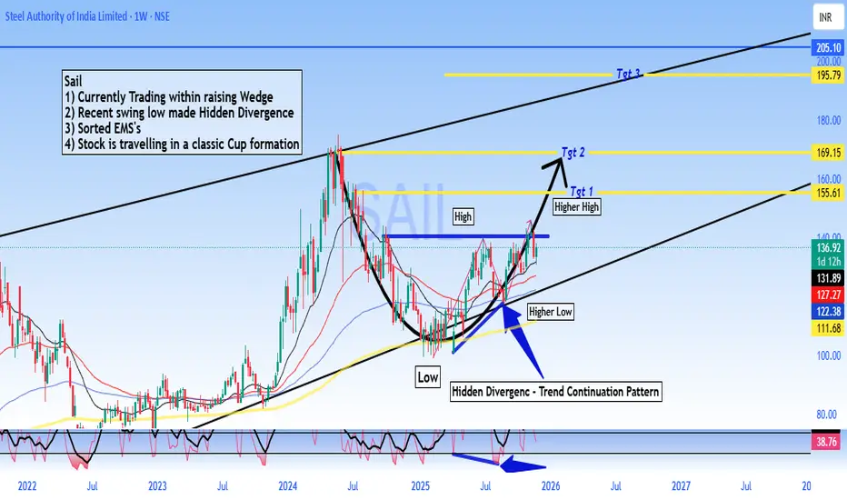
SAIL - Buy - Technical Analysis# Steel Authority of India Limited (SAIL) - Technical Analysis Report
Current Price: 136.92
Timeframe: Weekly Chart Analysis
Technical Setup Overview
SAIL is presenting a compelling technical picture with multiple bullish indicators aligning for a potential significant upward move. The stock is currently trading within a well-defined rising wedge pattern and has recently formed a **Hidden Divergence** on the weekly chart - a classic trend continuation signal.
Key Technical Observations
Rising Wedge Pattern:
The stock is trading within a rising wedge formation, which typically indicates consolidation before a breakout. The current price action suggests the stock is in the later stages of this pattern.
Hidden Divergence - Bullish Continuation Signal:
A **Hidden Divergence** has formed on the weekly timeframe.
- This pattern typically signals trend continuation and suggests the uptrend is likely to resume with strength
Sorted EMA Structure:
The Exponential Moving Averages are properly aligned, indicating a healthy bullish trend structure with multiple moving averages providing dynamic support.
Cup Formation in Progress:
The stock appears to be carving out a **classic Cup pattern**, which is a well-known bullish continuation formation. This pattern suggests accumulation and potential for a significant breakout move.
Price Targets & Projections
Based on the technical structure, here are the potential price targets:
Target 1: 155.61 (Higher High breakout level)
Target 2: 169.15
Target 3: 195.79
These targets are derived from the pattern structure and represent key resistance zones where profit-taking may occur.
Trading Strategy Considerations
For Swing Traders:
- Current levels offer a potential entry opportunity for medium to long-term positions
- A move above ₹140 could confirm the continuation pattern
- Stop loss can be placed below the recent higher low at 122 for risk management
Risk Factors to Monitor
- Failure to hold above ₹122 would invalidate the bullish hidden divergence
- Breakdown below the rising wedge support would change the outlook
- Sector performance and broader market conditions should be monitored
- Steel industry fundamentals and commodity price trends
🔔 Conclusion
SAIL is exhibiting strong technical characteristics with the Hidden Divergence pattern, sorted EMA structure, and cup formation all pointing toward potential upside. The current price action within the rising wedge presents an interesting risk-reward setup for traders and investors with appropriate risk management.
DISCLAIMER
This analysis is for educational and informational purposes only and should NOT be considered as investment advice or a recommendation to buy, sell, or hold any securities. - I am not a SEBI registered analyst or investment advisor - This is purely a technical analysis based on chart patterns and indicators - Past performance and technical patterns do not guarantee future results - Trading and investing in stocks involves substantial risk of loss - Always conduct your own research and due diligence before making any investment decisions - Consult with a qualified financial advisor before taking any investment positions - The author holds no responsibility for any profits or losses incurred based on this analysis - Risk management and position sizing are crucial - never invest more than you can afford to lose
**Trade/Invest at your own risk. Do your own analysis.**
#SAIL #SteelAuthorityOfIndia #StockMarket #TechnicalAnalysis #NSE #IndianStocks #ChartAnalysis #TradingView #StockTrading #HiddenDivergence #CupPattern #PriceAction #SwingTrading #Investing #MarketAnalysis #SteelSector #Commodities #TradingStrategy #ChartPatterns #TechnicalIndicators
One Gold Trade Can Destroy a Week of Profits💥 One Gold Trade Can Destroy a Week of Profits – Education
One Gold Trade Can Destroy a Week of Profits
Gold (XAUUSD) is one of the most exciting yet dangerous instruments in trading. Its high volatility offers massive profit potential—but one wrong move can erase all your hard-earned gains. Let’s break this down in detail.
1️⃣ Understanding Gold Market Volatility 🔥
Gold reacts sharply to geopolitical events, economic news, and central bank decisions.
Price swings of 50–200 pips in a day are common.
High volatility means both high reward and high risk—making risk management essential.
Example:
If you earned $500 in small, careful trades, one unexpected spike or wrong trade in XAUUSD could cost $600+, wiping out a week’s profits in minutes. 😱
2️⃣ Risk Management is Your Lifesaver 🛡️
Trading without protecting your capital is like walking on a tightrope without a safety net.
✅ Rules to Follow:
Risk 1–2% of your account per trade.
Always set a stop-loss and take-profit.
Use a risk-to-reward ratio of at least 1:2 or 1:3.
Avoid over-leveraging—even small mistakes become huge losses with high leverage.
Tip: A single trade should never threaten your entire weekly profit.
3️⃣ Emotions Can Kill Your Profits 😵🧠
Trading isn’t just about charts; it’s about psychology. One impulsive decision can erase a week of careful work.
Avoid revenge trading after losses.
Don’t chase trades that don’t meet your plan.
Practice discipline and patience—stick to your strategy and setups.
Reality Check: Emotional trades often ignore risk management, which is why one trade can wipe out a week of profits.
4️⃣ Timing is Everything ⏱️
Gold has major moves during:
US session open 🌎
Fed announcements 🏦
High-impact economic news 📊
Avoid trading blindly during these times unless you are highly experienced.
Pro Tip: Sometimes the best trade is no trade—waiting for clear setups can save your profits.
5️⃣ Technical Analysis Must Be Precise 📈🔍
Before entering a trade, confirm setups using:
Order Blocks & Fair Value Gaps
Momentum Shifts
Volume & Price Action Confirmation
Avoid: Entering on impulse or guessing the trend. Even a small error can result in losses bigger than weekly profits.
6️⃣ Practical Example: The “Profit Destroyer” Trade 💣
Imagine your trading week:
Monday to Friday: 5 small, calculated trades → $500 profit 💰
Friday afternoon: Impulsive Gold trade without stop-loss → $600 loss 😱
Result? You’re down $100 for the week despite a strong start.
Lesson: Protect your capital first. Profits come from consistent, disciplined trading—not luck.
7️⃣ Key Takeaways ✅
Gold = High Risk, High Reward ⚖️
Risk Management is Non-Negotiable 🛡️
Discipline Beats Emotions Every Time 🧘♂️
Wait for Clear Setups 🕵️♂️
One Wrong Trade Can Erase a Week of Profits ⚠️
Follow for More Gold & Forex Trading Insights! 🚀📈
Stay updated with XAUUSD tips, risk management strategies, and profitable trading setups. Don’t miss out—follow now and trade smarter every day! 💎🔥

Why Bitcoin Hits Your Stop Loss Before the Real MoveWhy Bitcoin Hits Your Stop Loss Before the Real Move
Have you ever placed a Bitcoin trade and noticed this? 🤔
Your stop loss 😭💸 gets hit… just a few pips from your entry… then the price suddenly rockets 🚀💎 in the direction you were expecting!
This is not bad luck. It’s a Stop Loss Hunt 💥, used by smart money 🏦💰 to collect liquidity before the real trend begins.
1️⃣ Liquidity Pools Above Highs & Below Lows 📊💎
Retail traders place stop losses at obvious highs/lows 📈📉
These stops create liquidity zones 💧, which smart money targets 🔍
Price moves to these zones to collect liquidity → fuels the next trend 🚀
Example:
BTC trending upward 📈
Traders place buy stops above the previous high ⬆️
Smart money pushes price to trigger stops 💥 → collects liquidity 💎 → then moves the price in the real trend direction 🚀
2️⃣ Stop Loss Sweep 💥⚡
Price triggers retail stop losses 🛑
Retail traders get stopped out 😭💸
Institutions enter large positions with minimal resistance 💹
Key Insight:
Price needs liquidity 💧 to move strongly.
Without collecting stops, smart money cannot drive momentum efficiently ⚡
3️⃣ Fake Breakouts & Wicks 🌪️🔥
Watch for wick spikes or sudden breakouts 🕵️♂️
These are stop loss hunts
Many traders panic 😱 and exit positions
Smart money uses this to trap retail traders and continue the trend 🚀
4️⃣ The Real Move Begins 🚀🔥
After liquidity is collected 💎💧
The true trend resumes 📈
Traders who waited can enter safely 🧘♂️💹
Often, the move is stronger and faster ⚡ because institutions now control the market
5️⃣ Market Psychology Behind Stop Hunts 🧠💭
Retail traders panic when stops are triggered 😅💸
Fear is used to manipulate sentiment 🧲
Recognizing this psychological trap helps you stay calm 🧘♂️ and trade strategically 🏆
6️⃣ How to Trade Stop Loss Hunts 💡🧠
✅ Avoid stops at obvious highs/lows 🚫
✅ Wait for liquidity sweep ⏳💧
✅ Watch for wick spikes 🌟 — early signs of stop hunts
✅ Follow market structure 📊 (BOS/CHoCH)
✅ Trade after confirmation ⏱️
✅ Patience + discipline = profits 💎💹
7️⃣ Examples in Bitcoin Trading 🔍
Double top wicks above high → triggers stops 💥 → continues trend 🚀
Price dips below support → triggers stops 😭 → rebounds ⬆️
💡 Observation: Every wick tells a story 🌟 — learn to read it!
💬 Key Takeaways
Stop Loss Hunts = institutional footprints 👣
Price hunts liquidity 💧 — that’s why your SL is hit 💥
Understanding this helps you:
Trade smarter 💎
Avoid losses 😅💸
Spot trends before they happen 🚀

Sharda crop - Buy - Technical Analysis#Sharda Cropchem Ltd - Technical Analysis
Current Price: 908.30
#Key Observations
Bullish Structure:
- Price broke above the descending trendline (RSI HD pattern)
- Successfully formed Higher Low at ~ 855, confirming uptrend continuation
- Currently in "Price Action" zone after Higher High at 1,181
Critical Levels:
- Support: 855-895 (recent Higher Low zone)
- Resistance: 965 (0.9 Fib), 1,018 (0.618 Fib), 1,181 (recent high)
- Key Breakout: Above 1,018 could target 1,106-1,181 range
Technical Indicators:
- RSI in neutral zone showing momentum building
- Price action suggests consolidation before next move
- Previous resistance zone (blue box) now acting as support
The chart shows a bullish reversal pattern with higher lows forming. A sustained move above 965-1,018 zone could signal continuation toward the 1,181-1,300 levels. Watch for volume confirmation on breakouts.
DISCLAIMER: This is for educational purposes only and not investment advice. Trading in stocks involves substantial risk of loss. Always do your own research and consult with a certified financial advisor before making investment decisions. Past performance is not indicative of future results.

ICICIPRULI - Buy - Trade setup#ICICI Prudential Life Insurance - Technical Analysis
| Price: 626.05 |
#Swing Trade Setup
Pattern: Price trading above EMA with EMA squeeze formation. RSI showing bullish momentum structure.
Technical Indicators:
1. Price trading above EMA - EMA Squeeze pattern forming
2. RSI consolidation - Moving above 50 level
3. RSI taking support on RSI MA line
4. Conservative entry - Buy above ₹635
Entry Strategy:
- Buy Above: 635.30
- Stop Loss (Swing): 608.93 (on candle close)
- Stop Loss (Investment): 532.40
Target Levels:
- Target 1: 662.40
- Target 2: 693.50
- Target 3: 727.30
- Grand Target 4: 789.50
Key Reference: Previous ATH Breakout zone around 727
#Technical Outlook
The stock is consolidating near the 626 level after a significant rally from 532. The EMA squeeze and RSI structure suggest potential for upside continuation. A breakout above 635 could trigger movement toward the 662 - 693 zone initially, with extended targets at 727 - 789.
Risk-Reward: Favorable setup with well-defined stop losses for both swing trading and long-term investment approaches.
⚠️ DISCLAIMER
This is NOT investment advice. This analysis is provided for educational and informational purposes only. Stock trading and investing involve substantial risk of loss. Technical patterns and indicators do not guarantee future price movements. Past performance is not indicative of future results.
Always conduct your own thorough research and consult with a SEBI-registered financial advisor or qualified professional before making any investment decisions. The author/analyst assumes no responsibility or liability for any financial losses or damages incurred from using this information.
**Trade at your own risk.**
#ICICIPrudential #StockMarket #NSE #TechnicalAnalysis #SwingTrading #IndianStockMarket #Trading #FinTwit #Insurance #StocksToWatch #TradingView #ChartAnalysis #MarketUpdate #InvestorEducation

#Bajaj Finance Limited - BUY - Technical Analysis#Bajaj Finance Limited - #Technical Analysis
Price: 1,048.00
#Swing Trading Setup
Pattern: #Range #breakout with #consolidation above breakout zone. #Triangle/Box pattern breakout with target hit. Currently forming double bottom pattern.
Key Technical Points:
1. Range breakout & consolidating above breakout area
2. EMA's sorted & aligned - price trading above all EMAs
3. Triangle/Box pattern breakout - target achieved, now forming double bottom
4. Classic divergence in recent bounce area confirming retracement completion
Target Levels:
- Target 1: 1,103.80
- Swing Target 2: 1,155.00
- Grand Target: 1,225.00
Support: 1,026 - 1,018 (critical zone)
#Outlook
Strong bullish structure with potential upside of 10-17% toward targets. The double bottom formation suggests the retracement phase is complete. Price sustaining above ₹1,048 confirms continuation toward higher targets.
⚠️ DISCLAIMER
This is NOT investment advice. For educational purposes only. Stock trading involves substantial risk. Past performance doesn't guarantee future results. Always do your own research and consult a SEBI-registered financial advisor before investing. Author assumes no responsibility for losses.
#BajajFinance #StockMarket #NSE #TechnicalAnalysis #SwingTrading #IndianStockMarket #Trading #FinTwit #ChartAnalysis #StocksToWatch #TradingView #MarketAnalysis

SBI Buy - Range Breakout - Technical analysis#State Bank of India - #TechnicalAnalysis - #sbin
Price: 948.85 |
#Technical Setup
Pattern: #Swing trade setup with All-Time High (ATH) breakout confirmed on monthly chart. #Pullback/base formation in progress before next upward move.
Strategy: Conservative buy on breakout on candle-closing basis
Entry: Buy above 973.30
Stop Loss: 944.45
**Key Levels:**
- Target 1: 1,025.00
- Target 2: 1,055.80
- Grand Target: 1,144.00
- Support: 961.78 - 944.45
#Technical Observations
1. **Range & ATH Breakout** confirmed on monthly timeframe
2. Current pullback/base formation before next leg up
3. **EMA's aligned** confirming uptrend structure
4. **Hidden Divergence (HD)** formed in RSI - trend continuation pattern
5. Price action remains constructive on daily chart
⚠️ DISCLAIMER
**This is NOT investment advice.** This analysis is for educational purposes only. Stock trading involves substantial risk of loss. Past performance and technical patterns do not guarantee future results. Always conduct your own research and consult a SEBI-registered financial advisor before making any investment decisions. The author assumes no responsibility for trading losses incurred.

Indian Metals & Ferro Alloys - Buy - Swing Trading#Indian Metals & Ferro Alloys Ltd - #Swing Trade Setup
Current Price: 1,348.10
Technical Setup
Swing Trade Configuration:
✅ **All-Time High Breakout** - Stock has broken out from its previous ATH
✅ **Sorted EMAs** - Moving averages aligned in bullish formation
✅ **Consolidation Above ATH** - Price sustaining above breakout zone
✅ **Range Breakout** - Successfully broken and retested key resistance
Key Observation
Accumulation After ATH Breakout & Range Breakout After Retest
The stock is showing classic post-breakout behavior with accumulation building above the all-time high. The successful retest of the breakout level (962- 1,049 zone) has provided an excellent entry opportunity for swing traders.
Price Targets
Target 1: 1,418
Target 2: 1,498
Target 3: 1,614
Target 4: 1,829
Stop Loss: Below 1,049
Disclaimer: This analysis is for educational purposes only and should not be considered as financial advice. Trading and investing in stocks involves risk. Please conduct your own research or consult with a SEBI-registered financial advisor before making any investment decisions. Past performance is not indicative of future results.
#SwingTrading #StockMarket #TechnicalAnalysis #IndianStocks #BreakoutTrading #NSE #RetestOpportunity #TrendIsYourFriend #IMFA #MetalStocks

HDFCLIFE - BUY - Technical AnalysisHDFC Life Insurance - 4-Year Breakout Setup
HDFCLIFE (NSE) Current Price: 787.55
Date: November 27, 2025
Key Highlight: 4-YEAR BREAKOUT CONFIRMED
HDFC Life has broken out from a **4-year consolidation zone** around 787, signaling a major technical development with significant upside potential.
Technical Setup
4-Year Resistance Breakout - Stock cleared multi-year hurdle
Strong Volume Confirmation - Breakout supported by buying interest
Higher Highs Pattern - Bullish structure on daily chart
Moving Averages Aligned - Trending above key EMAs
Price Targets
Target 1: 862.10
Target 2: 907.25
Target 3: 972.10
Conservative Entry: 820.75 (post-retest confirmation)
Trading Plan
Entry Zone: 787-820
Stop Loss: Below 757 (breakout invalidation)
Risk:Reward: 1:3+ favorable setup
Strategy: Long-term breakout traders can accumulate; conservative traders wait for pullback to ₹820 zone.
- 4-year resistance breakouts often lead to sustained rallies
- Insurance sector showing strength
- Strong institutional interest in HDFC Life
- Technical + fundamental alignment
Risk Management
- Use stop loss below 757
- Position size: Risk only 1-2% capital
- Trail stop loss as targets are achieved
- Monitor broader market conditions
DISCLAIMER
**NOT investment advice. For educational purposes only.** I am NOT a SEBI registered analyst. This is technical analysis based on chart patterns. Trading involves substantial risk. Do your own research (DYOR). Consult a financial advisor before investing. Trade at your own risk.
**#HDFCLIFE #Breakout #StockMarket #NSE #TechnicalAnalysis #Insurance #Trading #IndianStocks #ChartAnalysis #SwingTrading #BreakoutTrading #TradingView #StockAlert #BullishSetup #PriceAction**
Long Jsw HoldingsTechnical Overview – JSW Holdings Ltd (Weekly Chart)
The weekly chart of JSW Holdings Ltd indicates that the price is currently stabilizing around the 50-week EMA, suggesting the formation of a potential accumulation base. A classic bullish RSI divergence is observed, signalling weakening downside momentum and the possibility of a medium-term trend reversal.
A confirmation trigger is identified at a weekly close above 18,876, which would indicate renewed buying strength and validate a breakout from the consolidation range. The risk–reward structure is clearly defined, with an estimated downside risk of approximately 18% and an upside potential of about 37% from the trigger level. Momentum indicators, including multiple RSI readings, are turning upward from lower zones, reinforcing the improving sentiment.
Overall, the chart setup reflects an early-stage recovery structure, with a breakout above the defined trigger level required to activate a long trade bias.

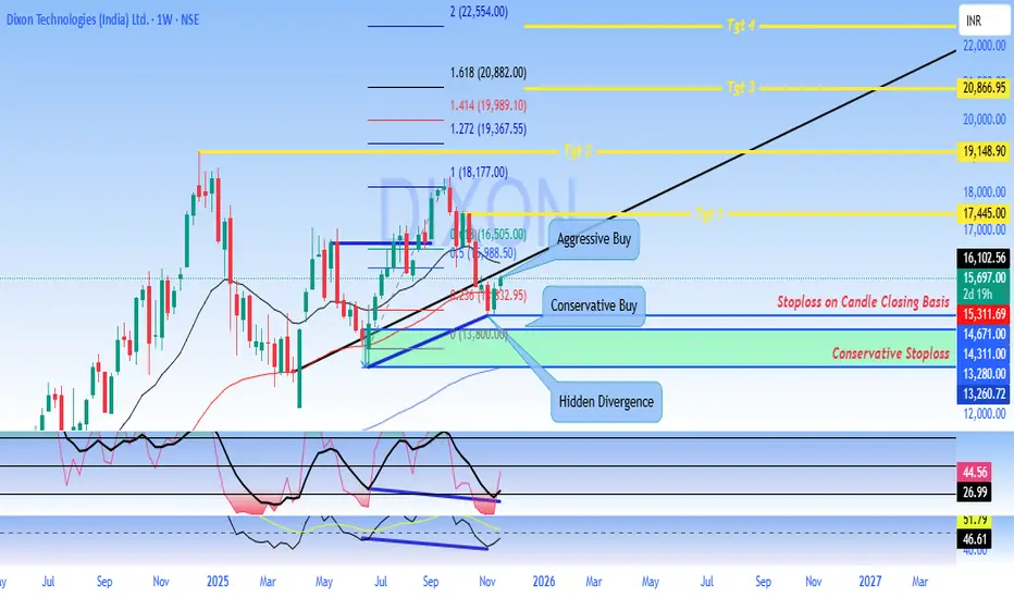
DIXON Technologies - Swing Trade Analysis
#Dixon Technologies (India) Ltd. - Technical Analysis Report
Current Price:15,697.00
Timeframe: Weekly Chart Analysis
Market Structure Overview
Dixon Technologies is currently trading at 15,697, showing signs of potential #bullish #momentum after a period of #consolidation. The #stock has been forming a significant base pattern following its decline from #all-time highs near 18,177.
#Key Technical Levels
#Support Zones
- Primary Support: 13,800 - 14,311 (Conservative Stoploss zone)
- Secondary Support: 13,260 - 13,280
- Critical Support: 12,000 (major psychological level)
#Resistance Zones
- Immediate Resistance: 16,102 - 16,505
- Key Resistance 1: 17,445 (Target 1)
- Key Resistance 2: 19,148 (Target 2)
- Major Resistance: 20,866 - 22,000 (Target 3 & 4 zone)
#Chart Pattern Analysis
The weekly chart reveals a **potential bullish reversal pattern** with the following characteristics:
1. Hidden Divergence: The chart shows hidden bullish divergence on momentum indicators, suggesting underlying strength despite recent price consolidation
2. Consolidation Box: A clear accumulation zone has formed between 13,800 and 16,500
3. Trend Channel: A rising trend channel indicates the potential for continued upward movement toward the 20,000+ zone
#Trading Strategies
#Aggressive Buy Setup
- Entry Zone: 16,505 - 16,102 (on breakout confirmation)
- Target Sequence: 17,445 → 19,148 → 20,866
- Stop Loss: Below 15,311 on candle closing basis
- Risk-Reward: Favorable 1:3+ ratio
#Conservative Buy Setup
- Entry Zone: 15,697 - 15,311 (current levels)
- Target Sequence: 17,445 → 19,148
- Stop Loss: Below 14,311 on candle closing basis (Conservative Stoploss)
- Risk-Reward: Approximately 1:2.5 ratio
#Momentum Indicators
The lower panel indicators suggest:
- Recovery from oversold conditions
- Building positive momentum
- Potential for sustained upward movement if key resistance levels are breached
#Fibonacci Levels
Key Fibonacci retracement/extension levels marked on the chart:
- 1.618 Extension: 20,882
- 1.414 Extension: 19,989
- 1.272 Extension: 19,367
- 1.000 Level: 18,177
#Outlook
Bullish Scenario: A sustained move above 16,505 with strong volume could trigger momentum toward 17,445 initially, with extended targets at 19,148 and potentially 20,866+. The stock appears to be in an accumulation phase with potential for a significant upside breakout.
Bearish Scenario: Failure to hold above 14,311 on a closing basis would invalidate the bullish setup and could lead to a retest of 13,260-13,280 support zone.
#Risk Management.
- Always use stop-loss orders on a candle closing basis - Position sizing should not exceed 2-3% of total portfolio value - Avoid overleveraging in options or futures - Monitor volume confirmation on breakout levels
DISCLAIMER
This analysis is for educational and informational purposes only and should NOT be considered as financial advice or a recommendation to buy or sell securities.
- Past performance is not indicative of future results - Trading and investing in stocks involves substantial risk of loss - All investment decisions should be made based on your own research, risk tolerance, and financial situation - Please consult with a SEBI-registered financial advisor before making any investment decisions - The author/analyst is not responsible for any profits or losses incurred based on this analysis - Technical analysis has limitations and should be combined with fundamental analysis - Market conditions can change rapidly, and all levels mentioned are subject to change
**Trade at your own risk. Always do your own due diligence.**
*Analysis created using TradingView charts | Not SEBI Registered Investment Advice*
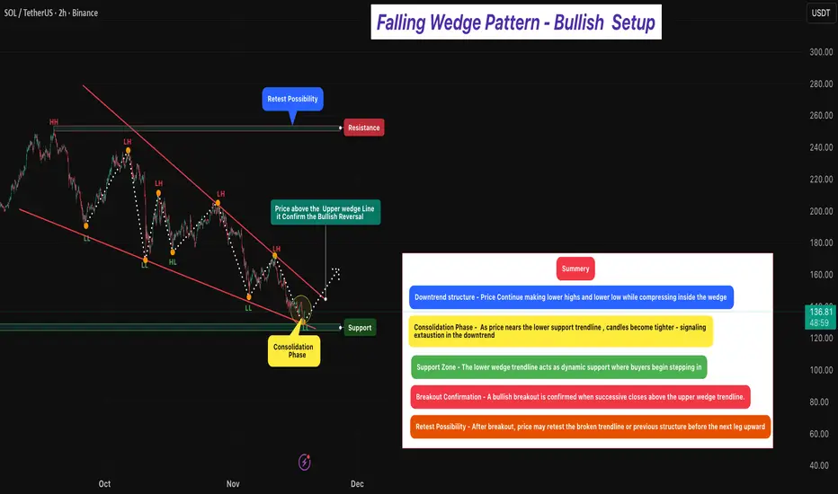
Falling Wedge Pattern - Bullish Setup 🔎 Overview [ /b]
The Falling Wedge Pattern is a bullish reversal setup that forms when price trades inside a narrowing downward channel — creating lower highs and lower lows that converge toward the bottom.
It typically appears after a downtrend, signaling that selling pressure is weakening and buyers may soon regain control.
As price descends within the wedge, the slope begins to reduce and volatility tightens, indicating seller exhaustion and early buyer accumulation near support.
Momentum shifts once price breaks and closes above the upper wedge trendline, confirming a potential bullish reversal.
⸻⸻⸻⸻⸻⸻⸻⸻⸻⸻⸻
📊 Chart Explanation
1️⃣ Downtrend Structure
Price continues forming Lower Highs and Lower Lows within the wedge.
This compression reflects weakening bearish momentum.
2️⃣ Consolidation Phase
As price approaches the wedge’s lower line, candles narrow — indicating reduced volatility, seller fatigue, and early buying activity.
This is often the early reversal zone.
3️⃣ Support Zone
The lower wedge boundary overlaps with a strong structural support area — where buyers repeatedly defend the lows, forming a demand zone.
4️⃣ Breakout Confirmation
A bullish reversal is confirmed when price breaks and closes above the upper wedge line.
This signals a clear momentum shift from sellers → buyers.
5️⃣ Retest Possibility
Post-breakout, price may retest the broken wedge or prior resistance area.
A successful retest adds conviction to the continuation move.
⸻⸻⸻⸻⸻ ⸻⸻⸻⸻⸻⸻
🟩 Summary
• Pattern Type → Falling Wedge (Bullish Reversal)
A narrowing downward structure that signals seller exhaustion and early buyer accumulation.
• Bias → Bullish After Breakout Confirmation
Momentum shifts only when successive candles close firmly above the upper trendline, confirming a true breakout.
• Trend Context → Formed After a Downtrend
Makes the reversal stronger and increases the probability of upside continuation.
• Market Psychology → Sellers Losing Strength
Lower highs are losing momentum, and buyers are defending lows aggressively.
⸻⸻⸻⸻⸻⸻⸻⸻⸻⸻⸻
⚠️ Disclaimer
📘 For educational purposes only.
🙅 Not SEBI registered.
❌ Not a buy/sell recommendation.
🧠 Purely a learning resource.
📊 Not Financial Advice.
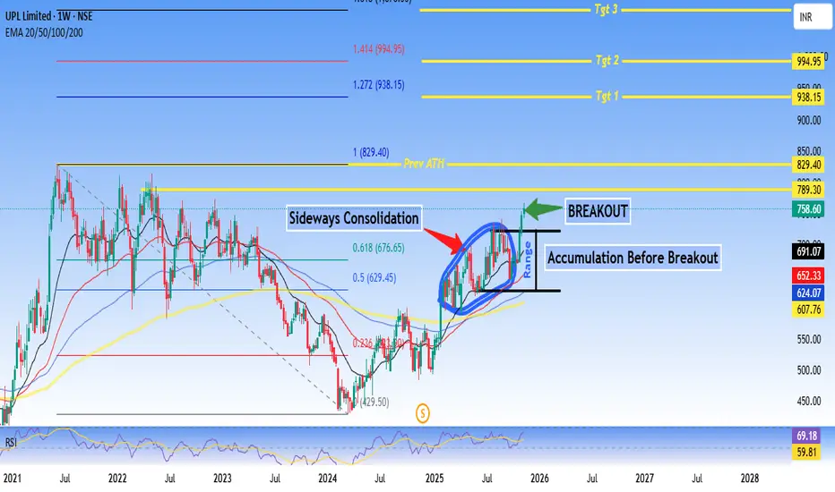
UPL Limited approaching Prev ATH - Technical AnalysisUPL Limited - #Breakout Setup After #Accumulation Phase
Current Price: 691.07
Good For Swing to Short-term Trading.
Technical Summary:
UPL is showing a classic accumulation-to-breakout pattern after an extended sideways #consolidation phase. The stock has broken out from a well-defined range with strong volume confirmation and is now positioned for potential upside momentum.
Key Technical Highlights:
✅ Breakout Confirmed: Price breaking above 768 resistance zone with volume expansion
✅ Accumulation Phase Complete: Extended consolidation (2024-2025) suggesting smart money accumulation
✅ EMA Alignment: 20/50/100/200 EMAs converging and starting to fan out bullishly
✅ RSI Strength: At 69.18, showing momentum without being overbought
✅ Fibonacci Levels: Currently between 0.236-0.5 retracement, plenty of upside room
Price Targets:
- Target 1: 938.15 (+35% from current levels)
- Target 2: 994.95 (+44%)
- Target 3: 1,050+ (Extended target)
Support Levels:
- Immediate: 676 (0.618 Fib)
- Strong: 629 (0.5 Fib + breakout level)
- Critical: 607 (20 EMA)
Risk-Reward: Favorable at current levels with defined support zones and multiple upside targets.
Disclaimer:
This analysis is for educational and informational purposes only and should NOT be considered as financial advice or a recommendation to buy/sell any security.
- Technical analysis is based on historical price patterns and may not predict future performance - Past performance is not indicative of future results - Trading and investing involve substantial risk of loss - Always conduct your own research and due diligence - The author may or may not hold positions in the discussed security - Price targets are projections based on technical levels and not guaranteed outcomes - Market conditions can change rapidly, invalidating technical setups - Use appropriate position sizing and risk management strategies
** Trade at your own risk. You are solely responsible for your trading/investment decisions.**
#UPL #TechnicalAnalysis #Breakout #Accumulation #StockMarket #NSE #SwingTrading #ChemicalSector #FibonacciRetracement #RSI
JTEKT India Technical AnalysisHere's a comprehensive TradingView report for JTEKT India Limited:
Current Price:160.90
📊 TECHNICAL SETUP OVERVIEW
JTEKT India is displaying a compelling technical structure within a well-defined ascending channel pattern that has been in play since the 2020 lows. The stock is currently consolidating after a significant rally and appears to be setting up for the next leg of movement.
KEY TECHNICAL OBSERVATIONS
1. Channel Pattern Analysis:
- Long-term Ascending Channel: The stock has been respecting a parallel channel since 2020, with clear support and resistance boundaries
- Current Position: Trading in the middle zone of the channel, suggesting room for movement in either direction
- Channel Support: Lower trendline around 120-130 zone
- Channel Resistance: Upper trendline projecting towards 220-240 zone
2. Moving Average Structure:
All major moving averages are sloping upward, confirming a strong bullish trend across multiple timeframes.
3. Price Action Patterns:
- Clear higher highs and higher lows formation since 2020
- Recent consolidation after touching 220+ levels suggests healthy profit-booking
- Volume expansion during rallies indicates strong buying interest
- Formation of a potential inverse head and shoulders pattern on monthly timeframe
4. Support & Resistance Levels:
Immediate Support Zones:
- S1: 148-150 (8/13 EMA cluster)
- S2: 134-135 (50 EMA + channel support)
- S3: 120-122 (psychological level + lower channel boundary)
Resistance/Target Zones:
- Target 1:188.50 (Previous swing high)
- Target 2: 209.71 (Major resistance + psychological 200 level)
- Target 3: 255.40 (Channel top + Fibonacci extension)
PROJECTION & TREND ANALYSIS
Bullish Scenario (Higher Probability):
If the stock holds above 148-150 support zone:
1. First target: 188.50 (18% upside potential)
2. Breakout above 190 could trigger momentum towards 209.71
3. Ultimate target within channel: 255.40 (58% upside from current levels)
Bearish Scenario (Risk Assessment):
Break below 134 (50 EMA) could lead to:
- Retest of 120-122 zone (channel support)
- Deeper correction to 110-115 if channel breaks
- This would invalidate the current bullish setup
CONCLUSION
JTEKT India Limited presents a well-defined bullish channel with strong moving average support. The technical structure suggests the stock is consolidating before the next leg up, with multiple targets identified.
Accumulate on dips toward 148-150, add on strength above 170, with ultimate targets of 188, 210, and ₹255.
Disclaimer: This is a technical analysis for educational purposes only. Not financial advice. Technical analysis should be combined with fundamental research, and proper risk management should always be employed. Past performance does not guarantee future results.
#JTEKT #TechnicalAnalysis #StockMarket #ChannelTrading #SwingTrading #NSE #AutoSector #MovingAverages #TrendAnalysis #IndianStocks

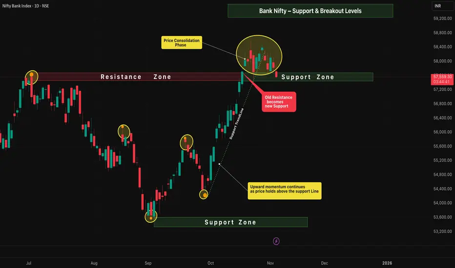
Bank Nifty – Support & Breakout Levels📈 Bank Nifty – Daily Timeframe Analysis
The price structure on the daily chart shows a healthy continuation of the upward momentum , maintaining strength above the key support zone.
Buyers are still in control, but the market has now entered a phase of sideways consolidation — signaling preparation for the next directional move.
⸻⸻⸻⸻⸻⸻⸻⸻⸻⸻
📊 Key Observations
1️⃣ Upward Momentum Continues — Price remains above the support line, showing sustained bullish control and healthy trend structure.
2️⃣ Consolidation Range — Price is currently consolidating between 58577.50 and 57482.05 , reflecting a balance between buyers and sellers.
3️⃣ Old Resistance → New Support — The previous resistance zone is now acting as a strong support base, adding confirmation to the bullish sentiment.
4️⃣ Breakout Scenarios —
A break above the consolidation high at 58,577.50 could ignite the next upward leg and continue the prevailing uptrend.
• A break below the support zone at 57,482.05 may shift momentum to the downside, opening the possibility of a move toward the previous support area.
⸻⸻⸻⸻⸻⸻⸻⸻⸻⸻⸻
✅ Summary
• Trend bias remains bullish as long as price holds above the key support line.
• Consolidation signals short-term indecision before the next major move.
• A confirmed breakout candle above 58,577.50 may open the path for further upside.
• Conversely, a breakdown below 57,482.05may invite short-term selling pressure toward the old support region.
⸻⸻⸻⸻⸻⸻⸻⸻⸻⸻⸻
⚠️ Disclaimer:
📘 For educational purposes only.
🙅 Not SEBI registered.
❌ Not a buy/sell recommendation.
🧠 Purely a learning resource.
📊 Not Financial Advice.
Bullish Fibonacci Retracement Setup📈 Bullish Fibonacci Retracement Setup
Intro
The chart illustrates a classic Bullish Fibonacci Retracement structure — highlighting key swing points, retracement levels, and potential continuation zones.
Price action shows a healthy pullback within a larger uptrend, suggesting accumulation before a possible breakout move.
⸻⸻⸻⸻⸻⸻⸻⸻⸻⸻⸻⸻⸻
🟩 Chart Overview
• Point A → Represents the Swing Low , marking the starting point of the current upward move.
• Point B → Denotes the Swing High , where price faced resistance before retracing.
⸻⸻⸻⸻⸻⸻⸻⸻⸻⸻⸻⸻⸻
📊 Key Fibonacci Levels
1️⃣ Validation Line (78.60%) — Entry is confirmed when any two consecutive candles close above this level, signaling a strong breakout and bullish continuation.
2️⃣ Minimum Retracement (61.80%) — This level has been achieved, and two candles have successfully closed below it, confirming a valid retracement phase within the Fibonacci structure.
3️⃣ Devalidation Line (38.20%) — If any two candles close below this level, the Fibonacci setup becomes invalid.
⸻⸻⸻⸻⸻⸻⸻⸻⸻⸻⸻⸻⸻
🎯 Trail Levels
Trail Levels →
• Stop-loss will trail two levels below the current active level.
• Each target level is confirmed only when two consecutive candles close above it successfully .
⸻⸻⸻⸻⸻⸻⸻⸻⸻⸻⸻⸻⸻
✅ Summary
• Price is retracing within a strong bullish trend.
• A close above the 78.6% Validation Line confirms continuation.
• Structure remains valid as long as price holds above the 38.2% Devalidation Line.
• Trail progressively with momentum as higher targets activate.
⸻⸻⸻⸻⸻⸻⸻⸻⸻⸻⸻⸻⸻
⚠️ Disclaimer:
📘 For educational purposes only.
🙅 Not SEBI registered.
❌ Not a buy/sell recommendation.
🧠 Purely a learning resource.
📊 Not Financial Advice.

Flag Pole and Pennent
🧭 Overview
The chart showcases a strong uptrend followed by a pennant formation, a classic continuation pattern.
After a powerful rally (flagpole), price enters a phase of tight consolidation, forming lower highs and higher lows — a sign that volatility is contracting before the next expansion.
This structure reflects a healthy pause in momentum as the market prepares for a potential upward breakout.
⸻⸻⸻⸻⸻⸻⸻⸻⸻⸻⸻⸻⸻
📊 Chart Observations
1. Higher Highs and Higher Lows formed during the rally confirm a strong bullish bias.
2. After the impulsive move, price starts creating Lower Highs and Higher Lows, shaping a symmetrical pennant.
3. Price Consolidation inside the pennant shows market equilibrium — buyers and sellers are temporarily balanced.
4. The flagpole represents strong prior momentum, and the pennant signals continuation rather than reversal.
5. As the range tightens, probability favors an upward breakout in the direction of the preceding trend.
6. Confirmation: A candle close above the pennant’s upper trendline validates bullish continuation and signals entry.
⸻⸻⸻⸻⸻⸻⸻⸻⸻⸻⸻⸻⸻
🟢 Summary
• Structure: Flagpole + Pennant (Bullish Continuation)
• Market Context: Ongoing uptrend with temporary consolidation
• Trade Bias: Bullish — watch for breakout above upper boundary
⸻⸻⸻⸻⸻⸻⸻⸻⸻⸻⸻⸻⸻
⚠️ Disclaimer
📘 For educational purposes only.
🙅 Not SEBI registered.
❌ Not a buy/sell recommendation.
🧠 Purely a learning resource.
📊 Not Financial Advice.

Flagpole & Breakout – Bullish Continuation Setup🔎 Overview
The Flagpole & Breakout setup is a bullish continuation pattern that forms during strong uptrends.
It represents a temporary pause in momentum where prices consolidate after a sharp upward move (flagpole) — before continuing higher.
This pattern highlights a healthy market structure: strong impulse → controlled pullback → renewed breakout.
____________________________________________________________
📔 Concept
• The pattern starts with a sharp upward surge (Flagpole) driven by strong buying momentum.
• After this, price enters a consolidation phase that resembles a small symmetrical triangle or a downward-sloping flag.
• Buyers and sellers reach temporary equilibrium before the next impulsive leg.
• A breakout above the upper trendline confirms the continuation of the prior uptrend. ____________________________________________________________
📌 How to Use
✅ Validation → When price closes above the upper trendline, confirming bullish continuation.
❌ Devalidation → If price breaks below the lower support line, pattern fails.
____________________________________________________________
📊 Chart Explanation
• Flagpole → Represents the strong initial buying momentum driving prices higher.
• Pennant / Flag → The consolidation phase where the market takes a breather before the next move.
• Upward Move → Indicates powerful buyer strength leading into the pattern.
• Consolidation Zone → A tight price range where buyers and sellers balance before breakout.
• Breakout → A bullish signal confirming the continuation of the prior trend.
• Key Insight → The stronger the flagpole and the tighter the consolidation, the higher the breakout reliability.
____________________________________________________________
👀 Observation
The flag pattern reflects market psychology — after a surge, traders take profits, causing short-term consolidation.
Once sellers are absorbed, a breakout occurs, attracting new momentum buyers and triggering trend continuation.
High volume during the breakout adds confirmation and strength to the setup.
____________________________________________________________
💡 Conclusion
Flag and Pennant formations are among the most reliable continuation patterns in technical analysis.
Recognizing them early allows traders to join the trend with defined risk and reward setups .
____________________________________________________________
⚠️ Disclaimer
📘 For educational purposes only.
🙅 Not SEBI registered.
❌ Not a buy/sell recommendation.
🧠 Purely a learning resource.
📊 Not Financial Advice.

EMA Ribbon - Trend Strength & Reversal insight🧭 1. Overview
The EMA Ribbon is a set of multiple Exponential Moving Averages (EMAs) layered together to visualize the trend strength, direction, and possible reversals.
It helps traders identify when the market is trending strongly or losing momentum.
In this chart,
• Yellow lines = Short-term EMAs (react quickly to price)
• White lines = Long-term EMAs (show overall market direction)
When used together, they form a ribbon-like structure that acts as both dynamic support and resistance.
⸻⸻⸻⸻⸻⸻⸻⸻⸻⸻⸻⸻
📊 2. EMA Ribbon on Chart
• When the ribbon expands, it shows trend strength increasing — momentum is strong.
• When the ribbon contracts (becomes narrow), momentum is cooling, often leading to consolidation or reversal.
• The slope and crossover behavior of short and long EMAs reveal bullish or bearish momentum.
⸻⸻⸻⸻⸻⸻⸻⸻⸻⸻⸻⸻
🟢 3. Bullish Momentum
When short-term EMAs (yellow) stay above the long-term EMAs (white):
• EMA ribbon slopes upward → confirms an ongoing uptrend.
• Ribbon acts as a dynamic support zone — price often bounces from it.
• Indicates strong buying pressure and trend continuation.
• The wider the ribbon, the stronger the bullish momentum.
⸻⸻⸻⸻⸻⸻⸻⸻⸻⸻⸻⸻
🔴 4. Bearish Momentum
When short-term EMAs (yellow) fall below long-term EMAs (white):
• EMA ribbon slopes downward → confirms a downtrend.
• Ribbon acts as a dynamic resistance zone — price struggles to break above it.
• Indicates strong selling pressure and bearish control.
• Ribbon expansion during a downtrend suggests momentum strength from sellers
⸻⸻⸻⸻⸻⸻⸻⸻⸻⸻⸻⸻
📘 5. Summary
✅ Bullish Phase: Short EMAs above long EMAs → strong uptrend & support zone.
❌ Bearish Phase: Short EMAs below long EMAs → strong downtrend & resistance zone.
⚙️ Neutral / Reversal Phase: EMAs narrow together → momentum cooling, await breakout.
The EMA Ribbon is not just a visual trend indicator — it’s a dynamic momentum tool that adapts with price, helping traders identify both trend continuation and early reversal signs.
____________________________________________________________
⚠️ Disclaimer
📘 For educational purposes only.
🙅 Not SEBI registered.
❌ Not a buy/sell recommendation.
🧠 Purely a learning resource.
📊 Not Financial Advice.

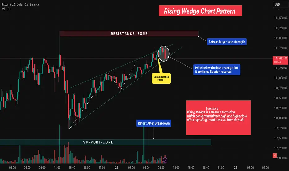
Rising Wedge Chart Pattern 🔎 Overview
The Rising Wedge Pattern is a bearish reversal setup that forms when price moves within a narrowing upward channel — creating higher highs and higher lows that converge toward the top.
It often appears after an uptrend, signaling that bullish momentum is weakening and sellers may soon take control.
As price rises inside the wedge, volume usually decreases, showing fading buyer strength before a potential breakdown .
____________________________________________________________
📔 Concept
• The pattern develops between two converging trendlines sloping upward.
• Each new swing high becomes smaller, showing exhaustion in buyers.
• A break below the lower wedge line confirms the bearish reversal.
• The expected move often equals the height of the wedge projected downward.
____________________________________________________________
📊 Chart Explanation
• Pattern Name → Rising Wedge Chart Pattern
• Resistance Zone → Acts as seller territory where buyers begin losing strength.
• Support Zone → Serves as the final defense; breakdown confirms bearish trend reversal.
• Consolidation Phase → Price compresses within the wedge before breakdown, showing indecision.
• Breakdown Confirmation → When price closes below the lower wedge line, it confirms bearish reversal.
• Retest After Breakdown → Price often retests the wedge from below before continuing downward.
• Summary → Rising Wedge is a bearish pattern of converging higher highs & higher lows, often signaling trend reversal from the upside.
____________________________________________________________
👀 Observation
The Rising Wedge shows weakening bullish pressure as the market climbs with smaller candles and lower volume.
Breakout traders monitor this setup for early reversal opportunities.
The most reliable setups occur near resistance zones or after extended rallies.
____________________________________________________________
💡 Conclusion
A confirmed breakdown below the wedge structure indicates sellers gaining control.
Using proper stop-loss, target projection, and volume confirmation can improve accuracy when trading this reversal formation.
____________________________________________________________
⚠️ Disclaimer
📘 For educational purposes only.
🙅 Not SEBI registered.
❌ Not a buy/sell recommendation.
🧠 Purely a learning resource.
📊 Not Financial Advice.
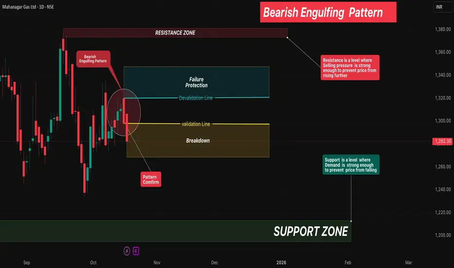
Bearish Engulfing Pattern🔎 Overview
The Bearish Engulfing Pattern is a strong two-candle reversal formation that signals a potential shift from an uptrend to a downtrend.
It occurs when a small bullish (green) candle is immediately followed by a large bearish (red) candle that completely engulfs the prior candle’s body.
This shows a clear shift in market psychology — buyers initially push the price higher, but sellers step in with force and erase those gains, marking the start of bearish momentum.
____________________________________________________________
📔 Concept
A Bearish Engulfing occurs when:
1️⃣ The first candle is a small green candle continuing the uptrend.
2️⃣ The next candle is a large red candle whose body completely engulfs the green candle’s body.
3️⃣ This pattern signals that sellers have regained control after buyer exhaustion.
____________________________________________________________
📌 How to Use
✅ Validation → The candle must close below the open of the red candle to confirm bearish reversal.
❌ Devalidation → If price closes above the close of the red candle before validation, the signal fails.
This structured confirmation helps filter false breakouts and define clear risk levels.
____________________________________________________________
📊 Chart Explanation
• Symbol → NSE:MGL
• Timeframe → 1D
• On 15 Oct 2025 , a small green candle formed, continuing the uptrend.
• On 16 Oct 2025 , a large red candle engulfed the previous green body — confirming the Bearish Engulfing Pattern .
• On 17 Oct 2025 , price broke down further, validating the bearish reversal.
This sequence highlights how quickly market sentiment shifted from bullish to bearish control.
____________________________________________________________
👀 Observation
• The Bearish Engulfing is most reliable near swing highs or resistance zones.
• High volume on the engulfing candle strengthens the reversal signal.
• Combining this pattern with confirmation tools like RSI, Supertrend, or Moving Averages
improves accuracy.
____________________________________________________________
💡 Conclusion
The Bearish Engulfing Pattern marks a clear shift in control from buyers to sellers.
Once validated, it indicates a high-probability reversal setup with defined stop-lose and target zones based on structure or risk-reward multiples.
___________________________________________________________
⚠️ Disclaimer
📘 For educational purposes only.
🙅 Not SEBI registered.
❌ Not a buy/sell recommendation.
🧠 Purely a learning resource.
📊 Not Financial Advice.