Viprasol Elite Advanced Pattern Scanner# 🚀 Viprasol Elite Advanced Pattern Scanner
## Overview
The **Viprasol Elite Advanced Pattern Scanner** is a sophisticated technical analysis tool designed to identify high-probability double bottom (DISCOUNT) and double top (PREMIUM) patterns with unprecedented accuracy. Unlike basic pattern detectors, this elite scanner employs an AI-powered quality scoring system to filter out false signals and highlight only the most reliable trading opportunities.
## 🎯 Key Features
### Advanced Pattern Detection
- **DISCOUNT Patterns** (Double Bottoms): Identifies bullish reversal zones where price may bounce
- **PREMIUM Patterns** (Double Tops): Detects bearish reversal zones where price may decline
- Multi-point validation system (5-point structure)
- Symmetry analysis with customizable tolerance
### 🤖 AI Quality Scoring System
Each pattern receives a quality score (0-100) based on:
- **Symmetry Analysis** (32% weight): How closely the two bottoms/tops match
- **Trend Context** (22% weight): Strength of the preceding trend using ADX
- **Volume Profile** (22% weight): Volume confirmation at key points
- **Pattern Depth** (16% weight): Significance of the pattern's price range
- **Structure Quality** (16% weight): Overall pattern formation quality
Quality Grades:
- ⭐ **ELITE** (88-100): Highest probability setups
- ✨ **VERY STRONG** (77-87): Strong trade opportunities
- ✓ **STRONG** (67-76): Valid patterns with good potential
- ○ **VALID** (65-66): Acceptable patterns meeting minimum criteria
### 🎯 Intelligent Target System
Three target modes per pattern direction:
- **Conservative**: 0.618 Fibonacci extension (safer, closer targets)
- **Balanced**: 1.0 extension (moderate risk/reward)
- **Aggressive**: 1.618 extension (higher risk/reward)
Targets automatically adjust based on pattern quality score.
### 🔧 Advanced Filtering Options
- **Volatility Filter (ATR)**: Excludes patterns during extreme volatility
- **Momentum Filter (ADX)**: Ensures sufficient trend strength
- **Liquidity Filter (Volume)**: Confirms adequate trading volume
### 📊 Pattern Lifecycle Management
- Real-time neckline tracking with extension multiplier
- Pattern invalidation after extended wait period
- Breakout/breakdown confirmation
- Reversal detection (pattern failure scenarios)
- Target achievement tracking
### 🌈 Premium Visual System
- Color-coded quality levels
- Cyber-themed color scheme (Neon Green/Hot Pink/Purple/Cyan)
- Transparent fills for pattern zones
- Dynamic labels with pattern information
- Elite dashboard showing live pattern stats
## 📈 How To Use
### Basic Setup
1. Add indicator to your chart
2. Enable desired patterns (DISCOUNT and/or PREMIUM)
3. Adjust quality threshold (default: 65) - higher = fewer but better signals
4. Set your preferred target mode
### Trading DISCOUNT Patterns (Bullish)
1. Wait for pattern detection (labeled points 1-4)
2. Check quality score on dashboard
3. Entry on breakout above neckline (point 5)
4. Stop loss below the lowest bottom
5. Target shown automatically based on your mode
6. ⚠️ Watch for pattern failure (break below bottoms = SHORT signal)
### Trading PREMIUM Patterns (Bearish)
1. Wait for pattern detection (labeled points 1-4)
2. Check quality score on dashboard
3. Entry on breakdown below neckline (point 5)
4. Stop loss above the highest top
5. Target shown automatically based on your mode
6. ⚠️ Watch for pattern failure (break above tops = LONG signal)
## ⚙️ Input Settings Guide
### 🔍 Detection Engine
- **Left/Right Pivots**: Higher = fewer but cleaner patterns (default: 6/4)
- **Min Pattern Width**: Minimum bars between bottoms/tops (default: 12)
- **Symmetry Tolerance**: Max % difference allowed between levels (default: 1.8%)
- **Extension Multiplier**: How long to wait for breakout (default: 2.2x pattern width)
### ⭐ Quality AI
- **Min Quality Score**: Only show patterns above this score (default: 65)
- **Weight Distribution**: Customize what matters most (symmetry/trend/volume/depth/structure)
### 🔧 Filters
- **Volatility Filter**: Avoid choppy markets (recommended: ON)
- **Momentum Filter**: Ensure trend strength (recommended: ON)
- **Liquidity Filter**: Volume confirmation (recommended: ON)
### 💎 Target System
- Choose target aggression for each pattern type and direction
- Higher quality patterns get adjusted targets automatically
## 🎨 Visual Customization
- Adjust colors for DISCOUNT/PREMIUM patterns
- Set quality-based color coding
- Customize label sizes
- Toggle dashboard visibility and position
- Show/hide historical patterns
## 🚨 Alert System
Set up TradingView alerts for:
- 🚀 **LONG Signals**: DISCOUNT breakout, PREMIUM failure
- 📉 **SHORT Signals**: PREMIUM breakdown, DISCOUNT failure
- ✅ **Target Achievement**: When price hits your target
## 💡 Pro Tips
1. **Higher Timeframes = Better Signals**: Patterns on 4H, Daily, Weekly are more reliable
2. **Quality Over Quantity**: Focus on ELITE and VERY STRONG grades
3. **Combine with Trend**: DISCOUNT in uptrend, PREMIUM in downtrend = best results
4. **Watch Pattern Failures**: Failed patterns often provide strong counter-trend signals
5. **Adjust for Your Style**: Intraday traders use Conservative, swing traders use Aggressive
## 🔒 Pattern Invalidation
Patterns become invalid if:
- No breakout/breakdown within extension period
- Support/resistance levels are broken prematurely
- Pattern shown in faded colors = no longer active
## ⚠️ Risk Disclaimer
This indicator is a tool for technical analysis and does not guarantee profitable trades. Always:
- Use proper risk management
- Combine with other analysis methods
- Never risk more than you can afford to lose
- Past performance does not indicate future results
Support and Resistance

Advanced S&D Engine | ZikZak-Trader30About This Script
This is a fully custom-built Supply & Demand Zone detection engine for TradingView written by ZikZak-Trader30 (Kotdwar, UK). The script identifies potential key supply and demand zones based on market structure and pattern logic widely used by professional traders.
Detected Patterns:
RBR (Rally-Base-Rally, demand)
DBD (Drop-Base-Drop, supply)
RBD (Rally-Base-Drop, supply)
DBR (Drop-Base-Rally, demand)
Features Highlight
Detailed configurable zone filtering (freshness, gap detection, time spent, width, Fibonacci confluence, etc.)
Fair and adjustable scoring system for zone strength
Automatic management/removal of old or retested/violated zones
Optional Fibonacci level confluence and dynamic labeling
Transparency Statement
How It Works:
This script uses well-known price action concepts and compares candles’ movement, consolidation, and breakout patterns to mark S&D zones.
There are no repaints or future leaks: all logic is based entirely on historical and current bars.
Parameters and variables are fully described in the script inputs. The zone scoring and removal logic is also visible in the code for transparency.
IMPORTANT: Usage & Fair-Use Policy
This script is provided for educational and informational purposes only.
It should not be considered as financial advice or a trading signal.
Trading/investing involves risk—always do your own research or consult a financial advisor before making trading decisions.
Past performance or backtest results are not necessarily indicative of future results.
License & Fair Use
The code is original, written by ZikZak-Trader30.
All logic and comments are visible for users to study, adapt, or improve for personal, non-commercial use within TradingView.
You may NOT resell, repackage, or repost this script as your own.
If you fork or publicly remix/adapt the script, please credit "ZikZak-Trader30" and do not remove this disclosure section.
If you use ideas or snippets, kindly reference this script and author.
Absolutely NO plagiarized or resold code is permitted. This script is not for re-sale.
Acknowledgements
This indicator was inspired by years of price action study and usage of public S&D scripts. While the pattern logic is classic in nature, the version and scoring are original.
No proprietary datasets or paid logic from other sources are included.
Minor ideas on zone freshness and Fibonacci blending are common in the TradingView S&D community and have been custom-implemented here.

KVS-Ultimate FVG & iFVG System [MTF + Distance Filter]Description: This indicator identifies Fair Value Gaps (FVG) and Inversion FVGs (iFVG) across multiple timeframes (MTF) with an advanced visualization system. Unlike standard FVG indicators, this script solves the "chart clutter" problem with a unique Distance Filter and offers a customizable Split Label System.
Key Features:
1. Unique Distance Filter (Clean Screen Mode):
When enabled, the script only shows the closest FVGs to the current price within a user-defined limit.
Keeps your chart clean while focusing on relevant price action levels.
2. Split Label System (Tabular Design):
Completely customizable label positioning, sizing, and coloring.
Separate controls for Normal FVGs and iFVGs.
Smart Label Logic: If you hide the FVG box, its label automatically hides. If an FVG breaks and becomes an iFVG (or fades), the label logic switches automatically to the iFVG settings.
3. Strict Mode Filtering:
Enabled: Checks if the candle closing price effectively breaks the previous structure (High/Low of the 1st candle), ensuring high-quality gaps.
Disabled: Detects all gaps between wicks (Standard calculation).
4. Multi-Timeframe (MTF) Support:
Monitor FVGs from up to 5 different timeframes simultaneously on a single chart.
5. Dynamic Interaction:
Choose how the script reacts when an FVG is broken: Turn it into an iFVG (Inversion) or simply fade the color (Ghost/Fade mode).
How to Use:
Use the "Distance Filter" checkbox in settings to clean up old/far blocks.
Adjust "TF1" to "TF5" to set up your multi-timeframe analysis.
Customize the Label Panel to align text perfectly with your chart style.
Disclaimer: This tool is for educational purposes and support for technical analysis.

Magic Equity Trend & PivotsMagic Equity Trend & Pivots is a robust technical analysis engine designed specifically for equity and index traders. It serves as a comprehensive "Trend & Level" companion, combining institutional Pivot Points with a proprietary EMA trend filtering system to identify high-probability setups.
How the Magic Works
This indicator simplifies complex market data into a clear visual workflow:
1. The Magic Equity Trend (Trend Identification) The script uses a weighted system to determine the dominant market direction:
Bullish Trend: Price holds above the primary Trend SMA + a Volatility Buffer (Green Zone).
Bearish Trend: Price is rejected below the Trend SMA - Buffer (Red Zone).
No-Trade Zone: When the price is trapped inside the buffer (Gray Channel), the trend is considered weak or ranging.
2. Institutional Pivot Points Price often reacts at hidden levels. This tool calculates and overlays these levels automatically:
Multi-Type Support: Choose between Traditional, Fibonacci, Woodie, Classic, DM, and Camarilla pivots.
Timeframe Smart-Switching: Use fixed timeframes (e.g., Weekly Pivots on a Daily chart) or let the "Auto" mode decide the best reference period for your current view.
Historical Mode: Unlike standard pivots, these can be back-tested visually to see how prices respected levels in the past.
3. Precision Entry & Exit Logic Trade signals are not random; they are based on a strict confluence of "Magic" factors:
Entry Signal: Requires Trend Alignment + Fast/Slow EMA Crossover + RSI Strength (>60) + Relative Volume Spike.
Top-Up (Add-on): Detects low-risk opportunities to add to a position when price pulls back to the EMA10/20 during a strong trend.
Two-Stage Exit: Secures profits using either an ATR Trailing Stop or an Intraday RSI Breakdown, depending on your settings.
4. Divergence & Momentum
RSI Divergence: Automatically plots Regular Bullish and Bearish divergences to warn of potential reversals at tops or bottoms.
Darvas Boxes: Visualizes consolidation ranges to help identify breakouts.
5. Performance Dashboard A data table provides a snapshot of the asset's health:
Mean Reversion: Measures the % distance from key EMAs (10, 20, 50).
RVOL & ADR: Displays Relative Volume and Average Daily Range to gauge volatility.
Performance Tracker: A theoretical summary table showing how the trend signals have performed over the last 1W, 1M, and 1Y periods.
Settings & Customization
Visuals: Fully customizable colors for the Trend Cloud, Pivots, and Backgrounds.
Filters: Toggle specific filters (Volume, RSI, Trend Buffer) to adapt the sensitivity to different asset classes.
Disclaimer: This tool is for educational purposes and technical analysis assistance only. Past performance displayed in the dashboard does not guarantee future results.

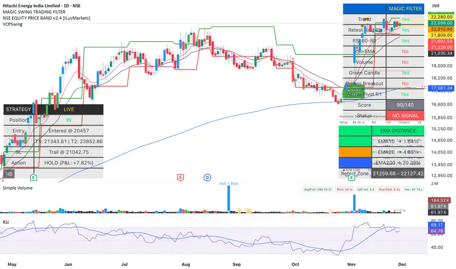
Magic Swing Suite: Trend, Pullback & Risk DashboardMagic Swing Suite: Trend, Pullback & Risk Dashboard
This indicator is a complete Swing Trading System designed to identify high-probability trend continuation setups. It combines classic trend-following principles with a unique "3-Bar Retest" logic and provides a real-time Strategy Dashboard to help you manage positions without needing a separate strategy script.
How it Works:
The system looks for a "Confluence" of factors before generating a signal. It scores every bar out of 140 points based on the following criteria:
Trend Alignment: Price must be above EMA 10, and EMA 10 must be above EMA 20.
Momentum (RSI): RSI must be in the "Bullish Control Zone" (60-80) and above its SMA.
Volume: Volume must be significantly higher than the average (1.5x by default).
The "Magic" Retest: The script checks the last 2-5 bars to see if the price has pulled back to "kiss" the EMA 10. This ensures we are buying a dip in a trend, not chasing a top.
Breakout Confirmation: Checks for Darvas Box breakouts and price position relative to Pivot R1.
Features:
🎯 Virtual Strategy Dashboard: A table that mimics a strategy tester. It tracks Entry, Stop Loss (Trailing), Target 1, and Target 2 in real-time.
📊 Confluence Scorecard: A detailed table showing exactly why a signal was (or wasn't) generated (Trend, Retest, RSI, Volume, etc.).
🛡️ Risk Management: automatically calculates a Trailing Stop (EMA 10) and fixed Risk:Reward targets based on recent highs.
📉 Multi-Layered Overlays: Includes Auto-Pivots (Traditional, Fib, Woodie, etc.) and Darvas Boxes to identify support/resistance levels.
How to Use:
Wait for a Signal:
"FULL BUY SIGNAL" (Green): All conditions are met, including a recent retest of the EMA. This is the highest probability setup.
"BUY - NO RETEST" (Orange): Trend and momentum are strong, but price hasn't pulled back recently. Use caution, as this may be a breakout trade.
Monitor the Dashboard: Once a trade is active, the dashboard will change to "IN POSITION." Follow the "Action" row.
If the trend weakens, the Trailing Stop (EMA 10) will move up to protect profits.
Targets:
T1: Previous Swing High (or 5% if no high found).
T2: 1:1.6 Risk/Reward extension.
Settings:
Volume Spike Factor: Adjust how much volume is needed to confirm a move. Default is 1.2.
Retest Tolerance: Adjust how close the price needs to get to the EMA 10 to count as a "retest."
Dashboard Toggles: You can hide the tables if you prefer a clean chart.
Pivot Timeframes: customizable lookback for S/R levels.
FAQ:
Does this repaint?
No. All signals trigger only on confirmed bars.
Can I use this intraday?
Yes. Works great from 5m to 1D.
Are exits manual or automated?
The indicator tracks SL, T1, and T2, and marks them on the chart.
Does retest affect the buy signal?
Retest is optional. The buy logic does not require it, but adds weight to the score.
Disclaimer: This tool is for educational purposes only. The "Strategy Dashboard" is a simulation based on script calculations and does not execute real trades. Always manage your own risk.
Trade Assist (D4 & D4a) v1Trade Assist - Professional Trading Setup Validator
Overview
Trade Assist is a comprehensive systematic trading indicator designed for forex traders who follow disciplined, rule-based approaches. This indicator eliminates subjectivity by providing clear setup validation with visual confirmations and real-time alerts.
Key Features
Dual Strategy System
- D4 Strategy: Conservative approach for higher-probability setups
- D4a Strategy: Aggressive variant for increased trading opportunities
- Simple dropdown selector to switch between strategies
Real-Time Setup Validation
Trade Assist analyses multiple market conditions simultaneously and provides instant feedback on whether a valid trading setup exists. The indicator displays clear visual signals:
- 🟢 Valid Buy/Sell - All criteria met, setup confirmed
- ⚠️ Check 1:1 - Valid setup with caution flag (requires additional verification)
- ❌ No Valid Setup - Specific failure reason displayed
Intelligent Filtering System
The indicator applies multiple validation layers to filter out low-quality setups:
- Trend confirmation requirements
- Range position analysis
- Candle structure validation
- Support/Resistance clearance checks
- Weekly level awareness
Visual Trading Aids
- SL/TP Guide: Dynamic bands showing optimal stop loss and take profit zones
- Pip Counter: Real-time pip distance calculations adjusted for JPY and non-JPY pairs
- Trend Display: Clear bullish/bearish trend identification
Smart Alerts
Integrated TradingView alert system notifies you the moment a valid setup appears:
- Instant notifications to mobile/desktop
- Customizable alert messages showing pair and direction
- "Only Once" frequency recommended to avoid alert spam
Grey Zone Protection
Automatically detects when price action becomes unclear or choppy, protecting you from marginal trades during uncertain market conditions.
Position Grading System
Not all valid setups are equal. Trade Assist grades entry positions:
- Clean Zone: Optimal entry location within range
- Warning Zone: Valid but less ideal positioning
- No Trade Zone: Entry location fails risk/reward criteria
Designed For
- Systematic forex traders on 4-hour timeframes
- Traders who value mechanical rules over discretion
- Anyone seeking to eliminate emotional decision-making
- Traders managing multiple currency pairs (optimized for 28 major pairs)
What You Get
✅ Objective setup validation - no guesswork
✅ Clear entry signals with specific failure reasons when criteria aren't met
✅ Automated pip calculations for SL/TP planning
✅ Multi-strategy flexibility in a single indicator
✅ Real-time alerts for valid setups
✅ Risk management guidance through visual zones
Important Notes
- This is a setup validation tool, NOT A SIGNAL SERVICE
- Designed for traders who understand price action and risk management
- Works best when combined with proper trading plan and money management
- Optimized for forex pairs (28 majors including JPY crosses)
- Recommended timeframe: 4H
Customization Options
- Strategy selection (D4/D4a)
- SL/TP band colours
- Display positions for tables
- Optional 50% ATR display
- Pip counter toggle
- Visual element customization
---
Access: Invite-only
Best For: Disciplined systematic traders
Markets: Forex (optimized)
Timeframes: 4H
Trade Assist brings clarity to your trading decisions by providing objective, rule-based validation for every potential setup. Stop guessing, start trading with confidence.

SPY Key LevelsUse Case
Do you belong to a group of traders that post key levels based on their technical analysis to be utilized for trading opportunities? The goal of this indicator is to reduce your daily prep time by allowing you to paste in the actual level values instead of trying to manually create each of the horizontal lines.
How it works
Simply enter the values of the key levels that you would like to plot horizontal lines for
Settings
You can enable/disable any of the levels
You can change the colors of the levels
You can add Previous Day High and Previous Day Low levels to the chart
Limitations
Currently the levels (besides PDH/PDL) are hardcoded to only display for the SPY security "AMEX:SPY"
// Terms \\
Feel free to use the script, If you do use the script could you please just tag me as I am interested to see how people are using it. Good Luck!

Tomo's Pivots // last W, last M, last Q, last30d, last90d.These are pivots that you can use to look back at various time periods to find magnetic Price points of support and resistance. There are: weekly, last 30 days, last month, last 90 days, and last quarter. You can change the color and style of every indicator and its label. So if it happens to be November 29 today, you will see the last 90 days representing 90 days before November 29. But you will also see last quarter which represents from July 1 to September 30. These values are fair value equilibrium price point by averaging the high low and close of that time period. Weekly is great for intraday trading and the last 30 is great for momentum. Consider using the monthly for swing trading. Stay in the green.

@DARKPOOL Magnet - MEMEDescription:
The @DARKPOOL Magnet indicator identifies and displays significant price levels where institutional buying and selling activity has created persistent support and resistance zones. The indicator focuses on three primary types of institutional footprints:
Pin Zone Detection: Identifies price levels where multiple pin bars (high volume, narrow range candles) have clustered within a specified tolerance, indicating repeated institutional defense of those levels.
Whale Footprint Detection: Detects absorption events where significant volume occurs with minimal net price movement, suggesting large institutional orders being filled without allowing substantial directional movement.
Dark Pool Detection: Identifies potential dark pool prints characterized by unexplained price gaps that occur without visible tape activity, indicating off-exchange institutional transactions.
The indicator draws horizontal lines at these identified institutional price levels and highlights areas where multiple detection methods converge, creating confluence zones that represent higher probability support and resistance levels.
Confluence lines are displayed when multiple independently identified institutional levels occur within a user-specified proximity, providing visual emphasis on price levels with the strongest institutional interest.

AG Pro Dynamic Channels PremiumAG Pro Dynamic Channels Premium
The Gold Standard in Automated Market Structure.
AG Pro Dynamic Channels Premium is the culmination of advanced algorithmic development, designed specifically for professional traders who refuse to compromise on chart clarity.
While standard indicators flood your screen with noise, this Premium edition employs a proprietary "Smart Filtering Engine" to identify, validate, and project only the most statistically significant support and resistance channels. It transforms chaos into a clear, actionable roadmap.
🏆 Why Go Premium?
This is not just an update; it is a complete overhaul of the trend detection logic.
1. 🧠 Smart Quality Control (Exclusive) The core difference in the Premium version is its ability to "think" before it draws.
Volatility Filtering: The script analyzes the slope of every potential trend. It automatically rejects unsustainable "pump/dump" moves and flat ranges, keeping only tradeable structures.
Wick Exclusion Logic: An advanced algorithm that ignores extreme volatility spikes (wicks), drawing channels based on candle body consolidation for higher precision.
2. 🏷️ Intelligent Labeling System Instant situational awareness. Every channel is auto-labeled (e.g., Mj Ext Up), so you know exactly which market phase (Major or Minor, Internal or External) you are trading in without guessing.
3. ⚡ Zero-Lag Optimization The code has been refactored for maximum efficiency, ensuring faster load times and smoother performance even on lower timeframes.
💎 Key Features
Dual-Layer Architecture: Simultaneously tracks Major Trends (for bias) and Minor Trends (for entries).
Dynamic Support & Resistance: The dotted midline acts as a high-probability reversal zone.
Institutional Grade Alerts: Fully customizable alerts for Breakouts and Reactions, complete with metadata for automated trading systems.
Auto-Tuning: Default settings are optimized for a balance of sensitivity and reliability, but fully customizable for specific assets (Crypto, Forex, Indices).
⚙️ Methodology (How It Works)
To comply with TradingView House Rules, here is the technical logic behind the script:
Pivot Detection: The script scans price action using a highly sensitive lookback period to find raw Pivot Highs and Lows.
Structure Mapping: It processes these points to define the Market Structure (HH, LL, LH, HL).
Validation Layer: Before rendering, the Smart Filter calculates the channel's duration and slope coefficient. If the channel is too short or too steep (violating the user-defined Max Slope threshold), it is discarded as "Market Noise."
Projection: Validated channels are drawn with dynamic extensions and fill zones.
🔒 How to Get Access
This is an Invite-Only script. Access is restricted to authorized users.
To Request Access: Please send me a private message on TradingView or check the links in my profile signature for more information.
Existing Members: If you have active access, the script will load automatically.
Disclaimer: Technical analysis tools are for educational purposes. Past performance does not guarantee future results.
Developed by Ali Gurtuna (AG Pro Series).

🎯 APEX-SIGNAL PROAPEX-SIGNAL PRO System
This is a private indicator for members only. อินดิเคเตอร์นี้เป็นระบบปิดสำหรับสมาชิก APEX-SIGNAL PRO เท่านั้น
Features:
High accuracy trend following system.
Support & Resistance calculation.
Easy to use for beginners and professionals.
Access / วิธีการเข้าใช้งาน: Please contact admin for access permissions. กรุณาติดต่อแอดมินเพื่อขอสิทธิ์การใช้งาน Contact:
คำแนะนำ: หลังจากวางข้อความแล้ว กด Continue -> หน้าถัดไปอย่าลืมเลือก "Invite-only script" นะครับ!

Adaptive Support & Resistance ProAdaptive Support & Resistance Pro – Description
Adaptive Support & Resistance Pro is an advanced S/R tool designed to automatically identify key support and resistance zones based on a combination of RSI, CMO dynamics, and pivot logic. This indicator provides precise and reactive levels that form only when specific technical conditions are met, filtering out noise and delivering more reliable S/R signals.
It is ideal for technical traders who want to understand where price naturally pauses, reverses, or consolidates—without the need to manually draw lines on every chart.
🔍 Key Features
1. Automatic Support & Resistance Detection
The indicator uses:
RSI (9)
CMO logic based on HMA
Pivot structure (len = 2)
to generate valid Support and Resistance zones.
A level is drawn only when all required conditions align, preventing false or weak signals.
2. Multi-Timeframe Analysis (MTF)
You can view the chart on one timeframe (e.g., 5m)
and display Support/Resistance levels from another timeframe (e.g., 1H, 4H, D) at the same time.
This allows for:
viewing higher-timeframe structures on lower charts,
better planning of entries and exits,
avoiding trades inside strong zones that may not be visible on the current timeframe.
All of this is controlled through the input:
S/R Timeframe
3. Adjustable Line Thickness (visual enhancement)
Using the input:
Line Width
you can increase the thickness of support/resistance lines to:
make important zones more visible,
improve chart readability,
emphasize S/R levels according to your visual preference.
This is especially useful on fast markets (Forex, Crypto) and on higher timeframes where clarity of levels is essential.
4. Clear distinction between Support and Resistance
Support lines have their own customizable color (default: green)
Resistance lines have their own customizable color (default: red)
You can freely adjust the colors to match your personal TradingView layout or theme.
5. Alerts (Notification System)
The built-in alert:
"New S/R line"
triggers whenever a new support or resistance level is detected.
This helps you:
monitor important levels without constantly watching the chart,
react quickly to new structure signals,
stay aware of market changes in real time.
🎯 How to Use the Indicator
Support levels often indicate potential reversals or long-entry opportunities.
Resistance levels highlight areas where price may reverse downward or form short setups.
The best performance is achieved when combining this indicator with:
price action,
EMA structure,
confirmation zones,
breakout logic,
trend filters.
MTF usage is highly recommended:
Analyze higher-timeframe S/R while trading lower-timeframe setups.
⚠️ Disclaimer
This indicator does not generate direct buy or sell signals.
Its purpose is to assist in market analysis and highlight areas where price is likely to react.
📌 Conclusion
Adaptive Support & Resistance Pro combines the strongest elements of automated S/R mapping: precision, reduced noise, multi-timeframe flexibility, and advanced logic based on RSI, CMO, and pivot structure.
It is perfect for traders who want:
clean and accurate S/R levels,
higher-timeframe insight while trading lower charts,
customizable and visually enhanced structure mapping.

Just SetupJust Setup — Modular Multi-Timeframe MA + Intraday Levels
Just Setup is a modular multi-timeframe tool that combines customizable Moving Averages with key intraday market levels.
It is designed for traders who need a flexible, clean and highly configurable structure that adapts naturally to any trading style — intraday or swing.
🎛️ Main Features
1️⃣ Four Fully Independent MA Groups
Each MA group includes:
On/Off toggle
Independent visibility range (Min TF / Max TF)
Up to 3 MA lines per group
10+ MA types (EMA, SMA, HMA, TEMA, DEMA, VWMA, WMA, SMMA, ZLEMA, LSMA)
Custom period, color and width
Dynamic labels with automatic text contrast
All MAs are calculated directly on the active chart (no request.security), meaning no repainting or sliding values.
2️⃣ Automatic MA Labels
Shows MA type + length
Adjusts text color based on background for maximum readability
Appears only on the last candle to keep charts clean
3️⃣ Previous Day High & Low (PDH / PDL)
Automatically detects previous day’s high & low
Extends levels across the current session
Optional labels
Supports multi-day history
Useful for identifying reactive liquidity zones and structural S/R context.
4️⃣ Premarket High & Low (PMH / PML)
Detects premarket range (04:00–09:30 ET)
Locks levels at market open
Extends lines throughout the trading day
Optional labels
Automatic session reset
5️⃣ All-Time High (ATH) Line
Automatically tracks and updates ATH
Clean visual line with optional label
No history shifting or distortion
⚙️ Ideal Use Cases
Multi-TF trend context
MA confluence framework
Intraday levels (PDH/PDL, PMH/PML)
Higher timeframe swing structure
Clean, configurable chart layouts
System building and backtesting environments
🚫 Disclaimer
This indicator does not generate buy/sell signals and should not be considered financial advice. It is a visual analysis tool meant to support independent decision-making.

PyraTime Intraday Cycles**Concept and Methodology**
PyraTime Intraday Cycles is a technical analysis tool designed to introduce the concept of **Temporal Cycle Projection**. While most indicators analyze price action (Y-axis), this tool focuses exclusively on the X-axis (Time).
By anchoring to a specific "Origin Pivot" (a user-defined High or Low), the script projects harmonic time intervals into the future. These vertical vectors serve as a grid, helping traders identify moments where time-based cycles may align with price structure.
**Technical Features**
This edition is optimized for **Multi-Timeframe Harmonic Flows**, utilizing a fixed algorithm for key intervals:
* **Anchor Point Logic:** The user manually selects a significant market pivot. The script calculates forward projections from this exact timestamp.
* **Standard Rhythms:** This version renders the **5-minute**, **15-minute**, **1-hour**, and **Daily** harmonic sequences. This allows for analysis across scalping, intraday, and swing trading structures.
* **Visual Confluence:** The indicator draws vertical lines to highlight potential zones of temporal exhaustion or acceleration.
**How to Use**
1. **Identify a Pivot:** Locate a significant High or Low on the chart.
2. **Set the Origin:** Open the settings and input the date/time of that pivot.
3. **Analyze Confluence:** Watch how price behaves when it approaches a vertical line. If price hits a key support/resistance level *at the same time* it hits a PyraTime vertical line, this is considered a high-probability "Time/Price" intersection.
**Version Comparison**
This script represents the foundational layer of the Great Pyramid system (PyraTime Apex).
* **PyraTime Intraday Cycles (This Script):** Focuses on Standard Timeframes (5m, 15m, 1h, Daily).
* **GPM Architecture (Advanced):** The full methodology extends these calculations to Esoteric Sequences (33, 144, 108), includes 3x Cycle Extensions, and features a Predictive Dashboard for complex multi-timeframe analysis.
**Disclaimer**
This tool is for educational and analytical purposes only. It identifies time cycles, not price direction. Past performance of a time cycle does not guarantee future results.

Gamma Levels w/AlertsPlots Gamma Levels for identifying Market Positioning. Has alert function on the specific levels.
---To apply to different tickers You Must:
1. apply to chart layout
2. input ticker specific levels
3. Save as an INDICATOR TEMPLATE titled same as ticker (check the remember symbol box)
Now when switching to different tickers, simply open that template

Confirmed Pivots + MACD Signals (with BOS Lines)Confirmed Pivots + MACD Signals
This indicator combines confirmed swing highs/lows (pivots) with MACD-based momentum signals to highlight key reversal and continuation points on the chart.
Core Logic
Confirmed Pivots:
The script identifies swing highs and lows using the user-defined pivot confirmation length.
Once a structure is broken beyond the last pivot, that level becomes a confirmed support (CL) or resistance (CH) line.
These levels are plotted as dashed horizontal rays and labeled directly on the chart.
MACD Integration:
The classic MACD crossover/under logic is used:
Bullish Crossover: MACD line crosses above the Signal line.
Bearish Crossunder: MACD line crosses below the Signal line.
Signal Filtering by Proximity:
A Proximity Zone (%) defines how close price must be to an active support or resistance to trigger a signal.
Buy Signal: When price is within the support zone and a bullish MACD crossover occurs.
Sell Signal: When price is within the resistance zone and a bearish MACD crossunder occurs.
Inputs
Pivot Confirmation Length: Bars used to confirm swing points.
MACD Fast/Slow/Signal Lengths: Standard MACD settings.
Proximity Zone (%): Defines zone width (e.g., 1% around active level).
Output
Labels: "CH" (Confirmed High) and "CL" (Confirmed Low) with color-coded dashed lines.
Signals: "BUY" and "SELL" markers appear when both pivot and MACD conditions align.
Tips
Works best on higher timeframes (H1 and above).
Combine with price action or trend filters for confirmation.
Use proximity percentage according to volatility (e.g., smaller % for low-vol assets).
⚠️ Disclaimer:
This script is provided for educational and informational purposes only.
It does not constitute financial or investment advice, and the author is not responsible for any financial losses that may occur from its use.
Always perform your own analysis and use this indicator together with other technical and risk management tools before making trading decisions.
---------------------------------------------------------------------------------------------
سقف و کف تاییدشده + سیگنالهای MACD
این اندیکاتور ترکیبی از شناسایی سقفها و کفهای تاییدشده (Pivot High/Low) به همراه سیگنالهای مومنتوم MACD است که نقاط برگشت یا ادامهی روند را روی چارت مشخص میکند.
🔹 منطق عملکرد
تایید سقف و کفها:
ابتدا سقف و کفهای محلی بر اساس تعداد کندلهای تنظیمشده شناسایی میشوند.
وقتی ساختار قیمتی از آخرین سقف یا کف عبور کند، آن سطح به عنوان حمایت یا مقاومت تاییدشده در نظر گرفته شده و با برچسبهای “CL” (کف تاییدشده) و “CH” (سقف تاییدشده) و خطوط نقطهچین رسم میشود.
ادغام با MACD:
از منطق کلاسیک کراساور/کراسآندر MACD استفاده شده است:
کراس صعودی: عبور خط MACD از بالای خط سیگنال.
کراس نزولی: عبور خط MACD از زیر خط سیگنال.
فیلتر سیگنال با ناحیه مجاور:
با استفاده از درصد ناحیه مجاور (Proximity Zone %)، فقط زمانی سیگنال صادر میشود که قیمت نزدیک حمایت یا مقاومت فعال باشد.
سیگنال خرید: وقتی قیمت در ناحیهی حمایت و همزمان MACD صعودی شود.
سیگنال فروش: وقتی قیمت در ناحیهی مقاومت و همزمان MACD نزولی شود.
تنظیمات ورودی
طول تأیید پیوتها
تنظیمات MACD (Fast, Slow, Signal)
درصد ناحیه مجاور برای فعال شدن سیگنالها
خروجیها
برچسبهای “CL” و “CH” برای سطوح تاییدشده
نشانگرهای “BUY” و “SELL” در محل صدور سیگنال
نکات کاربردی
بهترین عملکرد در تایمفریمهای بالاتر (۱ ساعته به بالا)
برای دقت بیشتر، آن را با فیلتر روند یا پرایساکشن ترکیب کنید
درصد ناحیه مجاور را با توجه به نوسانات دارایی تنظیم کنید

Eggy Signal V2.1This script is a fully automated mechanical trading system designed to identify high-probability continuation setups based on significant market volatility expansions. It moves beyond simple crossovers or lagging indicators by analyzing price action structure and momentum velocity.
The algorithm detects specific "price disconnects" where aggressive buying volume has occurred, creating a high-value zone for potential re-entries. It waits for the market to efficiently rebalance and test these zones before signaling a trade, ensuring that you only engage with the market at discounted prices.
Key Features:
Algorithmic Zone Detection: The script automatically scans for significant volatility expansions. It uses an ATR (Average True Range) filter to ignore market noise and small fluctuations, focusing only on high-impact moves that indicate genuine institutional interest.
Smart Workflow (State Machine): Unlike standard indicators that spam signals, this tool uses a "State Machine" logic. It follows a strict discipline:
Phase 1 (Scan): Hunts for valid momentum zones.
Phase 2 (Wait): Projects a Limit Order setup (Entry, Stop Loss, Take Profit) and waits for the price to return (pullback).
Phase 3 (Active): Only activates the trade status if the price strictly touches the entry level.
Analysis Validation ("Missed Trade" Logic): A unique feature of this system is its ability to validate analysis even if no trade is taken. If the market respects the zone and hits the target without triggering your entry first, it marks the setup as "MISSED (Analysis OK)" in Green. This confirms the directional bias was correct, helping you build confidence in the algorithm without skewing your PnL.
Strict Risk Management: The system comes with a built-in, fixed Risk-to-Reward ratio (Default 1:2) to ensure positive expectancy over the long term.
How to Use:
Wait for the Setup: When a valid zone is detected, the script will draw the Entry (Blue), Stop Loss (Red), and Target (Green) lines. The status will read "WAITING".
Prepare Order: Place a Limit Order at the Blue line shown on the chart.
Execution:
If price touches the Blue line, the trade becomes "ACTIVE".
If price hits the Green line, it is a "WIN".
If price hits the Red line, it is a "LOSS".
Auto-Reset: Once a trade is concluded (Win/Loss) or invalidated, the drawings automatically clear to keep your chart clean for the next opportunity.
Settings:
Swing Length: Adjusts the sensitivity of the market structure detection.
Risk Reward: Define your target multiple (e.g., 1:2 or 1:1.5).
Minimum Zone Size (Volatility Filter): Filters out insignificant moves. Higher values = fewer but higher quality setups.
24 minutes ago
Release Notes
With Alerts
⚠️ How to Activate Notifications (Mobile & PC)
Add the Indicator to your chart first.
On the right toolbar, click the Alerts icon (looks like a clock).
Click the Create Alert button (the + icon).
Condition: Change it from the symbol (e.g., XAUUSD) to Eggy Signal V2 (With Alerts).
Trigger: Select "Any alert() function call".
Important: You must select this option because the code uses dynamic alert() messages.
Notifications tab:
Check Notify in App (to get notifications on your phone).
Check Show Pop-up (to see it on your PC screen).
Alert Name: Give it a name (e.g., "Eggy Signal V2").
Click Create.

Alpha Net Pro Support/ResistanceAlpha Net Pro Support/Resistance is a hybrid indicator that combines pivot-based support/resistance zone detection with Stochastic RSI to highlight high-probability reversal points. It is designed to help traders identify areas where price action is likely to react, and generate context-aware buy/sell signals based on momentum and structure alignment.
This tool overlays adaptive support/resistance channels directly on the chart while scaling the Stochastic RSI oscillator visually to the price action, enhancing usability in live environments.

Eggy Signal V2This script is a fully automated mechanical trading system designed to identify high-probability continuation setups based on significant market volatility expansions. It moves beyond simple crossovers or lagging indicators by analyzing price action structure and momentum velocity.
The algorithm detects specific "price disconnects" where aggressive buying volume has occurred, creating a high-value zone for potential re-entries. It waits for the market to efficiently rebalance and test these zones before signaling a trade, ensuring that you only engage with the market at discounted prices.
Key Features:
Algorithmic Zone Detection: The script automatically scans for significant volatility expansions. It uses an ATR (Average True Range) filter to ignore market noise and small fluctuations, focusing only on high-impact moves that indicate genuine institutional interest.
Smart Workflow (State Machine): Unlike standard indicators that spam signals, this tool uses a "State Machine" logic. It follows a strict discipline:
Phase 1 (Scan): Hunts for valid momentum zones.
Phase 2 (Wait): Projects a Limit Order setup (Entry, Stop Loss, Take Profit) and waits for the price to return (pullback).
Phase 3 (Active): Only activates the trade status if the price strictly touches the entry level.
Analysis Validation ("Missed Trade" Logic): A unique feature of this system is its ability to validate analysis even if no trade is taken. If the market respects the zone and hits the target without triggering your entry first, it marks the setup as "MISSED (Analysis OK)" in Green. This confirms the directional bias was correct, helping you build confidence in the algorithm without skewing your PnL.
Strict Risk Management: The system comes with a built-in, fixed Risk-to-Reward ratio (Default 1:2) to ensure positive expectancy over the long term.
How to Use:
Wait for the Setup: When a valid zone is detected, the script will draw the Entry (Blue), Stop Loss (Red), and Target (Green) lines. The status will read "WAITING".
Prepare Order: Place a Limit Order at the Blue line shown on the chart.
Execution:
If price touches the Blue line, the trade becomes "ACTIVE".
If price hits the Green line, it is a "WIN".
If price hits the Red line, it is a "LOSS".
Auto-Reset: Once a trade is concluded (Win/Loss) or invalidated, the drawings automatically clear to keep your chart clean for the next opportunity.
Settings:
Swing Length: Adjusts the sensitivity of the market structure detection.
Risk Reward: Define your target multiple (e.g., 1:2 or 1:1.5).
Minimum Zone Size (Volatility Filter): Filters out insignificant moves. Higher values = fewer but higher quality setups.

Institutional Zones | Rushi TradesA minimalist Supply & Demand indicator designed for professional scalpers. Filters out noise by identifying only high-momentum institutional zones. Features dynamic visibility (shows only the nearest zones) and auto-cleans broken levels to keep your chart pristine.
Premium Zones is a high-precision technical tool designed for traders who value chart clarity and institutional logic. Unlike standard support/resistance indicators that clutter the screen with hundreds of lines, this script focuses purely on Significant Structure.
It identifies Supply and Demand zones based on Price Velocity—ensuring that a level is only drawn if price reacted aggressively from that point (a sign of institutional order flow).
Key Features:
Velocity-Based Detection:
The algorithm does not rely on simple pivots. It requires a "Strong Move" (customizable Momentum Strength) away from a level to confirm it as a valid zone. This filters out weak retail levels and "stop hunts."
Dynamic Visibility Engine (The "Clean Chart" Protocol):
Nearest Zones Only: You can set a limit (e.g., 3 or 5). The script automatically hides zones that are far away and only displays the ones closest to current price. As price moves, new zones fade in automatically.
Auto-Management:
Break & Delete: If a candle closes beyond a zone, the script instantly deletes it. No more confusing "ghost levels" from the past.
Live Updates: Zones extend automatically until they are tested or broken.
Premium Aesthetics:
Designed with a "Glass" transparency effect.
Smart Labels: Price tags are placed externally (floating above/below the zone) in clean black text, ensuring they never obscure the candle action inside the zone.
Recommended Settings:
This indicator is highly effective for volatile assets like XAUUSD (Gold), US30, and Forex/Indian Majors.
For XAUUSD (Gold) Scalping (M5 / M15):
Pivot Lookback: 15 (Filters local noise)
Momentum Strength: 2.0/1.5 (Ensures only violent reversals are caught)
Max Visible Zones: 3 (Keeps focus on immediate price action)
For Day Trading / Swing (H1 / H4):
Pivot Lookback: 10
Momentum Strength: 1/1.5
Max Visible Zones: 3
How to Trade With It:
The Rejection: Do not place blind limit orders. Wait for price to enter a Premium Zone and show a rejection candle (wick) or a shift in market structure on a lower timeframe.
First Touch: These zones are most accurate on the first retest.
Developed by Rushi Trades

TR-ATR-DATR+MAs shows the Range of selected Candle + 3 Moving Averages
True Range
Avg True Range
Daily Range


Support Resistance📌 1. Indicator Name
Premium Auto Support & Resistance
📌 2. One-Line Description
An automated S/R system that generates support and resistance zones based on swing highs and lows, displaying them in a premium visual style directly on the chart.
📌 3. Overall Summary (7+ lines)
This indicator automatically detects price levels where the market has repeatedly reacted and generates support and resistance zones.
Instead of simple horizontal lines, it visualizes reaction ranges as zones, helping traders clearly understand the actual price areas where activity occurs.
It uses swing points (high/low pivots) as the fundamental basis and continuously updates only the most meaningful recent S/R levels.
A smoothing process is applied, reducing noise and creating more natural, reliable S/R zones.
Support and resistance are displayed as filled transparency-based zones, enabling intuitive identification of zone strength and market position.
When price touches one of these zones, a small signal appears to highlight potential reversal points.
All elements are plotted directly over the candles with overlay=true, making it an instantly usable and visually premium tool.
📌 4. Advantages (6 items)
① Automatic Swing-Based S/R Detection
Automatically analyzes key pivot points and extracts only the most meaningful support and resistance levels.
② Support/Resistance Zone Structure
Provides intuitive reaction ranges instead of single lines, making it far more practical for real trading.
③ Smooth Premium-Style Lines
S/R lines are smoothed to remove noise, maintaining a natural and refined premium visual appearance.
④ Automatic Candle-Touch Alerts
Displays signals whenever price touches support or resistance, helping you quickly identify potential reversal areas.
⑤ Overlay-Based Immediate Clarity
Drawn directly onto the chart without occupying indicator windows, keeping visual focus on price action.
⑥ Simple Yet Powerful Framework
A pivot + smoothing + zone combination that strengthens automatic S/R detection while remaining easy for beginners to use.
