Trade ideas
Relative Strength Index (RSI) Indicator Secrets1. The Hidden Meaning Behind RSI Levels
Most traders use the 70/30 rule blindly. In reality, RSI levels are relative, not absolute. For instance:
In a strong uptrend, RSI can remain above 70 for a long period — this does not mean the market will immediately reverse. It often indicates strong bullish momentum.
In a downtrend, RSI can stay below 30 for an extended time — signaling strong bearish pressure, not necessarily an immediate bounce.
Secret Tip:
Adjust your RSI levels based on market conditions:
Bullish market: Use RSI zones of 40–80 (support around 40, resistance around 80).
Bearish market: Use RSI zones of 20–60 (resistance around 60, support around 20).
By doing this, you interpret RSI in the context of trend strength rather than treating it as an isolated signal.
2. RSI as a Trend Identifier
One of the most overlooked uses of RSI is trend confirmation. Traders often rely on moving averages or price patterns to identify trends, but RSI can do this more efficiently.
In uptrends, RSI tends to stay above 40 and frequently reach 70–80.
In downtrends, RSI remains below 60 and often hits 20–30.
Secret Insight:
If RSI repeatedly bounces from the 40–50 zone during a price pullback, it suggests that the uptrend is healthy. Conversely, if RSI fails to move above 60 during rallies, it signals weakness in the market.
This method helps traders stay with the trend longer, instead of prematurely exiting a position when RSI crosses traditional overbought or oversold levels.
3. RSI Divergence – The Ultimate Reversal Signal
RSI divergence is one of the strongest signals for trend reversal. It occurs when the price makes a new high or low that isn’t confirmed by the RSI.
Bullish Divergence: Price makes a lower low, but RSI makes a higher low — signaling potential upward reversal.
Bearish Divergence: Price makes a higher high, but RSI makes a lower high — indicating possible downward reversal.
Secret Tip:
For divergence to be effective, it must occur after a strong trend and be confirmed by volume or candlestick patterns (like Doji, hammer, or engulfing). Many traders lose money by trading every small divergence — patience is key.
Additionally, hidden divergence can predict trend continuation:
Hidden Bullish Divergence: RSI makes a lower low, but price makes a higher low → continuation of uptrend.
Hidden Bearish Divergence: RSI makes a higher high, but price makes a lower high → continuation of downtrend.
Combining regular and hidden divergences can give traders early entry signals and improve accuracy.
4. RSI Swing Rejections: The Secret Entry Technique
Welles Wilder’s original writings described an advanced RSI technique called “Swing Rejection”, which most traders overlook.
A bullish swing rejection occurs when:
RSI drops below 30 (oversold zone).
It rises above 30.
Pulls back but stays above 30.
Then breaks its previous high.
This pattern signals a strong bullish reversal — often before the price fully turns up.
A bearish swing rejection is the opposite:
RSI rises above 70.
Falls below 70.
Rebounds but fails to cross 70 again.
Then breaks its prior low — confirming weakness.
Secret Insight:
Swing rejections filter out false overbought/oversold signals and identify high-probability turning points in the market.
5. RSI with Multiple Time Frames
Professional traders rarely rely on a single RSI setting or timeframe. Instead, they confirm RSI signals across multiple timeframes.
For example:
If the daily RSI is oversold but the weekly RSI is still in a downtrend, the bounce may be short-lived.
When both daily and weekly RSI align in the same direction, it indicates a powerful trend reversal or continuation.
Secret Tip:
Use RSI(14) on higher timeframes (daily/weekly) for trend bias, and RSI(7) or RSI(9) on lower timeframes (hourly or 4-hour) for precise entries.
6. RSI and Moving Averages – A Smart Combination
Combining RSI with moving averages creates a more reliable trading system. For example:
Use a 50-period moving average to determine the trend direction.
Trade RSI signals only in the direction of the moving average.
Example:
If the price is above the 50-MA and RSI bounces from 40 → it’s a strong buy signal.
If the price is below the 50-MA and RSI drops from 60 → it’s a strong sell signal.
This combination filters out false signals and aligns trades with the dominant market trend.
7. RSI Range Shifts – The Professional Secret
A rarely discussed RSI secret is the concept of range shifts. In a strong uptrend, RSI tends to move between 40–80 instead of 30–70. In a strong downtrend, it shifts between 20–60. Recognizing this range shift early helps traders identify when the market transitions from sideways to trending behavior.
When RSI consistently fails to fall below 40 and pushes above 70, it confirms that bulls control the market. Conversely, when RSI struggles to rise above 60 and keeps hitting 30, bears dominate.
Spotting a range shift early can help you enter trends sooner and ride them longer.
8. Customizing RSI Periods for Different Assets
Most traders use the default 14-period RSI. However, adjusting the period can dramatically change its responsiveness:
Shorter RSI (5 or 7): More sensitive, gives early signals but more noise.
Longer RSI (20 or 30): Smoother, fewer false signals but more lag.
Secret Tip:
For volatile instruments like cryptocurrencies or small-cap stocks, use a shorter RSI (7–10).
For stable assets like large-cap stocks or indices, use longer RSI (14–21).
Customizing RSI settings according to volatility improves accuracy and reduces whipsaws.
9. Psychological Secrets of RSI
At its core, RSI reflects market psychology — the tug-of-war between buyers and sellers. When RSI rises above 70, it shows traders’ greed; when it falls below 30, it reveals fear. Understanding this helps you trade in the opposite direction of crowd emotions.
The best traders use RSI not just as a technical tool, but as a window into trader sentiment. Combining RSI readings with support/resistance zones or volume analysis offers a powerful edge.
10. Conclusion
The RSI indicator is far more than a simple overbought/oversold tool. Its true strength lies in understanding context, trend structure, divergence, and range behavior. By mastering RSI’s hidden secrets — such as swing rejections, range shifts, and multiple timeframe confirmations — traders can dramatically improve accuracy and timing.
When used intelligently, RSI reveals the rhythm of market momentum and helps traders ride trends, spot reversals, and stay on the right side of price action. Like all tools, it works best when combined with sound risk management, patience, and discipline — the true secrets behind profitable trading.
Trump’s $2,000 stimulus = $600B Liquidity: Bitcoin To the Moon?Trump’s $2,000 Stimulus Could Light the Fuse for the Biggest Crypto Rally Ever
This isn’t just another political headline.
If Trump’s plan to send $2,000 stimulus checks funded by tariff dividends actually happens, it could unleash a $600 billion liquidity wave into the economy.
That’s nearly the same scale as the 2020 stimulus, which kicked off one of the most legendary bull runs in history.
🔹 Bitcoin skyrocketed from $3,800 to $69,000
🔹 Ethereum exploded from $90 to $4,800
🔹 Altcoins went absolutely wild, 50x, 100x, even more
But here’s the twist...
This time, the setup is 10x stronger.
In 2020, those checks were about survival, paying rent, buying food, covering bills.
Crypto was new. ETFs didn’t exist. Institutions were on the sidelines.
Now? The game has completely changed.
✅ Crypto is mainstream
✅ Bitcoin ETFs are live
✅ Institutions are ready to buy
✅ Retail access is everywhere
✅ The U.S. economy is growing, not crashing
In 2020, people used stimulus to survive.
In 2025, they’ll use it to invest.
When money flows into a market that’s already primed for risk...
That’s not just bullish, that’s explosive.
The 2020 checks fueled a survival rally.
The 2025 checks could ignite a speculation supercycle.
Imagine $600 billion pouring into a global asset class that’s waiting for liquidity.
Bitcoin. Ethereum. Solana. AI coins. RWA tokens. Meme coins.
History doesn’t repeat but it sure does rhyme.
And this rhyme could make millionaires all over again.
NFA & DYOR
Weekly analysis BTC with 4R trade ideaLast weeks’ trade has performed well and already moved ~15K points and still going on. Further to this week analysis, we expect good reversal trade from the zone of 89700 to 90385. Still we have ~11k points movement pending to reach to this level. Price would be showing weakness in sell side and reversal pattern. We should patiently wait for entry model and confirmation as price is in sell side.
1. 1D FVG and wick is creating strong cluster of their relevant CE levels.
2. We would see exaction in sell side movement and reversal pattern.
3. RSI will also show oversold or bearish divergence on HTF.
4. Most probably price will take liquidity of FVG and create MSS/CISD/TS/iFVG in LTF.
5. Price should show rejection/reversal in respective LTF (1H/15m) at FVG zone.
6. Take the trade only once clear entry model i.e. turtle soup. iFVG break, CDS or MSS happens on LTF
All these combinations are signalling a high probability and ~4R trade scenario.
Note – if you liked this analysis, please boost the idea so that other can also get benefit of it.
Also follow me for notification for incoming ideas.
Also Feel free to comment if you have any input to share.
Disclaimer – This analysis is just for education purpose not any trading suggestion. Please take the trade at your own risk and with the discussion with your financial advisor.
,
Part 2 How to Draw Accurate Support and Resistance LevelsParticipants in Option Trading
There are four primary participants in the options market:
Buyer of Call Option (Long Call) – Expects the price to rise.
Seller of Call Option (Short Call) – Expects the price to fall or remain flat.
Buyer of Put Option (Long Put) – Expects the price to fall.
Seller of Put Option (Short Put) – Expects the price to rise or remain flat.
Each participant has a specific risk-reward profile. Option buyers have limited risk (the premium paid) and unlimited profit potential. Option sellers, on the other hand, have limited profit (premium received) but potentially unlimited risk.
AI-Driven Economies: Boon or Inflation Trap?1. The Economic Boon of AI
a. Productivity Revolution
One of AI’s most powerful contributions lies in its ability to enhance productivity. Unlike previous technological shifts that replaced physical labor, AI enhances cognitive productivity. Algorithms can analyze massive datasets, make real-time decisions, and optimize operations that humans could never process at similar speed or accuracy.
For instance, AI-driven automation in manufacturing reduces downtime, minimizes errors, and lowers production costs. In the service sector, AI chatbots and recommendation engines improve customer experiences while cutting operational costs. As a result, output per worker increases — a key driver of GDP growth.
b. Innovation and New Industry Creation
AI is not just optimizing existing industries but creating entirely new ones. The rise of autonomous vehicles, robotics, healthcare analytics, and smart agriculture represents multibillion-dollar markets built around AI innovation. These new sectors attract massive investment, stimulate entrepreneurship, and create high-value jobs in data science, engineering, and software development.
The global AI market, projected to surpass $2 trillion by 2030, has become a cornerstone of modern industrial policy. Nations investing early in AI infrastructure, like the U.S., China, and India, are positioning themselves as leaders in the next phase of the digital economy.
c. Efficiency in Resource Allocation
AI systems enable more efficient use of resources — energy, raw materials, and capital. In agriculture, AI optimizes irrigation and fertilizer use; in finance, it reduces bad loans through predictive risk models; and in logistics, it minimizes fuel consumption by optimizing routes. These efficiencies reduce costs and environmental impact simultaneously — a win-win scenario for businesses and governments alike.
d. Deflationary Forces in the Short Term
Interestingly, AI can initially act as a deflationary force. As automation increases, the cost of goods and services tends to drop because of higher productivity and lower labor costs. For example, AI-driven manufacturing allows companies to produce more at lower costs, passing savings on to consumers. This short-term price stability often supports economic expansion and higher consumer spending.
2. The Inflation Trap: Hidden Risks of AI-Driven Economies
While the short-term gains from AI appear promising, long-term structural challenges could create inflationary pressures and social imbalances.
a. Unequal Distribution of Wealth
AI-driven productivity gains do not always benefit everyone equally. Large corporations that own AI technologies and data infrastructure accumulate significant economic power, while smaller firms and low-skilled workers struggle to keep up. This wealth concentration leads to income inequality, which indirectly fuels inflationary cycles.
When profits are concentrated in a few hands, consumer demand may become skewed — luxury goods prices rise, while basic goods and wages stagnate. As the middle class shrinks, governments may increase fiscal spending and social programs to stabilize consumption, adding inflationary pressure to the system.
b. Wage Polarization and Cost-Push Inflation
AI often automates repetitive, low-skill jobs while creating demand for high-skill technical roles. This “job polarization” leads to wage growth at the top and stagnation at the bottom. Over time, this could produce cost-push inflation, especially in sectors like healthcare, education, and housing — where human labor remains essential and costs cannot easily be automated.
Moreover, displaced workers may require retraining or government support, which increases fiscal spending. This government-driven stimulus, though necessary, can also be inflationary if not managed carefully.
c. Overreliance on Technology and Supply Constraints
AI systems depend on complex supply chains — semiconductors, rare earth elements, and high computing infrastructure. If supply disruptions occur (like during the 2020–2022 global chip shortage), the cost of AI deployment could spike dramatically. Such shortages can trigger supply-side inflation, as companies raise prices to offset rising input costs.
d. Productivity Paradox and the Lag Effect
Historically, major technological innovations take years to translate into widespread productivity gains. While AI promises long-term efficiency, short-term disruptions — such as job losses, retraining costs, and restructuring — can slow growth. If governments and central banks anticipate faster gains than reality delivers, they may overstimulate the economy through loose monetary or fiscal policy, unintentionally fueling inflation.
e. Data Monopoly and Market Power
Another inflationary risk comes from AI-driven monopolies. As large tech firms dominate AI data and computing ecosystems, competition declines. With fewer players controlling markets, they gain pricing power. For instance, if a handful of companies control AI chips or cloud computing, they can increase prices with little resistance — embedding inflation within critical digital infrastructure.
3. The Policy Balancing Act
The challenge for policymakers is to harness AI’s growth potential without allowing it to destabilize inflation and inequality.
a. Investing in Human Capital
Education and reskilling programs are essential to help workers adapt to AI-driven changes. By closing the skill gap, governments can prevent mass unemployment and wage stagnation — two key sources of inflationary pressure. Encouraging AI literacy at all education levels ensures that the workforce evolves alongside technology.
b. Strengthening Competition and Regulation
To prevent monopolistic practices, policymakers must enforce antitrust laws and promote open data ecosystems. Encouraging small and medium enterprises (SMEs) to adopt AI through subsidies or shared platforms can democratize productivity gains, spreading benefits more evenly across the economy.
c. Smart Monetary Policy
Central banks face a unique challenge: distinguishing between AI-driven deflation (from productivity) and AI-driven inflation (from inequality or bottlenecks). Adaptive monetary policies — including real-time data analysis powered by AI itself — could help maintain balance.
d. Sustainable AI Infrastructure
AI consumes significant energy and computing resources. Building green, efficient data centers and investing in renewable energy reduces the risk of cost-driven inflation tied to energy usage.
4. The Long-Term Outlook
If managed wisely, AI could usher in a new era of sustainable, inclusive growth. Imagine economies where AI predicts demand accurately, minimizes waste, and boosts productivity across industries — from healthcare diagnostics to energy optimization. However, without careful regulation and equitable access, AI could deepen divides, distort price structures, and trap economies in persistent inflation.
The real test will be governance — how nations balance innovation with fairness. Economies that combine AI adoption with strong education systems, ethical regulation, and transparent competition policies will likely emerge as winners. Those that allow monopolies, inequality, and resource inefficiencies to spread may find themselves facing an inflationary storm masked as progress.
Conclusion
AI-driven economies are neither pure blessings nor inherent traps — they are complex ecosystems shaped by human choices. Artificial Intelligence can unlock enormous wealth and efficiency, but it can also magnify inflationary risks if benefits are unevenly distributed or poorly regulated.
The future of AI in economics depends not only on technological progress but on policy foresight. Governments, corporations, and societies must collaborate to ensure that AI serves as a tool for inclusive growth rather than a catalyst for inflationary instability. The question, therefore, is not whether AI will reshape economies — it already is — but whether we can guide its power wisely enough to ensure prosperity without falling into the inflation trap.
BITCOIN 1HRSWING TRADE
- EARN WITH ME DAILY 10K-20K –
BITCOIN Looking good for Downside..
When it break level 106400 and sustain.. it will go Downside...
SELL @ 106400
Target
1st 102784
2nd 99000
Enjoy trading traders.. Keep add this STOCK in your watch list..
Big Investor are welcome..
Like this Post??? Hit like button..!!!
Follow me for FREE Educational Post and Alert..
Part 2 Intraday Master ClassParticipants in Option Trading
Option Buyers (Holders):
Pay premium to gain the right to buy/sell.
Risk limited to the premium.
Aim to profit from favorable price movement.
Option Sellers (Writers):
Receive premium from buyers.
Take on potential unlimited risk.
Often use strategies to generate income.
BTC is showing bullish momentum and eyeing further upside.Hi traders! 👋
Wishing you a profitable trading day ahead 💪
Bitcoin is showing signs of recovery after a local pullback.
If the bullish momentum continues, the next targets are:
🎯 TP1: 107,000
🎯 TP2: 110,500
As long as the price stays above 103,000, the bullish scenario remains valid.
A break below this level would cancel the upward setup.
🧠 Stay patient, follow your plan, and let the market come to you.
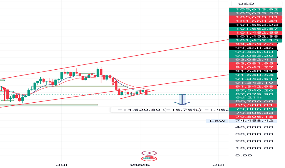
Fair Value Gap Retracements in a Downtrend📈 BTC/USD – Understanding Fair Value Gap Retracements in a Downtrend
The current market structure on the daily timeframe highlights a clear bearish trend, where price continues to form lower highs and lower lows.
After a strong downward impulse, a Fair Value Gap (FVG) has formed — representing an area of imbalance that price may eventually retrace to before deciding its next move.
This setup reflects a potential rebalancing phase within the ongoing downtrend.
⸻⸻⸻⸻⸻⸻⸻⸻⸻⸻
📊 Key Observations
1️⃣ FVG Formation — A bearish Fair Value Gap has emerged following a strong sell-side move, signaling a region of inefficiency left behind by aggressive sellers.
2️⃣ Retracement Possibility — Price may attempt to retrace into the FVG zone to rebalance this inefficiency before continuing its primary downtrend.
3️⃣ Potential Rejection Zone — If price reacts negatively from the FVG, it could confirm continued bearish sentiment and lead to another lower low.
4️⃣ Trend Context — The overall market remains under a descending structure, with sellers maintaining control as long as price stays below the FVG zone.
⸻⸻⸻⸻⸻⸻⸻⸻⸻⸻
📊 Chart Explanation
Symbol → BINANCE:BTCUSD
Timeframe → 1D
This chart illustrates how a Fair Value Gap (FVG) functions as a key retracement zone within a broader bearish structure. The price action shows a sequence of lower highs and lower lows, confirming a prevailing downtrend.
After a strong downward impulse, price created a bearish FVG — highlighted in red — representing an imbalance area where institutional orders may remain unfilled. Price is now retracing upward, likely to fill this inefficiency.
If the market faces rejection from this FVG zone, it could signal the continuation of the ongoing bearish momentum. However, a clean break and close above it might hint at a short-term structural shift.
Below the current price, a liquidity pool zone is marked — an area where stop-losses likely reside. Price often sweeps such zones to collect liquidity before reversing, aligning with Smart Money behavior.
Overall, this setup showcases how identifying FVGs within market structure helps traders anticipate rebalancing phases, retracements, and potential reaction points in trending markets.
⸻⸻⸻⸻⸻⸻⸻⸻⸻⸻
✅ Summary
• The Fair Value Gap acts as a magnet zone where price may retrace to fill inefficiency.
• A rejection from the FVG could resume bearish continuation.
• A confirmed close above the FVG might hint at short-term strength or structural shift.
• Traders should observe price behavior within this zone for potential rebalancing reactions.
⸻⸻⸻⸻⸻⸻⸻⸻⸻⸻
⚠️ Disclaimer:
📘 For educational purposes only.
🙅 Not SEBI registered.
❌ Not a buy/sell recommendation.
🧠 Purely a learning resource.
📊 Not Financial Advice.
Bitcoin Bulls Target $113K**Bitcoin (BTC/USD) Analysis — November 2025**
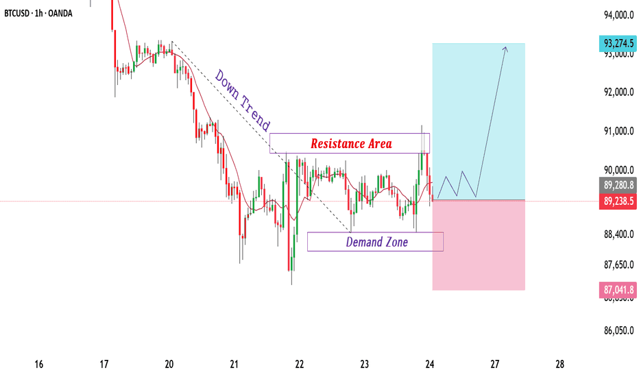
Bitcoin has been moving within a controlled downtrend channel, facing continuous lower highs since late October. The market recently went through a **liquidity sweep**, followed by a minor **market structure shift (MSS)** on the 3-hour timeframe. This suggests exhaustion in the current bearish leg.
After a period of **sideways consolidation**, price is testing a strong accumulation zone near the **$100K–$97K** region. This zone aligns with prior demand and high-volume nodes, making it a potential base for a bullish reversal.
A clean rebound from this level could drive Bitcoin toward the **$113K–$115K** area, where the next liquidity cluster sits. If buyers regain momentum, this move could accelerate into a **V-shaped recovery**, confirming the start of a fresh mid-term bullish cycle.
Overall sentiment remains **bullish**, supported by renewed buyer activity and potential macro-driven inflows ahead. Traders should watch for volatility spikes as the market transitions from accumulation to breakout mode.
**Key Takeaway:**
BTC is stabilizing near key demand, eyeing a rebound toward $113K+. Momentum confirmation above the short-term consolidation zone could trigger a strong upward continuation.
**#Bitcoin #BTCUSD #CryptoAnalysis #BitcoinForecast #BTCPricePrediction #CryptoTrading #BullishReversal #CryptoMarket #TradingViewAnalysis**
BTC/USD Bullish Pennant – Breakout Entry SetupBTC/USD Bullish Pe✅ BTC/USD Pennant Breakout – Technical Analysis
Chart Breakdown
The chart shows Bitcoin forming a bullish pennant pattern on the 45-min timeframe.
A pennant typically forms after a strong impulsive move (pole), followed by price compression between:
Descending trendline (upper)
Ascending/flat trendline (lower)
This usually signals continuation in the direction of the previous trend, which in this case is upward.
Key Levels
Entry Zone: Just above the pennant resistance (breakout zone).
Stop-Loss: Below the pennant support — good risk management.
Target: Projected by measuring the previous impulse (the pennant pole) and extending it upward.
Market Signals
✔ Price is squeezing near the apex — breakout imminent.
✔ Buyers appear to be defending the lower trendline.
✔ If price breaks and closes above resistance, upside continuation becomes likely.
✘ But if price rejects and falls below support, the setup invalidates.
Bias
Bullish Continuation – If breakout occurs with strong volume.
Option Chain: Powerful Tools for Traders and Investors1. What is an Option Chain?
An option chain, also known as an option matrix, lists all the available call and put options for a specific security. Each row represents an individual option contract with its strike price, expiry date, premium, and other key metrics. It helps traders compare multiple options to make informed decisions about trading strategies.
For example, on the NSE (National Stock Exchange of India), you can view the option chain for NIFTY 50, Bank NIFTY, or any stock. It displays both Call Options (CE) on the left and Put Options (PE) on the right.
2. Basic Terms in an Option Chain
a. Call Option (CE)
A Call Option gives the buyer the right, but not the obligation, to buy the underlying asset at a predetermined price (strike price) before or on the expiration date. Buyers of calls expect the underlying price to rise, while sellers (writers) of calls expect it to stay the same or fall.
b. Put Option (PE)
A Put Option gives the buyer the right, but not the obligation, to sell the underlying asset at a predetermined strike price before or on expiration. Buyers of puts expect the underlying asset’s price to fall, while sellers expect it to stay the same or rise.
c. Strike Price
The strike price is the price at which the option holder can buy (for a call) or sell (for a put) the underlying asset. Option chains list multiple strike prices around the current market price of the asset.
Example:
If NIFTY is trading at 22,000, the option chain may show strikes like 21,900, 22,000, 22,100, etc.
d. Expiry Date
The expiry date (or expiration date) is the date when the option contract ceases to exist. In India, options can have weekly or monthly expiries.
Weekly options expire every Thursday.
Monthly options expire on the last Thursday of the month.
After expiry, the option either becomes worthless (out-of-the-money) or is settled for profit/loss (in-the-money).
e. Option Type
Each contract specifies whether it is a Call (CE) or Put (PE). Traders choose the type based on their market outlook:
Bullish traders buy Calls or sell Puts.
Bearish traders buy Puts or sell Calls.
3. Option Chain Data Columns Explained
Each row in an option chain contains various data points. Let’s decode them one by one.
a. Last Traded Price (LTP)
The Last Traded Price is the most recent price at which the option contract was traded. It indicates the current market value or premium of the option.
Example:
If NIFTY 22,000 CE LTP = ₹120, that means the last buyer paid ₹120 for that call option.
b. Change and % Change
This shows how much the premium has moved compared to the previous trading session.
Change = LTP today – LTP yesterday
% Change = (Change / Previous LTP) × 100
It helps traders track intraday momentum and volatility.
c. Bid Price & Ask Price
Bid Price: The highest price a buyer is willing to pay.
Ask Price: The lowest price a seller is willing to accept.
The difference between them is the Bid-Ask Spread, which shows liquidity—narrow spreads indicate higher liquidity.
d. Bid Quantity & Ask Quantity
These represent how many contracts traders are willing to buy or sell at the bid or ask price.
Example:
If Bid Quantity = 1,200, it means traders want to buy 1,200 contracts at the bid price.
e. Open Interest (OI)
Open Interest is one of the most important metrics in an option chain. It represents the total number of outstanding (open) option contracts that have not been settled yet.
Rising OI indicates new positions being created.
Falling OI means positions are being squared off.
Interpretation Example:
Price ↑ and OI ↑ → Strong trend continuation (bullish).
Price ↓ and OI ↑ → Bearish trend strengthening.
Price ↑ and OI ↓ → Short covering.
Price ↓ and OI ↓ → Long unwinding.
f. Change in Open Interest
This shows how much the OI has changed compared to the previous session. It helps identify whether traders are entering new positions or exiting existing ones.
g. Volume
Volume indicates the number of option contracts traded during the day.
High volume shows active trading and high liquidity.
h. Implied Volatility (IV)
Implied Volatility reflects the market’s expectation of future volatility in the underlying asset.
High IV → Expensive premiums (greater uncertainty).
Low IV → Cheaper premiums (stable markets).
Traders use IV to assess whether options are overpriced or underpriced.
i. LTP vs. IV Relationship
If IV rises, option premiums generally increase (even if the underlying doesn’t move).
If IV falls, premiums tend to decline.
j. Intrinsic Value and Time Value
Each option premium consists of:
Intrinsic Value: The actual value if the option were exercised now.
Time Value: The extra value based on time to expiry and volatility.
Example:
If NIFTY = 22,100 and Call Strike = 22,000,
then Intrinsic Value = 100 (22,100 – 22,000).
4. In-the-Money (ITM), At-the-Money (ATM), Out-of-the-Money (OTM)
a. For Call Options:
ITM: Strike < Current Price
ATM: Strike ≈ Current Price
OTM: Strike > Current Price
b. For Put Options:
ITM: Strike > Current Price
ATM: Strike ≈ Current Price
OTM: Strike < Current Price
Traders often focus on ATM and nearby strikes, as they have higher liquidity.
5. Option Chain Analysis Techniques
a. OI Analysis
By comparing Call OI and Put OI, traders can estimate support and resistance levels:
High Call OI → Resistance zone (sellers active).
High Put OI → Support zone (buyers active).
b. Put-Call Ratio (PCR)
PCR = Total Put OI / Total Call OI
PCR > 1 → More Puts, bullish sentiment.
PCR < 1 → More Calls, bearish sentiment.
Traders use PCR as a contrarian indicator when extreme values appear.
c. Max Pain Theory
The Max Pain point is the strike price where the combined loss for option buyers is maximum and sellers benefit most.
At expiry, the underlying price often gravitates toward this level due to hedging and unwinding activity.
6. Real-World Example (NIFTY Option Chain)
Suppose NIFTY = 22,000, and we analyze the option chain:
Strike Call OI Put OI CE LTP PE LTP
21,900 25,000 10,000 160 70
22,000 30,000 28,000 120 120
22,100 45,000 20,000 80 160
Interpretation:
Strong Call OI at 22,100 → Possible resistance.
Strong Put OI at 22,000 → Possible support.
Market range: 22,000–22,100.
7. Advanced Option Chain Terms
a. Delta
Measures how much an option’s price moves for every ₹1 change in the underlying.
Call Delta: 0 to +1
Put Delta: 0 to –1
Example: Delta = 0.5 means the premium moves ₹0.50 for every ₹1 move in the asset.
b. Theta
Represents time decay—how much the option loses in value each day as expiry nears.
c. Gamma
Shows the rate of change of Delta. High Gamma means Delta will change rapidly with price movements.
d. Vega
Measures sensitivity of an option’s price to changes in volatility. High Vega means the option is more affected by IV changes.
e. Rho
Represents sensitivity of option price to interest rate changes.
8. Conclusion
Understanding option chain terms is essential for anyone involved in derivatives trading. The data helps traders:
Gauge market sentiment (bullish or bearish).
Identify support/resistance zones through OI.
Track volatility via IV.
Recognize trading opportunities through volume and price changes.
A skilled trader doesn’t just read numbers — they interpret the psychology behind them. With consistent analysis, the option chain becomes not just a data sheet, but a strategic roadmap for profitable trading decisions in dynamic markets like India’s NSE.
Bitcoin Bybit chart analysis November 11Hello
It's a Bitcoin Guide.
If you "follow"
You can receive real-time movement paths and comment notifications on major sections.
If my analysis was helpful,
Please click the booster button at the bottom.
This is a Bitcoin 30-minute chart.
There are no separate Nasdaq indicators.
I developed a strategy based on the lower gap retracement of both Bitcoin and Nasdaq.
*Conditional long position strategy when the red finger moves
1. Confirm the first touch of the purple finger at the top (autonomous short)
Switch to a long position at the bottom at $103,790.4 /
Stop-loss price if the green support line is completely broken or the bottom is touched
2. First target for a long position at $106,701.5 / Target prices are Top and Good in that order.
If the strategy is successful, the first section is used to re-enter the long position.
If a correction occurs immediately without touching the first section at the top,
I'll wait for a long position at the bottom. Looking at the overall picture today, if the price drops to the bottom,
the medium-term pattern will be broken.
The purple support line must be maintained or the upper limit must be reached at 106.7K.
A rebound in the 1+4 range is required without breaking the green support line.
The Nasdaq variable is important, so please keep a close eye on the movement.
I hope you operate safely, with principled trading and stop-loss orders essential.
Thank you.
BTC 8R Sell scenario.........BTC is in downtrend in daily timeframe and shown sniper delivery, now it is in pullback mode. We may anticipate a good short term trade on hourly time frame around hourly FVG
1. HTF MSS is already done and price is reverting to FVG after BOS.
2. Daily quadrant cluster is also falling around FVG. Which is giving us some more critical levels of price reversal.
3. RSI has already shown bearish divergence on hourly TF.
4. Most probably price will take liquidity of FVG and create MSS/CISD/TS/iFVG in LTF.
5. Price should show rejection/reversal in respective LTF (5m/15m) at FVG zone.
6. Take the trade only once clear entry model i.e. turtle soup. iFVG break, CDS or MSS happens on LTF
All these combinations are signalling a high probability and ~8R trade scenario.
Note – if you liked this analysis, please boost the idea so that other can also get benefit of it.
Also follow me for notification for incoming ideas.
Also Feel free to comment if you have any input to share.
Disclaimer – This analysis is just for education purpose not any trading suggestion. Please take the trade at your own risk and with the discussion with your financial advisor.
BTC current week update and explanation BTC is still inside a short-term downtrend but is showing signs of base formation / potential reversal.
BTC has lower highs and lower lows = still technically bearish.
EMA 20 ≈ slightly below EMA 50 → still bearish crossover. But candles are hovering near the EMAs, meaning bearish momentum is weakening.
Volume is flat to decreasing during price drops — indicating seller exhaustion. If a breakout occurs on strong volume, it’ll be a strong bullish confirmation.
BTC is currently trading below a descending trendline, showing the sellers still in control.
A daily candle close above $107K would signal a potential trend reversal.
The information and analysis provided are for educational and informational purposes only. This does not constitute financial, investment, or trading advice.
BTC New ATH or Low??BTC bounced around the 0.236 level ($98K) — a healthy retracement zone in a strong uptrend.
The corrective structure from ~$125K to ~$95K looks like a wave-4 correction.
The dotted trendline in your chart shows strong ascending support, which has held since early 2023. No major distribution signs yet — volume dips on red candles suggest profit-taking, not panic selling.
Historically, BTC enters a supply squeeze rally 6–12 months post-halving.
Miners’ supply drops, while demand from institutions rises.
Primary short-term support (Fib 0.236)- $98K–$100K
Trendline + previous breakout area- $93K–$95K
Fib 0.382 retracement zone- $82K–$85K
What should be the next goal.
Part 1 Intraday Master ClassIntroduction to Options
Option trading is a type of financial trading that gives investors the right—but not the obligation—to buy or sell an underlying asset, such as stocks, indices, commodities, or currencies, at a predetermined price before or on a specific date. Unlike owning the asset itself, an option allows traders to speculate on price movements or hedge against potential risks in the market.
Options are powerful financial instruments because they can be used for leverage, income generation, and risk management. However, they also carry complexity and risk, making education essential for anyone interested in trading them.