Quantum Flow ScannerOverview
The Quantum Flow Scanner is a comprehensive technical analysis indicator that combines trend detection, momentum analysis, and dynamic band systems to identify potential market opportunities. This indicator uses advanced filtering techniques and multi-factor detection strength calculations to help traders make informed decisions.
Key Features
Trend Detection System
Dual-period momentum analysis (Fast/Slow periods configurable)
Pattern recognition engine that analyzes recent price movements
Normalized momentum calculations adjusted for volatility
Bull and Bear detection generation based on trend changes
Dynamic Band System
Adaptive bands that adjust to market volatility using ATR (Average True Range)
Customizable band width and distance multipliers
Optional midline, upper band, and lower band displays
Visual channel fill options for enhanced clarity
Background color coding for trend direction
Detection Strength Rating
Multi-factor detection strength calculation (25-92% range)
Considers volatility, momentum, trend duration, and volume
Higher timeframe alignment analysis
Swing position evaluation
Real-time percentage display on detections
Performance Tracking
Live performance statistics table
Total detections counter
Successful detections vs unsuccessful detections tracking based on configurable stop loss and take profit levels
Success rate percentage calculation
Average detection strength monitoring
How It Works
The indicator employs a sophisticated filtering mechanism based on pole-zero placement algorithms to smooth price data and calculate dynamic bands. When price crosses these bands in conjunction with momentum shifts, the indicator generates Bull or Bear detections.
Detection strength is calculated using eight weighted factors:
Market volatility assessment
Momentum cluster analysis
Distance from dynamic midline
Trend consistency duration
Higher timeframe trend alignment
Volume profile analysis
Candle strength evaluation
Swing position context
Configuration Options
Period Settings:
Fast Period (1-200): Controls short-term momentum sensitivity
Slow Period (1-500): Defines longer-term trend context
Pattern Recognition Length (5-50): Sets momentum analysis window
Sensitivity Controls:
Distance Multiplier (1.0-10.0): Adjusts band width relative to volatility
Cluster Size (1-15): Number of bars analyzed for momentum clustering
Display Options:
Customizable detection colors
Optional detection markers and percentage labels
Dynamic band visibility toggles
Channel fill options
Background color coding
Performance Tracking:
Configurable stop loss and take profit levels (in points)
Optional performance statistics table
Success rate monitoring
Use Cases
This indicator is designed for:
Trend identification across multiple timeframes
Entry and exit timing optimization
Market volatility assessment
Detection quality evaluation through strength ratings
Strategy performance tracking
Important Notes
This indicator is for educational and informational purposes only
Past performance does not guarantee future results
Always use proper risk management and position sizing
Detections should be used as part of a comprehensive trading strategy
Test thoroughly on historical data before live trading
No indicator is 100% accurate; losses are part of trading
Bands and Channels

AnAn Master: VWAP + EMA9/21 + Volume Spike ArrowsAnAn Master: VWAP + EMA9/21 + Volume Spike Arrows to help with spikes

Volume Spike Bars (AnAn Edition)volume spike indicators that will help show you when volume is spiking

5 MA Length Custom [wjdtks255]Indicator Title: 5 MA Length Custom
This indicator is a minimalist tool designed for pure trend visualization across five user-defined periods using Simple Moving Averages (SMAs). It contains no built-in signals or dynamic features—it serves strictly as a trend filter and confirmation layer.
Key Features and Customization
The indicator plots five fixed-color, fixed-thickness moving average lines. Only the Length (period) of each MA can be changed in the settings, offering clean, focused market analysis.
MA 1 (Default 5): Immediate price action.
MA 2 (Default 20): Short-term momentum.
MA 3 (Default 60): Key Mid-term Trend Line.
MA 4 (Default 40): Proxy for the standard Bollinger Band Center Line.
MA 5 (Default 120): Major Long-term Trend.
🧭 Trading Strategy: MA Filtered Reversion
This strategy uses the MA hierarchy for trend filtering and bias confirmation when executing trades based on an external signal indicator (e.g., a volatility/reversal signal like BB OPT EN).
🟢 Long Bias Confirmation (Buy)
The short-term trend must support the mid-term trend. This is confirmed when MA 2 (20) is positioned above MA 3 (60). When this alignment occurs, you should only take external Buy signals (reversal signals) for higher probability trades.
🔴 Short Bias Confirmation (Sell)
The short-term trend must align with the bearish direction. This is confirmed when MA 2 (20) is positioned below MA 3 (60). When this alignment occurs, you should only take external Sell signals (reversal signals) for higher probability trades.

200 Week MA Extensions (Crypto Currently Strategy)Bitcoin 200 Week MA Extensions
The 200-week moving average has never been breached in Bitcoin's history, making it one of the most reliable indicators for identifying absolute market bottoms. This indicator plots the 200 Week MA along with percentage extensions above it to help identify potential cycle tops and key resistance levels during bull markets.
What is the 200 Week MA?
The 200-week simple moving average is the average closing price of Bitcoin over the past 200 weeks (approximately 3.8 years). It's a ultra-long-term trend indicator that:
Has never been broken to the downside in Bitcoin's entire history
Acts as the ultimate floor for Bitcoin price during bear markets
Rises steadily over time, reflecting Bitcoin's long-term growth trajectory
Moves slowly, making it a stable reference point for market cycles
Key Components:
200 Week MA - Blue Line (Base Level)
The foundation line that has historically marked absolute bottoms
Currently around $62,000 (and rising ~$500-800 per week)
Touching this level has historically represented generational buying opportunities
Last tested during the COVID crash (March 2020) and 2022 bear market
+50% Extension - Green Line (1.5x the 200 Week MA)
First major resistance zone above the base
Often acts as support during healthy bull market corrections
Historically a comfortable zone for accumulation in early bull markets
+100% Extension - Yellow Line (2.0x the 200 Week MA)
Double the 200 Week MA value
Represents a well-developed bull market
Often tested multiple times during mid-cycle consolidations
Can act as strong resistance when first approached
+150% Extension - Orange Line (2.5x the 200 Week MA)
Advanced bull market territory
Historically marks the acceleration phase of bull runs
Breaking above this level often signals euphoric market conditions approaching
+200% Extension - Red Line (3.0x the 200 Week MA)
Triple the 200 Week MA value
Extreme overextension zone
Historically near or beyond previous cycle tops
Suggests extreme caution and profit-taking considerations
Historical Context:
2020-2021 Bull Market:
March 2020: Price touched the 200 Week MA (~$5,000) - absolute bottom
Throughout 2020: Price traded between +50% and +100% extensions
Late 2020 - Early 2021: Price broke above +100%, accelerated to +150%
April 2021 & November 2021: Price reached +200% extension area, marking local/cycle tops
2022 Bear Market:
Price fell from +200% extension back toward the 200 Week MA
June 2022: Price came within 10% of the 200 Week MA ($18,000)
Bounce from near the 200 Week MA marked the bear market bottom
2023-2024 Recovery:
Price recovered from near 200 Week MA back through the extension levels
Each extension level acted as resistance, then support as bull market developed
Current position relative to extensions helps gauge cycle maturity
How to Use This Indicator:
For Long-Term Accumulation:
At 200 Week MA: Maximum conviction buying zone - historically has never failed
+0% to +50%: Excellent accumulation zone, low risk relative to reward
+50% to +100%: Good accumulation zone during bull market dips
Above +100%: Consider reducing accumulation, focus on holding or taking profits
For Profit Taking:
Approaching +100%: Consider taking initial profits (10-20% of position)
+100% to +150%: Take incremental profits as price advances
+150% to +200%: Increase profit-taking pace significantly
Above +200%: Maximum caution - historically unsustainable levels
For Risk Management:
Distance from 200 Week MA indicates market risk level
Further above = higher risk, more extended, closer to top
Closer to = lower risk, better value, closer to bottom
Use extensions as profit-taking targets in bull markets
Use extensions as re-entry targets during corrections
For Cycle Timing:
Bear Market: Price converges toward 200 Week MA
Early Bull: Price in +0% to +50% range, building base
Mid Bull: Price in +50% to +100% range, healthy growth
Late Bull: Price in +100% to +150% range, acceleration
Euphoric Top: Price at +150% to +200%+, extreme extension
Key Insights:
The 200 Week MA as Ultimate Support:
Bitcoin has touched or approached this level during every major bear market
It rises consistently (~$30,000 per year currently), creating a rising floor
Breaking below would be unprecedented and signal a fundamental market structure change
Provides enormous psychological and technical support
Extension Levels as Resistance/Support:
Bull markets often stall at each extension level before breaking through
Once broken, extensions often flip from resistance to support
Rejections from higher extensions can signal local or cycle tops
Corrections back to lower extensions offer re-entry opportunities
Diminishing Returns:
Each cycle's top has formed at progressively lower extension multiples
2013: ~10x the then-200WMA
2017: ~5x the then-200WMA
2021: ~3x the then-200WMA
Suggests future tops may not reach +200% extension (market maturation)
Best Practices:
Do:
Use the 200 Week MA as your ultimate risk-off level for long-term holdings
Scale into positions as price approaches the 200 Week MA
Take profits incrementally as price rises through extensions
View corrections back to lower extensions as opportunities
Combine with other on-chain metrics (MVRV, Realized Price) for confirmation
Don't:
Expect the 200 Week MA to provide perfect entry timing (you might be early)
Assume price will reach +200% extension every cycle
Sell all holdings at first extension level during bull markets
Ignore price action and volume when making decisions
Panic if price approaches the 200 Week MA (historically the best time to buy)
Why This Indicator Works:
The 200 Week MA represents nearly 4 years of price data, which:
Encompasses approximately one full Bitcoin halving cycle
Smooths out all short and medium-term volatility
Reflects Bitcoin's true long-term adoption and growth trend
Provides a slow-moving, stable reference that doesn't whipsaw
The extension levels work because:
They create objective profit-taking targets based on historical overextension
They account for the rising base (200 Week MA) over time
They've proven reliable across multiple market cycles
They help remove emotion from buy/sell decisions
Technical Notes:
Calculations performed on weekly timeframe data for consistency
The indicator displays correctly on any chart timeframe (Daily, 4H, etc.)
Uses lookahead_on to prevent repainting and show consistent historical values
All extension levels update automatically as the 200 Week MA rises
Best viewed on logarithmic scale for full historical perspective
Important Reminders:
Past performance does not guarantee future results - while the 200 Week MA has never been breached, future market conditions could differ
Market maturation - as Bitcoin matures, cycle dynamics may change
Black swan events - unexpected macro events could temporarily break historical patterns
Not financial advice - this is an educational tool, always do your own research
Recommended Usage:
Best Timeframes: Daily, Weekly, Monthly charts
Pair With: MVRV Ratio, Realized Price, Stock-to-Flow, Fear & Greed Index
Update Frequency: Weekly (the base 200 Week MA only changes weekly)
Chart Type: Logarithmic scale recommended for full historical view
Strategy Example:
Buy aggressively when price is within 20% of 200 Week MA
Hold and accumulate between 200WMA and +50% extension
Begin scaling out profits at +100% extension (20% of position)
Scale out more at +150% extension (40% of position)
Significant profit-taking at +200% extension (remaining position)
Wait for next cycle and repeat
This indicator provides a simple, objective, and historically reliable framework for navigating Bitcoin's market cycles. By respecting the 200 Week MA as the ultimate floor and using the extensions as profit-taking guides, investors can remove emotion and develop disciplined strategies for long-term success.

AUDNZD Mean Reversion (5 minutes)Here are the results
drive.google.com
🔒 The Mechanism for Exploiting Asymmetry in the AUD/NZD Pair
This strategy is not about directional trading; it is about Relational Trading, leveraging the structural fact that the Australian Dollar (AUD) and New Zealand Dollar (NZD) are highly synchronized due to their similar fundamental drivers (commodity exports, sensitivity to China, risk sentiment). This coupling creates a strong Structural Elasticity where the price is inherently inclined to revert to a long-term equilibrium.
1. Defining the Equilibrium State (The Center Point)
The core of the strategy lies in accurately defining the pair's True Statistical Mean (μ), which acts as the pair's long-term gravitational center.
Principle: Identify the μ value—the statistical equilibrium—that the pair has historically maintained (often observed near the 1.0800 - 1.1000 range).
Significance: This μ represents the Gravitational Pull; any movement beyond this point is considered temporary short-term noise or a deviation from the structural norm.
2. Measuring the Tension (The Deviation Gauge)
A statistical tool is necessary to measure precisely how far the price has been stretched away from its mean relative to its historical volatility.
The Instrument: This is achieved by calculating the Z-Score or using volatility-based Envelopes calibrated against the historical standard deviation of the price movement relative to μ.
The Analysis: When the AUD/NZD price deviates beyond a statistical significance level (e.g., exceeding ±2 Sigma), it indicates that the Tension in the relationship has peaked, and the corrective force towards the mean is maximized.
3. The Execution Protocol (Actionable Triggers)
Trading occurs only when tension is at an extreme, effectively fading the current momentum to capitalize on the structural force of mean reversion.
__________________________________________________________________________________
🔒 กลไกการฉวยโอกาสจากความไม่สมมาตรในคู่ AUD/NZD
กลยุทธ์นี้ไม่ได้เป็นการเทรดทิศทาง (Directional) แต่เป็นการเทรด ความสัมพันธ์ (Relational) โดยอาศัยข้อเท็จจริงที่ว่า AUD และ NZD เป็นสกุลเงินที่ได้รับอิทธิพลจากปัจจัยพื้นฐานที่ใกล้เคียงกันมาก (สินค้าโภคภัณฑ์และความเสี่ยง) จึงทำให้ราคามี "ความยืดหยุ่นเชิงโครงสร้าง" ที่จะกลับมาสู่จุดสมดุลเสมอ
1. การกำหนดจุดศูนย์กลาง (The Equilibrium State)
หัวใจของกลยุทธ์คือการนิยาม "ค่าเฉลี่ยจริง" ของความสัมพันธ์นี้ (ไม่ใช่แค่ค่าเฉลี่ยเคลื่อนที่ของราคา)
หลักการ: ต้องหาค่า μ (Mu) ซึ่งเป็นจุด สมดุลทางสถิติ ในระยะยาวของคู่เงินนี้ ซึ่งมักอยู่ใกล้เคียงค่า 1.0800 - 1.1000
ความสำคัญ: ค่า μ นี้คือ เส้นแรงดึงดูด (Gravitational Pull) ที่ราคามีแนวโน้มจะวิ่งกลับเข้าหาในท้ายที่สุด การเคลื่อนไหวที่เกินจากจุดนี้ถือเป็นเพียง "สัญญาณรบกวนระยะสั้น"
2. การวัดความตึงเครียด (The Tension Gauge)
เราจำเป็นต้องมีเครื่องมือวัดว่าแรงดึงดูดถูก "ยืดออก" ไปจากค่าสมดุลมากน้อยเพียงใด ซึ่งทำได้โดยการวัด "ความเบี่ยงเบนมาตรฐาน (Standard Deviation)" ของราคาเทียบกับจุดศูนย์กลาง
เครื่องมือที่ใช้: การประยุกต์ใช้ค่า Z-Score หรือ Envelope ที่ตั้งค่าตามความผันผวนทางสถิติในอดีต
การวิเคราะห์: เมื่อราคา AUD/NZD เบี่ยงเบนเกินระดับนัยสำคัญ (เช่น เกิน ±2 Sigma) นั่นหมายความว่า ความตึงเครียด ระหว่างสองสกุลเงินอยู่ในระดับสูงสุด และแรงผลักให้กลับสู่ค่าเฉลี่ยกำลังสะสม
3. โปรโตคอลการเข้าปฏิบัติการ (The Execution Protocol)
การเข้าเทรดจะต้องเกิดขึ้นเมื่อความตึงเครียดถึงขีดสุด โดยเป็นการ "สวนทางกับแรงเหวี่ยงปัจจุบัน" เพื่อจับจังหวะที่แรงดึงดูดกลับเข้าทำงาน

SUMA Fib Channels with JMA Ribbon TrendlinesI made this indicator because I was tired of drawing the lines everyday and adding fib lines, so I wanted to automated my daily process so I can be more productive,
-The Green Yellow and red line on the right side of the indicator are the Fib Regression
- The Green top of the line/sell the premium, wait for the price to fully stop and retest this area before you sell (double top or M pattern)
- Yellow is the 0.618 Possibly reversal and in most cases a highly likely area for price to comeback to this point.
- The Red/Buy price is at discount, Wait for the price to fully stop and retest this area before buying (double bottom or W pattern)
The channels lines are easy to read and self explanatory
- Price Above green lines or channel = bullish (always wait for retest and to break above resistance line (lines above price))
- Price Below red lines or channel = Bearish (always wait for retest and to break below support line (lines below price))

Orderbook Table1. Indicator Name
Orderbook Table
This is an order book style trading volume map
that upgraded the price from my first script to label
2. One-line Introduction
A visual heatmap-style orderbook simulator that displays volume and delta clustering across price levels.
3. Overall Description
Orderbook Table is a powerful visual tool designed to replicate an on-chart approximation of a traditional order book.
It scans historical candles within a specified lookback window and accumulates traded volume into price "bins" or levels.
Each level is color-coded based on total volume and directional bias (delta), offering a layered view of where market interest was concentrated.
The indicator approximates order flow by analyzing each candle's directional volume, separating bullish and bearish volume.
With adjustable parameters such as level depth, price bin density, delta sensitivity, and opacity, it provides a highly customizable visualization.
Displayed directly on the chart, each level shows the volume at that price zone, along with a price label, offset to the right of the current bar.
Traders can use this tool to detect high liquidity zones, support/resistance clusters, and volume imbalances that may precede future price movements.
4. Key Benefits (Title + Description)
✅ On-Chart Volume Heatmap
Shows volume distribution across price levels in real-time directly on the price chart, creating a live “orderbook” view.
✅ Delta-Based Bias Coloring
Color changes based on net buying/selling pressure (delta), making aggressive demand/supply zones easy to spot.
✅ High Customizability
Users can adjust lookback bars, price bins, opacity levels, and delta usage to fit any market condition or asset class.
✅ Lightweight Simulation
Approximates orderbook depth using candle data without needing L2 feed access—works on all assets and timeframes.
✅ Clear Visual Anchoring
Volume quantities and price levels are offset to the right for easy viewing without cluttering the active chart area.
✅ Fast Market Context Recognition
Quickly identify price levels where volume concentrated historically, improving decision-making for entries/exits.
5. Indicator User Guide
📌 Basic Concept
Orderbook Table analyzes a configurable number of past bars and distributes traded volume into price "bins."
Each bin shows how much volume occurred around that price level, optionally adjusted for bullish/bearish candle direction.
⚙️ Settings Overview
Lookback Bars: Number of candles to scan for volume history
Levels (Total): Number of price levels to display around the current price
Price Bins: Granularity of price segmentation for volume distribution
Shift Right: How far to offset labels to the right of the current bar
Max/Min Opacity: Controls visual strength of volume coloring
Use Candle Delta Approx.: If enabled, colors the volume based on candle direction (green for up, red for down)
📈 Example Timing
Look for green clusters (bullish bias) below current price → possible strong demand zones
Price enters a high-volume level with previously aggressive buyers (green), suggesting support
📉 Example Timing
Red clusters (bearish bias) above current price can act as resistance or supply zones
Price stalling at a red-heavy volume band may indicate exhaustion or reversal opportunity
🧪 Recommended Use
Use as a support/resistance mapping tool in ranging and trending markets
Pair with candlestick analysis or momentum indicators for refined entry/exit points
Combine with VWAP or volume profile for multi-dimensional volume insight
🔒 Cautions
This is an approximation, not a true L2 orderbook—volume is based on historical candles, not actual limit order data
In low-volume markets or higher timeframes, bin granularity may be too coarse—adjust "Price Bins" accordingly
Delta calculation is based on open-close direction and does not reflect true buy/sell volume splits
Avoid overinterpreting low-opacity (light color) zones—they may indicate low interest rather than true resistance/support
+++

Filter Volume1. Indicator Name
Filter Volume
2. One-line Introduction
A regression-based trend filter that quantifies and visualizes market direction and strength using price behavior.
3. Overall Description
Filter Volume+ is a trend-detection indicator that uses linear regression to evaluate the dominant direction of price movement over a given period.
It compares historical regression values to determine whether the market is in a bullish, bearish, or neutral state.
The indicator applies a percentage threshold to filter out weak or indecisive trends, highlighting only significant movements.
Each trend state is visualized through distinct colors: bullish (greenish), bearish (reddish), and neutral (gray), with intensity reflecting trend strength.
To reduce noise and create smooth visual signals, a three-step smoothing process is applied to the raw trend intensity.
Users can customize the regression source, lookback period, and sensitivity, allowing the indicator to adapt to various assets and timeframes.
This tool is especially useful in filtering entry signals based on clear directional bias, making it suitable for trend-following or confirmation strategies.
4. Key Benefits (Title + Description)
✅ Quantified Trend Strength
Only displays trend signals when a statistically significant direction is detected using linear regression comparisons.
✅ Visual Clarity with Color Coding
Each market state (bullish, bearish, neutral) is represented with distinct colors and transparency, enabling fast interpretation.
✅ Custom Regression Source
Users can define the data input (e.g., close, open, indicator output) for regression calculation, increasing strategic flexibility.
✅ Multi-Level Smoothing
Applies three layers of smoothing (via moving averages) to eliminate noise and produce a stable, flowing trend curve.
✅ Area Fill Visualization
Plots a colored band between the trend value and zero-line, helping users quickly gauge the market's dominant force.
✅ Adjustable Sensitivity Settings
Includes tolerance and lookback controls, allowing traders to fine-tune how reactive or conservative the trend detection should be.
5. Indicator User Guide
📌 Basic Concept
Filter Volume+ assesses the direction of price by comparing regression values over a selected period.
If the percentage of upward comparisons exceeds a threshold, a bullish state is shown; if downward comparisons dominate, it shows a bearish state.
⚙️ Settings Overview
Lookback Period (n): The number of bars to compare for trend analysis
Range Tolerance (%): Minimum threshold for declaring a strong trend
Regression Source: The data used for regression (e.g., close, open)
Linear Regression Length: Number of bars used to compute each regression value
Bull/Bear Color: Custom colors for bullish and bearish trends
📈 Example Timing
When the trend line stays above zero and the green color intensity increases → trend gaining strength
After a neutral phase (gray), the color shifts quickly to greenish → early trend reversal
📉 Example Timing
When the trend line stays below zero with deepening red color → strong bearish continuation
Sudden change from bullish to bearish color with rising intensity
🧪 Recommended Use
Use as a trend confirmation filter alongside entry/exit strategies
Ideal for swing or position trades in trending markets
Combine with oscillators like RSI or MACD for improved signal validation
🔒 Cautions
In ranging (sideways) markets, the color may change frequently – avoid relying solely on this indicator in those zones.
Low-intensity colors (faded) suggest weak trends – better to stay on the sidelines.
A short lookback period may cause over-sensitivity and false signals.
When using non-price regression sources, expect the indicator to behave differently – test before deploying.
+++

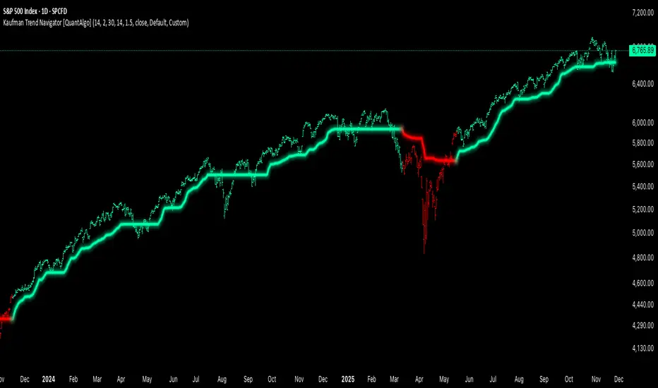
Kaufman Trend Navigator [QuantAlgo]🟢 Overview
The Kaufman Trend Navigator is an adaptive trend following system that combines efficiency-weighted price smoothing with volatility-adjusted bands to identify and track directional market movements. The indicator dynamically adjusts its sensitivity based on market conditions, becoming more responsive during trending periods and more conservative during consolidation. This dual-layer approach provides traders and investors with a systematic framework for trend identification, entry timing, and risk management across multiple timeframes and asset classes.
🟢 How It Works
The indicator employs an efficiency ratio mechanism that measures the directional movement of price relative to total price volatility over a defined lookback period. This ratio determines the adaptive response rate, allowing the system to distinguish between genuine directional moves and random market noise. When price exhibits strong directional characteristics, the internal smoothing accelerates to track the trend more closely. Conversely, during periods of low efficiency or choppy price action, the smoothing becomes more conservative to filter out false signals.
Volatility bands are constructed using normalized range measurements, creating dynamic upper and lower boundaries around the adaptive trend calculation. These bands expand and contract based on recent market volatility, providing context-dependent thresholds for trend validation. The trend line itself updates through a band-following logic where it tracks the relevant boundary based on the current directional bias, creating a stepping mechanism that maintains trend persistence while allowing for validated reversals.
The visual representation uses a gradient-weighted display to emphasize the primary trend line while maintaining clarity on price charts. Trend direction changes trigger when the internal logic confirms a boundary crossover, generating signals for potential position entries or exits. The system includes preset configurations calibrated for different trading timeframes, from responsive settings for scalping to smoother parameters suited for swing and position trading.
🟢 How to Use It
▶ Enter Long positions when the trend line transitions to Bullish (Green) coloring, which indicates upward directional bias has been established. Conversely, enter Short positions or exit Longs when the trend line shifts to Bearish (Red), which signals confirmed downward momentum.
The trend line itself can be used as dynamic support during uptrends and resistance during downtrends, providing logical areas for position management and stop placement. Price remaining above the line during bullish phases or below during bearish phases can also be used as a confirmation of trend strength and continuation probability.
▶ Built-in alert functionality provides real-time notifications for trend changes without requiring continuous chart monitoring. Configure alerts for Bullish Trend Signal to capture upward reversals, Bearish Trend Signal for downward shifts, or the general Trend Change alert to monitor both directions simultaneously. These alerts trigger only on confirmed trend transitions, reducing noise from intrabar fluctuations.
The indicator also includes six color presets (Classic, Aqua, Cosmic, Ember, Neon, Custom) to optimize visual clarity across different chart themes and lighting conditions. Select presets based on your monitor setup and background preference to ensure immediate trend recognition without visual strain. Bar coloring can be enabled to highlight trend direction directly on the price chart, eliminating the need to reference the trend line position during rapid market analysis.
🟢 Pro Tips for Trading and Investing
▶ Match the preset configuration (or your preferred settings) to your trading timeframe: use Fast Response for intraday charts (1-15 minutes), Default for swing trading (hourly to daily), and Smooth Trend for position trading (4-hour to weekly).
▶ Combine trend signals with volume analysis and market structure to filter lower-probability setups. During sideways markets, expect increased signal frequency with reduced reliability; consider waiting for the trend line to establish a clear slope before committing capital.
▶ Use the trend line as a trailing reference rather than a fixed stop level, allowing normal intrabar volatility while protecting against genuine reversals.
▶ For portfolio management, align position sizing with trend strength by observing the angle and consistency of the trend line progression.
DCA + Liquidation LevelsThe indicator combines a Dollar-Cost Averaging (DCA) strategy after downtrends with liquidation level detection, providing comprehensive market analysis.
📈 Working Principle
1. DCA Strategy Foundation
EMA 50 and EMA 200 - used as primary trend indicators
EMA-CD Histogram - difference between EMA50 and EMA200 with signal line
BHD Levels - dynamic support/resistance levels based on volatility
2. DCA Entry Logic
pinescript
// Entry Conditions
entry_condition1 = nPastCandles > entryNumber * 24 * 30 // Monthly interval
entry_condition2 = emacd < 0 and hist < 0 and hist > hist // Downtrend reversal
ENTRY_CONDITIONS = entry_condition1 and entry_condition2
Entry triggers when:
Specified time has passed since last entry (monthly intervals)
EMA-CD is negative but showing reversal signs (histogram increasing)
Market is emerging from downtrend
3. Price Zone Coloring System
pinescript
// BHD Unit Calculation
bhd_unit = ta.rma(high - low, 200) * 2
price_level = (close - ema200) / bhd_unit
Color Zones:
🔴 Red Zone: Level > 5 (Extreme Overbought)
🟠 Orange Zone: Level 4-5 (Strong Overbought)
🟡 Yellow Zone: Level 3-4 (Overbought)
🟢 Green Zone: Level 2-3 (Moderate Overbought)
🔵 Light Blue: Level 1-2 (Slightly Overbought)
🔵 Blue: Level 0-1 (Near EMA200)
🔵 Dark Blue: Level -1 to -4 (Oversold)
🔵 Extreme Blue: Level < -4 (Extreme Oversold)
4. Liquidation Levels Detection
pinescript
// Open Interest Delta Analysis
OI_delta = OI - nz(OI )
OI_delta_abs_MA = ta.sma(math.abs(OI_delta), maLength)
Liquidation Level Types:
Large Liquidation Level: OI Delta ≥ 3x MA
Middle Liquidation Level: OI Delta 2x-3x MA
Small Liquidation Level: OI Delta 1.2x-2x MA
Leverage Calculations:
5x, 10x, 25x, 50x, 100x leverage levels
Both long and short liquidation prices
⚙️ Technical Components
1. Moving Averages
EMA 50: Short-term trend direction
EMA 200: Long-term trend foundation
EMA-CD: Momentum and trend strength measurement
2. BHD Levels Calculation
pinescript
bhd_unit = ta.rma(high - low, 200) * 2
bhd_upper = ema200 + bhd_unit * N // Resistance levels
bhd_lower = ema200 - bhd_unit * N // Support levels
Where N = 1 to 5 for multiple levels
3. Open Interest Integration
Fetches Binance USDT perpetual contract OI data
Calculates OI changes to detect large position movements
Identifies potential liquidation clusters
🔔 Alert System
Zone Transition Alerts
Triggers: When price moves between different BHD zones
Customizable: Each zone alert can be enabled/disabled individually
Information: Includes exact level, price, and EMA200 value
Alert Types Available:
🔴 Red Zone Alert
🟠 Orange Zone Alert
🟡 Yellow Zone Alert
🟢 Green Zone Alert
🔵 Light Blue Zone Alert
🔵 Blue Zone Alert
🔵 Dark Blue Zone Alert
🔵 Extreme Blue Zone Alert
🎨 Visual Features
1. Candle Coloring
Real-time color coding based on price position relative to EMA200
Immediate visual identification of market conditions
2. Level Displays
EMA lines (50 & 200)
BHD support/resistance levels
Liquidation level lines with different styles based on significance
3. Entry Markers
Green upward labels below bars indicating DCA entry points
Numbered sequentially for tracking
📊 Input Parameters
DCA Settings
Start/End dates for backtesting
EMA periods customization
Liquidation Levels Settings
MA Length for OI Delta
Threshold multipliers for different liquidation levels
Display toggles for lines and histogram
Alert Settings
Individual zone alert enable/disable
Customizable sensitivity
🔧 Usage Recommendations
For DCA Strategy:
Enter positions at marked DCA points after downtrends
Use BHD levels for position sizing and take-profit targets
Monitor zone transitions for market condition changes
For Liquidation Analysis:
Watch for price approaches to liquidation levels
Use histogram for density of liquidation clusters
Combine with zone analysis for entry/exit timing
⚠️ Limitations
Data Dependency: Requires Binance OI data availability
Market Specific: Optimized for cryptocurrency markets
Timeframe: Works best on 1H+ timeframes for reliable signals
Volatility: BHD levels may need adjustment for different volatility regimes
🔄 Updates and Maintenance
Regular compatibility checks with TradingView updates
Performance optimization for different market conditions
User feedback incorporation for feature improvements
This indicator provides institutional-grade market analysis combined with systematic DCA strategy implementation, suitable for both manual trading and algorithmic strategy development.

ORB 15min: Break & ConfirmUsing the 15-minute opening candle range, this generates an alert when a 5-minute candle breaks the range and another 5-minute candle closes above the breakout candle's high or the high of any other candle that attempted to break the range.

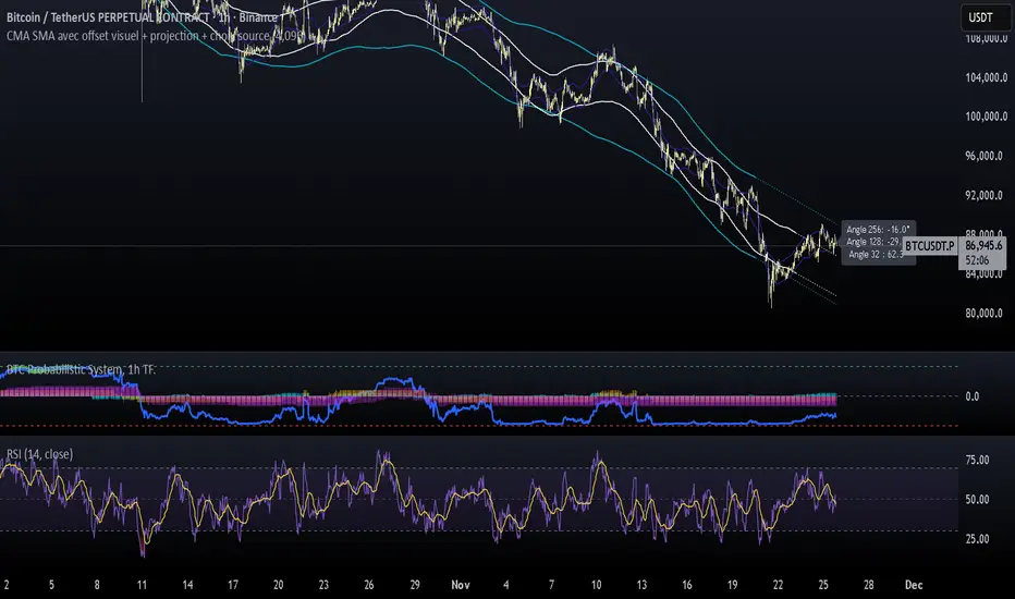
CMA SMA avec offset visuel + projection + choix sourceCMA Channels are a set of bands built around a Centered Moving Average (CMA), a tool often used in market cycle analysis (e.g., Hurst).
Unlike a regular moving average, the CMA is shifted forward in time to remove lag and reveal the underlying cyclical structure of price.
NW Envelope + Hull Safe & Professional:No repainting — everything uses (previous closed bar)
Signals only appear after bar close
Built-in cooldown (10 bars) to avoid spam
Loud customizable sound alerts that actually play
Works perfectly on all timeframes (especially 15m, 1h, 4h)

VWAP Bands ProDisclaimer: This script is for educational purposes only and is not financial advice. Trading involves risk, and users are responsible for their own decisions.
VWAP Bands Pro is a professional volatility tool that anchors the Volume Weighted Average Price to a chosen timeframe and projects standard deviation bands to reveal stretched price zones.
Key Features
Anchored Precision : Calculates VWAP from a fixed anchor period (default: Daily) for a clean institutional reference point.
Standard Deviation Bands : Plots 1s, 2s, and 3s bands to show volatility. Moves into the outer bands often point to exhaustion or possible reversal areas.
Glowing Gradient Design : Uses a premium multi step gradient that fades outward, making extreme zones easy to spot.
Clean Visuals : Prioritizes smooth gradient fills instead of crowding the chart with heavy lines.
How to Use
Anchor Period : Select the timeframe you want the tool to follow. Daily works well for intraday setups, while Weekly or Monthly suits swing trades.
Strategy : Watch for mean reversion setups when price moves into the 2s to 3s outer zones and starts to reject, aiming for a return toward the central VWAP.

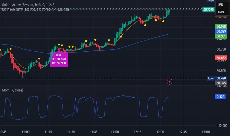
bows//@version=5
indicator("NQ EMA+RSI+ATR Alerts with SL/TP", overlay=true, shorttitle="NQ Alerts SLTP")
// === Inputs ===a
fastLen = input.int(9, "Fast EMA", minval=1)
slowLen = input.int(21, "Slow EMA", minval=1)
rsiLen = input.int(14, "RSI Length", minval=1)
rsiLongMax = input.int(70, "Max RSI to allow LONG", minval=50, maxval=90)
rsiShortMin = input.int(30, "Min RSI to allow SHORT", minval=10, maxval=50)
atrLen = input.int(14, "ATR Length", minval=1)
atrMultSL = input.float(1.5, "ATR Stop-Loss Multiplier", step=0.1)
atrMultTP = input.float(2.5, "ATR Take-Profit Multiplier", step=0.1)
// === Indicator calculations ===
price = close
fastEMA = ta.ema(price, fastLen)
slowEMA = ta.ema(price, slowLen)
rsiVal = ta.rsi(price, rsiLen)
atr = ta.atr(atrLen)
// === Entry signals ===
longSignal = ta.crossover(fastEMA, slowEMA) and rsiVal < rsiLongMax
shortSignal = ta.crossunder(fastEMA, slowEMA) and rsiVal > rsiShortMin
// === SL/TP Levels ===
longSL = price - atr * atrMultSL
longTP = price + atr * atrMultTP
shortSL = price + atr * atrMultSL
shortTP = price - atr * atrMultTP
// === Plotting ===
plot(fastEMA, color=color.orange, title="Fast EMA")
plot(slowEMA, color=color.blue, title="Slow EMA")
plotshape(longSignal, title="Buy Signal", style=shape.triangleup, color=color.new(color.green, 0), location=location.belowbar, size=size.tiny)
plotshape(shortSignal, title="Sell Signal", style=shape.triangledown, color=color.new(color.red, 0), location=location.abovebar, size=size.tiny)
// Optional visualization of SL/TP
plot(longSignal ? longSL : na, "Long Stop-Loss", color=color.new(color.red, 50), style=plot.style_linebr)
plot(longSignal ? longTP : na, "Long Take-Profit", color=color.new(color.green, 50), style=plot.style_linebr)
plot(shortSignal ? shortSL : na, "Short Stop-Loss", color=color.new(color.red, 50), style=plot.style_linebr)
plot(shortSignal ? shortTP : na, "Short Take-Profit", color=color.new(color.green, 50), style=plot.style_linebr)
// === Alerts with SL/TP info ===
alertcondition(longSignal, title="BUY Signal",
message="BUY Alert — NQ LONG: Entry @ {{close}} | SL: {{plot_1}} | TP: {{plot_2}} | {{ticker}}")
alertcondition(shortSignal, title="SELL Signal",
message="SELL Alert — NQ SHORT: Entry @ {{close}} | SL: {{plot_3}} | TP: {{plot_4}} | {{ticker}}")
// === Visual labels ===
if (longSignal)
label.new(bar_index, low, "BUY SL: " + str.tostring(longSL, format.mintick) + " TP: " + str.tostring(longTP, format.mintick),
style=label.style_label_up, color=color.new(#be14c4, 0), textcolor=color.white)
if (shortSignal)
label.new(bar_index, high, "SELL SL: " + str.tostring(shortSL, format.mintick) + " TP: " + str.tostring(shortTP, format.mintick),
style=label.style_label_down, color=color.new(color.red, 0), textcolor=color.white)
Raja_Intraday: Bull/Bear Logic SetupBased on Candle high low/PDH-PDL break out, in combination with other indicators.
Focus is more on accuracy than on higher frequency of trades. Enjoy!!

Structural Liquidity ZonesTitle: Structural Liquidity Zones
Description:
This script is a technical analysis system designed to map market structure (Liquidity) using dynamic, volatility-adjusted zones, while offering an optional Trend Confluence filter to assist with trade timing.
Concept & Originality:
Standard support and resistance indicators often clutter the chart with historical lines that are no longer relevant. This script solves that issue by utilizing Pine Script Arrays and User-Defined Types to manage the "Lifecycle" of a zone. It automatically detects when a structure is broken by price action and removes it from the chart, ensuring traders only see valid, fresh levels.
By combining this structural mapping with an optional EMA Trend Filter, the script serves as a complete "Confluence System," helping traders answer both "Where to trade?" (Structure) and "When to trade?" (Trend).
Key Features:
1. Dynamic Structure (The Array Engine)
Pivot Logic: The script identifies major turning points using a customizable lookback period.
Volatility Zones: Instead of thin lines, zones are projected using the ATR (Average True Range). This creates a "breathing room" for price, visualizing potential invalidation areas.
Active Management: The script maintains a memory of active zones. As new bars form, the zones extend forward. If price closes beyond a zone, the script's garbage collection logic removes the level, keeping the chart clean.
2. Trend Confluence (Optional)
EMA System: Includes a Fast (9) and Slow (21) Exponential Moving Average module.
Signals: Visual Buy/Sell labels appear on crossover events.
Purpose: This allows for "Filter-based Trading." For example, a trader can choose to take a "Buy" bounce from a Support Zone only if the EMA Trend is also bullish.
Settings:
Structure Lookback: Controls the sensitivity of the pivot detection.
Max Active Zones: Limits the number of lines to optimize performance.
ATR Settings: Adjusts the width of the zones based on volatility.
Enable Trend Filter: Toggles the EMA lines and signals on/off.
Usage:
This tool is intended for structural analysis and educational purposes. It visualizes the relationship between price action pivots and momentum trends.

deKoder | Ultra High Timeframe Moving Average & Log StDev BandsdeKoder | Ultra High Timeframe Moving Average & Log StDev Bands
Identify long-term statistical extremes and map the core trend with the deKoder | uHTF MA indicator. Designed for macro analysis, this tool uses ultra high timeframe moving averages and logarithmic standard deviation bands to frame price action, providing clear signals for when an asset is statistically cheap, fairly priced, or expensive.
KEY FEATURES
• Ultra High Timeframe (uHTF) Moving Average:
• Acts as a dynamic long term fair value equilibrium line. Choose from periods like 1-Year, 2-Year, or 'Long Time'.
• Select your MA type: SMA, EMA, Hull MA, or a Rolling VWAP .
• Automatically fetches optimal data (4H/D) for smoother plotting on lower timeframes.
• Probabilistic Logarithmic Bands:
• The bands are calculated using log-standard deviation , creating a framework that adapts to exponential growth. As such, your chart price scale should be set to log.
• ~68% of price action typically occurs between the ±1σ bands (fair value zone).
• Trading in the ±1σ to ±2σ channel is typical in a strongly trending market. Moves towards the ±3σ bands can indicate that the market is becoming overextended. Expect strong price moves here and pay attention for signs of reversal.
• Bitcoin Halving Timeline:
• Integrated vertical lines and labels for all Bitcoin halvings.
• Correlates technical extremes with fundamental scarcity events.
• 4-Year Cycle Visual Aid:
• The background color cycle highlights yearly changes.
• Red years have historically aligned with bear markets, while the subsequent green zone has marked accumulation phases.
• Note: The bands provide the primary information - the background color is a contextual guide based on historical patterns around the BTC 4 year halving cycle that may not persist in future. It's quite possible that the market will act differently going forward considering the new types participants such as ETFs and government reserve funds.
HOW TO USE & INTERPRET
• Fair Value & Extremes:
• Price between ±1σ Bands: The asset is trading within a statistically fair value range.
• Price at +2σ / +3σ Bands: The asset is statistically expensive. Statistically, the price is overextended in this region, although you do NOT want to fade it based only upon this information.
• Price at -2σ / -3σ Bands: The asset is statistically cheap. These zones have frequently coincided with the end of bear markets and profound long-term buying opportunities.
• Dynamic Support & Resistance:
• The uHTF MA and its bands tend to act as support and resistance areas of interest on daily, weekly and monthly charts.
INPUTS & CUSTOMIZATION
• Toggles : Master switch for the MA, Bands, and Halving markers.
• uHTF Moving Average Filter : Select instrument (default: BITSTAMP:BTCUSD), price source, MA length, and type.
• Colours : Fine-tune the appearance of all elements.
PRO TIPS
• While created for Bitcoin, this principle will work well on other high-growth assets and major indices.
• The most reliable signals occur on the Daily, Weekly and Monthly timeframes.
• This is a lagging, macro-filter indicator. It is not for timing short-term entries but for confirming the long-term trend and cycle phase.
"Be Fearful When Others Are Greedy and Greedy When Others Are Fearful." - The deKoder | uHTF MA is here to help you quantify that greed and fear on a macro scale.


Felix-Style Breakout ScannerThis stock scanner will scan stocks back on the 50MA, heartbeat pattern and buy volume to detect a good buying opportunity.


YenCarry IndexA risk gauge that signals when USD/JPY is moving fast enough to make yen intervention likely by Ministry of Finance.
