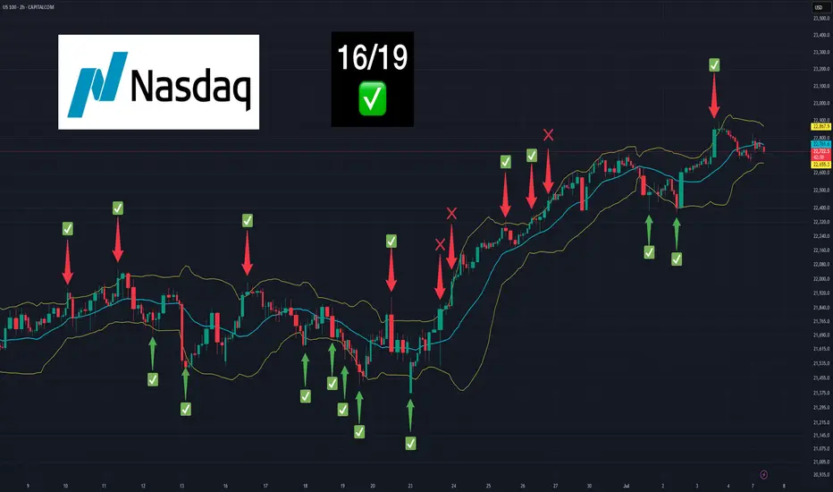
RIDE THE BIG MOVESWhat Does “Ride the Big Moves” Mean?
It means:
✅ Spotting a strong directional move early
✅ Entering with confirmation and confidence
✅ Managing your risk while maximizing reward
✅ Staying in the trade through minor pullbacks
✅ Exiting smartly at a major trend exhaustion point
Most traders cut winners early and let losers run. This approach flips that pattern — teaching you how to stay in profitable trades and compound gains.
🧠 Core Concepts You’ll Learn
1. Trend Identification
Learn how to identify:
Primary trends (uptrend/downtrend)
Pullbacks vs. reversals
Trend strength using price action and volume
Higher-timeframe confirmation
2. Entry Techniques for Big Moves
Breakout from consolidation
Trendline and moving average support
SMC-based entries: Order blocks & market structure shifts
Avoiding fakeouts with volume and time confirmation
3. Stay in the Move
How to manage fear during winning trades
Trailing stop techniques: MA trail, swing low method, ATR
Adding to positions safely in trending markets
Avoiding premature exits caused by emotions
4. Exit Like a Pro
Identifying exhaustion signals
Divergences, volume drops, or climax candles
Scaling out profits strategically
Avoiding full exit too early — ride until structure breaks
📊 Why Big Moves Matter
Let’s say your risk is ₹1,000 per trade.
In a scalp, you might make ₹1,500.
In a small swing, maybe ₹3,000.
But if you ride a big move, your reward could be ₹10,000 or more — with the same risk.
That’s the power of risk-reward optimization — where one big move can cover multiple small losses and lift your win ratio significantly.
👨🏫 Who Should Learn This?
Intraday and swing traders
Option buyers looking for momentum moves
Long-term investors who want better timing
Anyone tired of small profits and early exits
✅ What You’ll Achieve:
Learn to identify market momentum early
Improve patience and discipline
Build strategies that favor 1:5 or even 1:10 risk-reward setups
Confidence to hold winners without panic
Eliminate noise and trade with clarity
⚡ Start Riding Waves, Not Ripples
“Ride the Big Moves” is more than a strategy — it's a mindset shift. It teaches you how to think like professionals who don’t chase trades, but wait for the market to offer big, clean opportunities — then ride them with focus and control
X-indicator

LEARN INSTITUTIONAL TRADING🔍 What Is Institutional Trading?
Institutional trading is how large financial organizations operate in the markets. They don’t buy based on tips or random indicators — they use price action, volume data, liquidity zones, and market structure to accumulate and distribute positions quietly, often without the retail crowd noticing.
Learning institutional trading means learning:
How markets truly move
How smart money traps retail traders
How to follow big money footprints
🧠 Key Concepts You’ll Learn
1. Market Structure Mastery
Understand how institutions analyze market structure:
Break of Structure (BoS)
Change of Character (ChoCH)
Trends, ranges, and consolidation zones
2. Liquidity and Order Blocks
Learn how to identify:
Institutional order blocks (entry zones of banks)
Liquidity grabs (stop loss hunting zones)
Fair value gaps and imbalance areas
3. Smart Money Concepts (SMC)
SMC is the foundation of institutional trading. You’ll learn:
Wyckoff accumulation & distribution
Internal vs. external market structure
Entries based on premium-discount theory
4. Volume and Manipulation
Learn how volume, price action, and timeframes work together to show:
Hidden buying/selling
Trap zones
Institutional accumulation patterns
5. Entry & Exit Planning
How institutions plan:
Low-risk, high-reward entries
Multi-timeframe confirmation
Managing trades with scaling in/out
📊 Why Institutional Trading Is Powerful
Institutions:
Have deep capital
Move the market
Use strategies based on logic and patience
When you learn how to think like an institution, you stop chasing signals and start trading with confidence and structure.
👨🏫 Who Should Learn Institutional Trading?
Beginners looking for the right trading foundation
Intermediate traders tired of inconsistent results
Advanced traders seeking deeper strategy and psychology
Intraday, swing, and positional traders
✅ What You'll Gain:
A complete mindset shift in how you view the markets
Strategies with clear entry, stop loss, and target rules
Tools to trade any market: stocks, forex, indices, crypto
Confidence to follow smart money — not get trapped by it
🚀 Start Your Journey Now
Stop trading like the 90%. Learn how the 10% think, plan, and profit.
"Learn Institutional Trading" is your opportunity to elevate your market skills and build long-term trading success with a professional edge.

Institution Option Trading🔍 What Are Options?
Options are financial contracts that give you the right, but not the obligation, to buy or sell an asset at a specific price within a set time. There are two types:
Call Options – Right to buy
Put Options – Right to sell
Institutions use these tools not for speculation but for hedging, portfolio insurance, income strategies, and market positioning.
🧠 How Institutions Trade Options Differently
1. Multi-Leg Strategies
Institutions use advanced strategies like:
Covered Calls
Iron Condors
Vertical Spreads
Calendar Spreads
These strategies allow them to generate income and control risk, unlike directional bets most retail traders make.
2. Risk Management Focus
Institutions never “go all in.” They manage risk using:
Delta-neutral positioning
Hedging with opposite positions
Dynamic rebalancing
Volatility-based exposure control
They measure every trade based on risk-reward, not hope or prediction.
3. Understanding Option Greeks
Institutions actively monitor:
Delta (directional exposure)
Gamma (sensitivity to price change)
Theta (time decay)
Vega (volatility impact)
They use this to manage trades like professionals and adjust positions based on market conditions.
4. Implied Volatility & Volume Triggers
They don’t chase options with hype — they analyze:
Open interest spikes
Volatility crush or expansion
Skew analysis
These help detect big moves before they happen.
5. Smart Money Flow Tracking
Institutional traders leave footprints. You can learn to track:
Block trades
Unusual options activity
Dark pool activity
This reveals where big money is being placed — giving you a serious trading edge.
🎯 What You’ll Learn in Institutional Option Trading
Institutional mindset and objective-driven trading
How to trade options with structure and clarity
How to use Greeks for trade management
Institutional strategies vs. retail mistakes
Real-world case studies from option chain data
👨🏫 Who Is This For?
Traders who want to learn professional-grade options trading
Retail traders looking to stop losses and build consistency
Intermediate traders who want to move beyond basic buying
Investors looking to hedge or enhance returns with options
✅ Final Thoughts
Institutional Option Trading is not about quick profits — it's about risk-managed, high-probability trading with purpose. By learning how institutions trade options, you can elevate your trading game, improve consistency, and avoid emotional mistakes.

Technical Class📘 What is Technical Analysis?
Technical analysis is the study of past market data — mainly price and volume — to forecast future price movement. Unlike fundamental analysis (which looks at company financials), technical analysis focuses entirely on what is happening on the chart right now.
It’s based on three core principles:
Price Discounts Everything
Price Moves in Trends
History Repeats Itself
By mastering this, you can trade like a professional — with logic, structure, and discipline.
🔧 What You’ll Learn in the Technical Class
This class covers all the essential tools, techniques, and strategies used by full-time traders and institutions. Key topics include:
🔹 1. Charting Basics
Types of charts: Candlestick, Line, Bar
Timeframes: 1-min to monthly charts
How to set up charts for analysis
🔹 2. Candlestick Patterns
Bullish and bearish candlesticks
Reversal vs. continuation patterns
Psychology behind candlestick formations (e.g., Doji, Engulfing, Hammer)
🔹 3. Support & Resistance
How to identify key price levels
Role of horizontal zones and trendlines
Breakout and retest strategies
🔹 4. Chart Patterns
Double Top & Bottom
Head and Shoulders
Flags, Pennants, Triangles
Price action and pattern recognition techniques
🔹 5. Technical Indicators
Moving Averages (SMA, EMA)
RSI, MACD, Bollinger Bands
Volume Profile, VWAP
When to use and when to avoid indicators
🔹 6. Trend Analysis
Identifying uptrends, downtrends, sideways movement
Using higher timeframes for confirmation
Entry and exit based on trend strength
🔹 7. Volume Analysis
Importance of volume in confirming moves
Volume spikes and trap zones
Institutional activity detection
🧠 Why Technical Analysis Matters
Most professional traders rely heavily on technicals for:
Short-term and intraday trading
Identifying breakout and breakdown zones
Predicting reversals and continuation setups
Aligning with smart money and institutional behavior
It is one of the most practical skillsets you can learn in trading.
🎯 Who Should Join This Class?
Beginners in the stock market
Aspiring intraday/swing traders
Investors who want better timing
Crypto, forex, or index traders
📈 Conclusion: Read the Market Like a Pro
The Technical Class will give you the confidence to read charts, spot opportunities, and manage trades with structure — no more relying on tips or guesswork.
You’ll walk away with real, practical skills that you can apply in any market, any timeframe, any strategy

Trading Master Class 1. Understanding Financial Markets
The course starts with a strong foundation in how financial markets work. You’ll learn the difference between investing and trading, the role of exchanges (like NSE, BSE, NYSE), and how different participants — including retail traders, institutions, brokers, and market makers — influence the market.
You’ll also understand key trading instruments such as:
Stocks (Equities)
Indices (Nifty, Sensex, Dow Jones)
Options & Futures
Commodities and Currencies
This foundation helps in selecting the right markets and strategies for your trading style.
2. Technical Analysis & Chart Reading
Technical analysis is the core tool used by traders to make entry and exit decisions. In this section, you’ll master:
Candlestick Patterns (Doji, Hammer, Engulfing)
Support & Resistance Levels
Chart Patterns (Head & Shoulders, Triangles, Flags)
Volume Analysis
Trend Identification
You’ll also get hands-on experience with popular indicators like Moving Averages, RSI, MACD, and Bollinger Bands — learning when and how to use them effectively.
3. Institutional Trading Concepts
This section reveals how big institutions (smart money) operate and how they trap retail traders. You’ll learn advanced concepts like:
Market Structure
Order Blocks
Liquidity Grabs
Break of Structure (BoS)
Supply and Demand Zones
These concepts help you align your trades with institutional movements, giving you a powerful edge.
4. Strategy Development
You’ll be guided through the process of developing your own trading strategy based on market conditions and personal risk appetite. This includes:
Identifying setups
Entry and exit rules
Risk-reward calculations
Journaling and performance tracking
Backtesting strategies with real data
The focus is on clarity, simplicity, and consistency.
5. Options Trading Simplified
Options are a powerful tool for both hedging and profit. This module covers:
Basics of Calls and Puts
Options Buying vs. Selling
Option Greeks (Delta, Theta, Vega)
Strategies like Covered Calls, Iron Condors, Spreads
Intraday and expiry-day strategies
6. Risk Management & Trading Psychology
No trading system works without discipline and emotional control. This part of the course trains your mindset to handle:
Fear of loss
Greed during profits
Revenge trading
Overtrading
Proper position sizing and capital allocation
You’ll build habits to stay consistent — the key to long-term success.
Summary:
The Trading Master Class is not just about charts or indicators — it’s about learning the right way to trade, with a focus on:
Market knowledge
Strategy building
Institutional concepts
Risk control
Trading psychology
It’s the complete path to becoming a smart, confident, and consistently profitable trader.
Commodity Supercycle 2025: Metals & Energy⚒️ Metals: The Foundation of Industrial Growth
Why are metal prices booming?
Let’s break it down in human terms:
Massive Infrastructure Projects
India, US, China, and Europe are all spending billions on roads, bridges, railways, smart cities, and housing.
All of that needs steel, cement, aluminum, copper, etc.
Clean Energy = More Copper & Aluminum
Solar panels, EVs, and wind turbines need a lot more copper, lithium, and rare metals than conventional energy.
This creates a demand explosion for base metals.
Supply Chain Bottlenecks
Mines across the world (especially in Africa, Chile, and Australia) are facing labour shortages, political instability, or environmental restrictions.
Less mining = less supply = prices go up.
China’s Comeback
China is the largest consumer of metals globally.
After a slow period in 2022–23, it’s back with a stimulus to revive housing and infrastructure — adding massive demand pressure.
🔋 Energy: Fuel for the Supercycle
What’s happening in oil, gas, and coal?
Crude Oil Above $90/Barrel
Conflicts (Russia-Ukraine, Middle East) + OPEC production cuts = tight supply
Despite the push for renewables, the world still runs on oil for transport and manufacturing
Natural Gas Shortages in Europe/Asia
War-related disruptions in Russian supply have caused natural gas prices to skyrocket
LNG imports from the US and Qatar are booming — good for companies in that ecosystem
Coal Prices Rising Again
Despite climate goals, India, China, and others are still using coal for base power
Coal India and related PSUs have seen strong earnings due to volume demand + price support
🧾 How This Affects the Indian Market
India is both a major consumer and a growing exporter of various commodities.
Winners in the Supercycle:
1. Metal Stocks (Steel, Aluminum, Copper)
Company Why It’s Benefiting
Tata Steel Global presence + rising prices = higher margins
JSW Steel Export growth + capex-driven demand
Hindalco Aluminum giant + Novelis (US-based unit)
Hindustan Copper India’s only copper miner; global demand rising
2. Energy Stocks (Oil, Gas, Coal)
Company Why It’s Benefiting
ONGC Rising crude prices = stronger profitability
Oil India Smaller PSU with strong rally potential
Coal India Massive volumes, dividend, pricing power
Reliance Petrochemicals + oil refining benefits
3. Ancillary & Export-Based Stocks
Company Role in Supercycle
NMDC Supplies iron ore – key to steelmakers
MOIL Manganese supplier for steel industry
APL Apollo Tubes Beneficiary of infra + steel boom
Welspun Corp Pipes for oil & gas pipelines
📊 Real Performance: Numbers Don’t Lie
Let’s take a quick look at recent returns (approx. from Jan 2023 to July 2025):
Stock Price in Jan 2023 Price in July 2025 Approx % Gain
Tata Steel ₹110 ₹170+ 55%+
JSW Steel ₹690 ₹930+ 35%+
Hindalco ₹430 ₹675+ 55%+
Coal India ₹220 ₹450+ 100%+
ONGC ₹150 ₹270+ 80%+
These are fundamentally driven rallies — not pump-and-dump moves. That’s the beauty of supercycles.
📈 Technical Outlook in July 2025
Nifty Metal Index:
📌 Near all-time highs (~9,000+ zone)
📈 Trend: Strong bullish
🔁 Expect periodic corrections of 5–7%, but uptrend likely to continue
Nifty Energy Index:
📌 In a broad uptrend, thanks to Coal India, ONGC, Reliance
📈 Breakouts seen in power generation and refining stocks
🎯 Next resistance at 30,000+, support at 28,500
🧠 What Traders & Investors Should Do
🧭 For Traders:
Focus on volume breakouts in metal & energy stocks
Watch for sectoral momentum using indices like Nifty Metal, Nifty Energy
Use Futures & Options (F&O) strategies like:
Call buying on breakout confirmation
Bull call spreads in ONGC, Hindalco, Tata Steel
Short straddles for sideways phases in Coal India
📆 For Swing Traders:
Identify weekly breakout patterns (flags, cup & handle, triangle)
Use trailing SL and partial booking (these stocks move fast)
Best timeframe: 2–4 week swings, especially in trending names
💼 For Long-Term Investors:
Allocate 10–15% of your portfolio to core metal/energy stocks
Focus on low-debt, dividend-paying companies (e.g., Coal India, ONGC)
SIP or staggered entries work well in a volatile commodity cycle
Expect volatility — supercycles are not linear
❗ Risks & Cautions
Every rally has its risks. Here’s what to keep in mind:
Risk Impact
Global Recession Could reduce commodity demand globally
China Slowdown Big impact on copper/steel demand
Currency Volatility Affects import/export profitability
Policy Changes Carbon tax, ESG push may hurt coal/oil stocks
Overheating Stocks may correct 15–20% if valuations get stretched
Always use risk management — especially in leveraged trades.
🗺️ Global Supercycle Factors to Watch in 2025–26
🛢️ Crude oil production quotas (OPEC+ decisions)
🏗️ China’s stimulus on construction and EVs
🌱 ESG push: Will governments ban/restrict dirty fuels faster?
💹 US Fed rate cuts/inflation outlook (affects commodity pricing)
🧾 Mining policies in resource-rich countries (Africa, Latin America)
These global forces shape how long the current commodity upcycle will last.
✍️ Final Thoughts
The commodity supercycle in 2025 is real and being driven by multi-year global trends in infrastructure, energy transformation, and supply limitations. This is not just a short-term rally — it’s part of a structural shift.
If you’re a trader — this sector is offering sharp, trend-friendly price action.
If you’re an investor — this is your chance to ride secular growth in India’s industrial backbone.
💡 “When the world builds, commodities boom. And when that boom is real, wealth is created.”

PSU & Defence Stock Boom🏢 First, What Are PSU & Defence Stocks?
🔹 PSU Stocks
"PSU" stands for Public Sector Undertaking — companies where the Government of India holds a majority stake (more than 51%).
These companies operate in key sectors like:
Defence manufacturing
Railways
Energy (oil, gas, coal)
Power
Finance
Infrastructure
They have a long history of stability, but until recently, they were seen as slow-moving or inefficient.
🔹 Defence Stocks
These include companies that:
Make defence equipment (fighter jets, missiles, radars, warships)
Work with the Indian Armed Forces or export to global defence clients
Provide electronics, software, and parts for defence systems
In India, many defence companies are also PSUs, such as:
Bharat Electronics (BEL)
Hindustan Aeronautics (HAL)
Bharat Dynamics (BDL)
Mazagon Dock Shipbuilders
Cochin Shipyard
📈 Why Are PSU & Defence Stocks Booming in 2025?
Here are the main drivers behind this massive rally:
✅ 1. Make in India + Atmanirbhar Bharat (Self-Reliance)
The government wants India to become self-reliant in defence production, reducing dependency on imports.
Key points:
Ban on importing 450+ defence items that must now be made locally
Big push to increase defence exports
Support to Indian PSUs to ramp up production
Result: More contracts for Indian defence companies = higher revenues and profits.
✅ 2. Massive Order Books
Many PSU defence companies are sitting on huge order books, sometimes 5–7x their annual revenue.
Examples:
BEL: Order book of ₹65,000+ crore
HAL: Got ₹45,000+ crore order for fighter jets + helicopters
Mazagon Dock: Building submarines and destroyers for Navy
Bharat Dynamics: Orders for missiles, torpedoes
The market loves visibility — and order books give confidence in future earnings.
✅ 3. Government Capex Boom
India’s Union Budget 2025 has focused heavily on:
Defence capex: ₹6 lakh crore+ earmarked for the military
Railways & infrastructure spending
Indigenisation of key technologies
This benefits PSU stocks like:
RVNL, IRCON, RITES (railway infra)
BEL, BDL, HAL (defence manufacturing)
BHEL, Cochin Shipyard (industrial & shipbuilding)
✅ 4. PSU Re-Rating + Efficient Management
For years, PSUs were seen as "government-run, slow, and inefficient."
But things have changed:
Better transparency
Higher dividend payouts
Restructuring of loss-making units
More professional management
Now, investors are re-rating these companies — giving them better valuations than before.
✅ 5. Retail & FII Interest
Retail investors are loving PSU stocks because:
Many trade below ₹100–300 levels (psychologically attractive)
High dividend yields (5–10%)
Visible government support
FIIs are entering because:
Valuations are still reasonable
These sectors have strong growth tailwinds
India is among the top 5 global defence spenders
✅ 6. Global Geopolitics
With rising global tensions (Russia-Ukraine, China-Taiwan), countries are increasing defence spending.
India is emerging as a credible exporter of:
Radars
Drones
Warships
Missiles
This has opened up global demand for Indian defence PSUs.
🧾 Real-World Success Stories
Let’s look at some stocks that delivered multibagger returns recently:
Stock Price (Jan 2023) Price (July 2025) Gain %
Mazagon Dock ₹450 ₹2,400+ 400%+
BEL ₹95 ₹320+ 230%+
HAL ₹1,100 ₹4,300+ 290%+
IRFC ₹25 ₹120+ 380%+
RVNL ₹30 ₹300+ 900%+
This is not just hype. These stocks rallied due to:
Strong earnings
Better efficiency
Clear government push
Long-term order visibility
📊 Technical Outlook (July 2025)
PSU Index (NSE PSU Bank + Infra):
At all-time highs
Weekly RSI: Strong, but near overbought (watch for healthy correction)
Trend: Bullish
Defence Stocks:
Many in stage 2 rally (post-consolidation breakout)
Delivery volumes high = institutional buying
F&O interest rising in BEL, HAL, IRFC
🔍 Best PSU & Defence Stocks to Watch (2025–26)
🚀 Defence PSU Leaders
Stock Why It's Hot
BEL Radar, electronics, missile systems, exports
HAL Fighter jets, helicopters, strong order book
BDL Missile maker, strategic tech player
Mazagon Dock Submarine, destroyers, Navy contracts
Cochin Shipyard Exports + defence orders
🛤️ Railway + Infra PSUs
Stock Why It’s Hot
IRFC Rail project financer, consistent income
RVNL Railway EPC projects, delivery volume spike
IRCON Infra + overseas rail projects
RITES Consultancy + export contracts
🔋 Power & Energy PSUs
Stock Sector Focus
BHEL Power infra, defence components
NTPC Renewable + base power growth
ONGC Oil exploration, dividend stock
🧠 Should You Invest Now?
✅ Pros:
Many PSU stocks still offer value despite big rally
Dividends are attractive (3%–8%)
Government is unlikely to reduce support before 2026 elections
Sector is in a long-term structural uptrend
❌ Risks to Consider:
Valuations may be overheated in some names
Any global peace news may reduce defence urgency
PSU stocks may correct if general market sentiment turns negative
Political uncertainty (pre-election) can cause temporary sell-off
📌 What’s the Strategy for Traders?
📅 Short-Term Traders:
Look for breakouts with high delivery volume
Ride trends on daily/weekly chart
Use trailing stop-loss to lock in profits
Don’t chase upper circuits blindly
🕰️ Swing Traders:
Focus on 3–5 week setups
Use support-resistance, trendlines, 50 EMA entries
Look for consolidation + breakout patterns (e.g. flags, cup-handle)
🪙 What’s the Strategy for Long-Term Investors?
Identify quality PSU stocks with high ROE, low debt, and strong order book
Enter on pullbacks or minor corrections
Hold for 2–5 years horizon
Reinvest dividends to build compounding returns
Don’t fall for “cheap but junk” stocks — quality matters
📚 Final Thoughts
The PSU & Defence Stock Boom of 2025 is driven by real, structural changes, not just hype.
India is becoming a global defence player, and PSU companies are finally being run like businesses — with efficiency, innovation, and profitability.
This rally may pause or cool off in between — but the multi-year story is far from over.
💡 "In a country that wants to defend itself, build itself, and grow itself — PSU & defence are the frontlines."

Midcaps & Smallcaps Giving Multi-Bagger Moves🔍 What’s Going On in the Market?
If you’ve been watching the Indian stock market lately, you’ve probably noticed a massive rally in midcap and smallcap stocks. Stocks that were quietly trading in the background are now suddenly up 50%, 100%, or even 200% within months. Investors who took early positions in these counters are sitting on multi-bagger returns — and everyone wants a piece of the action.
You may have heard of recent examples like:
Suzlon Energy – up over 200% in a year
JTL Infra – up 5x in 2 years
Taneja Aerospace, Tata Tele, Lloyds Metals, Zen Tech, and others doubling in months
So, what’s behind this mega rally?
Should you join now or stay cautious?
Let’s break it all down — without jargon, just real talk.
💼 First, What Are Midcaps and Smallcaps?
These terms refer to the market capitalization (total value of a company’s shares).
Category Market Cap (Approx) Example Stocks
Large Cap ₹50,000 Cr+ Reliance, HDFC Bank, Infosys
Mid Cap ₹10,000 Cr to ₹50,000 Cr Cummins India, PI Industries
Small Cap Below ₹10,000 Cr Suzlon, JTL Infra, RCF
📌 Multi-bagger = A stock that gives 2x, 5x, or 10x returns on your investment
🔥 Why Are Midcaps & Smallcaps Flying in 2025?
Let’s look at the real reasons behind this boom.
1. Strong Economic Growth
India is projected to grow over 7%+ GDP in FY26, highest among large economies.
Sectors like defence, infra, power, and manufacturing are booming — and many mid/smallcap companies are direct beneficiaries.
2. Government Push for Capex & Manufacturing
Schemes like PLI (Production Linked Incentive), ‘Make in India’, and massive infrastructure spending have boosted earnings for niche companies.
Railways, roads, power, and defence see record budget allocations.
3. Retail Participation at All-Time High
More retail investors are trading and investing via Zerodha, Groww, Upstox, etc.
They’re moving beyond large caps and discovering low-priced high-potential stocks.
4. FIIs & DIIs Entering Midcaps Again
Big institutions avoided smallcaps for years due to volatility.
Now, even they are entering quality midcaps, fueling fresh momentum.
5. Technical Breakouts & Volume Surge
Chart patterns (like cup & handle, breakouts) are visible on hundreds of smallcap charts.
Delivery volumes (not just intraday) are rising — a bullish sign.
📈 Real Examples: 2023–2025 Multi-Bagger Stories
🌀 Suzlon Energy
Old wind energy player that was almost bankrupt.
Made a comeback with debt restructuring + clean energy narrative.
Went from ₹5 to ₹40+ in 2 years = 700%+ returns
🛠️ JTL Infra
Steel tube manufacturer for infra and construction.
Strong earnings, high promoter holding, and exports rising.
Stock gave 5x return from 2022 to 2025.
💣 Taneja Aerospace
In the aerospace + defence theme, a lesser-known player.
Low float, strong niche, government defence deals.
Stock moved from ₹90 to ₹500+ in less than 18 months.
These are just a few names. There are dozens of smallcap stocks giving 50–200% returns within 6–12 months.
🧠 The Psychology Behind the Rally
Retail Investors: "Small stocks are cheaper, I can buy 1000 shares instead of 5 of Reliance!"
Traders: "Breakouts with volume? Let’s ride it!"
Institutions: "Let’s grab quality midcaps before they become large caps."
This creates a self-fulfilling cycle:
Rising prices → More buzz → More buyers → Higher prices
🧭 But Is It Safe to Enter Now?
This is where you need clarity and discipline. Not all smallcap stocks are worth buying. Some are quality businesses growing fast. Others are just hype, junk, or operator-driven.
Here’s how to approach the current market:
✅ Smart Strategy to Ride the Rally
1. Focus on Fundamentals First
Ask:
Is the company profitable?
Is debt under control?
Are revenues & profits growing YoY?
Is promoter holding strong?
If yes, it's worth tracking.
2. Use Technical Confirmation
Look for:
Breakouts with volume
Sustained uptrends
Support-retest-bounce zones
Avoid chasing gaps blindly!
3. Track Themes That Are in Focus
Current hot mid/smallcap themes in 2025:
Theme Stock Examples
Defence Zen Tech, BEL, Taneja
Railway Infra RVNL, IRFC, Titagarh
Green Energy Suzlon, IREDA, KPI Green
Capital Goods JTL Infra, KEI, KEC
Fertilizers/Chem RCF, NFL, Deepak Nitrite
These themes are backed by government policy + earnings visibility.
4. Avoid Pump & Dump
Stay away from low-volume, “Telegram tip” kind of stocks.
Check if delivery % is high — if not, it’s probably a trap.
💡 Quick Checklist Before Buying a Smallcap
Question Good Sign?
Promoter Holding > 50%? ✅ Yes
Debt-to-Equity < 1? ✅ Yes
Consistent Profit Growth? ✅ Yes
Trading Above 200 EMA? ✅ Yes
Mentioned in Annual Budget/Sector News? ✅ Yes
If 4–5 of these match, it’s worth researching deeper.
🧾 What to Avoid
Stocks with huge moves but no earnings to justify it
“Operator stocks” — low float, sudden spikes, suspicious circuits
Tips from WhatsApp/Telegram without any proof
Stocks hitting back-to-back upper circuits without volume
These often crash when the tide turns.
🛡️ Risk Management Matters More Than Ever
Midcaps and smallcaps are high-return, high-risk areas.
You must:
Never put more than 10–20% of your portfolio in smallcaps
Use a stop-loss for every trade
Book partial profits on every 20–30% move
Don’t marry any stock — even the good ones fall eventually
📊 Long-Term vs. Short-Term Approach
If You’re a Long-Term Investor:
Stick to quality smallcaps with strong business models.
SIP method works well during volatile phases.
Great time to build wealth if you stay patient.
If You’re a Swing Trader:
Use technical setups: cup & handle, breakouts, flag patterns.
Trade 2–4 week timeframes.
Use position sizing — don’t go all in on one stock.
🔮 Outlook for 2025–26
With elections approaching and strong GDP, midcaps/smallcaps may continue to lead.
But correction or volatility is expected — markets don’t rise in a straight line.
Use dips to add, avoid panic exits.
✍️ Final Words
The midcap and smallcap rally in 2025 is not just a bubble — it’s being driven by real growth, real earnings, and massive retail interest. However, not every rising stock is worth chasing. Be selective, research-driven, and disciplined.
“Everyone wants multi-baggers. But only the patient and the smart ones actually catch them.
Nifty & Bank Nifty Near All-Time Highs🧠 What Are Nifty and Bank Nifty?
Before we get into the “all-time high” excitement, here’s a quick recap:
🔹 Nifty 50
Represents the top 50 blue-chip companies listed on the NSE.
Covers 13 major sectors like banking, IT, FMCG, pharma, auto, etc.
Reflects the overall health of the Indian economy.
🔹 Bank Nifty
Comprises the 12 most liquid and large-cap banking stocks.
Includes private banks like HDFC Bank, ICICI Bank, Kotak Bank and public sector banks like SBI, Bank of Baroda, etc.
Tracks the performance of the banking sector, which is the backbone of economic activity.
📈 What Does “All-Time High” Really Mean?
An All-Time High (ATH) is the highest price level ever recorded by an index or a stock.
So when Nifty and Bank Nifty approach or hit their ATHs:
It means market confidence is at a peak.
Investor wealth is growing.
There's strong buying interest — often from FIIs (Foreign Institutional Investors) and DIIs (Domestic Institutional Investors).
It also attracts retail traders who don’t want to miss the rally.
🏁 Current All-Time High Zones (As of July 2025)
Index All-Time High Current Level (Approx) Difference
Nifty 50 24,200+ 24,050–24,150 < 1%
Bank Nifty 54,500+ 54,200–54,400 < 1%
💡 These levels keep changing — and might even be broken by the time you read this.
🔥 Why Are Nifty & Bank Nifty So Strong Right Now?
Here are the top reasons behind this strong rally:
1. Strong Earnings Season
Most large-cap companies posted better-than-expected Q1 FY26 results.
Sectors like banking, infra, auto, and energy are leading.
Low NPAs (bad loans) and growing credit demand boosted banking profits.
2. FII Buying
Foreign investors are back with heavy inflows into Indian equities.
They see India as a stable and fast-growing economy.
3. Domestic Growth Outlook
India is projected to be the fastest-growing major economy.
Manufacturing, services, and infra growth are driving GDP higher.
4. Global Stability (for now)
US Fed likely to hold or reduce interest rates.
Crude oil prices are stable.
No major geopolitical shocks recently.
5. Sector Rotation Favoring Leaders
Money has rotated out of laggards (like IT) into leaders (like BFSI, Infra).
This is pushing index-heavyweights like HDFC Bank, Reliance, ICICI Bank, L&T to new highs.
📊 What Happens When Nifty & Bank Nifty Hit ATHs?
🚀 Bullish Breakout (if ATH is broken strongly)
Heavy buying can trigger a fresh uptrend.
Short sellers might cover positions, fueling a short squeeze.
Traders look for quick 2%–5% moves post-breakout.
FOMO (Fear of Missing Out) can bring in more retail investors.
🧱 Resistance & Reversal (if ATH acts as a barrier)
Many traders also book profits near ATHs.
If breakout lacks volume/strength, pullbacks or corrections can happen.
Smart money waits for confirmation before entering aggressively.
🧠 What Should You Do as a Trader?
✅ If You’re a Short-Term Trader:
Focus on Levels:
Mark important zones: Previous ATH, recent support/resistance.
Example: Nifty needs to break and close above 24,200 with volume.
Avoid Chasing:
Don’t enter long trades after a huge gap-up near ATH — wait for retest or breakout confirmation.
Use Options Wisely:
Weekly expiries have high volatility.
Strategies like bull call spreads, straddles, or breakouts with strict SL work well.
Watch Sector Leaders:
Stocks like HDFC Bank, L&T, Reliance, Axis Bank often lead Nifty.
Trade them directly instead of the index if volatility is too high.
📈 What Should You Do as an Investor?
✅ If You’re a Long-Term Investor:
Stay Invested, Don’t Panic
ATH doesn’t mean the rally is over.
Indian markets are still fundamentally strong.
Don’t Go All-In Now
If you have lump sum funds, consider SIP or staggered buying.
Wait for dips or consolidation phases to add.
Focus on Sectors With Tailwinds
Banking, Infra, PSU, Capital Goods, and Consumption are currently leading.
Avoid Over-Hyped Stocks
Stick to quality large and mid-caps.
Avoid microcaps or penny stocks that rally just due to hype.
📌 Technical Outlook (As of Mid-July 2025)
🔹 Nifty 50:
Support: 23,800, then 23,500
Resistance: 24,200 (ATH), then 24,400
RSI: Around 68 – near overbought zone
Trend: Bullish but cautious — wait for breakout or pullback confirmation
🔹 Bank Nifty:
Support: 53,600, then 52,900
Resistance: 54,500 (ATH), then 55,000
Volume: Rising, especially in ICICI, HDFC, SBI
Trend: Stronger than Nifty due to credit growth optimism
🤖 What Are Smart Money & Institutions Doing?
Mutual Funds: Continuing SIPs, rotating into banking, auto, infra, and PSU.
FIIs: Buying banks, energy, and large-caps after months of selling.
DIIs: Supporting the market on dips, absorbing supply.
This institutional interest is what’s really keeping the market stable near ATH levels.
🛑 Risks to Watch Out For
Even though things look bullish, be aware of these possible risks:
Global tensions (Russia-Ukraine, China-Taiwan flare-ups)
US Fed unexpected rate hike
Sudden spike in crude oil prices
Local political uncertainty (elections approaching)
Overvaluation in certain stocks (mid- and small-caps getting overheated)
🧭 Final Words: How to Navigate Nifty & Bank Nifty at ATH?
Don’t panic if markets are at highs. ATH doesn’t mean you missed the bus.
But don’t go blind into FOMO either.
Stick to high-quality stocks, use proper stop-losses, and avoid leverage.
Track volumes, news flow, and institutional activity.

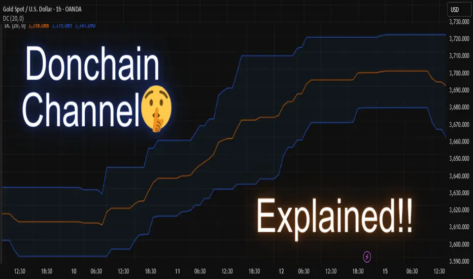
Donchain Channel Explainedthe donchian channel is a powerful trend-following indicator that helps traders visualize price breakouts, volatility, and market direction. it plots the highest high and lowest low over a selected period, forming an upper, lower, and middle band on the chart.
🔍 how it works
the donchian channel consists of:
🔹 upper band – highest high over the lookback period
🔹 lower band – lowest low over the same period
🔹 middle line – average of the upper and lower band (optional in some versions)
when price breaks above the upper band, it may indicate bullish momentum or a potential breakout. conversely, a break below the lower band suggests bearish momentum.
⚙️ customizable settings
you can adjust the channel period to fit your trading style:
📆 short periods (10–20) work well for scalping and intraday trading
📆 longer periods (50–100) help filter noise and spot bigger trends
🧠 how to use it
✅ trade long: can enter long when price closes above the upper band
✅ trade short: can enter short when price closes below the lower band
✅ ride trends: stay in the trade as long as price stays outside the band
✅ set trailing stops: use the opposite band as a dynamic stop-loss
✅ confirm signals: combine with volume, rsi, or moving averages for better accuracy
📈 strategy tips
• in trending markets, donchian channels can help capture large moves
• in ranging markets, be cautious of false breakouts
• works best when combined with a solid risk management plan
💡 the donchian channel was originally developed by richard donchian, a pioneer of trend-following systems. it remains popular among swing traders, breakout traders, and trend followers.
feel free to try it on different timeframes and instruments to see how price reacts to the channel boundaries. let the trend guide your decisions 📉📈
Disclaimer :
This post is not financial advice, it's for educational purposes only, I am not a SEBI-registered advisor. Trading and investing involve risk, and you should consult with a qualified financial advisor before making any trading decisions. I do not guarantee profits or take responsibility for any losses you may incur.
Swing Trading Setup - Super Bullish Momentum Strategy _ RSI Spec📈 High-Stakes Bullish Momentum Strategy
By a Senior Equity Research Analyst | 18 Years Experience | Stockholm Securities, UK
❓ A Quick Reality Check
Are you still stuck in intraday traps or index options hype?
Let’s be honest—retail traders rarely succeed there. It’s time to change your lens. Forget the noise. Focus on what institutions follow: Momentum on Higher Timeframes.
🔍 Why Most Retailers Fail
Most traders obsess over minute-by-minute charts. But serious money follows structure and momentum on higher timeframes—Monthly, Weekly, and Daily. If you can align your trades with these timeframes, you’ll ride the institutional waves rather than drown in intraday whipsaws.
✅ The Setup — A Proven Swing Momentum Framework
🔹 Step 1: Monthly RSI Filter (The Holy Grail)
• Monthly RSI must be > 60
This filters only the strongest, trend-following stocks. Ignore everything else.
🔹 Step 2: Weekly RSI Confirmation
• Weekly RSI must be > 60
Ensures trend continuity and institutional participation.
🚀 Two Swing Trading Approaches
✅ Approach 1: High-Momentum Breakout Entry
Ideal when daily trend is also aligned with higher timeframes.
• Daily RSI must be > 60
• Entry Trigger: Daily candle breaks swing high.
• Stop Loss: Current swing low or previous week’s low.
• Trail:
• Move SL to cost after good move.
• Later, trail to weekly low.
• Exit Conditions:
• RSI drops below 60 on daily
• Weekly candle closes below previous week’s low
⚡️ Approach 2: Early Institutional Entry
For catching early setups before the crowd.
• Monthly RSI > 60
• Weekly RSI > 60
• Daily RSI > 40
• Entry Trigger: Weekly candle breaks above previous swing.
• Stop Loss: Below previous week’s low
• Trail:
• After 3 positive daily candles, move SL to cost
• Exit Conditions:
• Daily RSI drops below 60
• Weekly candle closes below previous week’s low
📵 A Word of Advice
Avoid intraday trading and index options. They’re often traps designed to drain retail capital. Instead, align with trends backed by volume, structure, and institutional RSI signals.
📊 100 High-Beta, Highly Liquid NSE Stocks
These stocks are liquid, fundamentally strong, and mostly traded in the F&O segment — giving you both flexibility and depth.
🚗 Auto
• Bajaj Auto
• Bosch Ltd
• Eicher Motors
• Hero Motocorp
• Maruti Suzuki
• TVS Motors
• Tata Motors
🏦 Banking & Financial Services
• Bank of Baroda
• Kotak Mahindra Bank
• Axis Bank
• ICICI Bank
• HDFC Bank
• IndusInd Bank
• Bajaj Finserv
• Bajaj Finance
• SBI
🧪 Chemicals
• Aarti Industries
• Atul Ltd
• Navin Fluorine
• UPL
• Tata Chemicals
🍫 FMCG
• Britannia Industries
• Godrej Consumer
• Tata Consumer
• DMart
• Hindustan Unilever
• Dabur
💊 Pharma & Healthcare
• Apollo Hospitals
• Alkem Labs
• Biocon
• Divis Labs
• Dr. Reddy’s
• IPCA Labs
• Laurus Labs
• Lupin
• Aurobindo Pharma
• Sun Pharma
• Cipla
💻 IT Sector
• HCL Technologies
• Infosys
• LTIMindtree
• TCS
• Tech Mahindra
• Wipro
⛓️ Steel & Metals
• APL Apollo Tubes
• JSW Steel
• Jindal Steel
• Tata Steel
• Hindalco
• L&T
🛢️ Oil & Gas
• Reliance Industries
• Gujarat Gas
• Indraprastha Gas (IGL)
• Mahanagar Gas (MGL)
• Tata Power
🏢 Realty
• DLF Ltd
• Godrej Properties
• Lodha (Macrotech Developers)
• Oberoi Realty
• Phoenix Mills
🛋️ Durables & Others
• Sona BLW (Sona Comstar)
• Amber Enterprises
• Bata India
• Crompton Greaves
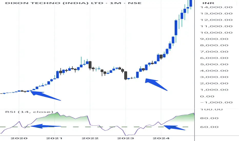
• Dixon Technologies
• Titan Company
• ACC Cement
• Ambuja Cement
• Ultratech Cement
• Voltas Ltd
• Polycab India
• Mazagon Dock (Mazdock)
• Asian Paints
• Berger Paints
📝 Final Thoughts
This is not just a strategy — it’s a framework to reprogram your trading mindset. Use higher timeframes, respect structure, and focus only on high-probability setups. You’re not here for noise. You’re here for moves that matter.
If this helped you, prepare a trading journal based on this strategy. Stay focused. Be consistent. Trade less, but trade right.
Option Trading Part-1 What Is Institutional Option Trading?
Institutional Option Trading involves using derivatives (Options) for:
Hedging big equity portfolios
Speculating on volatility or price movement
Arbitrage opportunities
🔹 Key Techniques:
Volatility Arbitrage
Delta-Neutral Hedging
Covered Calls
Protective Puts
Iron Condors & Spreads
How Institutions Use Options Differently
✅ Retail Focus:
Naked calls/puts
Directional trades
Limited capital
✅ Institutional Focus:
Portfolio insurance
Complex multi-leg strategies
Implied Volatility arbitrage
Event-based hedging (like earnings or Fed news)

Institution Option Trading What Is Trading?
Trading refers to buying and selling financial instruments (stocks, options, futures) in financial markets for profit. It can be:
Retail Trading – Done by individual investors.
Institutional Trading – Conducted by large organizations like banks, mutual funds, hedge funds.
What Is Investing?
Investing involves allocating capital with the expectation of long-term wealth generation. It focuses on:
Value appreciation
Dividends or returns over time
Longer holding periods

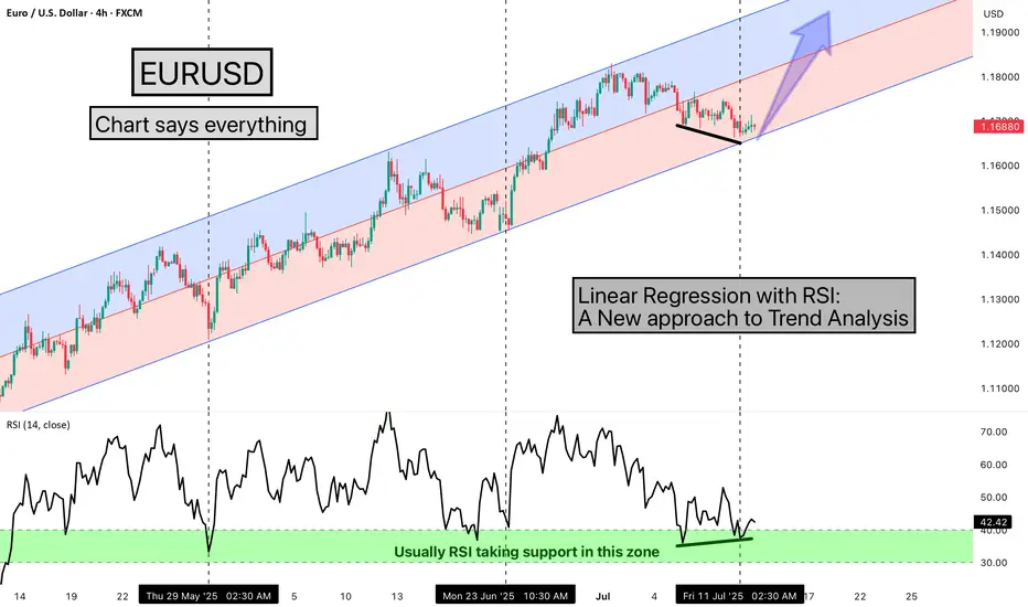
Linear Regression with RSI: A New approach to Trend AnalysisHello Friends,
Welcome to RK_Chaarts,
Today we are going to learn one Method of analysing the chart, here we are using EURUSD chart, and the method we're using is very simple & interesting, We are using the Linear Regression Trend Channel & Relative Strength Index (RSI), What happens in this method, is that we identify a particular zone where the price is making a one-sided move, like if the price is trending upwards, making higher highs and higher lows. We then apply a regression channel to it, and within that channel, we set internal deviation for the upper and lower sides, like 2 or 2.5 or 3 etc., whatever setting it takes.
In this chart, we can clearly see that the 2.5 setting is forming a complete channel, which we've applied for the last two months, from 12th May 2025, when the uptrend started. We've used the 4-hour time frame chart and the RSI. Every time the price hits the bottom of the channel, we can see that the RSI also enters the same zone, between 30-40, and from there, it bounces back.
Currently, the price has again hit the bottom of the regression channel, and the RSI has also gone below 40, between 30-40. And the good thing is that we're seeing a positive divergence in the RSI. So, there's a high possibility that the price might bounce back from here.
It's worth watching what happens next in the market. Nothing is guaranteed here; everything is a game of probabilities. This is one method that we often use, and its results have given us a very good experience. So, let's see what happens next in this chart. This observation is also a good learning experience, which we often encounter, 7-8 times out of 10, in favor of the market, but sometimes it doesn't work, maybe 2-3 times, when the trend changes. So, let's see what happens next.
This post is shared purely for educational purpose & it’s Not a trading advice.
I am not Sebi registered analyst.
My studies are for educational purpose only.
Please Consult your financial advisor before trading or investing.
I am not responsible for any kinds of your profits and your losses.
Most investors treat trading as a hobby because they have a full-time job doing something else.
However, If you treat trading like a business, it will pay you like a business.
If you treat like a hobby, hobbies don't pay, they cost you...!
Hope this post is helpful to community
Thanks
RK💕
Disclaimer and Risk Warning.
The analysis and discussion provided on in.tradingview.com is intended for educational purposes only and should not be relied upon for trading decisions. RK_Chaarts is not an investment adviser and the information provided here should not be taken as professional investment advice. Before buying or selling any investments, securities, or precious metals, it is recommended that you conduct your own due diligence. RK_Chaarts does not share in your profits and will not take responsibility for any losses you may incur. So Please Consult your financial advisor before trading or investing.
Dip-buying in quality large-caps & sectorsDip-Buying in Quality Large-Caps & Sectors: A Simple Investor's Guide
One of the hottest topics in today’s stock market is dip-buying in quality large-cap stocks and sectors. If you’ve been following the market even casually, you’ve probably heard this term thrown around a lot. But what does it really mean? And more importantly, how can you use this strategy to your advantage in a way that’s smart and simple?
This guide breaks it down in plain English, so whether you're new to investing or have been in the game a while, you'll understand exactly how dip-buying works, why it's trending, and what sectors and stocks are currently worth your attention.
What Is Dip-Buying?
"Buying the dip" means purchasing stocks when their prices temporarily fall, with the belief that they will rise again. Think of it like a sale at your favorite store. The item (in this case, a stock) hasn’t lost its value; it’s just cheaper for now. Smart investors take advantage of these moments to buy strong companies at a discount.
But there's a catch. Not every dip is worth buying. That’s why it's important to focus on quality large-cap stocks and strong sectors — companies and industries that have a solid track record, strong financials, and the ability to bounce back from short-term declines.
Why Is Dip-Buying So Popular Right Now?
Market Volatility: Global markets are swinging more than usual due to geopolitical tensions, inflation, interest rate changes, and currency pressure. This creates more short-term dips.
Economic Stability: Despite the ups and downs, long-term economic fundamentals in countries like India are still positive. Sectors like banking, pharma, and FMCG are showing resilience.
Pro Investor Strategy: Top fund managers and seasoned investors often use dip-buying to accumulate high-quality stocks at better prices. Retail investors are now catching on to this technique.
Better Risk-Reward: When you buy during a dip, you increase your chances of getting higher returns when the stock rebounds, while minimizing downside risk (if chosen wisely).
What Makes a Stock "Quality"?
Not every large-cap stock is a safe bet. Here are key signs that a company is worth buying on dips:
Consistent Revenue and Profit Growth
Strong Brand Recognition (like HUL, TCS, Infosys)
Good Corporate Governance
Low to Moderate Debt
Regular Dividends
Presence in a Growing Industry
These are the kinds of stocks that recover quickly after market corrections.
Sectors Worth Watching for Dip-Buying
Let’s break down a few of the most popular sectors where investors are buying dips:
1. FMCG (Fast-Moving Consumer Goods)
These are companies that sell everyday products like soap, toothpaste, and food.
Why it's strong: Demand is stable even in bad times.
Examples: HUL (Hindustan Unilever), Nestle, Dabur, Britannia.
Strategy: Buy during quarterly results disappointment or short-term inflation impact.
2. Pharma & Healthcare
Why it's strong: Healthcare is essential; global export markets offer growth.
Examples: Sun Pharma, Dr. Reddy’s, Cipla, Glenmark.
Strategy: Buy on regulatory setback or global pressure — long-term story is still intact.
3. Private Banking & Financials
Why it's strong: Credit growth is picking up; digital transformation is boosting profits.
Examples: HDFC Bank, ICICI Bank, Kotak Mahindra Bank, Axis Bank.
Strategy: Accumulate on market-wide corrections or temporary bad loan fears.
4. IT & Tech
Why it's strong: Digital services, AI, and automation are booming worldwide.
Examples: TCS, Infosys, Wipro, HCL Tech.
Strategy: Buy during global slowdown fears or margin pressure.
5. Auto & EV-Related Stocks
Why it's strong: Strong demand post-COVID, and EV boom is real.
Examples: Maruti Suzuki, Tata Motors, M&M, Bajaj Auto.
Strategy: Use monthly sales dips or raw material price spikes to enter.
How to Actually Do Dip-Buying (Without Stress)
Make a Watchlist: Pick 10–15 quality large-cap stocks across sectors.
Use Alerts or Apps: Set price alerts so you know when a stock drops 5–10% from recent highs.
Check the News: Was the dip due to a real problem or just market mood swings?
Start Small: Don’t put all your money at once. Invest in chunks. That’s called SIP (Systematic Investment Plan) in stocks.
Stay Updated: Re-evaluate your picks every quarter. Replace weak stocks.
Hold with Patience: Dip-buying is not about overnight returns. Give your stocks 6–12 months at least.
Common Mistakes to Avoid
Buying Every Dip: Not every fall is a buying opportunity. Some companies have deeper problems.
Ignoring Fundamentals: Always check financial health.
Getting Greedy: Don’t try to time the exact bottom.
Panic Selling: If you’ve done your homework, trust your process.
Real Example (as of July 2025)
Let’s say HUL dropped from ₹2,800 to ₹2,580 after weak results. If you believe in the company’s long-term story, that 8% drop is a buying opportunity. Maybe you buy 20% of your planned quantity now, and wait to add more if it drops further to ₹2,450. If it rebounds, great — you already entered.
Another example: Glenmark Pharma recently jumped 14% due to a global licensing deal. It had dipped earlier due to export pressure. Those who bought during that dip are now sitting on solid gains.
Final Thoughts
Dip-buying in quality large-cap stocks isn’t just a smart strategy; it’s also a calm one. It helps you invest without chasing highs or making emotional decisions. It works best when you combine common sense, basic research, and patience.
Markets will always move up and down. But strong companies bounce back. If you can learn to spot those temporary drops in quality businesses, you can grow your wealth steadily and confidently.
Happy Investing!
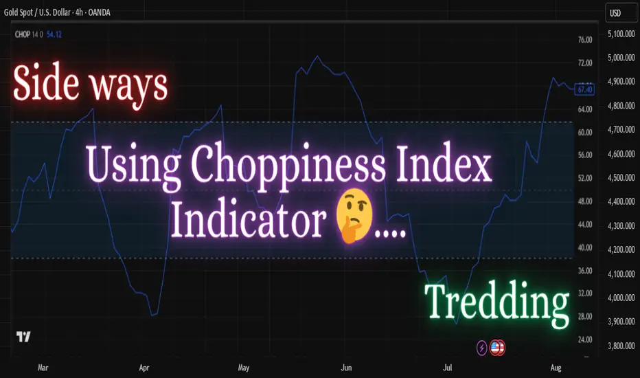
how to use choppiness index indicator ?the choppiness index is a volatility-based indicator designed to determine whether the market is trending or consolidating. it doesn’t predict direction, but helps traders identify the nature of price movement — choppy or directional.
🔍 how it works:
* the indicator ranges from 0 to 100.
* values above 60 usually indicate a sideways or consolidating market.
* values below 40 suggest a trending market (either up or down).
* the closer it is to 100, the more choppy the market; the closer to 0, the stronger the trend.
🧠 how to use it in trading:
1. use choppiness index to filter trades — avoid trading trend-based strategies during high choppiness.
2. combine it with a trend-following indicator (like moving average or adx) to confirm entries when the choppiness index is low.
3. during low choppiness, you can also trail your stops more aggressively as the market is likely trending.
⚙️ custom settings tip:
some traders use fibonacci levels (38.2 and 61.8) as thresholds. you can adjust the period (default is often 14) based on your timeframe and strategy.
💡 example usage:
* wait for the choppiness index to fall below 38.2.
* then look for a breakout or moving average crossover to align your trade in the direction of the trend.
🎯 summary:
the choppiness index helps you avoid trading during indecisive market conditions and improves your strategy’s timing by telling you when the market is likely to move. it's best used as a filter alongside other indicators.
Disclaimer :
This idea post is not financial advice, it's for educational purposes only, I am not a SEBI-registered advisor. Trading and investing involve risk, and you should consult with a qualified financial advisor before making any trading decisions. I do not guarantee profits or take responsibility for any losses you may incur.
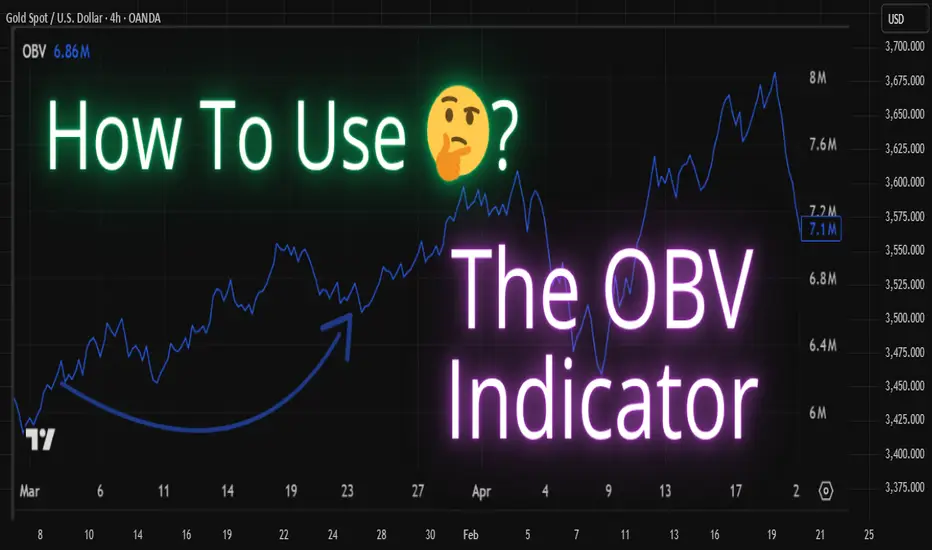
How To Use The OBV (On-Balance Volume) Indicator?The OBV (On-Balance Volume) is a classic volume-based indicator that helps traders measure buying and selling pressure using volume flow. It was developed by Joseph Granville and is widely used to confirm price trends or spot early signs of reversals.
🔍 How OBV Works:
The OBV line is calculated by adding volume on up days and subtracting volume on down days.
* If the closing price is higher than the previous close, that candle's volume is added to OBV.
* If the closing price is lower, the volume is subtracted.
This creates a cumulative volume line that reflects how volume is flowing with price action.
📊 What OBV Tells You:
✅ A rising OBV suggests accumulation (buying pressure)
✅ A falling OBV suggests distribution (selling pressure)
✅ Divergence between OBV and price can signal potential reversals
📌 Example Use Cases:
🔹 Confirming breakouts and breakdowns
🔹 Spotting hidden strength or weakness
🔹 Identifying bullish or bearish divergences
🛠 OBV is most powerful when combined with trendlines, moving averages, or other price action tools.
Disclaimer :
This Post is not financial advice, it's for educational purposes only, I am not a SEBI-registered advisor. Trading and investing involve risk, and you should consult with a qualified financial advisor before making any trading decisions. I do not guarantee profits or take responsibility for any losses you may incur.
Trading Master ClassPost-Trade Processing
Clearing and Settlement: Trades are cleared by clearing houses and settled typically on T+1 or T+2 basis.
Regulatory Reporting: All trades must be reported for transparency and compliance.
Performance Review and Compliance
Evaluation: Execution quality, cost efficiency, and market impact are reviewed.
Audit Trails: Maintain detailed records for regulatory bodies like SEBI, SEC, etc.
Continuous Improvement: Algorithms and strategies are refined based on trade performance.
Key Components in Institutional Trading
Liquidity Management: Large trades need sufficient liquidity to avoid market disruption.
Algorithmic Support: Automated systems manage trade slicing and timing.
Risk Control: Continuous monitoring of exposure, slippage, and adverse market moves.

Bollinger Bands: How to Stop Being a Slave to the Markets.Bollinger Bands: How to Stop Being a Slave to the Markets.
Bollinger Bands are a technical analysis indicator widely used in trading to assess the volatility of a financial asset and anticipate price movements. Created in the 1980s by John Bollinger, they consist of three lines superimposed on the price chart:
The middle band: a simple moving average, generally calculated over 20 periods.
The upper band: the moving average to which two standard deviations are added.
The lower band: the moving average to which two standard deviations are subtracted.
These bands form a dynamic channel around the price, which widens during periods of high volatility and narrows when the market is calm. When a price touches or exceeds a band, it can signal an overbought or oversold situation, or a potential trend reversal or continuation, depending on the market context.
What are Bollinger Bands used for? Measuring volatility: The wider the bands spread, the higher the volatility.
Identifying dynamic support and resistance zones.
Detecting market excesses: A price touching the upper or lower band may indicate a temporary excess.
Anticipating reversals or consolidations: A tightening of the bands often heralds an upcoming burst of volatility.
Why is the 2-hour time frame so widely used and relevant?
The 2-hour (H2) time frame is particularly popular with many traders for several reasons:
Perfect balance between noise and relevance: The H2 offers a compromise between very short time frames (often too noisy, generating many false signals) and long time frames (slower to react). This allows you to capture significant movements without being overwhelmed by minor fluctuations.
Suitable for swing trading and intraday trading: This timeframe allows you to hold a position for several hours or days, while maintaining good responsiveness to take advantage of intermediate trends.
Clearer reading of chart patterns: Technical patterns (triangles, double tops, Wolfe waves, etc.) are often clearer and more reliable on H2 than on shorter timeframes, which facilitates decision-making.
Less stress, better time management: On H2, there is no need to constantly monitor screens. Monitoring every two hours is sufficient, which is ideal for active traders who don't want to be slaves to the market.
Statistical relevance: Numerous backtests show that technical signals (such as those from Bollinger Bands) are more robust and less prone to false signals on this intermediate timeframe.
In summary, the 2-hour timeframe is often considered "amazing" because it combines the precision of intraday trading with the reliability of swing trading, providing superior signals for most technical strategies, especially those using Bollinger Bands.
To summarize
Bollinger Bands measure volatility and help identify overbought/oversold areas or potential reversals.
The 2-hour timeframe is highly valued because it filters out market noise while remaining sufficiently responsive, making it particularly useful for technical analysis and trading decision-making.
Institutional Objectives in Options TradingInstitutional Objectives in Options Trading
1. Hedging
Institutions use options to protect large portfolios from adverse price movements.
Example: A fund holding a large stock position may buy put options as insurance.
2. Speculation
Institutions speculate on short-term market movements with directional bets using options.
Example: Buying call options in anticipation of a stock rally.
3. Arbitrage
Institutions exploit pricing inefficiencies in the options market for risk-free profit.
Example: Engaging in index arbitrage or dividend arbitrage strategies.
4. Income Generation
By selling options, institutions generate consistent premium income.
Example: Writing covered calls on long equity positions.
Tools and Techniques Used by Institutions
1. Advanced Option Strategies
Spreads: Vertical, horizontal, and diagonal spreads to limit risk.
Straddles and Strangles: To profit from high volatility.
Iron Condors and Butterflies: To capture premium in low volatility.
2. Option Greeks Management
Institutional traders rely heavily on managing option Greeks:
Delta: Sensitivity to price changes in the underlying asset.
Gamma: Rate of change of Delta.
Theta: Time decay impact.
Vega: Sensitivity to volatility changes.
Rho: Sensitivity to interest rate changes.
3. Technology and Algorithms
Institutions employ high-frequency trading (HFT) systems and algorithmic strategies to execute options trades efficiently and capitalize on minute price movements.
4. Implied Volatility and Open Interest Analysis
Institutions use implied volatility (IV) and open interest (OI) as key indicators to gauge market sentiment and structure complex multi-leg strategies accordingly.

Institution Option TradingInstitutional options trading refers to the large-scale use of options by financial institutions such as hedge funds, mutual funds, pension funds, banks, insurance companies, and proprietary trading firms. Unlike retail traders, institutional participants possess significant capital, advanced technology, and deep market insight, enabling them to deploy complex options strategies for hedging, speculation, and arbitrage purposes.
Institutional options trading plays a crucial role in shaping market dynamics. These large entities can influence volatility, liquidity, and price movements due to the size and frequency of their trades. Understanding how institutional traders operate provides retail traders with key insights to align their strategies effectively.
The Foundation of Options Trading
1. Understanding Options
Options are derivative contracts that give the buyer the right, but not the obligation, to buy or sell an underlying asset at a predetermined price (strike price) within a specified time frame.
Types of Options:
Call Options: Provide the right to buy.
Put Options: Provide the right to sell.
2. Key Option Terminologies
Premium: Price paid to buy the option.
Strike Price: Predetermined price to buy/sell the underlying asset.
Expiration Date: Last date the option can be exercised.
In-the-Money (ITM): Option with intrinsic value.
Out-of-the-Money (OTM): Option with no intrinsic value.

Technical ClassCandlestick patterns are essential tools in technical analysis that help traders predict potential market movements based on price action. Each candlestick represents four key data points: Open, High, Low, and Close prices within a specific time frame.
Types of Candlestick Patterns:
1. Single Candlestick Patterns
Doji: Market indecision (Open ≈ Close)
Hammer: Bullish reversal, long lower wick
Shooting Star: Bearish reversal, long upper wick
Spinning Top: Market indecision, small body
2. Double Candlestick Patterns
Bullish Engulfing: Strong bullish reversal
Bearish Engulfing: Strong bearish reversal
Tweezer Bottom/Top: Reversal signals
3. Triple Candlestick Patterns
Morning Star: Bullish reversal (3 candles)
Evening Star: Bearish reversal (3 candles)
Three White Soldiers: Strong bullish continuation
Three Black Crows: Strong bearish continuation
✅ Importance in Trading:
Predict Trend Reversals
Identify Continuation Patterns
Spot Market Sentiment Early

Trading with Professionalsnvesting Basics
Investing involves allocating money into assets with the expectation of generating income or profit over time. Unlike trading, investing usually focuses on long-term wealth building.
Investment Vehicles:
Stocks: Equity ownership in companies.
Bonds: Fixed-income securities.
Mutual Funds: Pooled investments managed by professionals.
ETFs: Funds that track indices and can be traded like stocks.
Real Estate: Property investments.
Investment Strategies:
Value Investing: Buying undervalued stocks.
Growth Investing: Investing in companies with high growth potential.
Dividend Investing: Focusing on stocks that provide regular income.
Risk Management in Investing:
Diversification across sectors and asset classes.
Regular portfolio rebalancing.
Long-term focus to absorb short-term volatility
